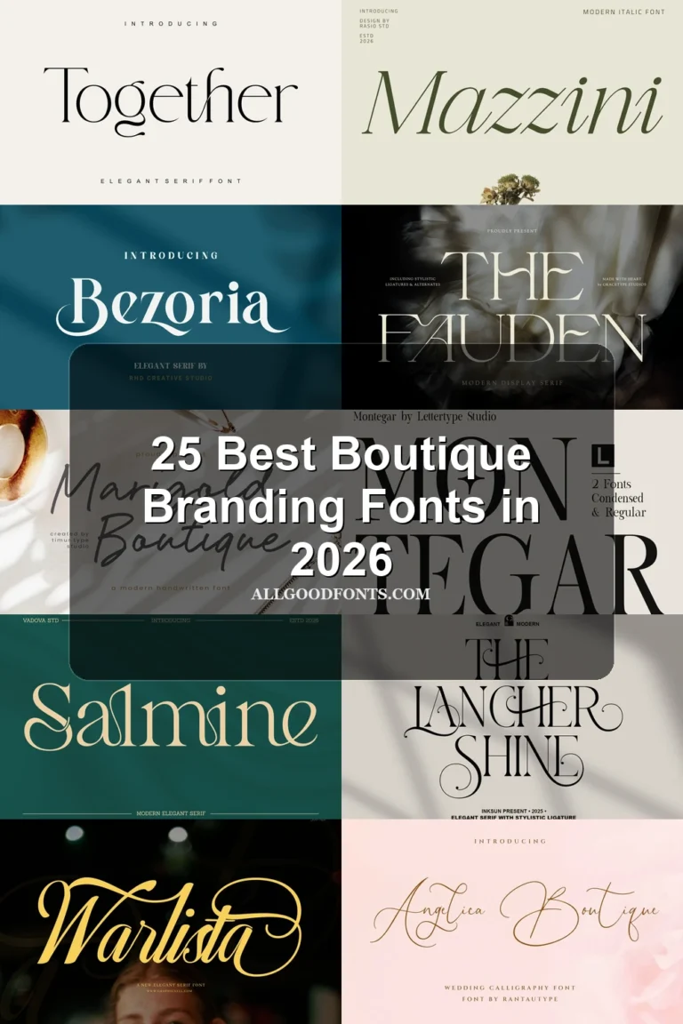
22 Best Minimal Branding Fonts in 2026
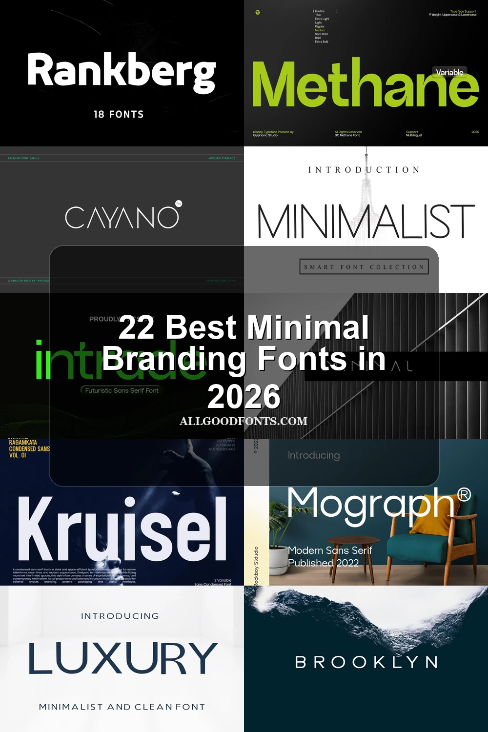
This collection moves from open, geometric sans serifs to compressed blocks, fragmented constructions, and high-contrast serif displays. These Minimal Branding Fonts help shape logos, packaging, headlines, labels, and supporting identity text, with practical differences in width, stroke weight, apertures, spacing, and small-size readability.
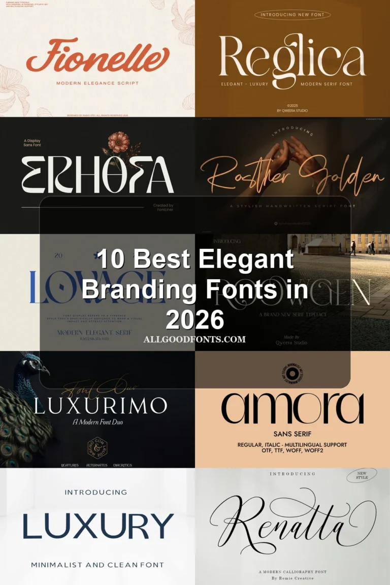
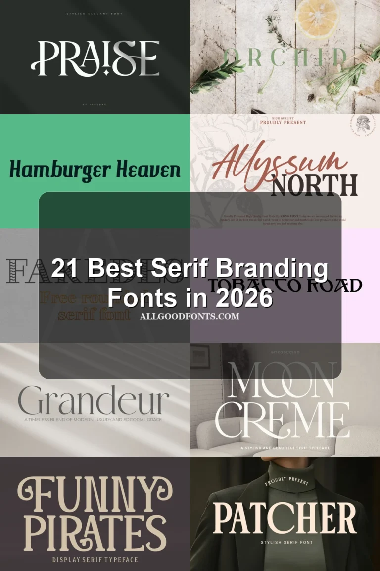
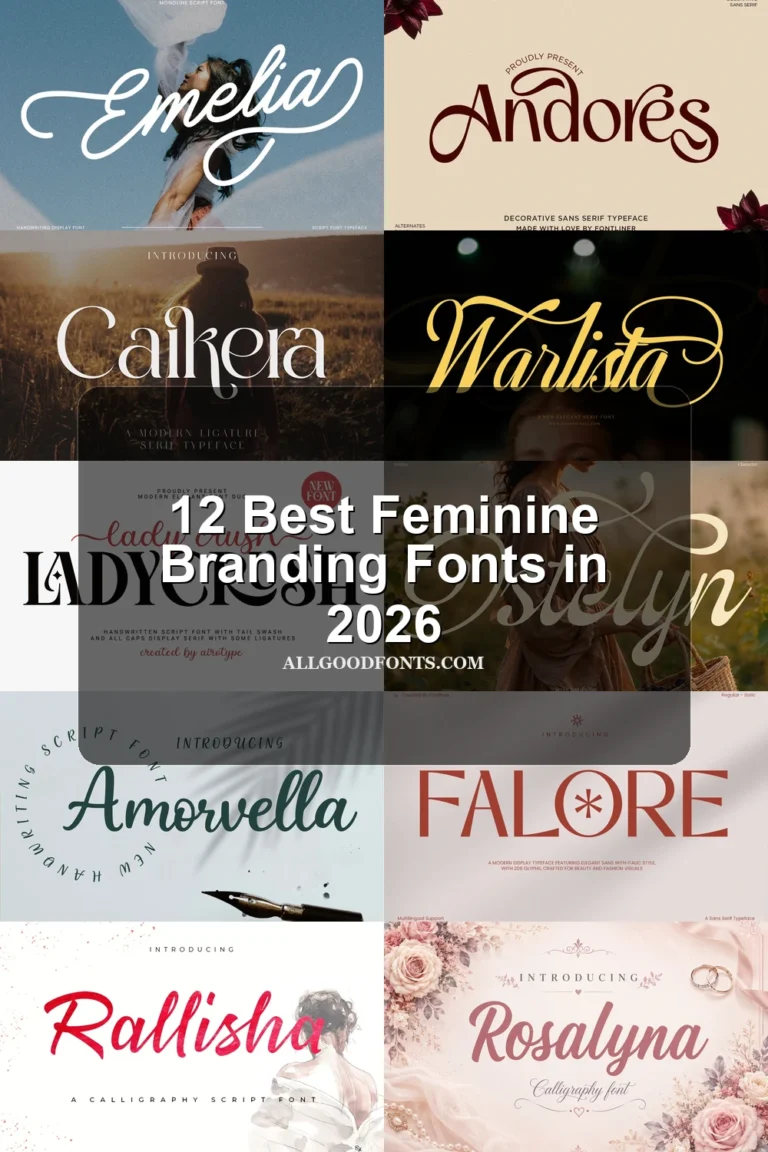
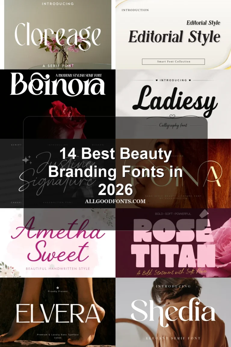
Looking for more branding fonts? Browse our complete Branding Fonts collection to compare modern, elegant, boutique, luxury, and beauty branding styles.
Minimal Branding Fonts
These Minimal Branding Fonts emphasize geometric order, open counters, and steady strokes. Compared with the other groups, they offer the most dependable route from brand name to supporting text.
Intrade Font
Best For: branding, display text, modern designs, minimal designs
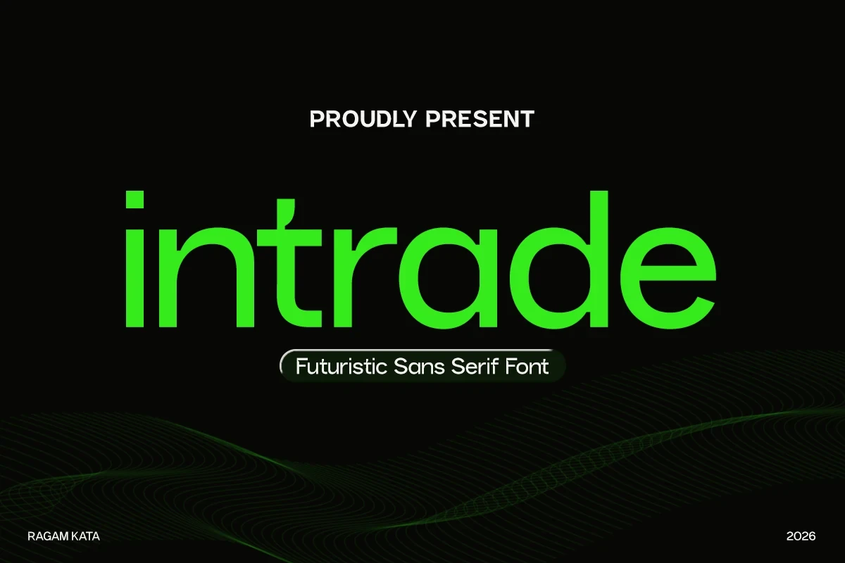
Intrade Font uses wide geometric proportions, monoline strokes, open apertures, and circular bowls. For Minimal Branding Fonts, that combination keeps headlines clear while giving a technology-oriented identity a structured visual character.
Phenom Font
Best For: branding, high-end designs, modern designs, minimal designs
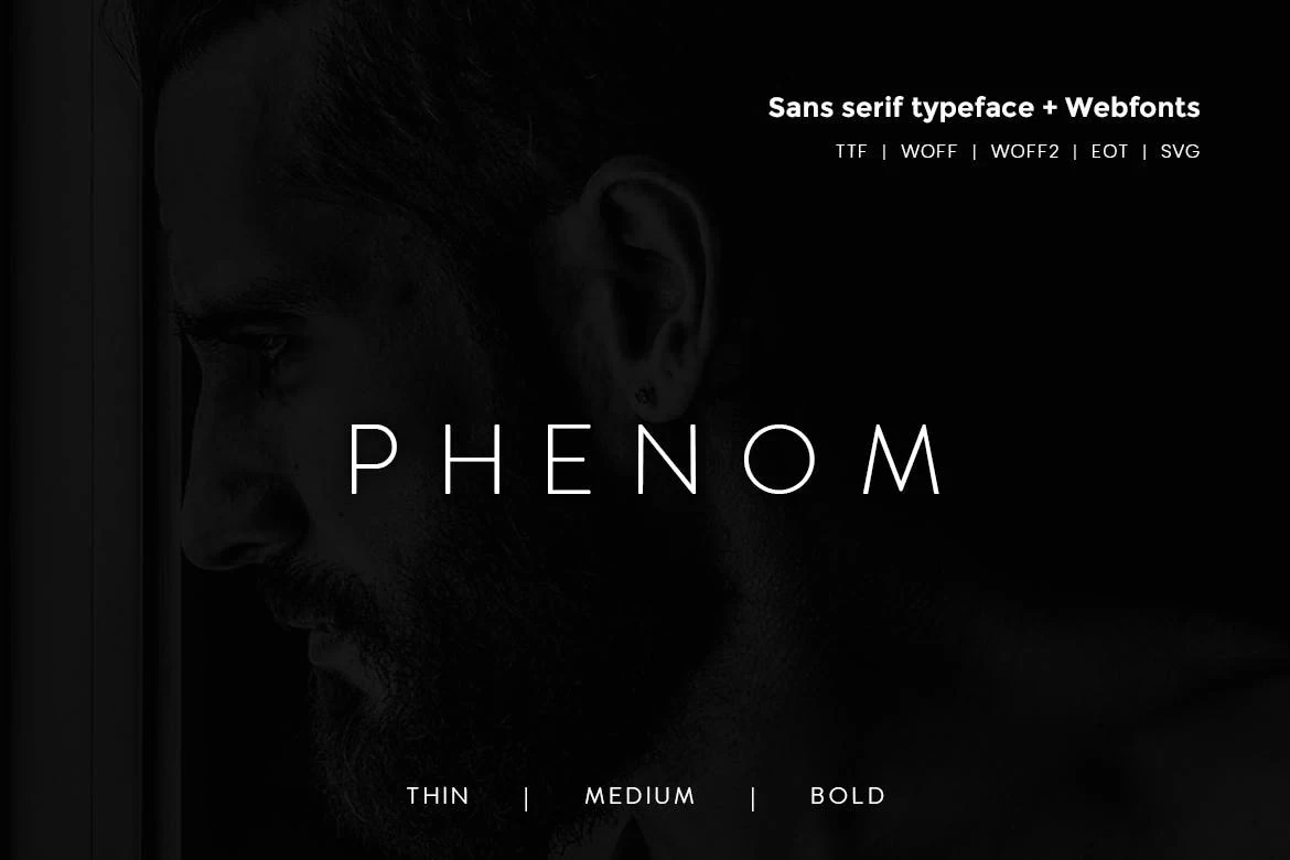
For Minimal Branding Fonts that need hierarchy, Phenom Font supplies Thin, Medium, and Bold weights within a wide geometric system. Uniform strokes and straight terminals keep the family controlled; use generous display sizing for the thinnest weight, which can lose detail when reduced.
Mansfield Font

Best For: branding, display text, modern designs, minimal designs
Mansfield Font is a restrained choice among Minimal Branding Fonts, built from geometric forms, uniform strokes, open counters, and ample spacing. It supports naming and display text without ornamental cues, making the identity easier to extend across straightforward headline applications.
Colasta Font
Best For: branding, display text, modern designs, minimal designs
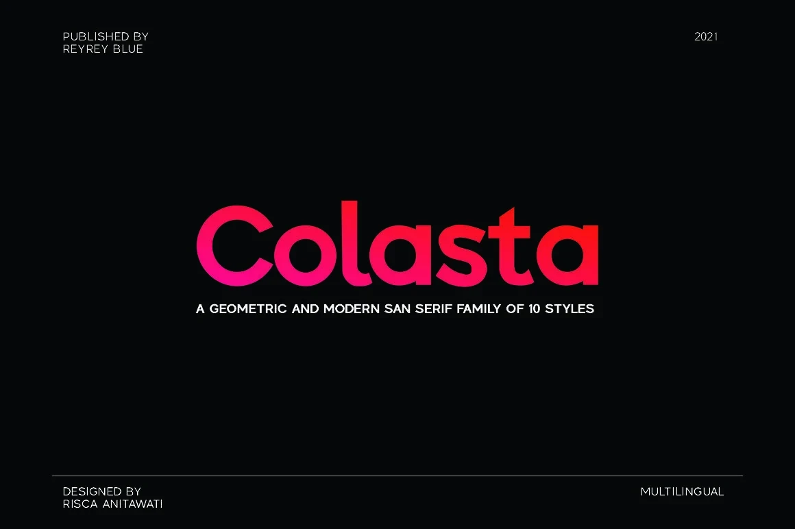
Colasta Font combines circular o and a forms with high horizontal crossbars and monoline strokes. Within Minimal Branding Fonts, it offers approachable headline clarity and enough structural simplicity to remain useful for mid-sized subheadings.
Noirden Font
Best For: branding, display text, modern designs, minimal designs
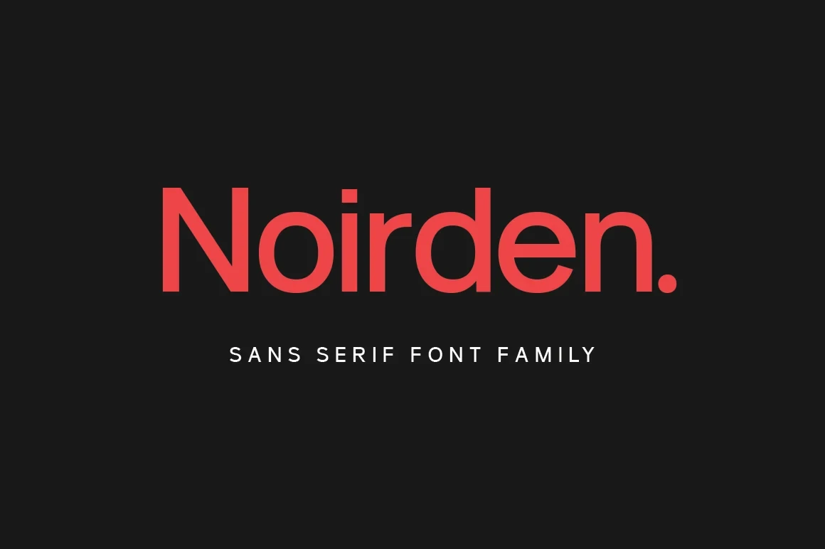
Noirden Font is one of the more dependable Minimal Branding Fonts options, using uniform geometric strokes, generous apertures, and circular curves. Its consistent construction remains readable in brand displays as well as smaller supporting text.
Mograph Font
Best For: branding, display text, modern designs, minimal designs
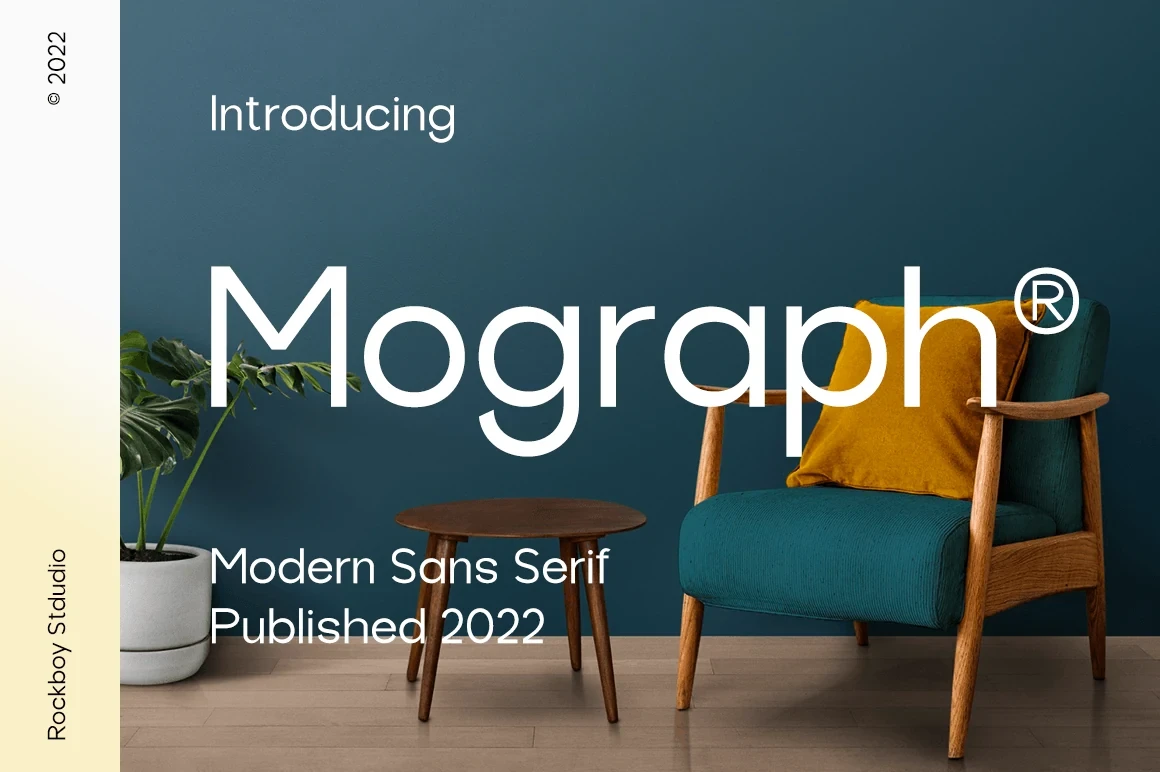
Mograph Font is well suited to Minimal Branding Fonts systems that need one family for logo, headline, and body roles. Its wide geometric proportions, large x-height, open apertures, and consistent strokes support a coherent hierarchy across sizes.
Balimo Font
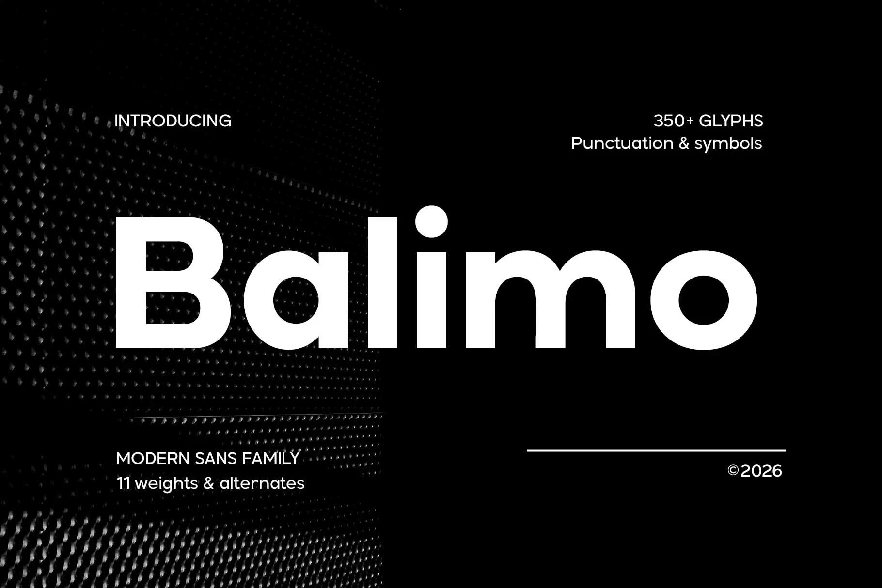
Best For: branding, headlines, professional designs, display text
Balimo Font softens a heavy geometric sans with rounded terminals, low contrast, and uniform strokes. It keeps brand headlines approachable while lighter supporting weights remain clear, making the family useful when the identity must work beyond one large name.
Calior Font
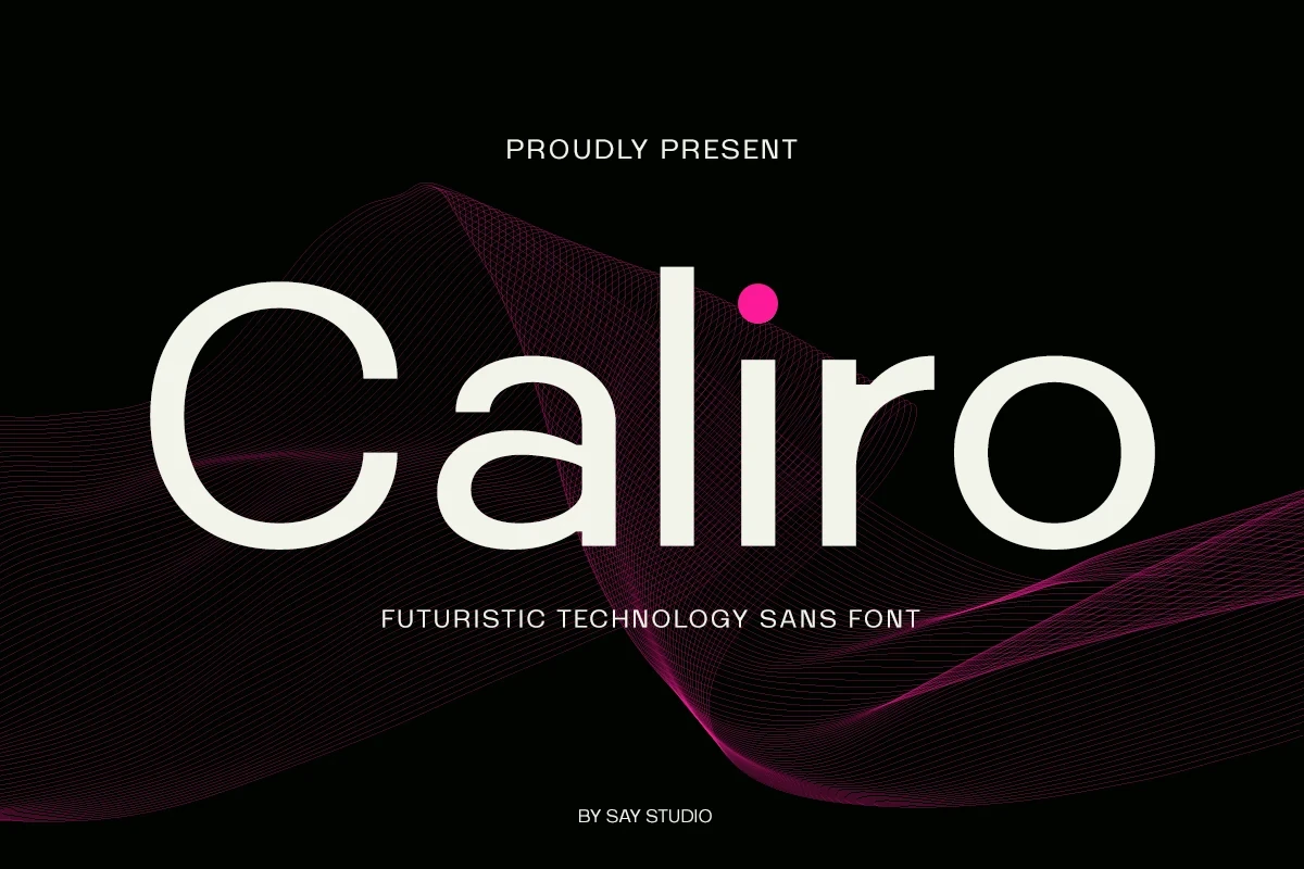
Best For: branding, display text, headlines, modern designs
Calior Font rounds out the Minimal Branding Fonts selection with balanced geometric forms, open counters, circular bowls, and monoline strokes. It offers technical clarity for names and headlines without depending on highly stylized letterforms.
Condensed Branding Statements
Condensed faces here concentrate branding into narrow, upright forms, ranging from readable compact sans serifs to nearly solid display blocks. Their space-saving construction suits names and lockups, not paragraphs.
Nothing Font
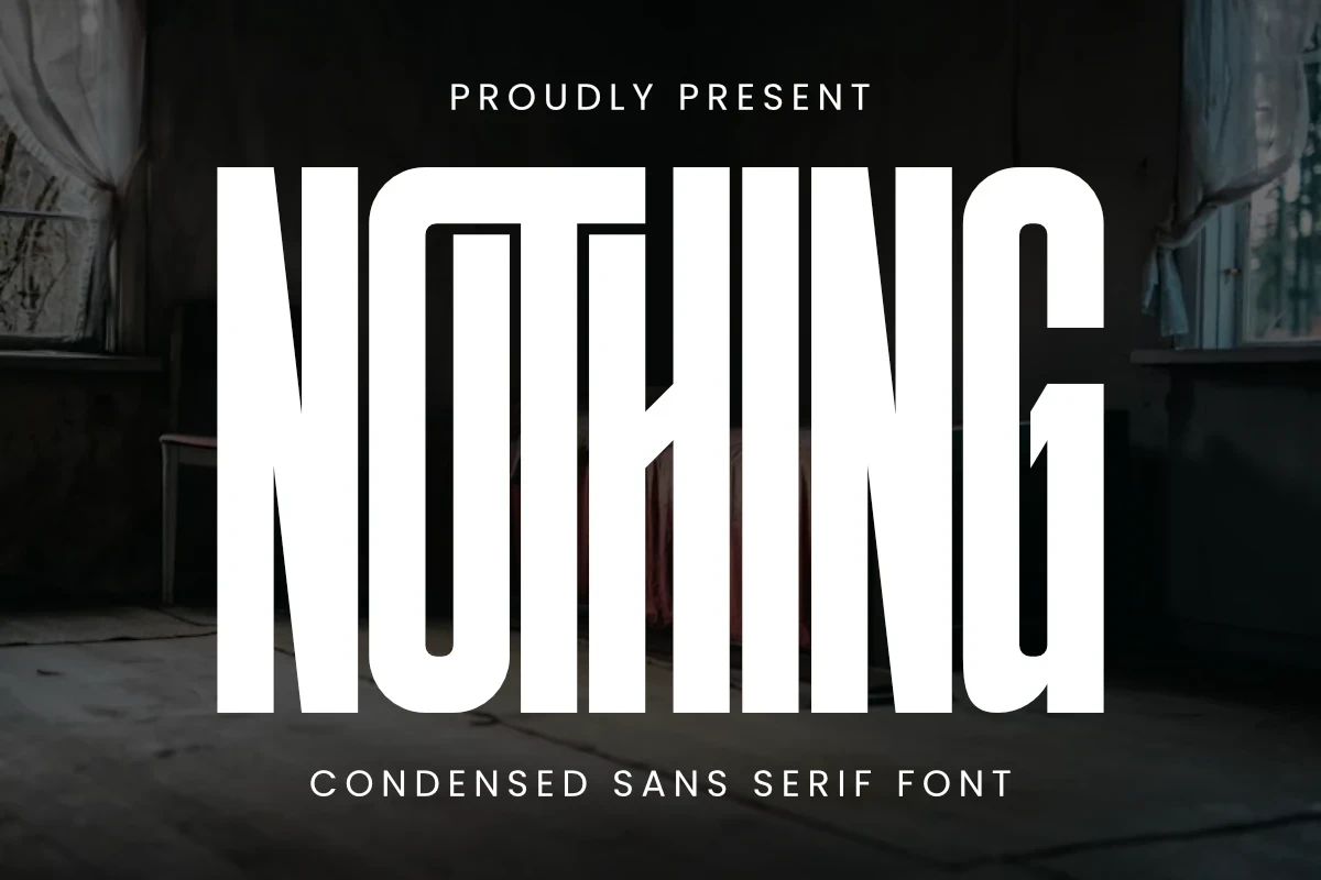
Best For: logos, branding, packaging, posters
Nothing Font compresses heavy, nearly solid letterforms into an imposing block with minimal counter space. It suits large logos, packaging marks, and posters, but the tight spacing and extreme width make it poorly suited to small text.
Kruisel Font
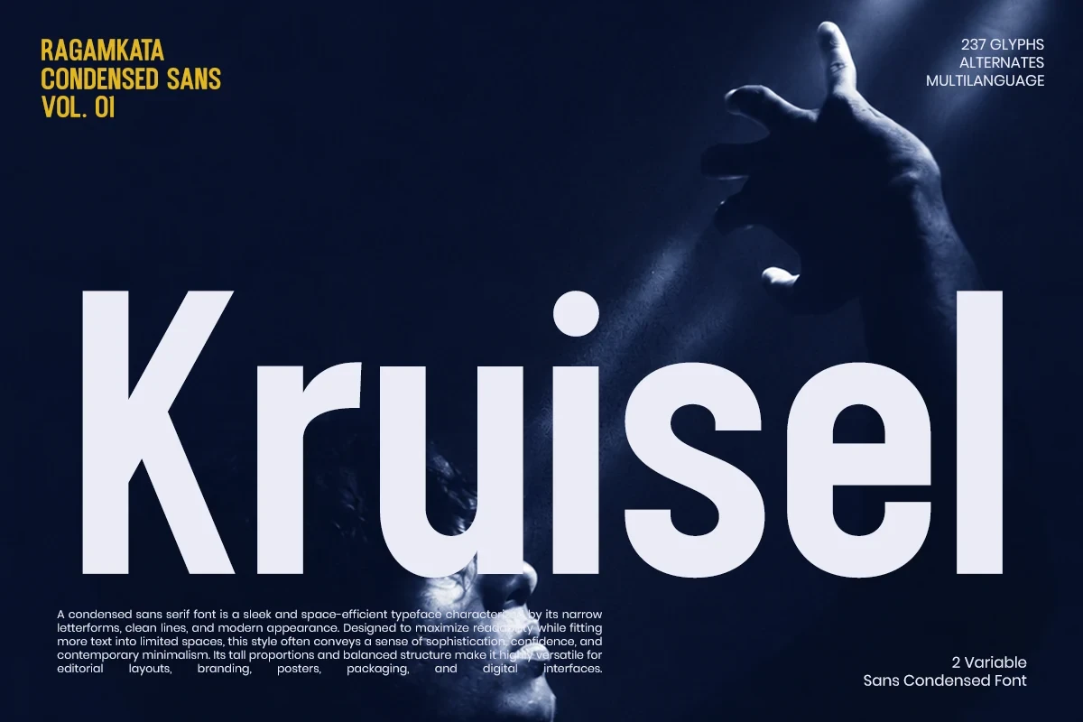
Best For: branding, display text, modern designs, minimal designs
Kruisel Font uses condensed proportions without collapsing its spacing, combining uniform strokes with an upright geometric structure. It fits compact brand names and can carry smaller supporting copy more reliably than extreme display condensations.
Movault Font
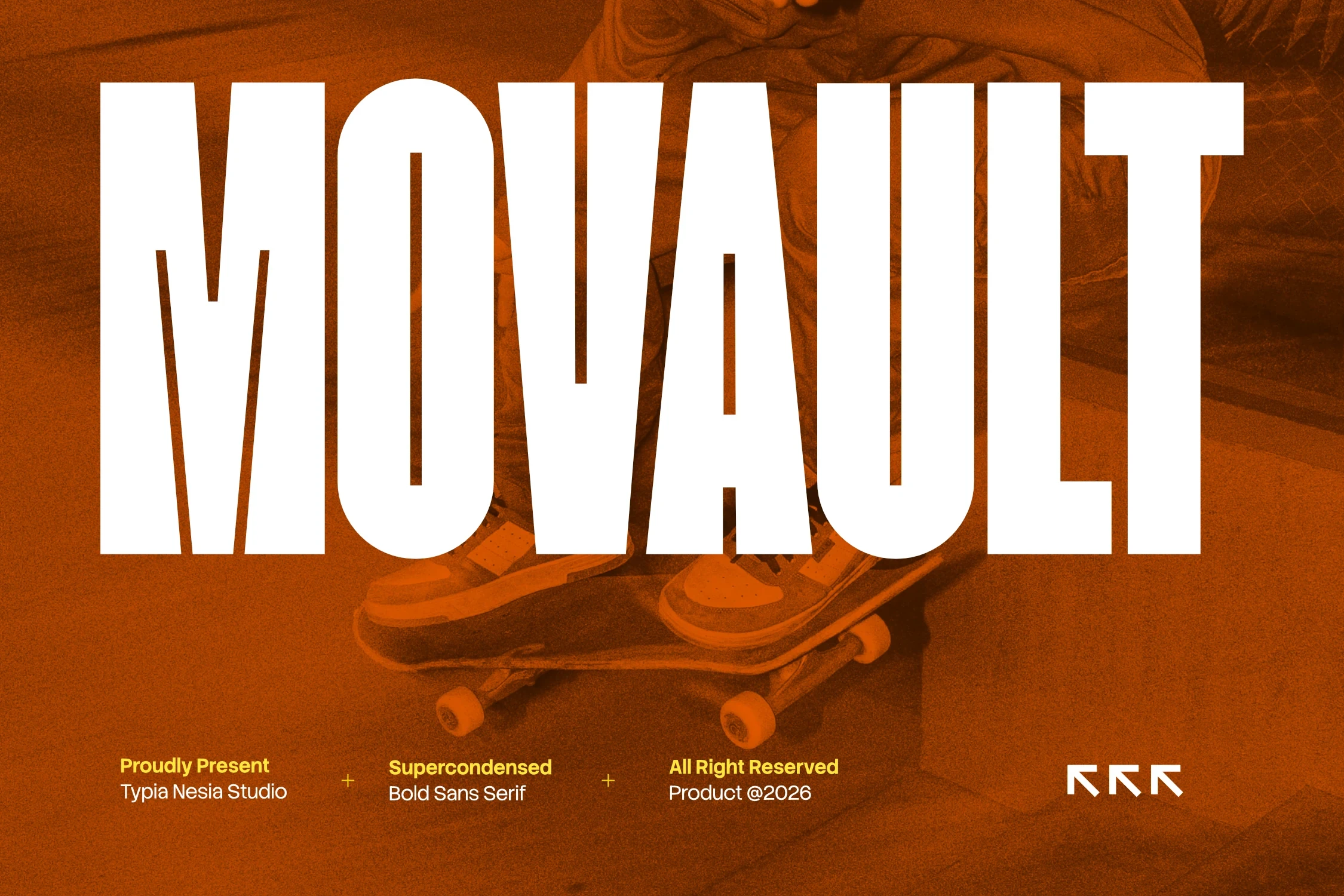
Best For: branding, display text, headlines, modern designs
Movault Font uses extremely compressed block geometry, a heavy weight, and square-cut terminals. It creates a forceful headline lockup for branding, while its narrow construction makes long-form text an unsuitable role.
Experimental Branding Forms
This group uses omissions, stencil breaks, disconnected strokes, and unusually thin structures to create recognition through construction. Those visual interruptions make it more specialized and size-dependent than the geometric group.
Minimal Font
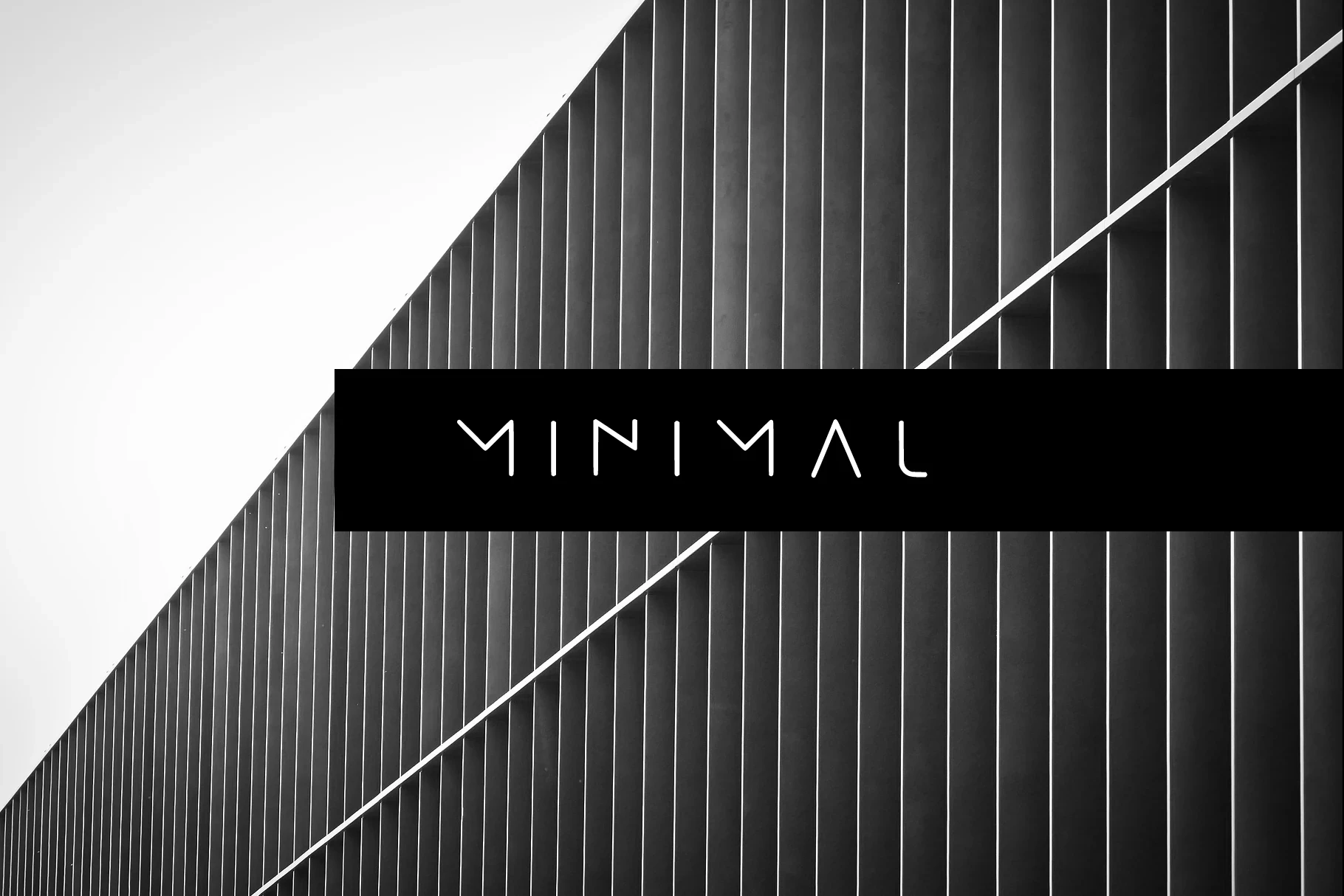
Best For: branding, display text, modern designs, minimal designs
Minimal Font removes the usual horizontal bars from the A and N, creating open-terminal letterforms with a technical character. The omission is memorable in a logo or headline, but recognition becomes less immediate when the type is reduced.
Minimal Font

Best For: branding, display text, modern designs, minimal designs
Minimal Font uses uppercase stencil construction with thin, deliberately fragmented strokes. The breaks create a technical cutout effect for logos and display text, but they interrupt reading too much for extended copy or small applications.
Cayano Pro Font

Best For: logos, branding, invitations, quotes
Cayano Pro Font suits Minimal Branding Fonts applications that need an airy logo or invitation title. Thin disconnected strokes, sharp A and V apexes, an open O, and wide spacing create lightness, but fine details weaken at small sizes.
Minimalist Font
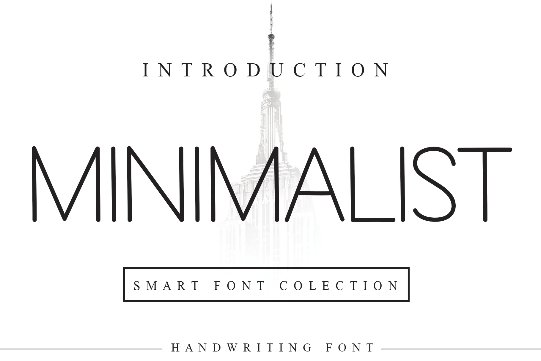
Best For: branding, display text, modern designs, minimal designs
Minimalist Font builds light upright lettering from extended geometric proportions and high contrast. It creates an understated editorial identity in large headings, but its thin strokes require careful size control before being used beyond display text.
Expressive Display Branding
Expressive display options introduce heavy geometry, serif contrast, rounded mass, or articulated rhythm. They create stronger mood and distinction than neutral sans serifs, but usually need larger applications.
Olline Font

Best For: branding, headlines, creative projects, display text
Olline Font gets its presence from heavy geometric strokes, extended width, and a closed circular O. It makes brand names and headlines immediately visible, although the dense construction can crowd smaller applications.
Methane Font
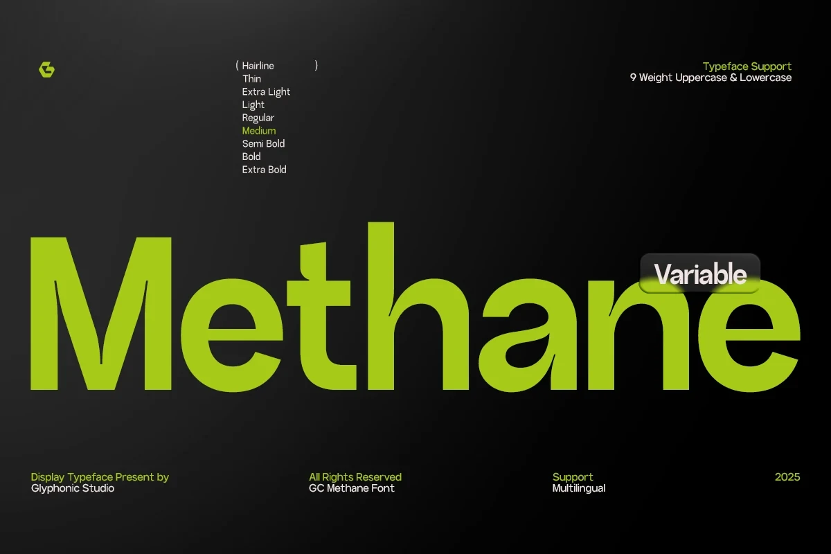
Best For: branding, headlines, display text, modern designs
Methane Font spans Hairline to Extra Bold, pairing geometric forms with pronounced thick-thin contrast. That range supports sharply different identity treatments, but its delicate strokes are more reliable in large branding, headings, and display text.
Luxury Font

Best For: branding, display text, modern designs, minimal designs
Luxury Font balances delicate horizontal strokes against heavier vertical stems, producing a high-contrast display texture. Its wide apertures and sharp terminals suit large brand names, while body-text use is less dependable as the contrast shrinks.
Brooklyn Font
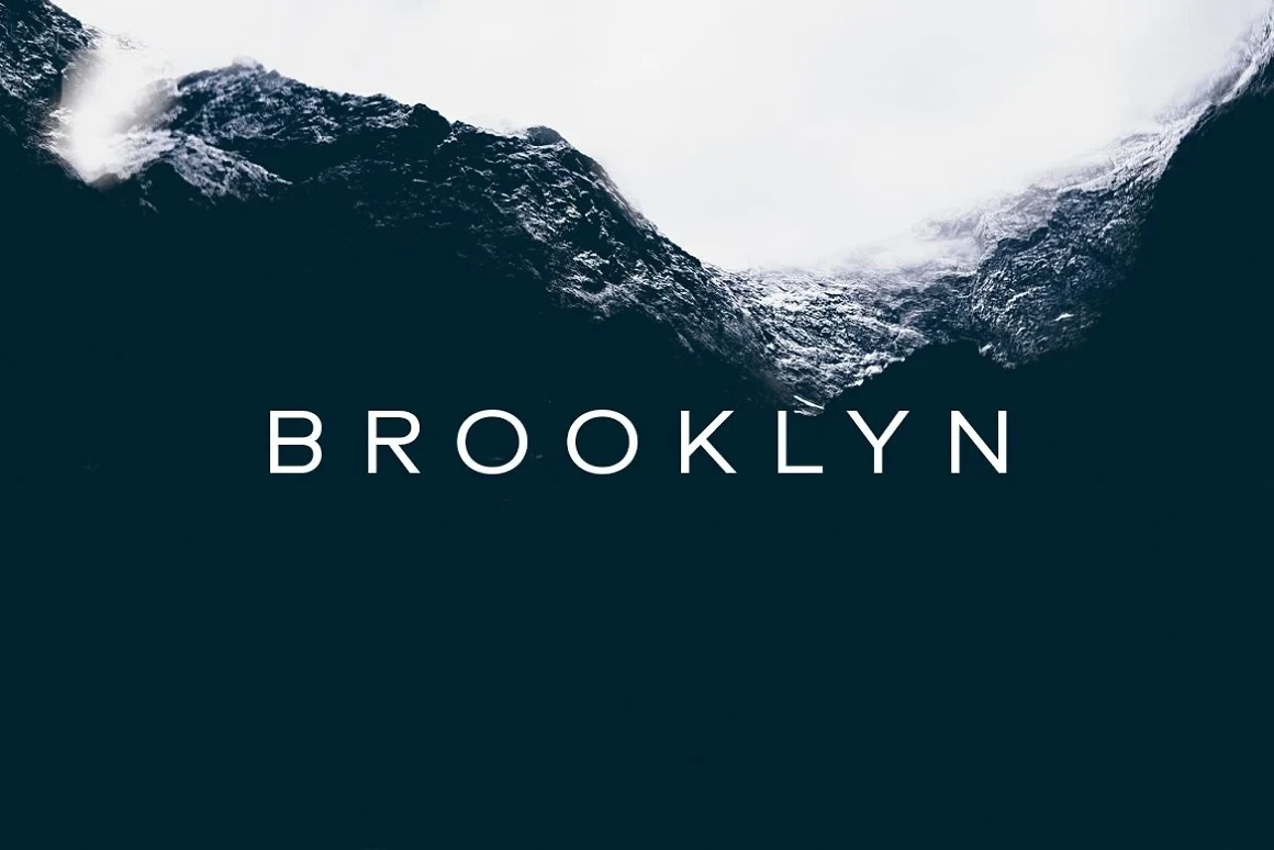
Best For: branding, display text, modern designs, minimal designs
Brooklyn Font brings a contemporary serif structure and clearly articulated stroke rhythm to restrained identity work. Its distinctive display forms are best judged in short brand names, headings, and other settings where the letter shapes can remain prominent.
Friendly Font
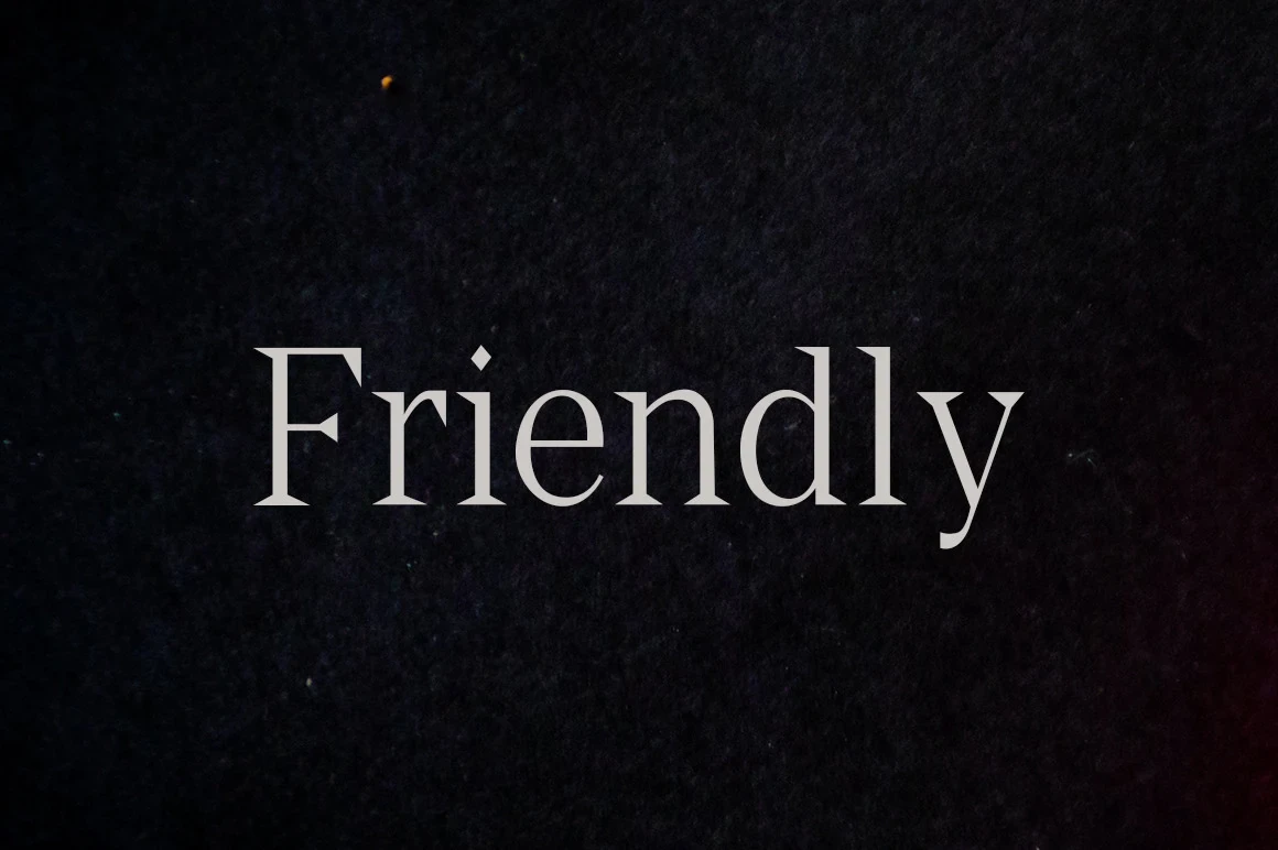
Best For: branding, display text, minimal designs, classic designs
Friendly Font is a heavy upright serif with pointed triangular serifs, regular proportions, and strong thick-thin contrast. It gives a brand display formal authority while preserving clear reading at medium and large sizes.
Gotuna Font
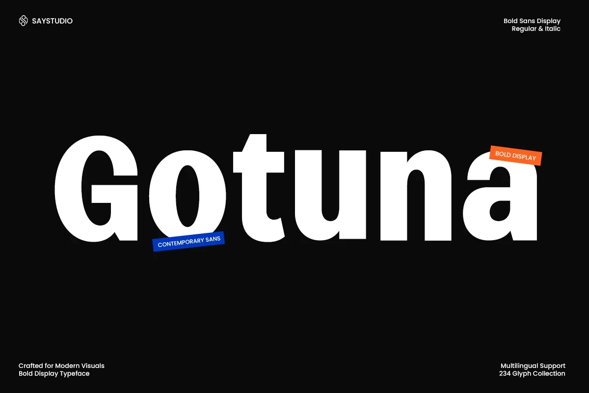
Best For: branding, headlines, product labels, social media graphics
Gotuna Font relies on heavy geometric lettering, closed apertures, and low stroke contrast to give product labels and social graphics a substantial presence. Its dense forms read well large, but become crowded when reduced.
Rankberg Font

Best For: branding, display text, modern designs, minimal designs
Rankberg Font uses heavy rounded forms, softened corners, and low stroke contrast for a substantial display identity. The shape remains approachable and legible at large sizes, though tight spacing calls for careful scaling.
How to Choose the Right Font
Choose Minimal Branding Fonts by matching construction to the job: open counters and uniform strokes support repeated reading, while compressed widths conserve space for short lockups. Check joins, apertures, contrast, and flourishes at the smallest intended size. Reserve fragmented, hairline, and tightly packed designs for large marks, and use a clearer companion when the system must carry longer copy.