10 Best Elegant Branding Fonts in 2026
Elegant Branding Fonts span high-contrast serifs, connected calligraphy, experimental displays, and geometric sans systems. Their practical roles range from memorable logos and fashion identities to packaging, invitations, social graphics, and large headings, with construction and scale determining how readable each choice remains.
Looking for more branding fonts? Browse our complete Branding Fonts collection to compare modern, elegant, boutique, luxury, and beauty branding styles.
Elegant Branding Fonts: Serif Statements
Elegant Branding Fonts in this serif group rely on contrast, sharp or elongated serifs, and decorative terminals. They create stronger editorial presence than the connected scripts or restrained geometric faces.
Reglica Font
Best For: logos, branding, fashion branding, display text
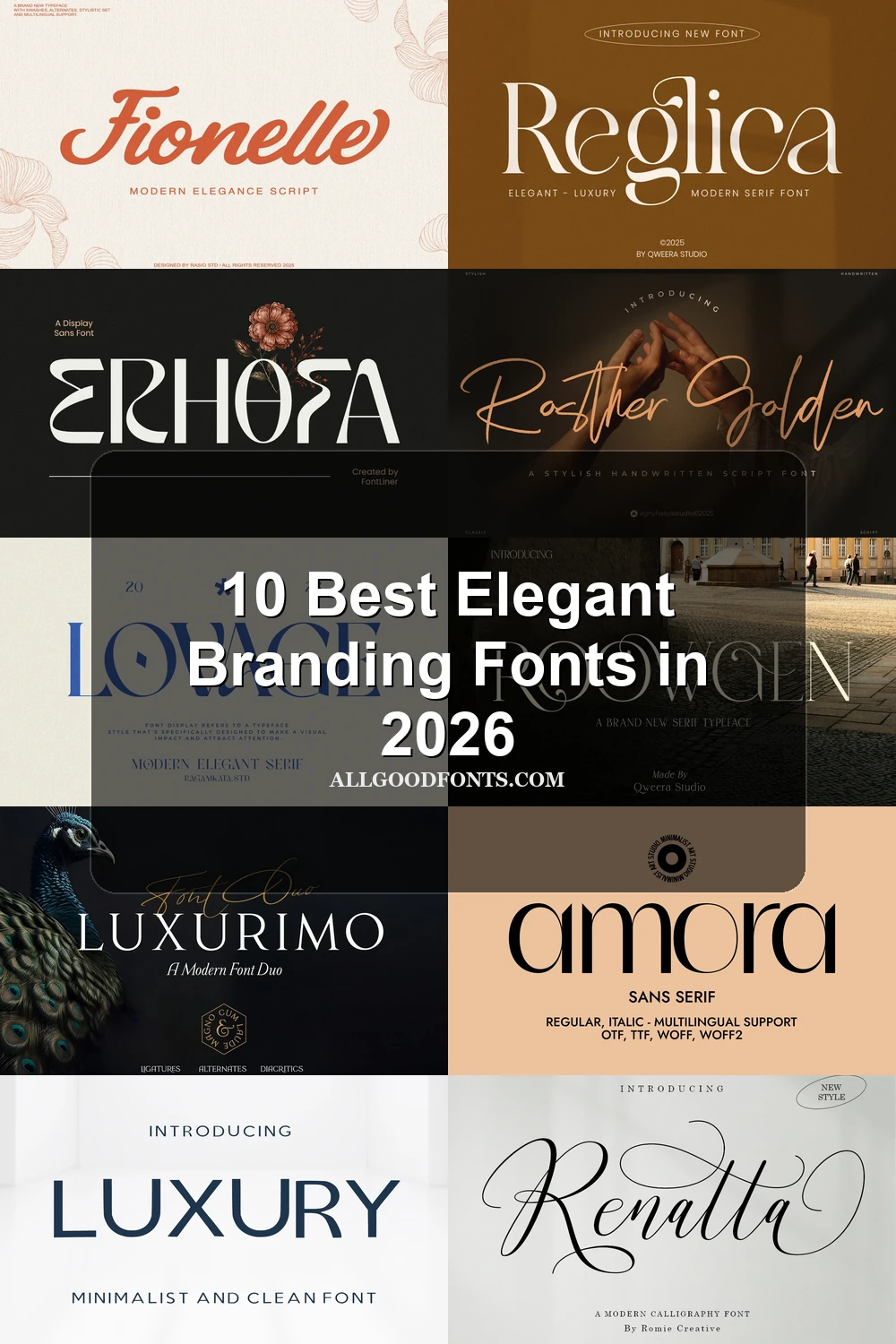
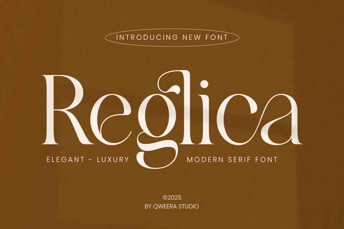
Reglica Font is a high-contrast display serif with decorative swashes on the g and a, an extended e crossbar, and teardrop terminals. Those flourishes make it a strong choice for Elegant Branding Fonts used in logos, fashion branding, and large editorial headings, but too intricate for compact text.
Lovage Font
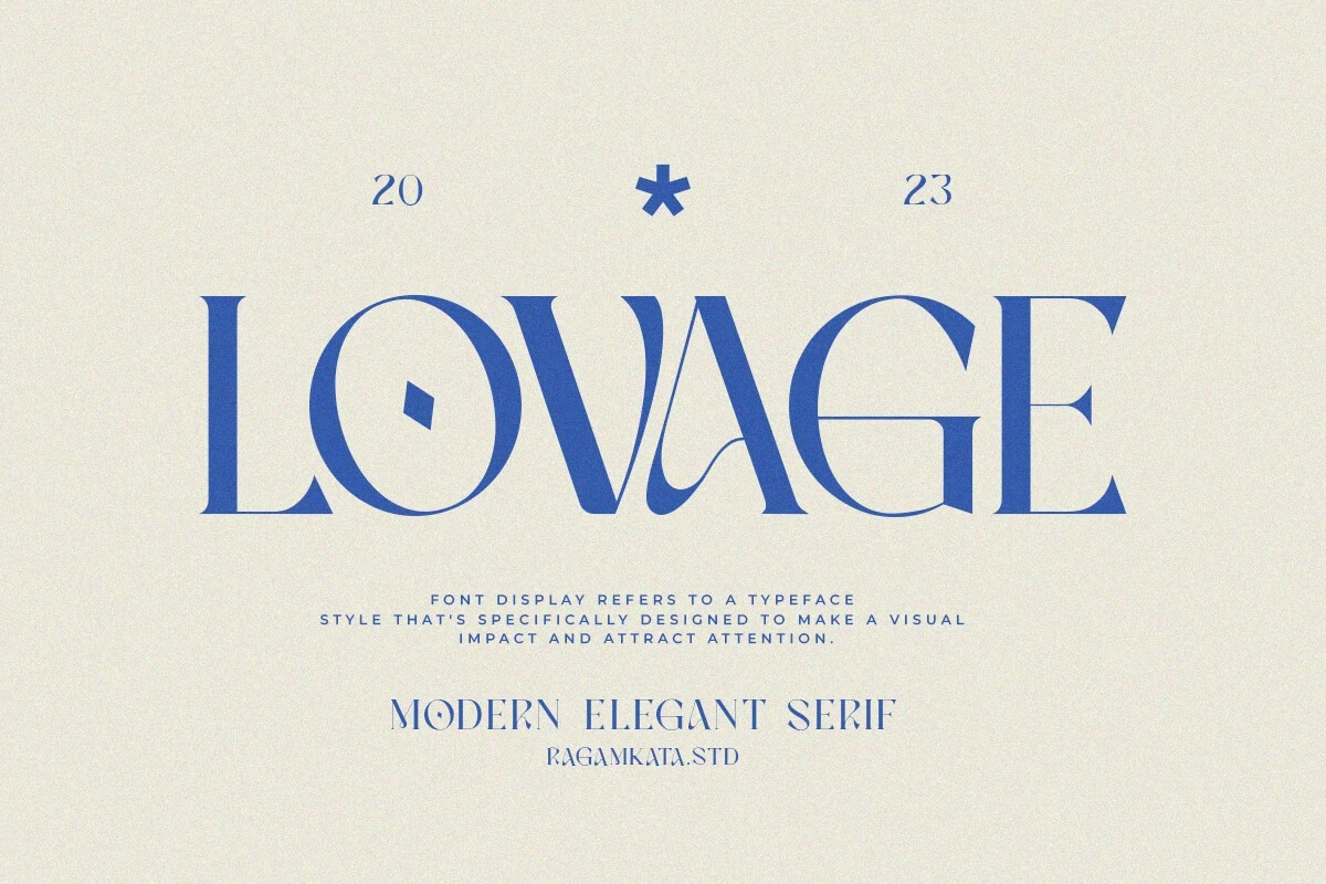
Best For: branding, invitations, social media graphics, eye-catching designs
Lovage Font gets its editorial force from sharp serifs, experimental characters, and a diamond-shaped aperture in the o. These unusual forms make short branding statements conspicuous, but their complexity reduces readability quickly at small sizes, favoring large headlines and controlled spacing.
Roowgen Font
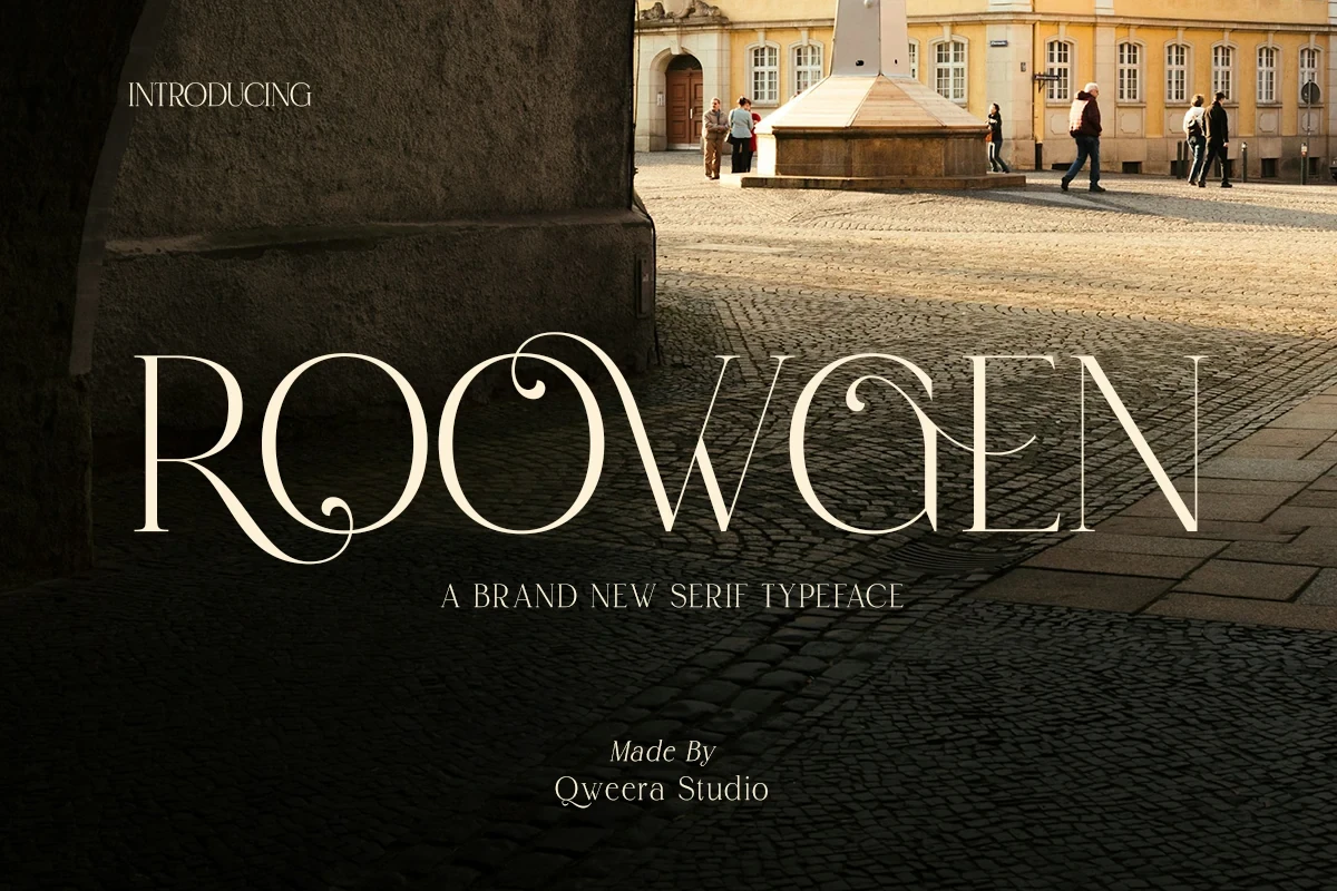
Best For: logos, branding, packaging, fashion branding
Sweeping uppercase swashes, elongated serifs, generous spacing, and alternate characters define Roowgen Font. Its all-caps construction expands logo and packaging options, while thin strokes and flourishes require large-scale display treatment to preserve both detail and readability.
Connected Script Signatures
These connected scripts use loops, swashes, slant, and changing rhythm to create personal signatures. Their expressive movement suits short branding phrases, unlike the more structured serif and sans groups.
Renatta Font
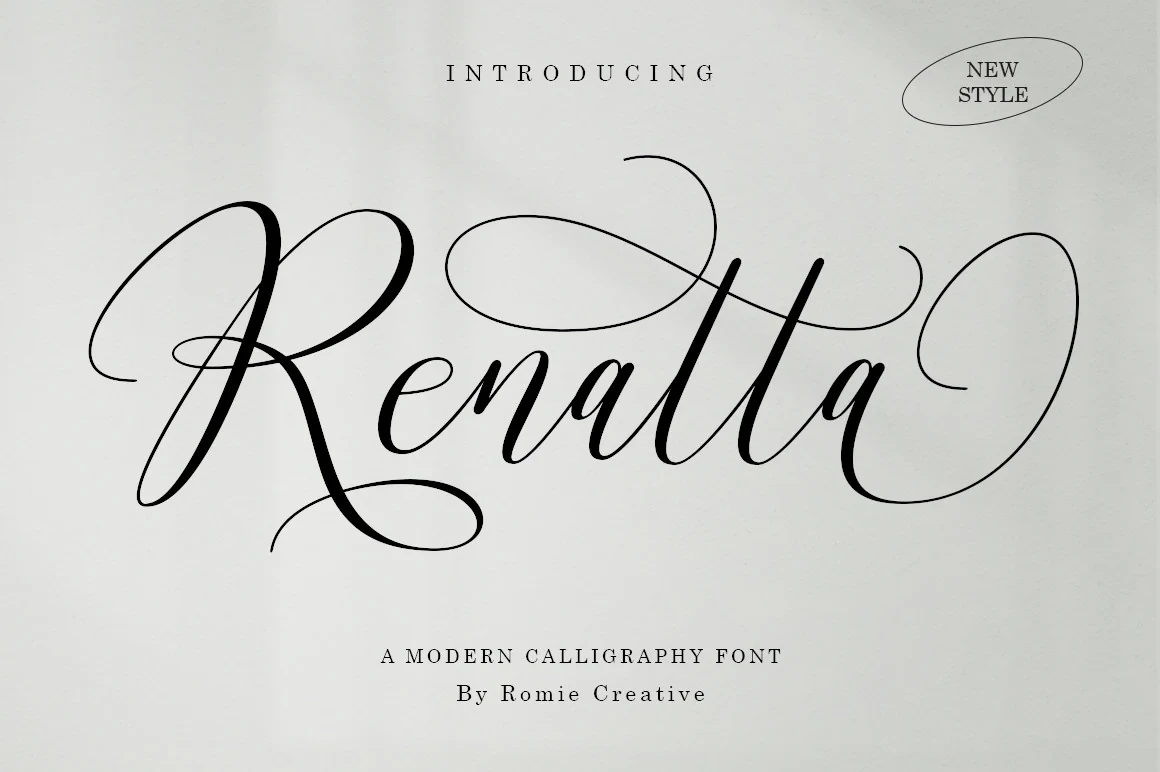
Best For: branding, invitations, beauty branding, modern designs
Pronounced loops, extended swashes, and variable slant give Renatta Font a connected calligraphic rhythm. It can create a distinctive beauty-brand or invitation signature, especially when set large, but its looping construction limits clarity in long wording and small supporting copy.
Fionelle Font
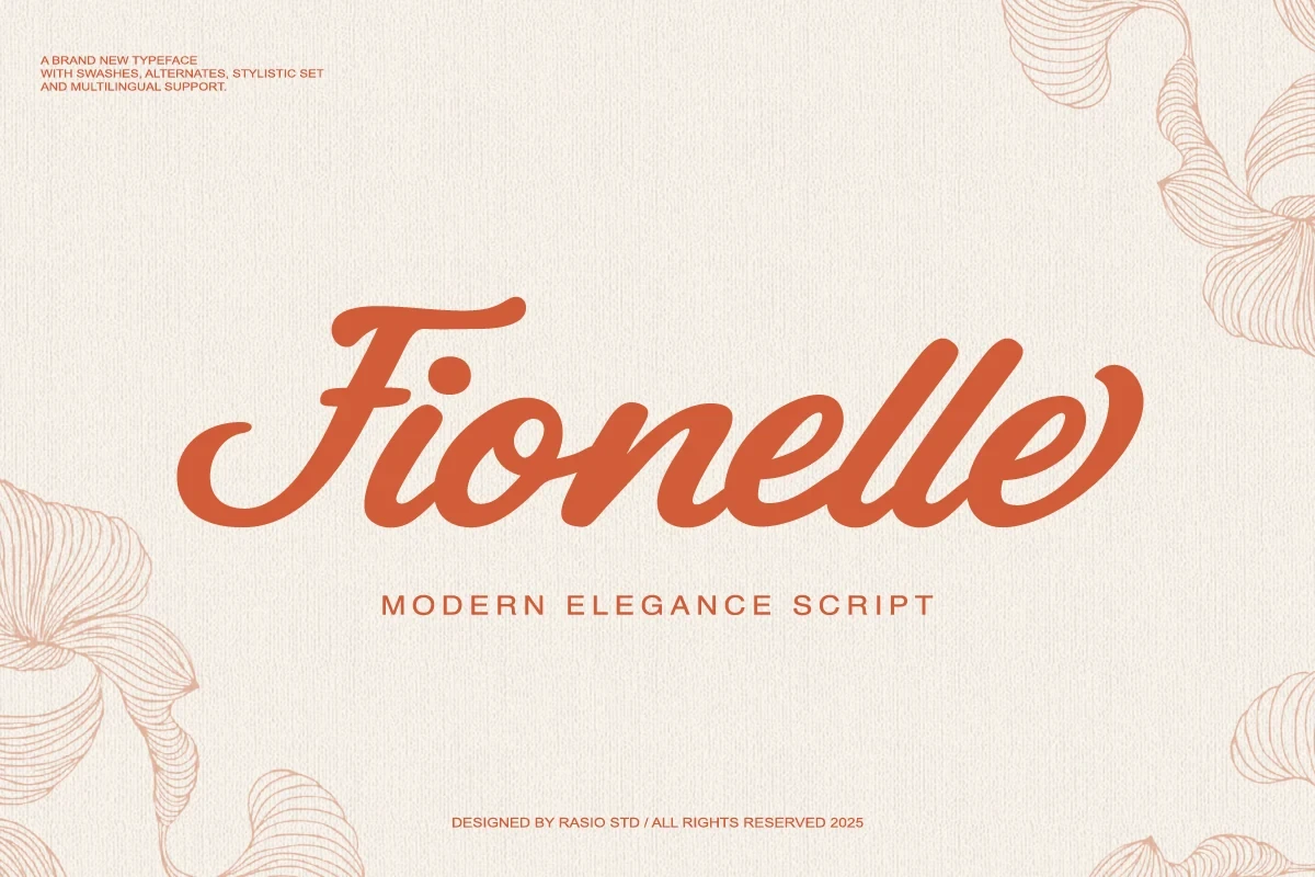
Best For: social media graphics, beauty branding, branding, packaging
Fionelle Font creates a fuller, friendlier signature through bold connected strokes, rounded terminals, and a soft rightward slant. Its monolinear construction stays clear in prominent branding treatments and headings, though the flowing joins are not suited to extended small-size copy.
Rosther Golden Font
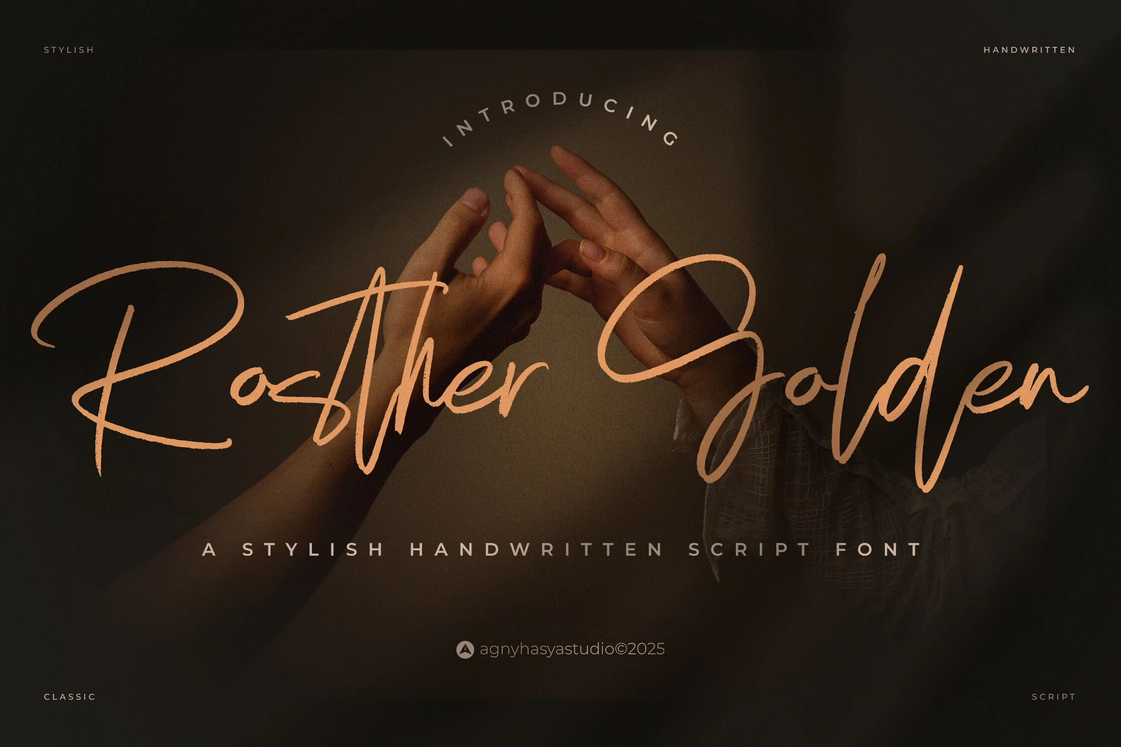
Best For: branding, personal branding, modern designs, clean designs
Rosther Golden Font uses connected handwritten forms, an irregular baseline, and changing letter heights to create an organic personal mark. The uneven rhythm suits personal branding and informal identity work, while complex joins mean it needs generous size and spacing to remain readable.
Modern Contrast and Pairing Systems
This group combines geometric structure with either experimental breaks or contrasting weights. It offers clearer heading systems and pairing flexibility than ornate scripts, while remaining primarily display-focused.
Luxurimo Font
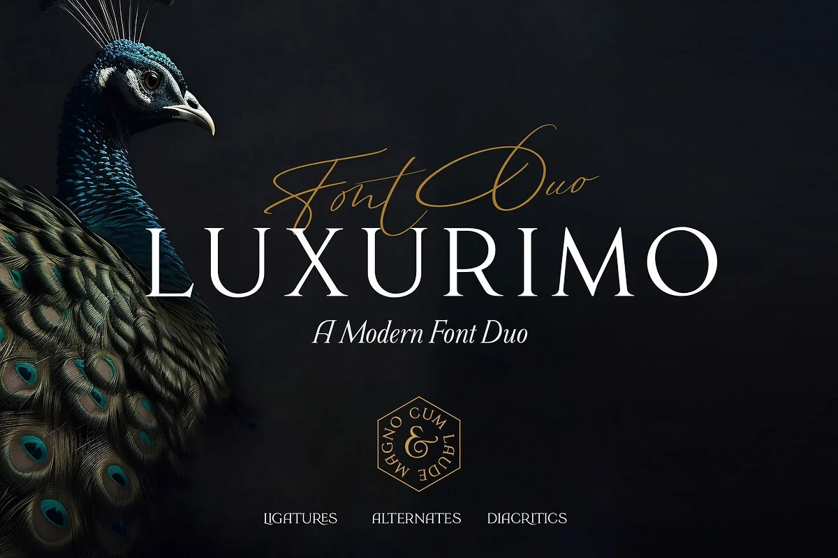
Best For: social media graphics, logos, branding, packaging
For Elegant Branding Fonts that need both hierarchy and personality, Luxurimo Font supplies a useful two-part identity system. Its upright, high-contrast serif carries headlines legibly, while the thin connected script adds a larger decorative accent to packaging, logos, or social graphics. Keep the script away from dense text.
Erhofa Font
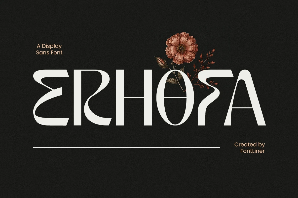
Best For: logos, branding, packaging, invitations
Disconnected geometric and curvilinear structures give Erhofa Font its experimental display character. High-contrast modulation and broken letter construction can produce a decorative logo or invitation effect, but the stylization interrupts reading flow, making it impractical for paragraphs or compact informational text.
Amora Font

Best For: branding, fashion branding, display text, modern designs
Amora Font is a light display face built around circular o and a forms, vertical terminals, and restrained geometry. It suits fashion and contemporary brand headlines where the shapes can be seen clearly; its thin, high-contrast strokes may weaken when reduced, so avoid small applications.
Luxury Font
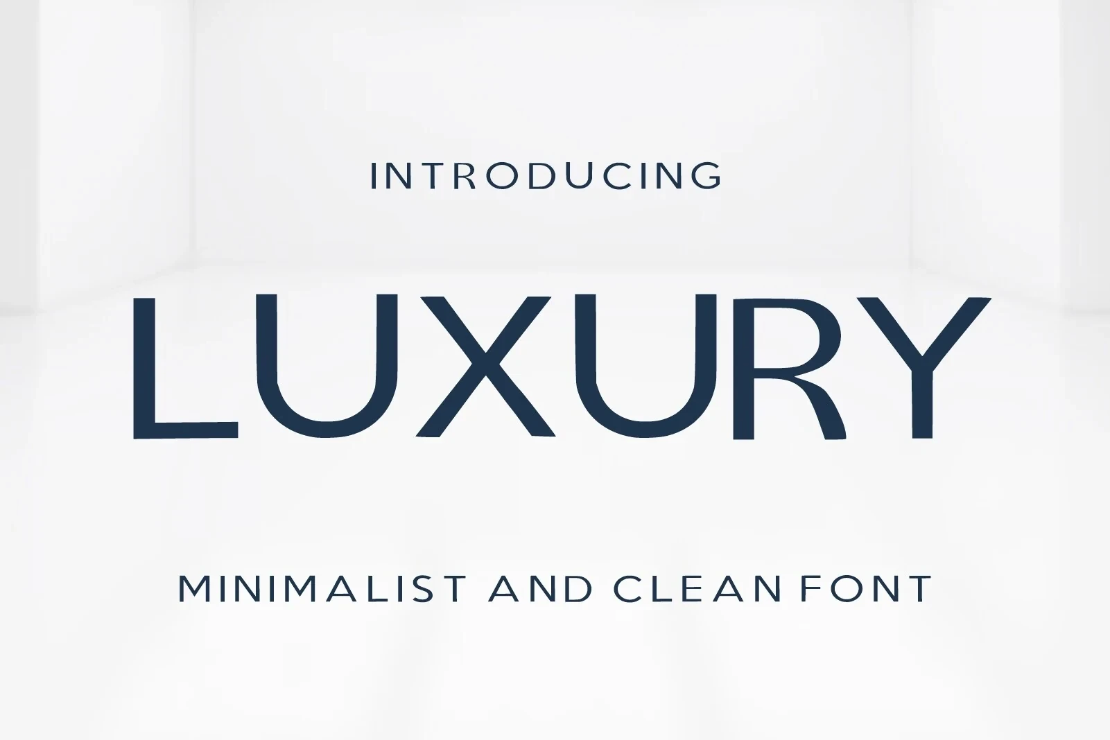
Best For: branding, modern designs, minimal designs, clean designs
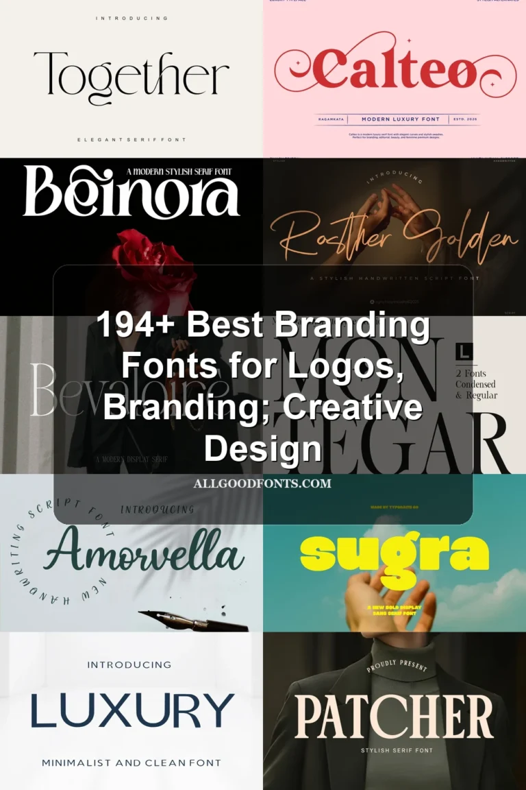
Luxury Font combines a wide geometric sans with a bold high-contrast title weight and a thinner mono-weight companion. Open counters and clear proportions give it stronger heading legibility than the ornate scripts, making it useful for modern identity layouts that need visible weight contrast.
How to Choose the Right Font
Choose among Elegant Branding Fonts by matching construction to the job: use a serif for authoritative headlines, a connected script for a short signature, or a geometric system when hierarchy and readability matter more. Check joins, contrast, flourishes, and stroke thickness at the final size before committing to packaging, logos, or supporting text.