16 Best Cool Script Fonts in 2026
This collection ranges from clean connected lettering and slender strokes to rounded, brush-led, and period-inspired scripts. Cool Script Fonts can give logos, headings, posters, invitations, social graphics, and short branded phrases a distinct voice, provided the letterforms remain readable at their intended size.
Looking for more cool fonts? Browse our complete Cool Fonts collection to compare bold, vintage, retro, script, and gothic cool styles.

Cool Script Fonts
Cool Script Fonts in this group use cleaner contemporary construction, separating them from the more nostalgic, playful, or openly flowing scripts through restrained display forms and uncluttered joins.
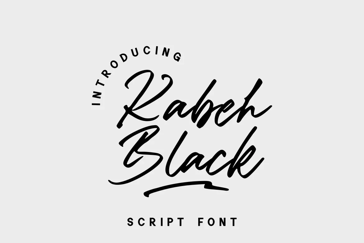
Kabeh Black Font
Best For: display text, modern designs, clean designs
Kabeh Black Font places clean contemporary construction inside a connected script framework. That makes these Cool Script Fonts a useful direction for uncluttered logos, modern designs, and display layouts that need expressive lettering without leaning on historical styling.
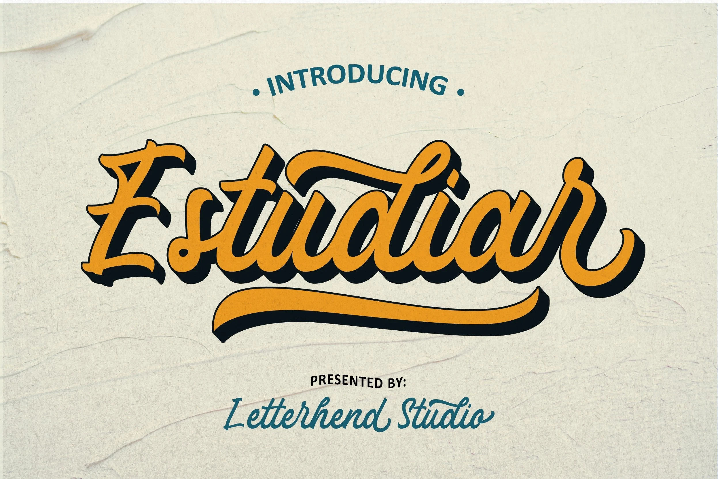
Estudiar Font
Best For: display text, modern designs, clean designs
Estudiar Font combines contemporary connected lettering with a brush-like rhythm. These Cool Script Fonts bridge clean branding and expressive display work, with the clearest results in headings and brief phrases rather than dense text or long sentences.
Calistora Font

Best For: logos, invitations, display text, modern designs
Calistora Font brings elegant connected lettering into a clean contemporary direction. These Cool Script Fonts suit logos, invitations, and modern display designs, although brief wording is important: longer names or phrases may crowd the forms and weaken legibility.
Gondess Font

Best For: modern designs, clean designs, playful designs, expressive designs
Gondess Font combines playful contemporary lettering with alternate characters that can vary logos and expressive layouts. These Cool Script Fonts work well in clean or playful designs, but compare the selected alternate forms across the final wordmark before approving the lettering.
Playful and Bold Scripts
These connected scripts emphasize rounded shapes, substantial weight, or playful character. They feel more immediate and animated than the cleaner contemporary group, with personality taking a leading design role.
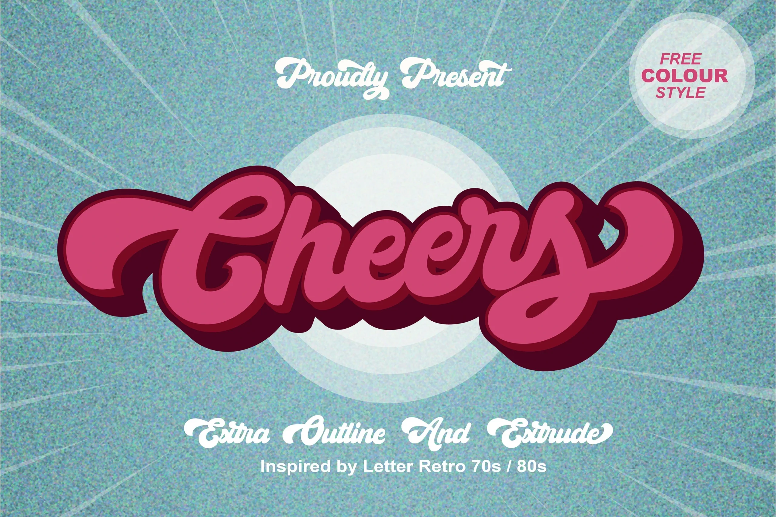
Cheers Font
Best For: display text, playful designs, bold designs, retro designs
Cheers Font combines a bold connected construction with substantial display weight, giving short wording a firm visual presence. Its ligatures add styling options, while the PUA-encoded characters mean glyph access should be checked in the design software used for the project.
Blackside Font
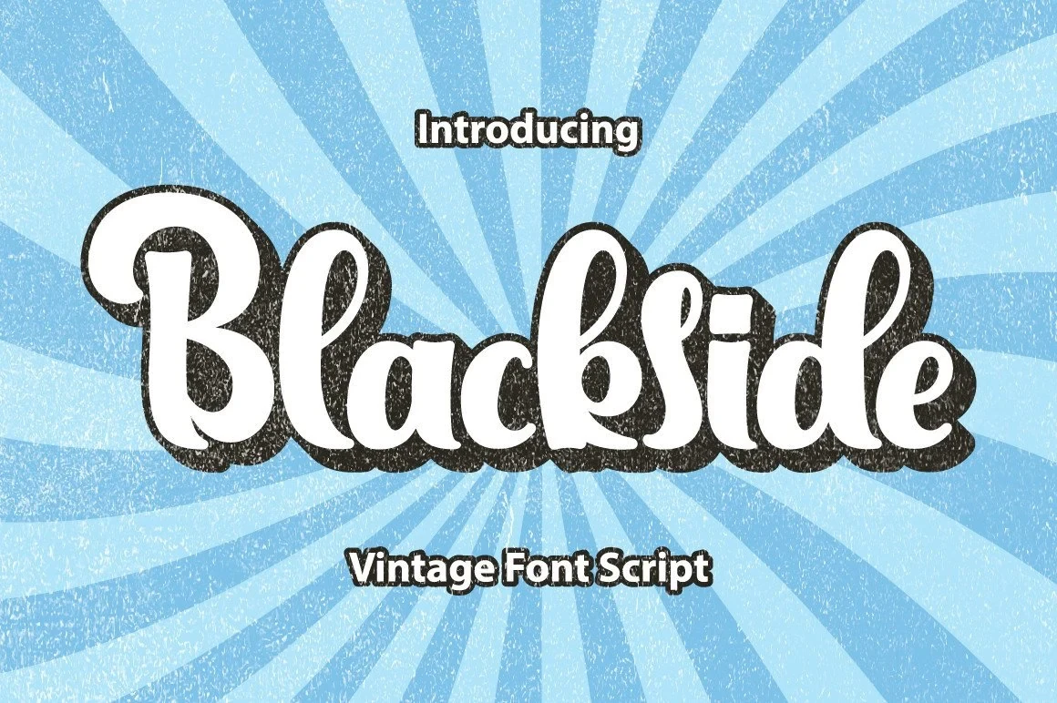
Best For: display text, playful designs, retro designs
Blackside Font pairs rounded, playful character with period-inspired connected forms. It works well for retro and expressive designs, but its personality can dominate a layout that needs a restrained tone, so reserve it for headings, titles, and other brief display text.
Collega Font
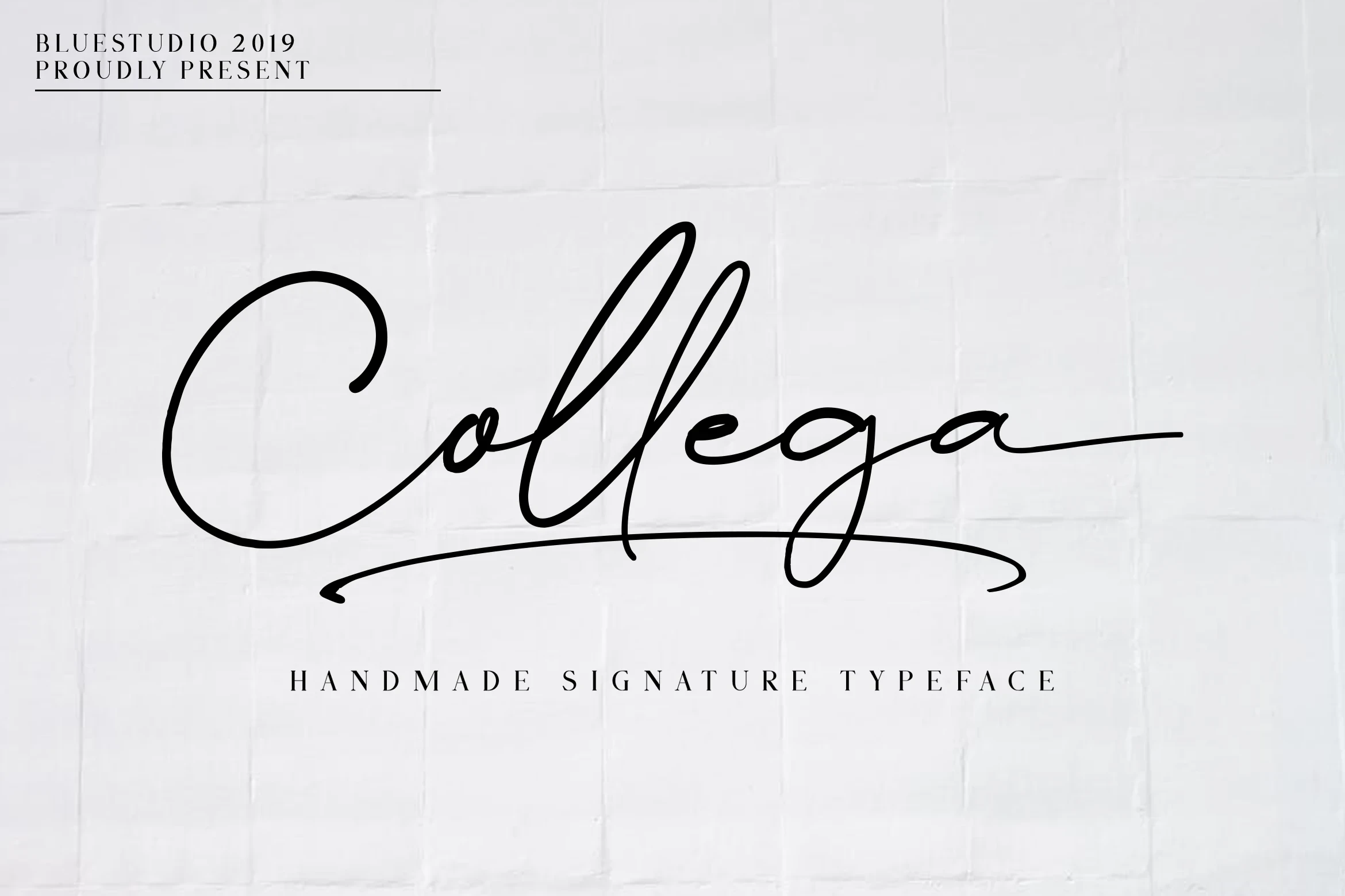
Best For: display text, bold designs, short phrases
Collega Font gives short connected phrases a substantial bold weight and immediate presence. These Cool Script Fonts fit assertive display treatments, while dense wording or longer lines may make the joined lettering feel crowded and less comfortable to read.
Bantah Kidul Font

Best For: display text, playful designs, fun designs
Bantah Kidul Font uses rounded playful forms to make its connected script approachable. These Cool Script Fonts suit fun designs and display titles, but their expressive tone is less suitable for formal identities or understated layouts that require visual restraint.
Nostalgic Script Styles
Period-inspired letterforms define this group, bringing historical display character and soft retro associations. Their decorative mood is more specific than the neutral clarity of contemporary connected scripts.
Rhapson Script Font
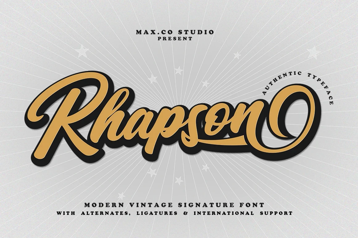
Best For: display text, soft designs, retro designs, expressive designs
For soft retro display work, Rhapson Script Font offers period-inspired connected lettering with a clear historical direction. Its nostalgic identity can support expressive designs and short headings, though it is less appropriate when a neutral, broadly functional tone matters more than atmosphere.
Amelona Font
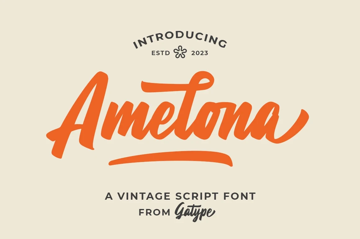
Best For: display text, retro designs, vintage designs, expressive designs
Amelona Font supplies period-inspired display character with a distinctly nostalgic direction. These Cool Script Fonts support retro and vintage designs, while short phrases preserve the decorative readability better than long wording or information-heavy applications.
Flowing Display Scripts
The flowing scripts here focus on stroke rhythm, movement, and expressive display lettering. They range from fine to brush-like treatments, making them more dependent on short text and generous scale.
Saucier Marker Font
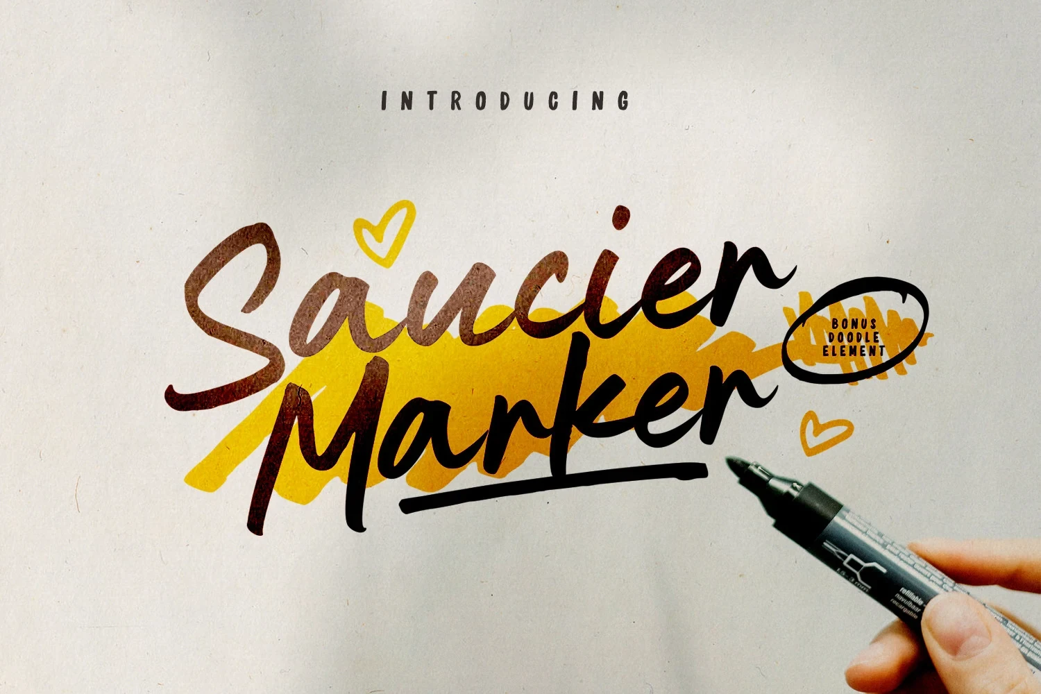
Best For: display text, logos, branding
Saucier Marker Font uses softly joined handwritten forms with a clear stroke rhythm, so individual letters remain easier to compare than in more elaborate scripts. Use it for names, logos, headings, and short phrases where expressive movement should not overwhelm readability.
Belmonth Font

Best For: display text, editorial designs, branding
Belmonth Font brings connected movement and distinctive display lettering to compact headlines. Its expressive character suits editorial designs and branding, but the joined forms are best kept to short wording rather than extended copy, where comparison between letters becomes less immediate.
Signation Font

Best For: display text, social media graphics, website headers
Signation Font has a steady stroke rhythm that keeps its flowing lettering controlled in short website headers and social media graphics. It is a better fit for concise display text than paragraphs or long captions, where the connected construction can become harder to scan.
Awestruck Font

Best For: display text, magazine covers, posters
Awestruck Font stands out through refined slender strokes and a lighter visual texture. These Cool Script Fonts are most convincing on magazine covers and posters at display sizes, where the fine connected forms have enough room and scale to remain visible.
Balletic Font
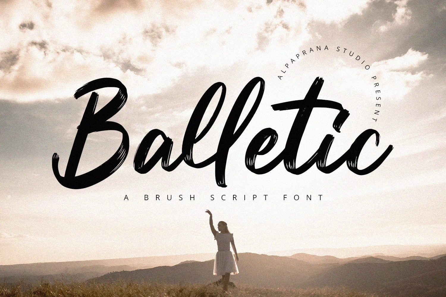
Best For: creative projects, display text, posters
Balletic Font uses a brush-like stroke rhythm to make its connected lettering feel actively drawn. These Cool Script Fonts can energize posters and expressive projects, while longer wording may dilute the immediacy of the brush effect and reduce quick readability.
Edification Font

Best For: display text, modern designs, classic designs, expressive designs
Edification Font sets a bold display weight against refined slender stroke details, creating a noticeable contrast within the connected forms. These Cool Script Fonts can suit modern or classic projects, but their readability should be judged in short display text before wider use.
How to Choose the Right Font
Choose Cool Script Fonts by matching construction to the job: lighter strokes need sufficient scale, bold joins suit short phrases, and nostalgic forms should support rather than conflict with the project’s tone. Check ligatures, alternates, and character spacing in the final wording, then test readability at the actual display size.