10 Best Modern Logo Fonts in 2026
Modern Logo Fonts span sharply contrasted serif lettering, rounded display forms, expressive flourishes, and weight-led constructions. This collection focuses on how those visible choices affect wordmark character, recognition, scale, and practical use across branding, packaging, posters, social graphics, and title treatments.
Looking for more logo fonts? Browse our complete Logo Fonts collection to compare logo-friendly logo styles.

Modern Logo Fonts: Editorial Serif Statements
Modern Logo Fonts: Editorial Serif Statements emphasize high contrast, sharp serifs, wide proportions, and formal display presence, making them more refined and scale-dependent than the rounded groups.
Modern Serif Font

Best For: logos, product labels, display text
Modern Serif Font pairs sharp triangular serifs with vertical stress, high contrast, and refined curves. Its modest apertures suit large logo lettering and title cards, but fine details make small applications less dependable.
Gothica Modern Font
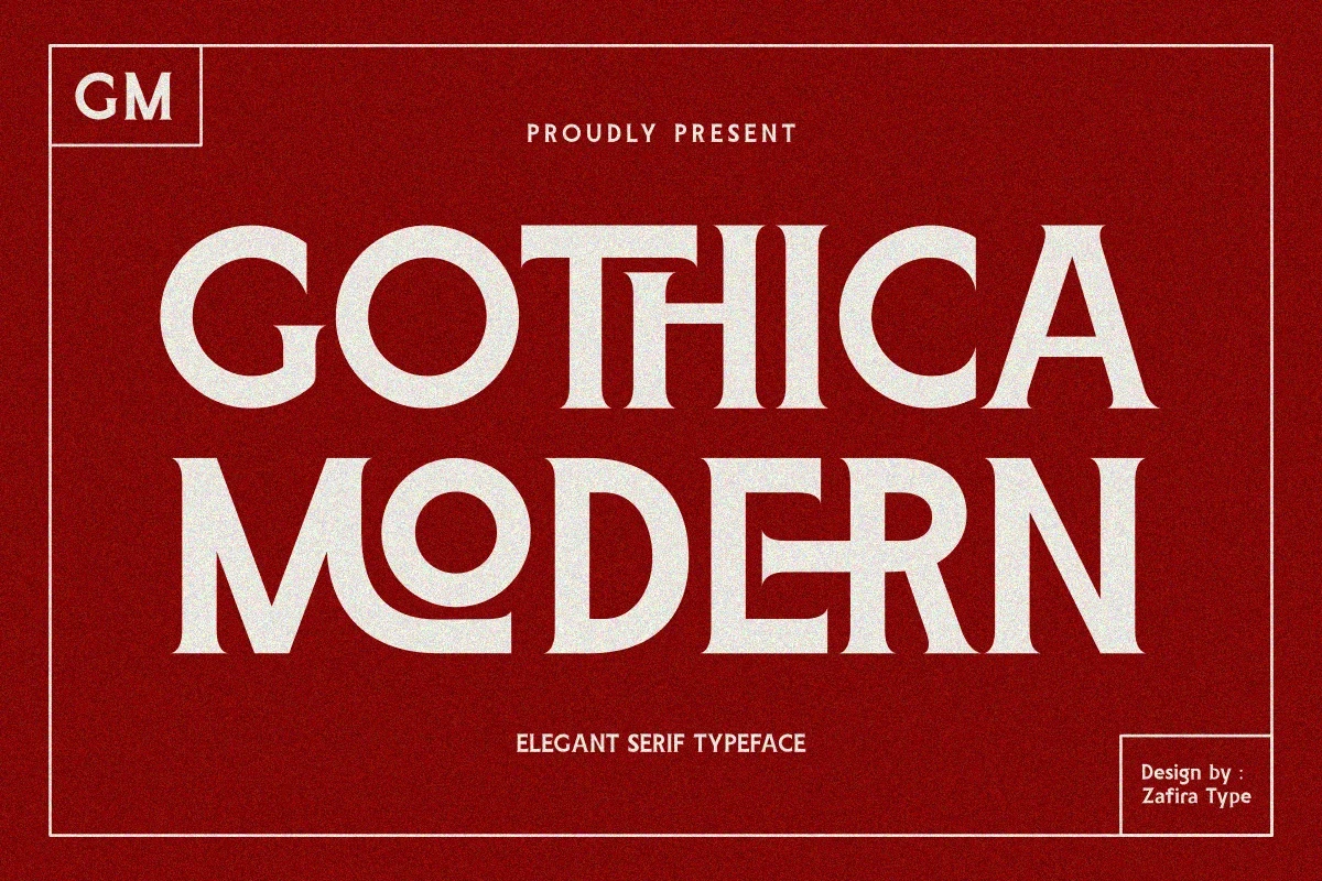
Best For: branding, headlines, logos
Gothica Modern Font uses wide proportions, sharp serifs, ornamental crossbars, and modified apertures to create a distinctive historical edge. Its unusual construction works for branding and headlines, though generous sizing is important for clear recognition.
Papillon Serif – Elegant Modern Luxury Font

Best For: branding, high-end designs, logos
Papillon Serif – Elegant Modern Luxury Font creates a controlled wordmark silhouette through wide upright forms, sharp refined serifs, and delicate high-contrast strokes. It suits larger branding applications, since thin details can fade when the logo is reproduced small.
Chanceux Modern Stylish Serif Font

Best For: branding, headlines, logos
Chanceux Modern Stylish Serif Font combines wide upright proportions with sharp refined serifs and a formal display presence. It reads well in large branding and headline work, although its finer strokes may weaken in very small print.
The Choed Font

Best For: branding, headlines, high-end designs, logos
The Choed Font stands out through swash flourishes, elongated teardrop terminals, wide proportions, and included ligatures. It can give large branding an editorial signature, but its extreme contrast and ornament may obscure compact logo text.
Expressive Contemporary Display Marks
Expressive contemporary display marks use rounded characters, substantial silhouettes, and clear rhythmic construction. They feel more approachable and direct than the sharper editorial serif styles.
Modern Minimalist Font

Best For: social media graphics, invitations, logos, display text
For short names, invitations, and social media graphics, Modern Minimalist Font offers rounded, playful characters within a clean contemporary display structure. Its clear stroke rhythm keeps individual letters easy to compare, while the expressive shapes give compact wordmarks a more approachable presence.
Seyna Font
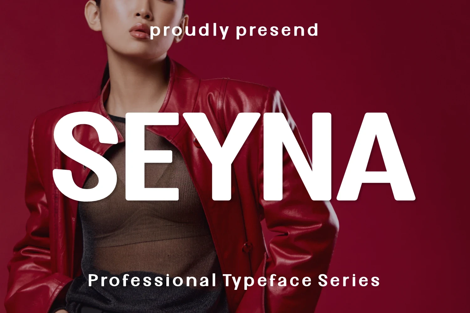
Best For: logos, social media graphics, posters
Seyna Font gives rounded, playful display characters a substantial weight, so short logos and posters retain strong visibility. Its expressive silhouette is less suitable for restrained corporate marks, where a quieter construction would communicate more directly.
Etmes Font
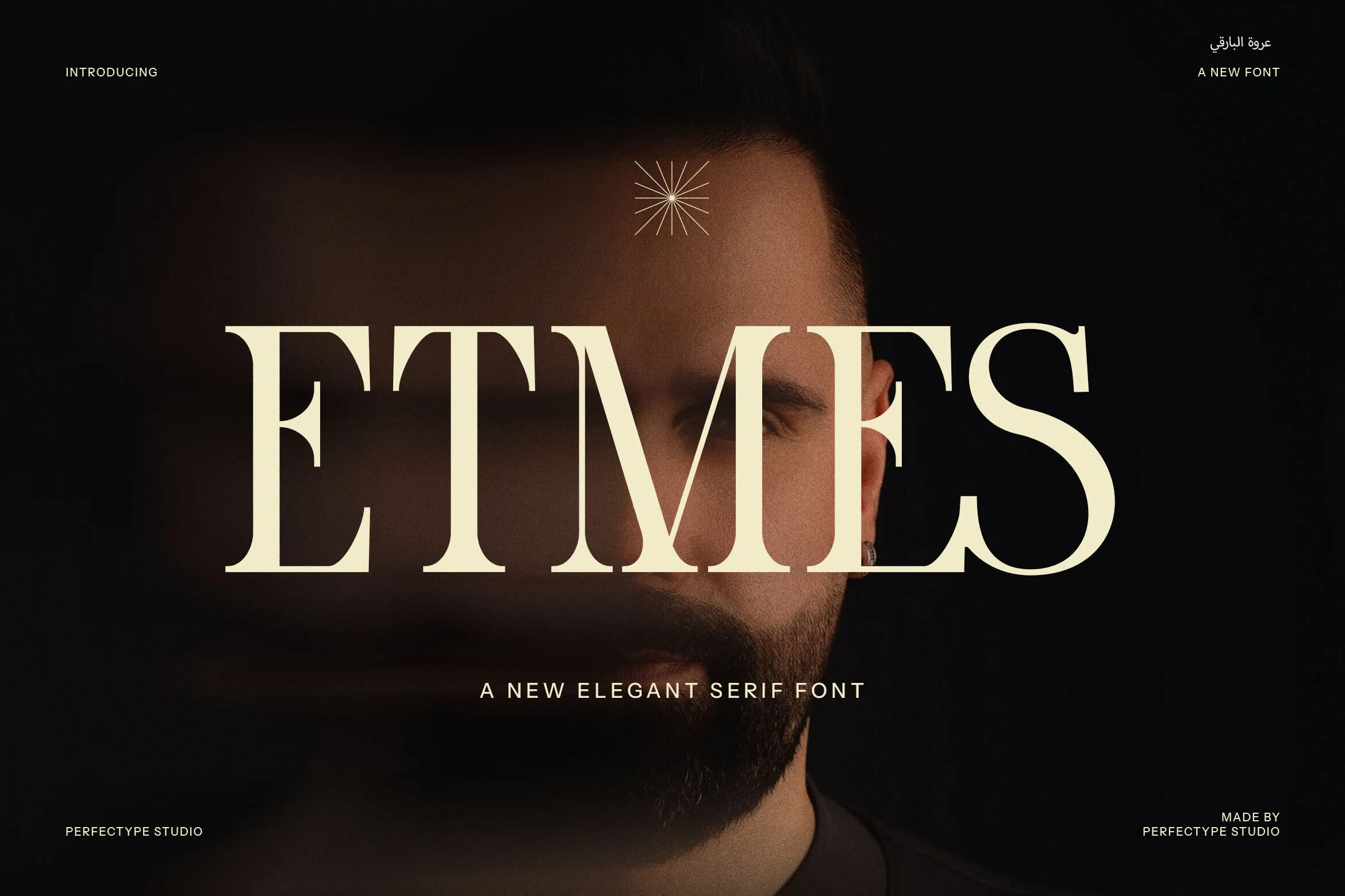
Best For: logos, branding, packaging, product labels
Etmes Font keeps a clear stroke rhythm within a contemporary display-serif construction. Its straightforward letterform behavior translates well to logos, packaging, and product labels, offering expressive character without relying on elaborate decoration.
Weight-Driven Serif Logo Styles
Weight-driven serif logo styles balance bold outer presence with slender internal strokes. Compared with ornamental or playful options, they rely on contrast and letter weight for distinction.
Balgind Modern Serif Font
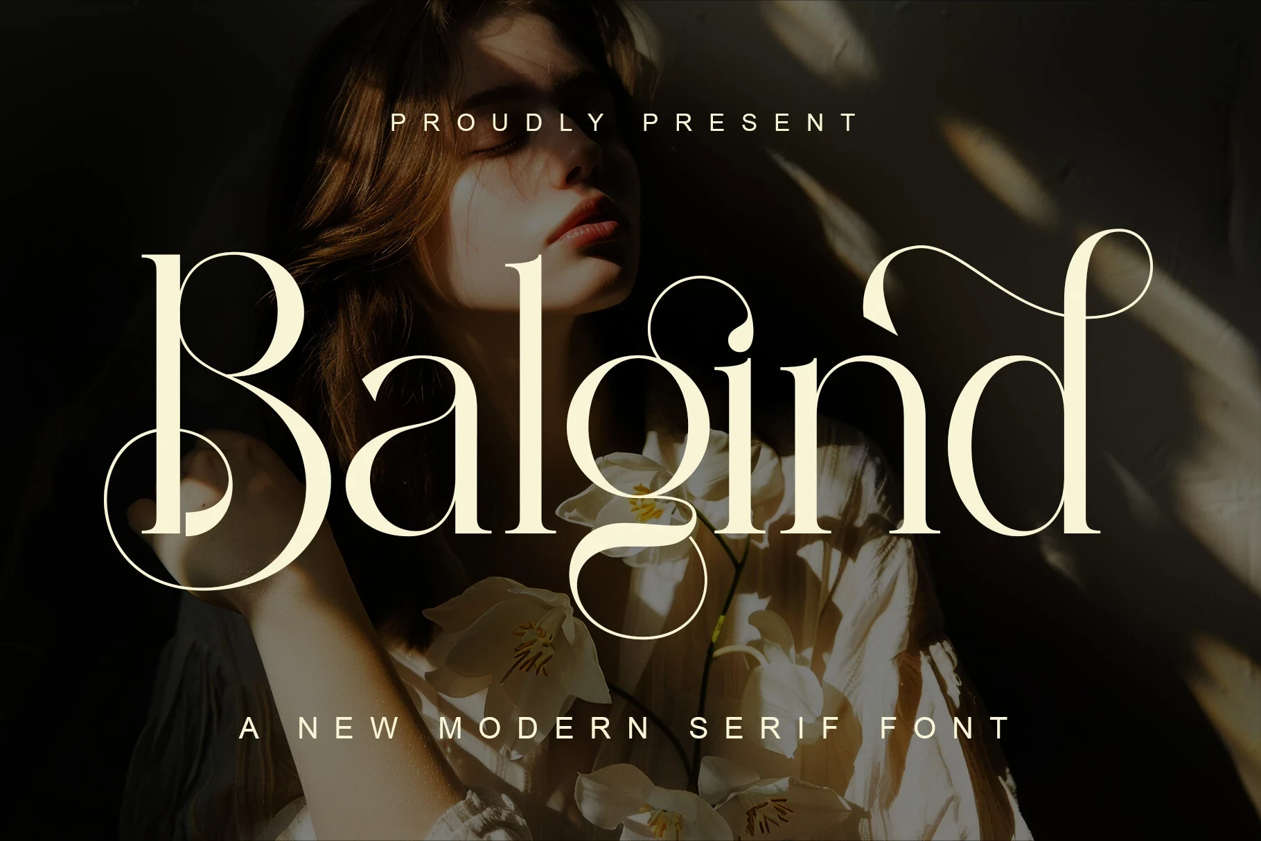
Best For: logos, display text, modern designs
Balgind Modern Serif Font brings a light, slender construction and clean contemporary rhythm to display lettering. Its included ligatures allow more control over distinctive letter combinations, making it useful for precise wordmarks and short display phrases.
Glacial Family Font
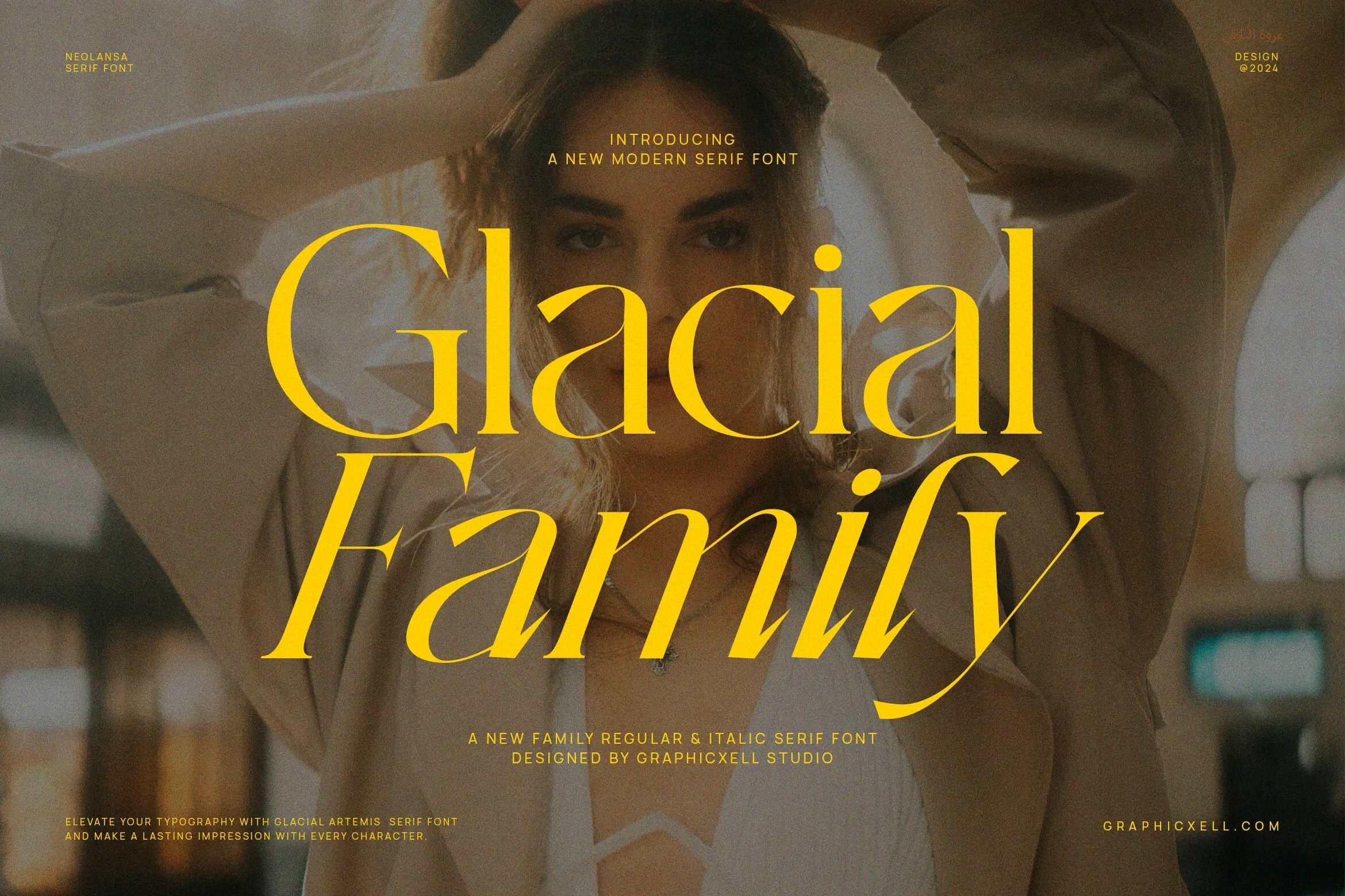
Best For: logos, posters, product labels, display text
For logos, posters, and product labels, Glacial Family Font uses substantial display weight alongside refined slender strokes. That internal contrast keeps the lettering noticeable at headline scale without depending on decorative flourishes, while short text remains the clearest testing ground.
How to Choose the Right Font
When choosing Modern Logo Fonts, compare the actual wordmark at its intended size: high-contrast serifs and swashes need room, while rounded or weight-led styles hold visibility more reliably. Check joins, apertures, fine strokes, ligatures, and flourishes against the brand’s desired mood before committing to a final lockup.