22 Best Playful Display Fonts in 2026
This collection ranges from rounded, heavy block letters and irregular brush textures to angular stencil forms, dimensional constructions, retro serifs, and flowing scripts. These Playful Display Fonts are designed for titles, logos, posters, packaging, labels, apparel, and other prominent graphic applications rather than extended reading.
Looking for more display fonts? Browse our complete Display Fonts collection to compare bold, vintage, retro, decorative, and playful display styles.

Playful Display Fonts
These Playful Display Fonts use bold, rounded, condensed, or expansive structures to create immediate personality. Compared with the other groups, they prioritize approachable silhouettes and fast recognition at display sizes.
Lemon Font
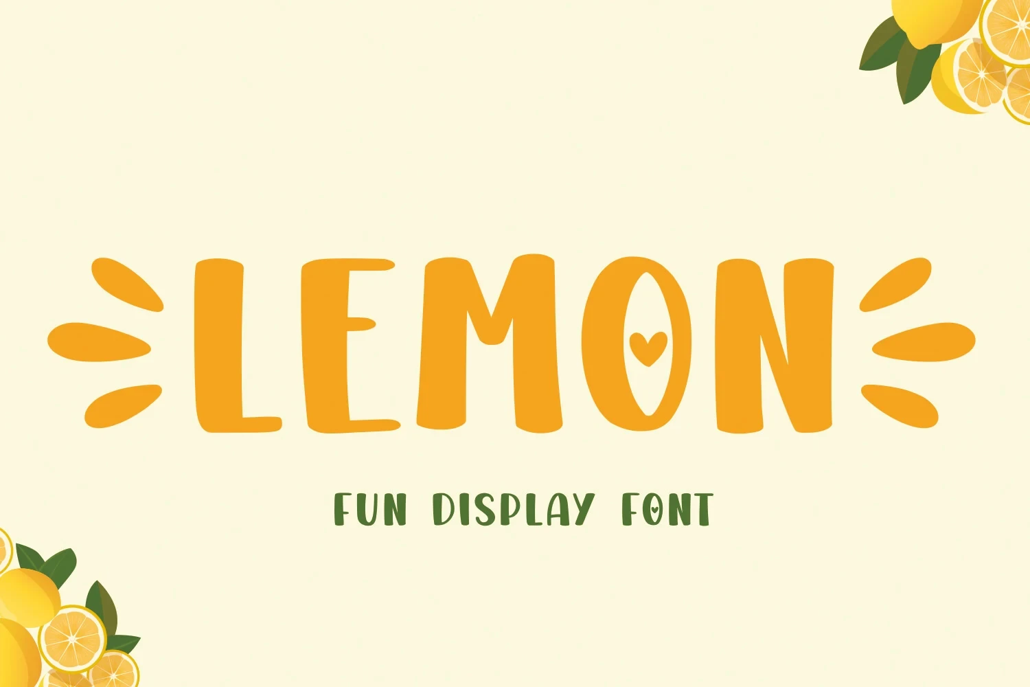
Best For: creative projects, display text
Lemon Font uses uniform heavy strokes and fully rounded terminals to create a soft, block-like silhouette. Its upright construction keeps large titles clear, but the thickness is too dominant for small settings or extended text.
Helpful Person Font
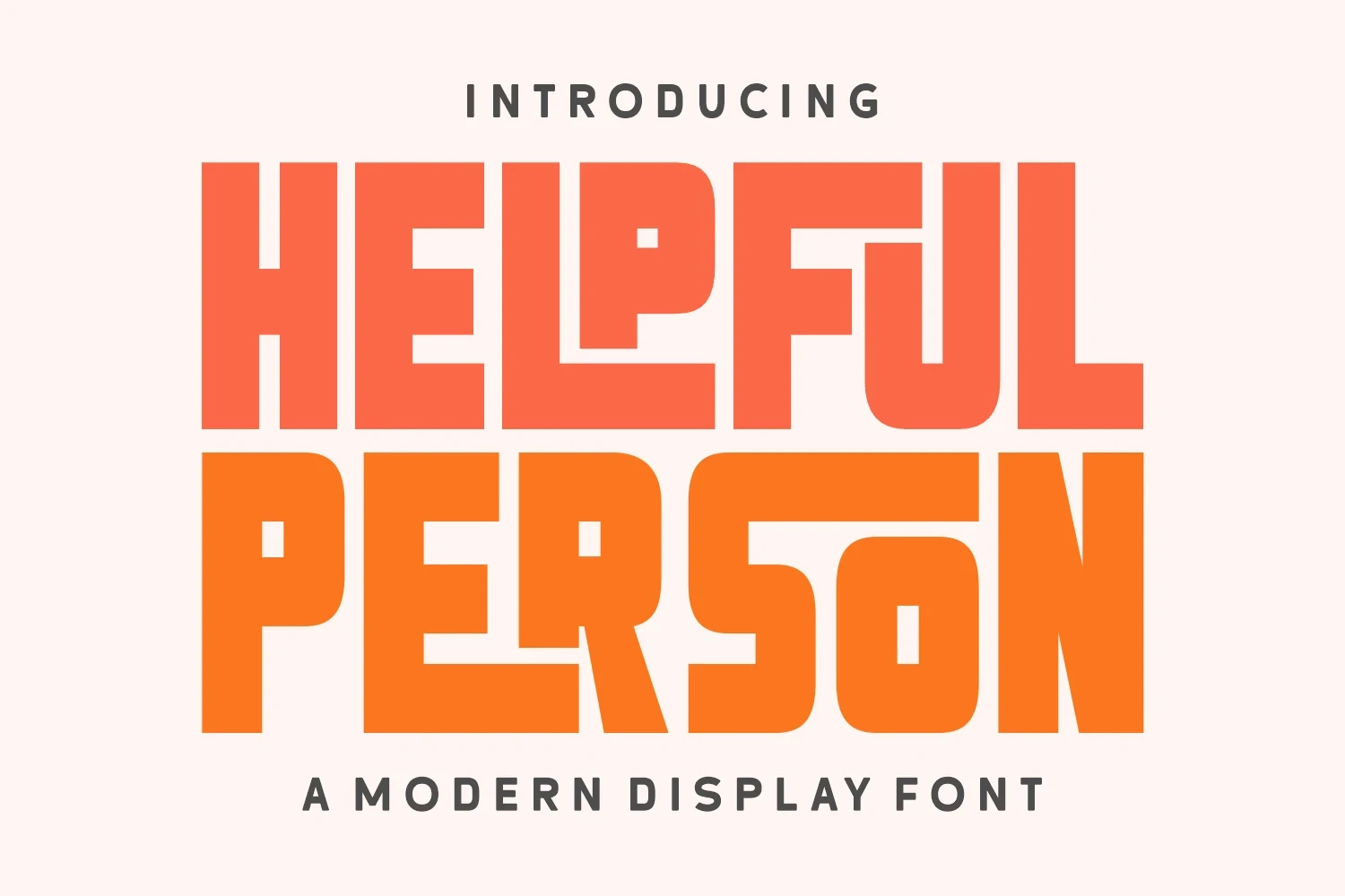
Best For: branding, posters, product labels, display text
Helpful Person Font brings Playful Display Fonts a condensed block structure that mixes sharp corners with rounded interior curves. Its compact width works well on labels and posters, but the heavy mass is excessive for paragraphs or small body text.
Super Magic Font
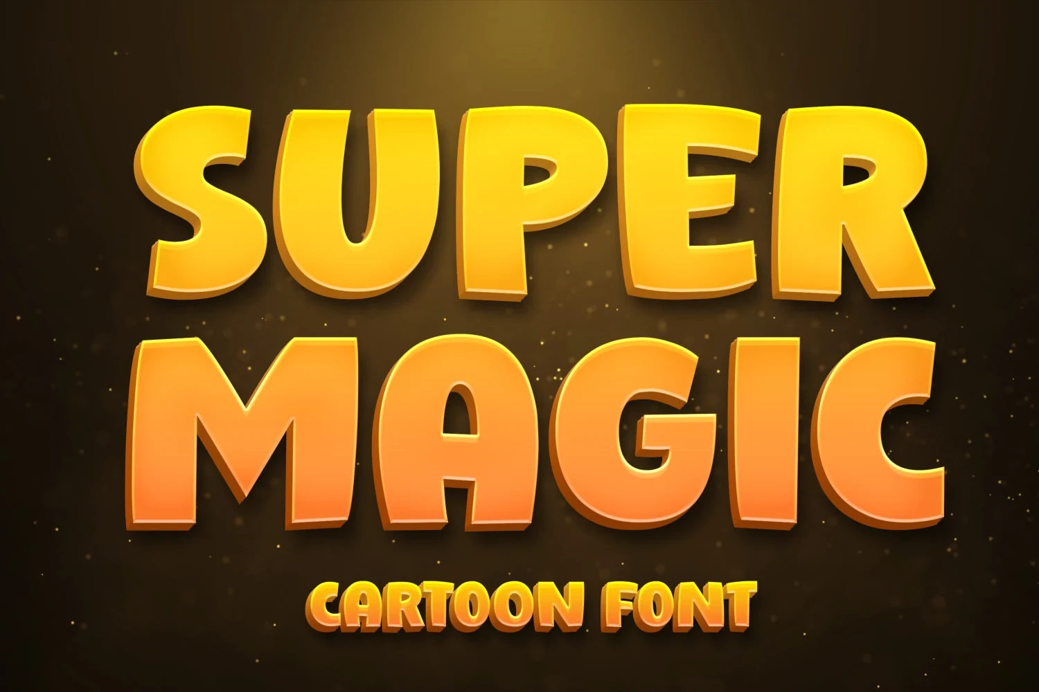
Best For: children’s designs, display text, minimal designs
Super Magic Font gives Playful Display Fonts a cartoon character through rounded corners, a large x-height, and minimal counter space. Its heavy upright forms suit youth-oriented titles, although tight spacing can make the word shape collapse at small sizes.
Sausage Font

Best For: branding, display text, modern designs
Sausage Font gives Playful Display Fonts a compact geometric build, combining condensed proportions, rounded terminals, and subtly square apertures. It suits posters and labels, though tight spacing can crowd the forms when the design is reduced.
Super Bubble Font

Best For: logos, packaging, posters, stickers
Super Bubble Font uses wide circular proportions and an ultra-heavy monolinear structure. Its simple shapes keep large logos and stickers readable, but the rounded mass loses definition when small, so give the lettering generous space and scale.
Sassy Sway Font
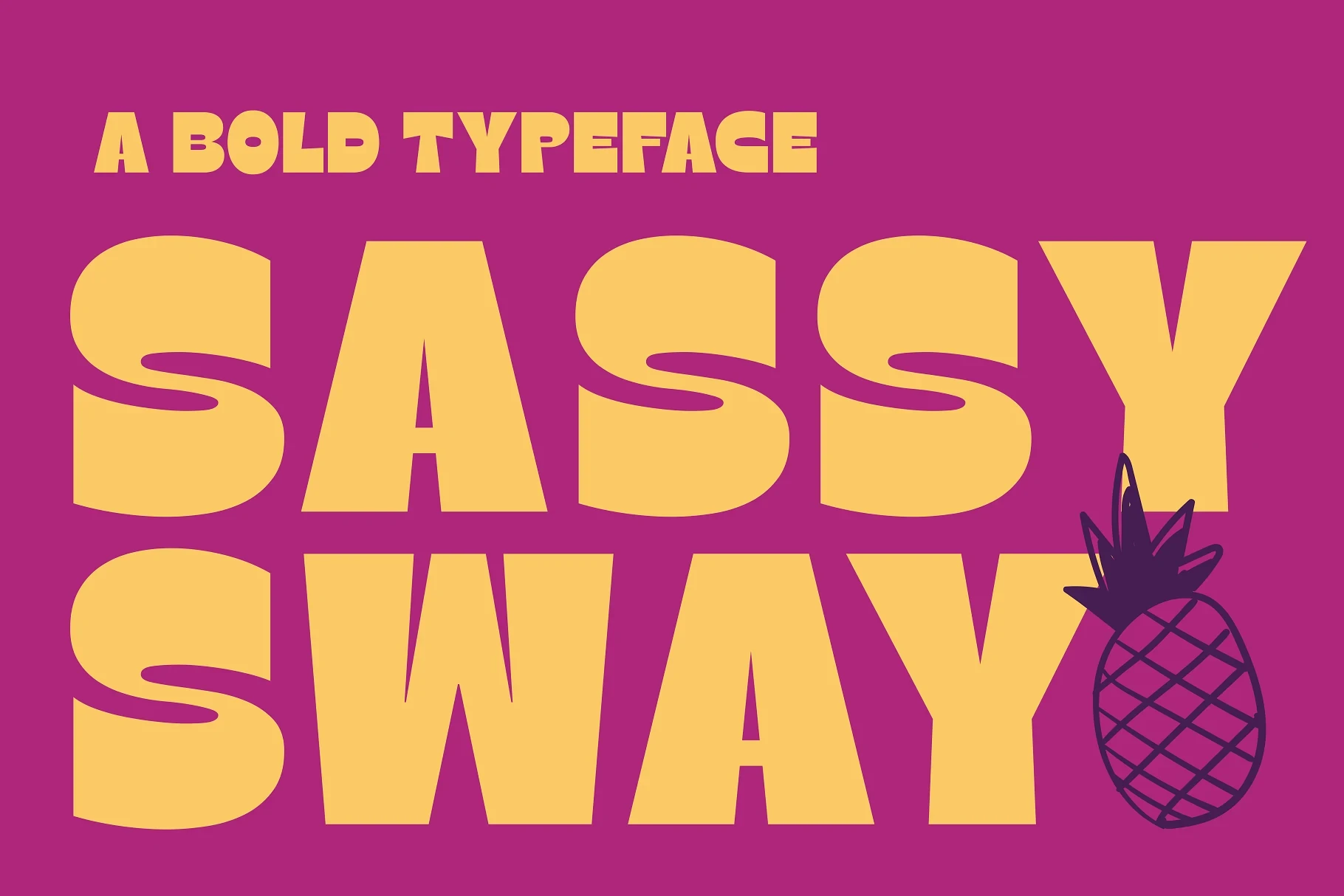
Best For: branding, posters, headlines, social media graphics
Sassy Sway Font uses expansive proportions and starkly contrasting horizontal and vertical terminals, giving Playful Display Fonts a clean, forceful silhouette. It remains clear in large branding and social graphics but can feel cramped at smaller scales.
Textured and Irregular Lettering
Texture, uneven contours, broken stems, and irregular spacing define this group. Its hand-drawn surfaces feel less controlled than the geometric category and often require generous sizing to preserve letter clarity.
First Batam Font
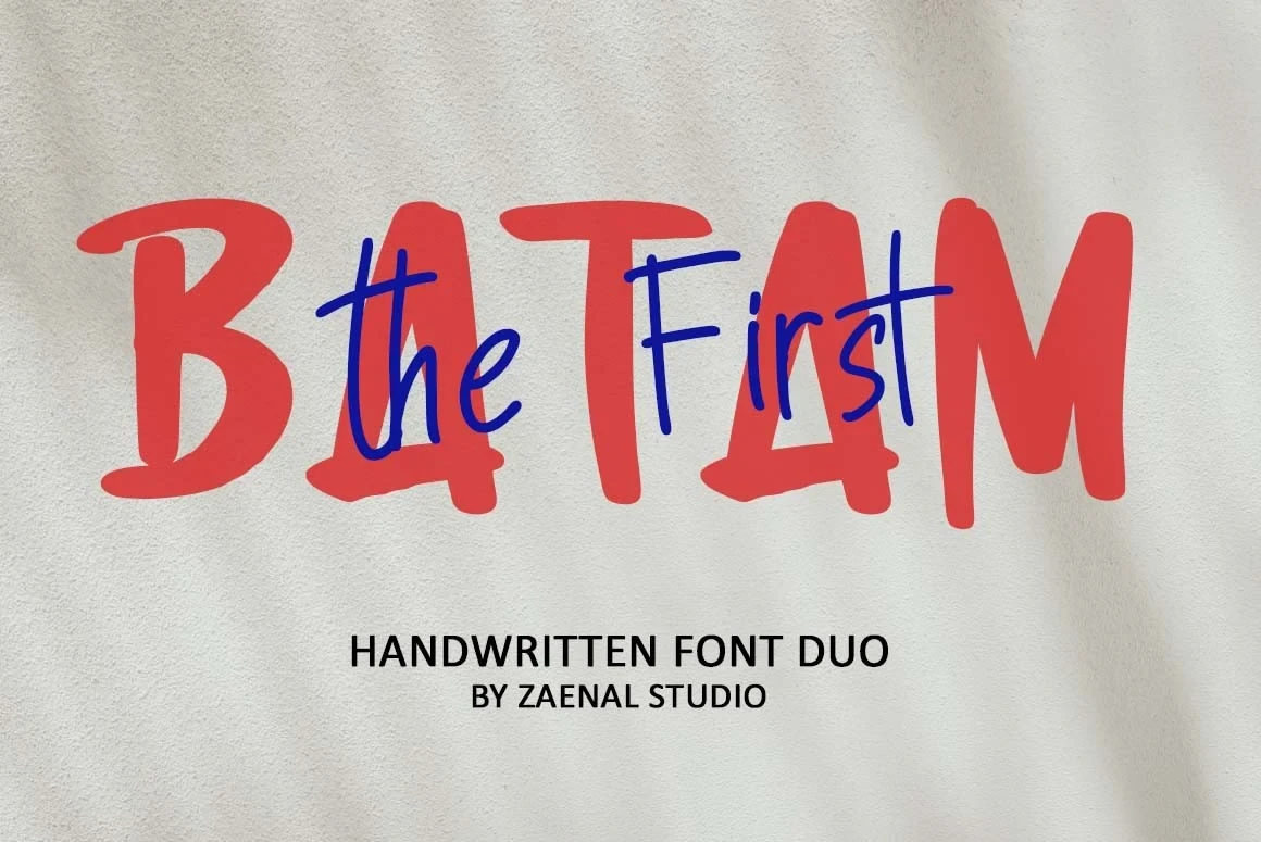
Best For: fun designs, social media graphics, eye-catching designs
First Batam Font combines chunky, irregular BATAM lettering with a thin monoline marker treatment layered over it. The heavy display letters remain easy to read, while the lighter script functions mainly as decoration and loses clarity sooner when reduced.
Truth Dare Font
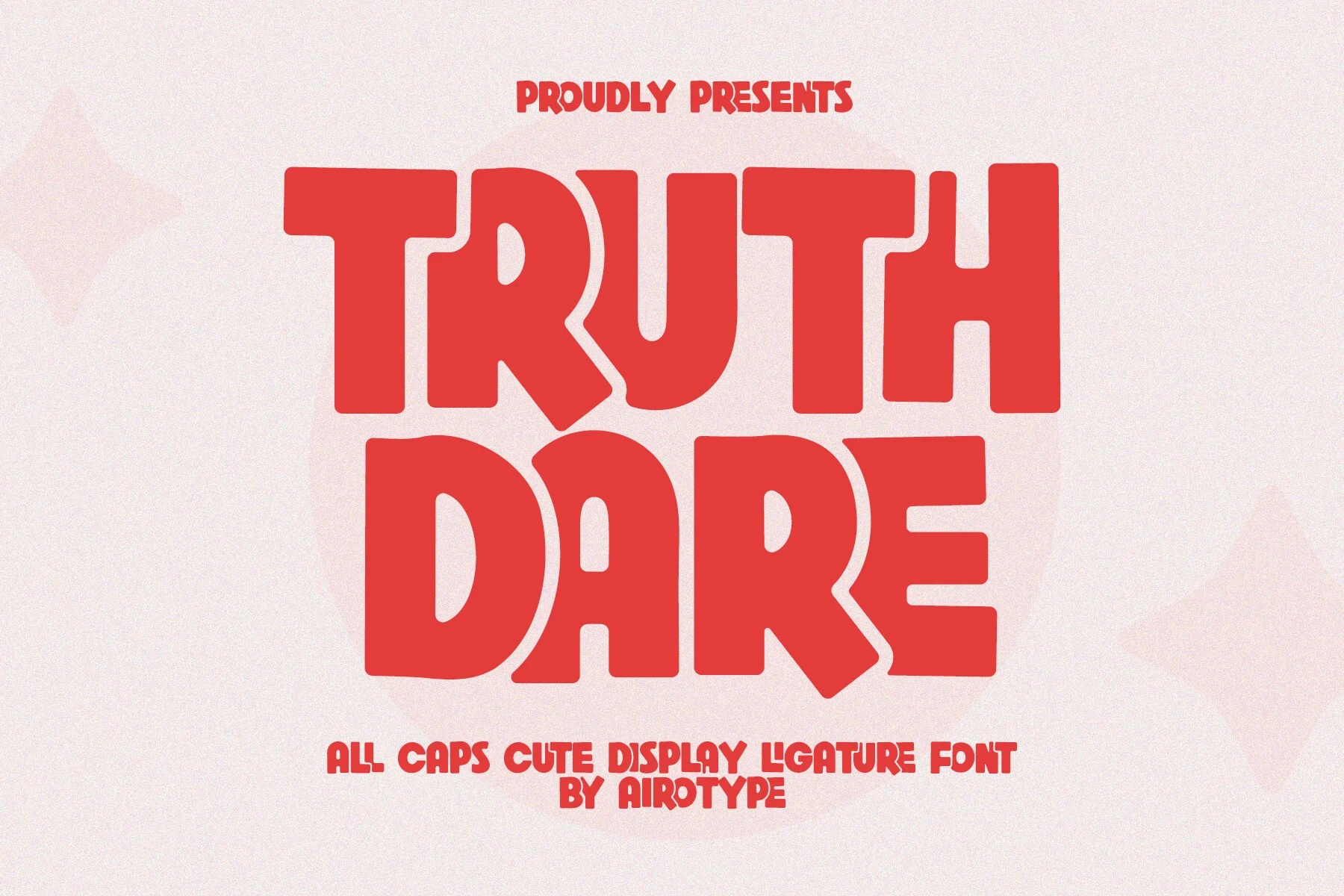
Best For: quotes, T-shirts, logos, display text
Truth Dare Font: Truth Dare creates a restless headline effect through disconnected all-caps letters, wavy contours, tight overlapping spacing, and an irregular baseline. Its ligatures provide extra variation, but the warped edges and crowded construction need large sizing for reliable reading.
Bigfans Font
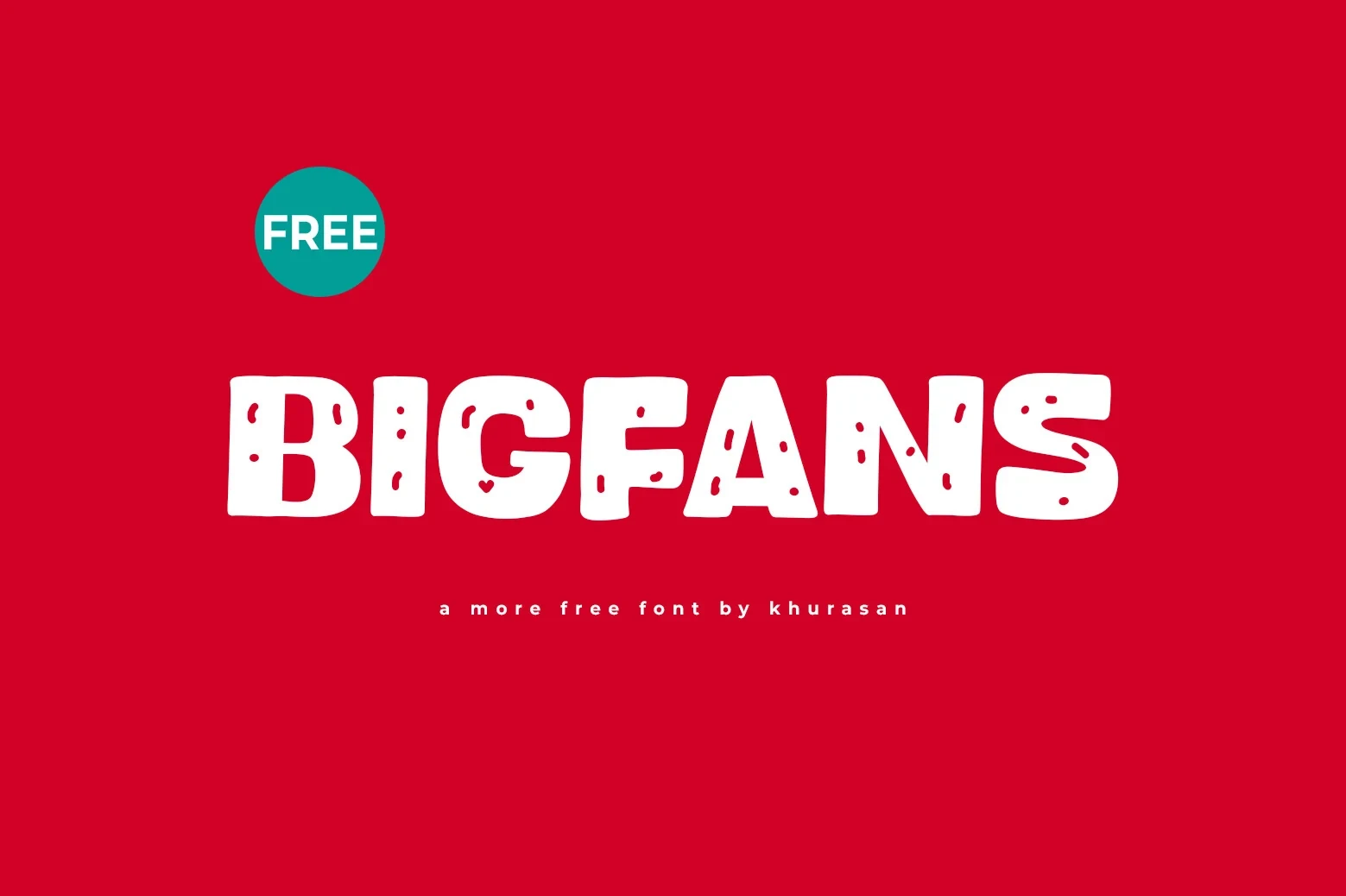
Best For: book covers, logos, posters, magazine covers
Bigfans Font suits Playful Display Fonts applications that need visible surface character: wide block proportions, hand-drawn strokes, and distressed internal cutouts give short headlines a strong printed texture. That texture can obscure letterforms at smaller sizes, so use it for covers, posters, or logos.
Coldzz Font
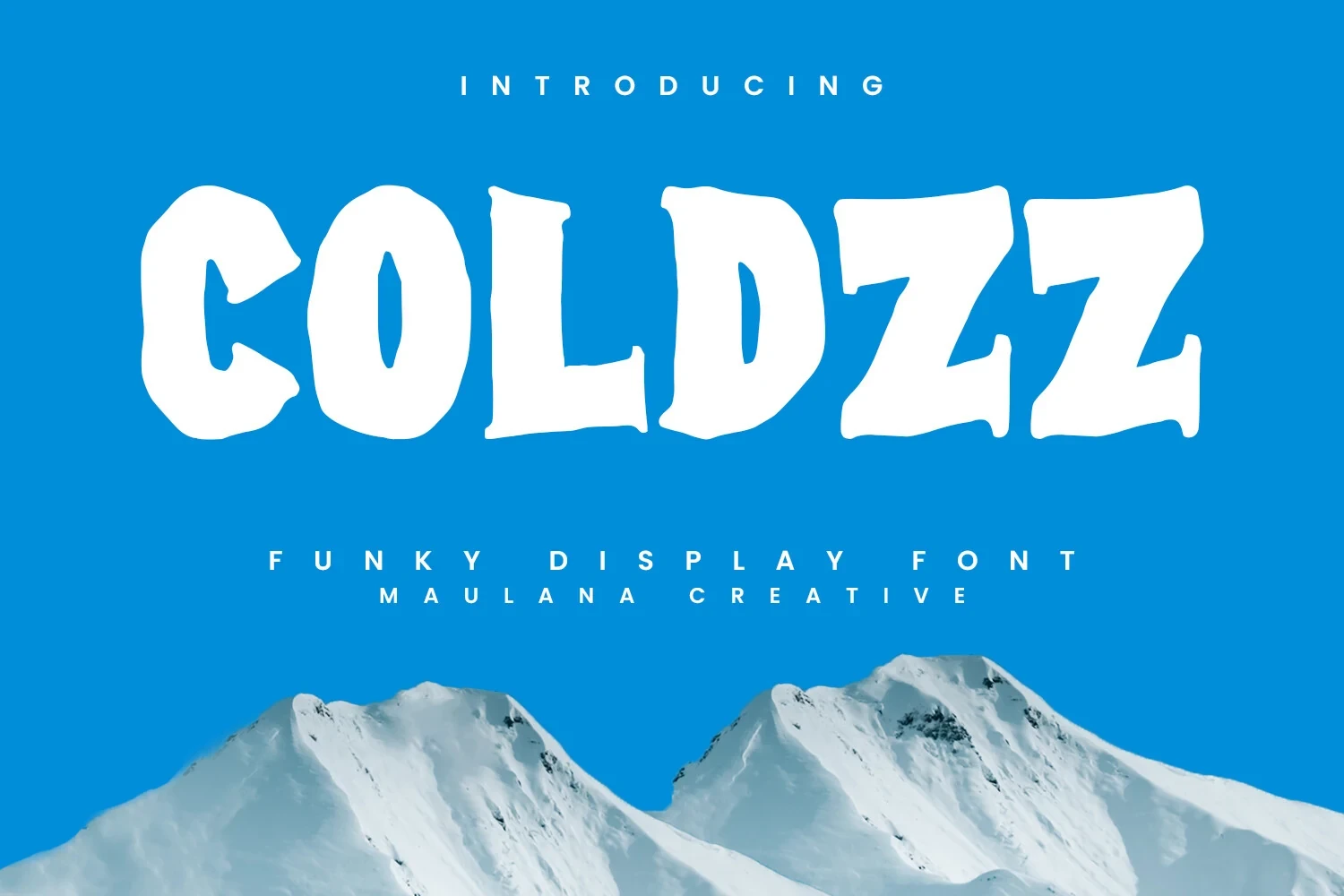
Best For: display text, playful designs, bold designs, headlines
Coldzz Font uses wide slab-like characters with uneven, bumpy contours instead of precise geometric edges. Its heavy uppercase construction stays readable in short headings, while the irregular outline becomes tiring and less dependable across sustained text.
Happy Brush Font
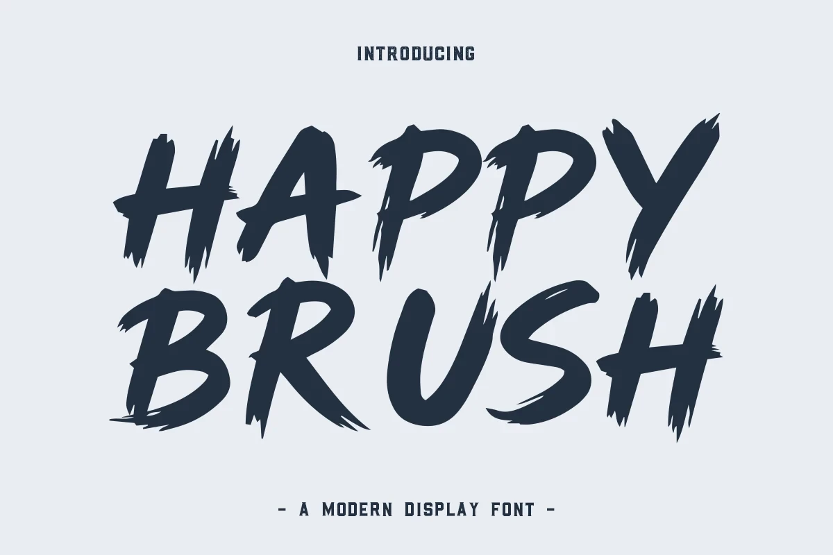
Best For: display text, clean designs, playful designs
Happy Brush Font gets its character from dry-brush texture, variable stroke width, and discontinuous stems. The upright letters and unstable baseline bring movement to headlines, but their inconsistent construction lacks the uniformity needed for long copy.
Neodex Font

Best For: book covers, logos, posters, magazine covers
Neodex Font is built from disconnected letters with a pronounced forward slant, high contrast, and rough brush edges. The separated construction keeps a wordmark forceful, but the textured finish limits it to prominent display roles such as covers, posters, and logos.
Geometric and Dimensional Forms
Angular modules, stencil gaps, open joins, compressed proportions, and extrusion give these designs a constructed appearance. They create stronger architectural or logo impact than the softer and more organic groups.
Monicho Font

Best For: display text, playful designs, bold designs
Monicho Font: For Playful Display Fonts with poster-scale force, Monicho uses compressed, tall forms and ultra-heavy characters interrupted by deep internal cutouts. The negative spaces add visual rhythm and impact, but the extreme construction makes it unsuitable for body copy or compact text.
Remuria Font
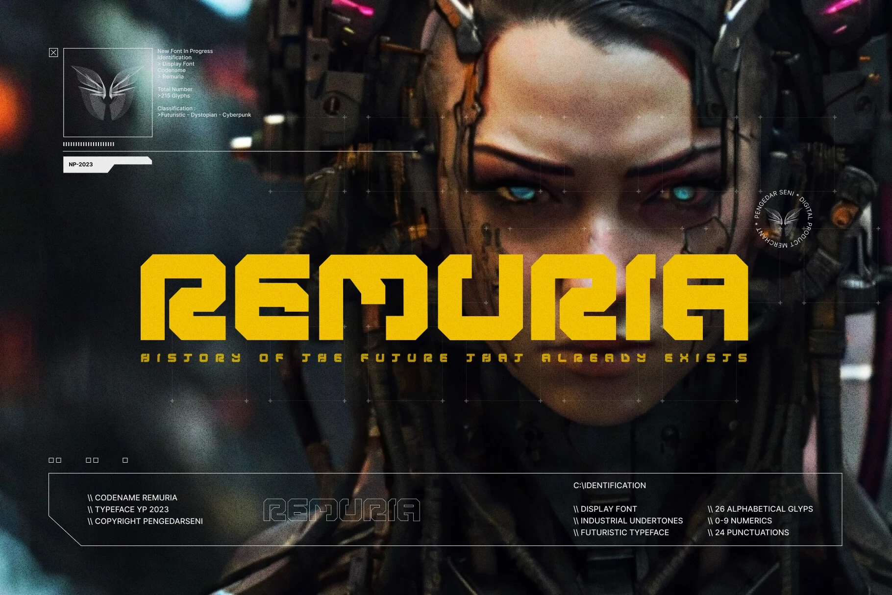
Best For: logos, headlines, website headers, display text
Remuria Font builds wide squared letters from angular modules with stencil-like gaps. Its solid treatment can anchor a bold header, while the outline version offers a lighter logo approach; both are display choices rather than solutions for long reading.
Folgore Font

Best For: display text, playful designs, bold designs
Folgore Font turns narrow monospaced forms into a high-contrast isometric extrusion with sharp architectural edges. The depth creates immediate logo impact, but the complex structure competes with effortless reading, especially below large headline sizes.
Kicking Limos Font
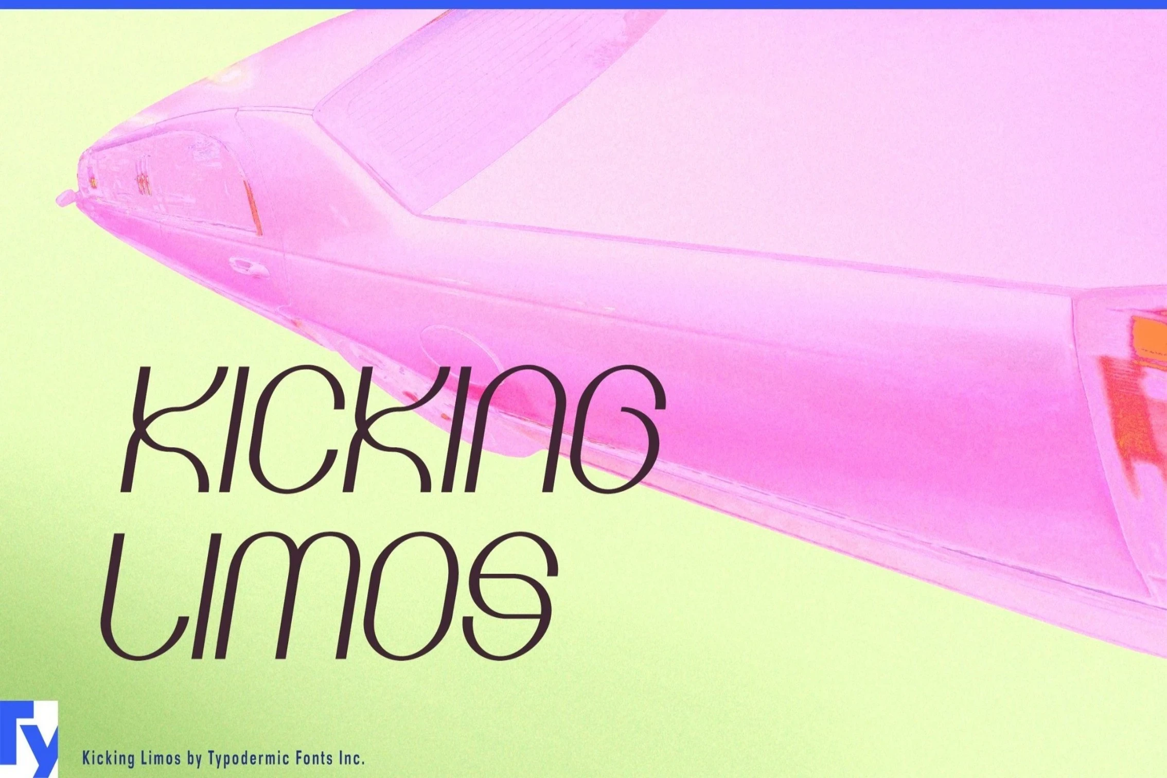
Best For: T-shirts, quotes, display text
Kicking Limos Font replaces conventional joins with open terminals and deliberate breaks in circular forms. Those interruptions create a distinctive branding mark, but they reduce immediate readability, making large-scale use much safer than compact text.
Retro Serifs and Flowing Accents
Chunky serifs, connected scripts, bulbous terminals, and selective swashes bring decorative movement to this category. These faces offer more ornamental detail than the direct block lettering elsewhere in the collection.
Thick Spirit Font

Best For: display text, playful designs, bold designs
Thick Spirit Font pairs heavy slab-serif forms with an extruded shadow treatment. The solid lettering stays clear at display size, while the added depth can muddy smaller applications and should be reserved for prominent titles.
Oldport Script Font
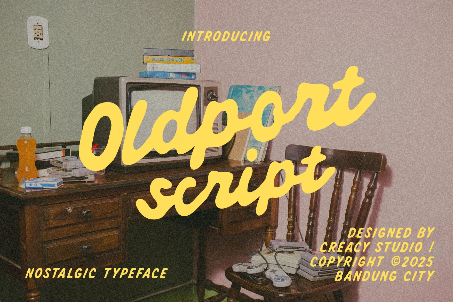
Best For: display text, clean designs, playful designs
Oldport Script Font relies on connected cursive movement, a slight forward lean, and rounded flowing terminals. Its continuous joins make inviting titles, though the letter connections become harder to parse when the design is scaled down.
Gropfy Font

Best For: branding, packaging, posters, display text
Gropfy Font combines high stroke contrast, chunky serifs, and liquid-like rounded terminals. Its organic curves suit packaging and headline work, while the irregular shapes lose definition at small sizes and need room to show their full construction.
Laguna Tropic Font
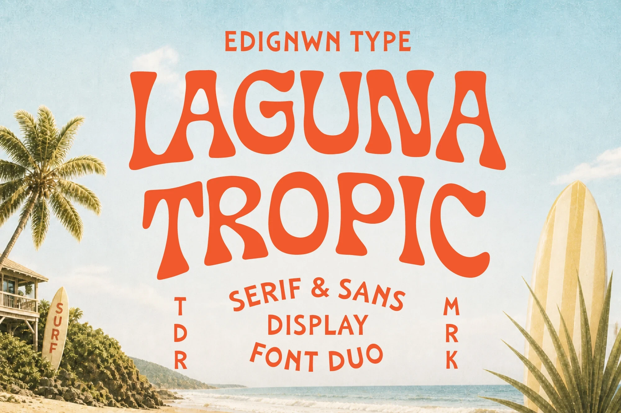
Best For: logos, branding, packaging, posters
Laguna Tropic Font pushes a 1970s-inspired structure through bulbous serifs, flowing stems, and heavy high-contrast strokes. Its distinctive contours make branding memorable, but generous sizing is essential if the unusual shapes are to remain recognizable.
Girly Love Font

Best For: T-shirts, packaging, posters, display text
Girly Love Font adds selective connected swashes between otherwise wide, heavy geometric letters. These joins create a decorative signature for apparel and packaging, yet they can interrupt word recognition when the design is reduced or tightly cropped.
Chroma Font

Best For: display text, minimal designs, elegant designs, playful designs
Chroma Font pairs heavy bracketed serifs with bulbous terminals and a pronounced swash on the m. The flourish creates an ornate title treatment, but it needs large sizing to remain legible and should not carry dense supporting copy.
How to Choose the Right Font
Choose among these Playful Display Fonts by matching construction to scale: rounded or condensed faces offer faster recognition, while cutouts, texture, joins, swashes, and extrusion add personality at the cost of readability. For logos and posters, favor the strongest visual distinction; for labels or social graphics, test spacing and counters at the smallest intended size.