24 Best Bold Display Fonts in 2026
This collection of Bold Display Fonts moves from wide geometric blocks and condensed cuts to high-contrast serifs, scripts, retro blobs, and jagged themed forms. Their practical roles range from logos and packaging to posters, labels, apparel, and headers, with scale and spacing determining readability.
Looking for more display fonts? Browse our complete Display Fonts collection to compare bold, vintage, retro, decorative, and playful display styles.

Bold Display Fonts: Block Forms
These Bold Display Fonts use heavy block construction, rounded corners, geometric frames, and tight counters for immediate impact. They are sturdier and less ornamental than the other groups.
Zenic Font
Best For: logos, branding, packaging, posters
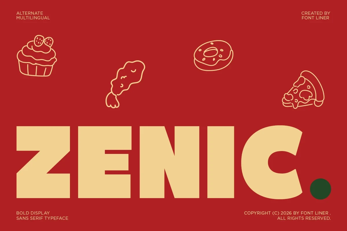
For Bold Display Fonts with a sturdy but approachable structure, Zenic Font uses a high x-height, heavy geometric strokes, and near-horizontal terminals on curved letters. It reads strongly in logos, packaging, and posters, although smaller settings benefit from generous letter spacing.
Garpit Font
Best For: display text, headlines, modern designs
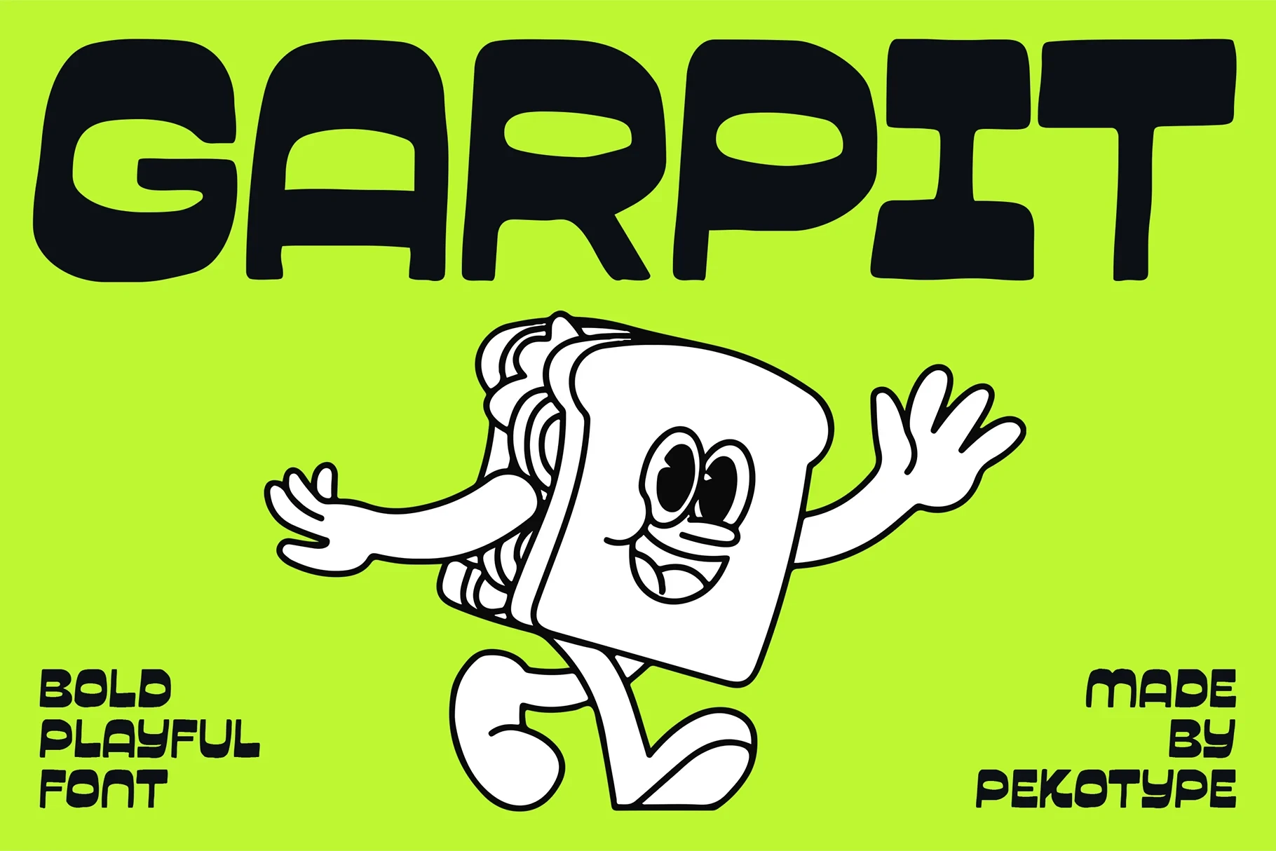
Garpit Font uses monoline strokes, rounded organic terminals, and tightly closed counters to create a chunky display silhouette. It works for casual headlines and modern designs, while dense copy loses openness because the counters and heavy forms leave little breathing room.
Bold Kiddo Font

Best For: eye-catching designs, T-shirts, branding, invitations
Bold Kiddo Font forms wide, ultra-heavy monoline letters with rounded terminals and a chunky block silhouette. It stands out on T-shirts, invitations, and identity graphics, though tight counters become harder to parse when the lettering is reduced.
Titan Font

Best For: social media graphics, logos, branding, packaging
Titan Font stretches heavy geometric letters into extremely wide proportions, softened by rounded corners and very low contrast. The expansive shapes command attention in social graphics, logos, and packaging, while thick stems and tight spacing can close up at small sizes.
Nocpro Font
Best For: branding, posters, display text, modern designs
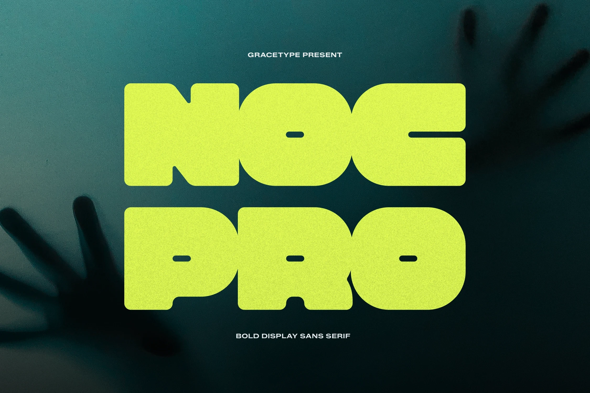
Nocpro Font brings a modern accent to Bold Display Fonts by placing horizontal negative-space apertures inside an ultra-bold monoline structure. The enclosed letters suit headlines and branding, but their thickness and restricted interiors make extended reading unsuitable.
Mirox Font

Best For: display text, clean designs, bold designs, high-end designs
Mirox Font relies on broad geometric proportions and deliberately spare character design rather than ornament. Its heavy primary style establishes a firm hierarchy beside thinner supporting text, making it a strong headline face but not a paragraph choice.
Golok Font
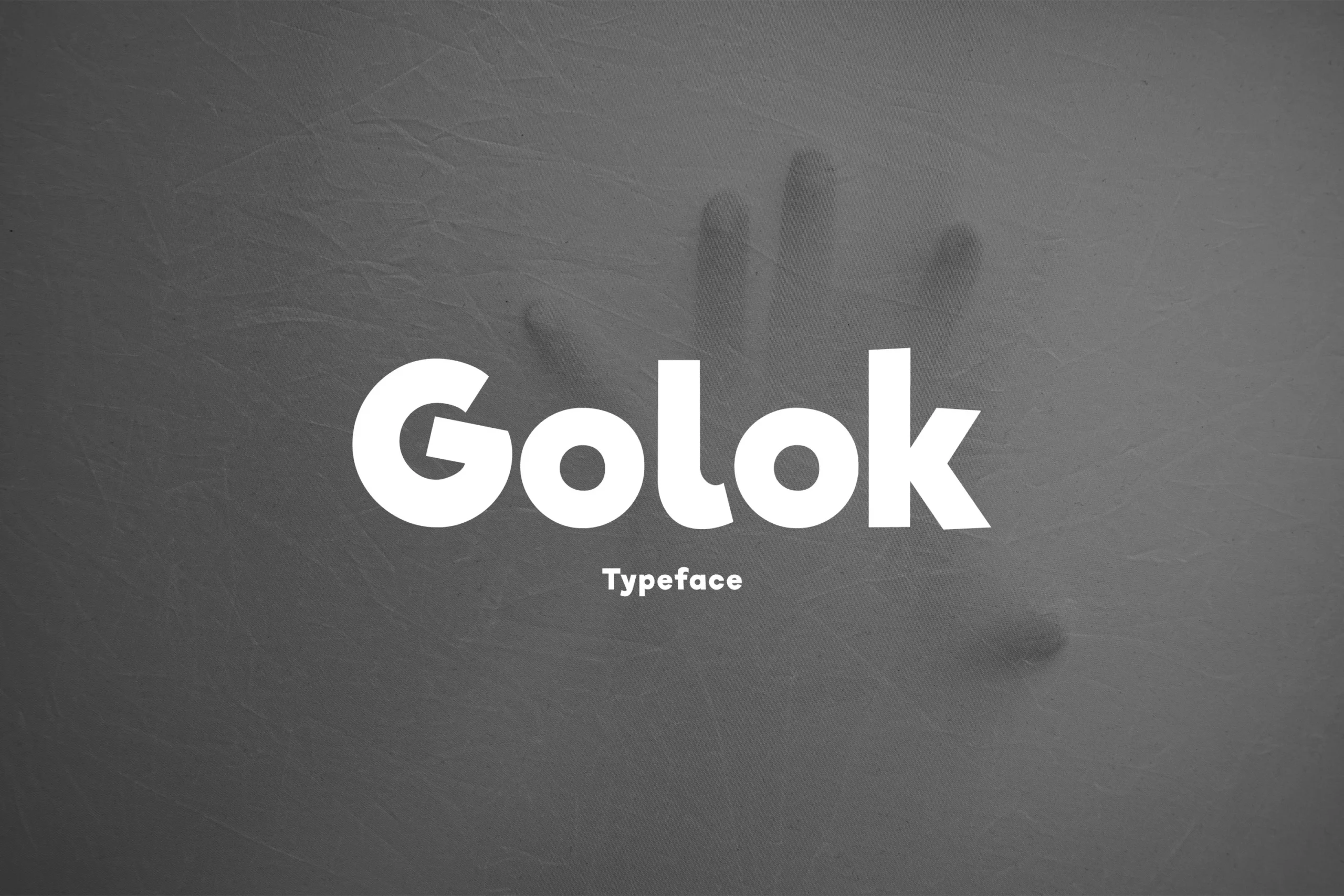
Best For: branding, website headers, display text, modern designs
Golok Font combines circular counters with a boxy geometric frame and rounded outer corners. The contrast between open circles and tight apertures gives branding and headers a distinctive block presence, though reduced lettering loses clarity.
Corva Bold Inside Font
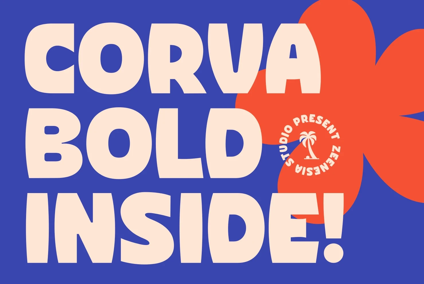
Best For: branding, packaging, posters, headlines
Corva Bold Inside Font uses rounded terminals, compressed wide proportions, and exceptionally tight spacing. Its simple mass reads quickly on packaging, posters, and headlines, but short words can merge when reduced because the characters sit so closely together.
Condensed, Slanted, and Cut Forms
Condensed, slanted, and cut forms create motion through narrow proportions, forward angles, clipped corners, inline channels, or sliced interiors. They occupy less width but demand larger display sizing.
Speed Font

Best For: posters, headlines, logos, display text
Speed Font makes its visual direction unmistakable through a pronounced rightward slant, wide proportions, and sharp angular terminals. The forward lean gives posters and logos immediate motion, but the dense, text-heavy use becomes difficult at smaller sizes.
Ridge 5 Bold Font
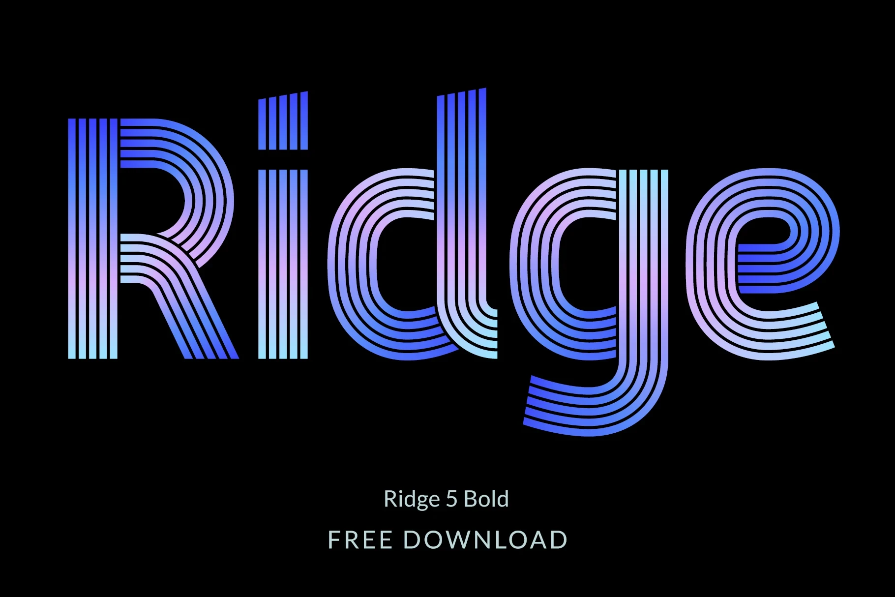
Best For: social media graphics, display text, wall art, bold designs
Ridge 5 Bold Font replaces a plain fill with a multi-line inline interior and geometric channels. Alternate characters add further poster and wall-art options, but the layered construction needs large sizing so its internal detail does not collapse.
Forega Sport Font

Best For: branding, social media graphics, display text, modern designs
Forega Sport Font uses horizontal slice cut-outs, angular inner corners, and a slight forward lean to suggest speed. Its disconnected construction fits team marks and campaign graphics, although the cuts can interrupt recognition when lettering is set too small.
Urban Block Font
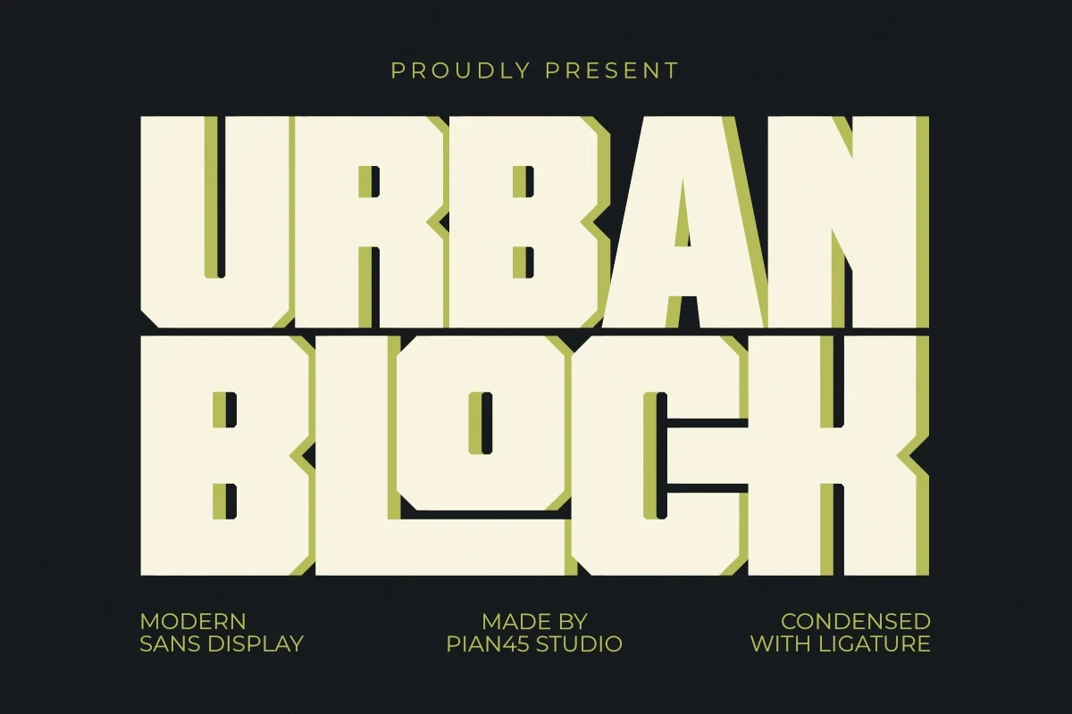
Best For: social media graphics, logos, branding, posters
Urban Block Font uses condensed proportions, clipped corners, and an offset shadow treatment to create a compact poster mark. It is useful when width is limited, but its extreme weight and spacing restrict it to large logos and headlines.
Turin Font

Best For: headlines, product labels, display text, minimal designs
Turin Font contrasts condensed geometric width with flat squared terminals and high stroke contrast. The narrow structure fits labels and headlines in restricted spaces, while its thick strokes and contrast quickly compromise clarity at smaller sizes.
Collins Butter Font
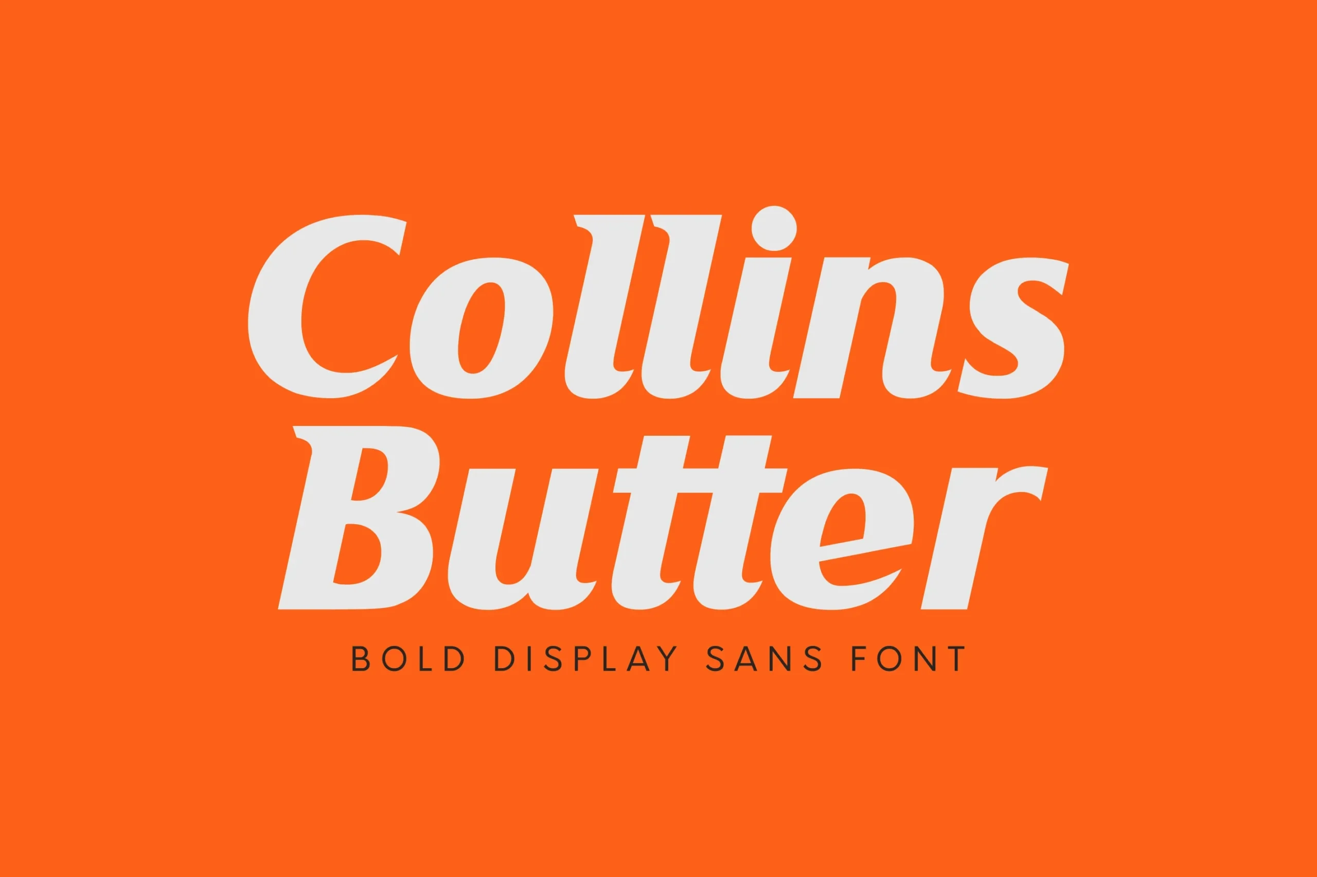
Best For: branding, packaging, website headers, posters
Collins Butter Font combines a heavy italic posture with pointed terminals and pronounced contrast. Its two-font family, including solid and hollow options, suits packaging and headers, while angled forms are less dependable in small text blocks.
Serif Weight and Vintage Structure
These serif styles balance substantial weight with slab structure, sharp contrast, carved curves, or vintage terminals. Their details feel more formal and textured than the block-based sans forms.
Rysel Font
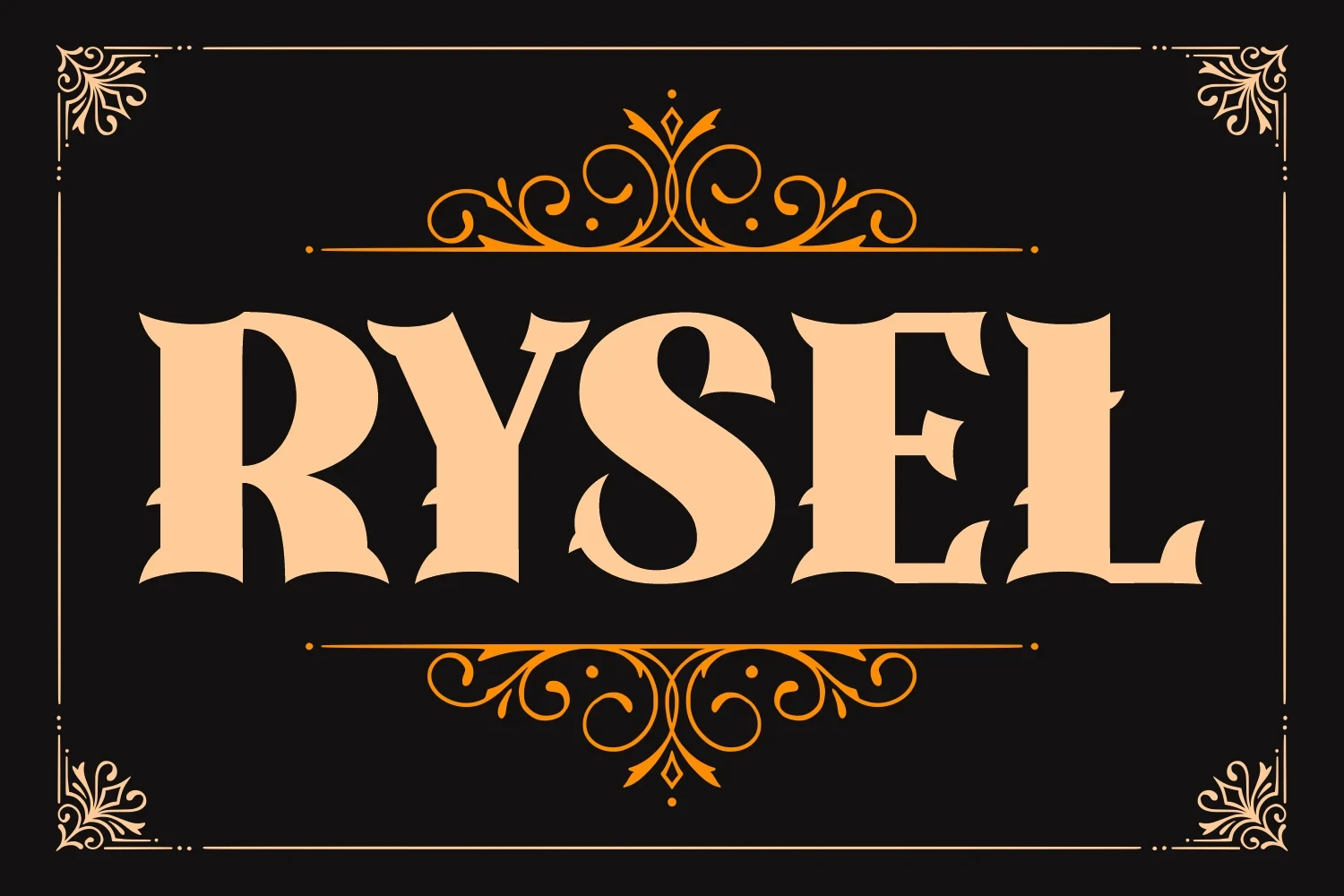
Best For: branding, posters, product labels
Rysel Font pairs heavy, wide letters with pointed, inward-curving serifs and sharp thick-to-thin contrast. Its Western character is clearest in large logos, headlines, and posters, where elaborate terminals and fine details have room to remain legible.
Bonaro Family Font

Best For: display text, clean designs, vintage designs
Bonaro Family Font builds a wide, upright slab structure in clean, rough, and stamped surface variants. The crisp version suits clear signage, while textured treatments add rugged character to labels and display text but become less precise when reduced.
Monteba Font
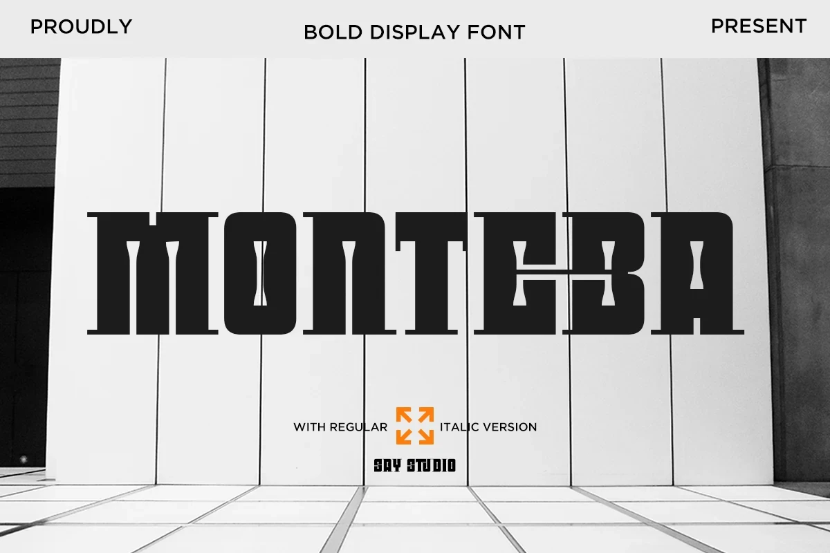
Best For: logos, branding, posters, headlines
Monteba Font combines wide, blocky slab serifs with unusually thin midsections and strong horizontal emphasis. The architectural contrast gives logos and headlines a structured presence, but its narrow stroke sections can disappear when the design is scaled down.
Rose Titan Font
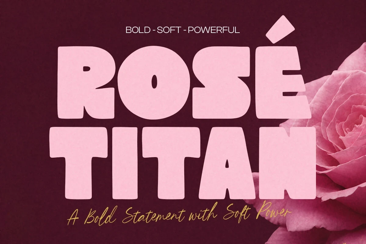
Best For: beauty branding, branding, website headers, posters
Rose Titan Font combines a boxy slab-inspired structure with notched terminals and angular joints. The wide, uniform main face suits beauty branding, headers, and signage, while its paired script requires ample display size to preserve clarity.
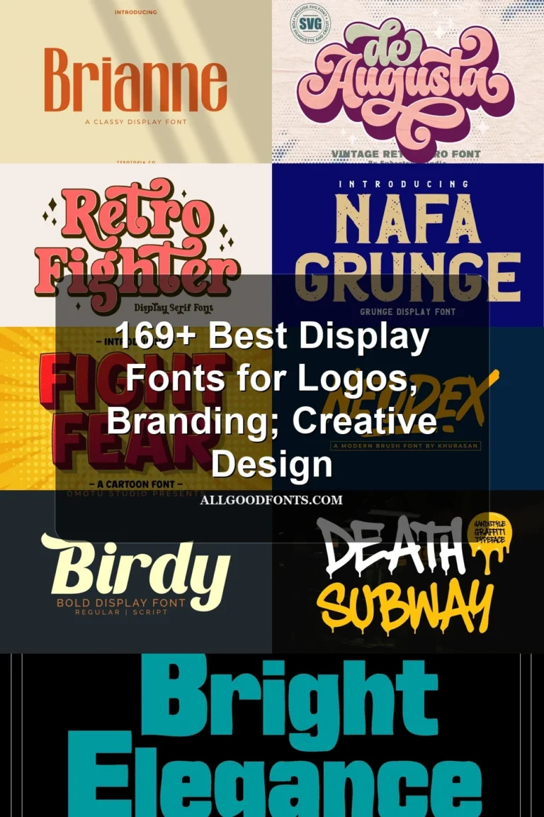
Brianne Font

Best For: product labels, display text, modern designs, classic designs
Brianne Font compresses sharp slab-like serifs into a vertical, high-contrast form with tight tracking. Its narrow silhouette suits product labels and formal titles, but thin horizontal serifs and compressed spacing make smaller applications unreliable.
Spooky Friday Font

Best For: branding, invitations, creative projects, T-shirts
Spooky Friday Font adds a slight ripple to its vertical strokes while retaining wide, blocky slab terminals. The controlled distortion supports Halloween titles, shirts, invitations, and other themed projects without losing recognition at large scale.
Sunday Font

Best For: product labels, display text, clean designs, playful designs
Sunday Font shapes heavy letters with concave inward curves and flaring terminals instead of straight-sided blocks. Those carved contours add retro character to labels and titles, though the indentations become less distinct when the type is reduced.
Decorative, Retro, and Themed Forms
Scripts, rounded retro shapes, and irregular contours dominate this group. They supply the strongest theme or period reference, but their connected details and clustered spacing reduce small-scale flexibility.
Birdy Font
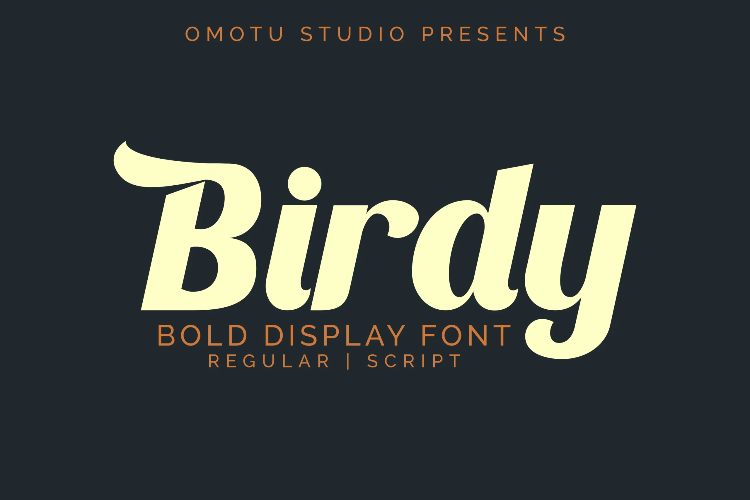
Best For: branding, packaging, website headers, posters
Birdy Font combines connected and semi-connected script forms with high contrast and a rising swash on the initial B. Its two-style setup supports branding, packaging, and headers, but the joins and swash need generous size to stay readable.
Retro World Font

Best For: display text, modern designs, playful designs, cute designs
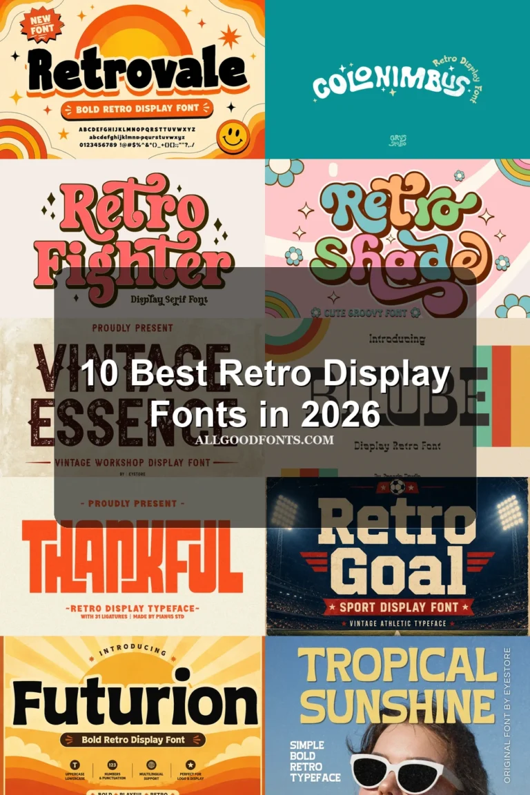
Retro World Font gives Bold Display Fonts a compact, blob-like treatment through uniform heavy strokes, rounded contours, and clustered spacing. It reinforces cheerful period styling in large titles, but is poorly suited to extended copy or small text.
Lazzleto Font

Best For: posters, website headers, display text, playful designs
Lazzleto Font layers jagged edges, sharp notches, irregular baseline movement, and high contrast onto heavy strokes. The unstable silhouette creates a forceful themed title for posters and headers, but sacrifices clarity in long or reduced text.
How to Choose the Right Font
Choose Bold Display Fonts by matching construction to the design role: wide, rounded blocks read quickly, condensed forms save space, and inline or cut interiors add detail at poster scale. Use high-contrast serifs and scripts only where their fine joins remain visible, and reserve irregular or tightly spaced styles for short titles rather than supporting text.