19 Best Creative Display Fonts in 2026
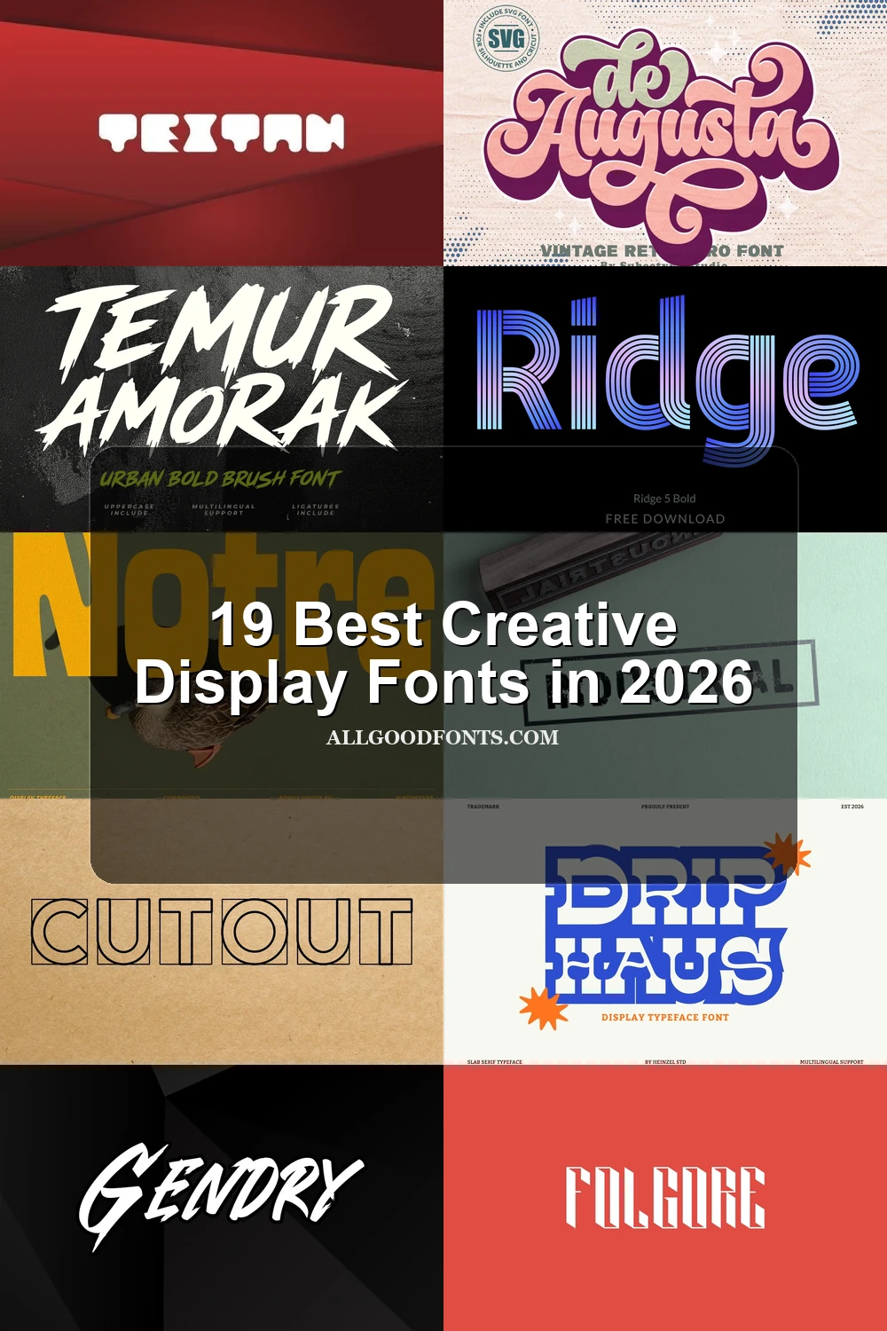
This collection spans geometric blocks, industrial stencils, dimensional graffiti, brush textures, connected lettering, slabs, and varsity pairings. These Creative Display Fonts are built for logos, posters, packaging, signage, social graphics, and short headlines where visible construction carries much of the design.
Looking for more display fonts? Browse our complete Display Fonts collection to compare bold, vintage, retro, decorative, and playful display styles.
Creative Display Fonts: Geometric and Block Forms
Creative Display Fonts in this group rely on geometric strokes, block proportions, open or restricted counters, and angular construction, making them more controlled and structural than the flowing or dimensional categories.
Cut out Font

Best For: display text, clean designs, branding
Cut out Font uses boxed, stencil-influenced letterforms built from monolinear geometric strokes. Its enclosed shapes remain clear for signage and branding, while orthogonal and circular forms add an industrial code without sacrificing headline readability.
Notre Font
Best For: branding, headlines, signage, display text
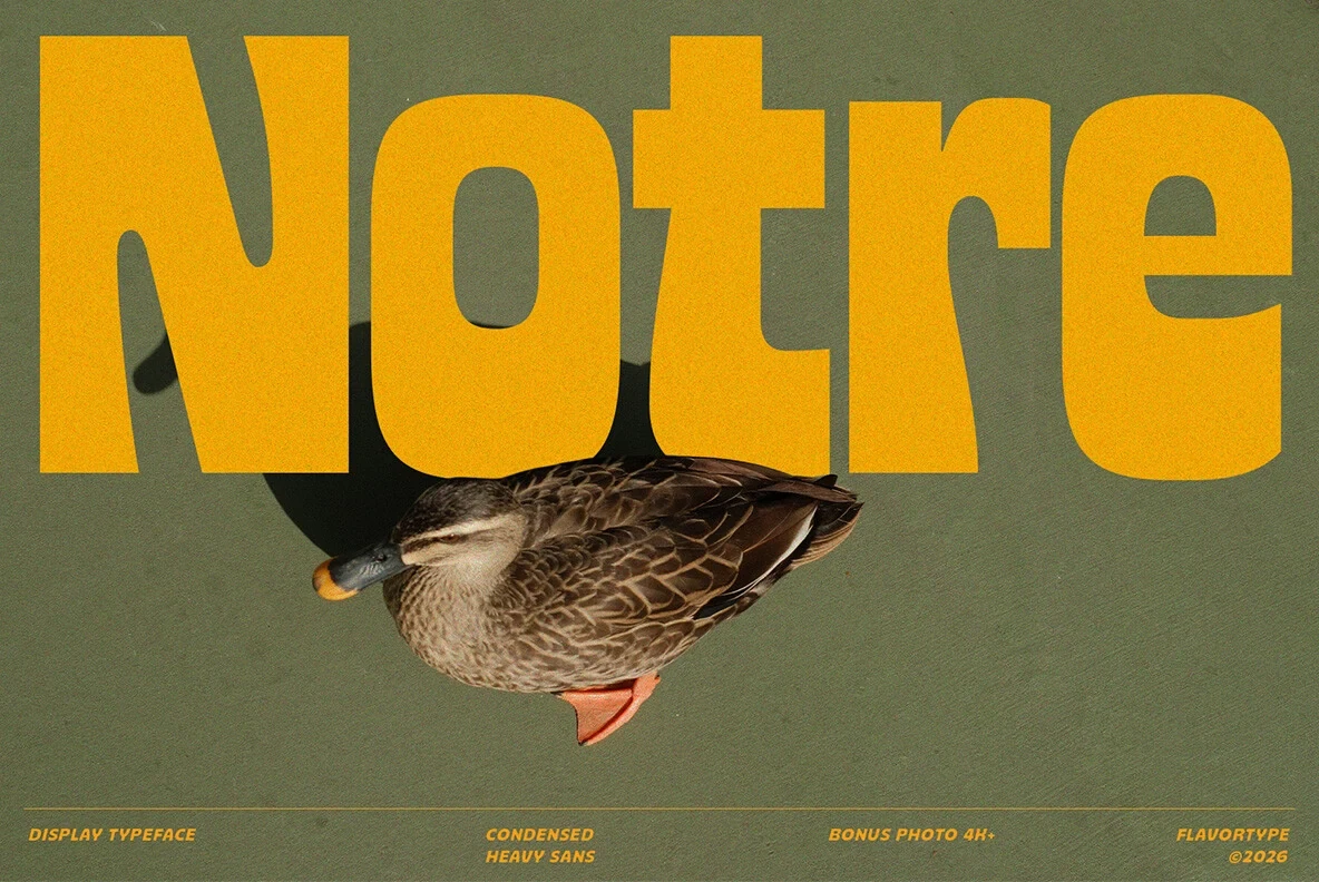
For branding, headlines, or signage, Notre Font supplies ultra-heavy condensed letters, a large x-height, and unusually fluid internal terminals. The narrow apertures create a strong title silhouette, but dense counters can blur when the size drops.
Textan Font

Best For: display text, modern designs, playful designs
Textan Font uses wide block proportions, rounded terminals, and extremely restricted counters to create substantial short headings. It works best at poster scale, since the small internal openings make compact text difficult to read.
North Hype Font

Best For: logos, branding, packaging, headlines
North Hype Font combines extended ultra-heavy forms with rounded corners and terminals. Its sturdy silhouette suits wordmarks, packaging, and headlines, though tight spacing can cause neighboring characters to merge.
Kafu Font

Best For: social media graphics, fashion branding, branding, posters
Kafu Font uses wide geometric lowercase forms, soft corners, and extreme weight to create a substantial poster word or logo. Tight spacing and thick strokes limit its usefulness for compact text.
Aexiron Font

Best For: logos, branding, social media graphics, product labels
For logos, product labels, and branding, Aexiron Font offers wide geometric forms, high stroke weight, and open counters. The clean technological structure preserves headline legibility, although broad characters are inefficient for body copy.
Propaganda Font
Best For: posters, display text, bold designs, minimal designs
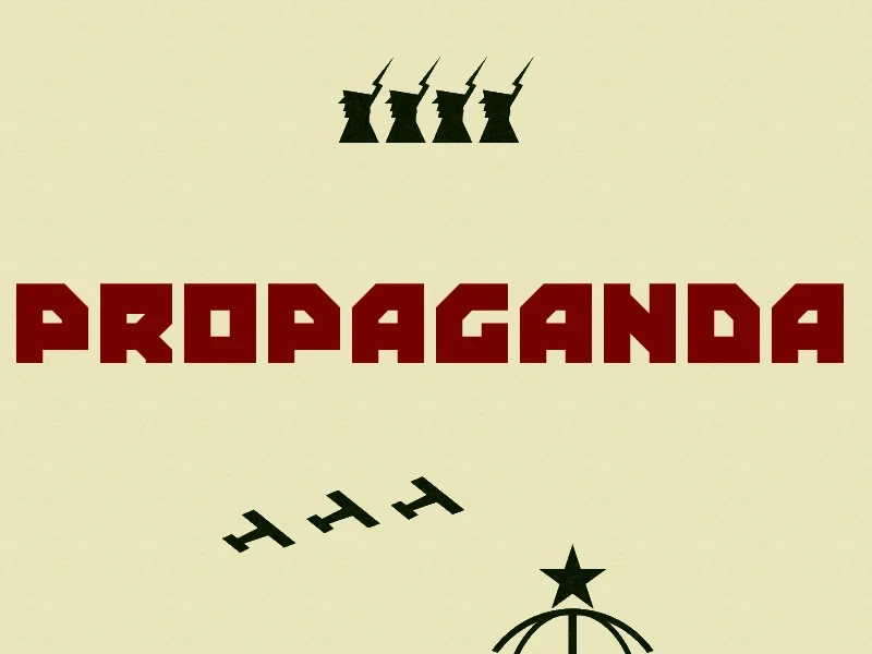
Propaganda Font forms monolithic block letters with square notch-like corners rather than rounded curves. Its angular, high-contrast profile produces commanding posters and stark statements, but demands large sizing for comfortable reading.
Industrial Font

Best For: logos, display text, bold designs
For signage, marks, and medium-to-large titles, Industrial Font provides condensed stamped lettering with uniform strokes, squared terminals, and blocky geometric structures. Its sturdy utilitarian tone favors clarity and function over ornamental detail.
Brush and Flowing Lettering
Brush and flowing lettering emphasizes texture, joins, swashes, contrast, and movement. These styles feel more expressive than geometric forms, but their flourishes and rough edges need generous display scale.
Gendry Font

Best For: display text, bold designs, logos
Gendry Font brings heavy brush texture, sharp terminals, strong stroke contrast, and a pronounced rightward slant. It gives short headlines and logos energetic force, although the rough surface loses clarity when reduced.
De Augusta Font
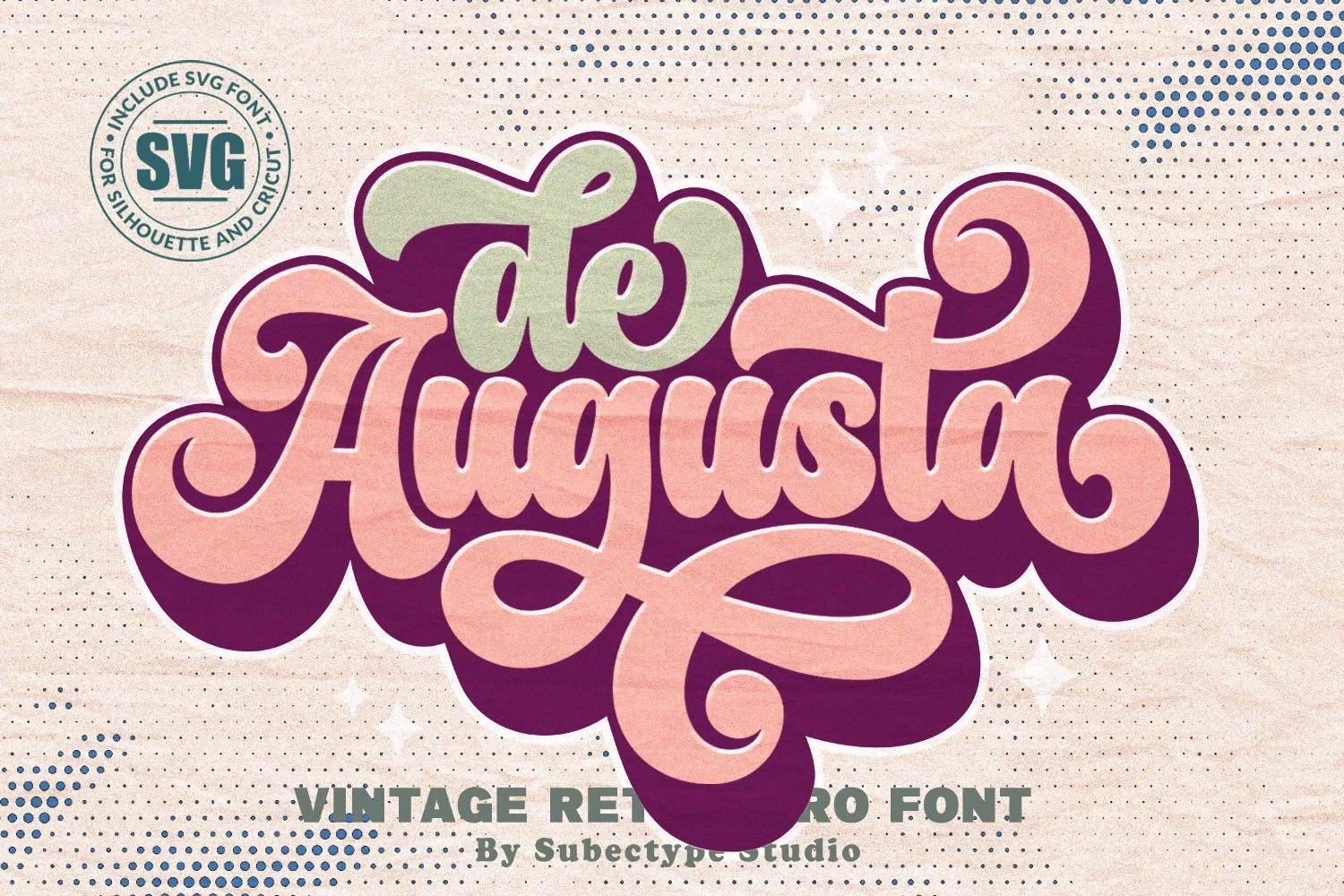
Best For: display text, playful designs, bold designs, retro designs
De Augusta Font creates a flowing headline treatment with connected letters, swash terminals, and pronounced thick-thin contrast. Its flourishes provide nostalgic character, but interconnected forms become harder to parse at reduced sizes.
Liquid Unflow Font
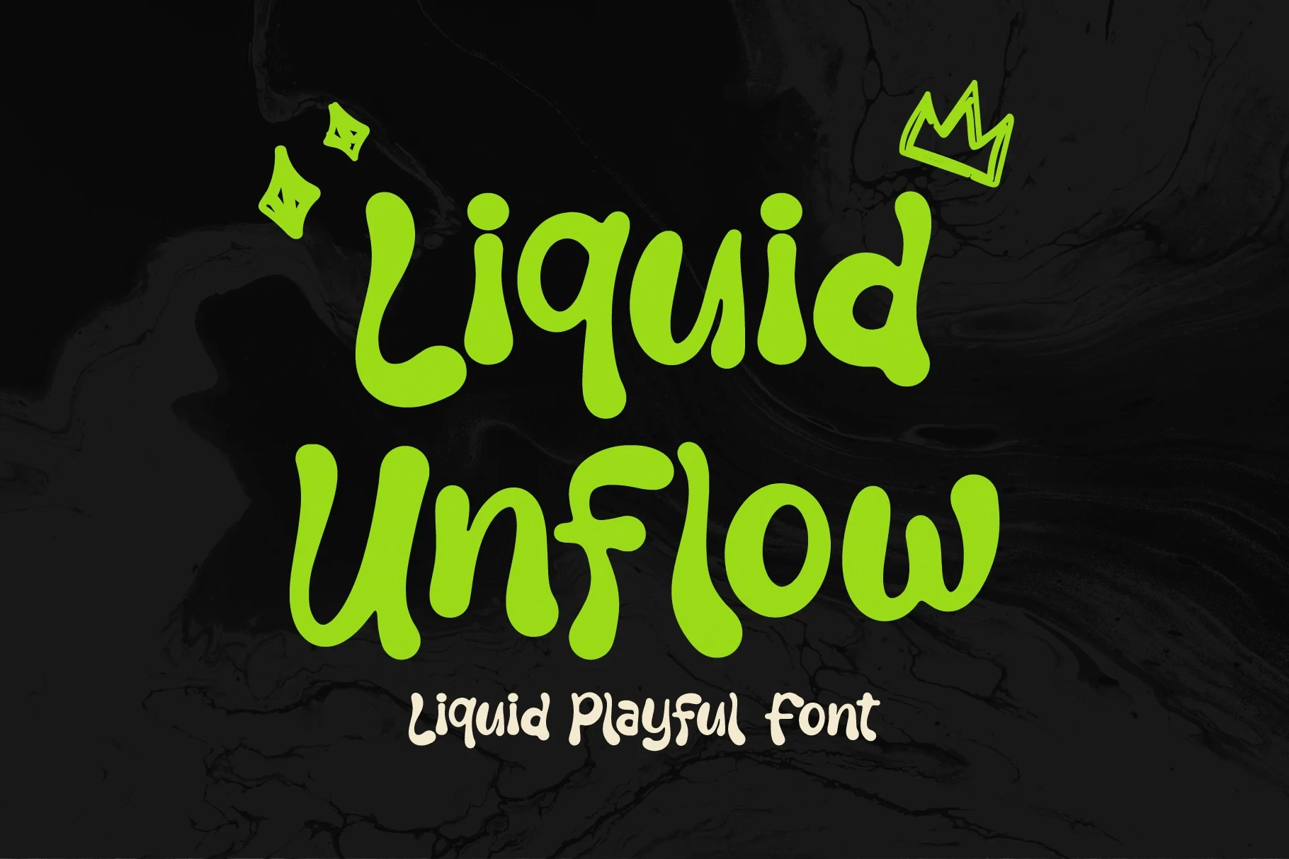
Best For: logos, branding, invitations, social media graphics
Liquid Unflow Font shapes disconnected lettering from heavy rounded blobs and irregular organic proportions. Those unusual silhouettes suit youthful logos and social graphics, but thick, non-uniform strokes lose clarity when scaled down.
Temur Amorak Urban Bold Brush Font

Best For: branding, display text, bold designs, personal branding
Temur Amorak Urban Bold Brush Font has disconnected letters, dry high-contrast edges, and jagged terminals. Ligatures and multilingual support broaden branding possibilities, while the rough texture remains most effective at headline scale.
Hanky Font

Best For: social media graphics, logos, branding, packaging
Hanky Font uses connected lettering, uniform heavy strokes, bulbous terminals, and a slight forward slant. Its continuous movement gives logos and packaging lively character, though layered effects can compromise small-size definition.
Graffiti and Dimensional Impact
Graffiti and dimensional styles add shadows, perspective, angular edges, and decorative layering. Their visual effects create immediate poster impact, though they generally sacrifice quick reading at small sizes.
Brick Edgie Font
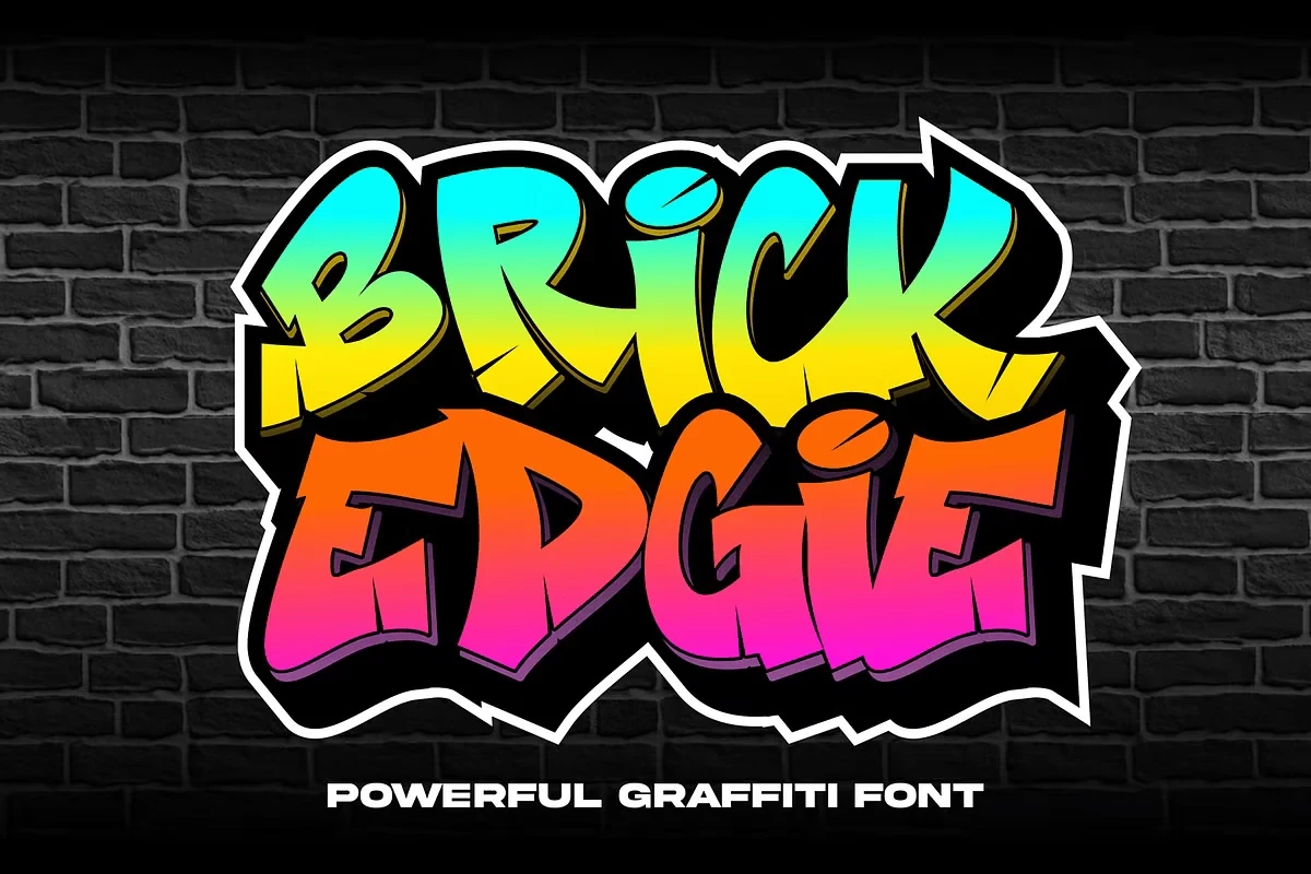
Best For: display text, wall art, bold designs, posters
Brick Edgie Font builds disconnected graffiti lettering from thick angular strokes and a pronounced shadow layer. It delivers immediate poster and wall-art impact, although decorative edges make reading slower than plain display lettering.
Graffiti Stroke Font
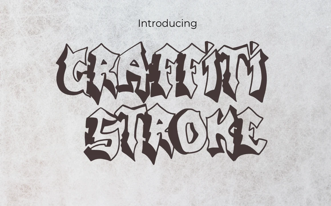
Best For: branding, fashion branding, display text, wall art
Graffiti Stroke Font pairs uppercase forms and sharp terminals with an integrated 3D drop shadow. Ligatures add expressive options for fashion marks, while the layered treatment favors title-scale Creative Display Fonts impact over quick reading.
Folgore Font
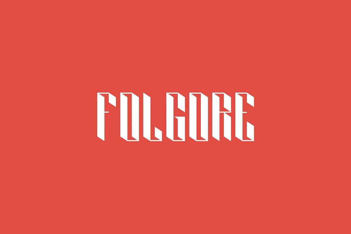
Best For: social media graphics, display text, bold designs, fun designs
Folgore Font creates dimensional title lettering through condensed block forms and contrasting faces. The architectural perspective adds volume, while narrow proportions and depth cues reduce clarity at tiny sizes.
Retro, Slab, and Varsity Display
Retro, slab, and varsity designs combine sturdy display structures with decorative or athletic cues. They offer stronger message-carrying shapes than scripts while retaining distinctive period-inspired character.
Ridge 5 Bold Font

Best For: social media graphics, display text, wall art
Ridge 5 Bold Font makes its multi-line monolinear construction the main graphic feature, producing an energetic, structured display effect. Alternate characters expand the design options, but its fine internal lines need generous scale to stay separate.
Drip Haus Font
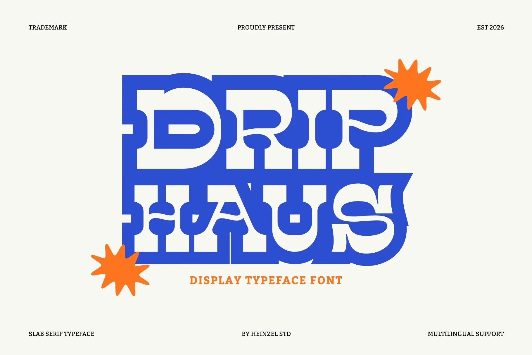
Best For: social media graphics, logos, branding, packaging
Drip Haus Font gives logos and packaging a sturdy slab-serif presence through wide proportions, thick horizontal strokes, rounded corners, and generous internal openings. Heavy weight and tight kerning make it more convincing in large Creative Display Fonts applications than small copy.
Golden Varsity Font
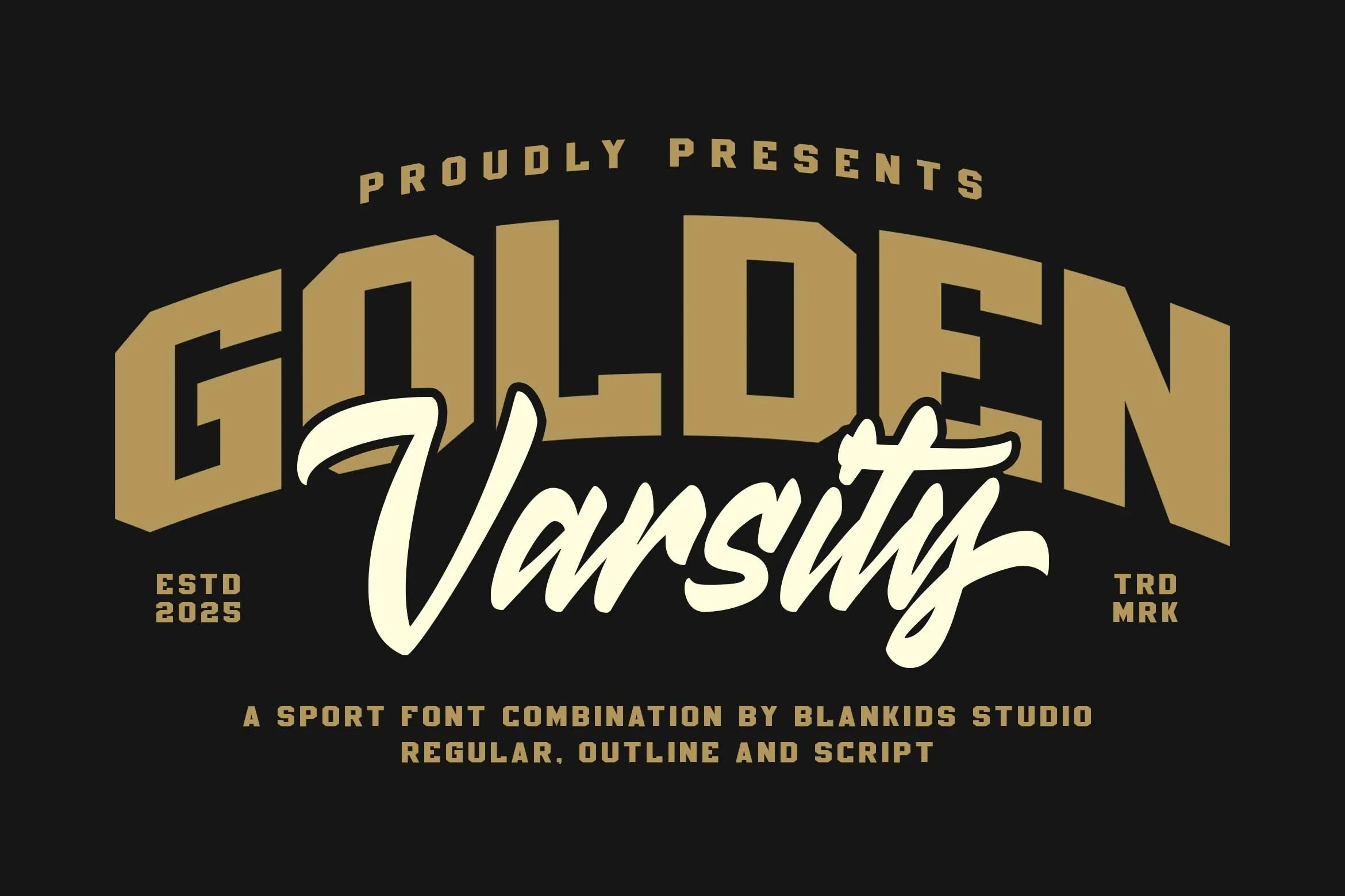
Best For: branding, packaging, posters, product labels
Golden Varsity Font pairs an arched block sans with a separate looping signature style. The athletic lettering carries the main message clearly, while the decorative accent works best when kept larger in Creative Display Fonts layouts.
How to Choose the Right Font
Choose by construction first: open counters and simpler strokes support better readability, while restricted counters, rough edges, joins, shadows, and perspective demand larger sizes. Use connected lettering for movement, geometric blocks for controlled messaging, and dimensional styles when visual impact matters more than rapid reading. These Creative Display Fonts work best as intentional display elements, not default body text.