10 Best Cursive Fonts for Logos in 2026
This collection moves from substantial connected lettering and clean brush-like rhythms to slanted calligraphic forms and high-contrast swashes. These Cursive Fonts for Logos are designed primarily for names, marks, headings, labels, and other short display applications where continuous movement can remain clear.
Looking for more cursive fonts? Browse our complete Cursive Fonts collection to compare modern, bold, wedding, logo-friendly, and Cricut-ready cursive styles.

Cursive Fonts for Logos: Bold, Contemporary Flow
This group gives Cursive Fonts for Logos a bold, contemporary direction, combining connected joins with substantial or controlled strokes. Compared with the other categories, these styles generally emphasize cleaner movement over elaborate ornament.
Dakiens Font
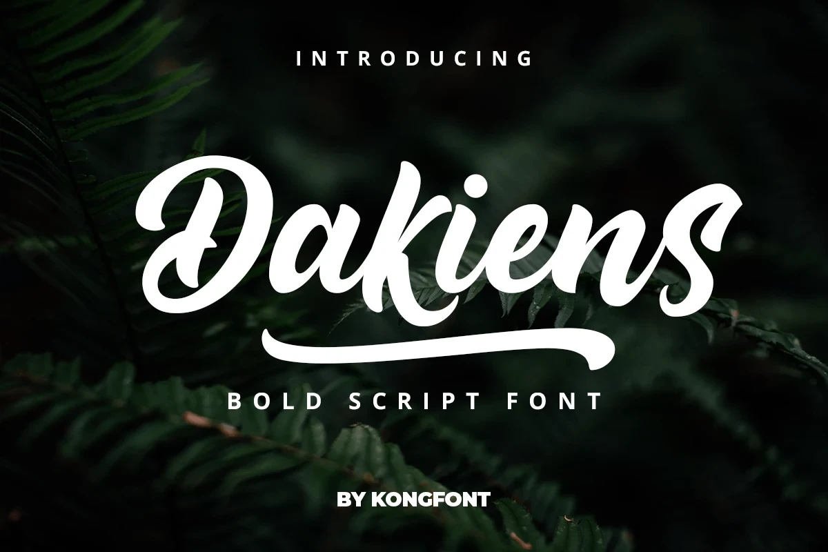
Best For: logos, headlines, display text
Dakiens Font brings substantial display weight to connected, flowing letterforms, giving short names and brand phrases a bold presence. Compare it at heading scale, where its distinctive shapes are easier to refine than in extended copy.
Hiatus Font
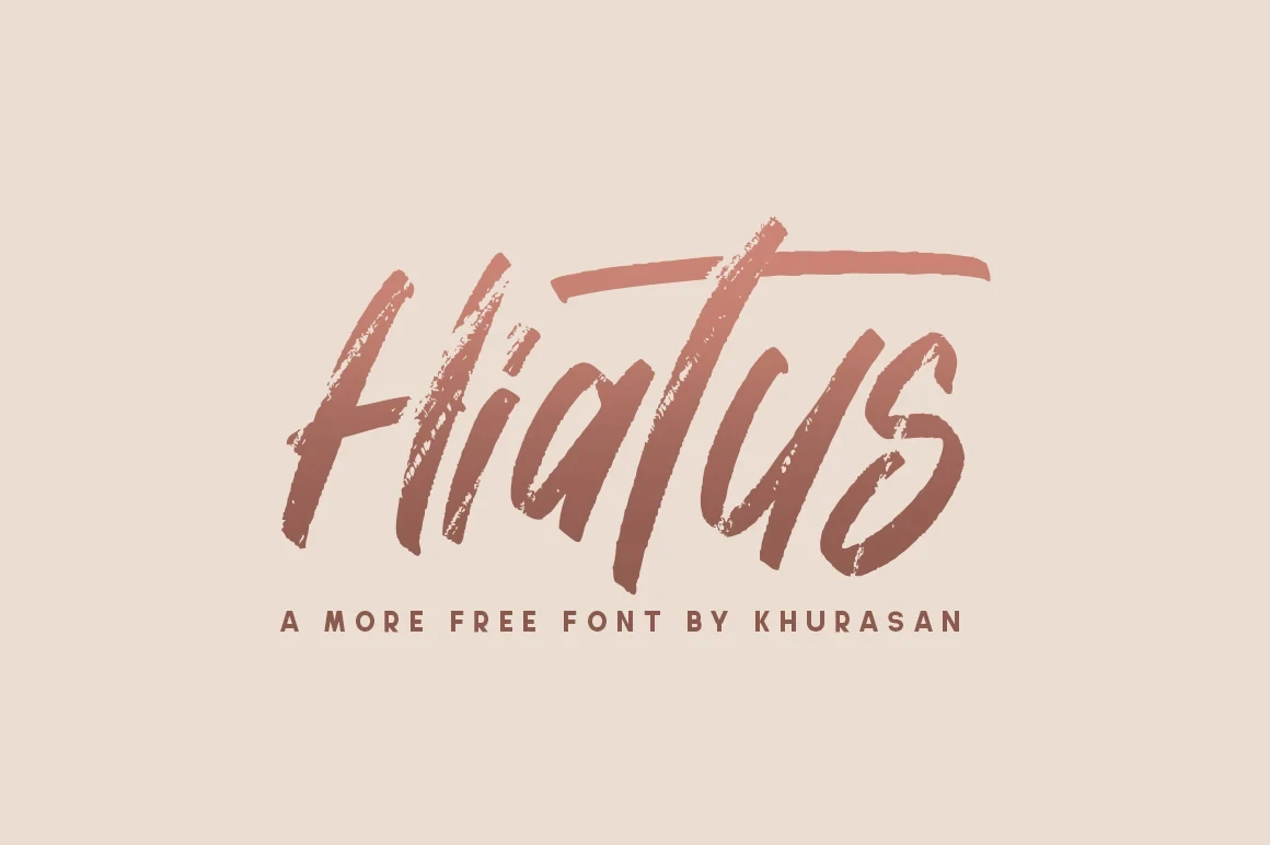
Best For: logos, branding, display text
Hiatus Font pairs a clean contemporary construction with connected, brush-like movement. Its expressive rhythm feels current while remaining most useful for concise logos, brand names, and display lines where the joins can stay visually distinct.
Mueband Font

Best For: logos, modern designs, high-end designs
Mueband Font gives Cursive Fonts for Logos a fluid contemporary character through moderate contrast, connected lettering, and energetic terminal swashes. The rightward slant adds movement, but its flourishes are most effective in prominent marks and display headings rather than reduced text.
Brittany Signature Script Font

Best For: logos, minimal designs, posters
Brittany Signature Script Font has the clearest signature-style fluidity here, using monoline connected letters and a pronounced rightward slant. Its flowing joins suit large logos, posters, and minimal marks, while reduction can make the connections less distinct.
Ornate Slanted Calligraphy
Pronounced slants, connected loops, high contrast, and extended flourishes define this formal calligraphic group. It is more decorative and scale-dependent than the contemporary category, with details intended to command attention in large marks.
Zephan Font
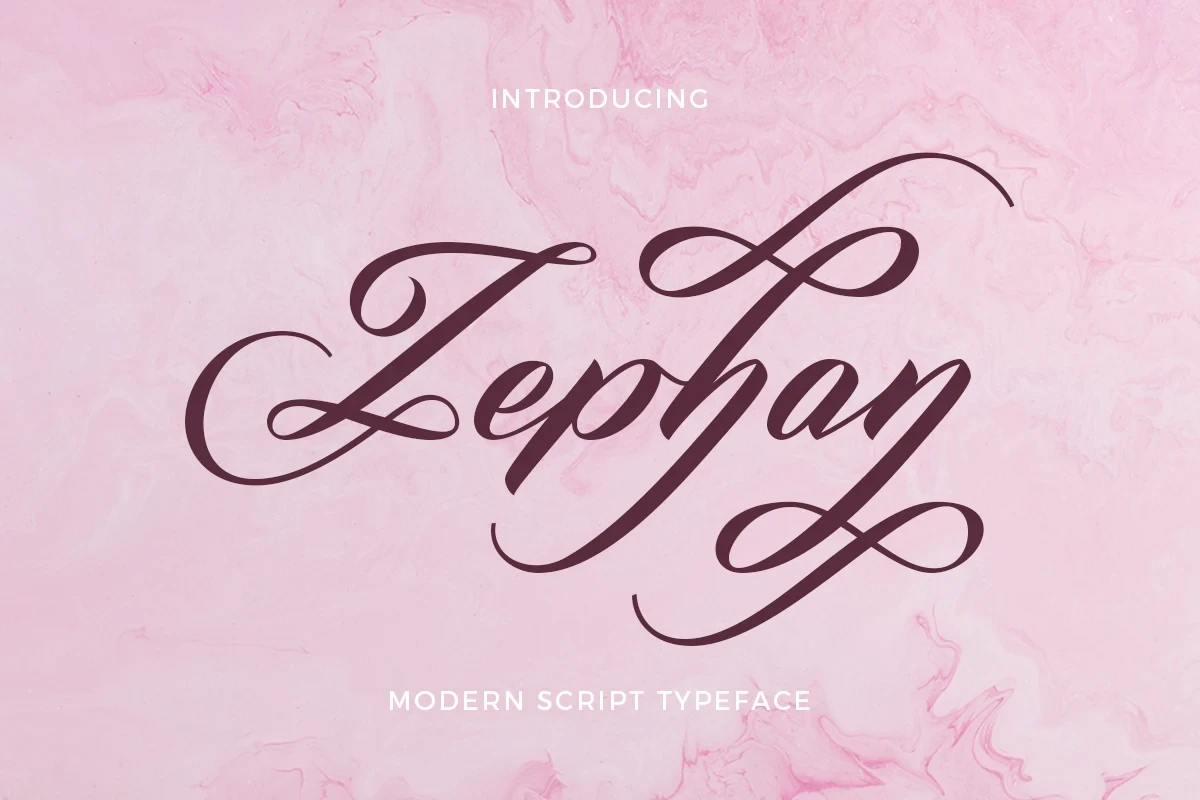
Best For: logos, product labels, elegant designs
Zephan Font creates a distinctly decorative profile through pronounced loops, extended ornamental swashes, and a strongly slanted flow. Its high-contrast connected construction is best reserved for large logos, product labels, and headers rather than compact text.
Gastonia Script Font
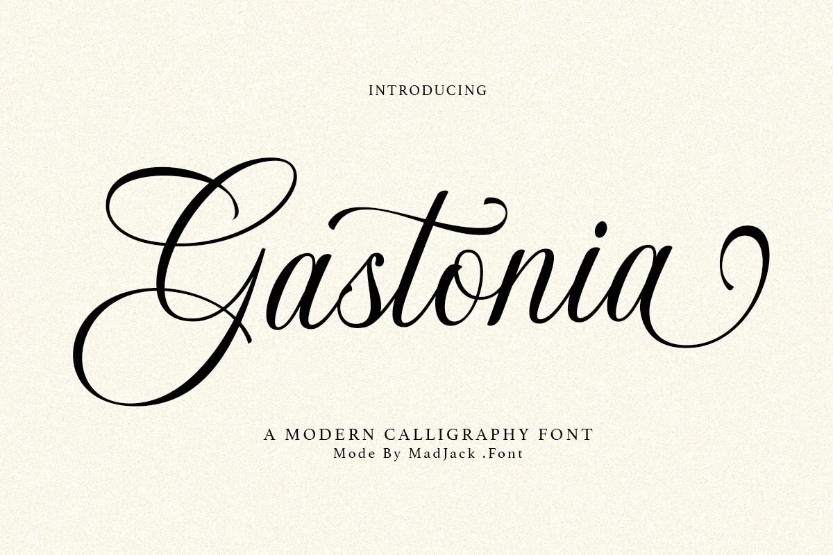
Best For: logos, branding, packaging
Gastonia Script Font uses exaggerated connected loops and a clear right-leaning axis for formal brand lettering. Its flourishes read most reliably in large logos, packaging, and other display settings, not small or extended text.
Alanta Font

Best For: logos, display text, minimal designs
Alanta Font combines flowing, interconnected forms with pronounced swashes and an italicized slant. The connected or mixed joins add movement, while the looping details require display scale; it works particularly well when a logo needs expression without relying on dense supporting text.
Calestine Calligraphy Font

Best For: logos, product labels, clean designs, elegant designs
Calestine Calligraphy Font builds a formal display signature from connected cursive structure, rightward slant, high contrast, and decorative loops. It can anchor a large heading or product mark, though smaller applications may lose clarity around its intricate flourishes and joining strokes.
High-Contrast Display Swashes
These display styles push contrast, swashes, and baseline variation further, creating especially expressive lettering. Their complex thin strokes and loops distinguish them from the cleaner connected forms and demand generous size for readable results.
Basskia Font
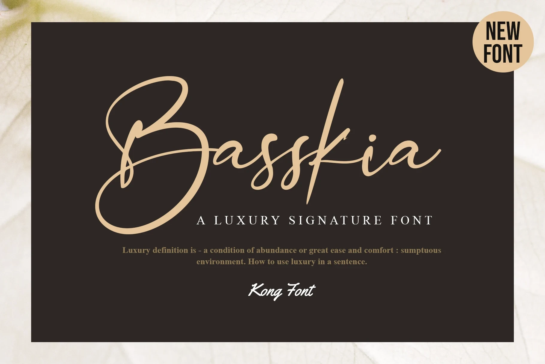
Best For: logos, creative projects, display text, headlines
Basskia Font suits large Cursive Fonts for Logos treatments that need a signature-like finish. Strong thick-to-thin contrast, elongated loops, connected letters, and a varying baseline create personalized movement, but thin strokes and complex swashes lose clarity when reduced.
Together Font

Best For: logos, branding, invitations, product labels
Together Font combines heavy weight, high thick-to-thin contrast, connected cursive forms, and calligraphic swashes with a varying baseline. That expressive construction favors large logos, invitations, and product labels where visual impact matters more than compact reading comfort.
How to Choose the Right Font
Choose connected, heavier options when a short name must hold its shape clearly, and move toward slanted calligraphy when loops and flourishes are part of the identity. For Cursive Fonts for Logos, test every candidate at its intended size: high contrast, thin strokes, and elaborate joins often need generous scale, while simpler connections remain easier to read.