
20 Best Wedding Cursive Fonts in 2026
This collection spans high-contrast scripts with sweeping flourishes, even monoline lettering, upright variations, and textured or mixed details. These Wedding Cursive Fonts are suited to invitation names, stationery headers, logos, packaging titles, social graphics, and other short display applications where connected movement can remain readable.
Looking for more cursive fonts? Browse our complete Cursive Fonts collection to compare modern, bold, wedding, logo-friendly, and Cricut-ready cursive styles.

Wedding Cursive Fonts: Flourished Formal Scripts
These Wedding Cursive Fonts emphasize slanted, high-contrast construction, pronounced joins, and extended flourishes. They create formal display presence, but their detail generally requires generous sizing and short wording.
Auralique Demo Font
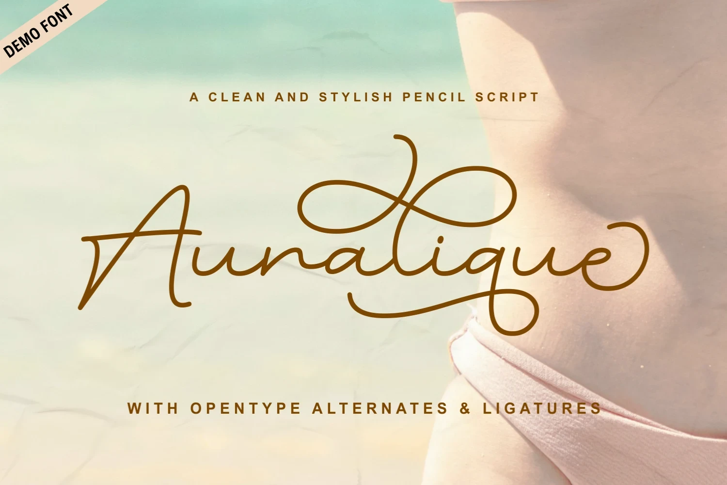
Best For: decorative designs, artistic designs
Auralique Demo Font combines pencil-like texture with connected, high-contrast strokes and extensive swashes. These Wedding Cursive Fonts work best at large sizes for a title or wordmark, while the complex joins make extended copy impractical.
Calestine Calligraphy Font

Best For: display text, decorative designs
Calestine Calligraphy Font drives the eye along an angled cursive path, then finishes with ornamental initial and terminal strokes. Its high contrast and flourishes need generous display sizing so the connected lettering remains distinct.
Evelyne Font
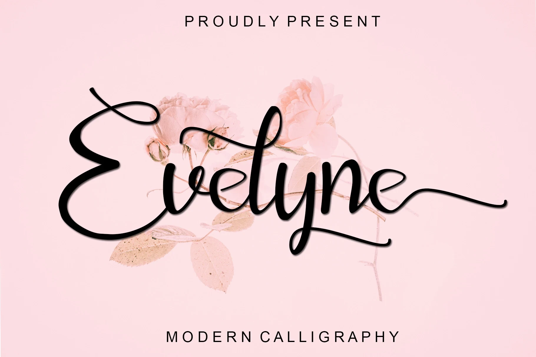
Best For: display text, clean designs
Evelyne Font pairs fluid, high-contrast connections with a notably elongated final-e terminal. The mixed joins create a distinctive wordmark, but its thin connectors and extended ending can lose definition when reduced.
Wedding Enchanting Font
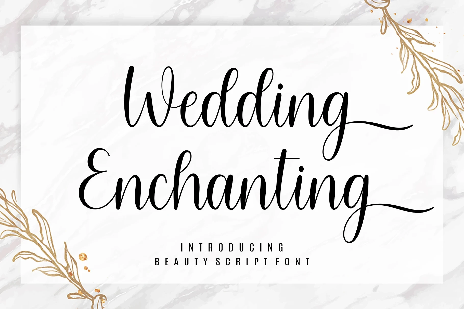
Best For: high-end designs, clean designs
Wedding Enchanting Font brings organic loops and broad end swashes to stationery headers. Its calligraphic flow gives Wedding Cursive Fonts a strong ceremonial presence, but intricate joins should be given large sizes to preserve clarity.
Elatina Font
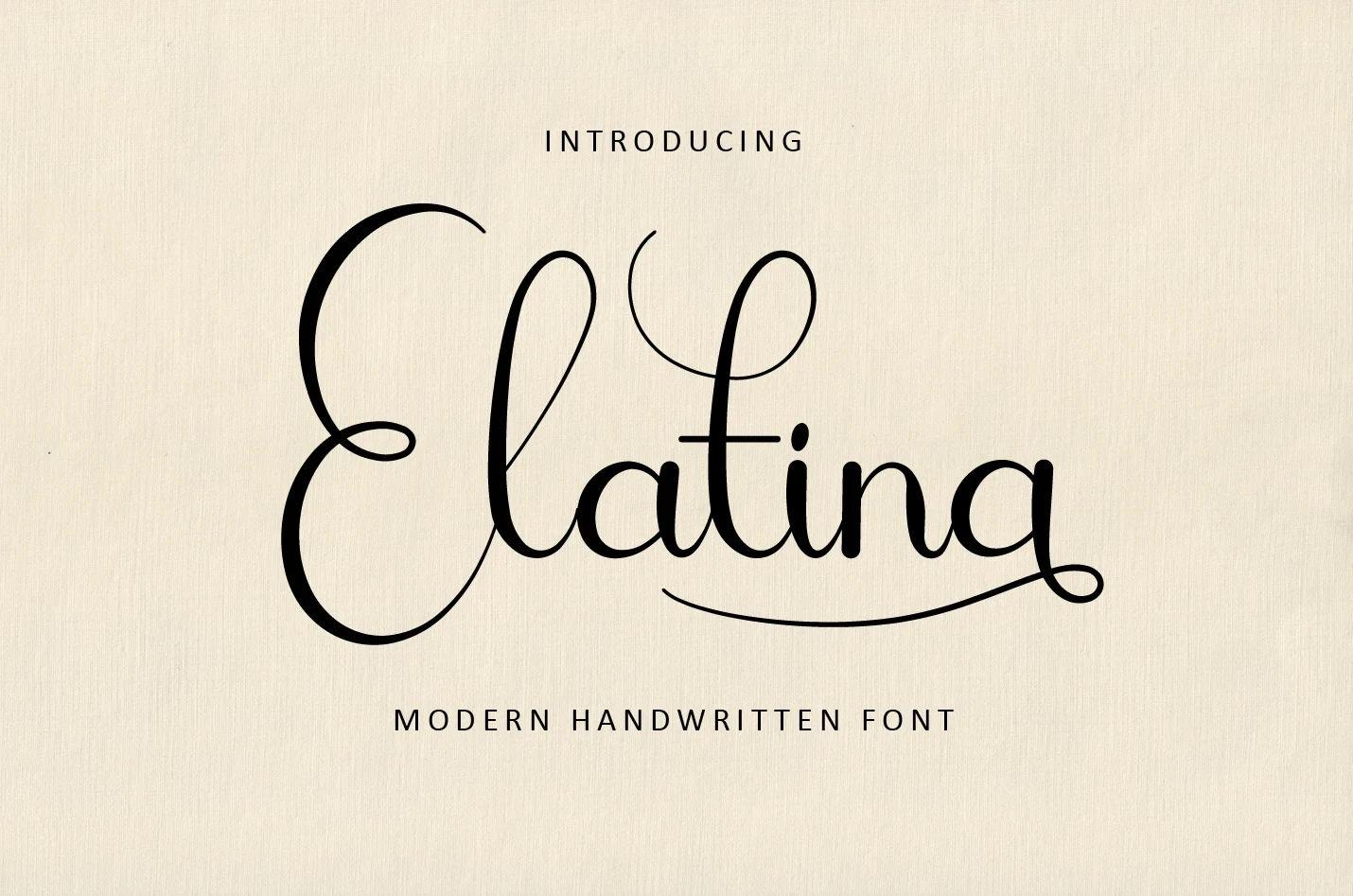
Best For: modern designs, decorative designs, elegant designs
Elatina Font extends connected lettering with flowing organic curves, swashes, and noticeable stroke contrast. It gives titles and branding a fuller silhouette, but the ornamental treatment is better reserved for short display wording than passages.
Angista Script Font

Best For: website headers, modern designs, elegant designs
Angista Script Font frames its word with prominent swashes on the opening and closing letters. The rightward slant adds energy to headers and marks, while its high contrast makes small applications difficult to read.
Alanta Font

Best For: wedding designs, decorative designs
For invitation titles, Alanta Font uses heavy calligraphic strokes and conspicuous swashes on the initial A and final a. Its strong rightward movement creates impact, but the varying weight and flourishes depend on larger sizing.
Elizabeth Font
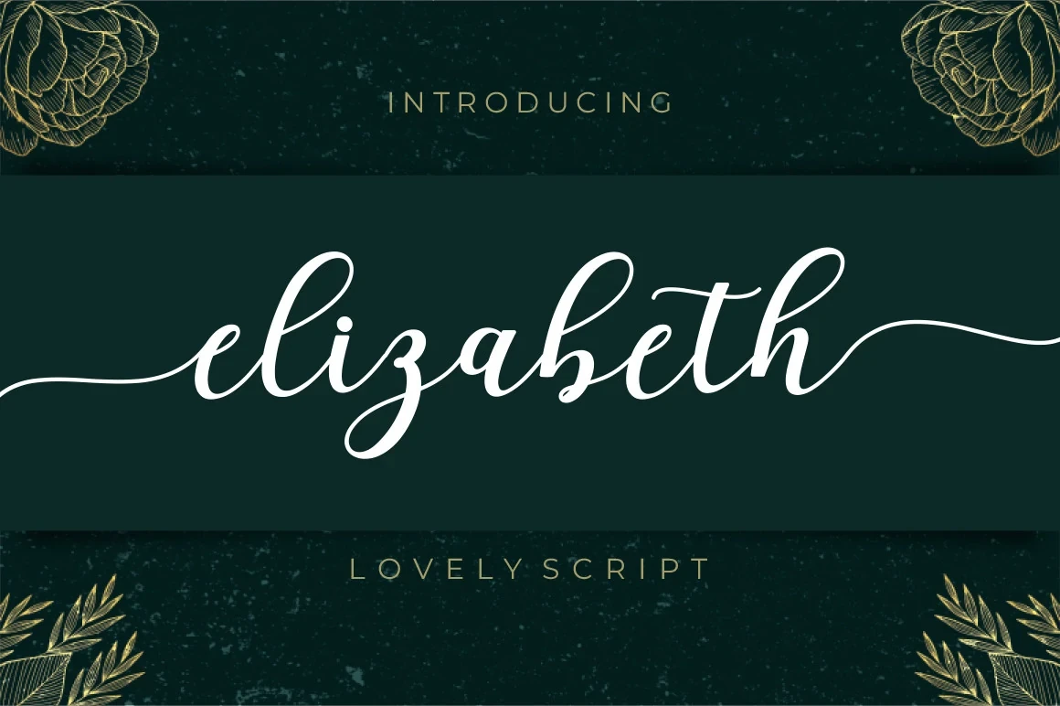
Best For: display text, minimal designs, clean designs
Elizabeth Font pushes right-leaning connected forms into long trailing flourishes. The result creates a clear invitation or logo silhouette, but those extended strokes can become cumbersome when wording grows dense.
Mullia Font
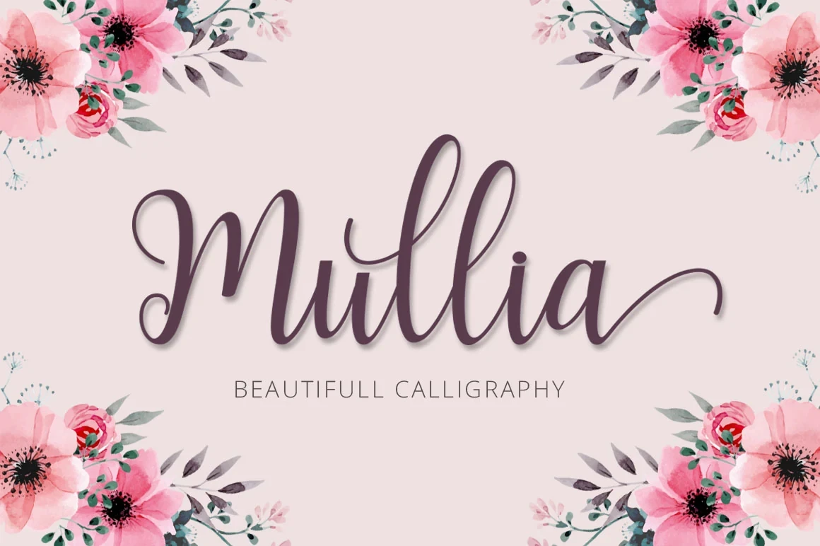
Best For: invitations, social media graphics, display text
Mullia Font adds terminal loops and extended flourishes to a right-leaning connected structure. Those loops make short invitation lines and social graphics distinctive, although the high contrast and detailed endings require generous sizing.
Cleopatra Font
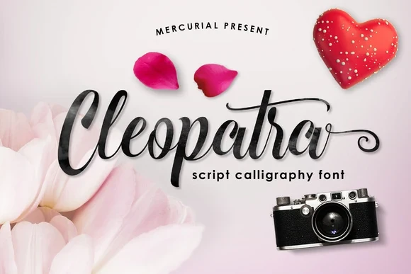
Best For: high-end designs, clean designs, elegant designs
Cleopatra Font intensifies directional movement through a slanted baseline, rightward orientation, and high-contrast joins. It suits signatures, titles, and invitations, while thin connection strokes can disappear in compact layouts.
Zephan Font
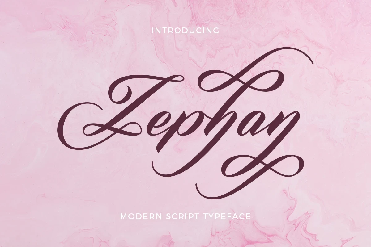
Best For: elegant designs, classic designs, decorative designs
For a large formal mark, Zephan Font combines a pronounced rightward slant with extensive swashes and high contrast. Its connected structure creates strong title lettering, but the flourishes make it unsuitable for body text.
Gastonia Script Font

Best For: branding, packaging, invitations
Gastonia Script Font combines heavy high-contrast strokes with a strongly slanted, flowing axis. Its pronounced swashes give Wedding Cursive Fonts impact on invitations and packaging titles, but dense paragraphs will lose readability.
Continuous Monoline Cursive
Even monoline strokes, rounded terminals, and continuous joins give this group a steadier rhythm. Compared with the flourished scripts, these designs feel simpler and more approachable for names and compact branding.
Callifornia Font

Best For: wedding designs, personal branding
Callifornia Font uses monoline connected lettering, an irregular baseline, and a distinctive lowercase-f tail. Its informal movement suits wedding names and personal branding, though the fully connected structure still calls for display sizing.
Meredith Font

Best For: wedding designs, personal branding
Meredith Font keeps its connected rhythm even through monoline strokes, rounded terminals, and a slight rightward slant. It suits names and personal branding when kept at a readable display scale.
Mama Font

Best For: logos, invitations, business cards
Mama Font links the beginning and end of a word with one continuous horizontal swash. These Wedding Cursive Fonts benefit from its alternate characters for logos and invitations, but the fully connected construction needs display scale.
Joseph Sophia Font

Best For: business cards, logos, invitations, quotes
Joseph Sophia Font combines monoline connected letters with rounded terminals and flourished entry and exit strokes. These Wedding Cursive Fonts have a clear silhouette for short names, logos, and quotes, but crowded wording reduces their advantage.
Expressive Flow and Mixed Details
This varied group introduces upright axes, ink texture, and dramatic opening or closing swashes. Its mixed details create more expressive personalities than the consistently structured formal and monoline categories.
Ayshana Script Font

Best For: logos, branding, quotes, eye-catching designs
For short logos, quotes, or other eye-catching designs, Ayshana Script Font offers connected slanted letters with monoline loops that create an even rhythm. Its PUA-encoded characters add decorative alternatives, although the elaborate primary style is firmly display-oriented.
Sweater Font

Best For: display text, wedding designs, clean designs
Sweater Font stands apart with an upright axis rather than the collection's more common slant. Variable weight adds display character, while rounded terminals maintain a casual tone; use it large enough for each connection to remain clear.
Bridgetown Font

Best For: expressive designs, decorative designs, clean designs
Bridgetown Font interrupts connected pen-pressure strokes with an integrated ink-splatter texture. The irregular surface adds spontaneous character to headings, though thin connectors and splatters may muddy the lettering when reduced.
Together Font
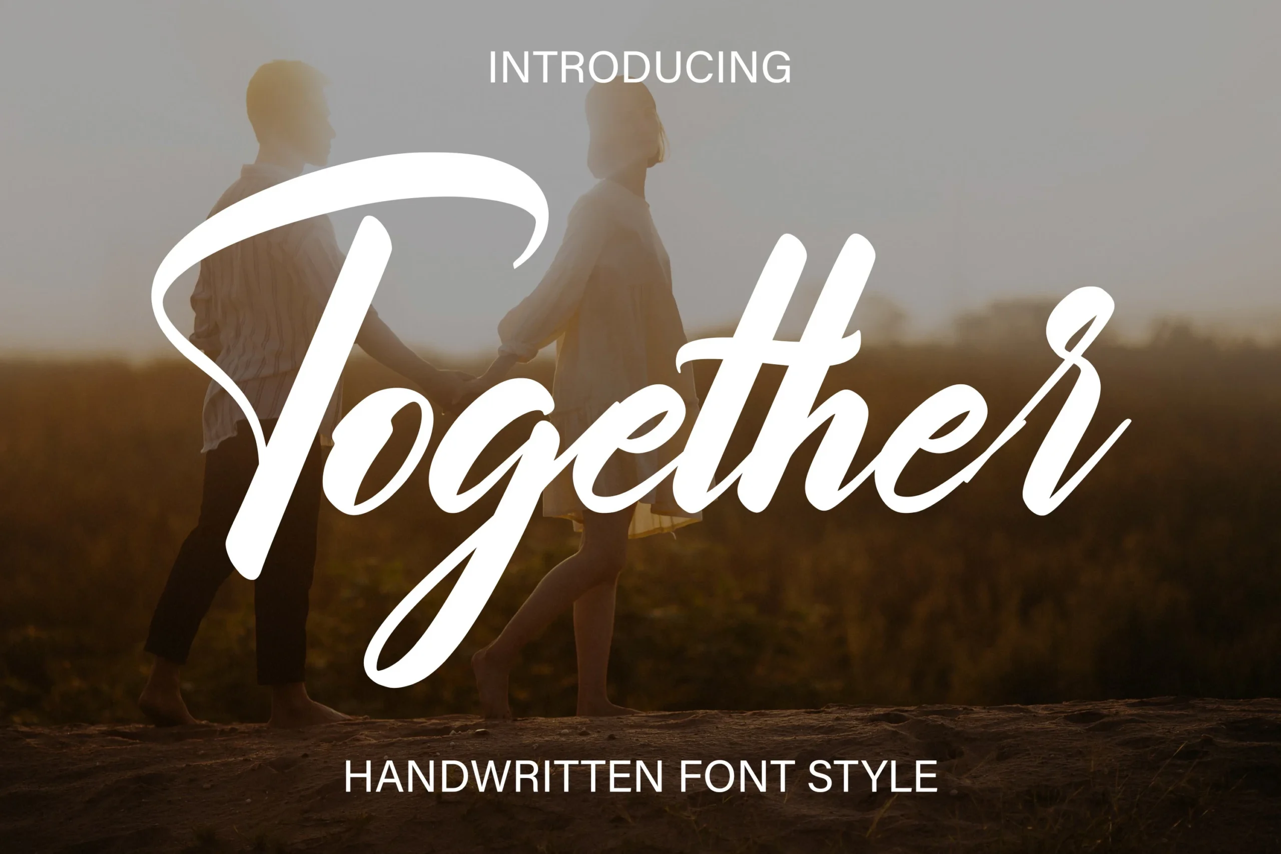
Best For: logos, branding, invitations
For names and invitations, Together Font creates a pronounced opening-and-closing arc through sweeping swashes on the uppercase T and terminal r. Its high-contrast connected forms are striking at display size, but the decorative ends reduce small-scale clarity.
How to Choose the Right Font
Choose by construction first: monoline options offer steadier joins, while high-contrast designs create stronger formal emphasis. Check flourishes and connector thickness at the final size, reserving elaborate Wedding Cursive Fonts for short names, titles, and marks rather than body copy. Upright or textured choices can add contrast when a slanted script feels too expected.


