28 Best Modern Branding Fonts in 2026
This collection moves from wide, high-contrast serifs and geometric display faces to swash-heavy signatures, ligature-rich forms, and a script-and-serif pairing. These Modern Branding Fonts are built for logos, packaging, website headers, labels, campaigns, and other identity-led applications where construction matters.
Looking for more branding fonts? Browse our complete Branding Fonts collection to compare modern, elegant, boutique, luxury, and beauty branding styles.
Modern Branding Fonts
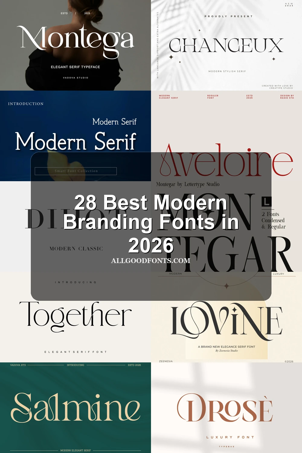
These Modern Branding Fonts favor upright, wide, geometric serif structures with open counters and restrained detailing, offering clearer identity systems than the more ornamental groups.
De Floria Font

Best For: branding, display text, modern designs
Pointed serifs and sweeping ascenders and descenders give De Floria Font a delicate, highly recognizable outline. Its open counters keep large logos and headers readable, while the fine contrast is better reserved for display text than body copy.
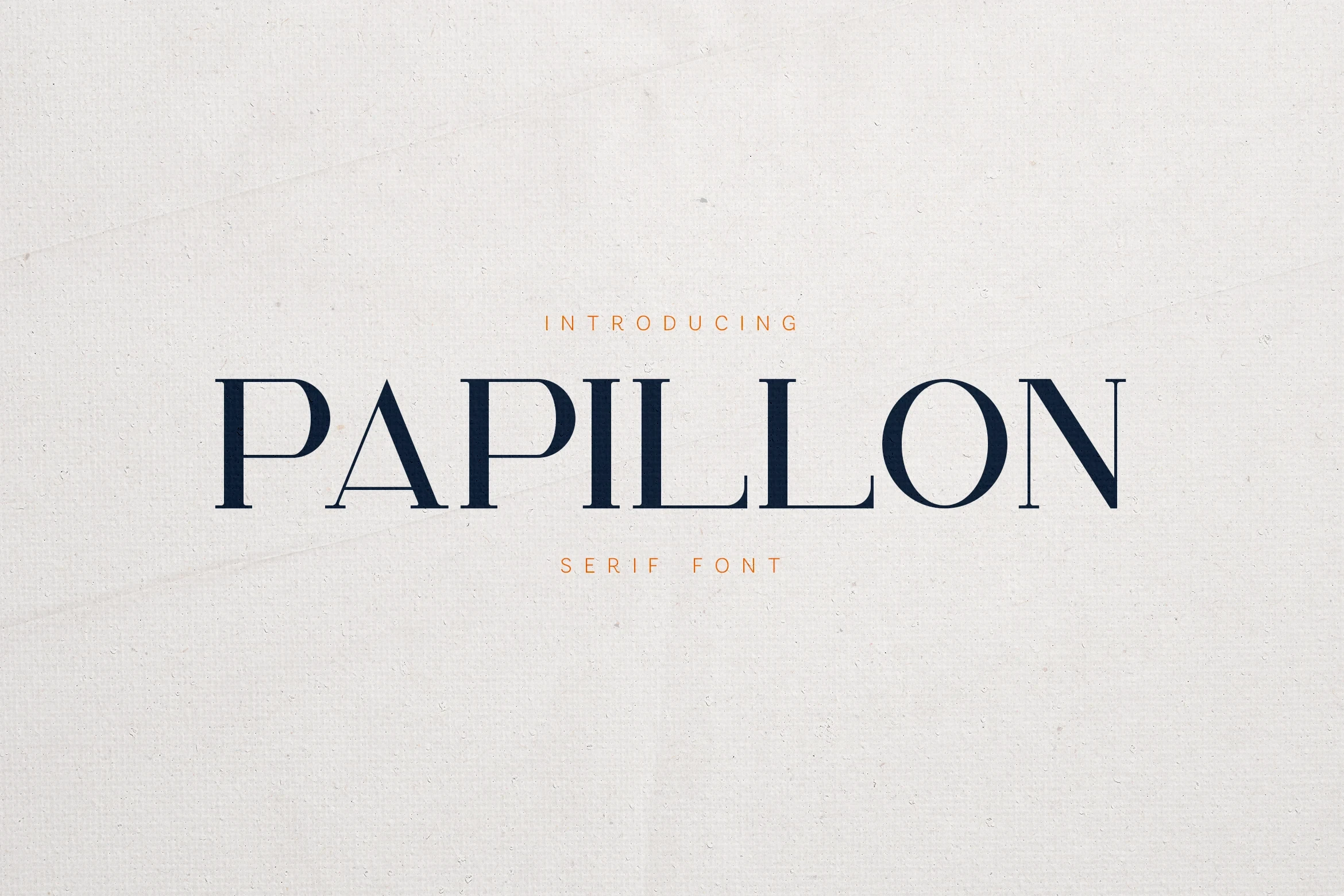
Papillon Serif – Elegant Modern Luxury Font
Best For: branding, product labels, display text
Papillon Serif – Elegant Modern Luxury Font combines wide geometric proportions, wedge-shaped serifs, and open rounded counters. It gives branding and product labels a composed upright silhouette, although its refined hairlines need display scale rather than tiny copy.
Sorento Regular Font

Best For: branding, packaging, website headers
For website headers and packaging, Sorento Regular Font offers a restrained display serif with minimal slant, open O and R counters, and sharp serifs. Its clarity is comparatively strong, yet thin strokes still need larger settings.
Grandeur – Elegant Classic Serif Font
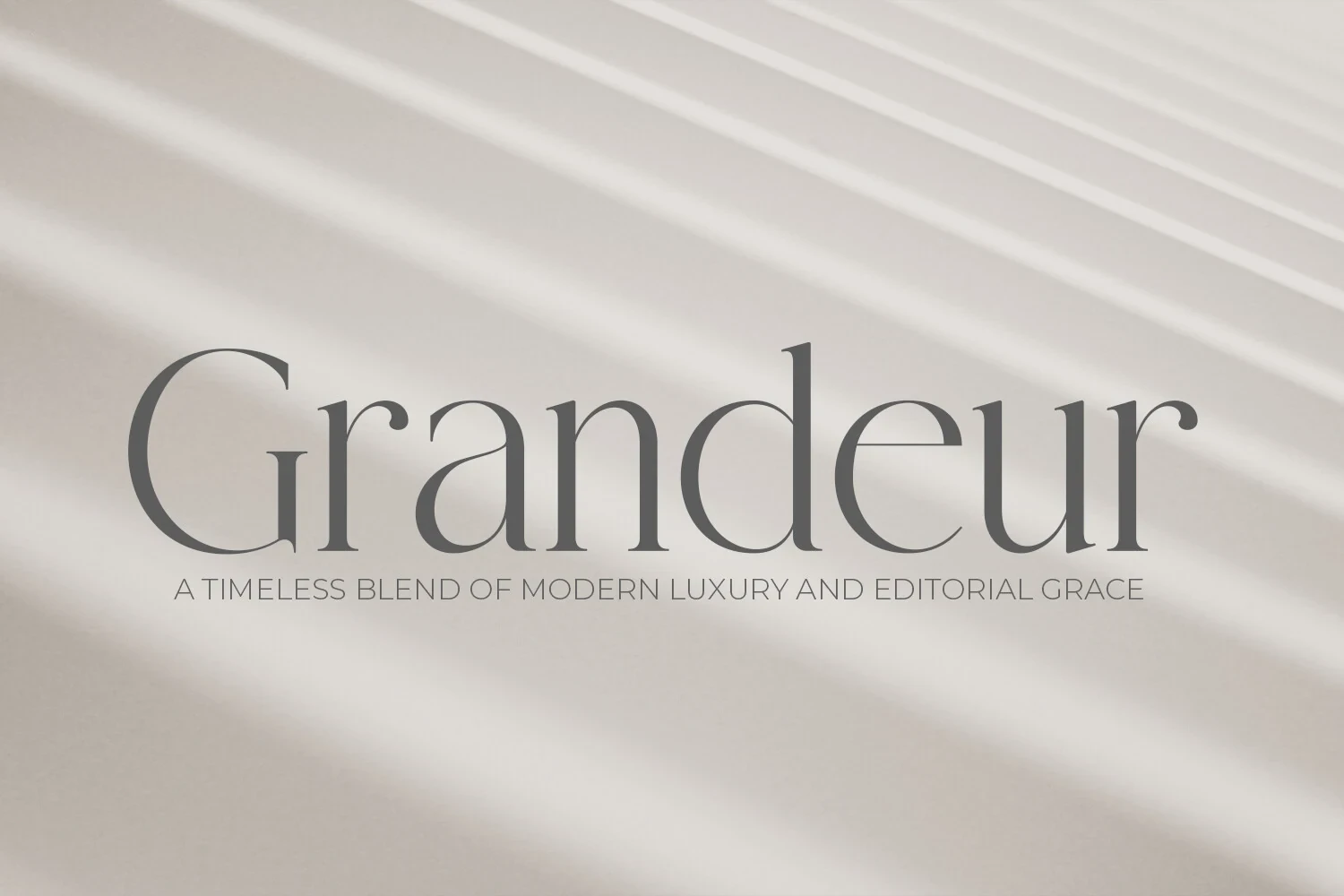
Best For: branding, display text, modern designs
Grandeur – Elegant Classic Serif Font combines wide upright proportions with fluid lowercase curves, producing a polished and authoritative identity silhouette. It works for branding and display text, while delicate strokes restrict small supporting copy.
Chanceux Modern Stylish Serif Font
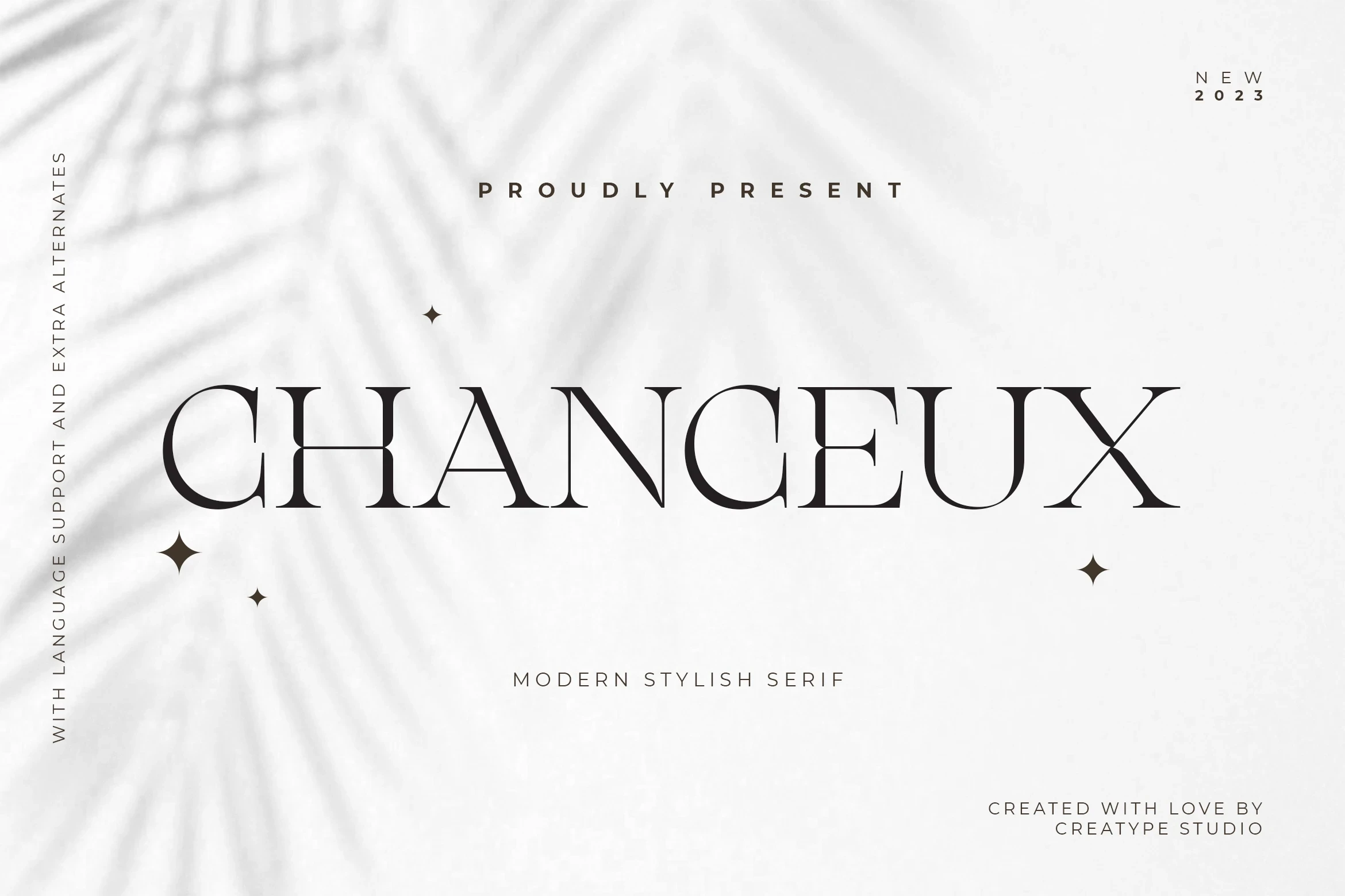
Best For: branding, high-end designs, display text
Chanceux Modern Stylish Serif Font stands apart through geometric width and an engineered upright presence rather than decorative swashes. Its clear large-scale structure suits branding and labels, but high contrast can weaken at very small sizes.
Modern Serif Font
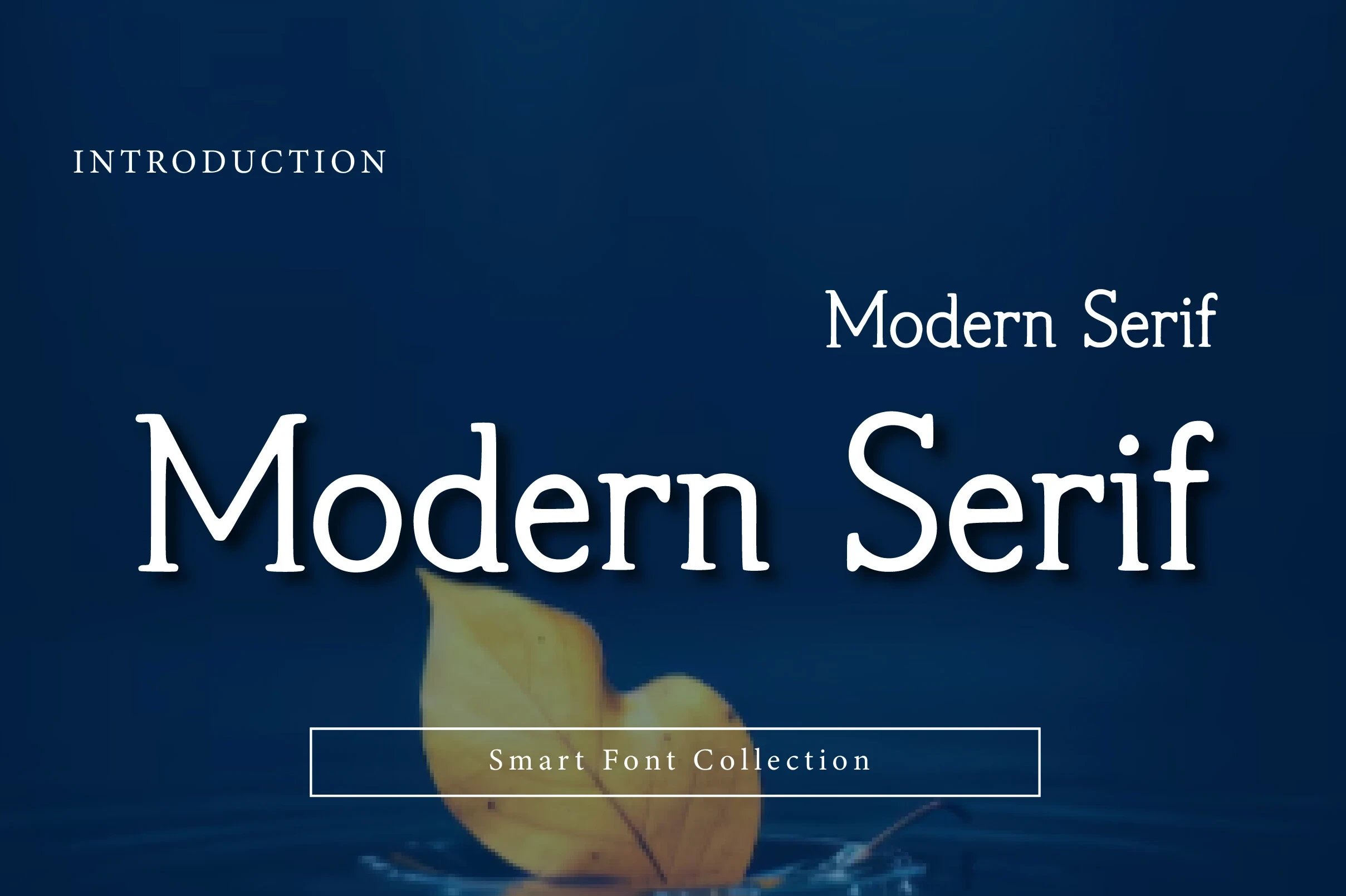
Best For: branding, product labels, display text
For product labels and editorial-style branding, Modern Serif Font balances sharp elongated serifs with generous spacing and open counters. The openness supports large names, though its fine high-contrast strokes should not carry compact text.
Ethereal Font
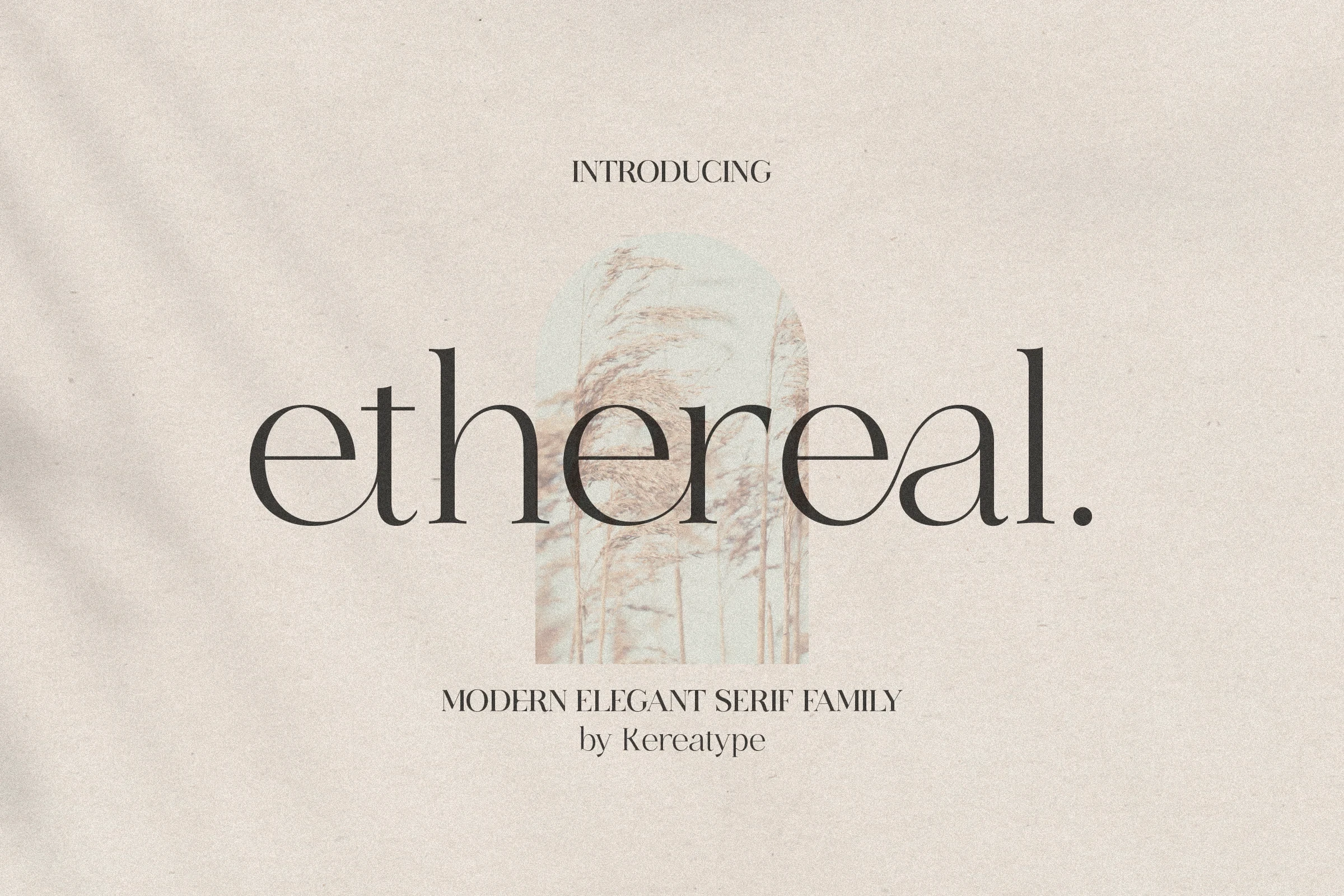
Best For: branding, display text, clean designs
Ethereal Font creates a tall, quiet profile through elongated vertical proportions and a fluid lowercase l tail. Its clean brand headings remain readable at display scale, while delicate strokes make small applications less reliable.
Dihot Font

Best For: branding, website headers, display text
Dihot Font uses a tall uppercase presence, sharp horizontal serifs, and a strong vertical axis. It suits website headers and identity statements, but its thin strokes can disappear when the lettering is reduced.
Ornamental Serif Signatures
This group is connected by visible swashes, ligatures, alternate forms, and signature terminals. It creates more decorative wordmarks than the cleaner structural serif styles.
Aveloire Font
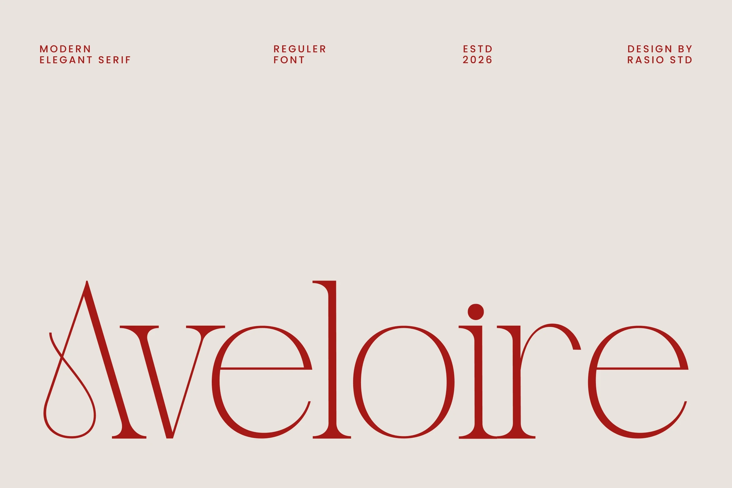
Best For: branding, headlines, fashion branding
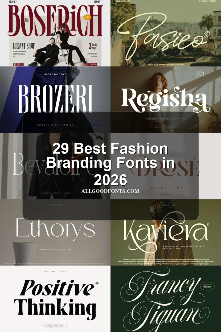
Aveloire Font is defined by a teardrop-shaped swash on the capital A, set against sharp serifs and open counters. That gesture gives branding and headlines a clear signature, but the detail needs generous sizing to remain legible.
Lovine Font
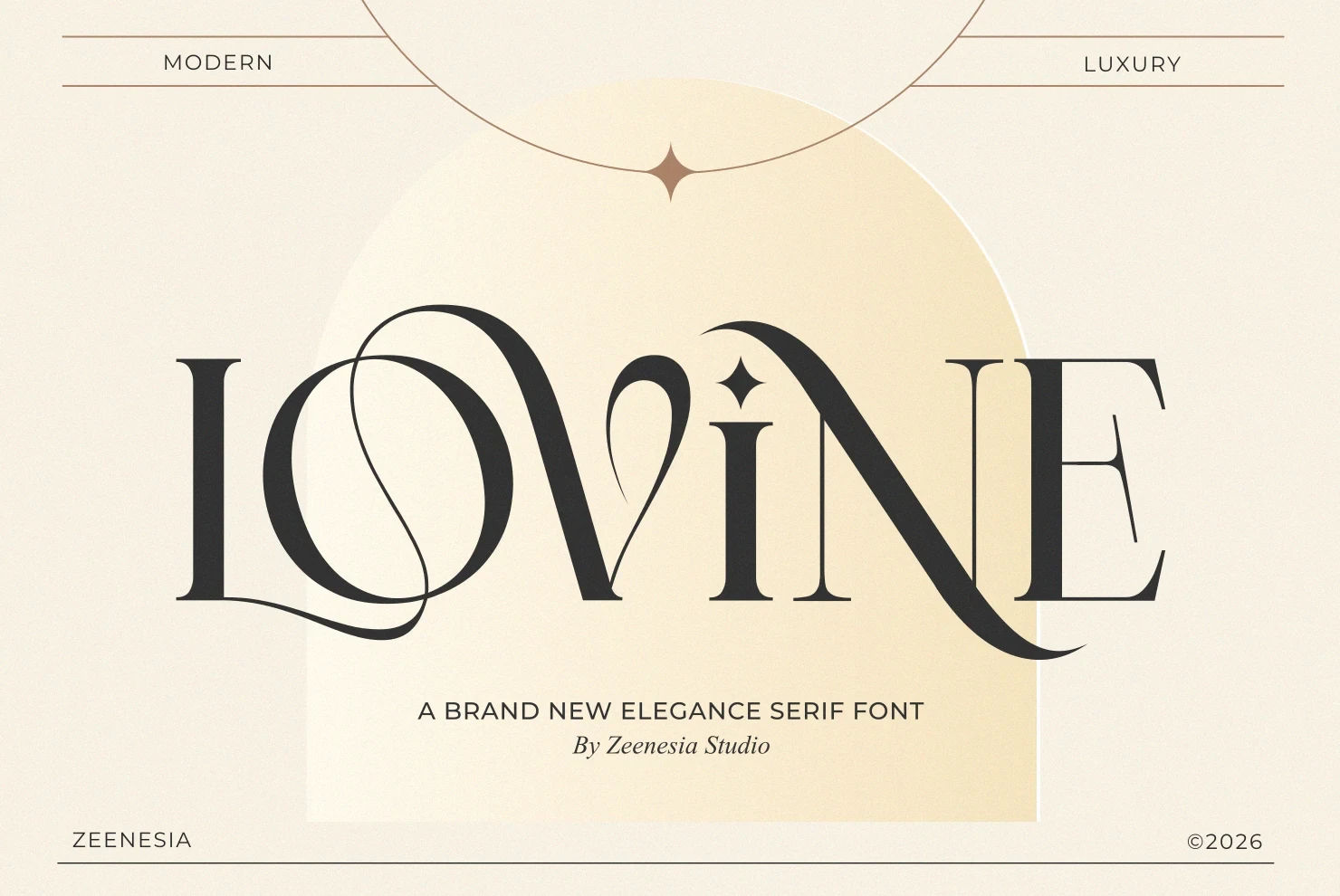
Best For: branding, beauty branding, display text
Lovine Font turns its serif structure into a decorative sequence through swash connections, flared serifs, and a star-shaped i dot. It is especially effective for beauty branding and short wordmarks; complex joins make long text harder to scan.
Montega Font

Best For: logos, branding, fashion branding
For logos and fashion branding, Montega Font supplies sweeping swashes on the M and a, with unusually thin hairlines creating strong movement. The fluid construction reads clearly at large sizes but needs careful control in smaller applications.
Astrid Font
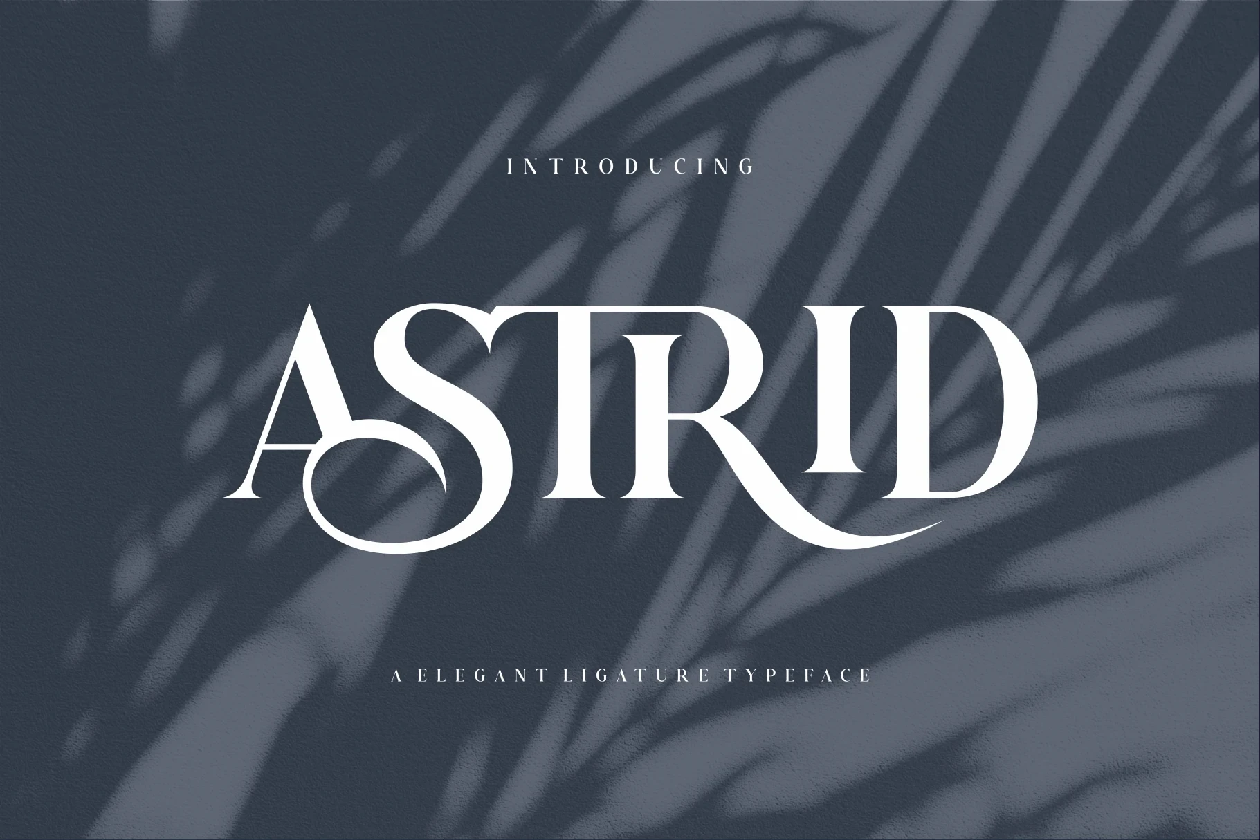
Best For: branding, display text, modern designs
Astrid Font adds decorative connections and swash-like S and R terminals to sharp serif forms. Those connected gestures make branding and title treatments distinctive, but they compromise readability when the lettering is reduced or used in longer text.
Salmine Font

Best For: branding, display text, modern designs
Salmine Font uses custom swash forms and ligatures to extend selected letters into fluid connectors. The altered forms make short branding lines and display text distinctive, but they can interrupt quick reading when the wordmark becomes too long.
Stanza Font
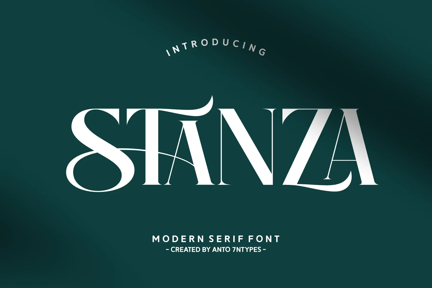
Best For: branding, posters, social media graphics
For posters and social media graphics, Stanza Font combines extended horizontal serifs, swooping terminals, and complex letter variations. Its ornamental range creates expressive branding treatments, but the high contrast and flourishes make body copy unnecessarily difficult.
Aretha Font
Best For: branding, beauty branding, fashion branding
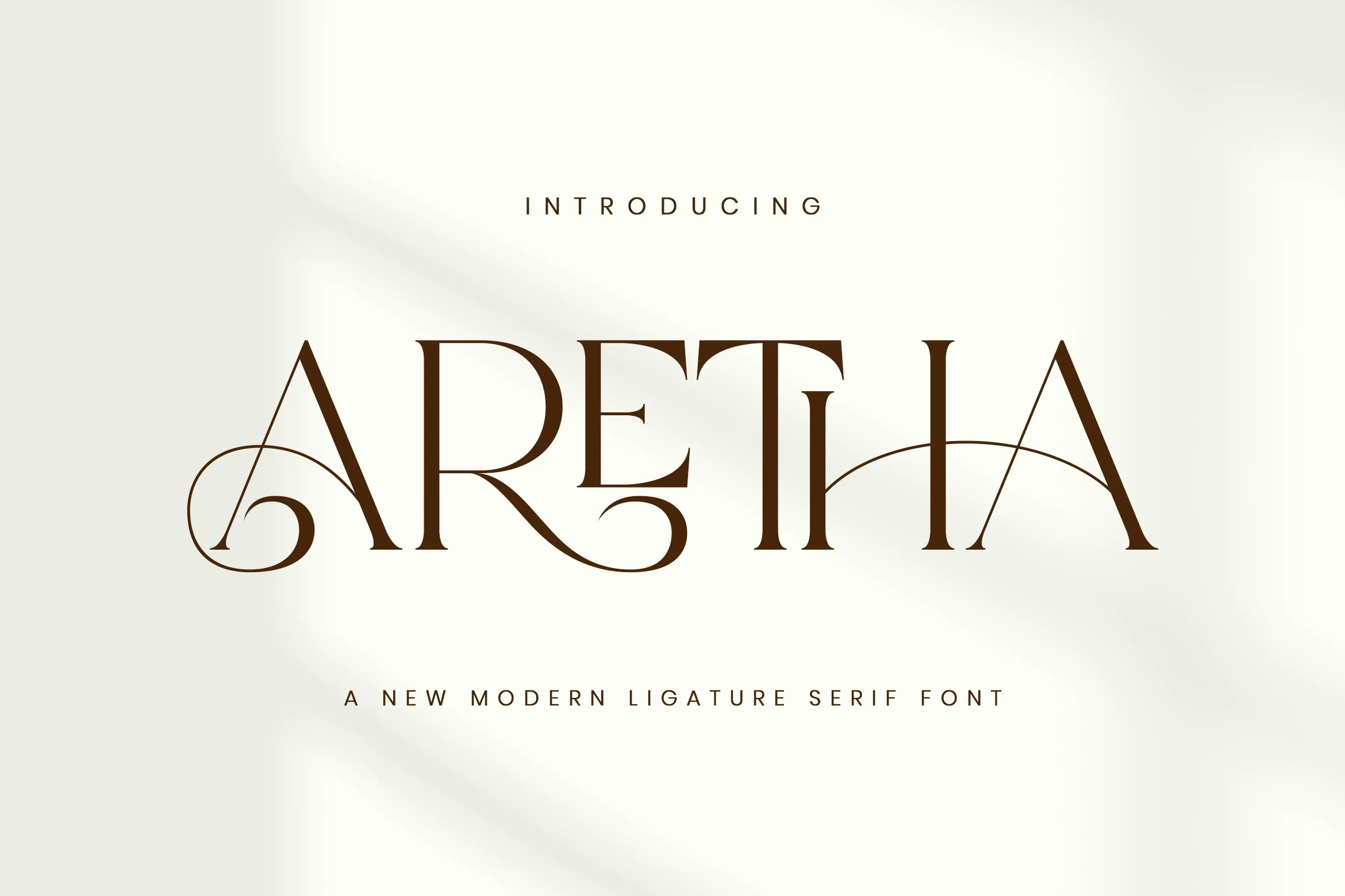
Aretha Font centers its display character on an arched T-H-A ligature, supported by swash terminals and fine serif details. The connected flourish can anchor beauty and fashion branding, while large sizing keeps the joins readable.
Grinola Font
Best For: branding, packaging, beauty branding
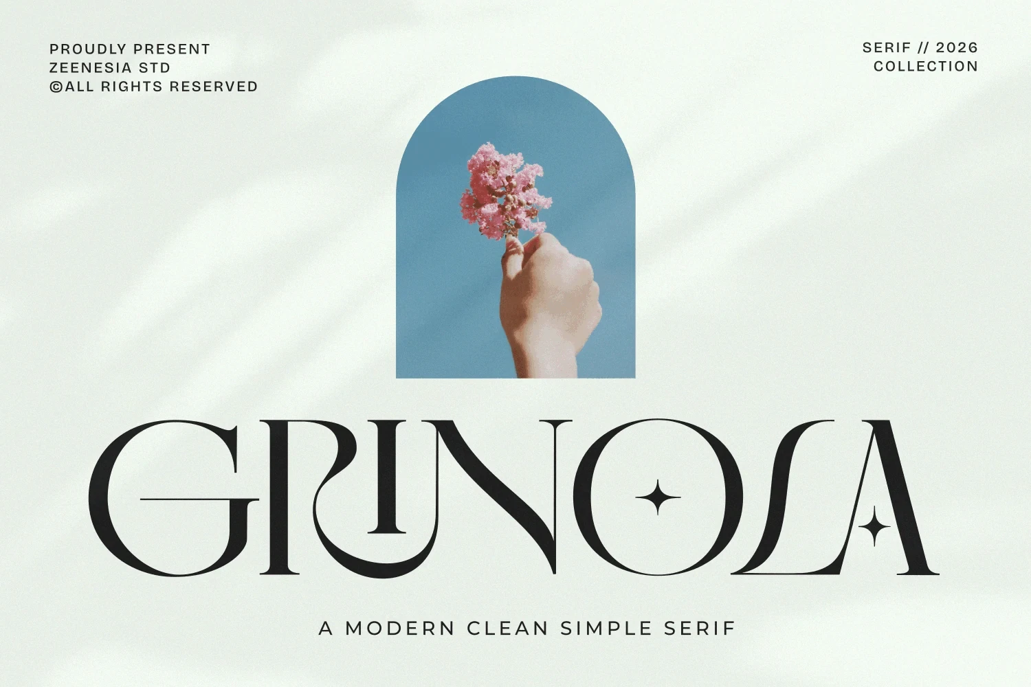
Grinola Font builds recognition through a four-pointed star inside the O, joined by flowing G and R swashes and sharp triangular serifs. The emblem-like detail strengthens packaging and beauty branding, but the decorative edges need room.
Nirain Font
Best For: branding, display text, modern designs
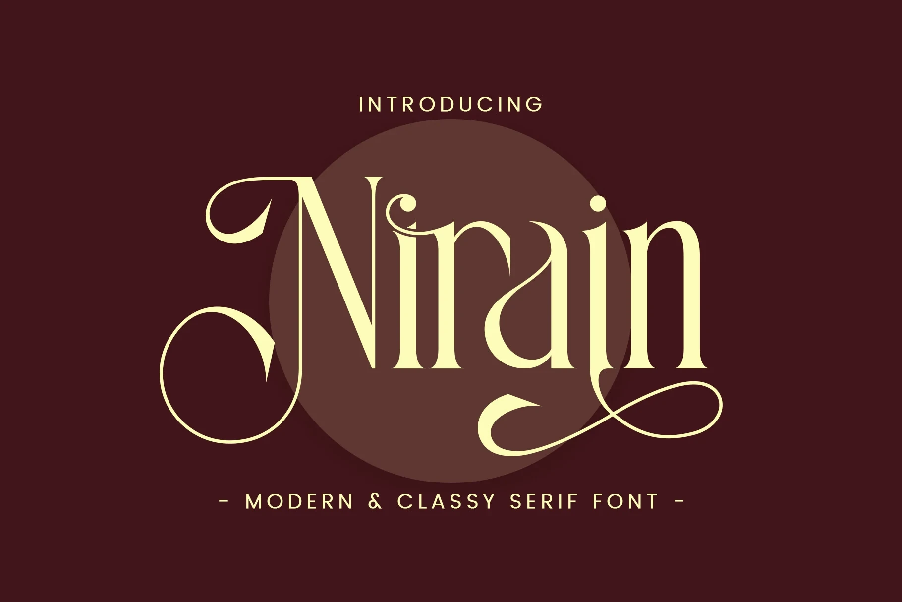
Nirain Font keeps an upright posture while adding swash terminals to the uppercase N and lowercase n. That controlled contrast works for branding and display text, though the terminal details lose clarity quickly at small sizes.
Kisvo Font
Best For: branding, invitations, fashion branding
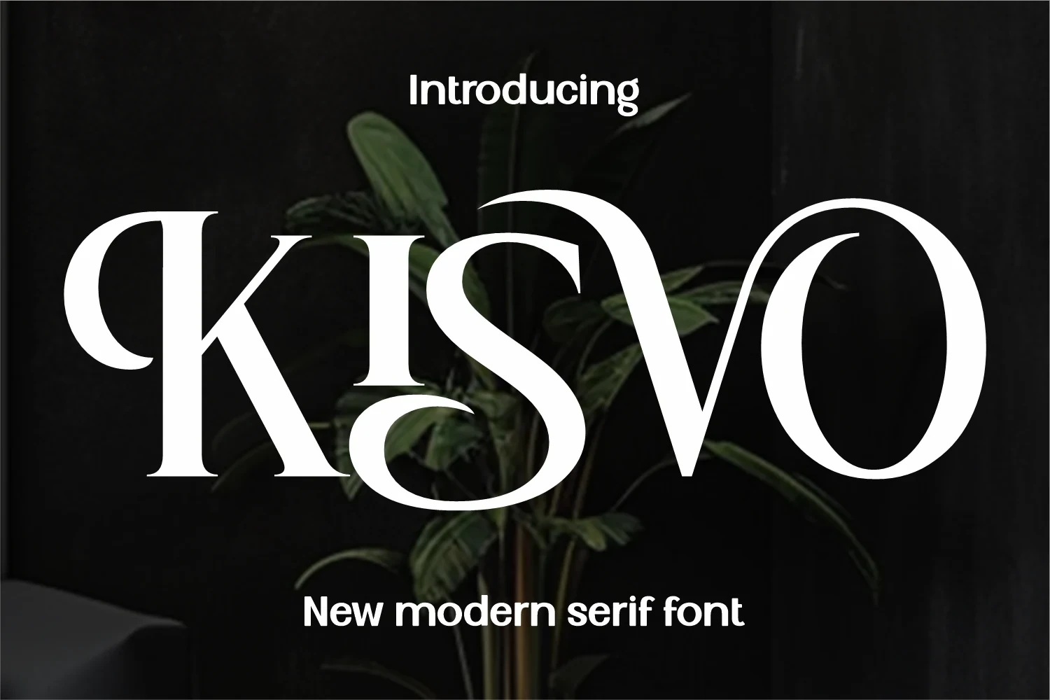
Kisvo Font creates its strongest movement through elaborate K and S swashes within an upright, high-contrast serif. Those flourishes suit fashion branding, logos, and invitations, while the interconnected shapes are unsuitable for sustained reading.
Vogane Font
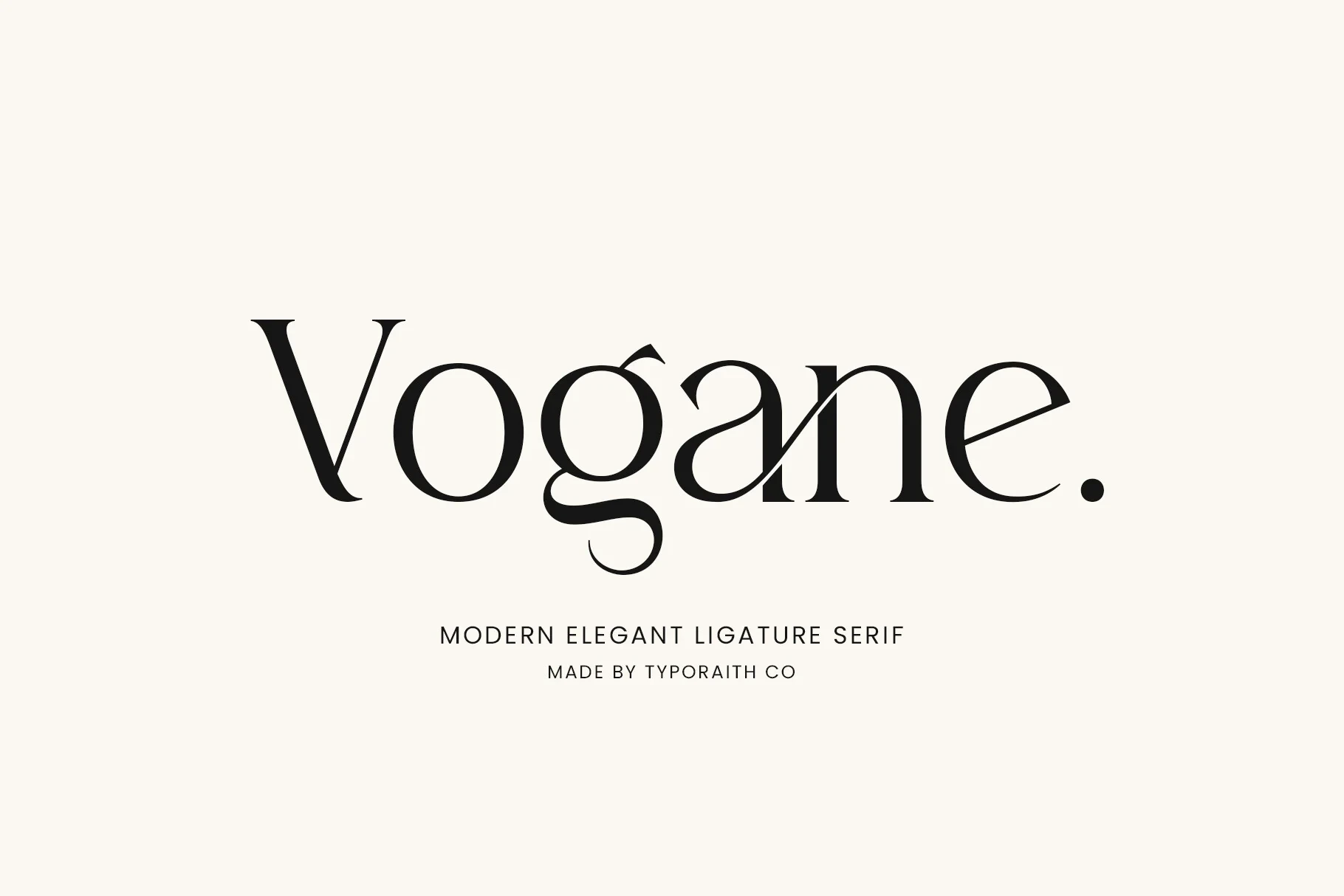
Best For: logos, branding, packaging
Vogane Font is useful when a wordmark needs customization: integrated ligatures, alternate characters, and a flowing lowercase g tail offer several routes. Its high contrast still favors display sizing for logos, packaging, and branding.
Calteo Font

Best For: branding, creative projects, display text
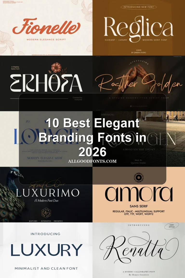
Calteo Font keeps its main forms upright while extending long swashes from the beginning and end of a word. The entry and exit gestures suit branding and titles, but can overwhelm compact layouts or short labels.
Ronsa Font
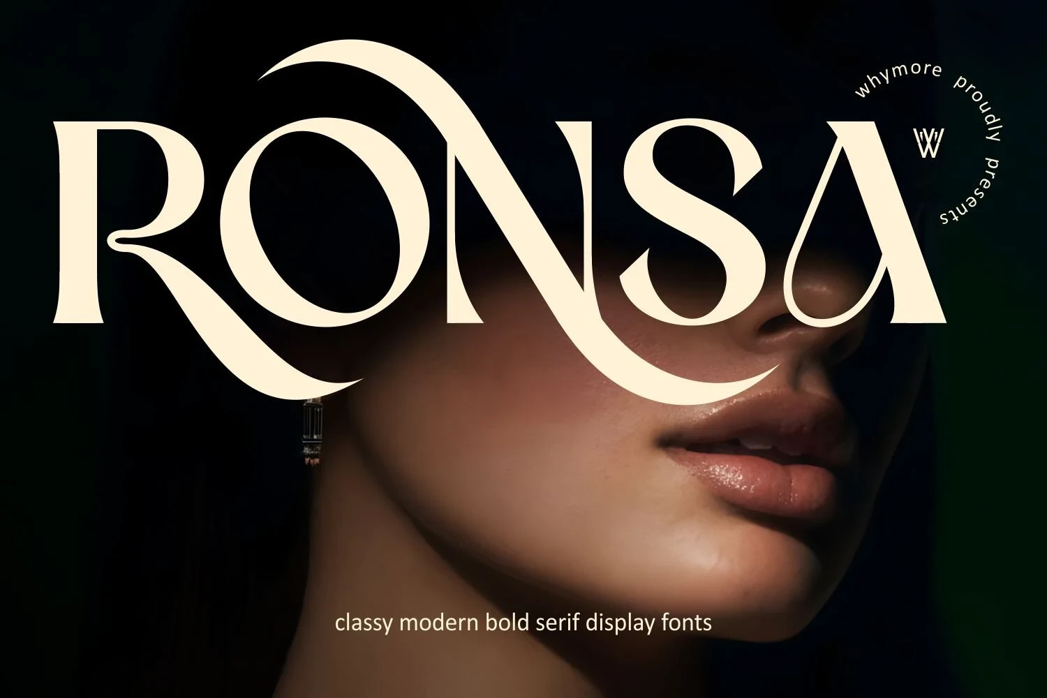
Best For: branding, beauty branding, headlines
Ronsa Font makes the sweeping swash on the R its primary recognition feature, supported by open counters and sharp serifs. It gives branding and headlines a memorable focal point, though the flourish can constrain short layouts.
Drose Font

Best For: fashion branding, logos, packaging
For fashion branding, logos, and packaging, Drose Font uses a large circular swash attached to the capital D as an immediate focal point. The varied stroke weights work at display scale, while the opening flourish reduces small-size clarity.
Together Font
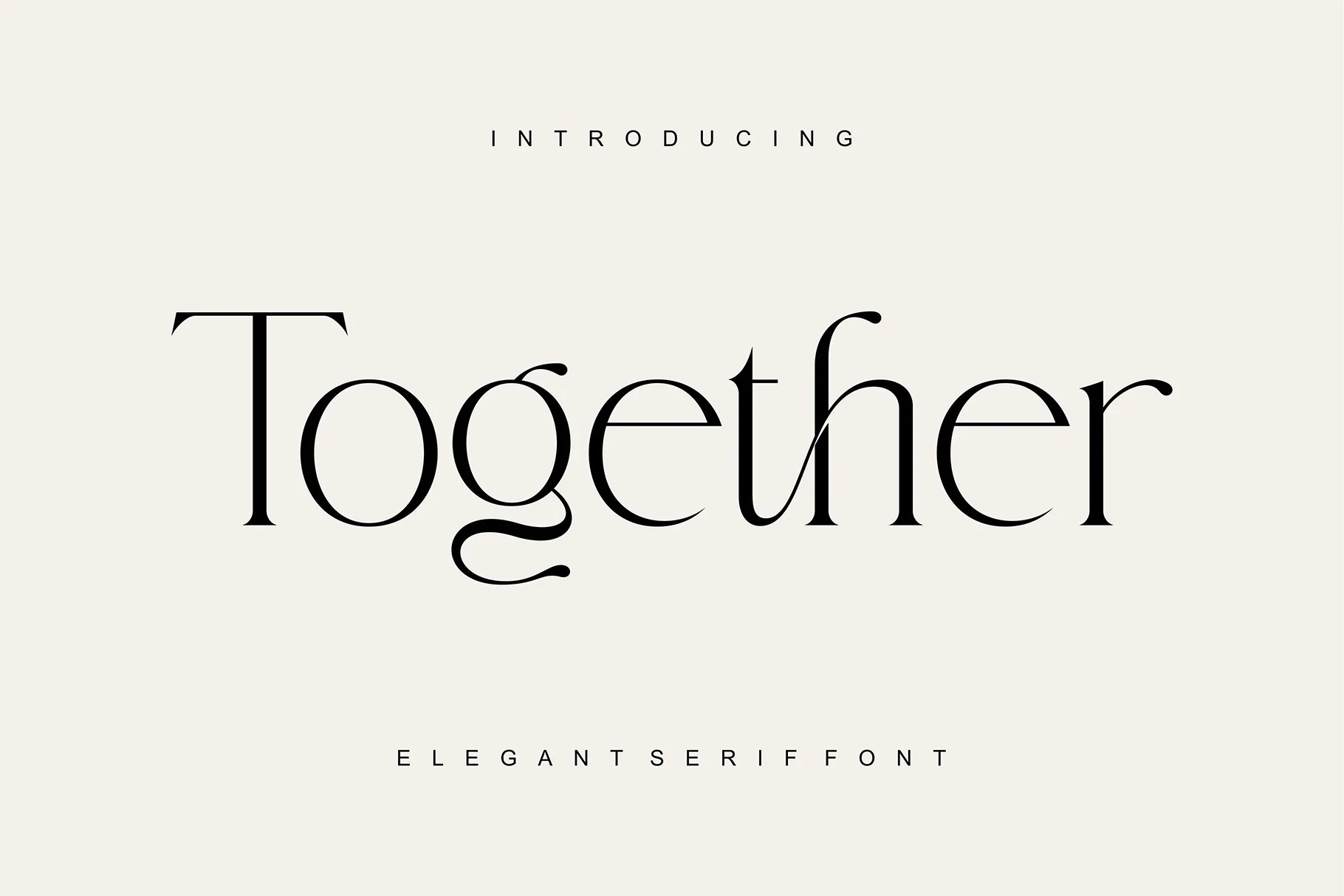
Best For: branding, packaging, invitations
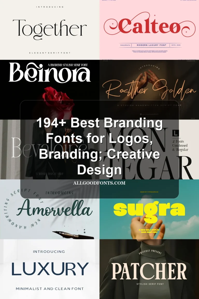
Together Font adds character without connected script: an extended T crossbar and a decorative lowercase g tail sit within sharp, bracketed serifs. It can anchor packaging and invitations, provided thin terminals receive generous display space.
Structural and Hybrid Display Styles
These faces emphasize structure through broad proportions, sharp serifs, width options, or a script-and-serif pairing, giving brands stronger layout control than purely ornamental designs.
Things Font
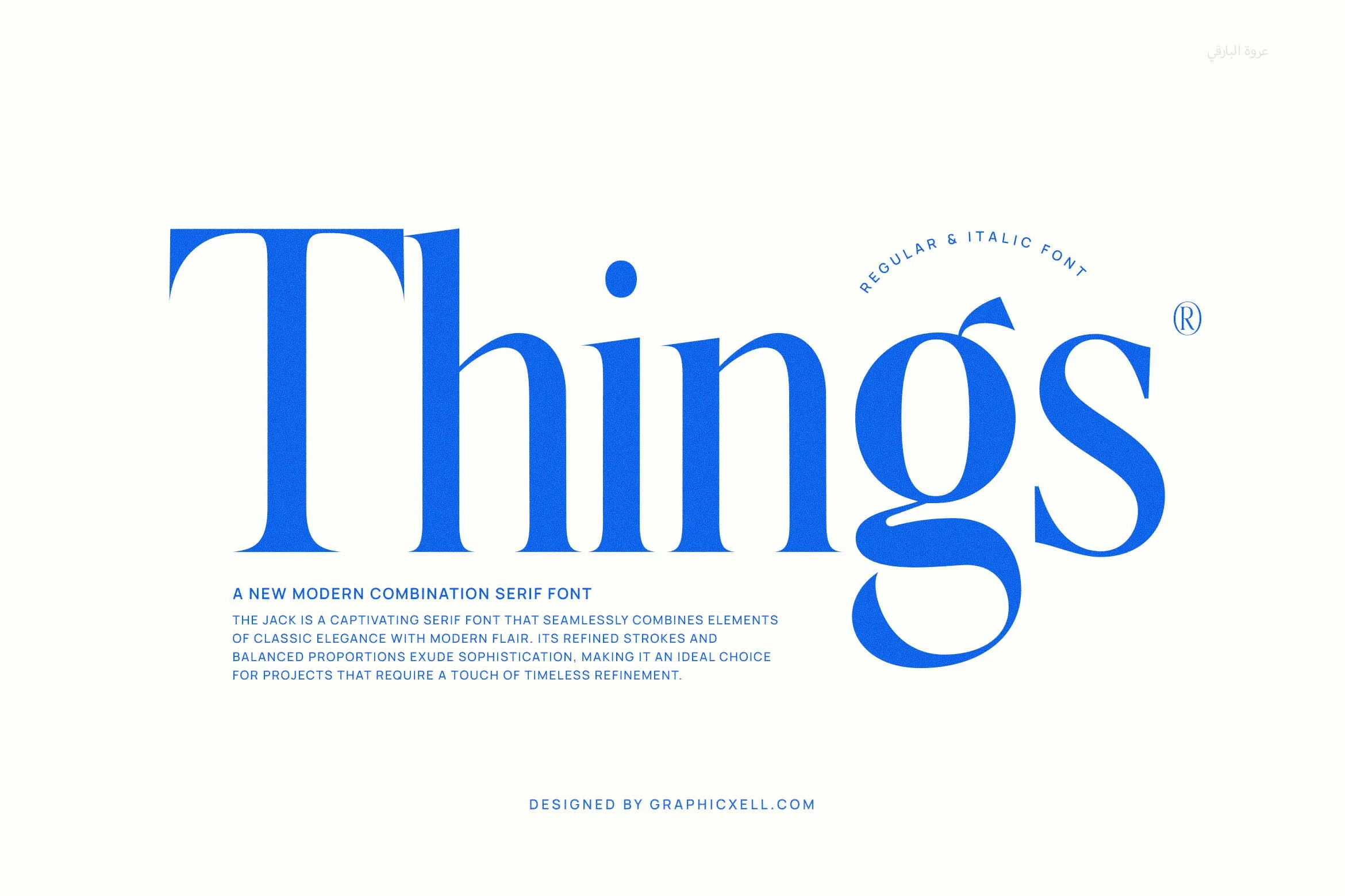
Best For: branding, display text, modern designs
Things Font uses heavy, high-contrast strokes, bracketed serifs, a right-leaning presentation, and a distinctive ball terminal on the lowercase g. It suits large branding and titles, but its thin strokes make dense small text a weak choice.
Geista Mond Font
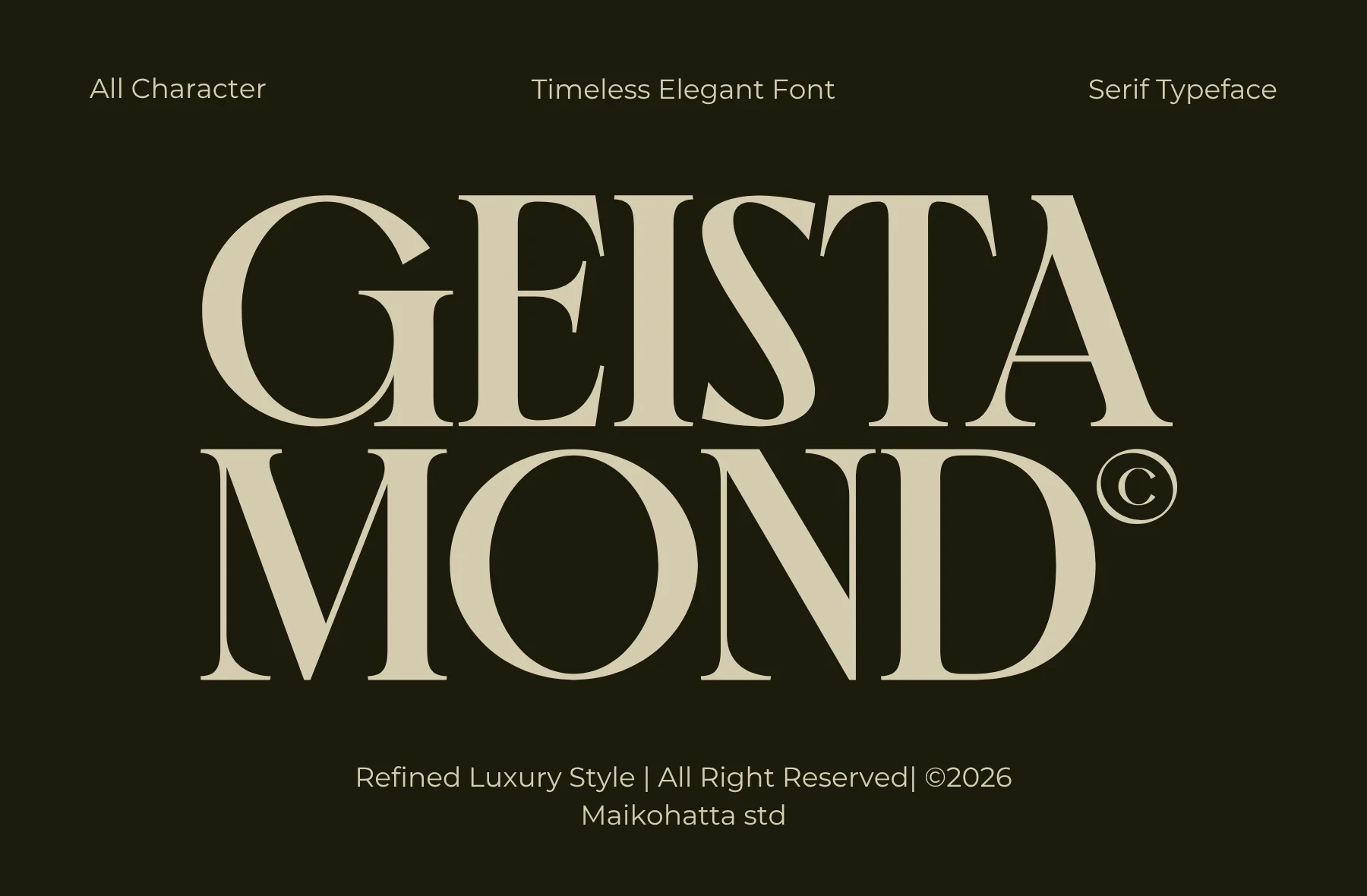
Best For: branding, fashion branding, product labels
For fashion branding, Geista Mond Font offers sharp triangular serifs, a strong vertical axis, and relatively closed apertures. The controlled decorative profile works well on product labels and large names, though high contrast and thin hairlines limit extended reading.
Patcher Font

Best For: fashion branding, logos, packaging
Patcher Font brings expansive width to a heavy, high-contrast serif construction. Its breadth gives logos and packaging statements room to command attention, while fine hairlines mean small-format applications should use a sturdier companion face.
Andora Modern Font

Best For: branding, display text, modern designs
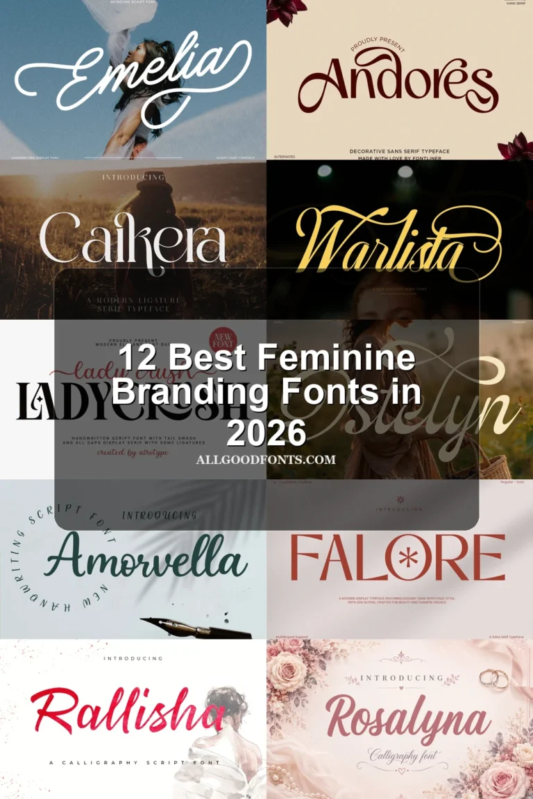
For branding systems, Andora Modern Font pairs a flowing connected script with a separate high-contrast serif. Use the script as a decorative accent and let the serif handle medium-to-large headlines where readability is more dependable.
Montegar Font

Best For: branding, headlines, fashion branding
Montegar Font provides a practical width choice through condensed and regular variations. Its sharp, high-contrast serifs and open circular counters can fit narrow brand placements, although both versions remain better suited to display sizing.
How to Choose the Right Font
Choose by construction first: wide or condensed proportions solve different placement problems, while open counters generally improve headline clarity. Reserve swashes, ligatures, and emblem-like details for short wordmarks, and test every option at its final size. For supporting copy, pair these display faces with a simpler, more readable companion.