17 Best Retro Aesthetic Fonts in 2026
This collection moves from thick bubble contours and flowing scripts to slab serifs, distressed surfaces, shadows, and inline stripes. These Retro Aesthetic Fonts are designed mainly for logos, posters, packaging, invitations, social graphics, and other short, highly visible display applications rather than continuous reading.
Looking for more aesthetic fonts? Browse our complete Aesthetic Fonts collection to compare modern, elegant, bold, vintage, and retro aesthetic styles.
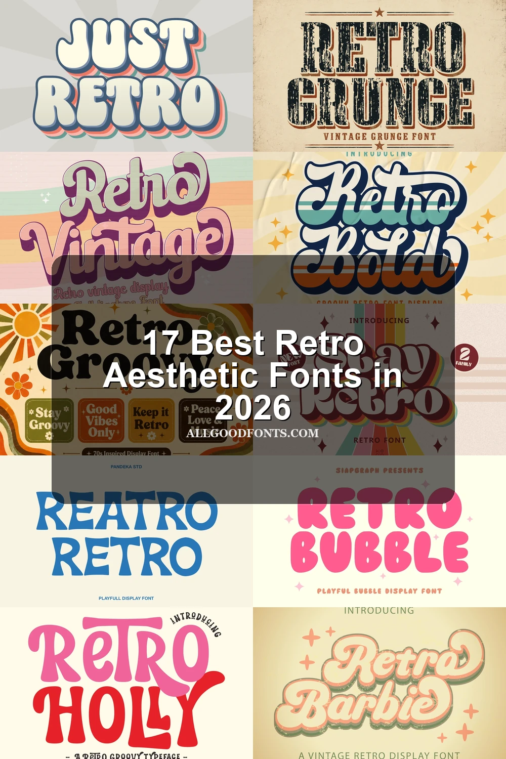
Retro Aesthetic Fonts: Rounded Display
Retro Aesthetic Fonts in this rounded display group share heavy, disconnected forms, soft terminals, and broad bubble silhouettes. They are generally clearer than scripts but still depend on generous sizing.
Wavy Retro Font
Best For: branding, display text, soft designs
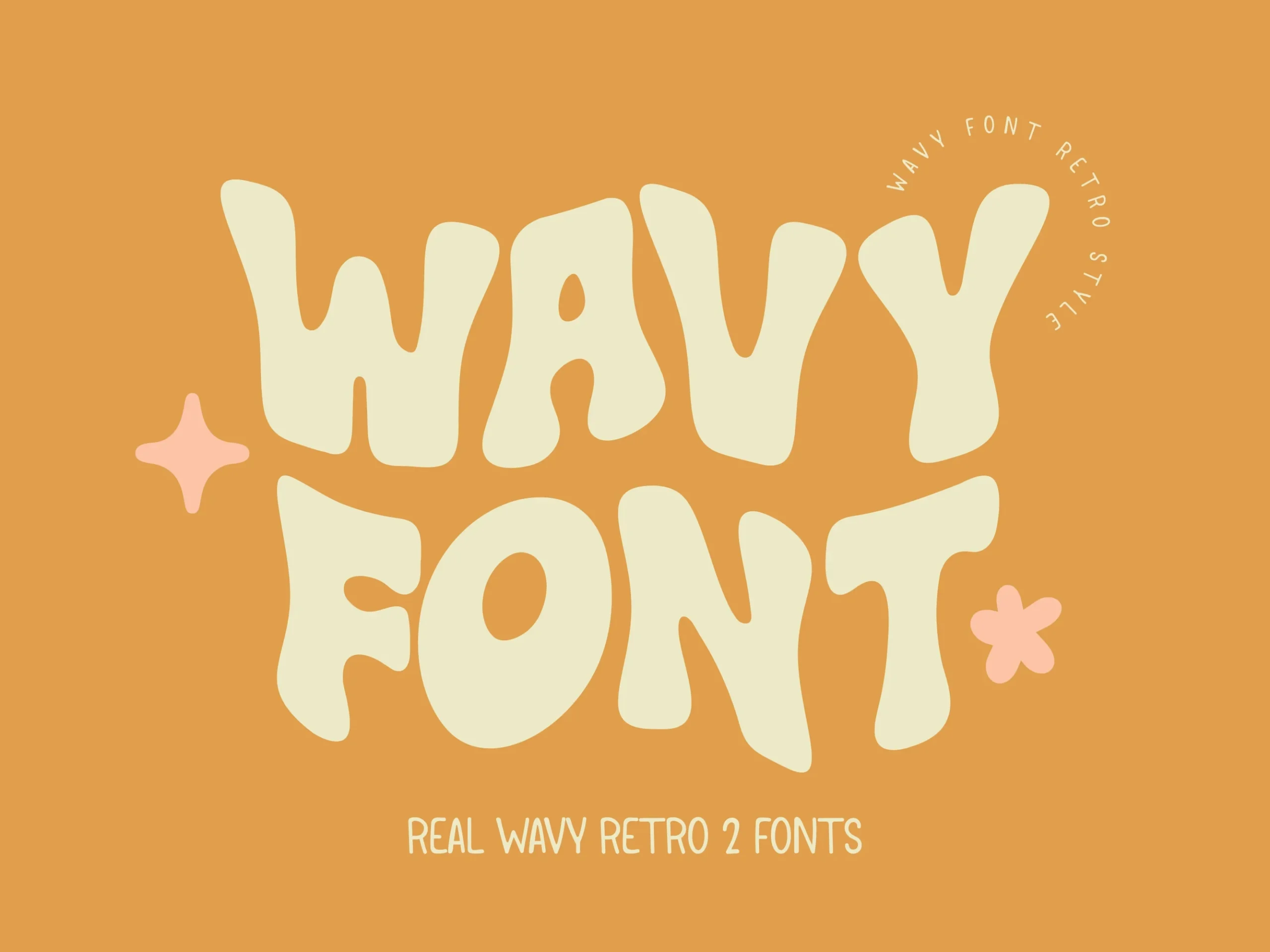
Wavy Retro Font gives Retro Aesthetic Fonts a soft, undulating profile through thick, uniform strokes and disconnected bubble forms. Its rounded contours feel playful and approachable, but distortion quickly reduces clarity, so reserve it for large headlines, logos, and soft branding.
Retro Sunday Font
Best For: posters, T-shirts, social media graphics, display text
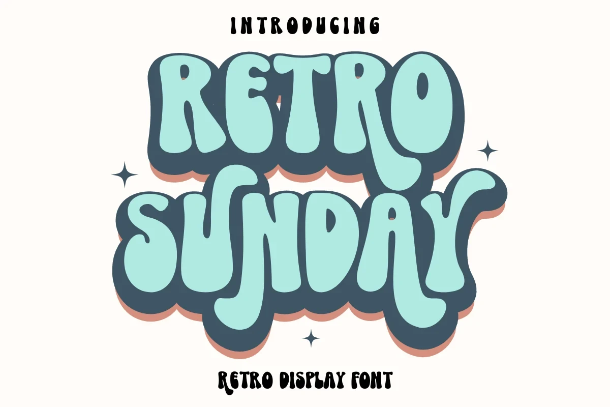
Extremely compressed bubble forms and an irregular baseline make Retro Sunday Font an immediate short-message display choice. Heavy overlaps and minimal interior space create impact for posters, T-shirts, and social graphics, while extended wording becomes difficult to separate and read.
Stay Retro Font
Best For: display text, playful designs, bold designs, retro designs
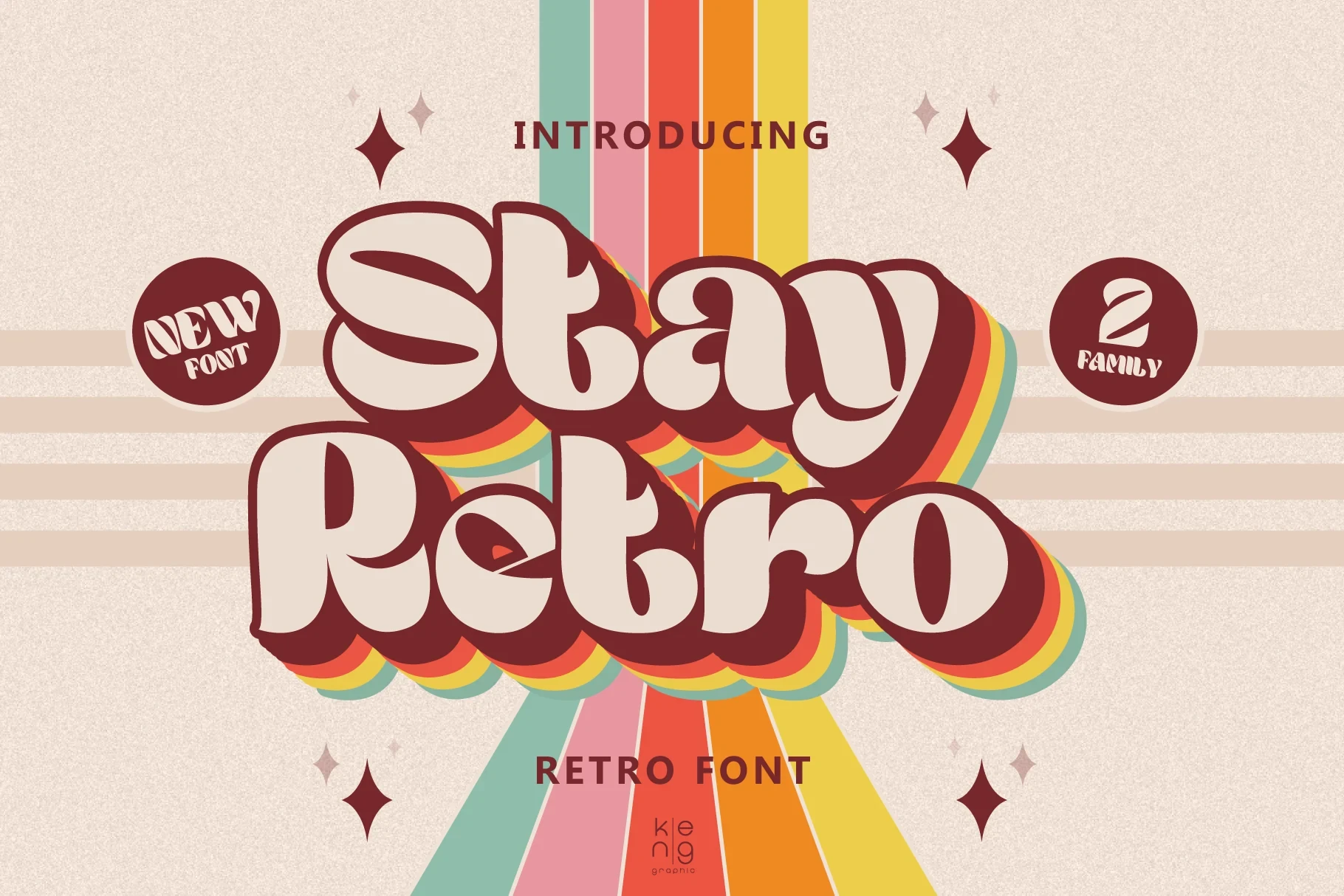
Stay Retro Font is built from wide rounded letters with substantial strokes that support a layered color-shadow treatment. It remains strong and readable at display size, but its width and weight make paragraphs or small labels feel cumbersome.
Just Retro Font
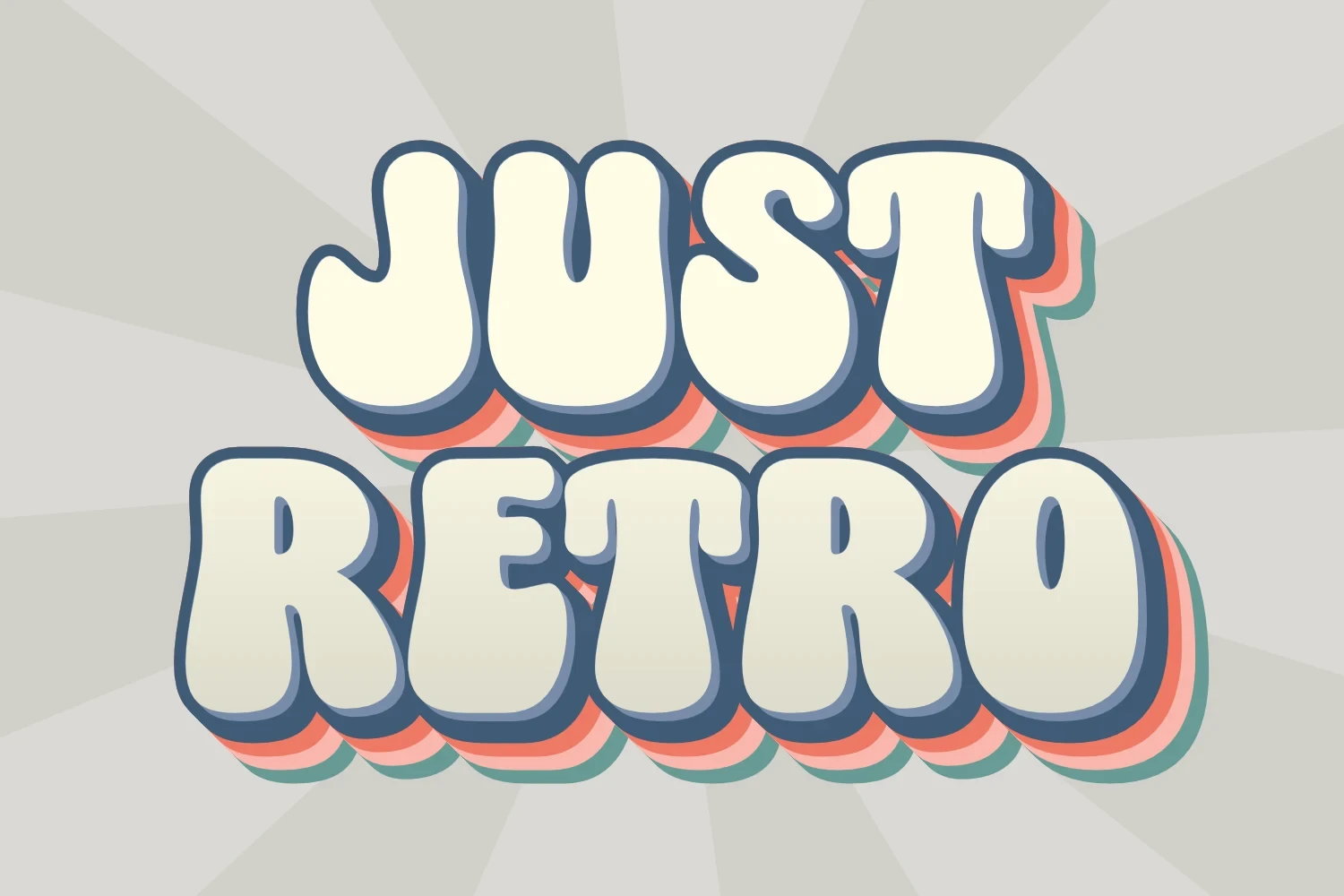
Best For: eye-catching designs, display text, playful designs
Upright all-caps bubble forms give Just Retro Font a clear block-like presence at large sizes. Rounded terminals and disconnected letters help individual characters remain distinct, although the heavy weight becomes inefficient and less clear when reduced.
Retro Holly Font
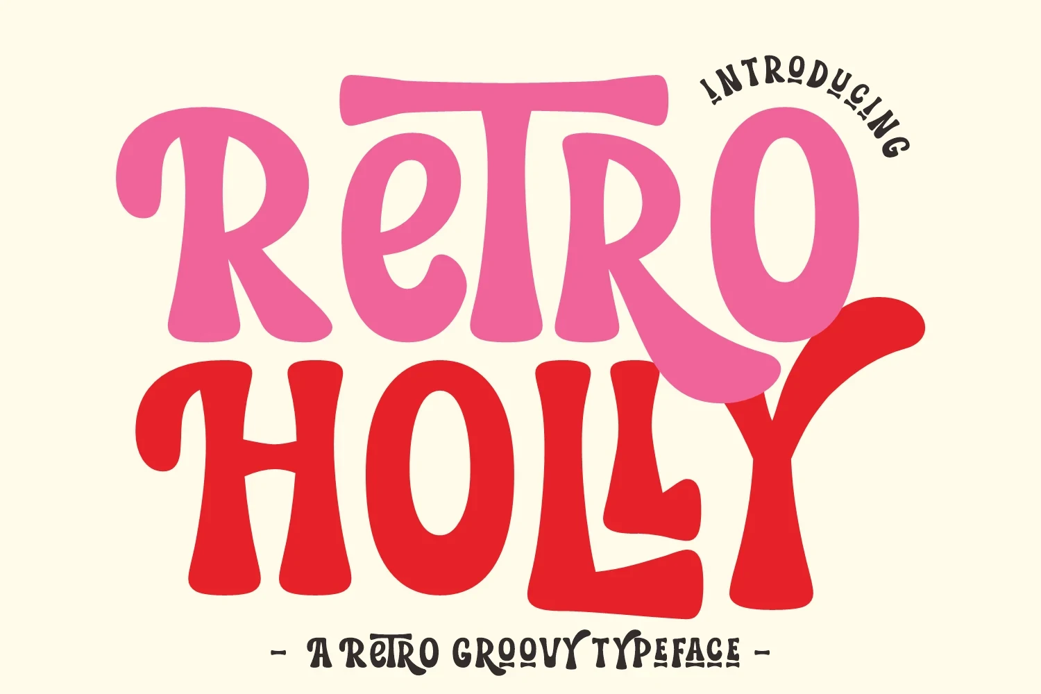
Best For: branding, display text, playful designs, bold designs
Retro Holly Font gives Retro Aesthetic Fonts an expansive silhouette through wide proportions, heavy strokes, and flowing organic curves. Its bold scale suits branding and display compositions, while the weight and breadth make it unsuitable for long-form body copy.
Retro Bubble Font
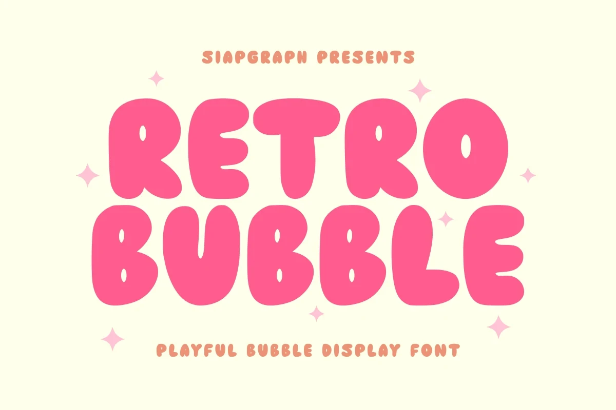
Best For: packaging, posters, headlines, stickers
Retro Bubble Font builds bulbous forms around enclosed negative-space openings, using an even, non-contrasting stroke. The result has strong poster and sticker presence, but the extreme thickness leaves little flexibility for small wording.
Connected Script Statements
These connected scripts use joins, changing baselines, loops, and thick-thin contrast to create movement. Compared with the rounded group, they offer more flowing rhythm but require extra spacing and display scale.
Retro Vintage Font
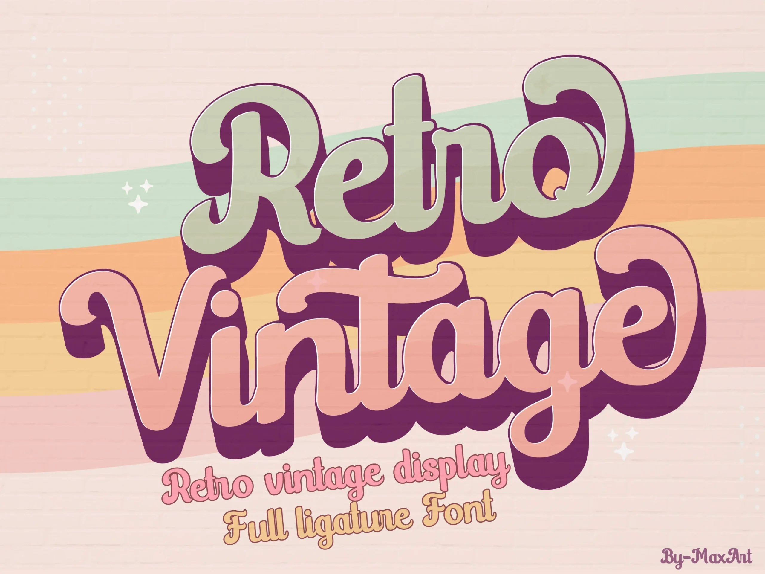
Best For: logos, branding, invitations, wedding designs
For logos and invitations, Retro Vintage Font offers wide connected cursive with rounded terminals and substantial strokes. Its generous proportions create a friendly, flowing presence, but dense settings quickly merge neighboring characters, making large titles safer than paragraphs or compact labels.
Retro Bold Font
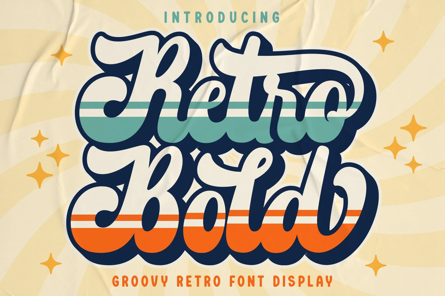
Best For: logos, branding, invitations, wedding designs
Retro Bold Font combines connected cursive with pronounced contrast between heavy bases and thinner joins. That difference gives logos and invitations a flowing rhythm, yet the interlinked structure needs display size and careful spacing to keep characters distinct.
Retro Script Font
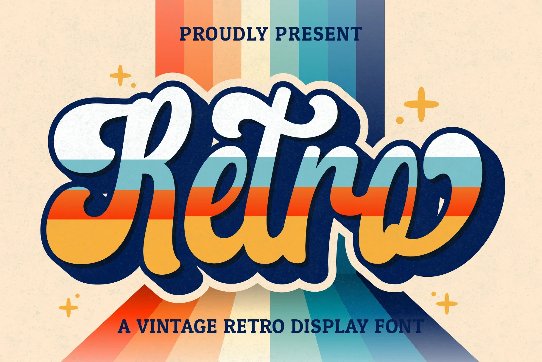
Best For: logos, branding, invitations, wedding designs
Retro Script Font uses heavy connected cursive, smooth rounded terminals, and a variable baseline to give branding and event lettering visible movement. Its layered treatment can obscure detail when reduced, so use it for short, prominent phrases.
Retro Voyage Font
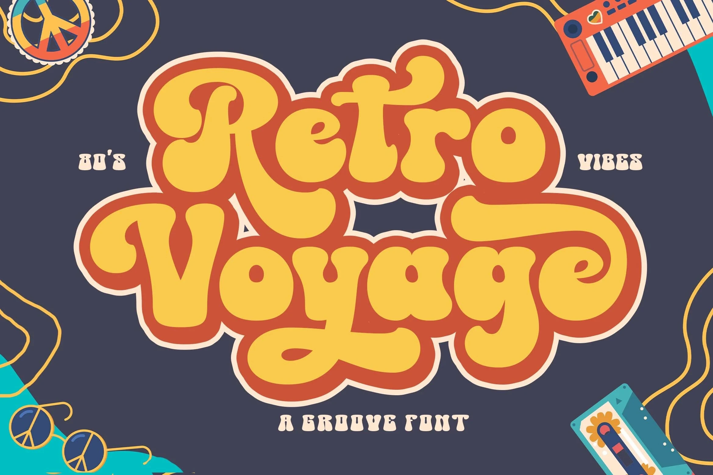
Best For: display text, playful designs, retro designs, vintage designs
Retro Voyage Font pushes connected script through exaggerated loops, swash-like tails, and strong thick-thin contrast. It creates an expressive headline silhouette within Retro Aesthetic Fonts, but dense joins make short, large-format phrases the safest choice.
Retro Barbie Font
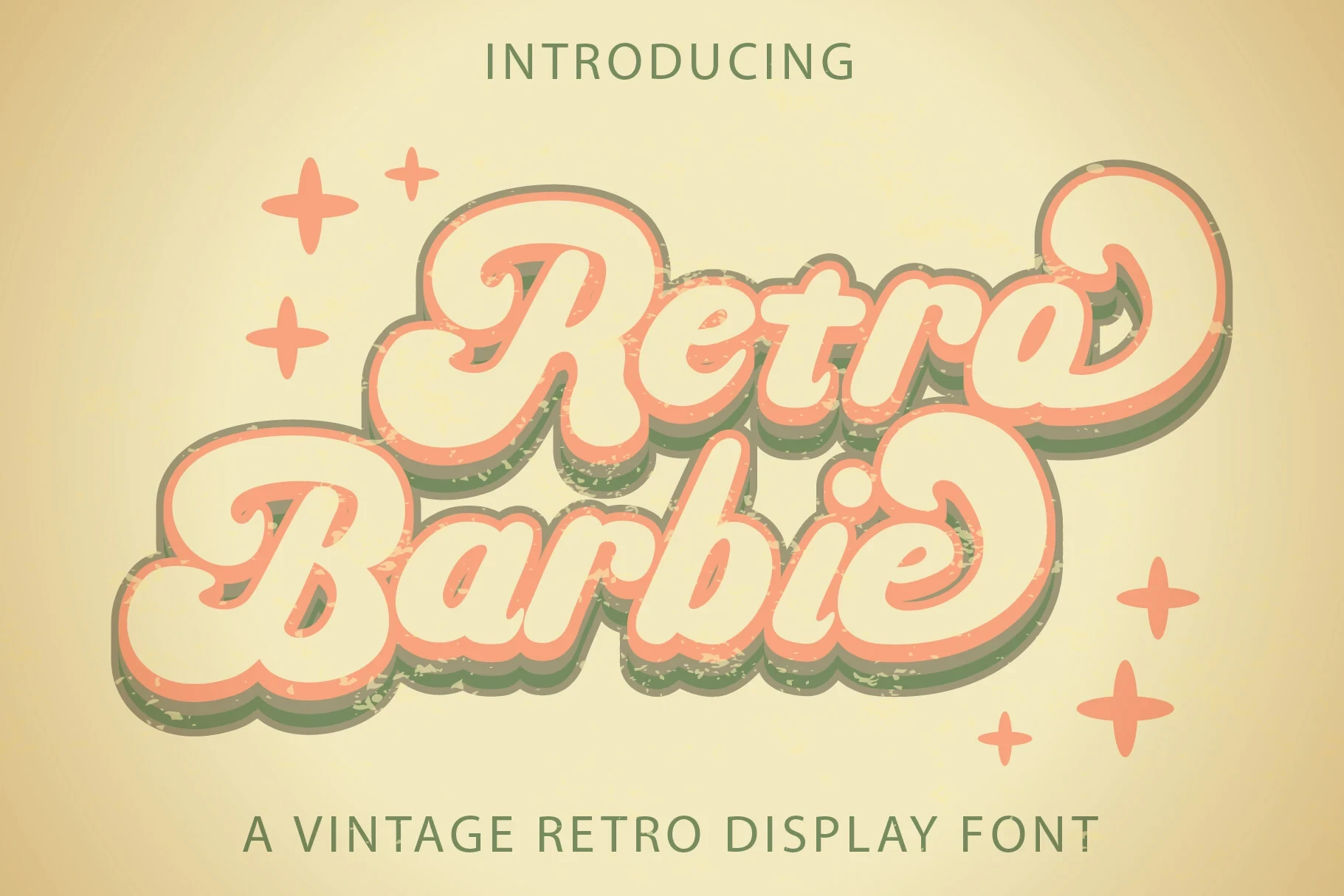
For vibrant logos and headings, Retro Barbie Font combines connected cursive, a pronounced rhythmic bounce, and layered shadowing. The animated silhouette has immediate presence, though the shadow and heavy strokes reduce letter clarity when the design is scaled down.
Serif and Slab Lettering
Serif and slab designs bring firmer structure through block serifs, flared terminals, or distressed surfaces. Their letter skeletons can feel more direct than bubble styles, though texture and distortion still limit small text.
Retro University Font
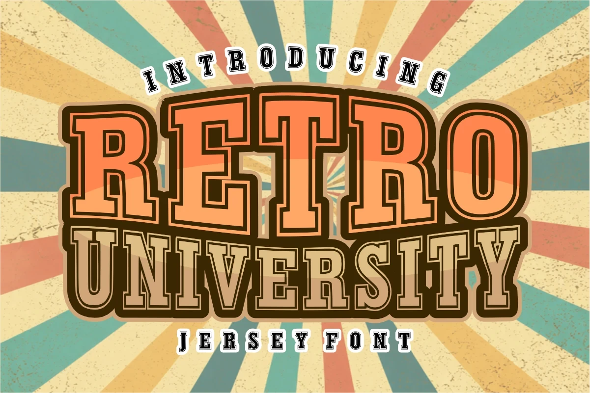
Best For: branding, website headers, display text, classic designs
Retro University Font uses heavy collegiate slab serifs and a geometric, right-leaning structure. The firm construction stays comparatively readable in headers and logos, giving it a more direct, organized role than highly distorted display styles.
Reatro Retro Font
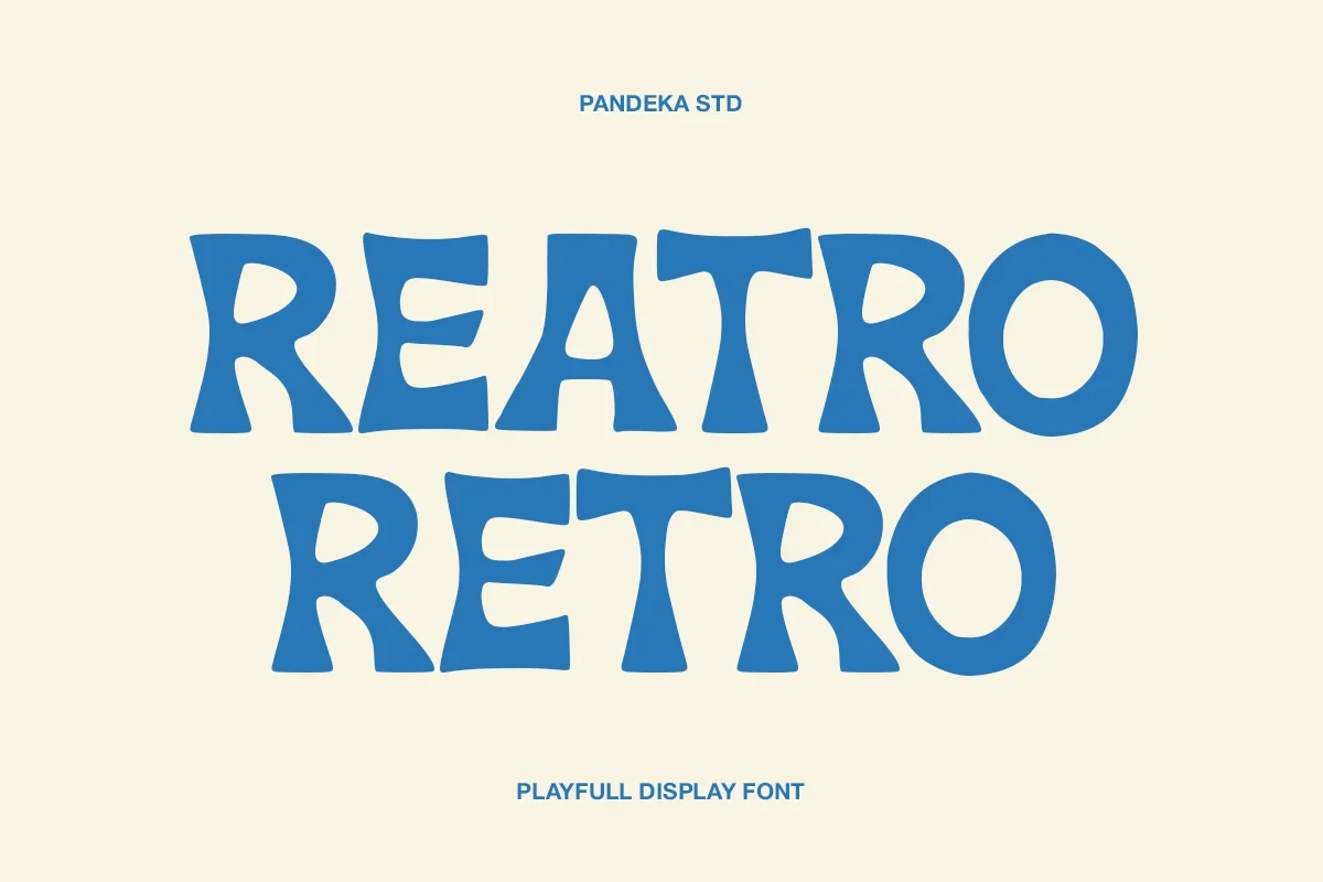
Best For: posters, headlines, social media graphics, display text
For posters and social graphics, Reatro Retro Font uses flared, inverted serifs, organic curves, and a low x-height to create an unusual silhouette. Its distorted proportions add personality within Retro Aesthetic Fonts, but curves lose definition quickly at smaller sizes.
Retro Grunge Font
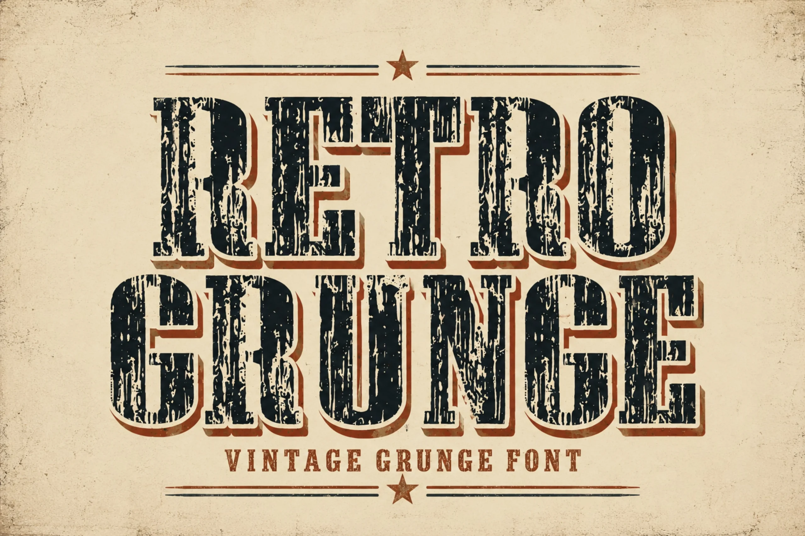
Best For: posters, signage, display text, clean designs
Retro Grunge Font pairs block-like slab serifs with a distressed surface, making texture as important as the underlying letter structure. It works well for signage and posters, while surface wear becomes the main obstacle to readable small text.
Retro Groovy Font
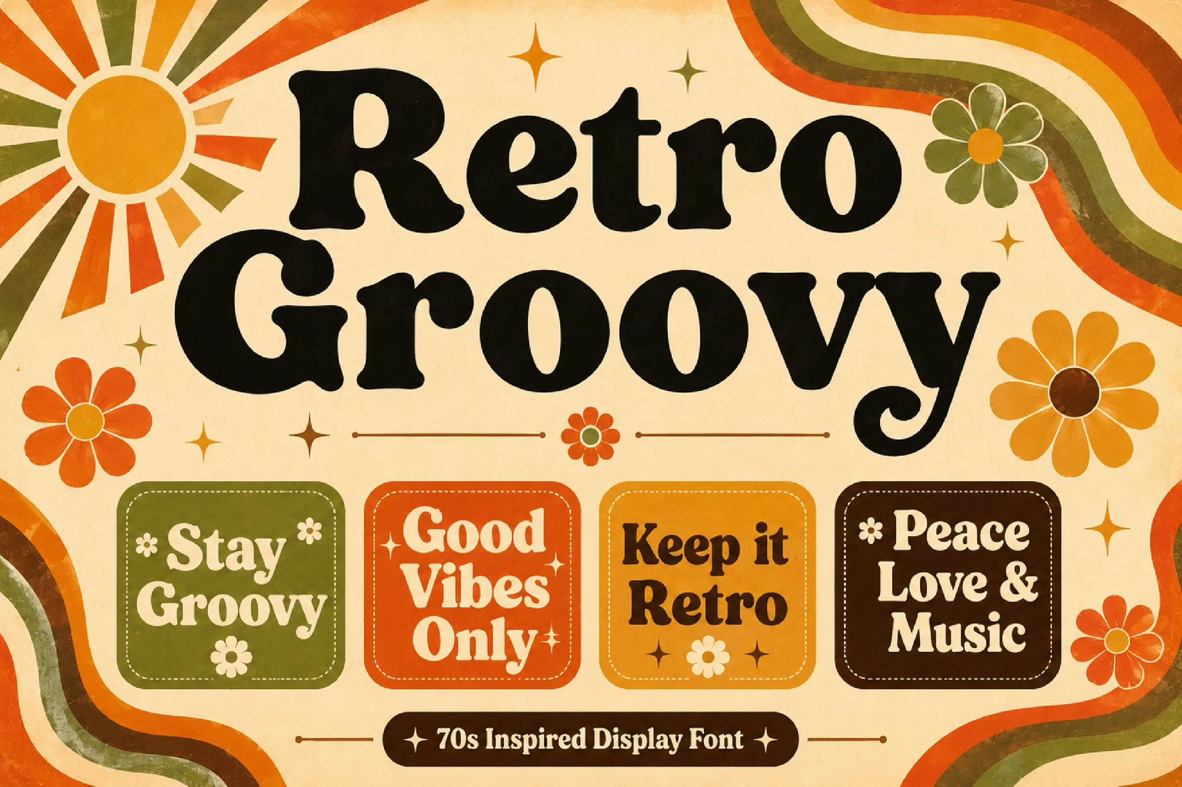
Best For: logos, branding, packaging, posters
Retro Groovy Font uses rounded serifs, bold weight, high terminal contrast, and a flourish on the lowercase y. It stays more readable than distressed alternatives for logos and packaging, although its substantial construction still favors display scale over body text.
Layered and Inline Effects
Layered and inline effects make the treatment itself the main feature, using shadows, parallel stripes, and contrasting constructions. These faces are strongest as short visual statements, not information-heavy typography.
Retro Boogy Font
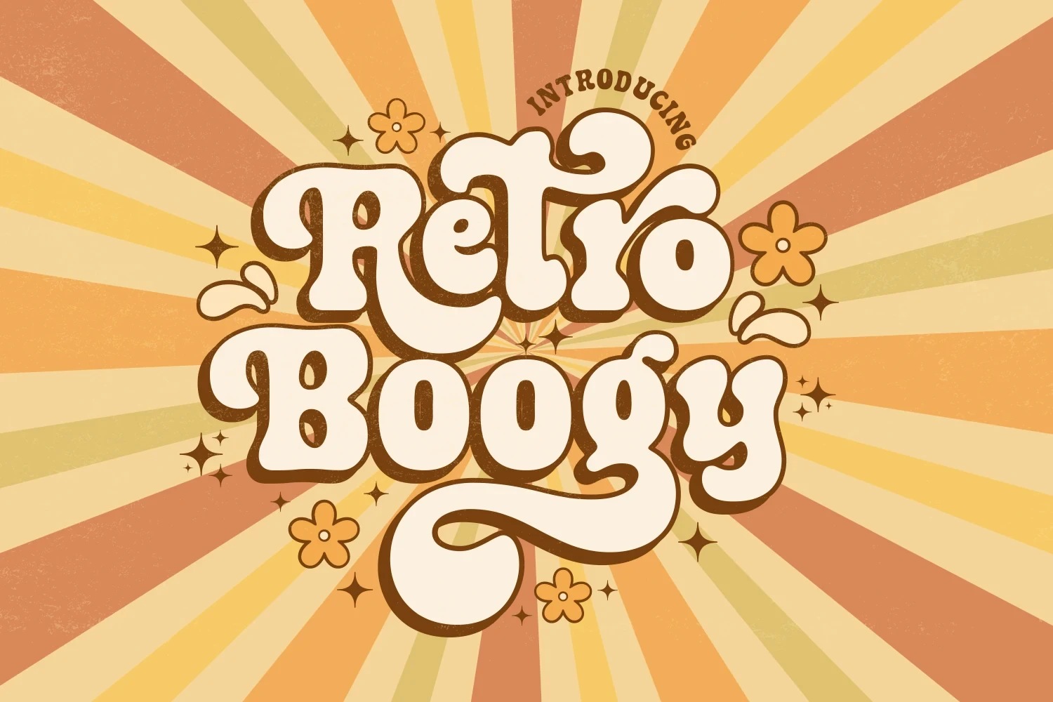
Best For: display text, classic designs, soft designs, playful designs
For two-part titles, Retro Boogy Font creates contrast by shifting from disconnected bubbly lettering to connected cursive. The heavy strokes and curving terminals add visual movement, but those flourishes favor large display work over consistently clear reading in smaller applications.
Parallel Retro Font
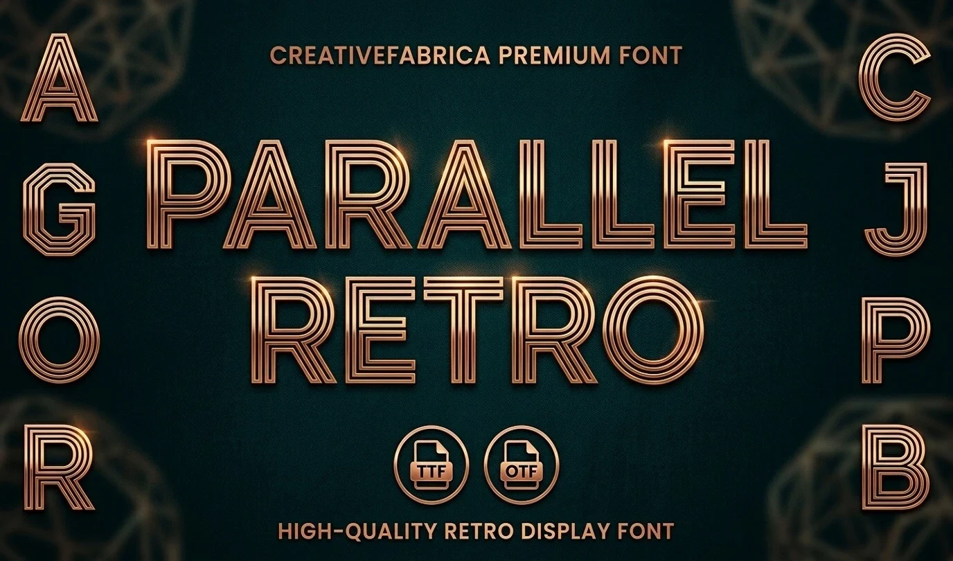
Best For: display text, bold designs, retro designs, high-end designs
Parallel Retro Font applies parallel inline stripes to structured uppercase geometry, creating a metallic texture suited to short statements. It adds a distinctive role to Retro Aesthetic Fonts, but internal lines weaken readability, especially in small logos or compact headlines.
How to Choose the Right Font
Choose disconnected bubble faces when you need immediate impact and clearer large lettering; choose connected scripts for flowing logos or invitations, checking joins and loops at the final size. Slabs offer firmer structure, while shadows, distress, and inline effects demand more space. For Retro Aesthetic Fonts, test the shortest essential wording before committing to a layout.