18 Best Vintage Aesthetic Fonts in 2026
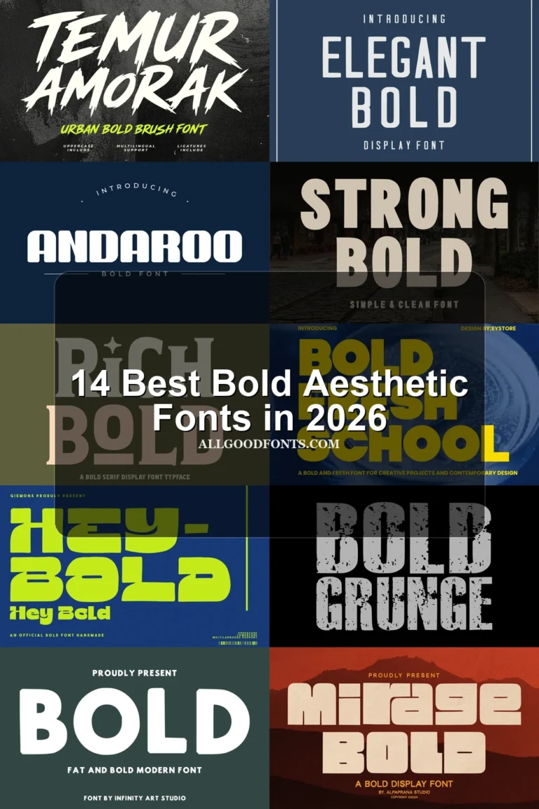
Vintage Aesthetic Fonts span connected brush scripts, block-built serifs, bulbous sans serifs, and high-contrast display lettering. Together, they serve wordmarks, posters, packaging, signage, invitations, and headline treatments where visible construction and mood matter more than extended reading.
Looking for more aesthetic fonts? Browse our complete Aesthetic Fonts collection to compare modern, elegant, bold, vintage, and retro aesthetic styles.
Vintage Aesthetic Fonts: Flowing Scripts
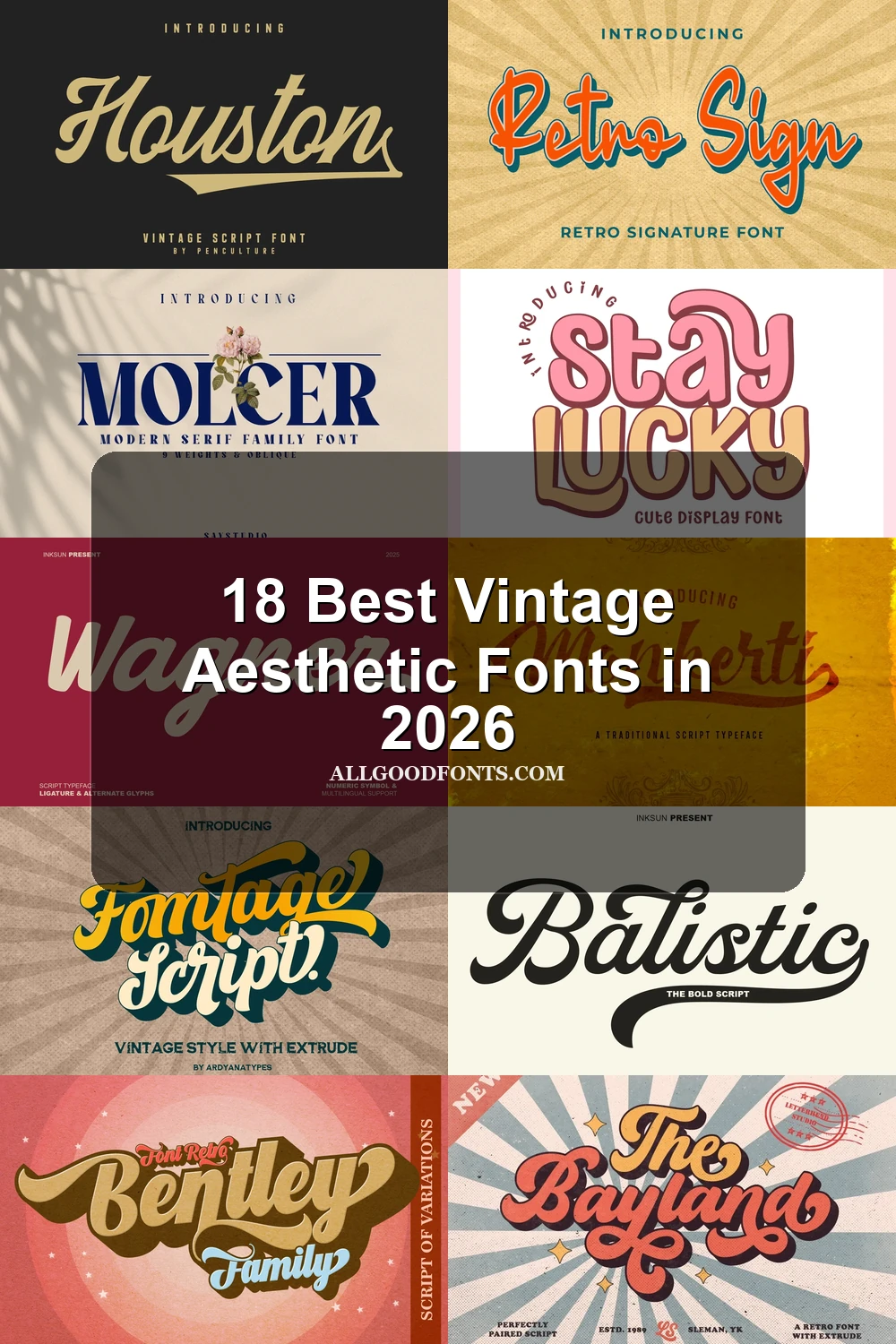
Vintage Aesthetic Fonts in this group rely on connected strokes, slant, swashes, and terminal flourishes, creating more movement and personality than the collection’s disconnected display styles.
Monkerti Font
Best For: display text, bold designs, expressive designs, retro designs
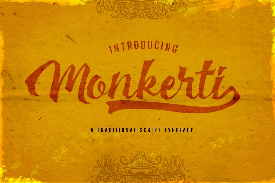
Monkerti Font brings a calligraphic brush finish, high contrast, connected letters, and a pronounced rightward axis. Its decorative construction is best reserved for large wordmarks, display text, or expressive retro designs rather than paragraphs.
Bardens Font
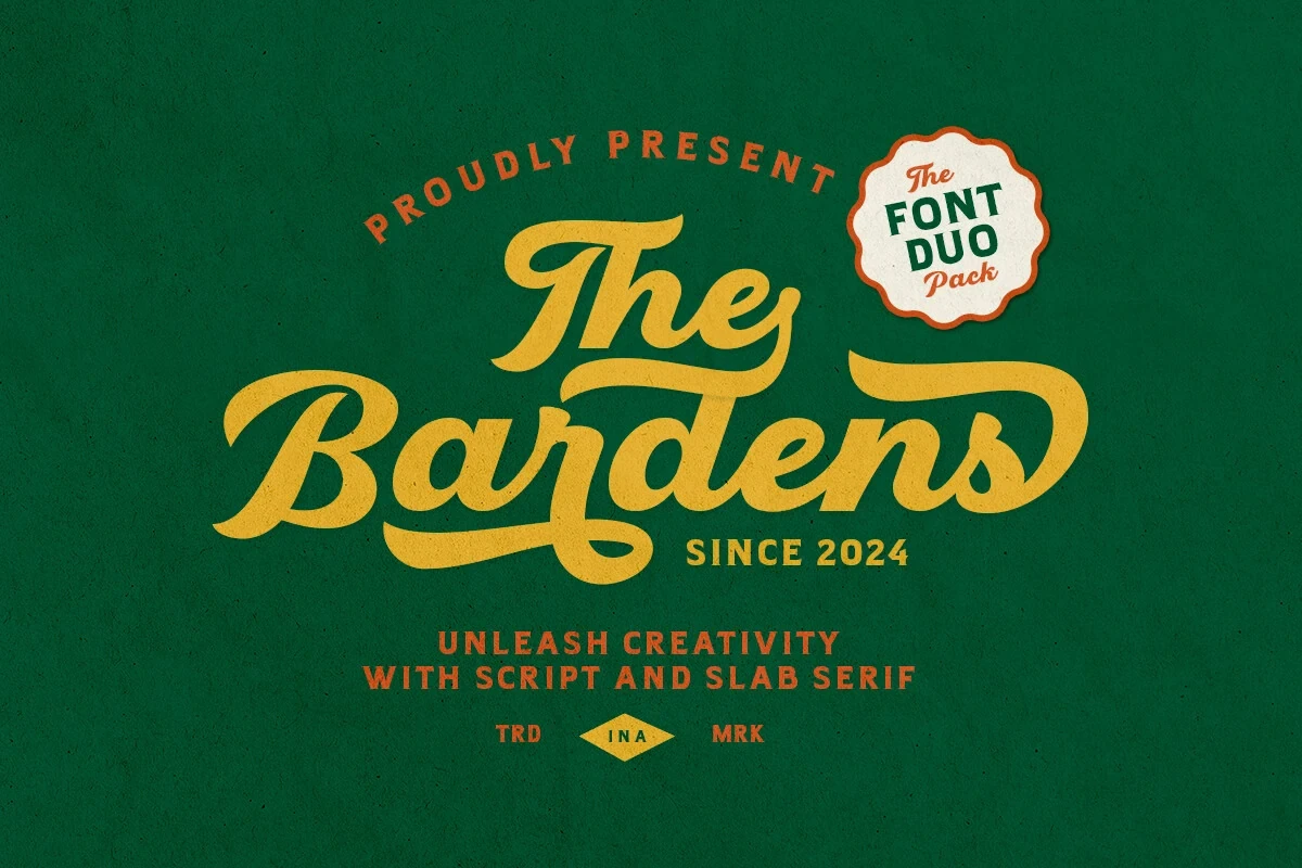
Bardens Font combines a heavy, high-contrast brush script with sweeping initial and terminal swashes, giving branding a branded athletic signature. Pair it with the clearer geometric slab serif when supporting information needs to remain readable.
City Mango Font
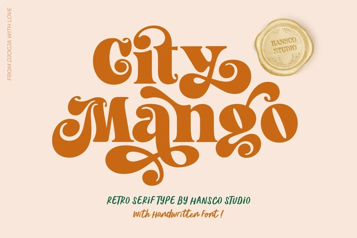
Best For: display text, clean designs, soft designs, playful designs
For large display text, City Mango Font builds a playful retro texture through flowing connected joins and curved swash-like terminals. The intricate forms lose clarity when reduced, and its PUA-encoded glyphs may require compatible access methods.
Balistic Font
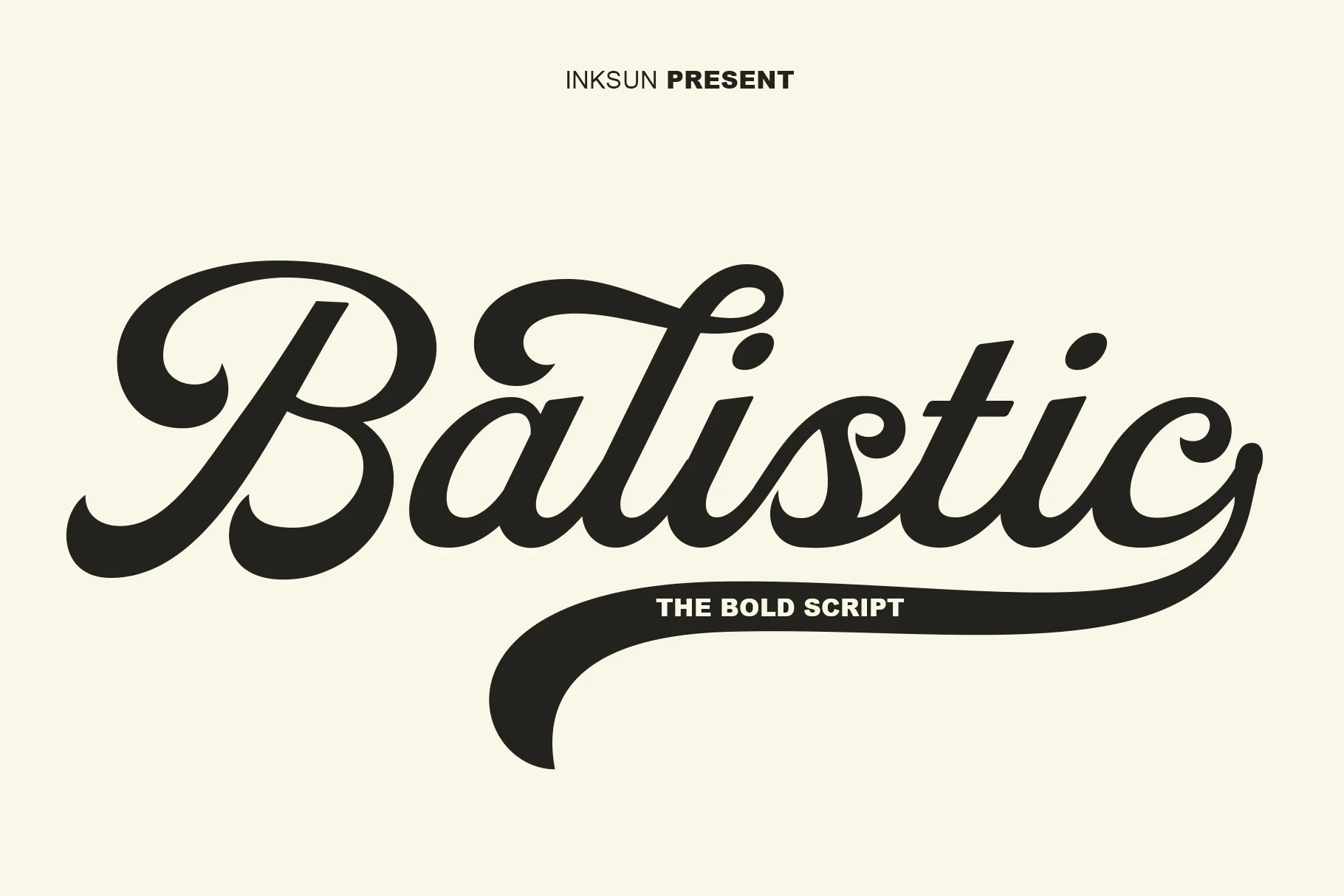
Best For: eye-catching designs, display text, modern designs, classic designs
Balistic Font keeps its heavy connected cursive unusually even through a monolinear structure and right-leaning slant. The long final-letter swash adds a logo-like finish, though the lettering can feel cramped in compact settings.
Bentley Font
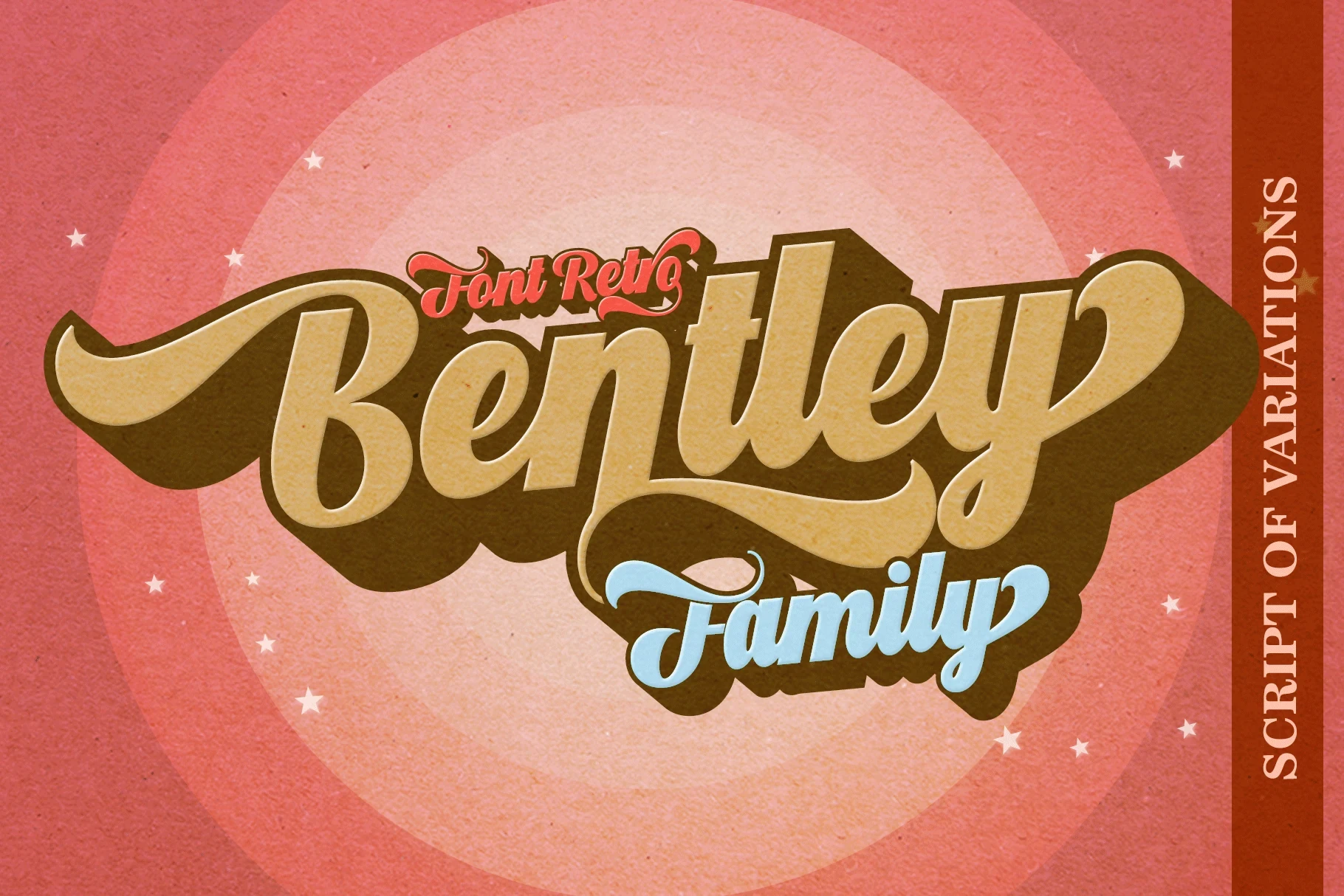
Best For: display text, playful designs, bold designs, decorative designs
Bentley Font pushes a heavy connected script toward decorative wordmarks with large entry and exit swashes. Its thick strokes read most clearly at display scale, while reduction quickly compromises the lettering’s readability.
Houston Font
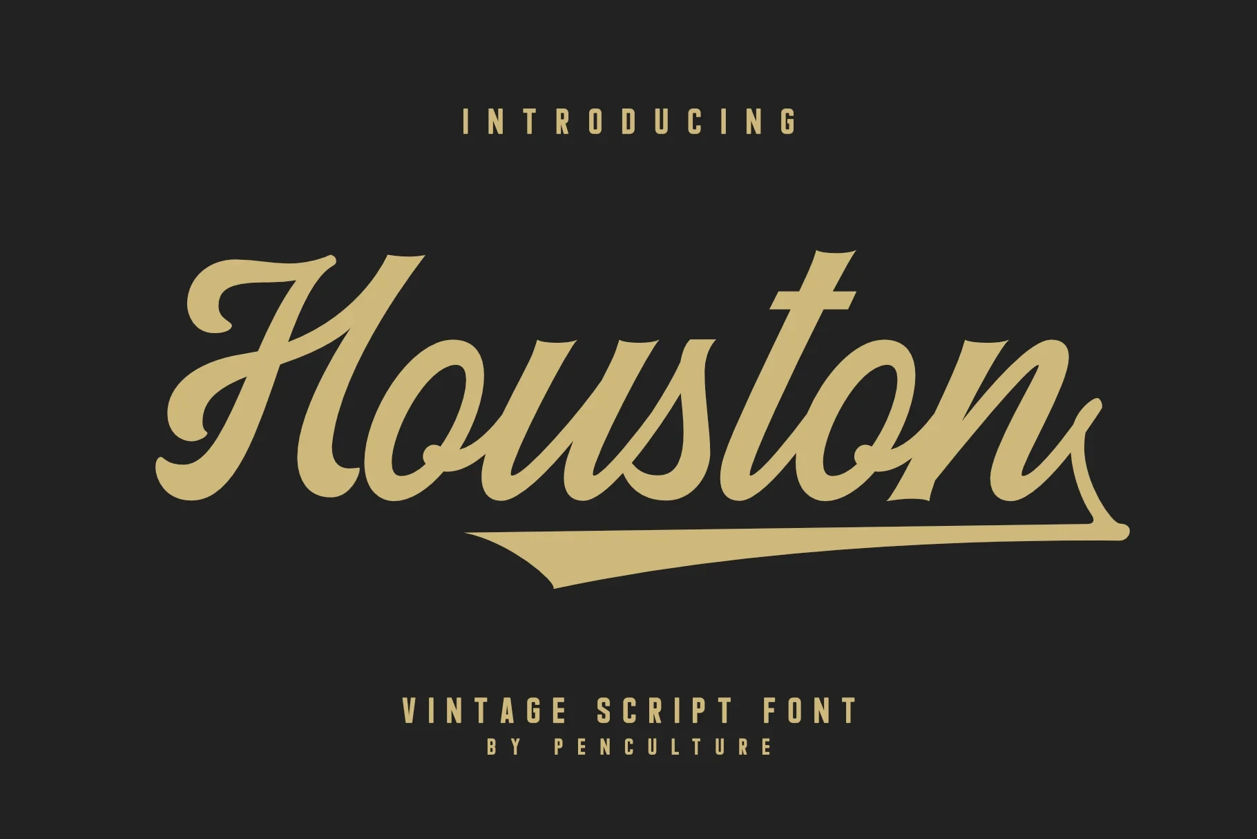
Best For: display text, clean designs, classic designs, bold designs
Houston Font stands apart through pronounced stroke-weight variation, a rightward slant, connected cursive forms, and an underline flourish. That bold construction suits logos and headlines while giving a finished badge effect.
Fomtage Script Font
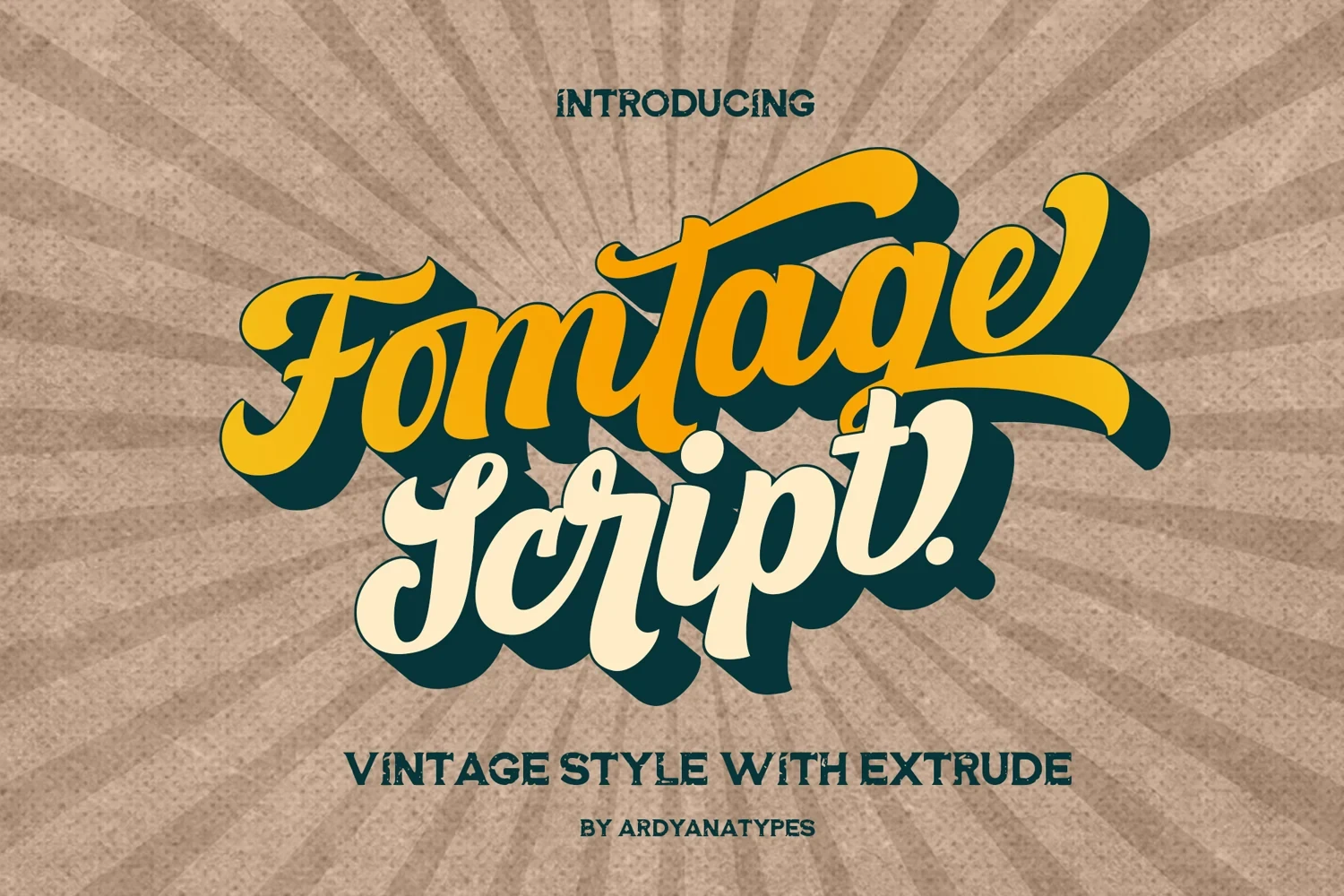
Best For: display text, bold designs, retro designs, vintage designs
Fomtage Script Font creates dense energy through high contrast, rounded terminals, connected letters, and a strong rightward slant. Use the distressed sans-serif companion for labels, but give the main script generous scale for recognition.
Donatello Font
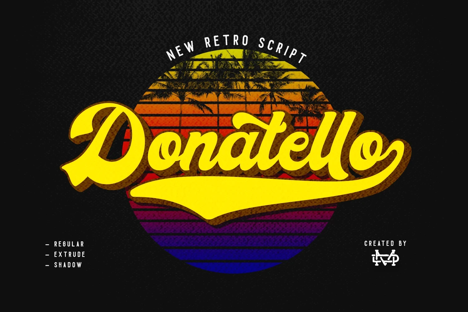
Best For: display text, clean designs, bold designs, retro designs
Donatello Font is easier to parse than ornate high-contrast scripts because its bold connections remain monolinear and clean. An extended horizontal underline turns a short word into a stronger graphic headline.
The Bayland Font
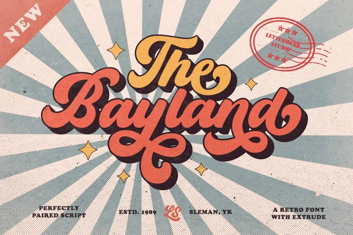
Best For: display text, clean designs, playful designs, bold designs
The Bayland Font uses heavy rounded strokes, connected cursive forms, a pronounced slant, and terminal curls for a soft, playful silhouette. It works best in large titles, while small supporting sans-serif text needs sufficient size.
Wagner Font
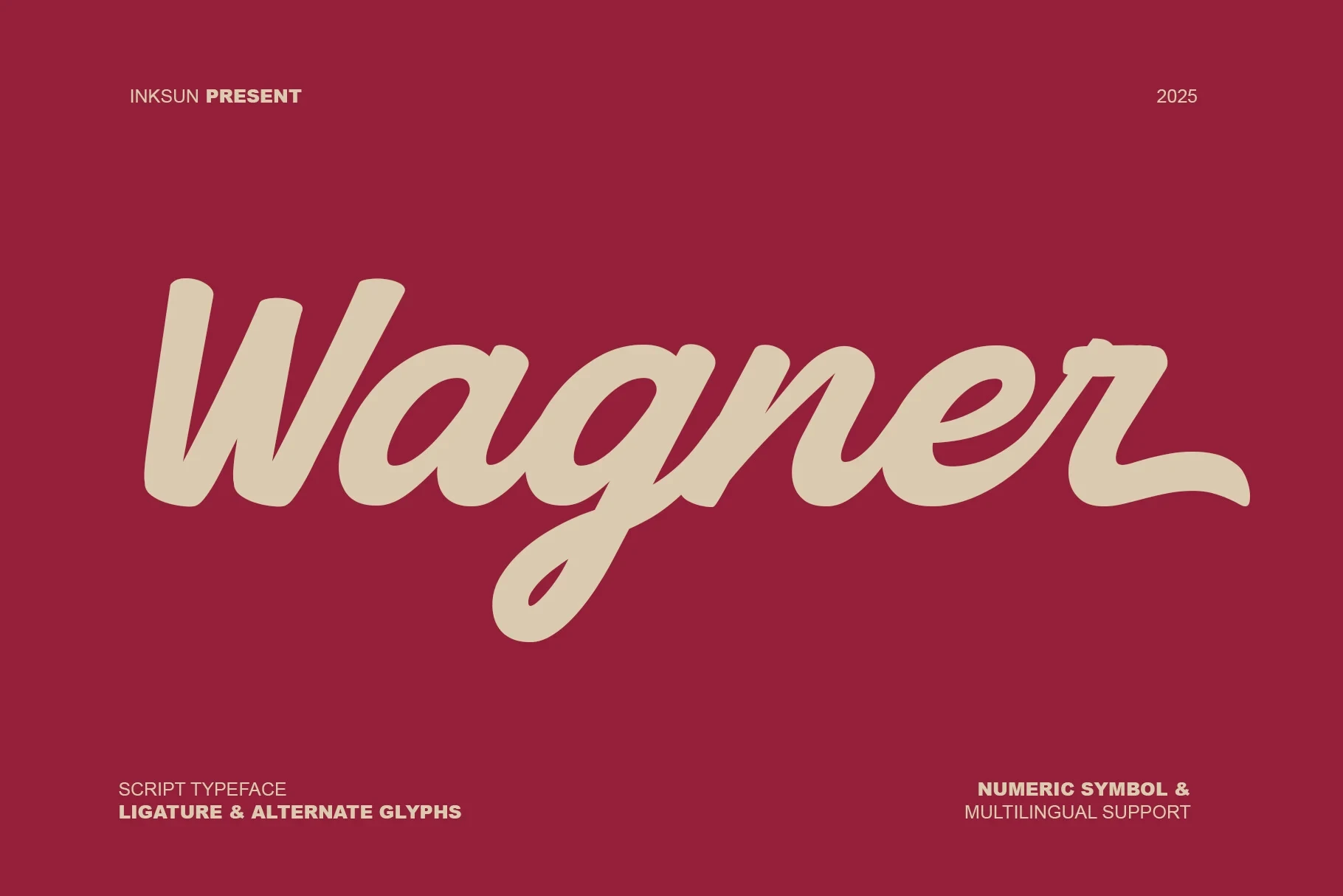
Best For: display text, modern designs, clean designs, classic designs
Wagner Font tempers its bold connected structure with a slight slant and rounded terminals. The wordmark remains readable at display size, but its flowing joins can crowd together when scaled down.
Boldy Skyline Font
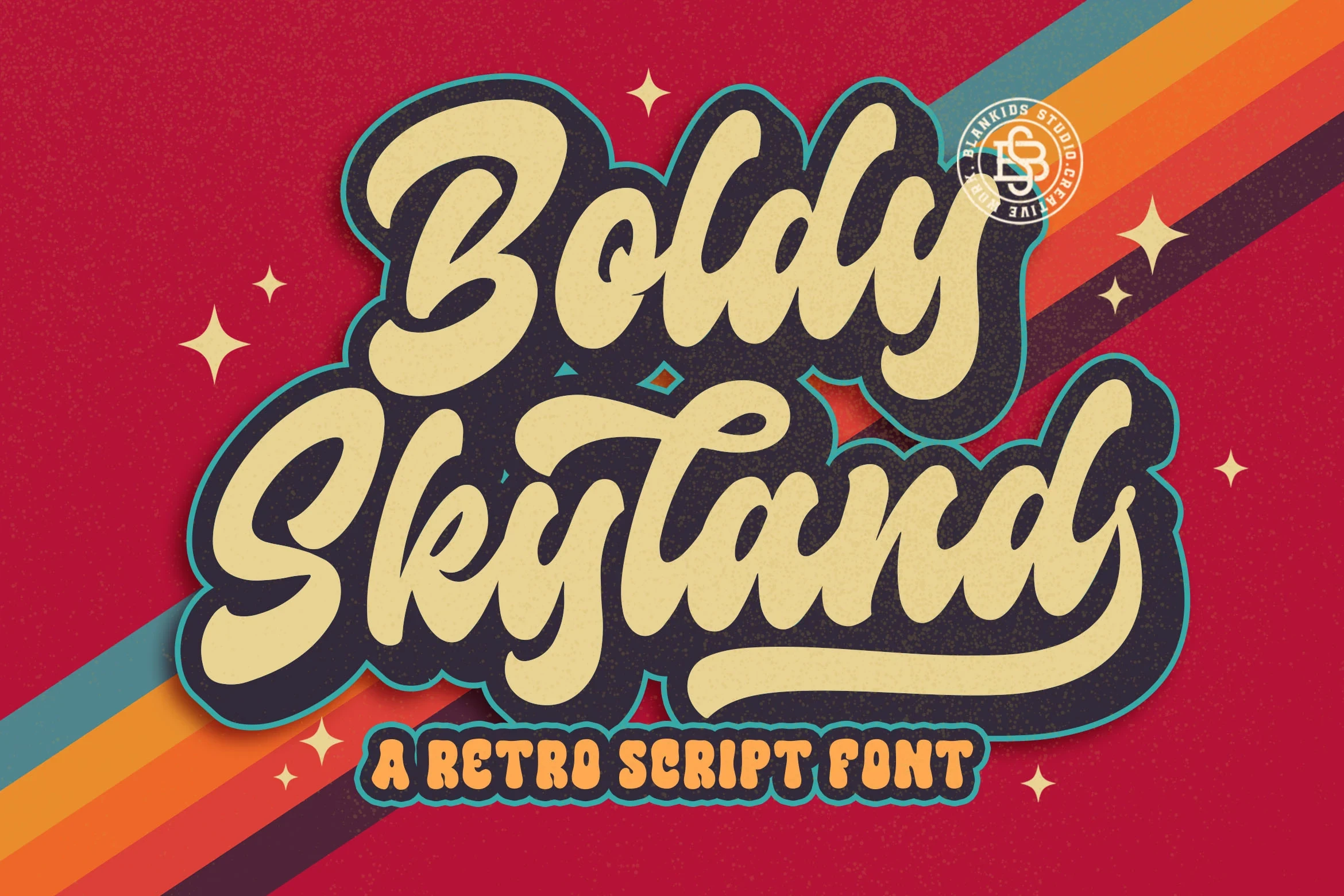
Best For: logos, branding, headlines, invitations
Boldy Skyline Font directs its heavy connected script upward through a lifted slant and soft-edged terminals. It supports logos, headlines, and invitations, although tight connections make smaller applications harder to read.
Retro Sign Font
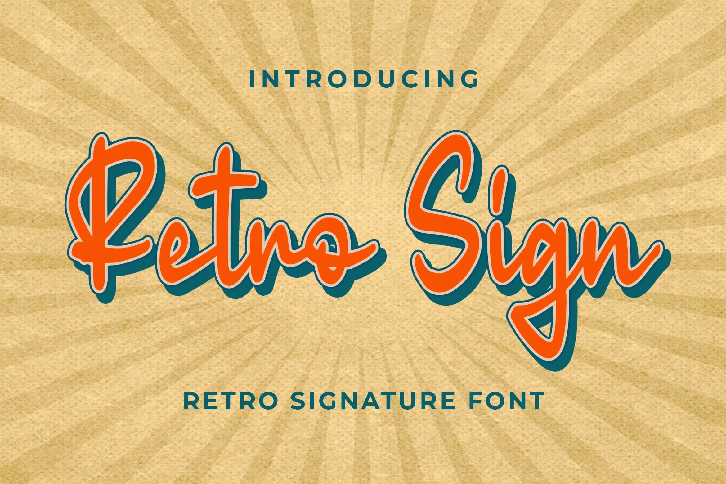
Best For: logos, branding, invitations, wedding designs
Retro Sign Font uses a monolinear signature construction with exaggerated loops, tails, and connected letters. Its handwritten identity works for large logos and invitations, but the stylized joins take priority over quick reading in compact uses.
Blocky Serif Displays
These blocky serif displays use upright structure, slab or sharp horizontal serifs, and substantial contrast. They feel more architectural and stable than the flowing scripts.
Wildhorn Slab Font
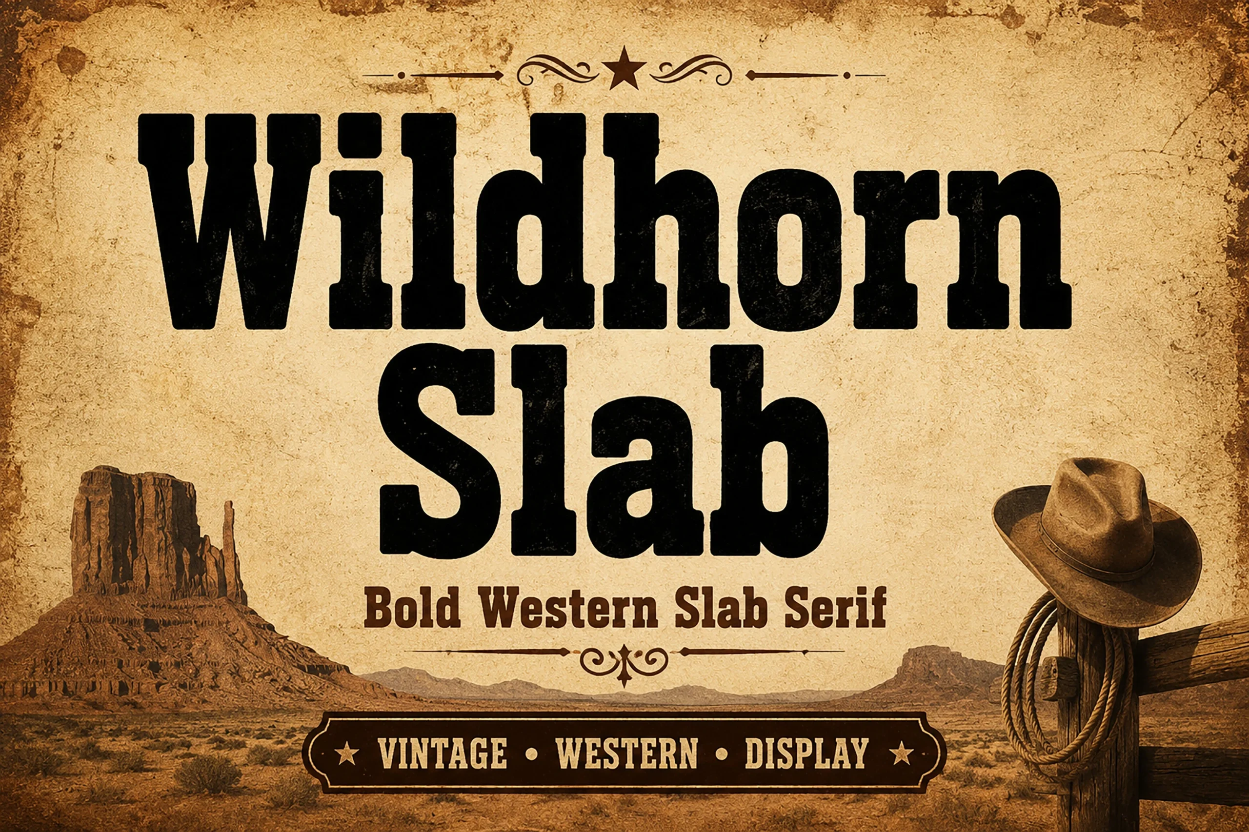
Best For: branding, signage, website headers, display text
Wildhorn Slab Font uses condensed heavy slab serifs, a tall cap height, and uniform strokes to create a compact block-built presence. Its simple forms stay readable for signage, website headers, and other large applications, making it a dependable Vintage Aesthetic Fonts option.
Molcer Font
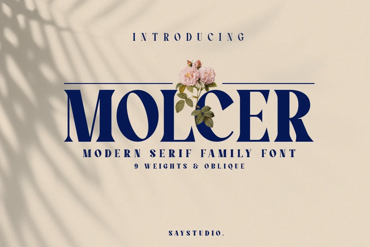
Best For: branding, packaging, headlines, logos
Molcer Font spreads wide with sharp horizontal serifs, vertical stress, and high thick-to-thin contrast. Its expansive display presence belongs in titles and logos, since delicate strokes may disappear in small packaging copy.
Lush Letter Font
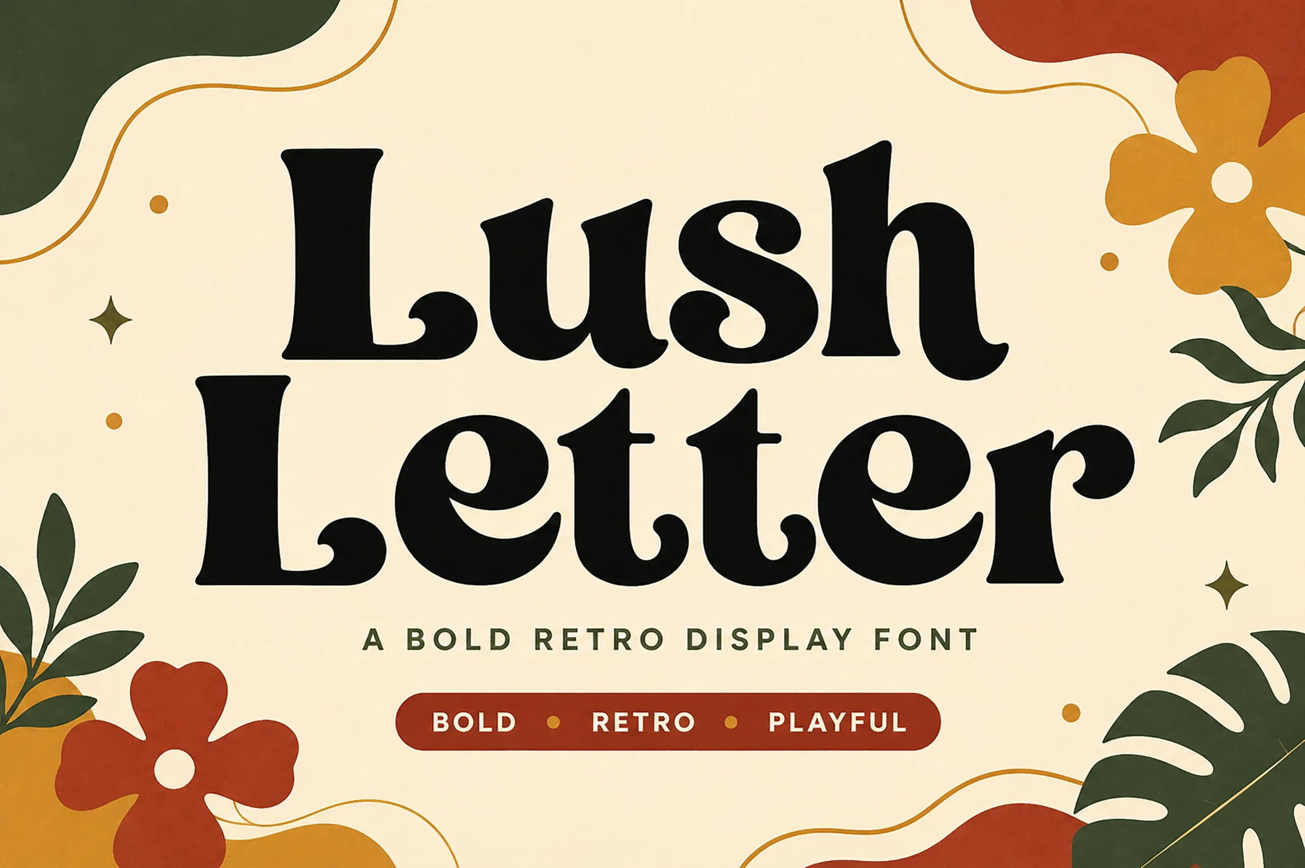
Best For: display text, modern designs, playful designs, bold designs
Lush Letter Font combines a heavy high-contrast serif with teardrop and ball terminals, adding decorative softness to large titles. Thick-to-thin shifts read best at display scale and can break down in body-sized text, a key consideration when choosing Vintage Aesthetic Fonts.
Rounded Retro Displays
Rounded retro displays replace joins and flourishes with bulbous terminals, heavy uniform strokes, and simple silhouettes, making them clearer and more compact than most scripts.
Sweet Sixties Font
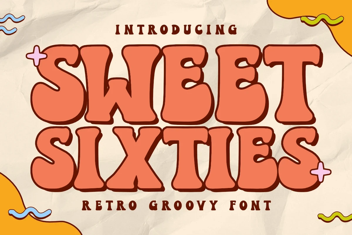
Best For: branding, packaging, posters, product labels
Sweet Sixties Font makes Vintage Aesthetic Fonts especially chunky through ultra-bold, bulbous forms, organic rounded terminals, and tight tracking. It suits labels, posters, packaging, and product branding, but its extreme weight rules it out for extended reading.
Regnas Font
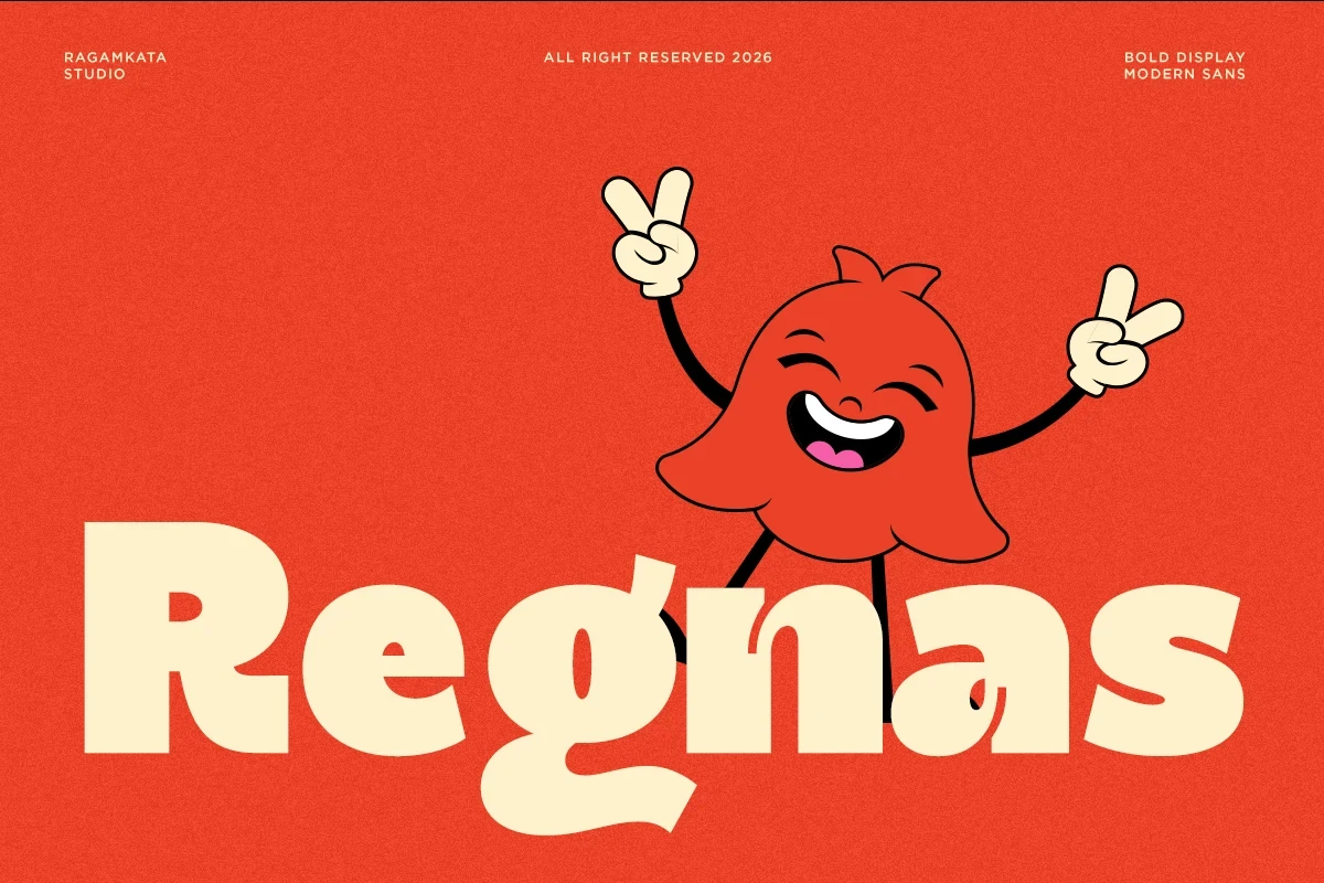
Best For: logos, branding, posters, headlines
Regnas Font softens a geometric base with rounded terminals and uniform heavy strokes. Because it avoids connected-letter complications, the silhouette stays clear in logos, posters, and headlines while retaining a rounded display character.
Stay Lucky Font
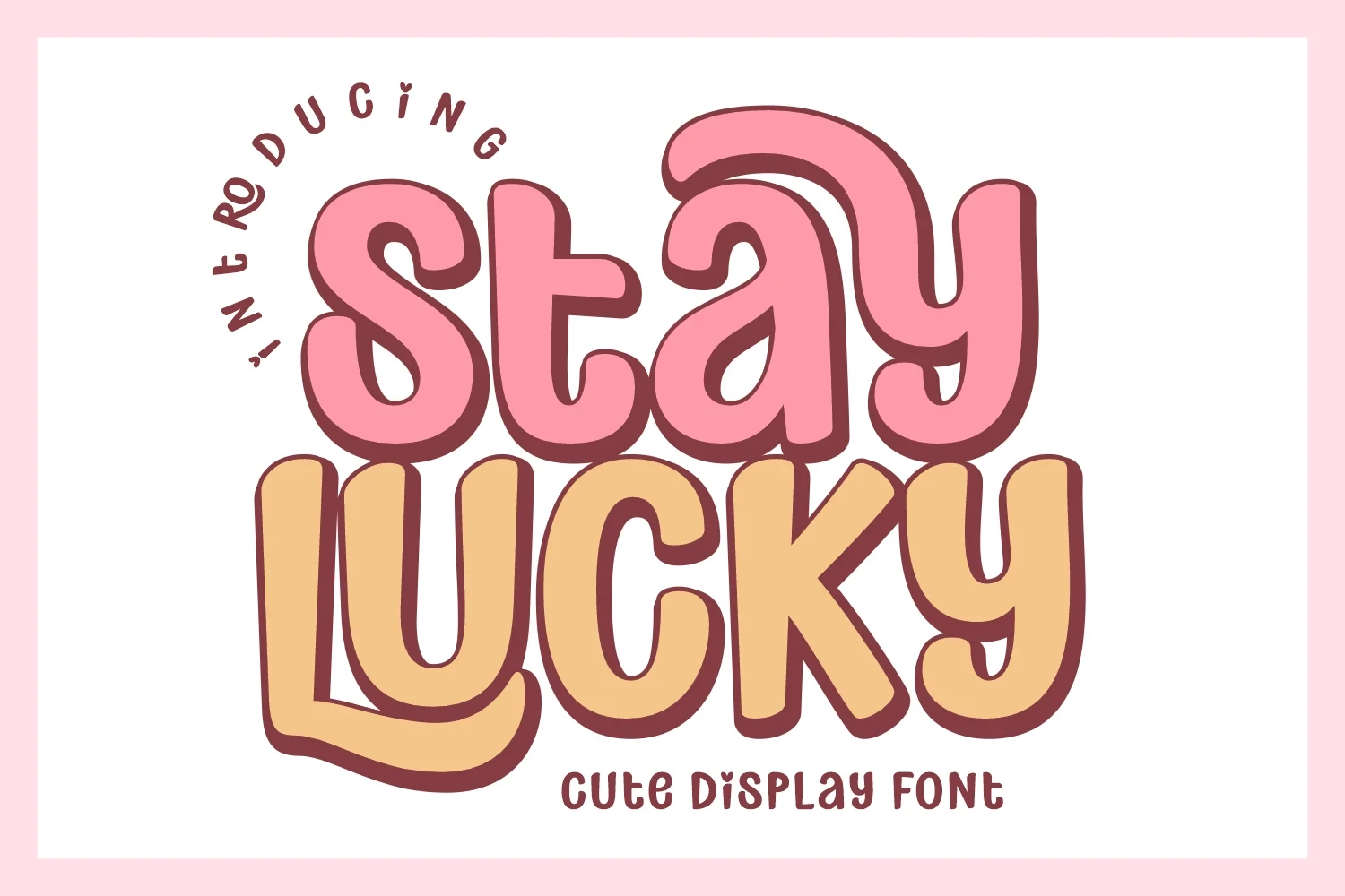
Best For: packaging, stickers, children’s designs, product labels
Stay Lucky Font separates itself from flowing scripts with disconnected letterforms, heavy rounded strokes, and soft bulbous terminals. The simple construction suits packaging, stickers, children’s designs, and product labels better than dense text.
How to Choose the Right Font
Choose connected scripts when swashes, slant, and personal wordmark energy are central; select monolinear options for clearer display reading. For sturdier signage, compare slab serifs and rounded displays, while high-contrast serifs need more scale. In Vintage Aesthetic Fonts, the strongest choice is the one whose construction matches the available space and reading distance.