16 Best Minimalist Aesthetic Fonts in 2026
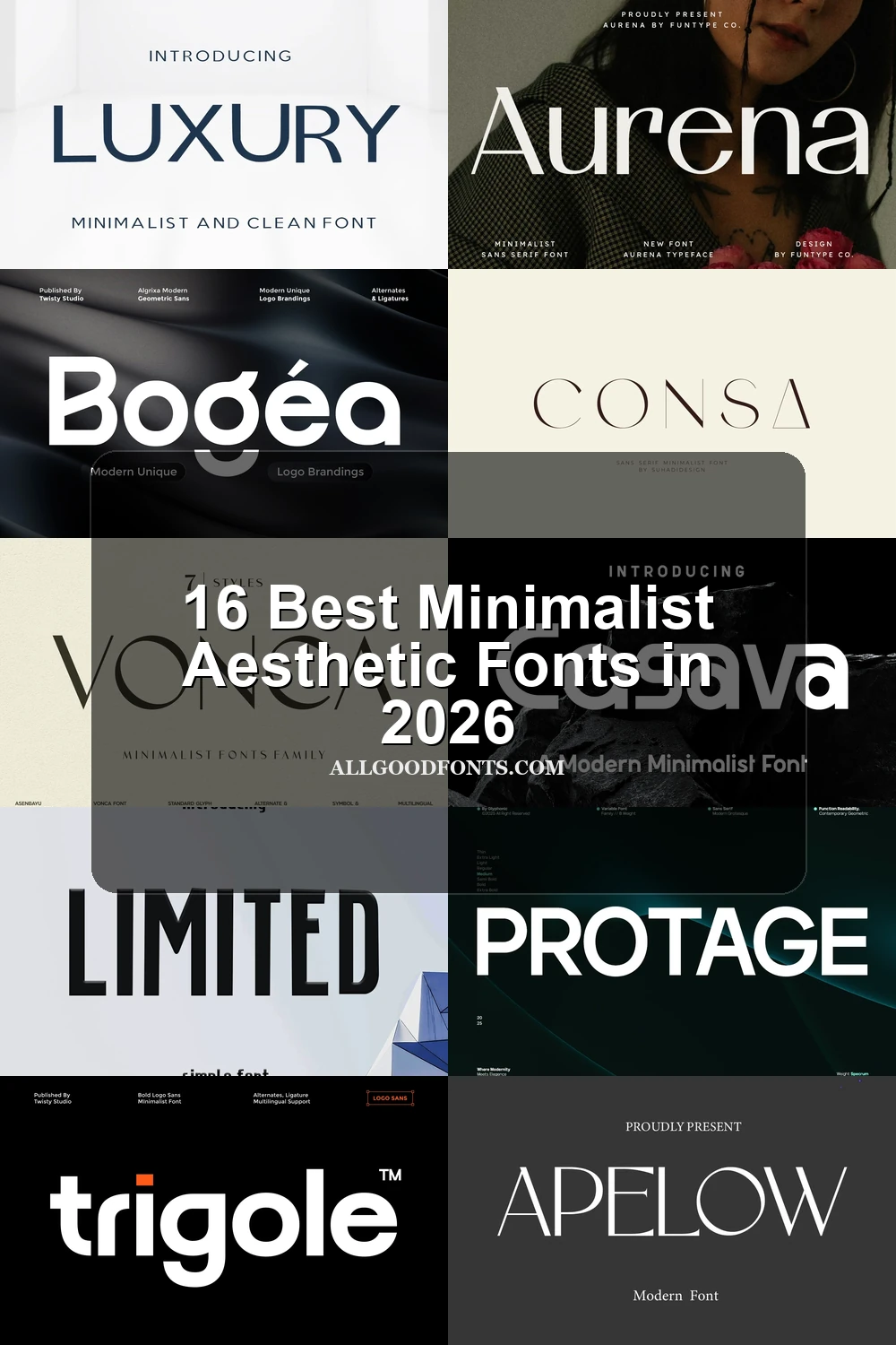
This collection moves from high-contrast serif and sans-serif displays to geometric, condensed, and modified letterforms, with visible differences in terminals, apertures, joins, and spacing. These Minimalist Aesthetic Fonts are best suited to logos, packaging, posters, signage, headlines, and other carefully scaled display work.
Looking for more aesthetic fonts? Browse our complete Aesthetic Fonts collection to compare modern, elegant, bold, vintage, and retro aesthetic styles.
Minimalist Aesthetic Fonts: Contrast-Led Displays
These Minimalist Aesthetic Fonts use contrast, sharp serifs, wide proportions, or flared terminals to create expressive display shapes. They are more delicate and headline-focused than the geometric groups.
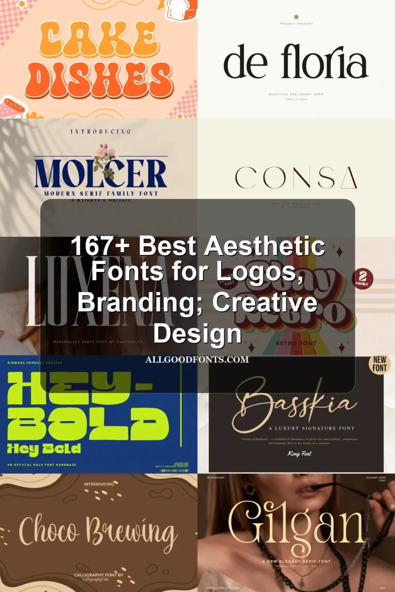
Consa Font
Best For: display text, modern designs
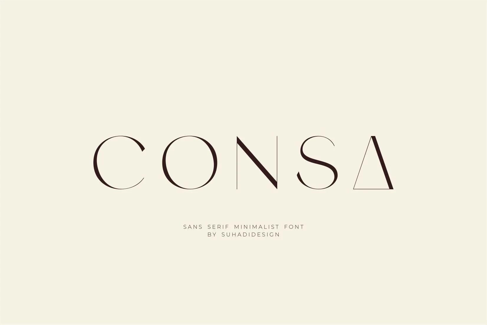
Consa Font combines lightweight high contrast with geometric proportions and open circular apertures. Its included ligatures add display flexibility, while thin strokes make it most reliable for large headlines and signage rather than small body text.
Vonca Font
Best For: logos, branding, packaging
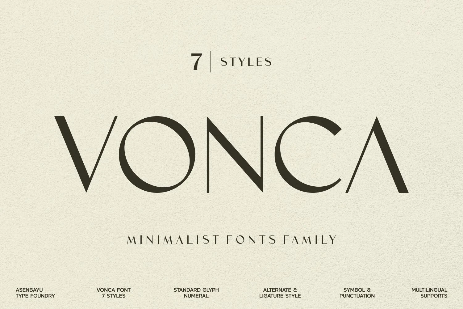
Vonca Font uses wide, spacious proportions and sharp, pointed triangular serifs to form an airy display face. Delicate strokes suit logos, branding, and editorial titles, but the generous spacing and fine details are less practical for continuous reading.
Melora Font
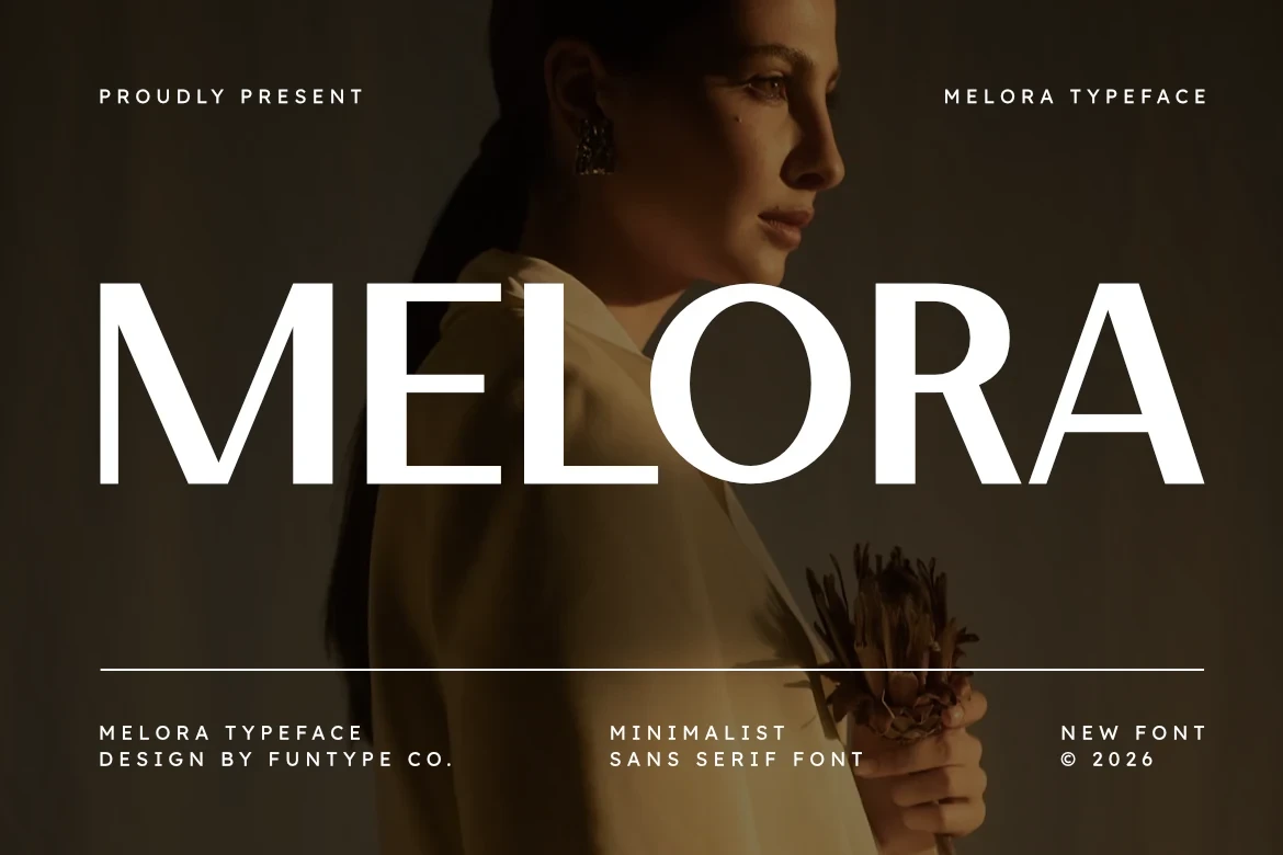
Best For: branding, posters, headlines, social media graphics
For branding, posters, and social media graphics, Melora Font brings a bold upright sans-serif with wide geometric proportions. High contrast, horizontal terminals on the E and A, and an upright axis give it strong large-scale presence, though those features are better suited to display text than paragraphs.
Aurena Font
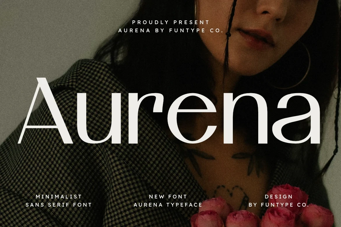
Best For: branding, posters, headlines
Aurena Font creates impact through wide rounded forms, open circular shapes, and flared terminals on the lowercase r and a. Its high contrast gives headlines a pronounced visual rhythm, but the construction should remain at display sizes instead of body copy.
Heluxa Font
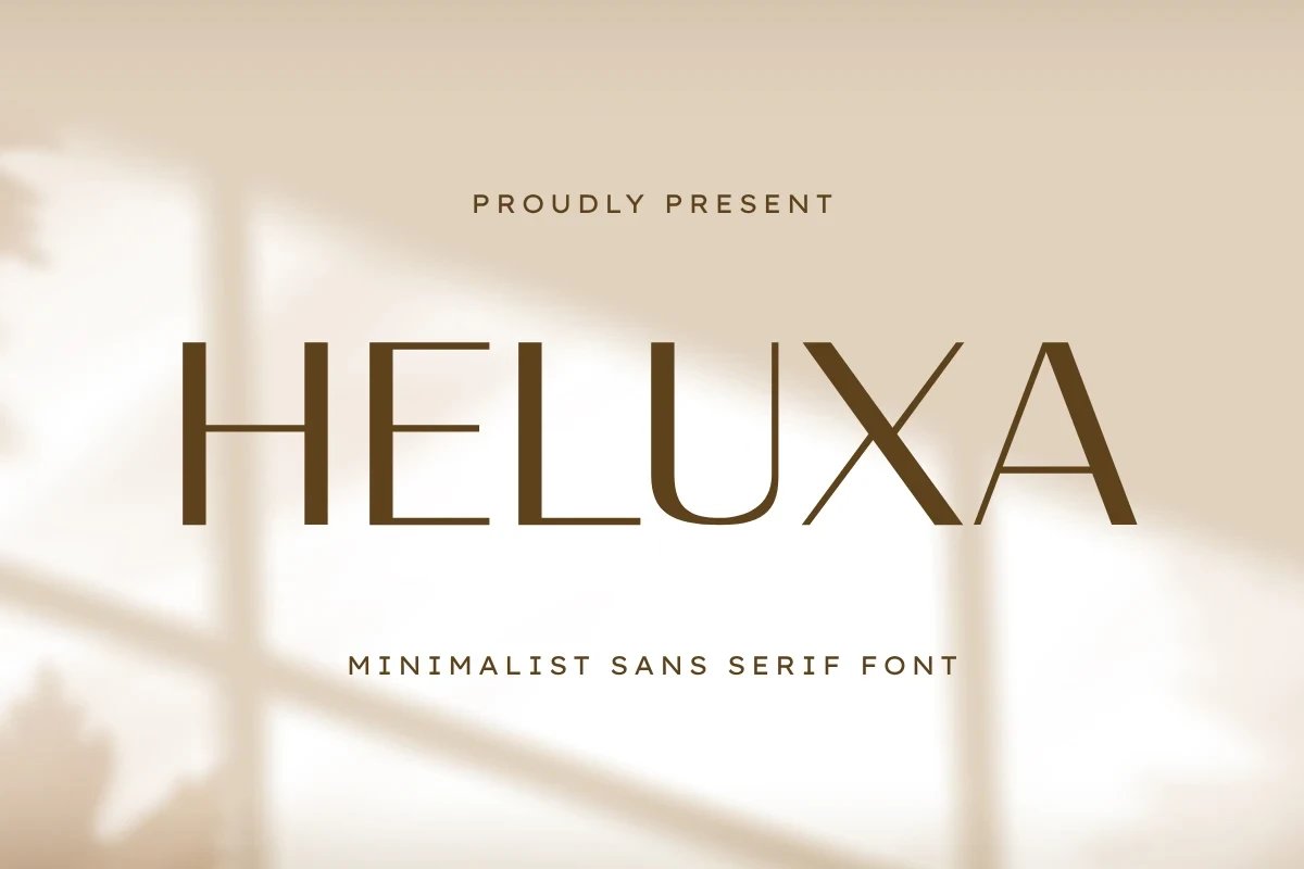
Best For: branding, packaging, posters, invitations
Heluxa Font is a light, wide display face with high contrast and blunt horizontal terminals. Thin strokes and open spacing favor large logos, packaging marks, posters, and invitations, where its proportions can breathe without the demands of small text.
Sunday Dreams Font
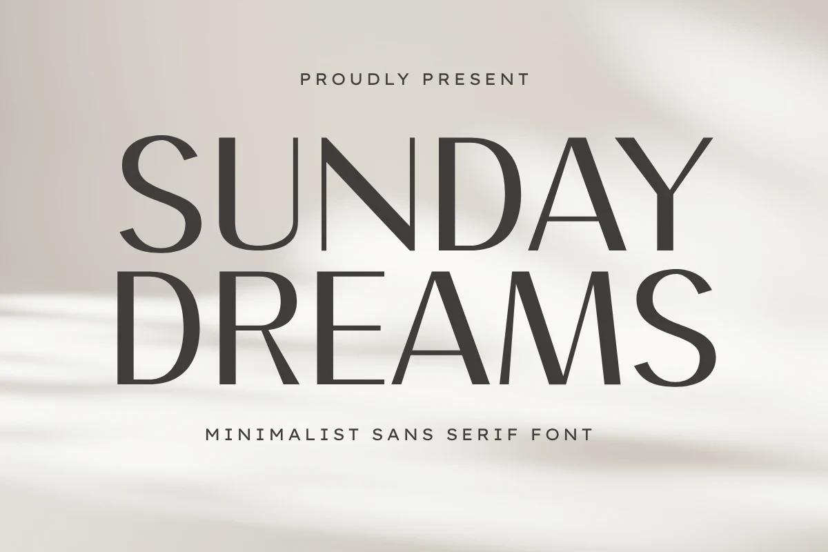
Best For: logos, branding, packaging, invitations
Sunday Dreams Font combines tall condensed proportions with sharp, flared serifs and open counters. Its narrow vertical structure concentrates attention in short titles and marks, while the contrast and fine details make extended reading a poor fit.
Apelow Font
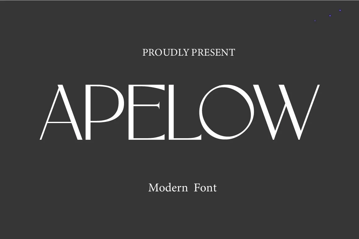
Best For: book covers, branding, invitations, social media graphics
Apelow Font gives Minimalist Aesthetic Fonts a wide serif option with vertical stress, sharp serifs, and pronounced thick-to-thin contrast. Its expansive title shape works for book covers and invitations, but thin strokes need generous sizing to remain readable.
Luxury Font
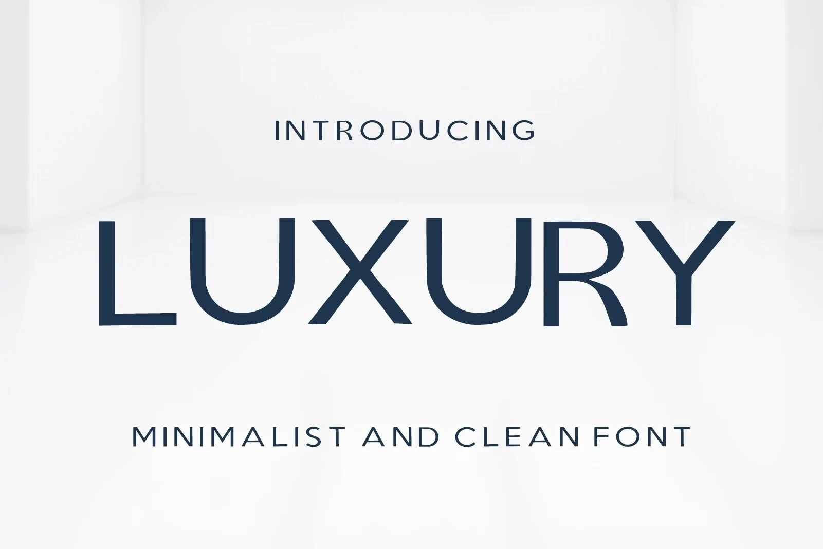
Best For: high-end designs, product labels, display text, modern designs
Luxury Font shapes wide sans-serif lettering with angular terminals and flared stroke ends. Generous spacing supports product labels and large headings, while the stylized terminals make it less efficient for compact text or small-scale information.
Geometric Sans-Serif Essentials
Uniform strokes, open counters, and geometric construction connect these sans serifs. Weight variation and measured proportions make them more adaptable for branding and headings than the highly stylized display faces.
Protage Font
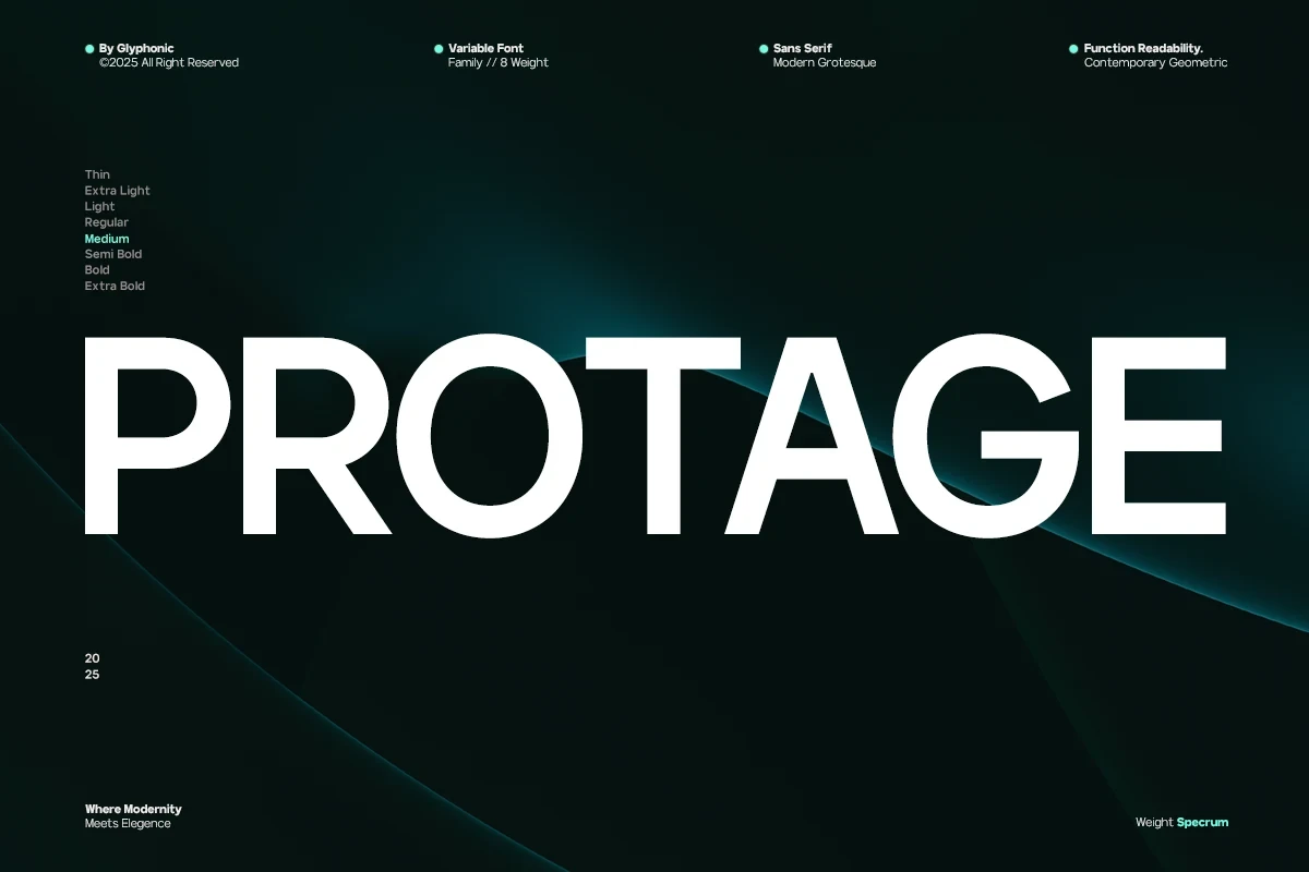
Best For: branding, social media graphics, modern designs, clean designs
Protage Font is a geometric grotesque family available from Thin through Extra Bold. That unusually broad weight span supports hierarchy across branding and social media graphics, giving it more practical range than a single-weight display face while retaining uniform strokes and geometric clarity.
Katten Font
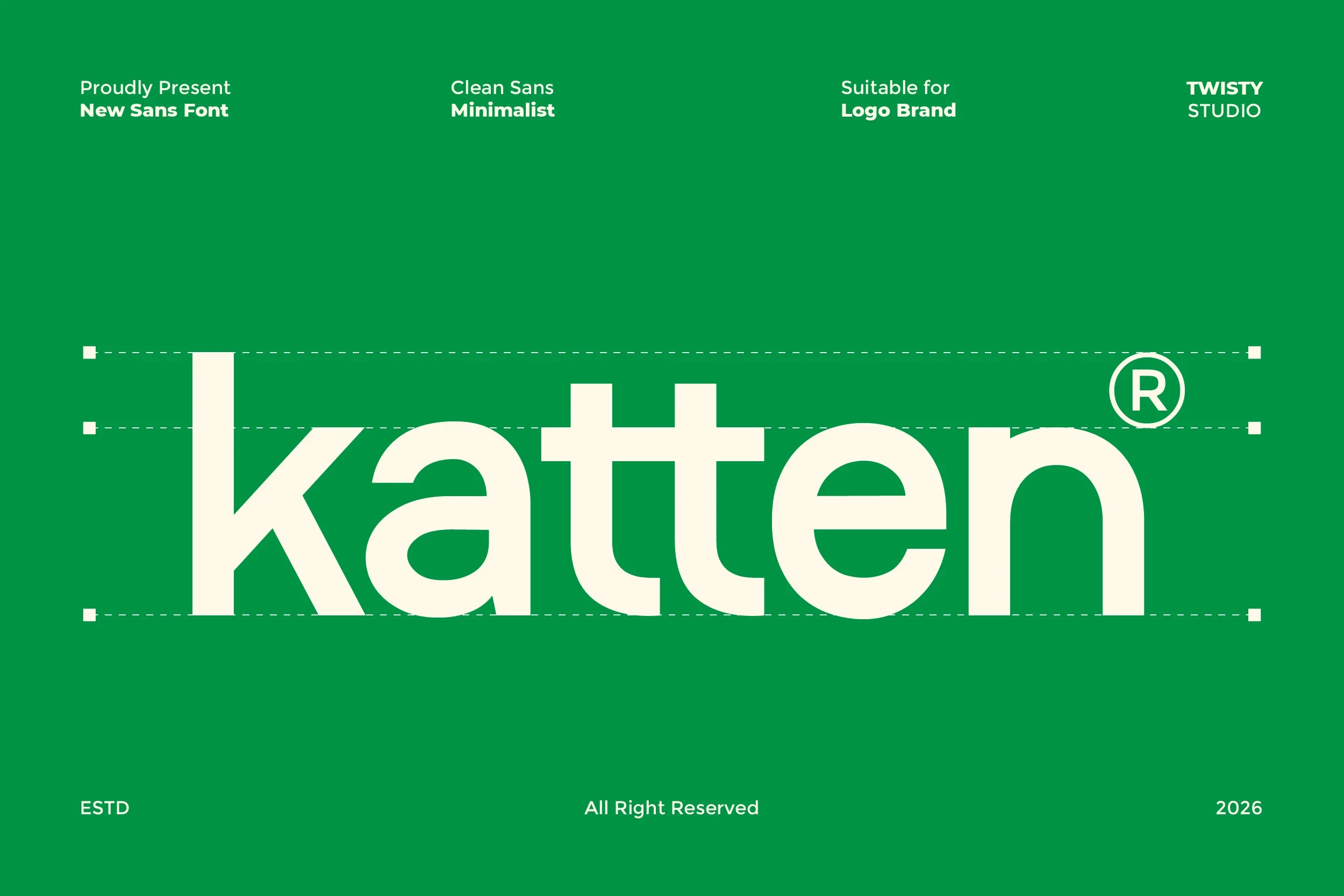
Best For: branding, headlines, modern designs, clean designs
Katten Font uses open counters, uniform strokes, and a notably low x-height beneath relatively tall ascenders. Horizontal terminals on the lowercase e and n help preserve readability, making it suitable for small branding as well as larger headings.
Lenatr Font
Best For: logos, headlines, quotes, modern designs
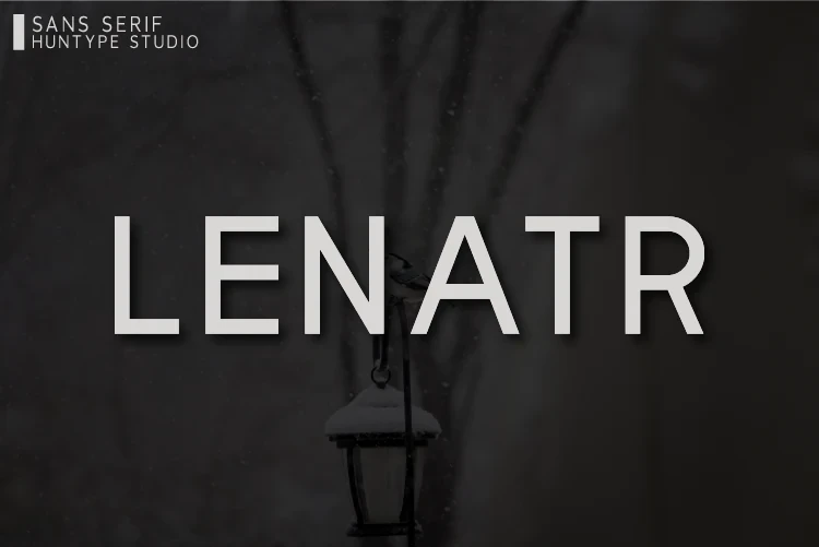
Lenatr Font is an uppercase geometric sans-serif with wide proportions, uniform strokes, and open counters. Consistent letterforms hold up particularly well in logos, signage, headlines, and large quotations, where spacing and shape can be seen clearly.
Trigole Font
Best For: logos, display text, modern designs, clean designs
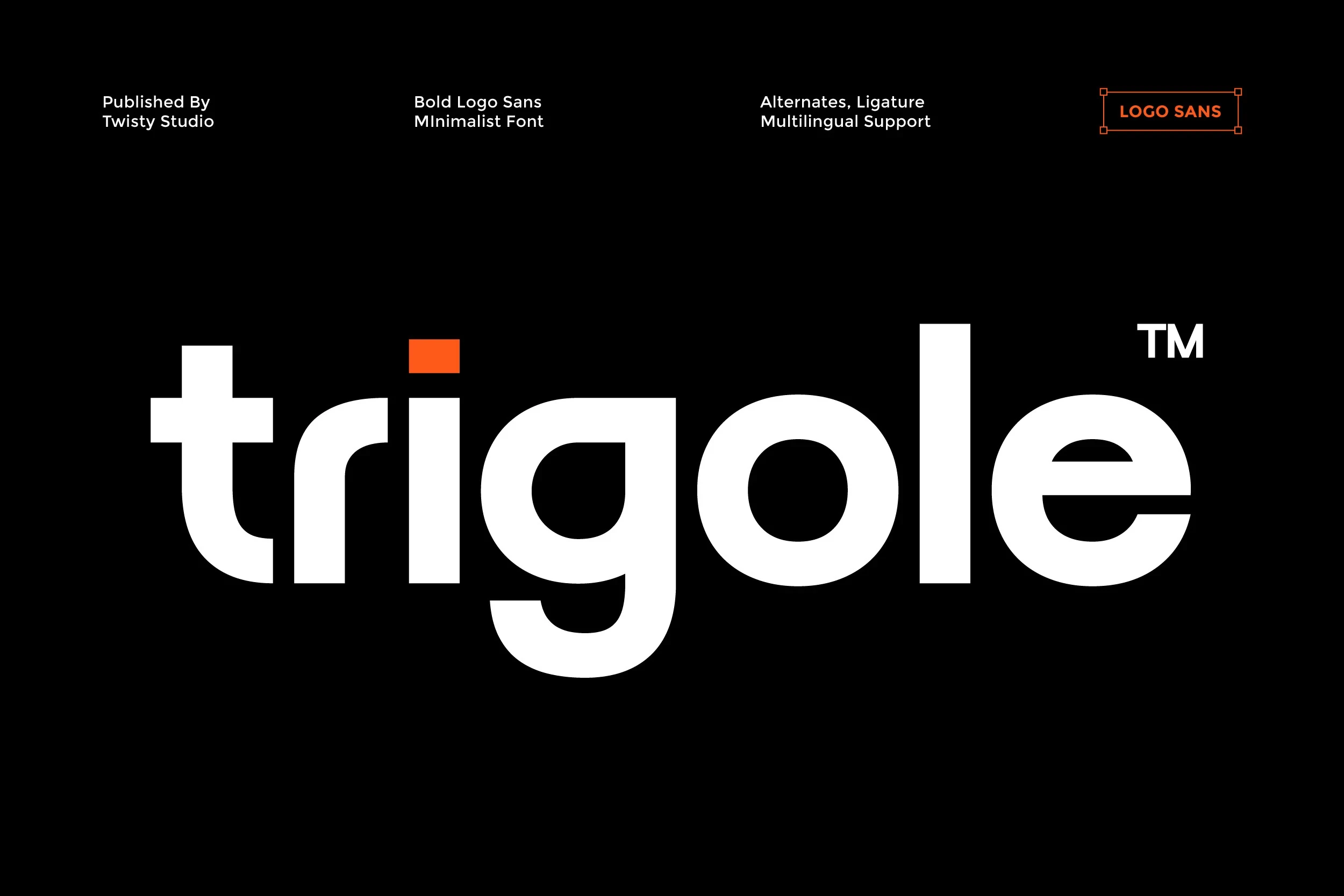
Trigole Font uses heavy rounded geometry with little stroke contrast and open counters in the g and e. The substantial weight keeps large display text readable, but dense forms can feel crowded when used at very small sizes.
Condensed and Industrial Structures
Condensed widths, squared corners, vertical axes, and engineered joints give this group a compact industrial character. Its lettering concentrates attention efficiently without depending on decorative serif contrast.
Limited Font
Best For: logos, branding, headlines, display text
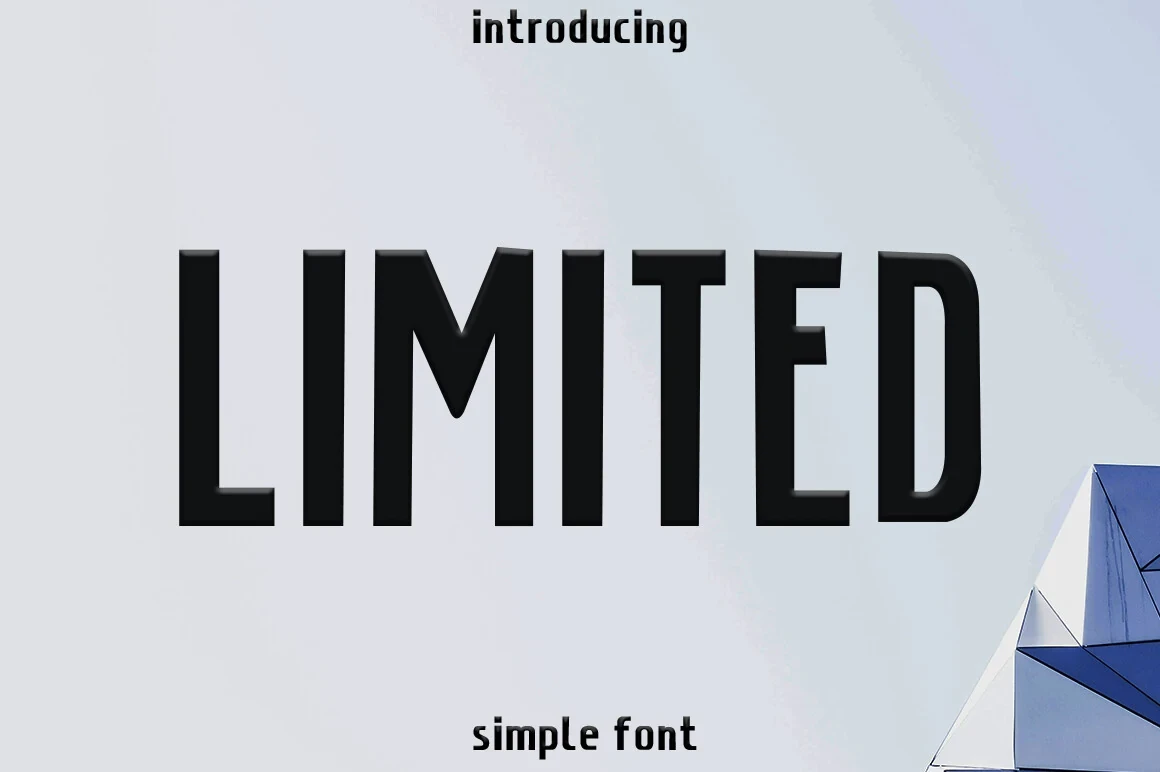
Limited Font serves compact logos and headlines with condensed monolinear lettering, a strict vertical axis, and squared-off corners. Its display strength comes from solid, consistent strokes rather than decorative contrast, making short text especially direct and legible at larger sizes.
Faggoe Font
Best For: display text, modern designs, clean designs, bold designs
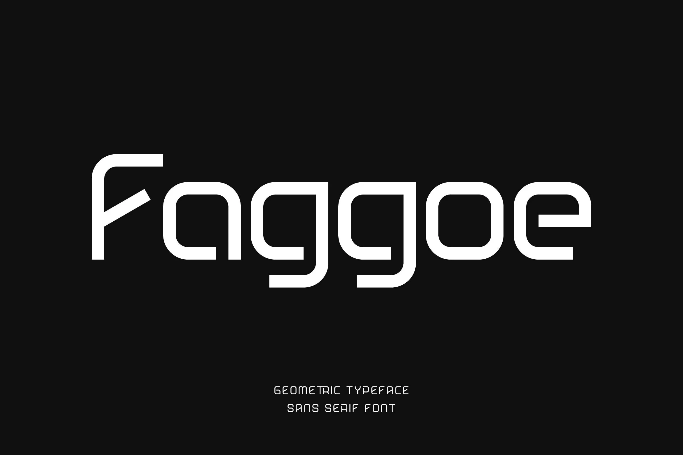
Faggoe Font pairs rounded exterior joints with sharp interior right angles, creating an engineered geometric construction. Fully closed counters reinforce its industrial appearance and keep the lettering clearest in large display settings rather than long-form text.
Modified Geometric Statements
Modified circles, rounded geometry, alternates, and ligatures distinguish these statement faces. They offer more typographic personality than standard geometric sans serifs, but require generous sizing for clarity.
Bogea Font
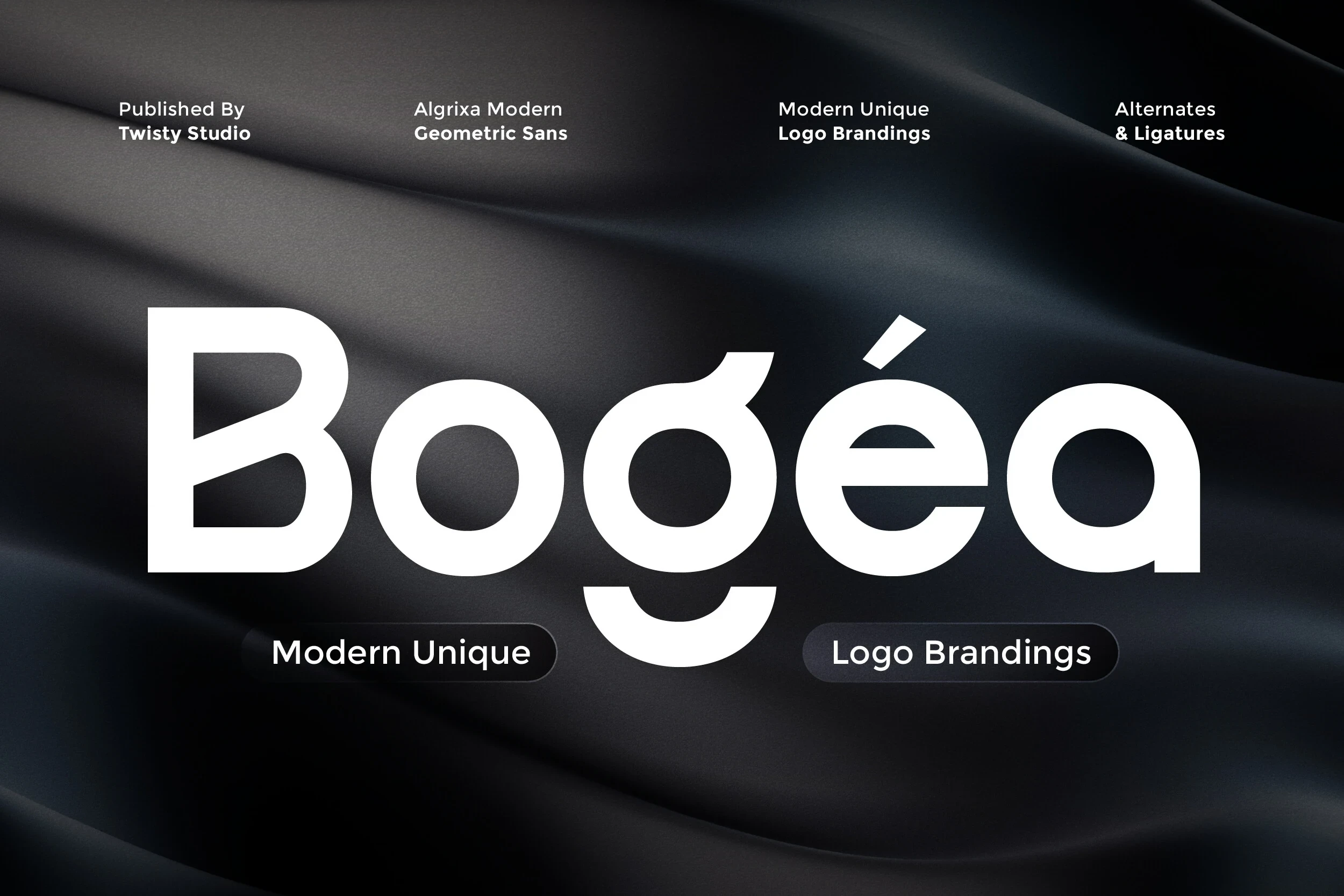
Best For: logos, product labels, display text, modern designs
Bogea Font builds a heavy monolinear statement from geometric circular forms, open apertures, and modified letters. Alternate characters encourage varied logo and label treatments, but those altered shapes can lose clarity when reduced to very small sizes.
Casava Font
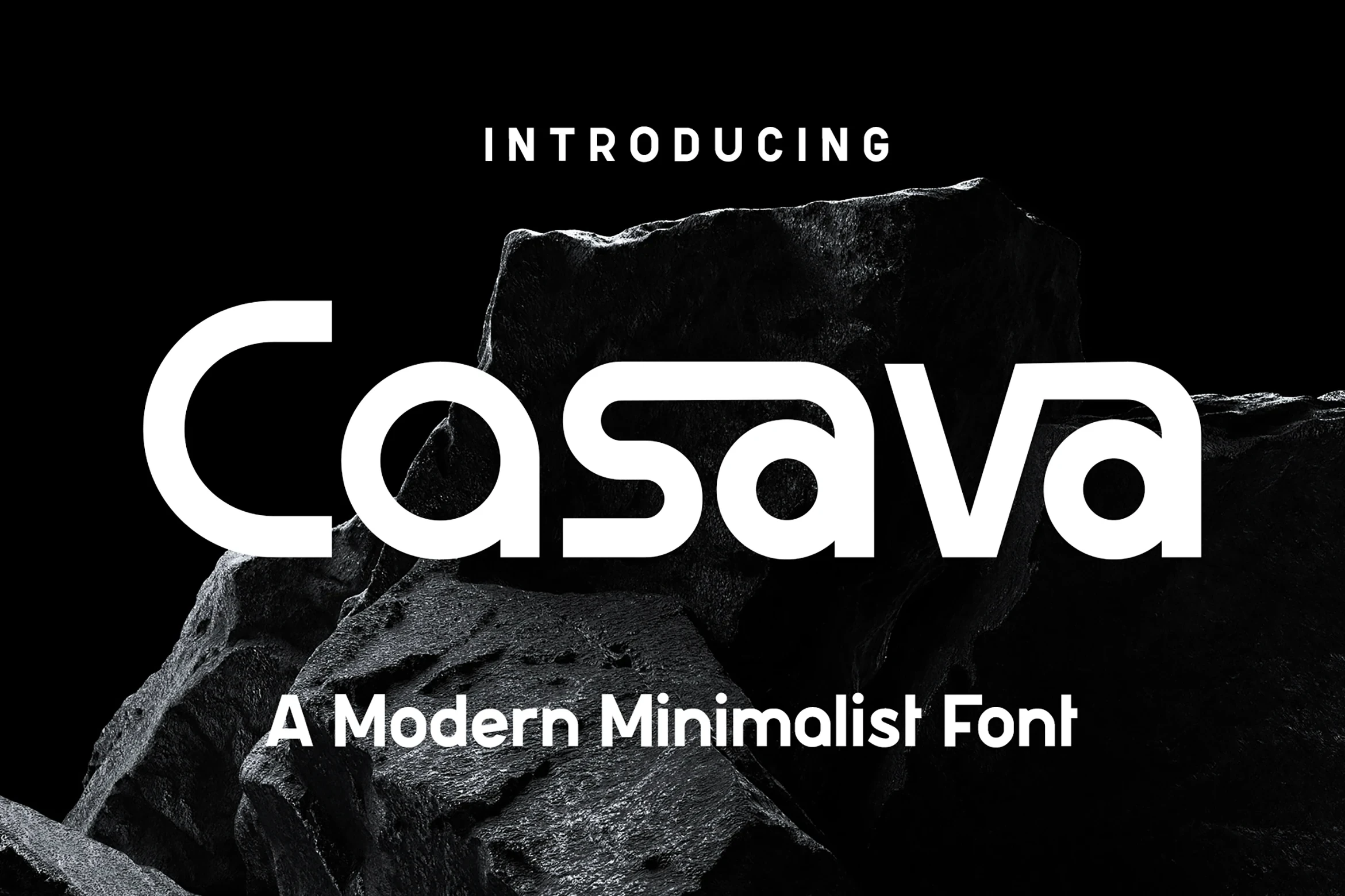
Best For: logos, branding, packaging, posters
Casava Font brings wide rounded geometry, a low x-height, ligatures, and alternate characters to packaging and poster work. Its forceful, wide-set construction reads strongly at display size, though the spacing and stylization reduce efficiency in small applications.
How to Choose the Right Font
Choose Minimalist Aesthetic Fonts by matching construction to scale: high-contrast faces need generous sizing, while open counters and consistent strokes support smaller branding. Use condensed or squared designs when space is tight, and reserve alternates or ligatures for prominent marks. For dependable hierarchy, compare available weights before pairing display lettering with simpler supporting text.