12 Best Modern Aesthetic Fonts in 2026
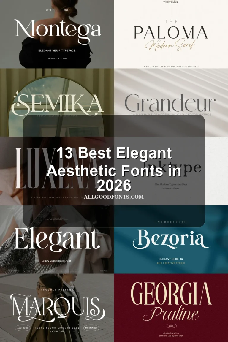
This collection spans sharp high-contrast serifs, condensed display faces, bold geometric sans serifs, and experimental lettering with merged forms. These Modern Aesthetic Fonts are aimed at headlines, logos, packaging, social graphics, labels, and other design roles where construction and scale matter as much as mood.
Looking for more aesthetic fonts? Browse our complete Aesthetic Fonts collection to compare modern, elegant, bold, vintage, and retro aesthetic styles.
Modern Aesthetic Fonts: High-Contrast Serif Displays
Modern Aesthetic Fonts in this serif group use contrast, pointed terminals, narrow proportions, and expressive swashes for editorial titles, branding, labels, and other large-format applications.
The Choed Font
Best For: branding, headlines, high-end designs, display text
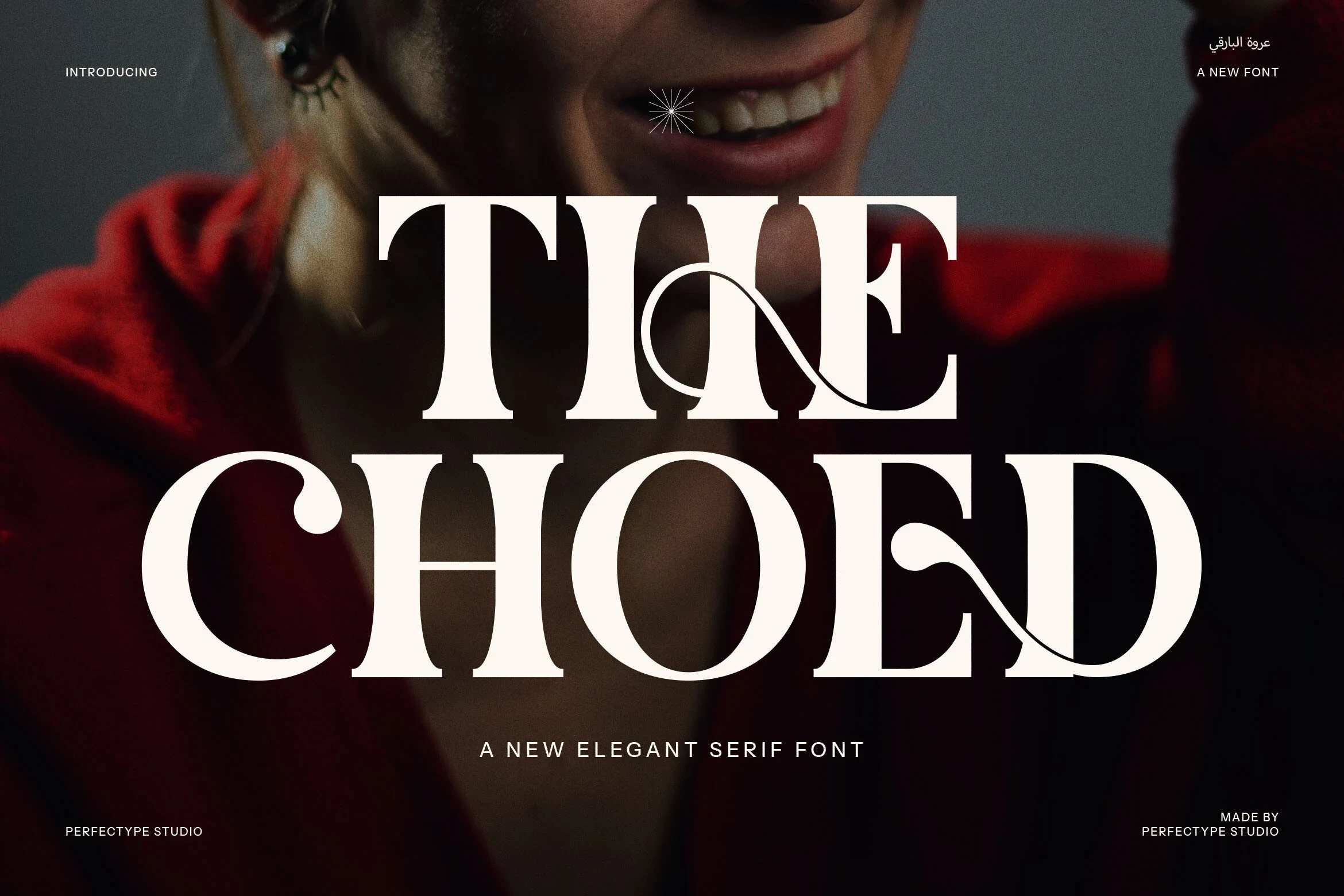
Heavy serif forms give The Choed Font its dramatic presence, while curling swashes and included ligatures add branding possibilities. Its wide proportions suit high-end titles and display text, though the varied strokes and flourishes become difficult to read at small sizes.
De Floria Font
Best For: high-end designs, display text, modern designs
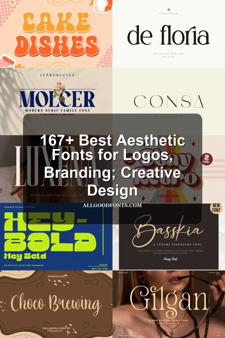
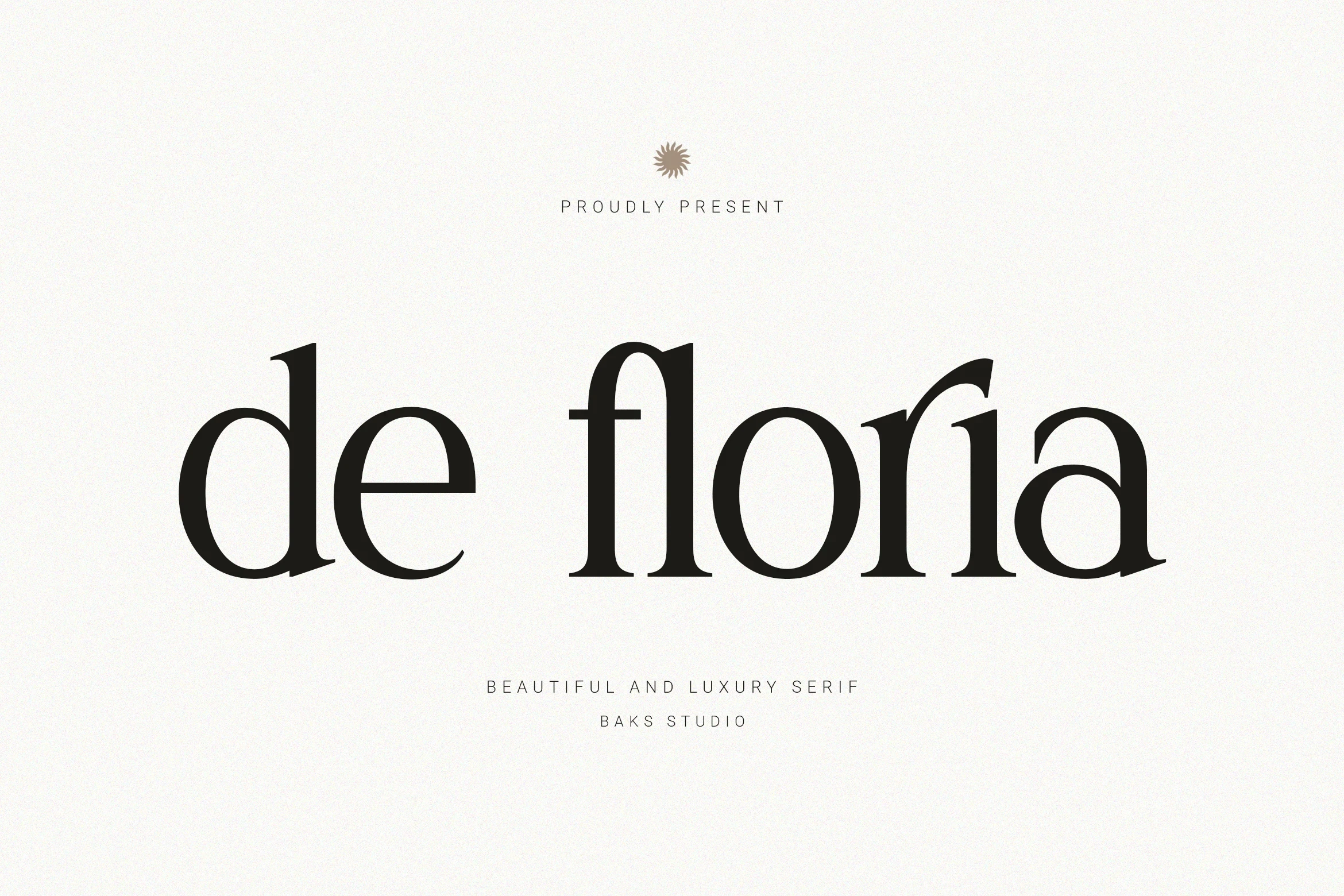
De Floria Font is particularly effective for high-end designs that need a polished headline silhouette. High contrast, sharp flared terminals, and unusually elongated crossbars create its distinctive construction; those fine details remain clear at display size but may fade in compact applications.
The Taylor Belle Font
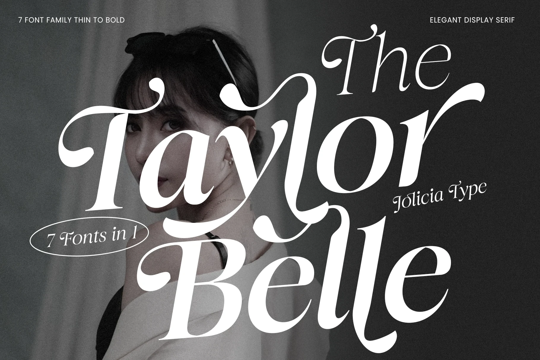
Best For: display text, modern designs, minimal designs
The Taylor Belle Font works best when a title needs flowing movement rather than plain text presence. High contrast, bracketed serifs, and swashes extending from ascenders and descenders create an elaborate display treatment, but the flourishes rule it out for body copy.
Mollen Fancyla Font
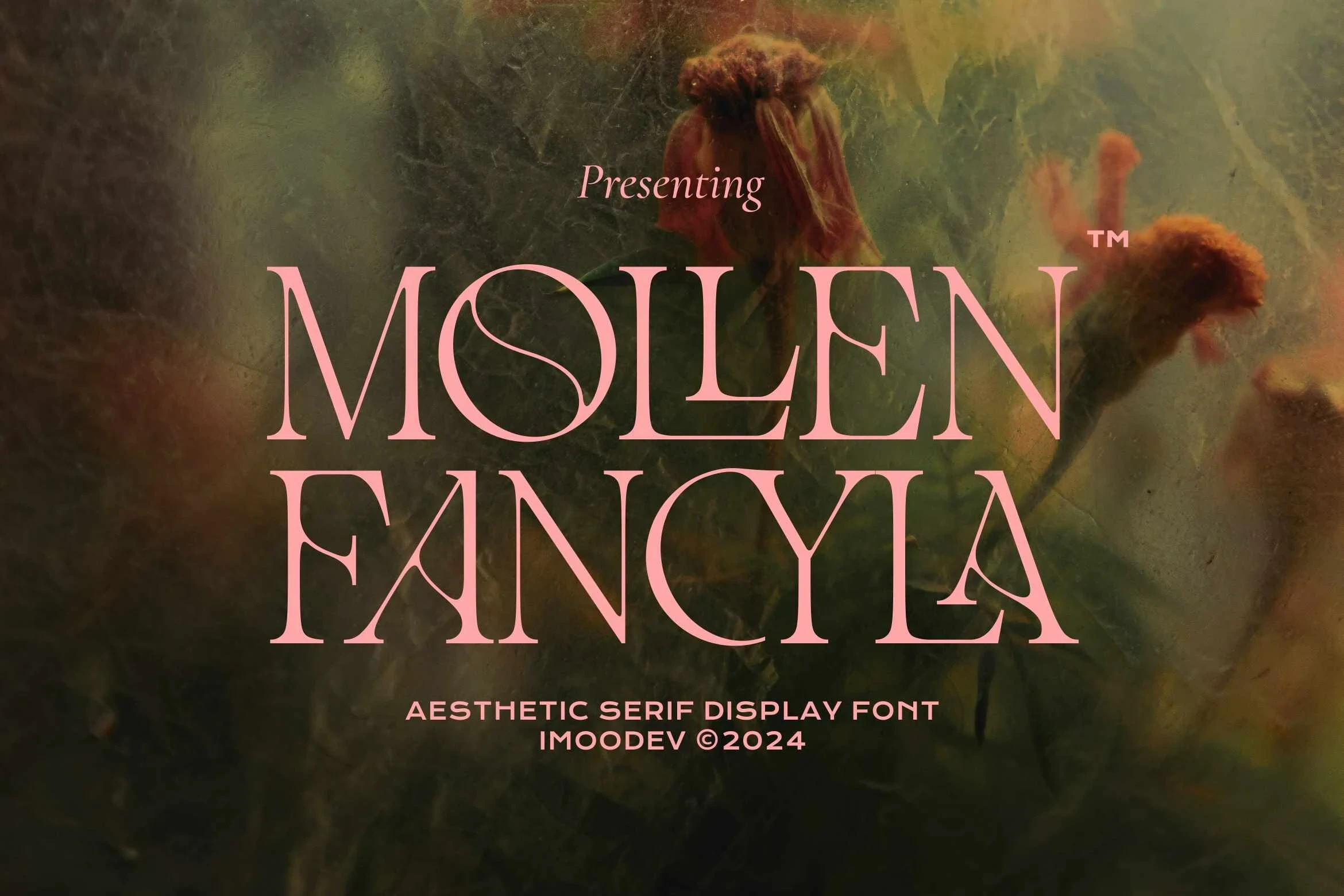
Best For: branding, beauty branding, high-end designs, display text
Mollen Fancyla Font combines narrow serif proportions with sharp triangular serifs and stencil-like notches in letters such as M, N, and A. The interruptions give branding and high-end designs a crafted editorial edge, although thin strokes and gaps can close up when scaled down.
Modern Aesthetic Font
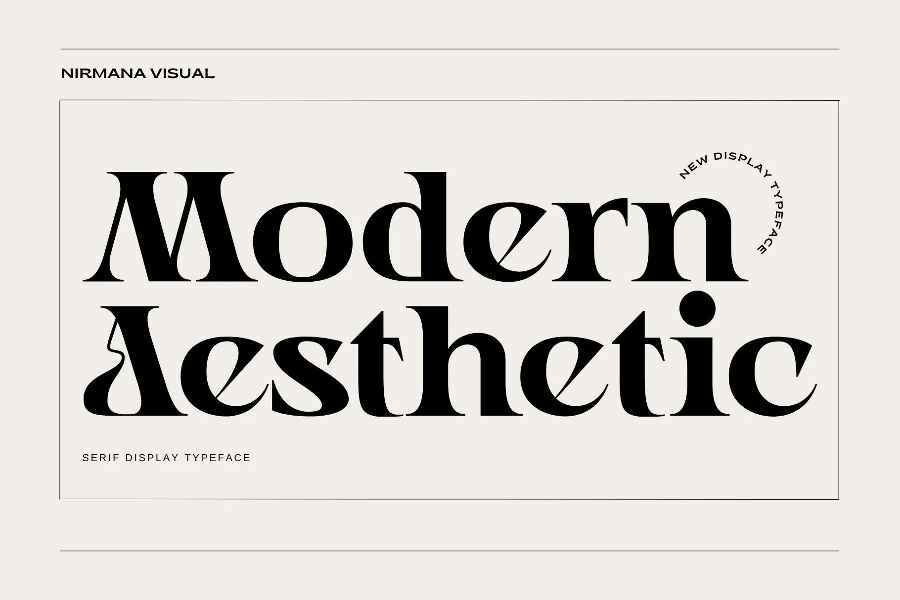
Best For: logos, branding, social media graphics, product labels
For branding, product labels, and social graphics, Modern Aesthetic Font offers an upright, high-contrast serif structure with pointed terminals and a long swash-like entry stroke on the capital A. Its PUA-encoded characters provide additional glyph and swash options, while the stylized details remain best at display scale.
Higlean Font
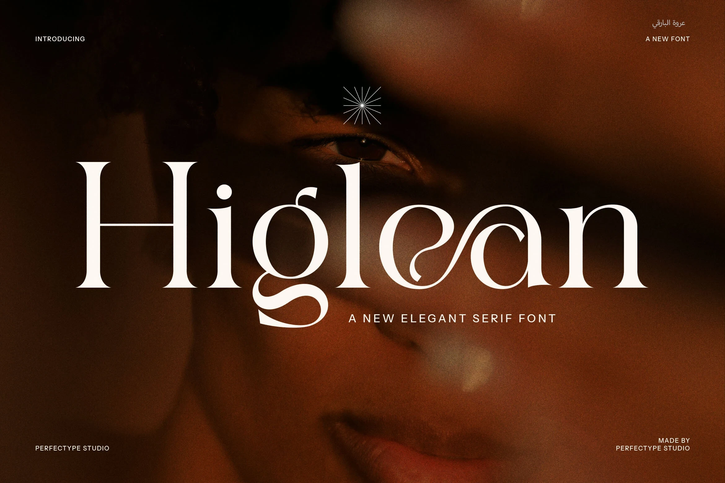
Best For: logos, branding, packaging, product labels
Higlean Font softens sharply contrasted serif lettering with fluid swash terminals on characters such as g and e. Open counters, decorative joins, and included ligatures make it useful for logos, packaging, and labels, though those features reduce small-size legibility.
Geometric and Experimental Sans Displays
These sans displays rely on geometry, monolinear strokes, condensation, rounded terminals, or overlap, creating stronger structural impact than the more decorative serif collection.
Nightboonts Font
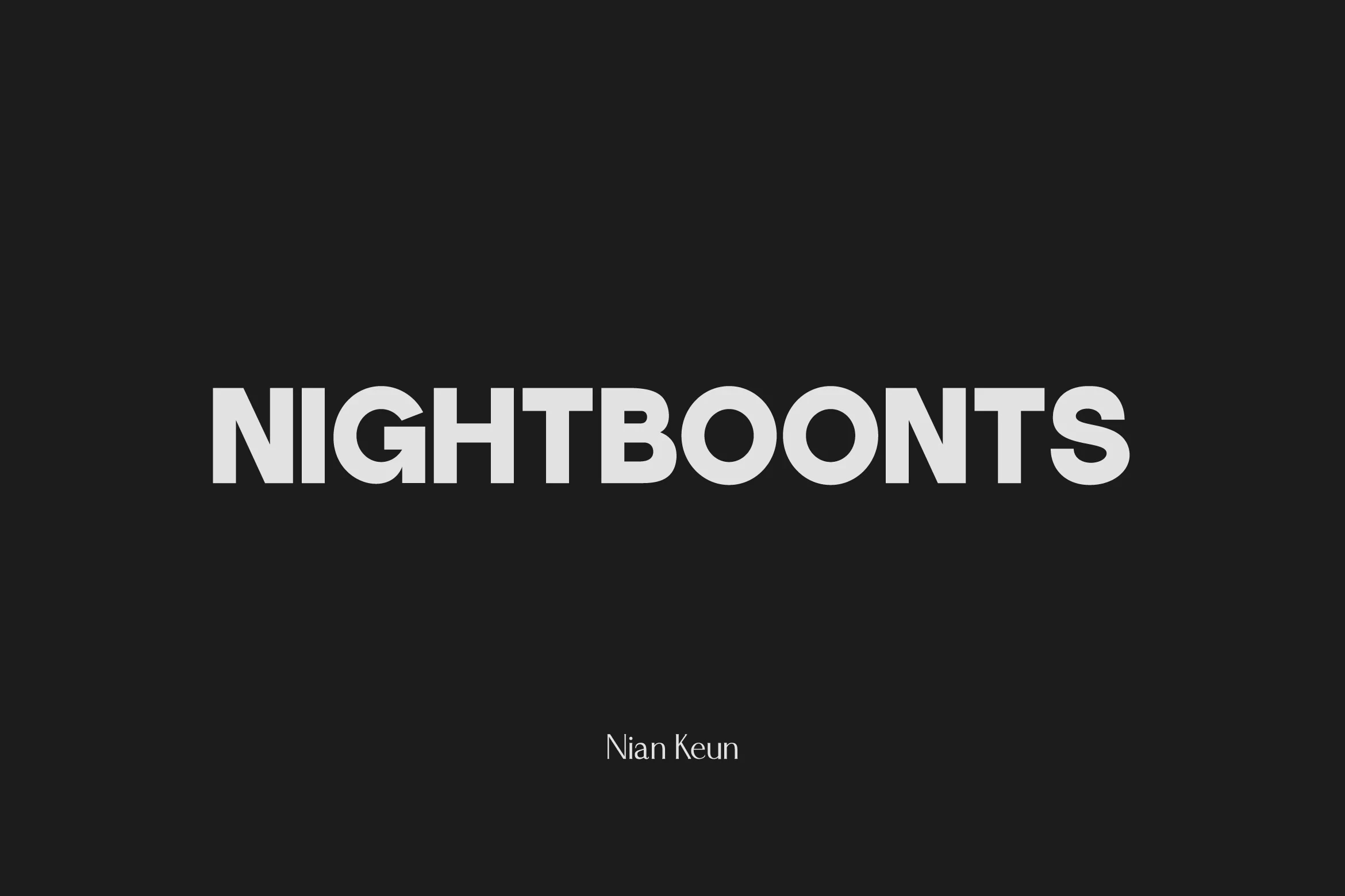
Best For: display text, headlines, modern designs
Nightboonts Font uses bold, uniform geometric strokes in a caps-only construction. It stays highly legible in large headlines and modern designs, but its display focus makes it less suitable for extended text.
Nugget Font
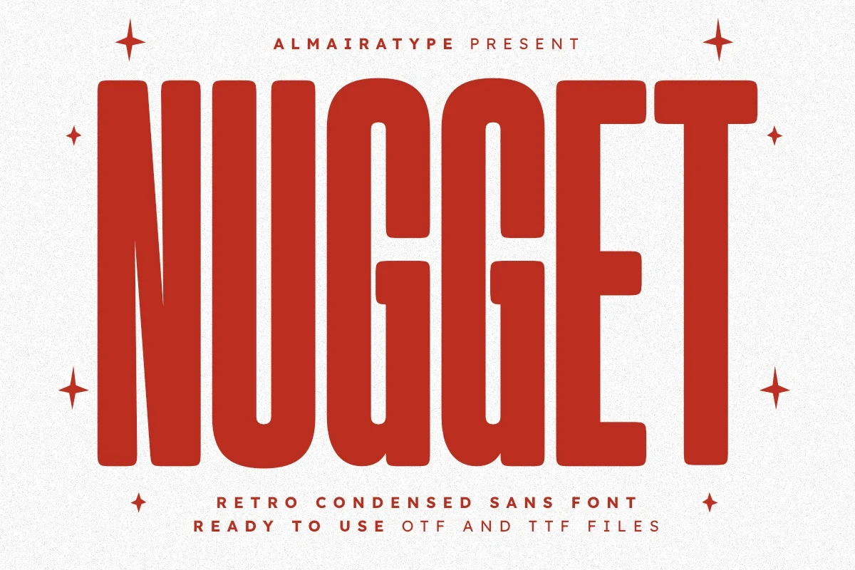
Best For: social media graphics, T-shirts, logos, headlines
Nugget Font compresses bold lettering into extremely narrow proportions, with rounded corners and terminals softening the vertical structure. It is useful for headlines, logos, social media graphics, and T-shirts, but the compressed forms lose readability when reduced.
Enegma Font
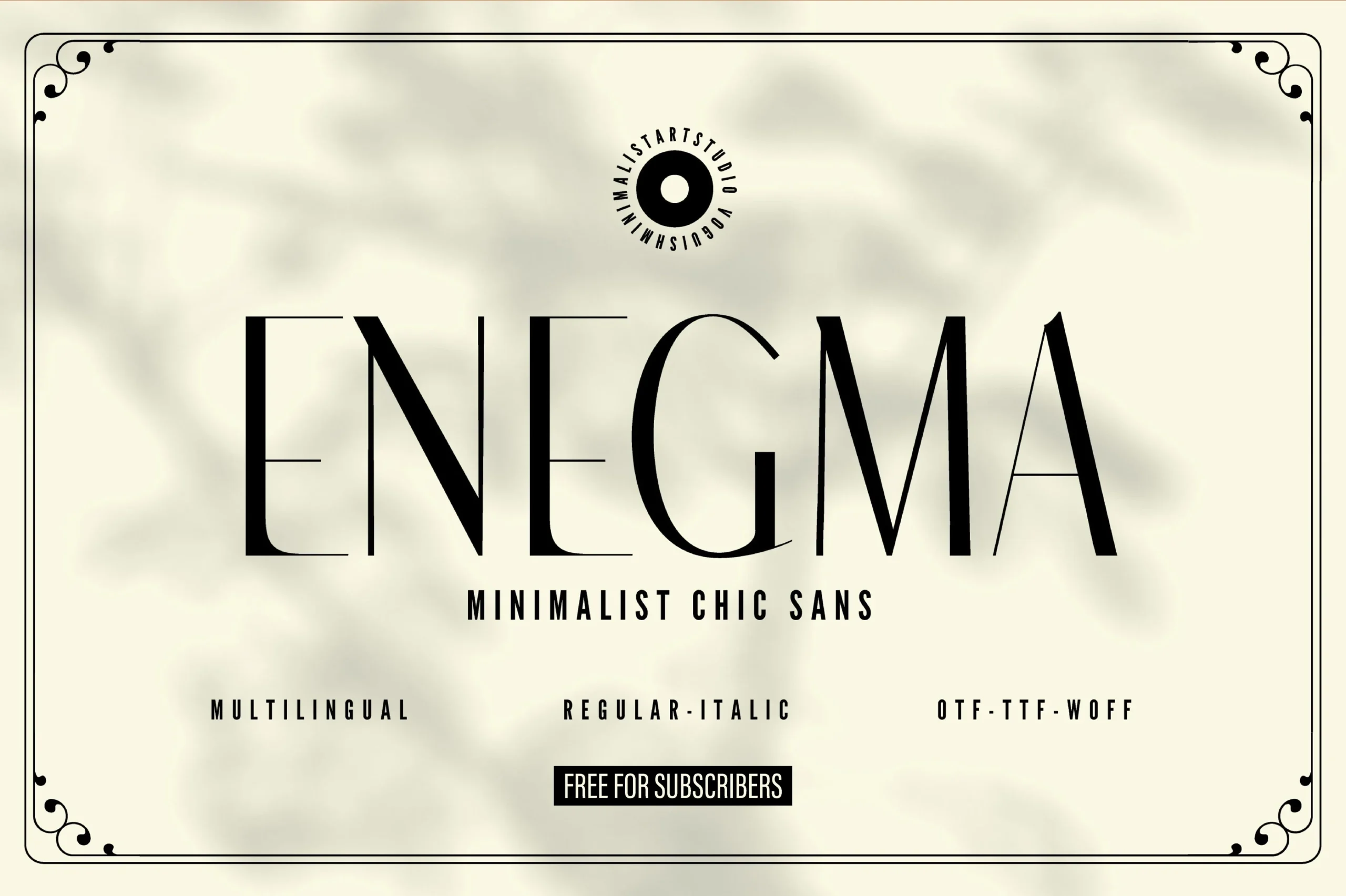
Best For: display text, modern designs, elegant designs
Enegma Font pairs extended geometric proportions with pronounced thick-and-thin contrast. Its light construction gives large titles an airy, elegant profile, while the thin strokes and sharp terminals require generous size to stay visible.
Olline Font
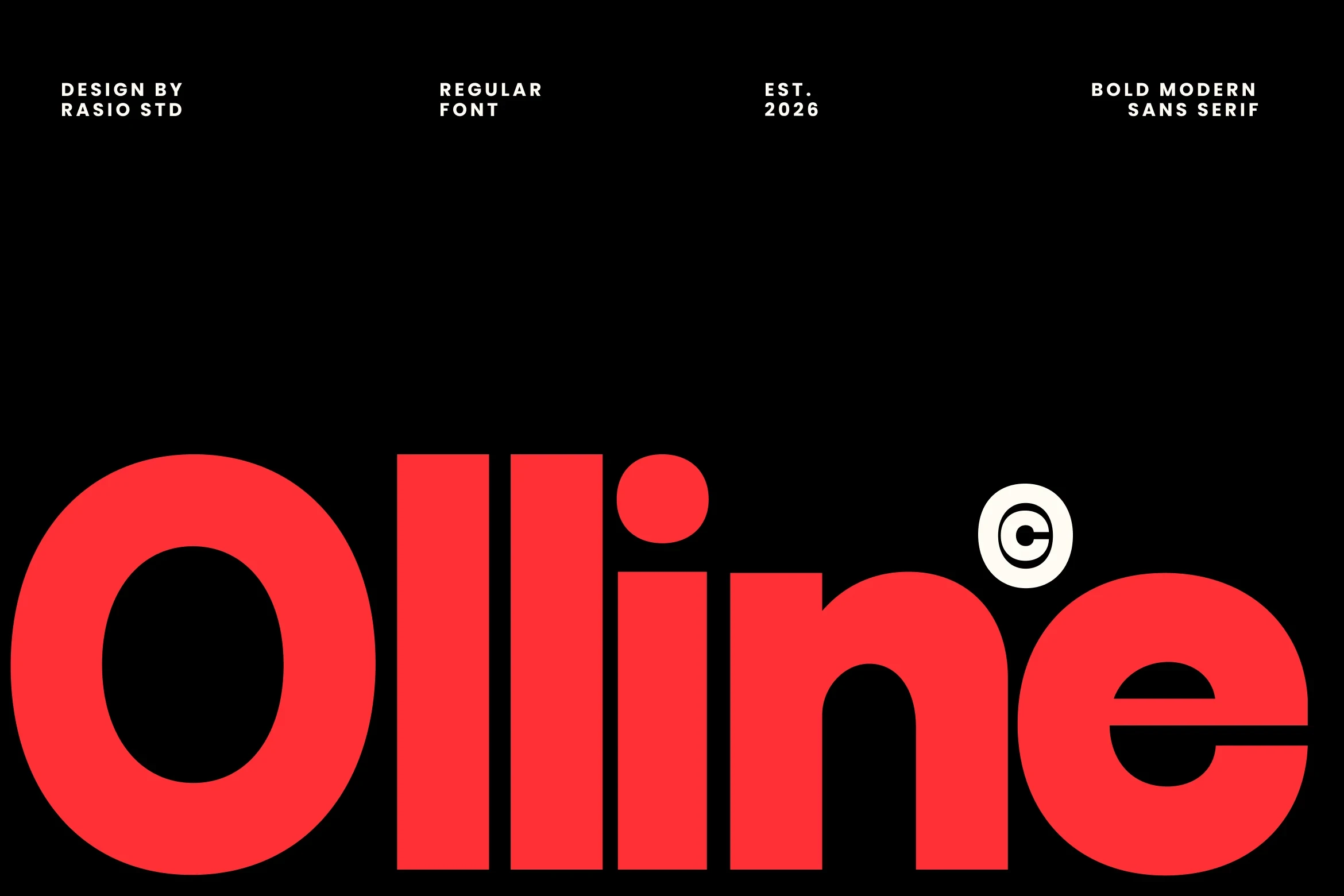
Best For: branding, headlines, creative projects, display text
Olline Font builds its impact from heavy geometric forms based on simple circles and rectangles. The monolinear structure avoids ornate detail while keeping lettering recognizable, making it dependable for branding, creative projects, and impactful headlines.
Fagor Font
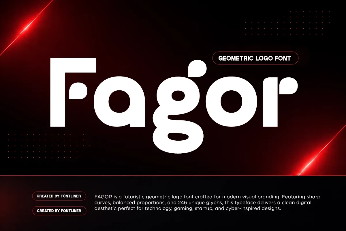
Best For: branding, logos, display text, modern designs
Fagor Font uses a geometric monolinear system with rounded terminals and a distinctive open-counter lowercase g. Thick, consistent strokes support clear logos and display text, while the unusual counter adds a technological character without relying on decorative detail.
Savenir Font
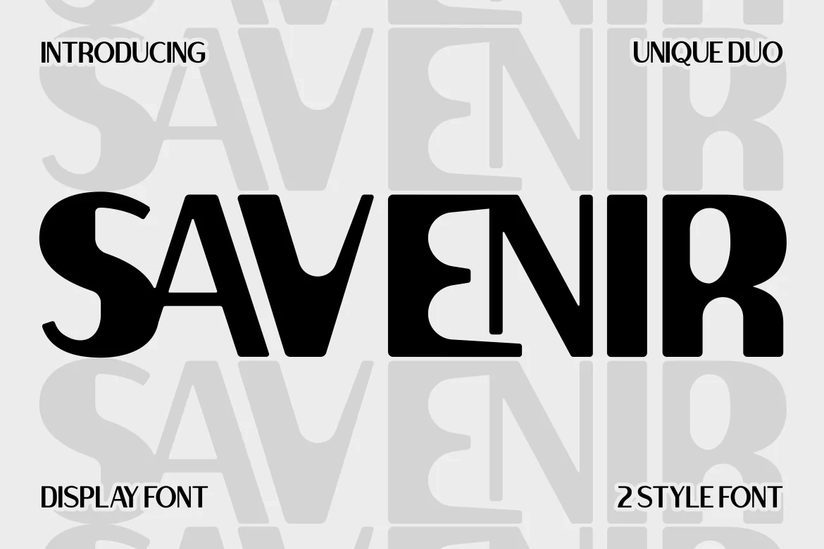
Best For: business cards, logos, branding, packaging
Savenir Font makes its word shape through interlocking characters and almost no negative space. The heavy, wide forms create a forceful logo, package mark, or business card treatment, but overlapping shapes sharply restrict readability at small sizes.
How to Choose the Right Font
Choose by construction first: use a monolinear sans for clearer branding, a condensed face when space is narrow, or a high-contrast serif when the title needs editorial drama. For Modern Aesthetic Fonts with swashes, notches, or overlaps, reserve generous display sizes and test readability before using them on labels, packaging, or supporting text.