19 Best Bold Handwritten Fonts in 2026
This collection moves from connected scripts and brush-led forms to rounded markers, nostalgic lettering, and substantial display faces with clear stroke rhythms. Bold Handwritten Fonts work best when their construction supports the design role: short headlines, logos, packaging, social graphics, names, and other compact expressive text.
Looking for more handwritten fonts? Browse our complete Handwritten Fonts collection to compare modern, bold, wedding, logo-friendly, and Cricut-ready handwritten styles.

Bold Handwritten Fonts: Connected Scripts
Bold Handwritten Fonts in this group use connected joins to create continuous movement. Their heavier scripts suit logos and short phrases, unlike the disconnected or upright display forms elsewhere.
Raylin Font
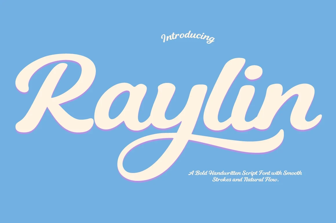
Best For: display text, modern designs, clean designs, bold designs
Raylin Font creates continuous handwritten movement through connected letterforms and a clean contemporary build. Its substantial weight supports modern short phrases, but the joins make it better suited to display scale than long reading. Choose it when connected Bold Handwritten Fonts need a clean, current finish.
The Minstar Font
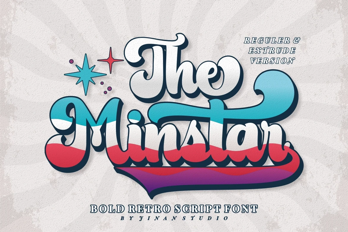
Best For: logos, headlines, magazine covers
For logos, covers, and headlines, The Minstar Font uses connected handwritten movement as a visual signature. Its heavier script construction is reinforced by period-inspired character, so the joins carry much of the personality. Keep the setting brief to preserve clear letter separation and readable movement.
Jhon Standup Font

Best For: branding, packaging, posters, social media graphics
Jhon Standup Font combines connected script movement with a brush-like stroke rhythm, producing a modern bold surface. It translates well to branding, packaging, posters, and social graphics, although short wording is the safer setting because the joins become harder to scan in longer lines.
Roses Font
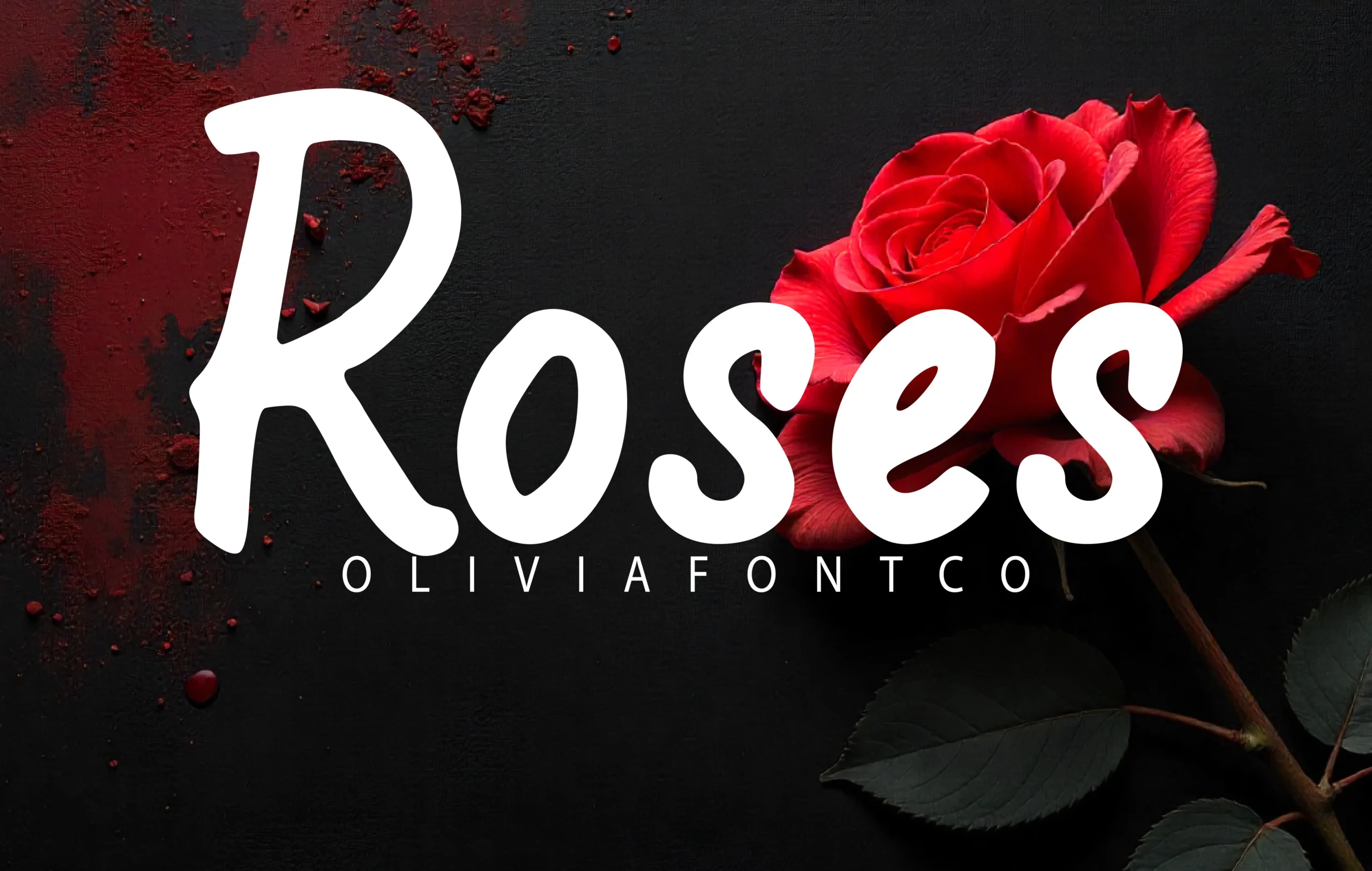
Best For: display text, bold designs, beauty branding
For beauty branding, Roses Font pairs connected handwritten movement with distinctive display letterforms. Its bold script construction works especially well in compact expressive text, where the joins can support the design without becoming difficult to follow. It belongs among Bold Handwritten Fonts for identity-led display work.
Marker and Playful Display Fonts
These marker and playful faces rely on rounded forms, thick strokes, or clean contemporary shapes rather than cursive joins. They bring a lighter display mood to packaging, branding, and social graphics.
Bullog Font

Best For: display text, playful designs, bold designs
Bullog Font distinguishes its substantial display weight with rounded, playful letterforms rather than formal shapes. It suits brief display messages and playful design work, while its tone is less appropriate for restrained identity systems that depend on a quieter visual voice.
Swift Marker Font
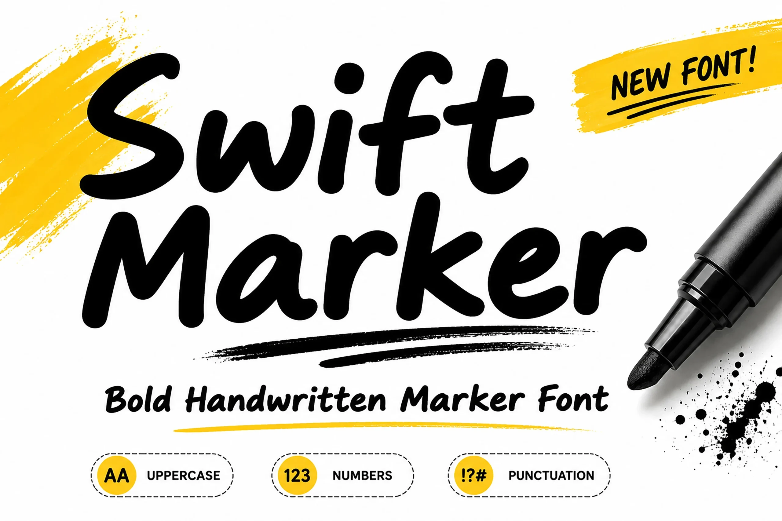
Best For: social media graphics, logos, branding, packaging
Swift Marker Font is built from heavy monolinear strokes, disconnected forms, and rounded terminals. These Bold Handwritten Fonts remain highly legible at smaller sizes, giving the face a practical role in headlines, logos, packaging, and social media graphics.
Humble Moon Font
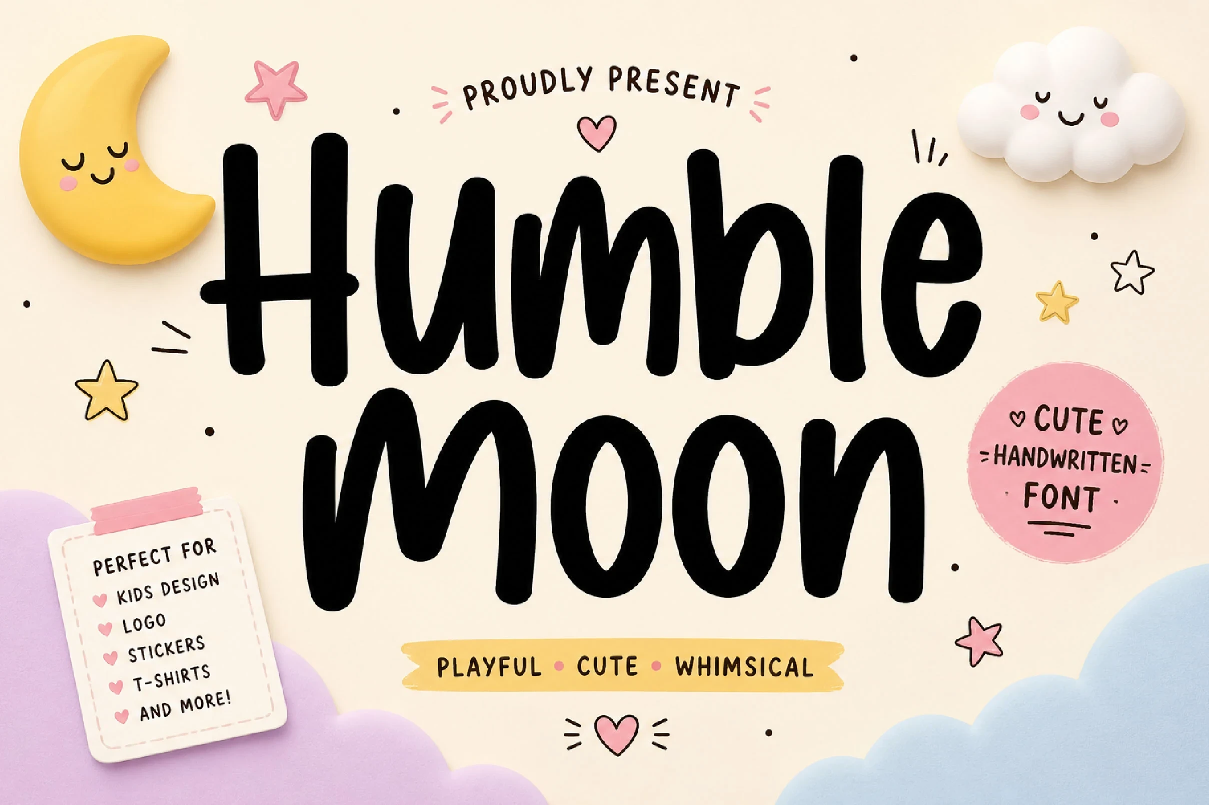
Best For: branding, packaging, quotes, social media graphics
Humble Moon Font balances refined slender strokes with a bold display role and rounded playful forms. That contrast gives it a lighter modern mood than heavier marker styles, making it useful for branding, packaging, quotes, and social media graphics.
Sevarozi Font
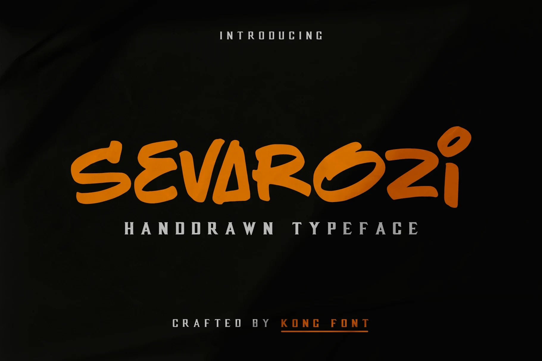
Best For: creative projects, display text, modern designs, clean designs
For creative projects, Sevarozi Font combines rounded playful character with clean contemporary construction. Unlike cursive Bold Handwritten Fonts, it avoids connected joins, so its distinct forms remain useful for display text, modern designs, and clean layouts that need a more open reading rhythm.
Nostalgic Display Lettering
Period-inspired construction gives these fonts their defining character, while substantial weights keep them useful at display scale. They differ from the modern groups through nostalgic polish in short-form applications.
Mantel Font

Best For: logos, headlines, signage, display text
Mantel Font combines period-inspired character with clean contemporary construction, giving its heavy forms a nostalgic display tone. It is a practical choice among Bold Handwritten Fonts for logos, signage, and headlines, provided the wording remains short rather than paragraph-length.
The Ralston Font
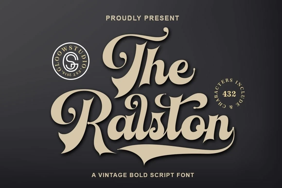
Best For: logos, packaging, invitations
The Ralston Font places an elegant, period-inspired character inside a bold display construction. It can add nostalgic polish to logos, packaging, and invitations, but its substantial forms make it primarily a short-form choice rather than a font for continuous information.
Expressive Display Lettering
This broad display group emphasizes heavy construction, distinct letterforms, and readable stroke rhythm without connected script movement. It offers the clearest choices for compact headings, names, and expressive display lines.
Rastle Font

Best For: display text, bold designs, expressive designs
Rastle Font brings substantial weight and a clear stroke rhythm to distinctive display letterforms. As Bold Handwritten Fonts, it is strongest in headings, names, and short phrases where its expressive shapes can remain easy to compare rather than carrying extended copy.
Hunting Season Font

Best For: display text, bold designs, business cards
Hunting Season Font uses a brush-like stroke rhythm to give its heavy display construction a visibly gestural surface. The forms are best judged in compact wording, from headings and names to business-card-sized text, where the expressive treatment has room to read clearly.
Hello Students Font

Best For: display text, bold designs, personal branding
For personal branding, Hello Students Font offers bold display forms without relying on connected script construction. Its distinct letter shapes are easier to assess in short names and headings, making this one of the more useful Bold Handwritten Fonts for compact identity wording rather than paragraphs.
Symphet Font

Best For: headlines, display text, bold designs
Symphet Font pairs a heavy display presence with distinct letterforms and an orderly stroke rhythm. It reads most clearly in headlines and brief expressive wording, where the substantial forms can stay prominent without the demands of dense text.
Viyona Font
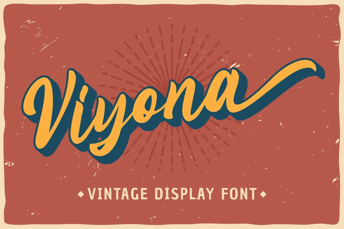
Best For: headlines, display text, bold designs
For headlines and short display lines, Viyona Font provides a straightforward heavy treatment built around distinct forms and clear stroke rhythm. Its letter shapes remain prominent without connected joins, so it is dependable when expressive Bold Handwritten Fonts must stay immediately legible.
Kandel Font
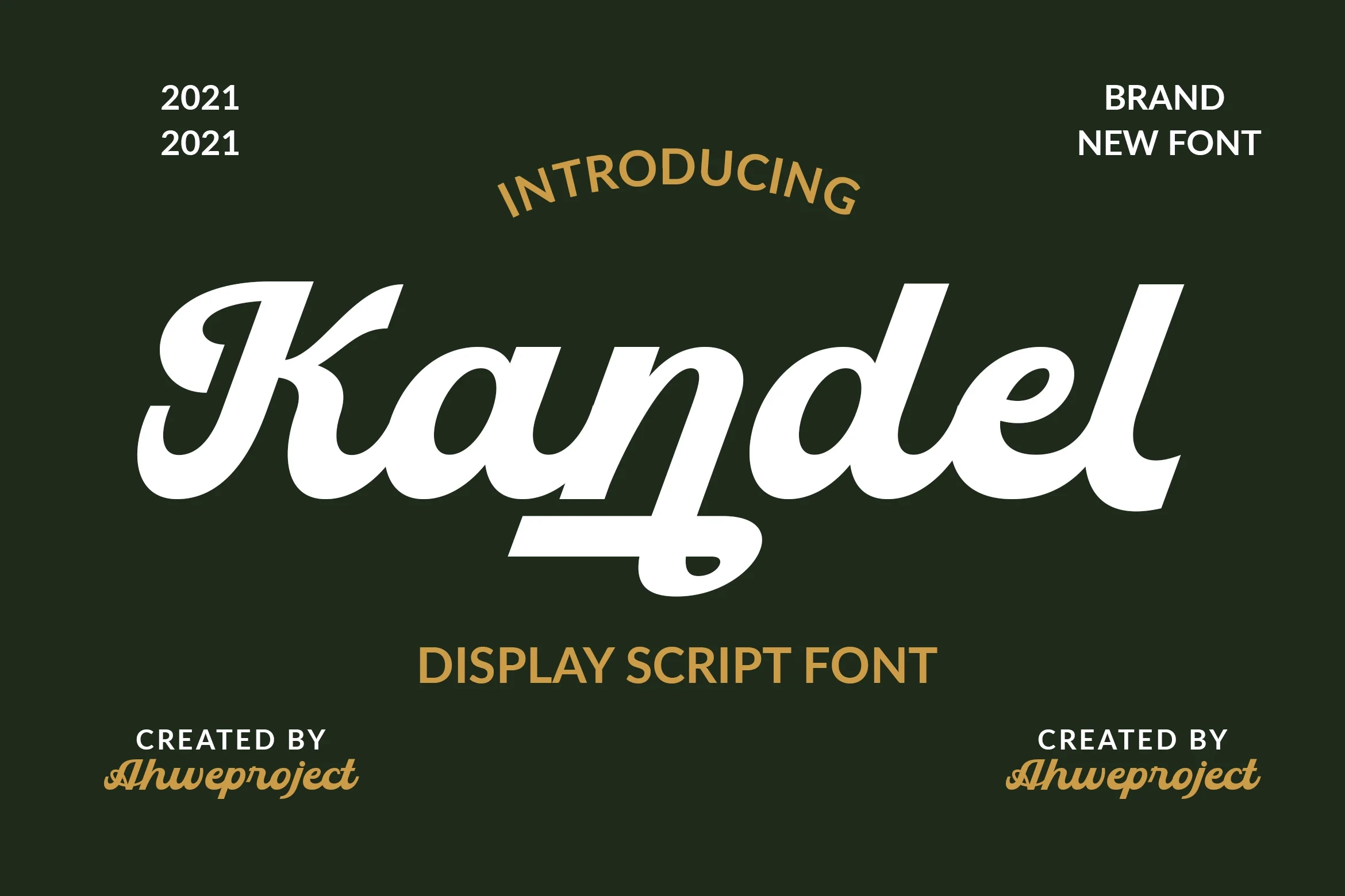
Best For: headlines, display text, bold designs
Kandel Font uses conventional bold display construction and adds a practical technical distinction: it includes PUA-encoded characters for accessing its glyphs and swashes. Check font handling in your workflow, then use it for headlines and short display text where its substantial forms can remain clear.
Sogate Font
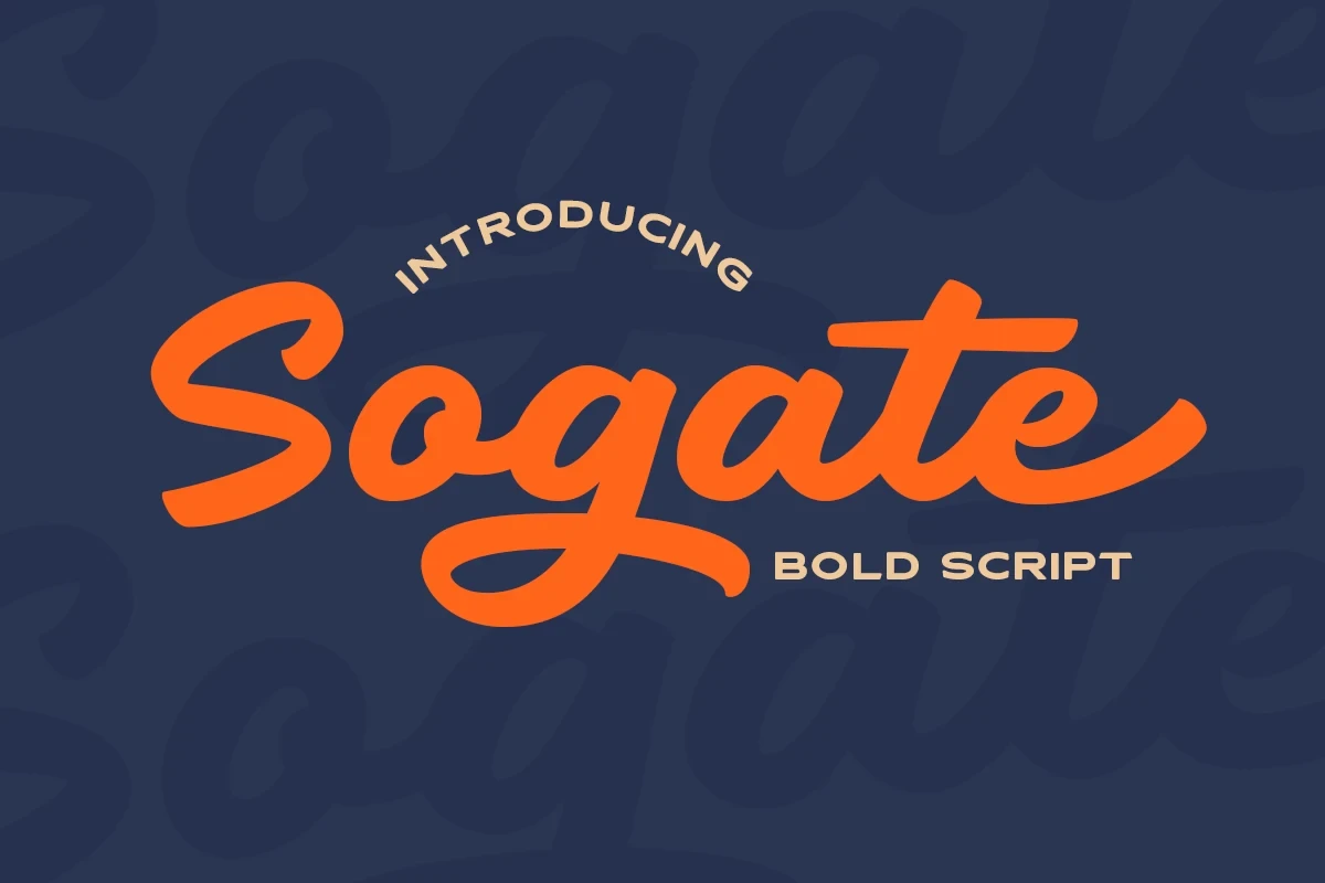
Best For: headlines, display text, bold designs
Sogate Font delivers heavy display forms with a consistent stroke rhythm and strongly expressive presentation. It is best reserved for headlines and short display phrases, where the letterforms can carry the composition without being crowded by dense informational copy.
Thick Font

Best For: logos, posters, headlines, display text
Thick Font uses an especially substantial display weight for logos, posters, and headlines. Its heavy presence is most effective in short wording, where the letterforms can carry the composition and the density of the construction does not compromise quick reading.
Straightfast Font

Best For: display text, bold designs, expressive designs
Straightfast Font combines substantial weight with a clear stroke rhythm and direct expressive presence. It works best in short display phrases where boldness must remain immediately legible, offering a more controlled alternative to connected script when the wording needs quick recognition.
How to Choose the Right Font
Choose connected scripts when joins and brush rhythm should become part of the identity, but test them at display size and keep the wording short. Marker faces offer stronger small-size clarity, while period-inspired styles add nostalgia. For the most dependable Bold Handwritten Fonts, compare weight, spacing, rounded terminals, flourishes, and readability at the final scale.