18 Best Modern Calligraphy Fonts in 2026
Modern Calligraphy Fonts span connected monoline scripts, ornate high-contrast lettering, and textured brush styles, ranging from restrained names to dramatic flourished headlines. Together, they serve logos, invitations, packaging, social graphics, labels, and other short-form designs where construction, scale, and readability shape the result.
Looking for more calligraphy fonts? Browse our complete Calligraphy Fonts collection to compare modern, elegant, bold, wedding, and logo-friendly calligraphy styles.

Modern Calligraphy Fonts: Flourished Display Scripts
Modern Calligraphy Fonts in this group emphasize high contrast, elaborate swashes, and formal display presence. Their ornate construction separates them from the cleaner connected scripts and textured brush lettering.
Sweetie Font

Best For: display text, modern designs, elegant designs
Sweetie Font uses heavy, high-contrast connected lettering, with a heart-bearing initial S and a matching heart tittle on the i. This romantic detail makes it immediate for logos and invitations, but the dense styling needs generous display sizing.
Charistina Font
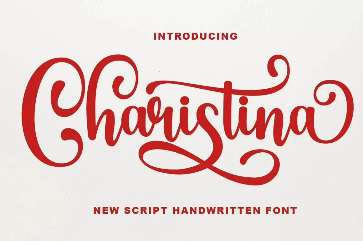
Best For: book covers, logos, branding, packaging
Charistina Font suits book covers, packaging, and branding through fluid connected strokes and long decorative swashes that give each word a ceremonial finish. Its layered calligraphic structure is visually complex, so compact labels and body copy are weaker applications.
Angel Font
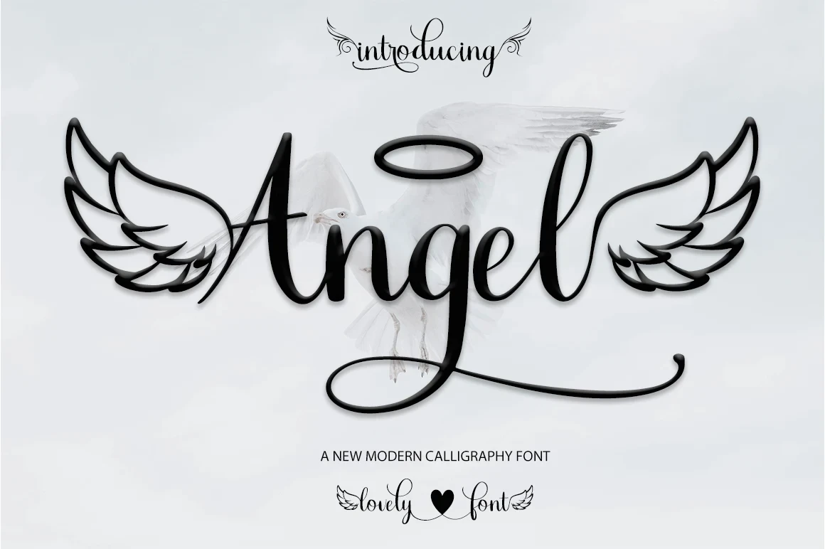
Best For: book covers, logos, branding
Angel Font combines pronounced contrast, connected forms, and extended swashes for a formal thematic presence. Its ornamental construction makes titles and identity marks more suitable than sustained reading, especially when the lettering must remain small.
Seraphina Font
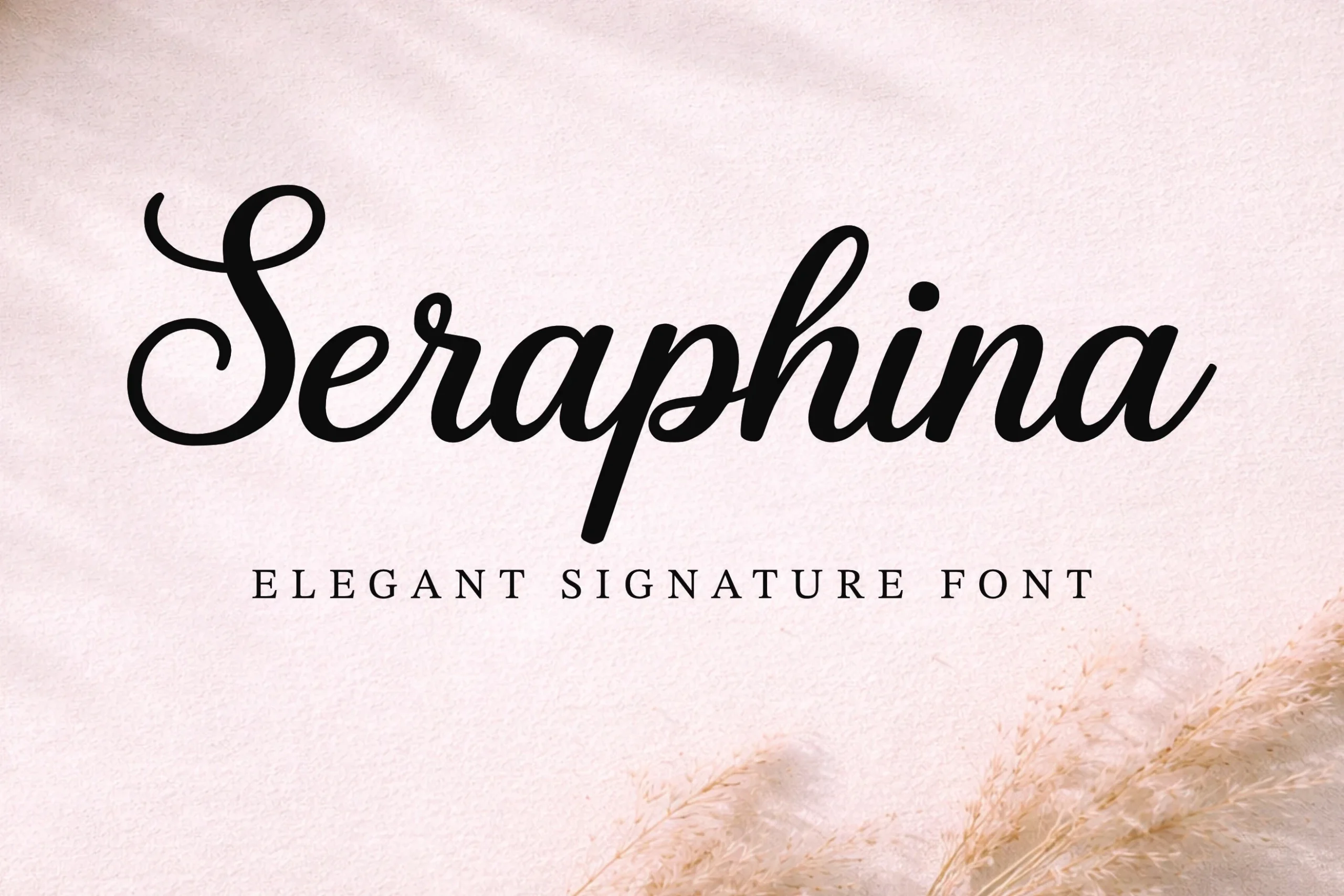
Best For: social media graphics, logos, branding
Seraphina Font makes a broad impression with heavy connected lettering, strong thick-thin contrast, and an ornamental entrance stroke on the initial S. Its width and elaborate opening favor short wording in branding and social graphics over dense copy.
Blandore Font
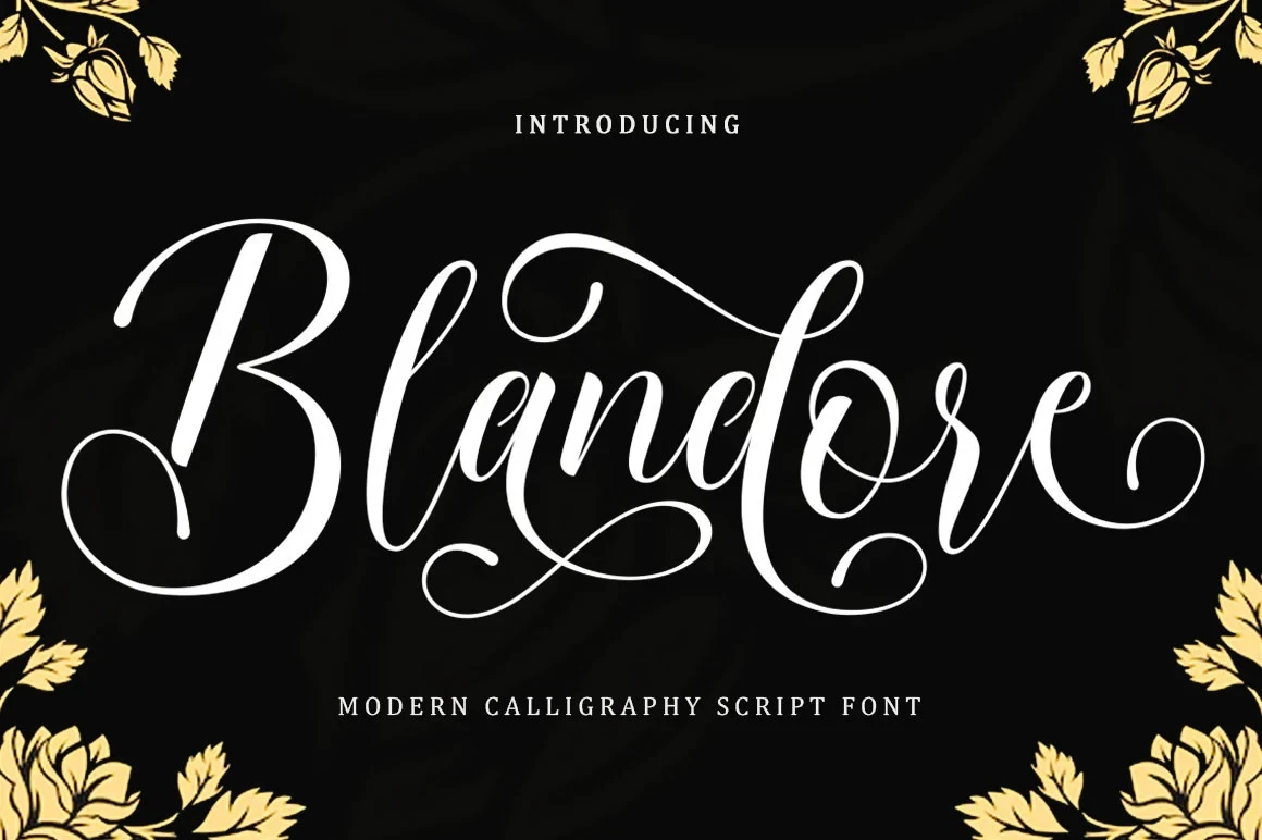
Best For: product labels, modern designs, elegant designs
Blandore Font is a right-leaning, high-contrast script with extensive flourishes that push words toward ornate display. Its strong slant adds forward motion to labels and headings, while the ornament limits compact text.
Alignment Font
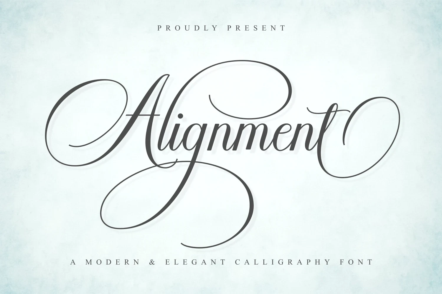
Best For: modern designs, clean designs, elegant designs
Alignment Font relies on rhythmic connected curves and elaborate swashes to form a composed, formal silhouette. Thin strokes and dense ornament can lose definition at small sizes, so prominent words and spacious layouts are the safer choice.
Garden of Heaven Font
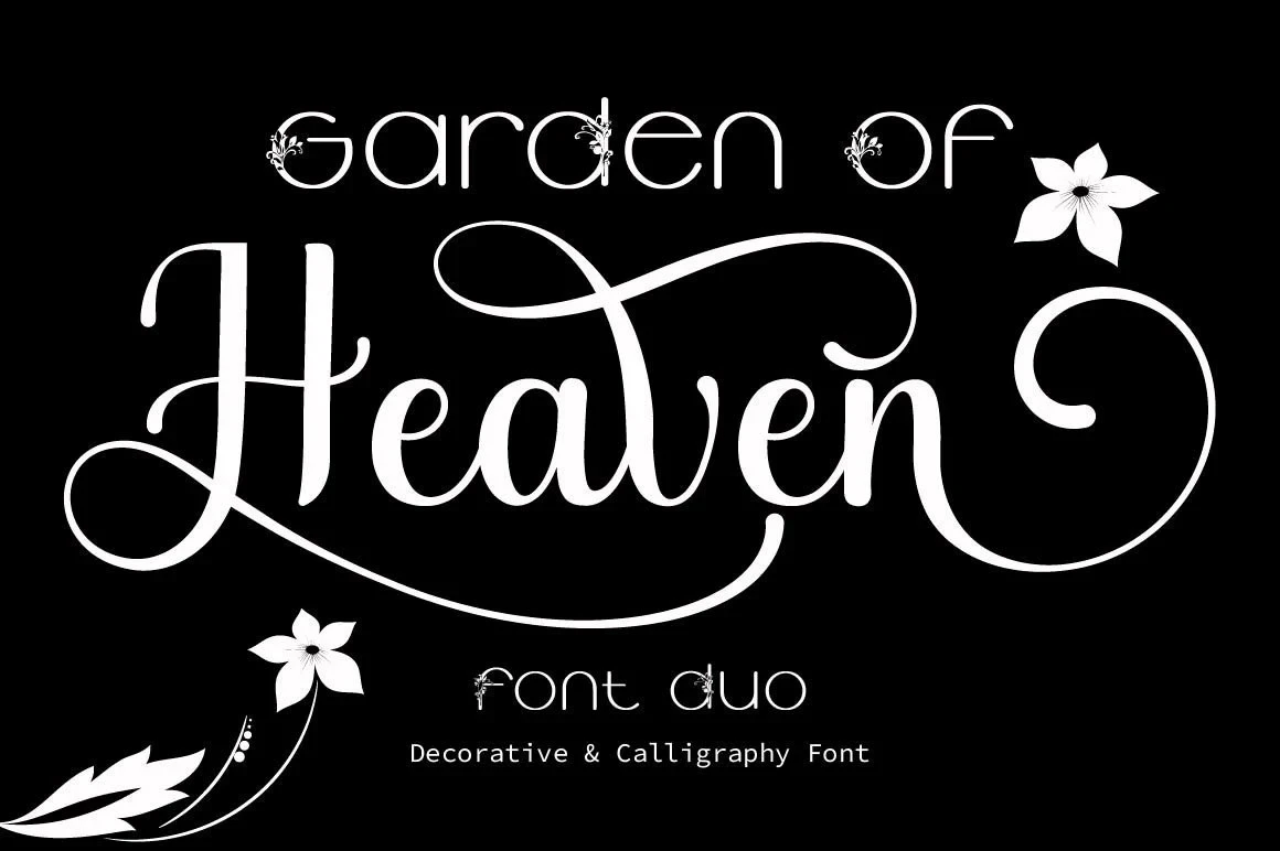
Best For: display text, modern designs, bold designs
Garden of Heaven Font combines high contrast with long baseline and ascender curls for a dramatic headline effect. Its PUA-encoded characters provide access to documented glyphs and swashes, but the decorative reach is not dependable at small sizes.
Flower Spring Font
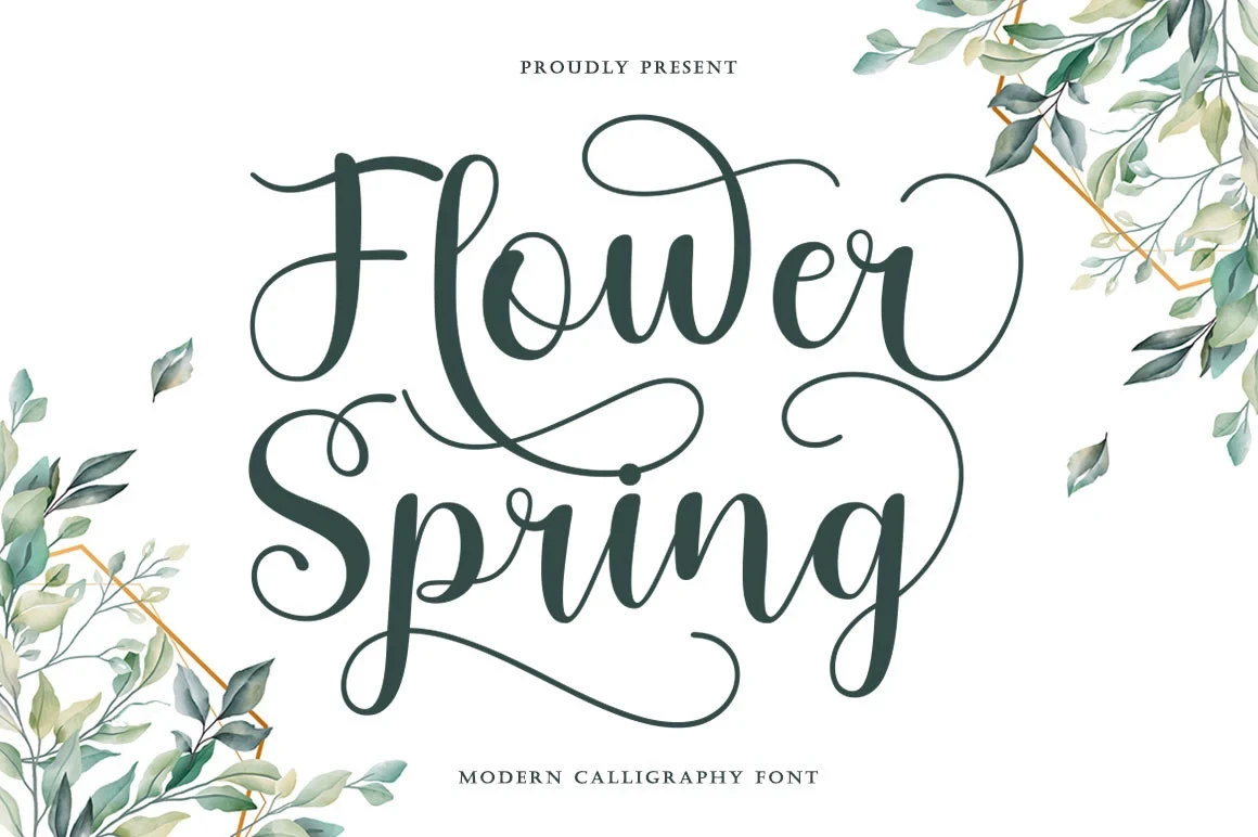
Best For: modern designs, clean designs, elegant designs
Flower Spring Font builds an organic flourish system from pronounced loops, curving terminals, and thick-thin contrast. The extended endings give titles a distinctive sweep, though shorter words can become obscured when available space is limited.
Valencia Font
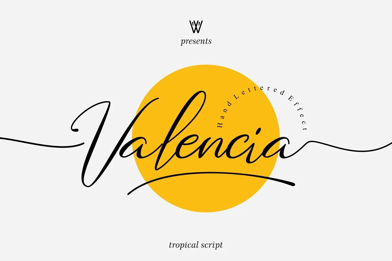
Best For: logos, invitations, modern designs
Valencia Font works especially well for names and invitations, using a slanted high-contrast structure with elongated swash terminals. Those extended endings create horizontal movement, but they demand short wording and a large display treatment to stay clear.
Gastonia Script Font
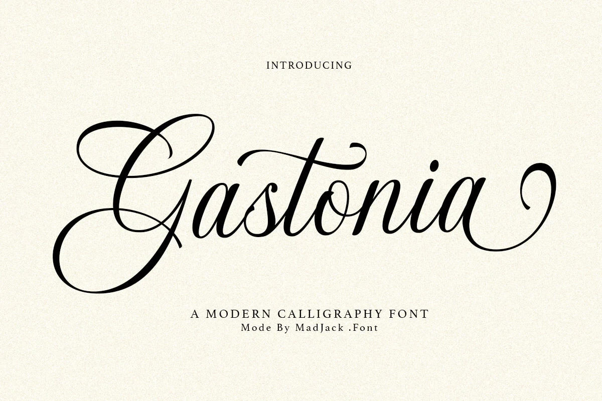
Best For: branding, packaging, editorial designs, invitations
Gastonia Script Font stands out through exaggerated looped ascenders and descenders, high contrast, and flourishing terminals. The vertical ornament adds invitation and editorial character, but intricate joins become difficult to parse in small or crowded settings.
Connected Contemporary Scripts
These connected contemporary scripts rely on rounded joins, steadier strokes, and restrained movement. They remain more readable for names and short headings than the heavily ornamented display styles.
Dairy Day Font
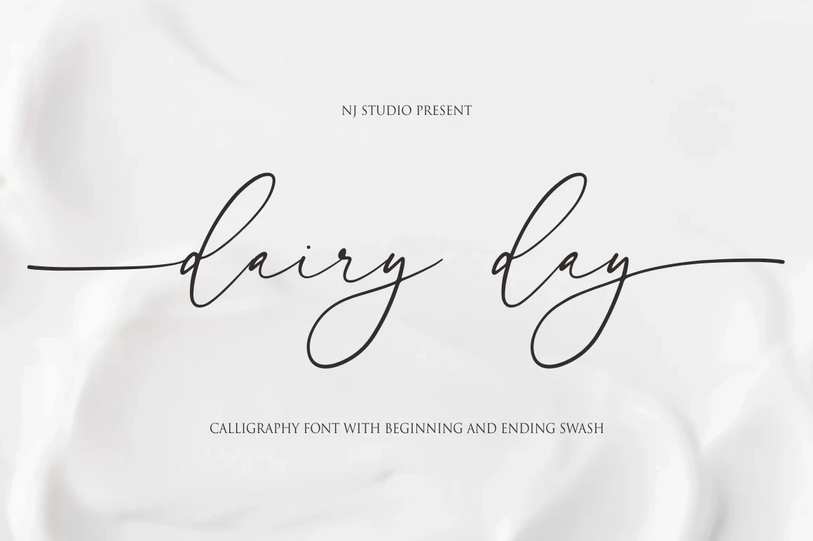
Best For: display text, modern designs
Dairy Day Font builds on a monoline foundation with subtle variation, rounded loops, and fully connected lowercase joins. Ligatures and extended opening and closing swashes add finish, though those long terminals can reduce clarity in small text.
Fairy Wing Font
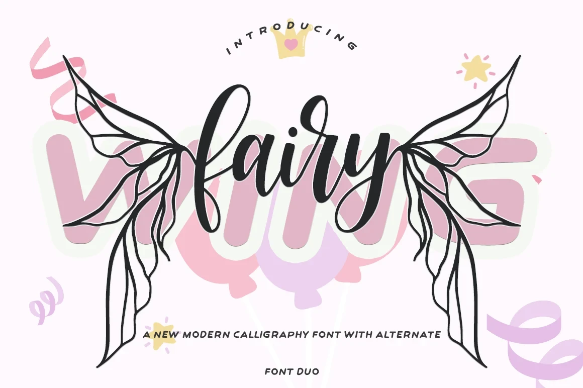
Best For: book covers, logos, branding
Fairy Wing Font creates a clean contemporary cursive effect through softly joined letters and flowing handwritten movement. The distinctive display shapes remain easiest to assess in names and short headings, where the forms have room to breathe.
The Inner Peach Duo Font

Best For: modern designs, playful designs, expressive designs, casual designs
The Inner Peach Duo Font uses rounded connected forms and a brush-like rhythm instead of formal ornament. That relaxed construction suits casual names and expressive graphics, though it carries less ceremonial authority than heavily flourished scripts.
Bellinda – Modern Calligraphy Font
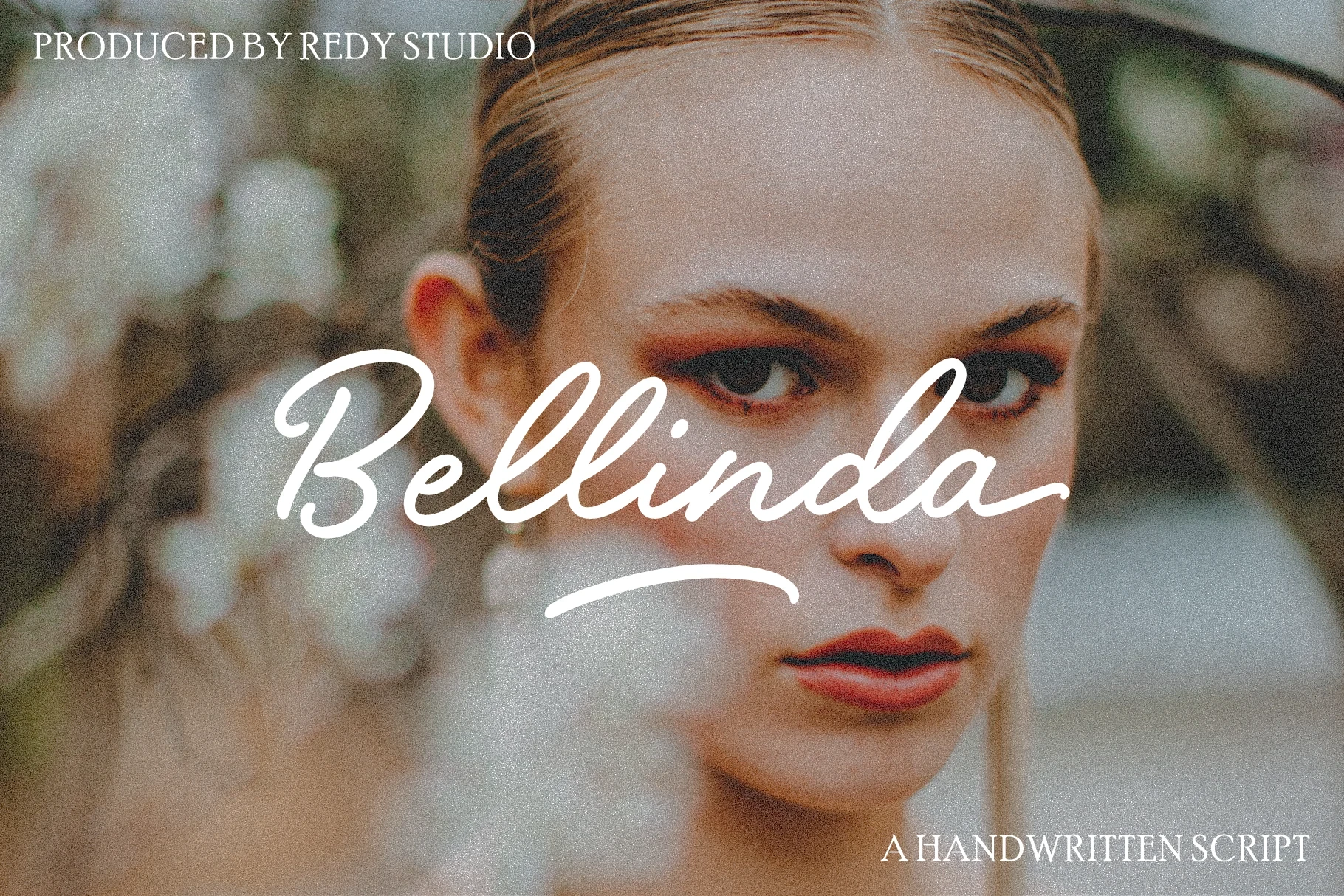
Best For: display text, product labels, modern designs, clean designs
Bellinda – Modern Calligraphy Font offers Modern Calligraphy Fonts a monoline connected structure with a slight forward slant and clear entry and exit flourishes. Its consistent weight supports readable display labels, while tightly joined strokes remain harder to follow when reduced.
Andelintia Font
Best For: book covers, logos, branding
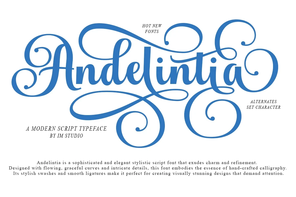
Andelintia Font brings slender connected strokes and rounded forms to Modern Calligraphy Fonts without relying on heavy ornament. Its fine construction suits names and short headings, where contemporary movement can remain legible against a lighter visual field.
Amelia Rose Font

Best For: logos, branding, invitations, social media graphics
Amelia Rose Font gives Modern Calligraphy Fonts a more dependable branding choice through medium-weight monoline strokes, rounded terminals, and a restrained rightward slant. Its consistent width supports clarity at medium-to-large sizes without competing with heavier flourishes.
Brush-Influenced Expressive Scripts
Brush-influenced scripts introduce irregular edges, tactile texture, and energetic rhythm. Their expressive surfaces feel less ceremonial than the flourished groups, while still working best as prominent display lettering.
Paint Brush Script Font
Best For: logos, branding, T-shirts, product labels
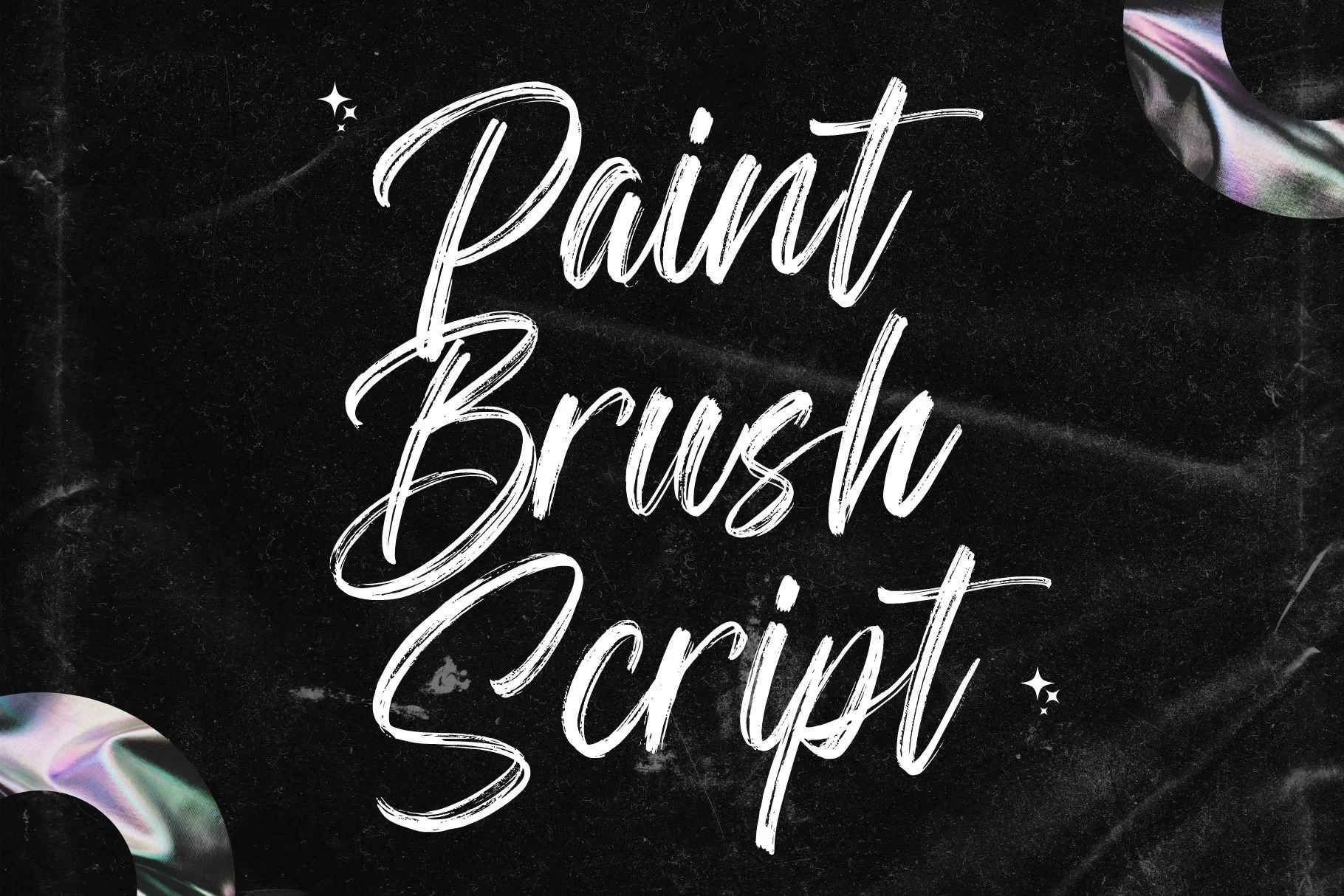
Paint Brush Script Font brings right-leaning movement, dry-texture edges, and irregular contours to Modern Calligraphy Fonts. The tactile surface gives logos, shirts, and labels a handmade visual energy, although reduction can quickly soften recognition.
Quincy Font
Best For: logos, branding, invitations, quotes
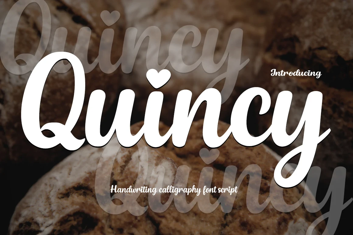
Quincy Font gives Modern Calligraphy Fonts a clearer brush-script option through bold connected letters, clean rounded edges, and an upright orientation. The absence of a strong slant improves recognition for logos, invitations, and quotes while keeping the role display-focused.
How to Choose the Right Font
Choose based on the role the lettering must play: use monoline connected styles when readable names or labels matter, heavier high-contrast scripts for short signature words, and brush textures for tactile impact. Check joins, swash length, and intended size before committing; the most ornate Modern Calligraphy Fonts need generous space and should not carry dense copy.