17 Best Brush Calligraphy Fonts in 2026
This collection spans high-contrast scripts with sweeping flourishes, textured dry-brush lettering, and lighter connected handwritten forms. These Brush Calligraphy Fonts are suited to logos, packaging, invitations, covers, headers, labels, and other short display treatments where construction and mood matter more than paragraph-length readability.
Looking for more calligraphy fonts? Browse our complete Calligraphy Fonts collection to compare modern, elegant, bold, wedding, and logo-friendly calligraphy styles.

Brush Calligraphy Fonts: Flourished High-Contrast Scripts
These Brush Calligraphy Fonts share connected joins, strong contrast, and prominent swashes, creating more formal, decorative silhouettes than the rougher or lighter scripts elsewhere.
Advantageous Font
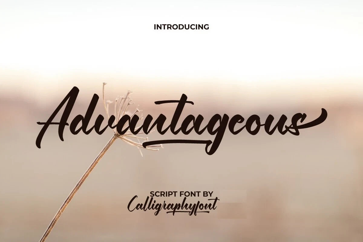
Best For: business cards, packaging, website headers
Advantageous Font uses heavy connected cursive, a rightward lean, and strong thick-to-thin contrast. Baseline and terminal swashes add decoration, but the intricate construction is clearest in large headings, logos, packaging, and other short display work.
Beckley Font

Best For: product labels, display text, minimal designs
For Brush Calligraphy Fonts that need a strong directional gesture, Beckley Font combines heavy connected letters, high contrast, and pronounced rightward movement. A large final underline swash gives short titles and product labels a clear finish. It remains legible at display size, while the joined forms and underline become harder to scan in dense text.
Roundtable Font

Best For: branding, signage, logos
Roundtable Font is a heavy connected script with high contrast and a pronounced rightward slant. Its memorable lowercase e tail acts like a signature, making the design effective for logos, branding, and signage, while reduced sizes compromise clarity.
Ovelyned Font

Best For: social media graphics, logos, packaging, invitations
Ovelyned Font combines connected cursive with high contrast, a rightward lean, and several extended swashes. The flourished outline suits invitations, logos, packaging, and social graphics, provided the lettering has enough scale for its fine details to remain distinct.
Artemil Font

Best For: social media graphics, logos, packaging, invitations
Artemil Font frames its connected wordmark with decorative swashes on both the initial and terminal characters. High contrast and a strong rightward slant give it presence for Brush Calligraphy Fonts applications such as invitations, logos, packaging, and social graphics. Use generous sizing so the framing gestures do not crowd the letter sequence.
Ridleys Font

Best For: high-end designs, clean designs, decorative designs
Ridleys Font builds a wide silhouette from connected, high-contrast lettering and long horizontal swashes at both ends. That extended footprint makes it especially effective for headers and logotypes, while compact labels and longer text may feel crowded.
Betterboxes Font

Best For: product labels, modern designs, bold designs
Betterboxes Font combines connected cursive, high contrast, a pronounced rightward slant, and an extended lowercase s tail. The decorative finish suits product labels and short names, but dense paragraphs will be difficult to scan because individual forms compete with the flourishes.
Rushine Font
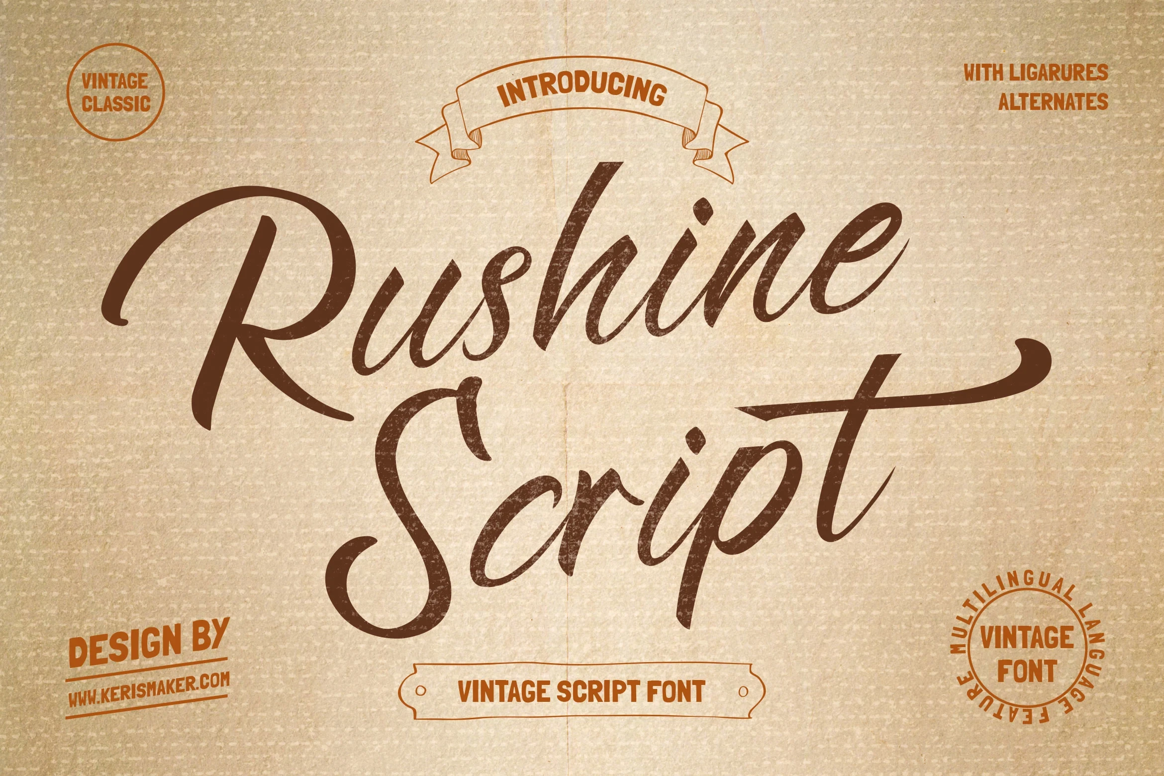
Best For: badges, social media graphics, logos, product labels
Rushine Font builds its vintage character from high contrast, connected joins, a rightward slant, and layered flourishes. The details remain most useful on badges, logos, labels, and social graphics where the lettering can stay large and prominent.
Textured and Irregular Brush Scripts
This group uses visible brush texture, uneven edges, mixed joins, and irregular baselines, giving it a handmade surface that differs from polished flourished scripts.
Charlotte Font
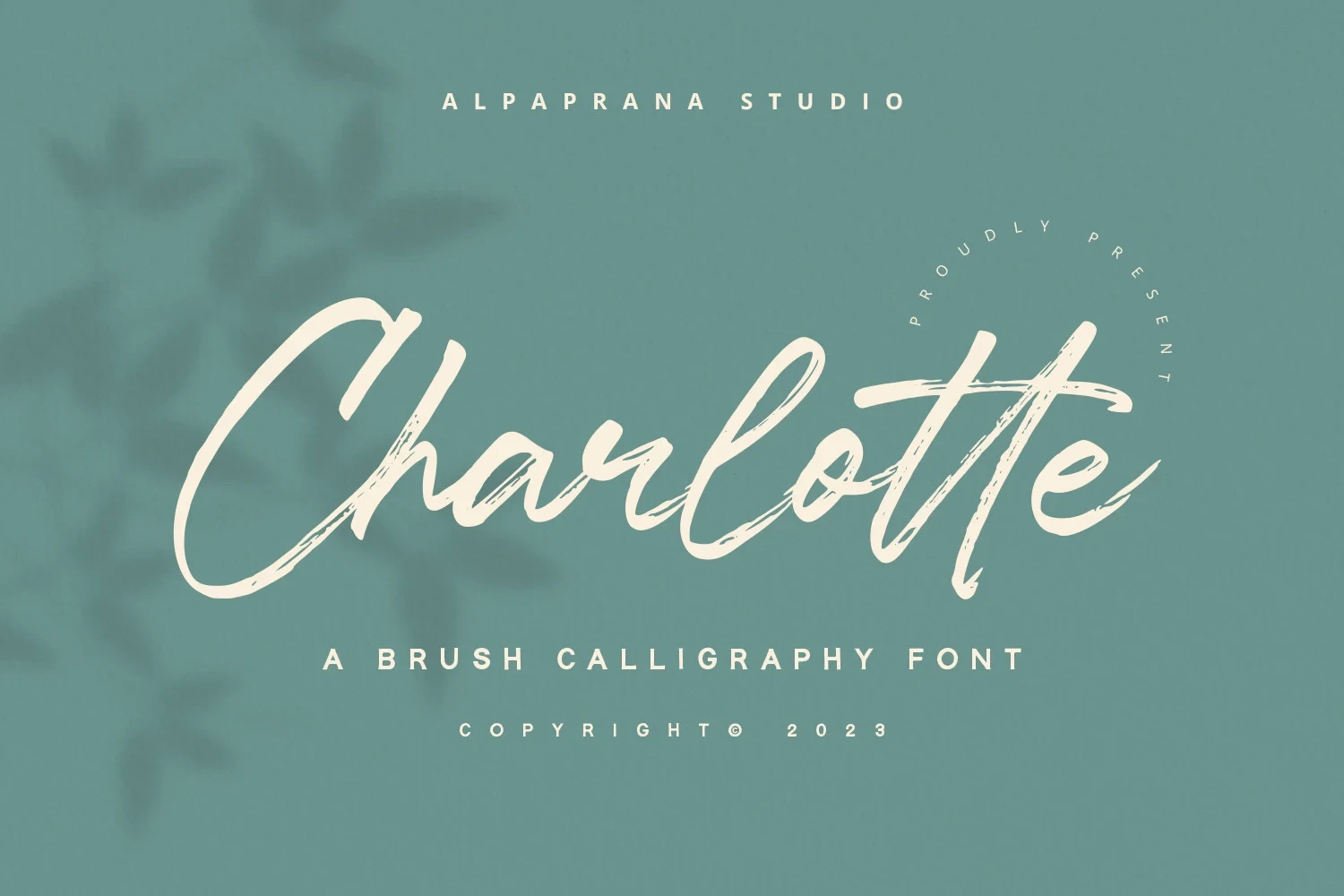
Best For: book covers, T-shirts, branding, packaging
Charlotte Font brings a dry-brush surface to connected cursive, with variable stroke contrast and a moderate rightward slant. Its worn texture adds character to Brush Calligraphy Fonts used for book covers, T-shirts, branding, and packaging, though tiny details may soften.
Tabuti Font

Best For: book covers, logos, posters, magazine covers
Tabuti Font combines a forward-leaning brush stroke with high contrast, connected or mixed joins, and an underline sweep. Its movement gives short titles, posters, logos, and covers immediate direction, but the same motion makes sustained reading unsuitable.
Originale Brush Font

Best For: display text, social media graphics, vintage designs, artistic designs
Originale Brush Font uses manual brush texture, moderate weight variation, connected cursive, and an irregular baseline. Moderate spacing helps preserve headline readability, yet the rough surface remains display-focused. It is a strong choice for social graphics, vintage treatments, and large lettering rather than body copy.
Quantter Font
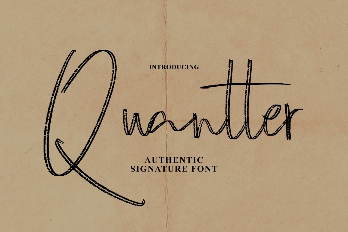
Best For: business cards, branding, posters, quotes
Quantter Font contrasts monoline connected lowercase forms with rough textured edges and an oversized initial Q. That capital provides a natural branding focal point, while the irregular surface keeps the font most effective for large headlines, posters, quotes, and other display uses.
Flowing Handwritten Display Scripts
These flowing display scripts rely on joined movement and recognizable handwritten letterforms, offering a lighter, more adaptable presence for names and short phrases.
Rightism Font

Best For: logos, website headers, display text
Rightism Font creates a lighter presence through slender, softly joined strokes and a flowing brush rhythm. The open construction suits names, logos, and headers where individual letters need to remain visible. PUA-encoded characters and swashes are included for supported workflows.
Frintake Font

Best For: logos, branding, display text
Frintake Font pairs softly joined letters with distinctive display shapes and a recognizable handwritten rhythm. Its connected movement works best for short names, logos, branding, and display phrases, where each letter can be judged individually rather than read through extended explanatory text.
Wishmeluck Font

Best For: display text, modern designs, bold designs
Wishmeluck Font gives connected brush lettering substantial weight, producing a strong silhouette that is easy to notice in short phrases. Compared with finer Brush Calligraphy Fonts, it supports prominent titles and display text especially well, while remaining dependent on generous sizing.
Springtime Font

Best For: display text, expressive designs, wall art, modern designs
Springtime Font follows continuous joined movement with distinctive display letterforms and a brush-like rhythm. Its flowing construction suits wall art, display text, and short treatments, but the letter connections make it a poor fit for paragraphs or detailed supporting copy.
Cupink Font

Best For: display text, classic designs, personal branding
Cupink Font separates itself through period-inspired character within a flowing connected script. It can anchor personal branding and compositions that need a historical touch, while its PUA-encoded characters and swashes should be checked in the intended design workflow before production.
How to Choose the Right Font
Choose by construction first: high-contrast scripts with swashes need generous scale, while textured styles trade clean edges for a handmade surface. Lighter connected scripts can suit names and headers, and heavier forms hold attention in short titles. For the most readable Brush Calligraphy Fonts result, reserve all of them for display roles and test joins, flourishes, and special glyphs at final size.