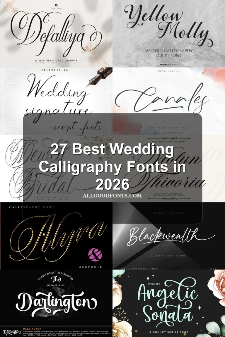
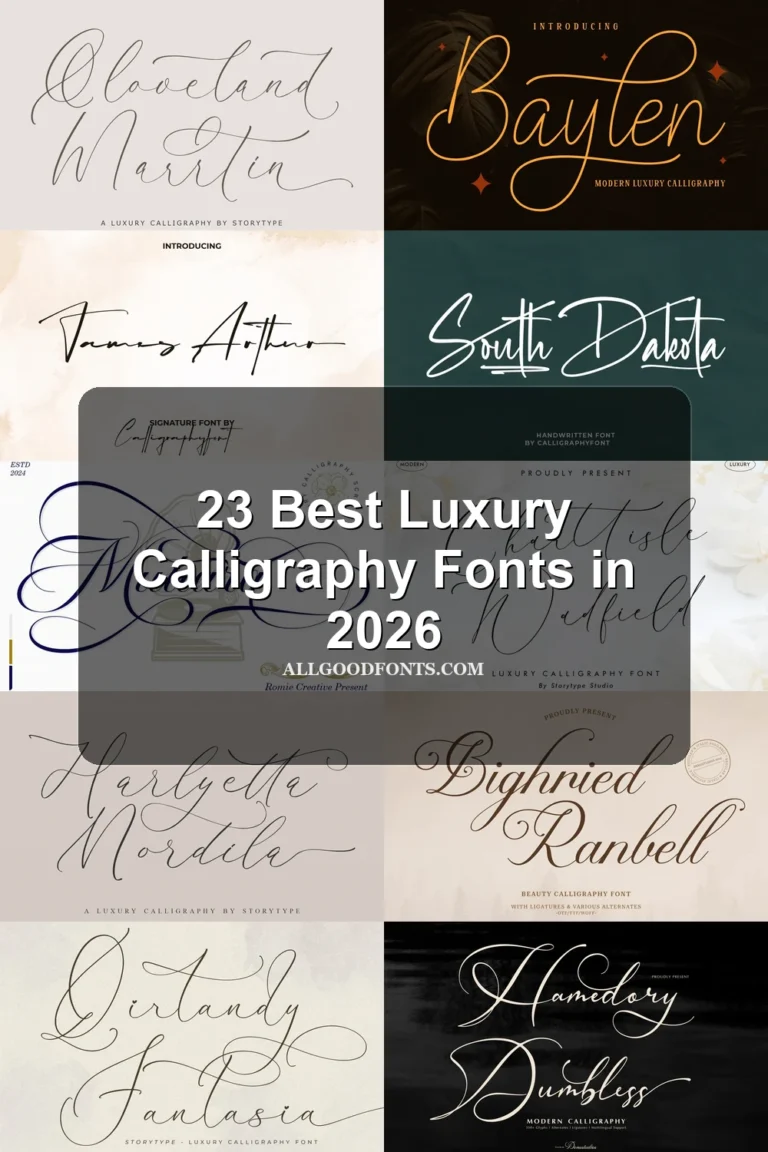
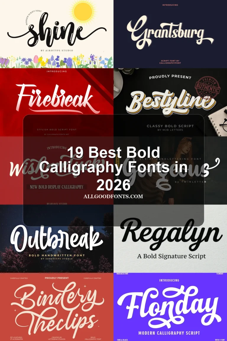
24 Best Vintage Calligraphy Fonts in 2026
This collection of Vintage Calligraphy Fonts ranges from fine hairlines and sweeping swashes to heavy, textured, and angular lettering. Most are designed for practical display roles—logos, invitations, labels, packaging, apparel, and headings—where construction and scale matter more than long-form readability.
Looking for more calligraphy fonts? Browse our complete Calligraphy Fonts collection to compare modern, elegant, bold, wedding, and logo-friendly calligraphy styles.
Vintage Calligraphy Fonts: Ornate Connected Displays
These Vintage Calligraphy Fonts share connected, high-contrast construction, rightward movement, and prominent flourishes. They are the most ornamental group, favoring short titles and wordmarks over quick-reading copy.
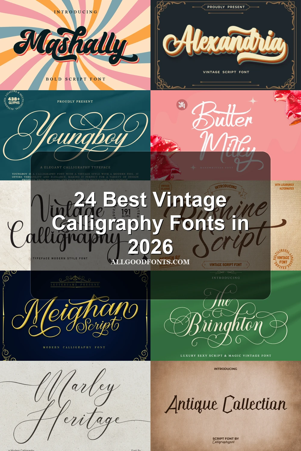
Vintage Calligraphy Font
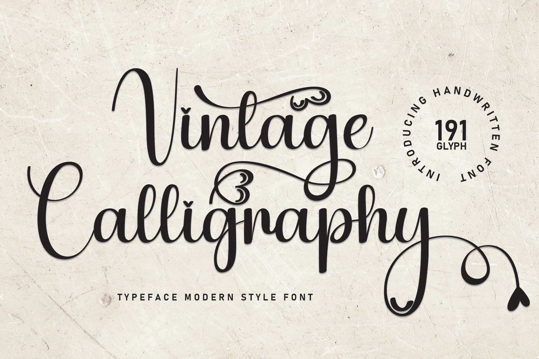
Best For: product labels, elegant designs
Vintage Calligraphy Font uses connected, right-leaning cursive with high contrast and extensive swashes. Its intricate terminals make it strongest for large titles, labels, and romantic display work rather than sustained reading.
Batherly Font
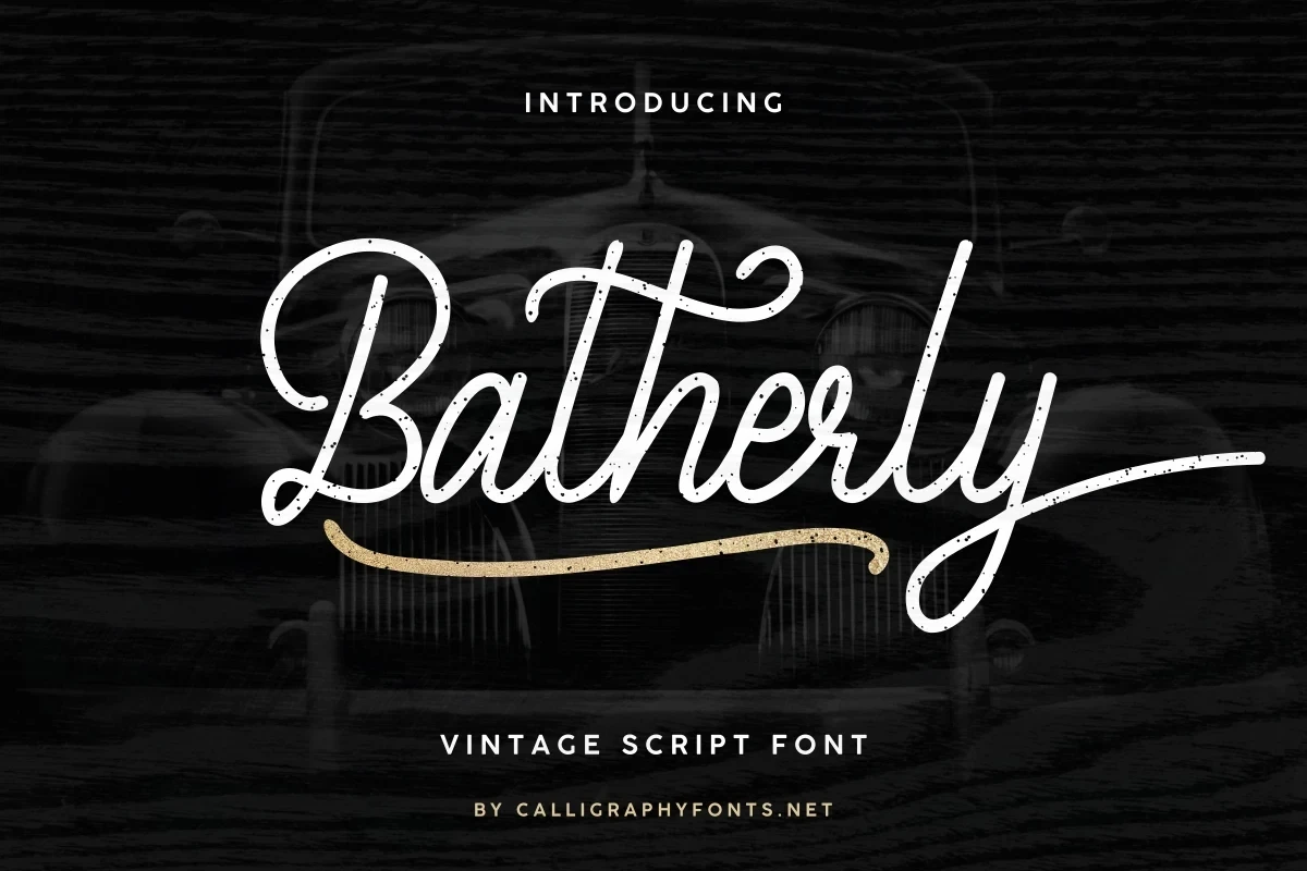
Best For: decorative designs, vintage designs, clean designs
Batherly Font is a heavy, high-contrast cursive with a pronounced slant and a sweeping final-y terminal. Alternate characters broaden display options, while distressed texture and swashes make large, short wording more practical than small text.
Rushine Font

Best For: logos, product labels, book covers
Rushine Font combines heavy calligraphic strokes, a rightward slant, and extended decorative tails. The dense texture gives logos, covers, and large labels a strong focal point, while compact copy loses clarity quickly.
Klasic Script Font
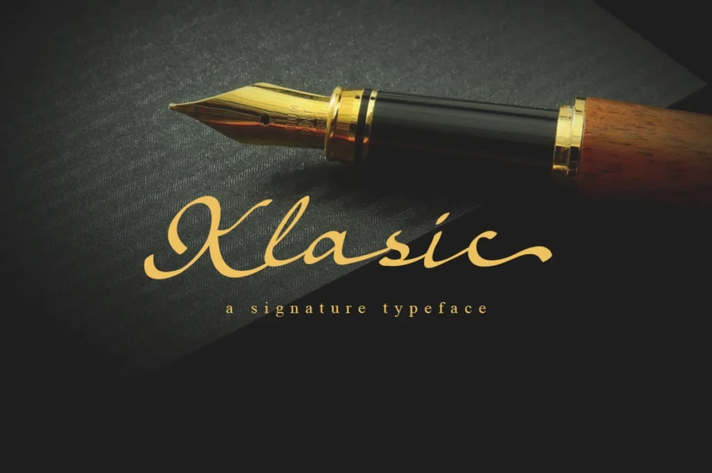
Best For: display text, elegant designs, classic designs
Klasic Script Font relies on high contrast plus ornamental swashes at the initial and terminal strokes. That fluid construction creates strong title impact, but its stylization makes short, prominent wording more suitable than rapid reading.
Miraclin Font

Best For: romantic designs, decorative designs, elegant designs
Miraclin Font pairs heavy high-contrast strokes with loop-based terminals and pronounced swashes. The decorative treatment makes a central wordmark or title stand out, while the same flourishes rule it out for body text.
Vintage Calligraphy Font

Best For: invitations, high-end designs, elegant designs
Vintage Calligraphy Font combines light hairlines, changing baseline movement, and extensive swashes. The delicate construction rewards generous display scale for invitations and prominent titles, while dense or small text can lose its fine details.
Marley Heritage Font

Best For: logos, branding, invitations
Marley Heritage Font builds a formal wordmark structure from heavy high-contrast strokes, a right-leaning slant, and extended swashes. It has authority for logos and invitations, though small applications may lose its fine distinctions.
Syiterlla Outline Font

Best For: display text, minimal designs, clean designs
Syiterlla Outline Font combines formal right-leaning calligraphy, high contrast, and prominent flourishes with ligatures and alternate characters. Those options allow controlled display customization, but the ornament limits practical text length and favors large settings.
The Bringhton Font

Best For: display text, decorative designs, clean designs
The Bringhton Font pairs heavy high-contrast lettering with a pronounced rightward slant and unusually extensive flourishes. It creates a strong title presence at large sizes, but decorative tails compromise smaller display wording.
Saverny Font
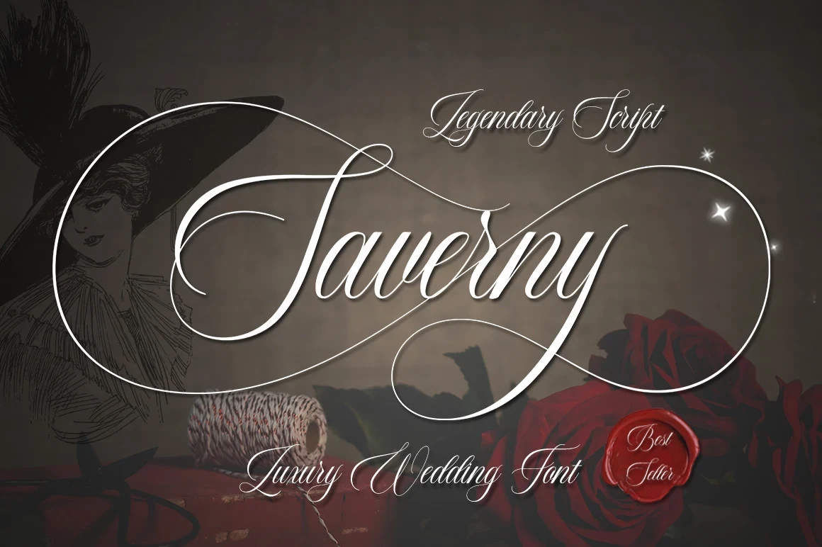
Best For: logos, invitations, product labels
Saverny Font uses high-contrast connected letters, rightward movement, and prominent swashes for a decorative profile. It works especially well for logos, invitations, and labels, but ornamentation makes compact wording harder to parse.
Flowing Handwritten Scripts
Flowing Handwritten Scripts use lighter connected strokes and a softer handwritten rhythm. Compared with the ornate group, they feel less heavily embellished, but still work best in names, headings, and brief phrases.
Youngboy Font
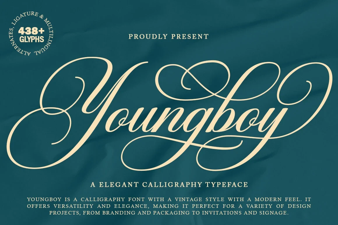
Best For: branding, packaging, invitations
Youngboy Font builds its period-inspired personality from light, slender strokes and softly joined letterforms. The flowing movement suits names, packaging, and headings, but short phrases are safest when quick recognition matters.
Sophistico Font

Best For: display text, expressive designs, vintage designs
Sophistico Font gives headings and names a soft period character through slender connected lettering and flowing handwritten movement. Its expressive construction adds warmth, but readers may need more time with longer or densely set phrases.
Bellinda – Modern Calligraphy Font
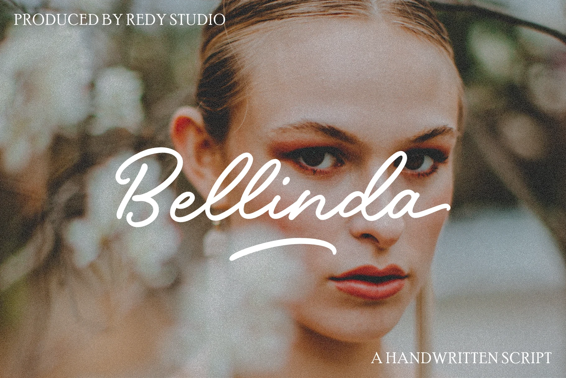
Best For: clean designs, decorative designs, modern designs
Bellinda – Modern Calligraphy Font uses connected monoline lettering, looping lowercase forms, and a strong forward slant. The even stroke creates a cleaner signature-like impression, although joined letters can tighten at small sizes.
Meighan Script Font
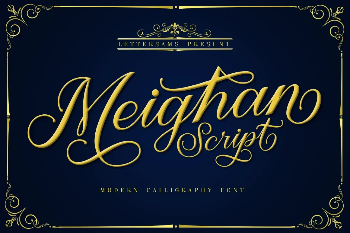
Best For: book covers, logos, posters
Meighan Script Font gives flowing connected movement more presence than typical light cursive through its substantial display weight. It can carry logos, posters, and covers effectively, although short phrases remain the clearest application.
Bettaway Font

Best For: fashion branding, personal branding, packaging
Bettaway Font follows an uneven handwritten flow with exaggerated lead-in and terminal swashes. Its monoline structure feels personal for fashion and branding, but those extended gestures can interrupt character recognition in longer wording.
Vintage Millenia Font
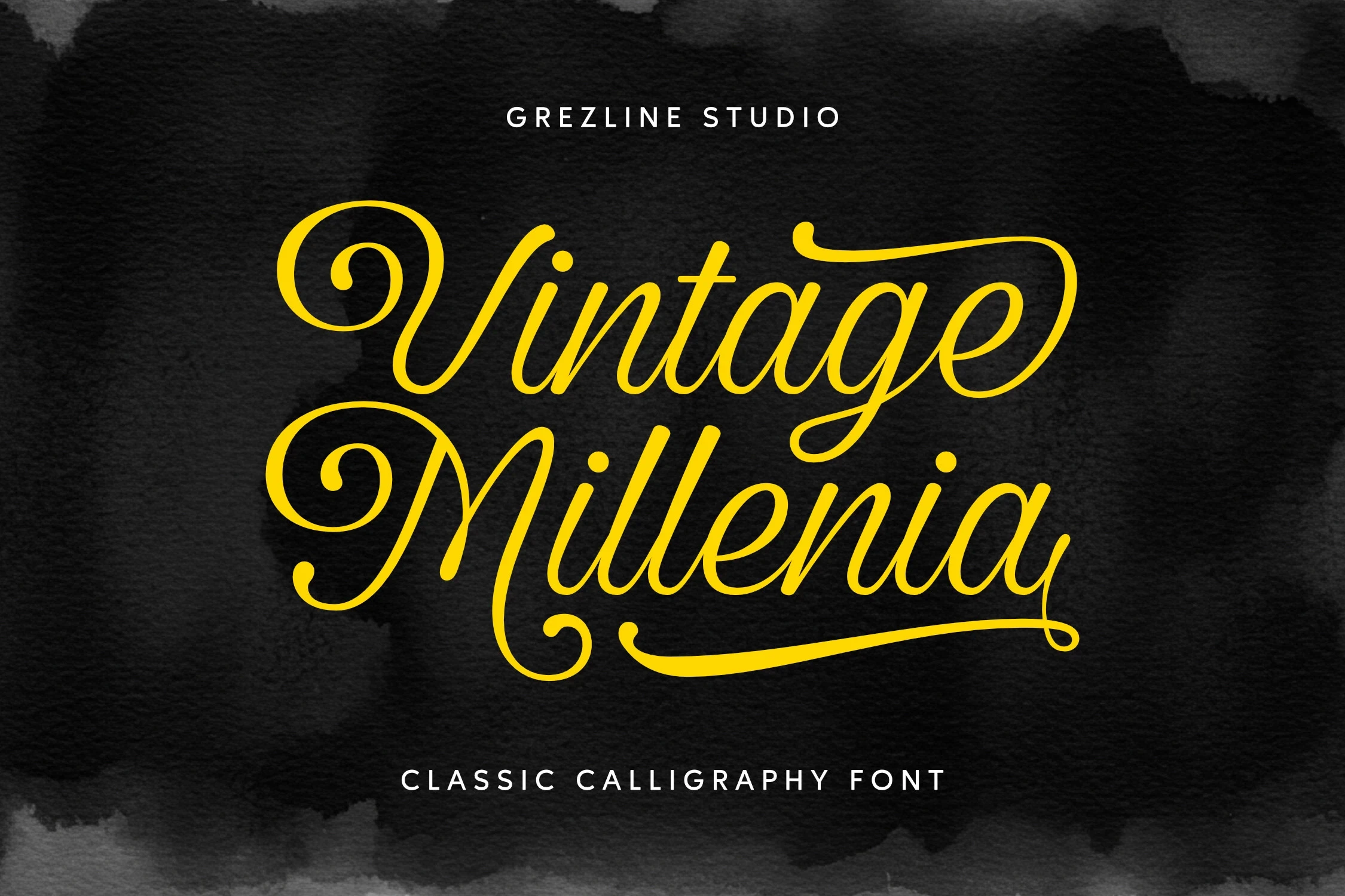
Best For: display text, vintage designs, nostalgic designs
Vintage Millenia Font uses light connected strokes and flowing movement to create a clearly period-oriented display personality. It suits headings and expressive names, with readability strongest when the wording stays brief.
Butter Milky Font

Best For: logos, branding, T-shirts
Butter Milky Font feels more logo-oriented than purely calligraphic because of its distinctive connected display letterforms. That identity works for branding, apparel, and labels, while longer phrases may become repetitive or difficult to scan.
Friday After Font
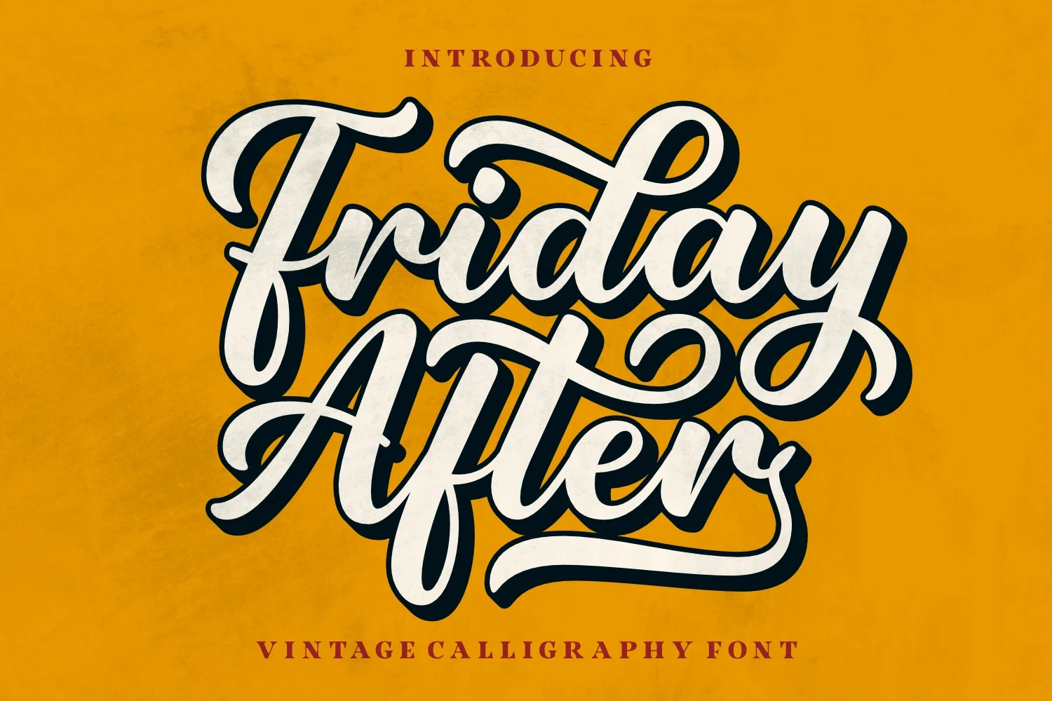
Best For: invitations, display text, vintage designs
Friday After Font creates a flowing, period-inspired texture with light connected strokes and restrained weight. It suits invitations and expressive headings when the text remains short enough for its joined forms to stay clear.
Bold Retro and Rustic Scripts
Bold Retro and Rustic Scripts rely on substantial connected forms, rounded terminals, and brush-like variation. Their stronger silhouettes remain visible at display size, though joins can merge when reduced.
Antique Font

Best For: product labels, wall art, cute designs
Antique Font brings brush-like stroke variation, rounded terminals, and a slight slant to its connected script. It stays clear in large display settings and works well on labels or wall art, but reduction weakens the letter definition.
Mashally Font
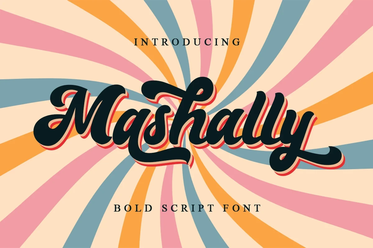
Best For: quotes, T-shirts, invitations
Mashally Font gives connected lettering an unusually upright orientation instead of a strong forward lean. Its heavy weight keeps large titles readable and makes quotes or apparel graphics feel direct, though small settings can merge.
Black Vintage Font

Best For: bold designs, vintage designs, casual designs
Black Vintage Font uses bold connected forms, rounded terminals, and a right-leaning orientation for a direct retro display impression. Its silhouette holds at large scale, but flowing joins may merge after significant reduction.
Textured, Shadowed, and Angular Displays
Textured, Shadowed, and Angular Displays stand apart through surface wear, dimensional layering, or disconnected pointed geometry. They create strong poster and packaging impact but generally demand generous sizing.
Royale Victoria Font

Best For: branding, packaging, logos
Royale Victoria Font is a monoline cursive marked by irregular textured edges and an uneven baseline. Its surface variation supports branding and packaging with a worn, organic feel, provided the lettering remains at medium or large size.
Alexandria Font
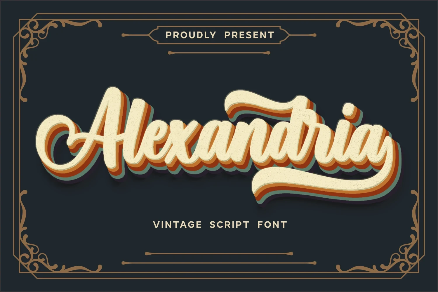
Best For: display text, bold designs, decorative designs
Alexandria Font is defined by a multi-layered drop shadow applied to connected monoline lettering. The dimensional treatment increases poster impact, but the added layers quickly reduce readability when the design is scaled down.
Antique Collection Font
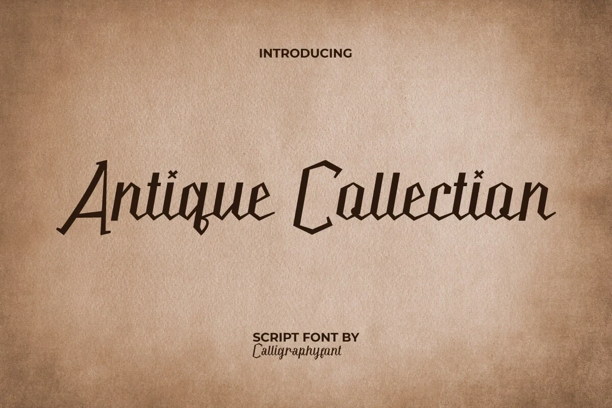
Best For: logos, packaging, creative projects
Antique Collection Font departs from flowing cursive through disconnected angular forms, pointed terminals, and heavy low-contrast strokes. Its rugged geometry suits logos and packaging, although the sharp construction can hinder small-size reading.
How to Choose the Right Font
Choose Vintage Calligraphy Fonts by matching construction to scale: heavy, upright scripts usually hold up better in large titles, while light hairlines and extensive swashes need more space. Use monoline options for a cleaner signature effect, textured or shadowed styles for surface impact, and angular designs when flowing joins are not the intended look.