27 Best Wedding Calligraphy Fonts in 2026
Wedding Calligraphy Fonts span ornate high-contrast scripts, slender connected cursives, upright monoline lettering, and deliberately textural designs. Together, they cover invitation names, ceremony headings, monograms, logos, social graphics, and supporting layouts where display scale and readable contrast matter.
Looking for more calligraphy fonts? Browse our complete Calligraphy Fonts collection to compare modern, elegant, bold, wedding, and logo-friendly calligraphy styles.

Wedding Calligraphy Fonts: Flourished Formal Scripts
These Wedding Calligraphy Fonts emphasize slanted or upright pen movement, strong thick-to-thin contrast, and sweeping entry or terminal flourishes. They create the most formal display presence, but need generous sizing and restrained wording.
Yellow Molly Font
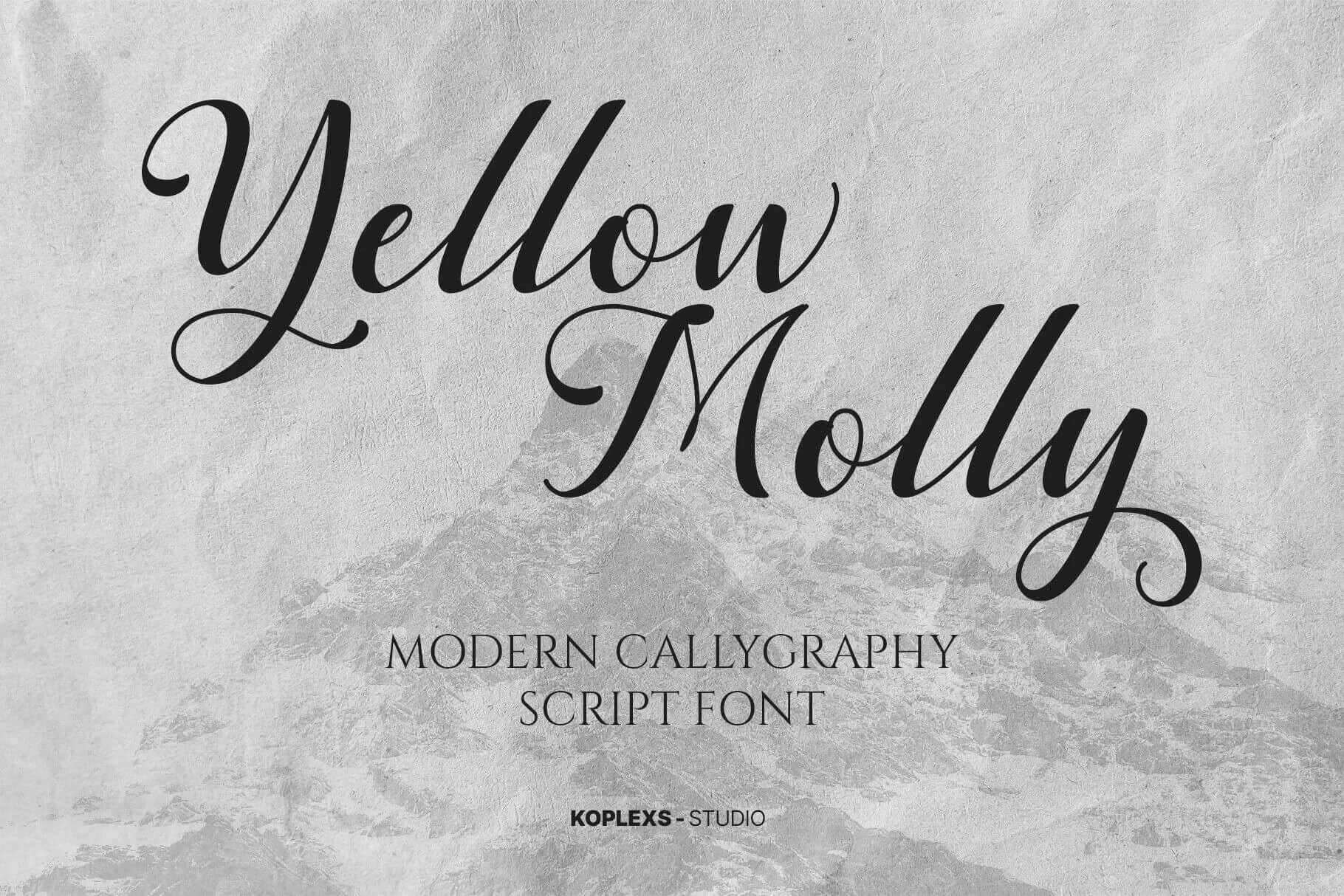
Best For: elegant designs, expressive designs
Yellow Molly Font uses heavy thick-to-thin contrast, a right-leaning connected structure, and large entry and exit swashes. Its delicate hairlines favor names and headlines at display size rather than small invitation details.
Romeo Wedding Font

Best For: modern designs, clean designs, elegant designs
Romeo Wedding Font gives connected calligraphy an upright, composed posture instead of a strong forward lean. High contrast, loops, and extended swashes create a decorative title treatment, but generous sizing is important for preserving word recognition.
Arvina Font
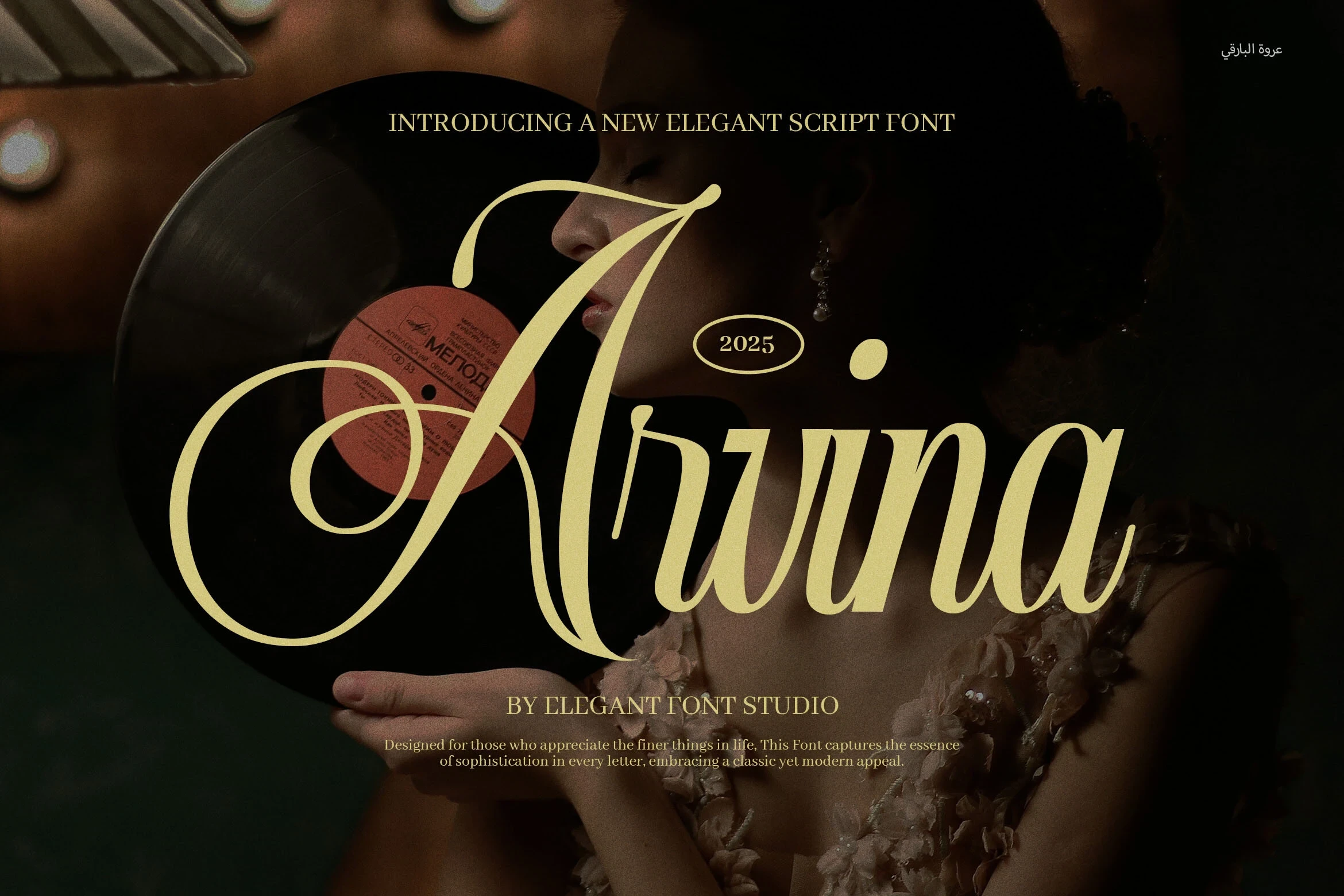
Best For: creative projects, website headers, clean designs, elegant designs
Arvina Font combines a right-leaning axis, high contrast, and pronounced swashes for a decorative title. For Wedding Calligraphy Fonts layouts, pair its ornate script with a clean sans-serif so supporting information stays legible at smaller sizes.
Canales Font
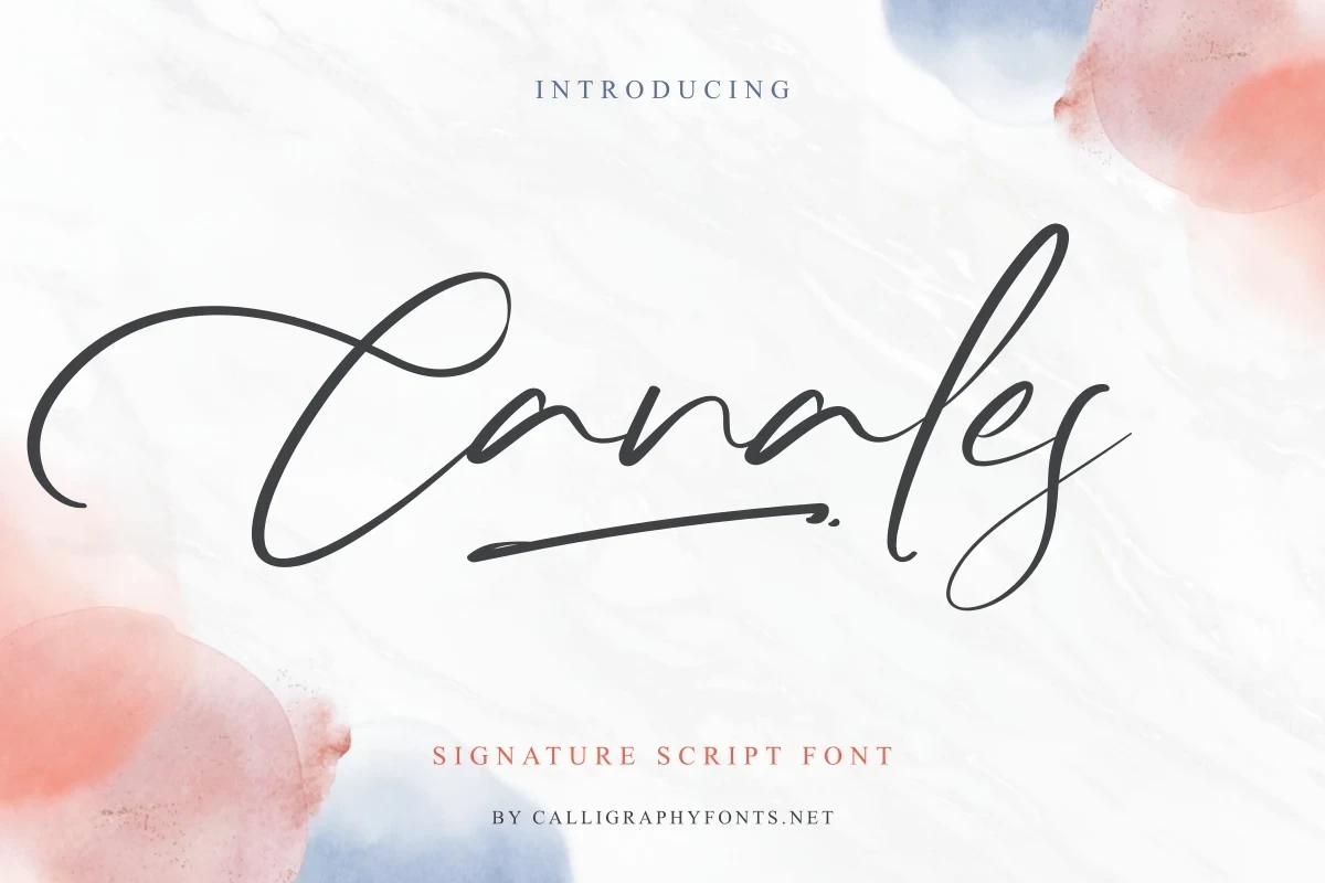
Best For: business cards, logos, branding, invitations
Canales Font builds heavy connected lettering around sweeping C and s terminals, with changing stroke weights and a pronounced slant. Its complex connected movement is especially effective for monograms, logos, invitation names, and other large display applications.
Arletta White Font
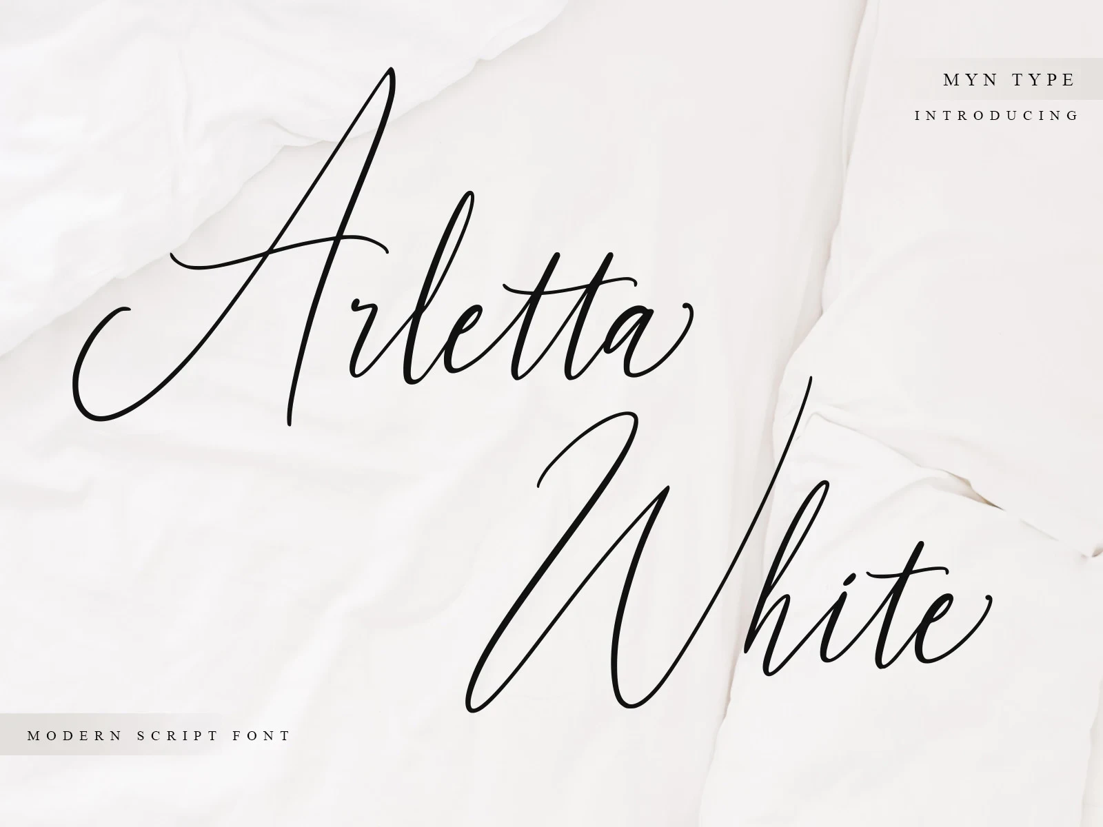
Best For: logos, branding, invitations, social media graphics
Arletta White Font pairs thin right-slanting connections with elongated entry and exit strokes. Its delicate hairlines and extended swashes need larger sizing in print or on screen, making short names and prominent titles safer than compact wording.
Arsellia Font
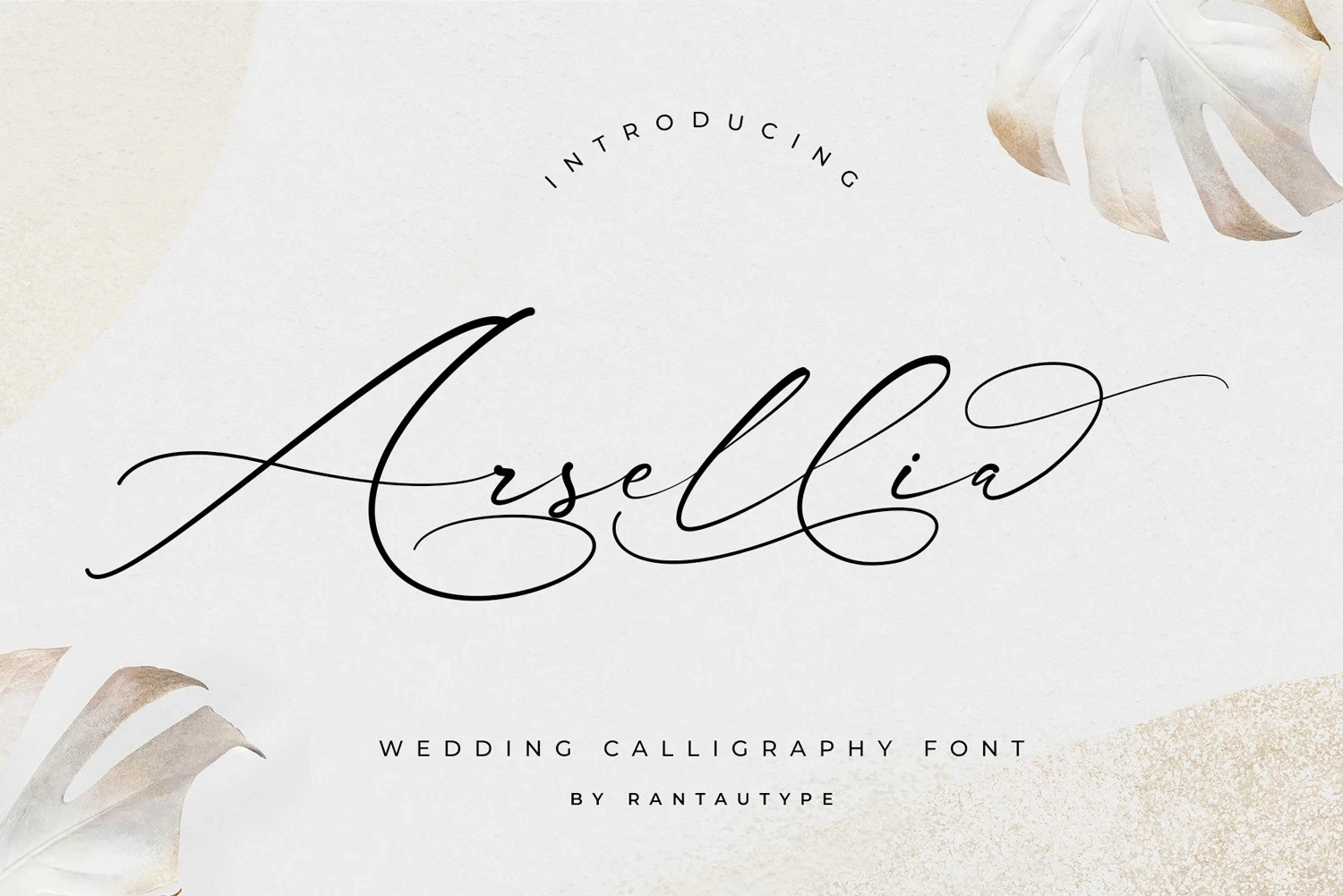
Best For: business cards, quotes, magazine covers, logos
Arsellia Font is useful for names and logos when you want variable stroke thickness, connected lettering, and extended swashes to form a formal silhouette. The elaborate joins lose clarity at small sizes, so keep the wording short and prominent.
Meldyte Font
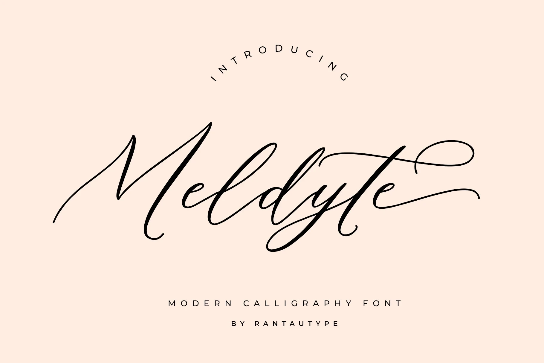
Best For: business cards, quotes, magazine covers, logos
Meldyte Font intensifies connected high-contrast strokes with a pronounced rightward slant and extended flourishes. Its movement makes titles and logos persuasive, but the decorative connections can overpower longer information text.
Miss Roderick Font
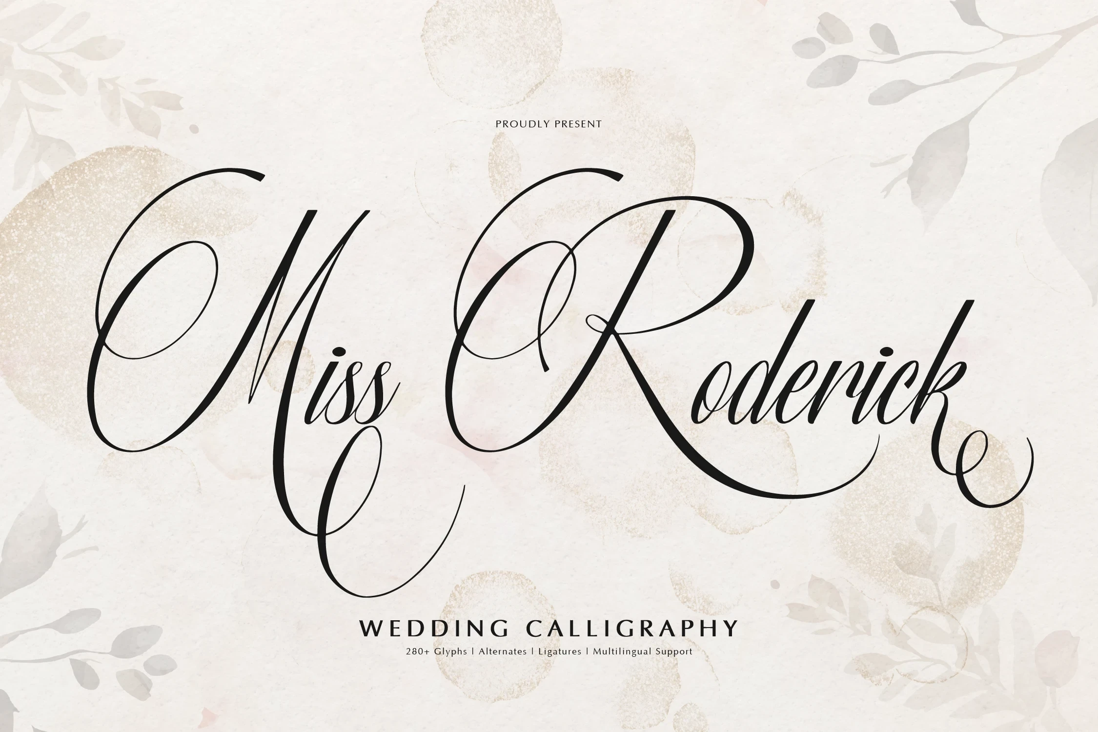
Best For: logos, branding, invitations, quotes
Miss Roderick Font pairs formal right-leaning penmanship with sweeping swashes. Its ligatures, alternate characters, and multilingual support expand production options, while the ornate structure still calls for display scale in bridal suites, quotes, and logos.
Defalliya Font
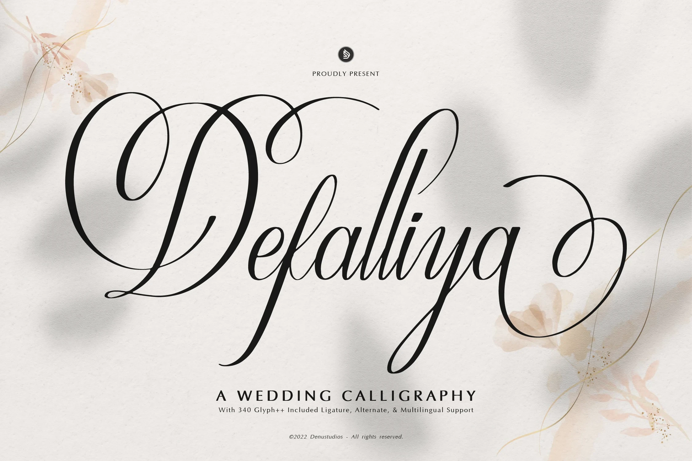
Best For: logos, branding, invitations, wedding designs
Defalliya Font combines right-leaning high-contrast strokes with connected lettering, ligatures, alternate characters, and multilingual support. Those features broaden its use for invitations and branding, but its flourishes still require generous display sizing.
Shantina Font
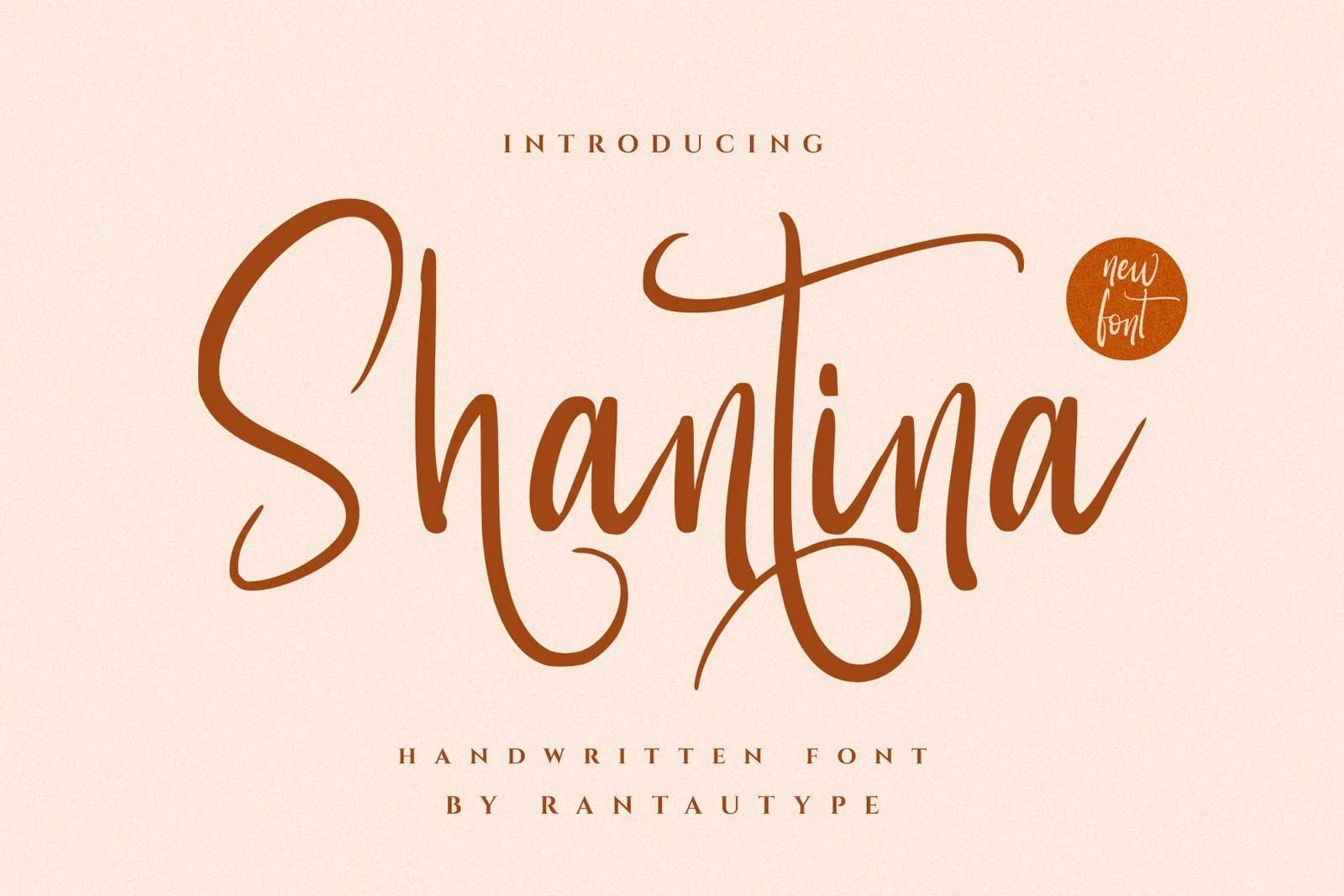
Best For: elegant designs, decorative designs, wedding designs, personal branding
Shantina Font has a heavy connected structure with an upright-to-slightly-inclined axis, giving it a steadier stance than strongly slanted alternatives. Opening and terminal swashes keep it focused on large wedding titles and personal branding.
Flavinda Font
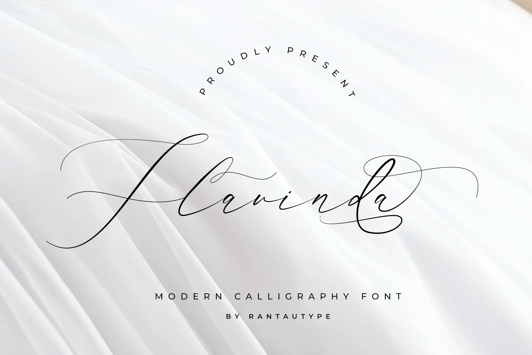
Best For: logos, invitations, quotes, social media graphics
Flavinda Font creates a strongly directional signature through a pronounced rightward slant, high contrast, and extended end strokes. Its intricate connections work for invitations and logos, but long-form reading would place too much strain on recognition.
Wedding Signature Font

Best For: T-shirts, display text, elegant designs, romantic designs
Wedding Signature Font uses light high-contrast lettering, connected forms, and a pronounced terminal swash for a formal finish. It remains readable in display use, while thin hairlines and complex joins can weaken when names become very small.
Light Contemporary Cursive
This group uses lighter connected strokes and cleaner joins, giving it a quieter visual rhythm than the flourished formal scripts. Its slender forms work especially well for names, short phrases, and contemporary invitation headings.
Senja Mentari Font
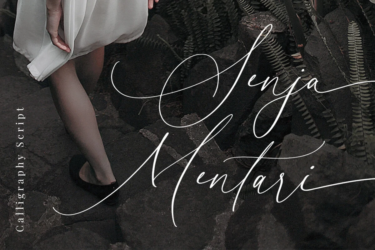
Best For: branding, modern designs, minimal designs, clean designs
For names and short headings, Senja Mentari Font offers slender joined strokes and a clean handwritten flow. Its lighter construction keeps the lettering open and contemporary, while dense wording can make the connected forms harder to compare quickly.
Salistya Font
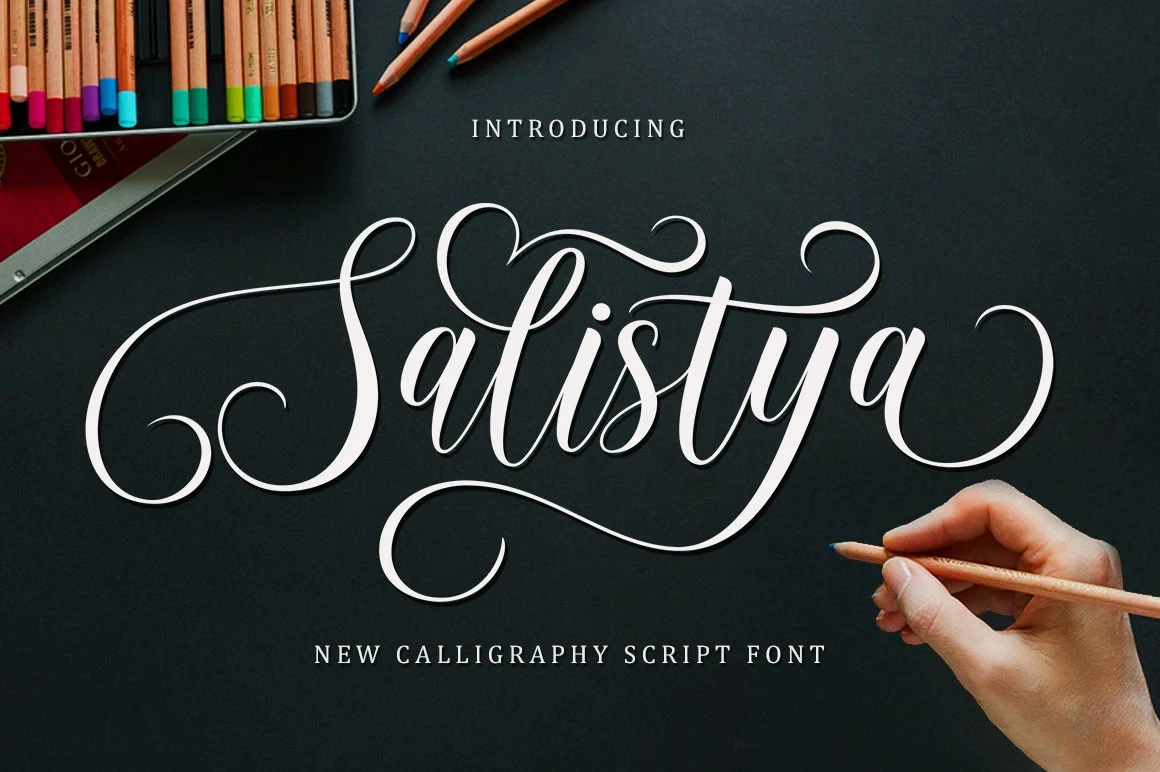
Best For: display text, expressive designs, wedding designs
Salistya Font is more expressive than a purely functional cursive because its slender connected forms include distinctive display letterforms. Use it for short wedding phrases or names where the joins can remain visible without competing with too much text.
Angelic Sonata Font
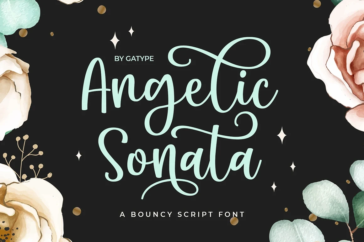
Best For: logos, branding, packaging, invitations
For invitation names and branding, Angelic Sonata Font provides connected movement with cleaner contemporary joins than heavily ornamented scripts. Its distinctive display shapes add expression, but the forms are better suited to short text than paragraphs.
Newly Bridal Font

Best For: display text, wall art, elegant designs, expressive designs
Newly Bridal Font has a clear stroke rhythm that makes its connected forms easier to assess across names and short phrases. Its distinctive display shapes are not intended for compact utility text, and its PUA-encoded characters provide access to its glyphs and swashes.
August Wedding Font
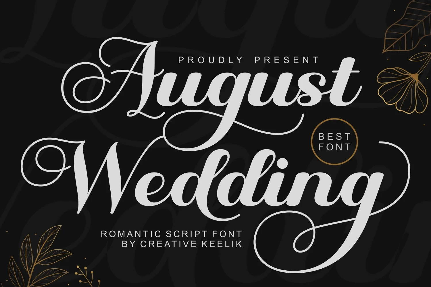
Best For: display text, elegant designs, romantic designs, expressive designs
August Wedding Font balances flowing connected forms with a comparatively clear stroke rhythm. That balance helps short names and headings remain identifiable, but its display-oriented letterforms still make it a poor choice for extended copy.
Glow Overload Font
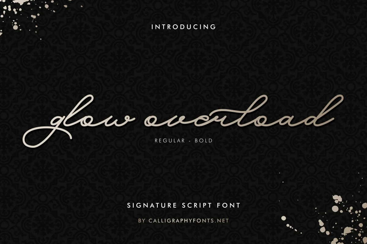
Best For: invitations, social media graphics, eye-catching designs, display text
Glow Overload Font brings a light display presence through refined slender strokes and connected handwritten movement. Use it for prominent invitation text or short social graphics, where its thin construction can remain visible without carrying too much wording.
Violyn Wedding Thivoria Font

Best For: modern designs, clean designs, elegant designs, expressive designs
Violyn Wedding Thivoria Font keeps connected movement slender and controlled through a clean contemporary construction. Short names and invitation headings show its forms more clearly than long wording, which can make the light joins visually difficult to follow.
Upright and Monoline Display Scripts
Upright orientation and relatively even strokes distinguish these scripts from strongly leaning calligraphy. Rounded terminals, ligatures, or selective contrast add personality, while the steadier structure improves clarity in short display text.
Blackwealth Font
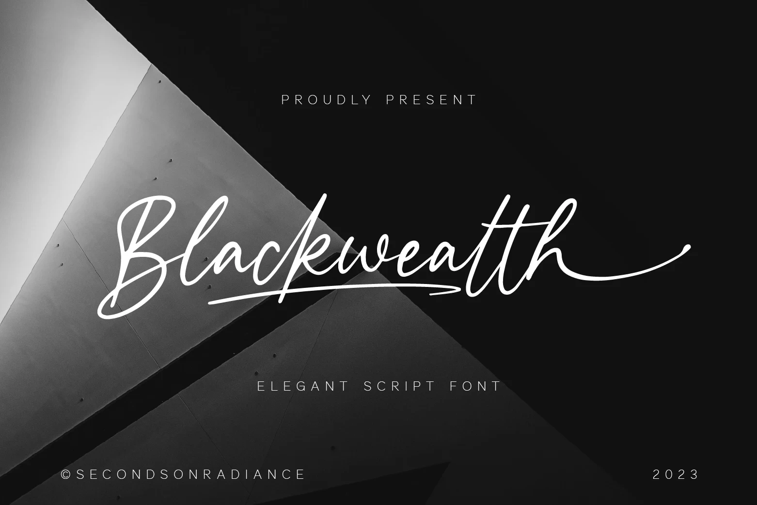
Best For: logos, branding, packaging, business cards
Blackwealth Font uses monoline connected strokes for a more even texture than high-contrast calligraphy, while a terminal flourish and ligatures retain its display character. It suits large headings, logos, and branding rather than body copy.
Darlington Font
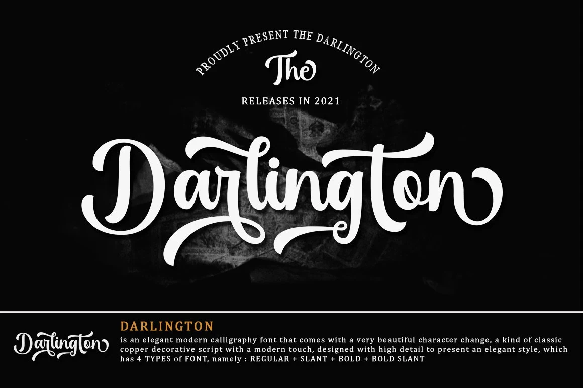
Best For: modern designs, clean designs, elegant designs, classic designs
Darlington Font gives Wedding Calligraphy Fonts a steadier alternative through heavy upright lettering and rounded loops. Its high contrast remains decorative, while thin connecting strokes and swashes mean it still needs large display sizing.
Wedding Calligraphy Font

Best For: social media graphics, invitations, headlines, modern designs
Wedding Calligraphy Font takes a calmer route with an upright monoline structure, rounded terminals, and minimal slant. The thin uniform stroke is clearest in headings, invitations, and other short text displayed large enough to protect readability.
Babyish Font

Best For: logos, branding, invitations, social media graphics
Babyish Font combines upright connected lettering and high contrast with rounded terminal strokes and decorative flourishes. Its playful personality works for names, logos, invitations, and social graphics, but formal information blocks will be less comfortable to read.
Textural and Gesture-Driven Scripts
These scripts make construction part of the message through irregular baselines, dot-like strokes, heavy swashes, or thematic ligatures. They are expressive focal treatments, though less predictable for tightly aligned invitation information.
Nikahan Script Font
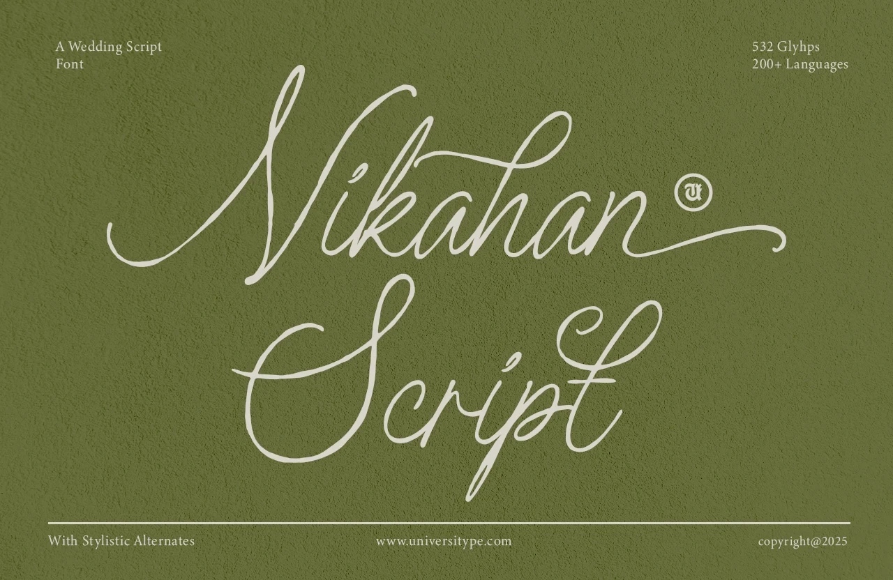
Best For: elegant designs, classic designs, romantic designs, decorative designs
Nikahan Script Font creates continuous motion through monoline lettering, a pronounced slant, and abundant flourishes. Among Wedding Calligraphy Fonts, it is best reserved for large decorative words or brief titles, where its ornamentation can remain legible.
Rustic Wedding Font
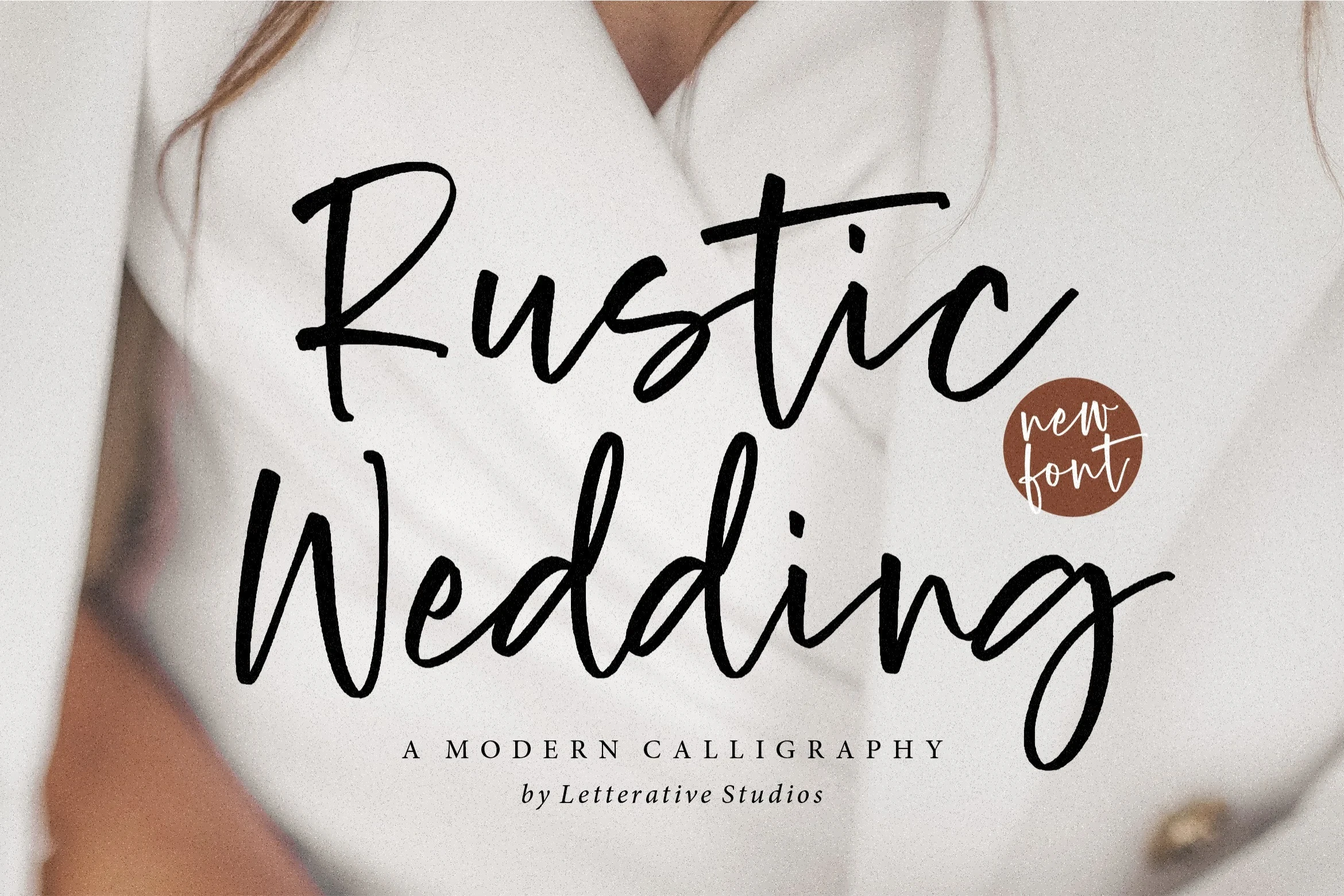
Best For: modern designs, minimal designs, clean designs, elegant designs
Rustic Wedding Font uses a wide layout, variable stroke thickness, and an irregular baseline to create a hand-arranged rhythm. Its organic movement is expressive in large headers, but less predictable when invitation copy must align tightly.
Alyra Font
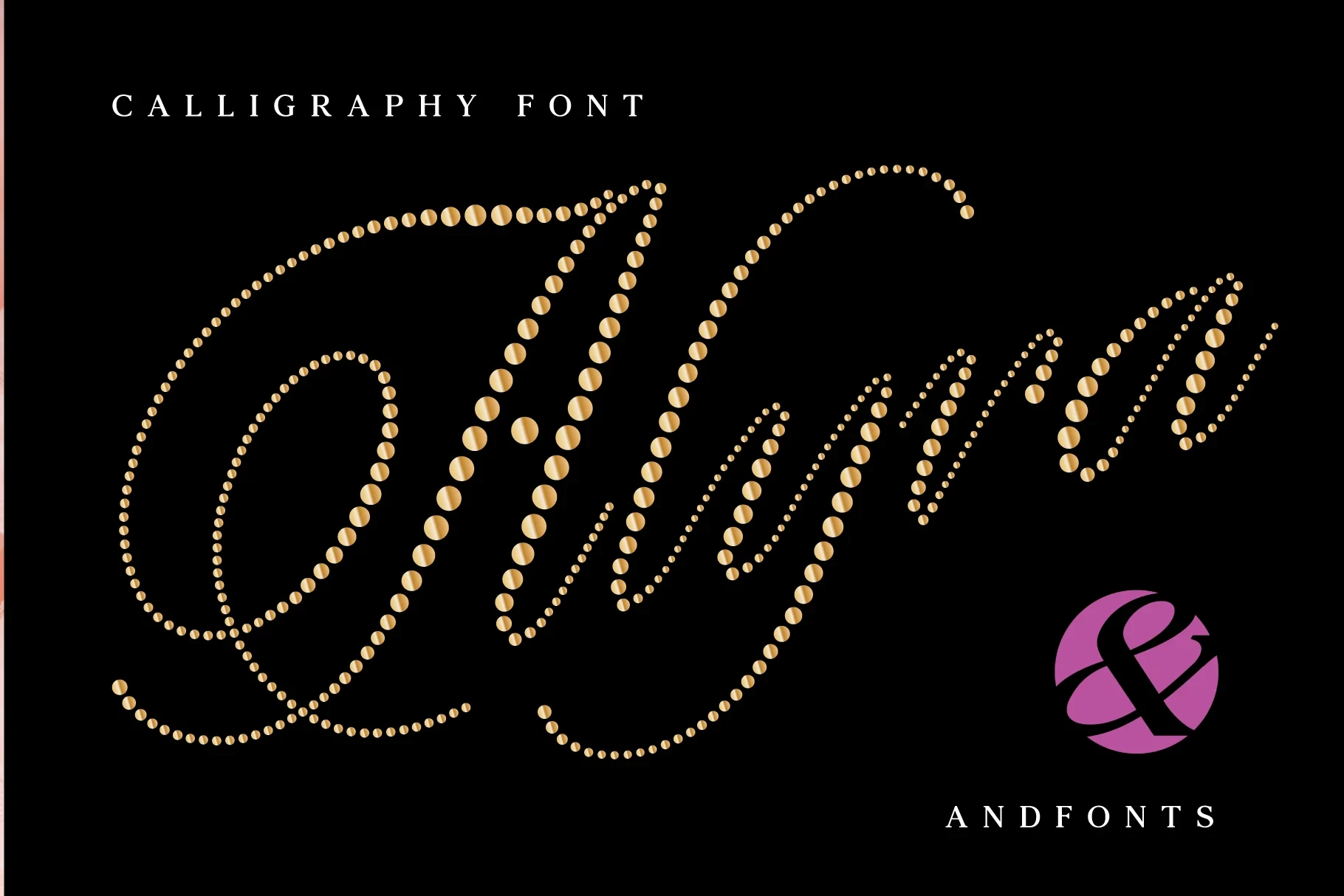
Best For: eye-catching designs, product labels, clean designs, elegant designs
Alyra Font replaces ink-like strokes with individual dots or beads while keeping a connected cursive structure and high contrast. This distinctive construction makes Wedding Calligraphy Fonts layouts more focal, though substantial size is needed to preserve legibility.
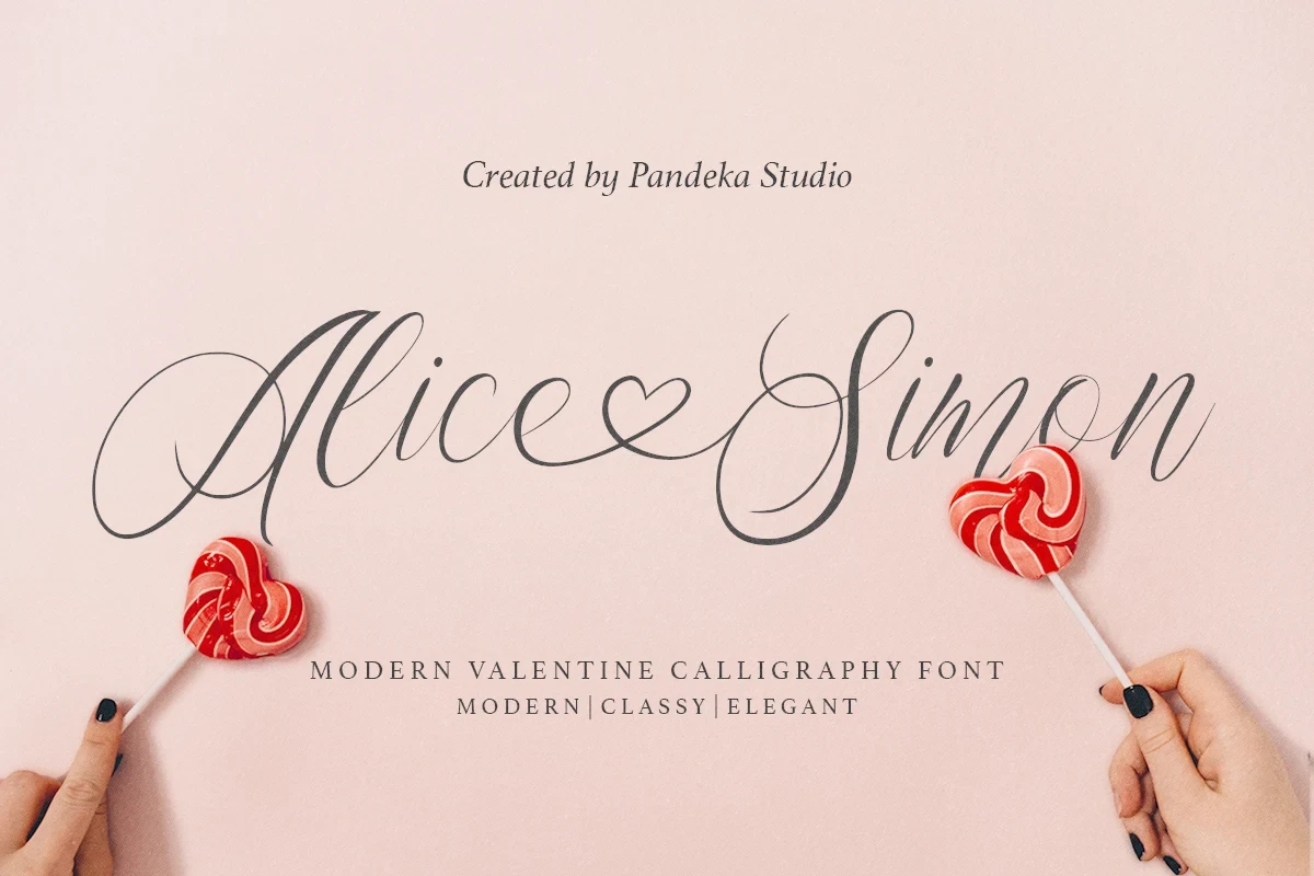
Alice Simon Font
Best For: logos, branding, invitations, social media graphics
Alice Simon Font turns its connection into a visible wedding motif with an integrated heart-shaped detail. Heavy high-contrast strokes and sweeping swashes make it strongest for names, titles, logos, or social graphics rather than general text.
How to Choose the Right Font
Choose by construction before choosing mood: heavy high-contrast scripts create stronger names and titles, while light or monoline designs need more size and breathing room. Upright options offer steadier reading, slanted scripts add directional energy, and textural styles work best as focal details. For longer invitation information, pair any Wedding Calligraphy Fonts choice with a clear supporting face.