12 Best Feminine Branding Fonts in 2026
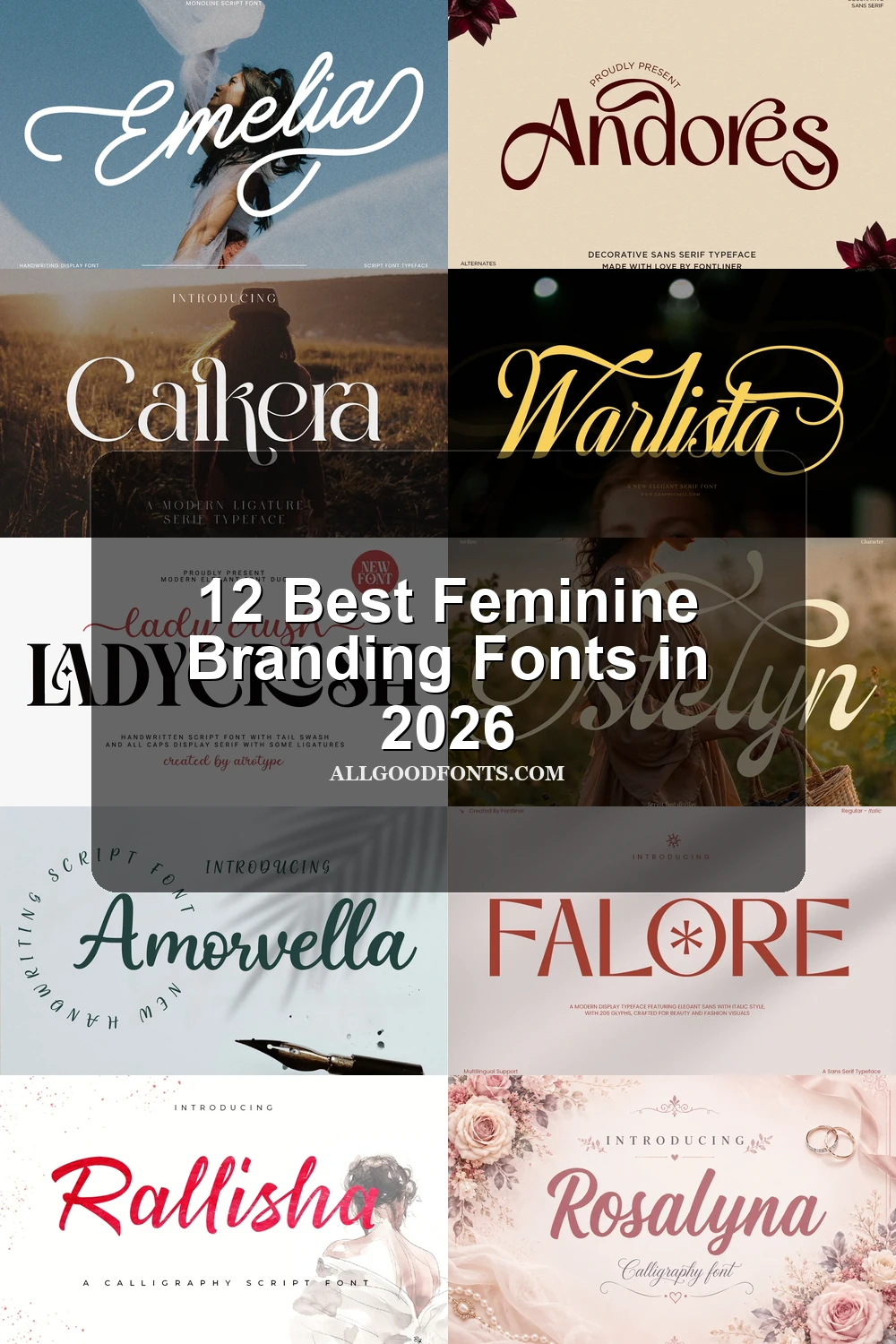
This collection moves from connected scripts and textured brush lettering to high-contrast serifs and structured display faces. These Feminine Branding Fonts are designed mainly for logos, founder names, beauty packaging, fashion headers, and other prominent brand moments where construction and scale shape readability.
Looking for more branding fonts? Browse our complete Branding Fonts collection to compare modern, elegant, boutique, luxury, and beauty branding styles.
Feminine Branding Fonts: Connected Scripts
These Feminine Branding Fonts share connected letterforms, slanted movement, and script-led personality. Their joins and swashes create personal signatures, but generally require more display space than supporting copy.
Emelia Font
Best For: logos, branding, invitations, quotes
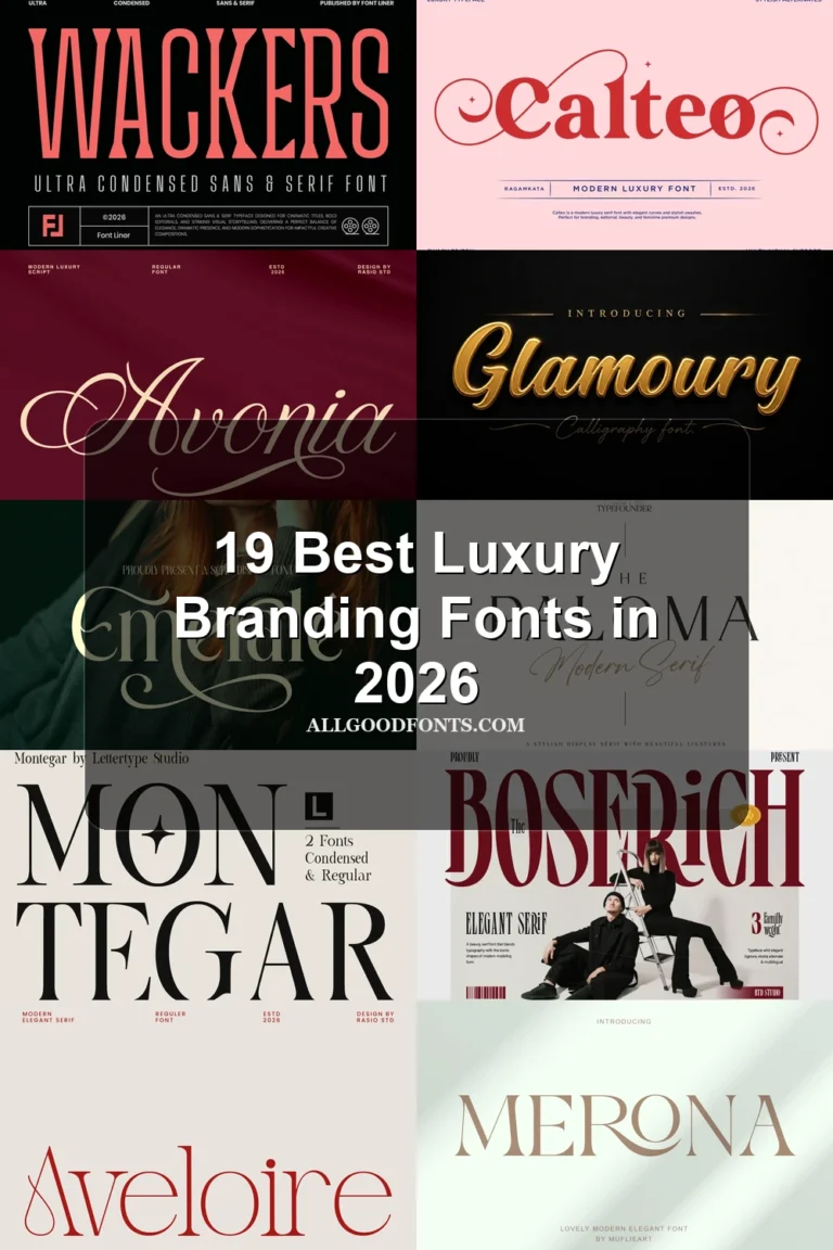
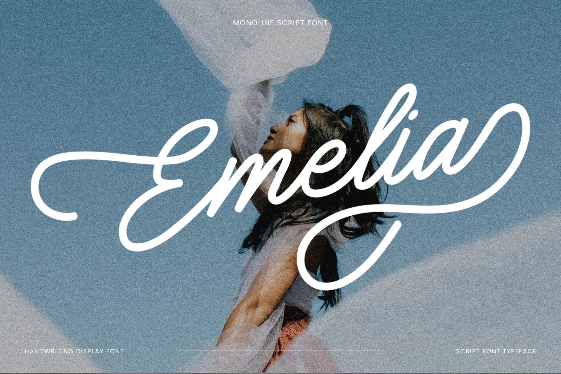
Emelia Font uses monoline connected lettering with an upward slant and extended cursive movement. It suits Feminine Branding Fonts applications such as logos, invitations, and founder-led identities, retaining clarity at large sizes while elongated joins can blur in small labels.
Warlista Font
Best For: branding, eye-catching designs, beauty branding, website headers
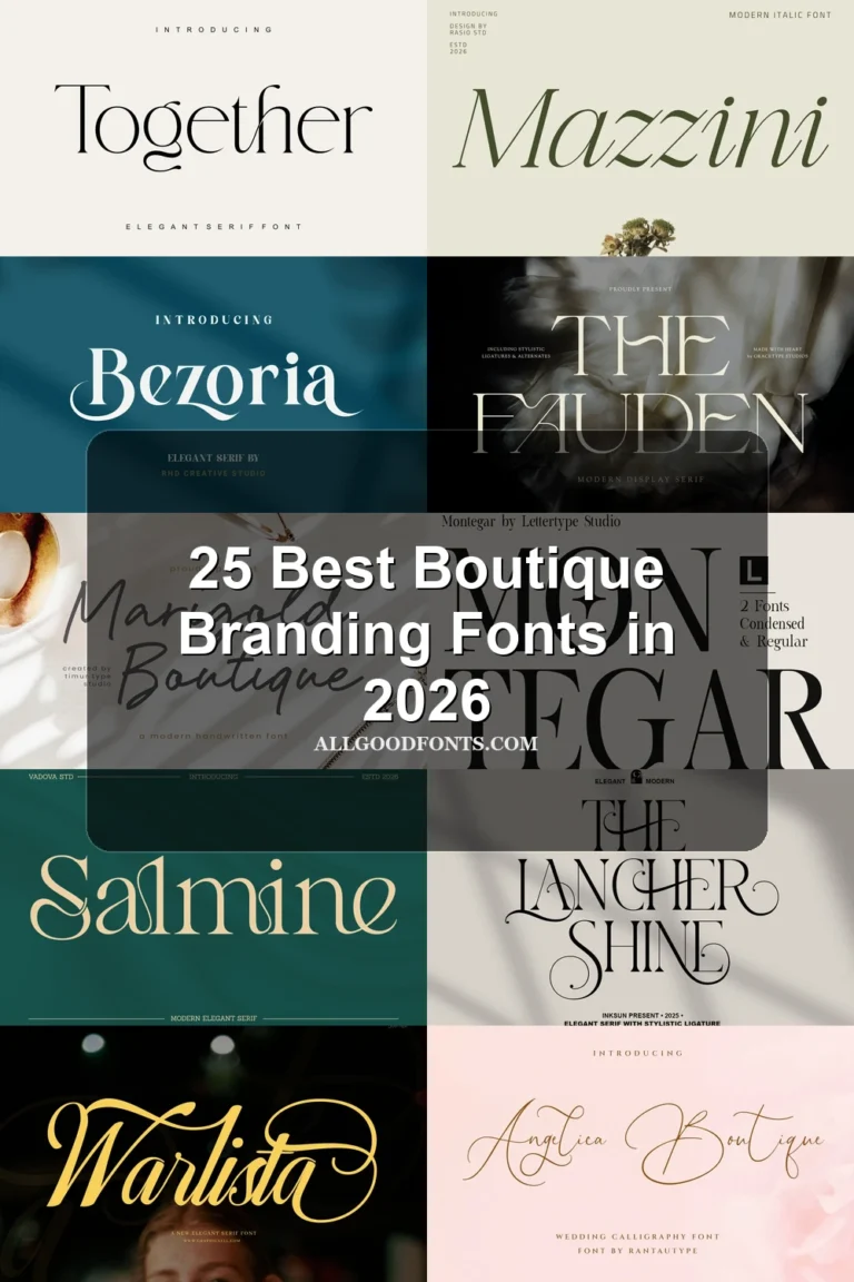
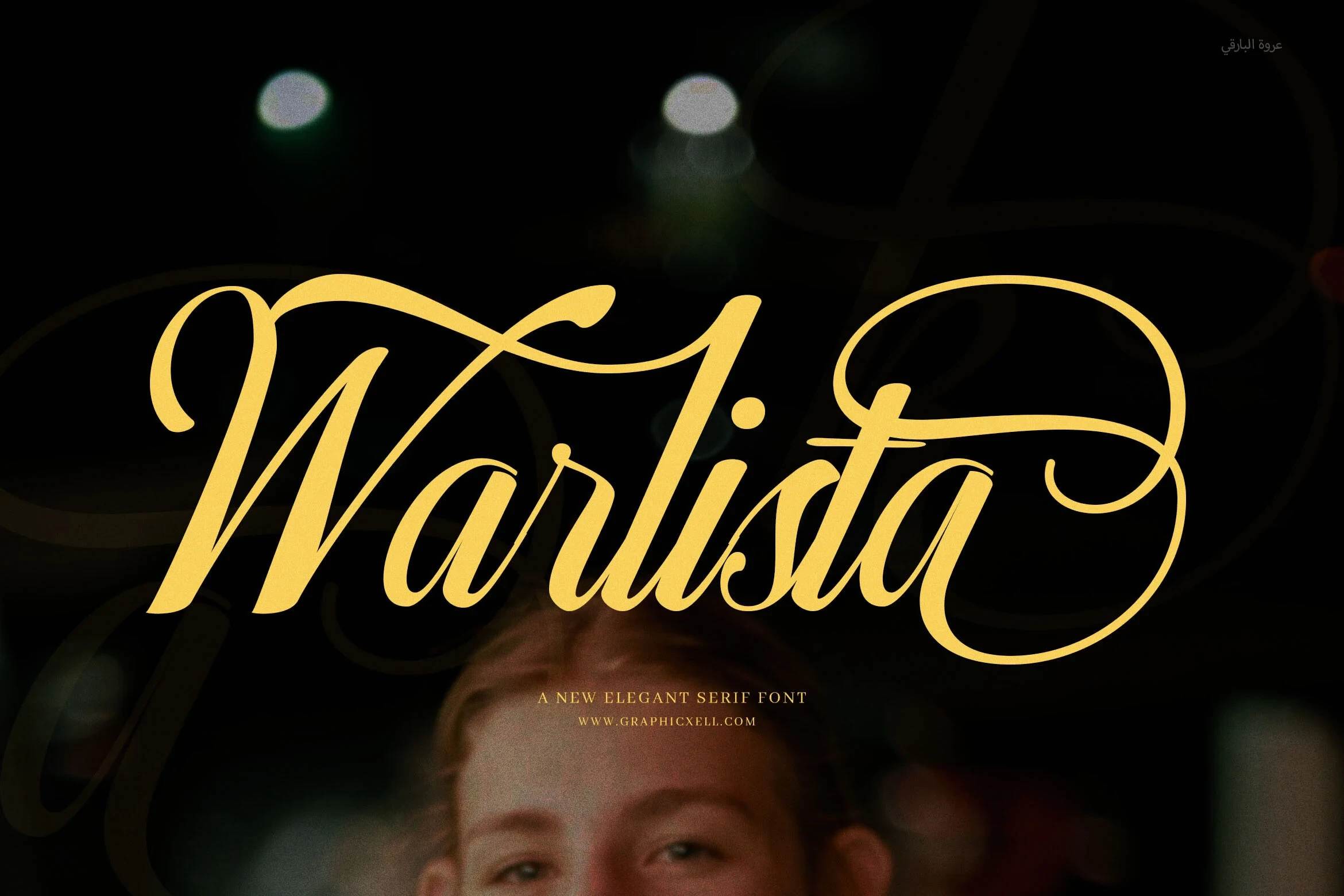
Warlista Font is particularly effective for beauty branding, where its high-contrast calligraphic connections, overlapping swashes, and alternate characters can turn a name into a prominent wordmark. The layered flourishes make it a better choice for large headers than compact packaging text, and it belongs among Feminine Branding Fonts that need generous scale.
Amorvella Font
Best For: branding, personal branding, beauty branding, clean designs
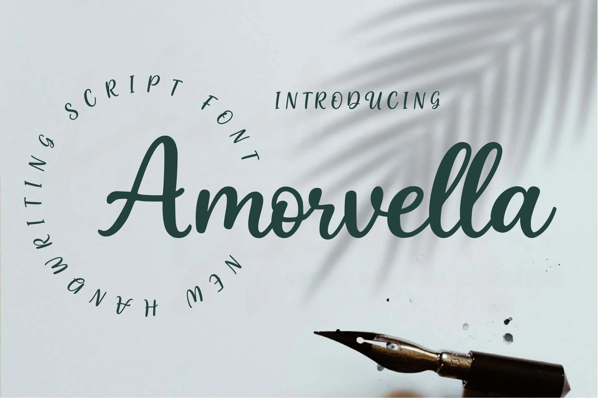
Amorvella Font combines connected monoline lettering with a moderate forward slant and rounded terminals. Its approachable construction fits founder names and personal identities, though the interconnected strokes need generous sizing to preserve clarity in Feminine Branding Fonts layouts.
Rallisha Font
Best For: branding, invitations, modern designs, clean designs
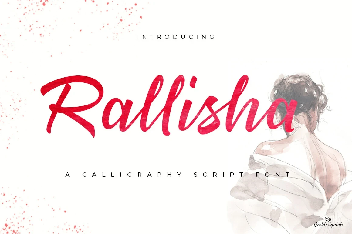
Rallisha Font has a connected brush-like construction, textured surfaces, and strongly varied line weight. The surface detail adds a handmade signal to large brand titles and invitations, but reduction quickly affects clarity, so it should remain a prominent rather than secondary voice.
Rosalyna Font
Best For: fashion branding, logos, branding, packaging
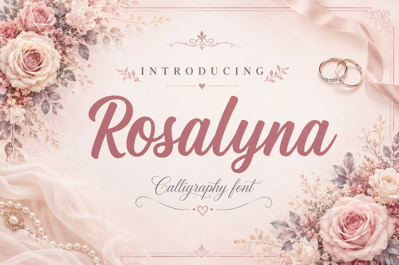
Rosalyna Font contrasts bold brush-script lettering with a thinner, more intricate calligraphic companion. That difference can separate a brand name from a subtitle or supporting phrase, although the fine companion needs substantial size to remain readable across packaging or logo applications.
Ostelyn Regular Font
Best For: branding, invitations, quotes, display text
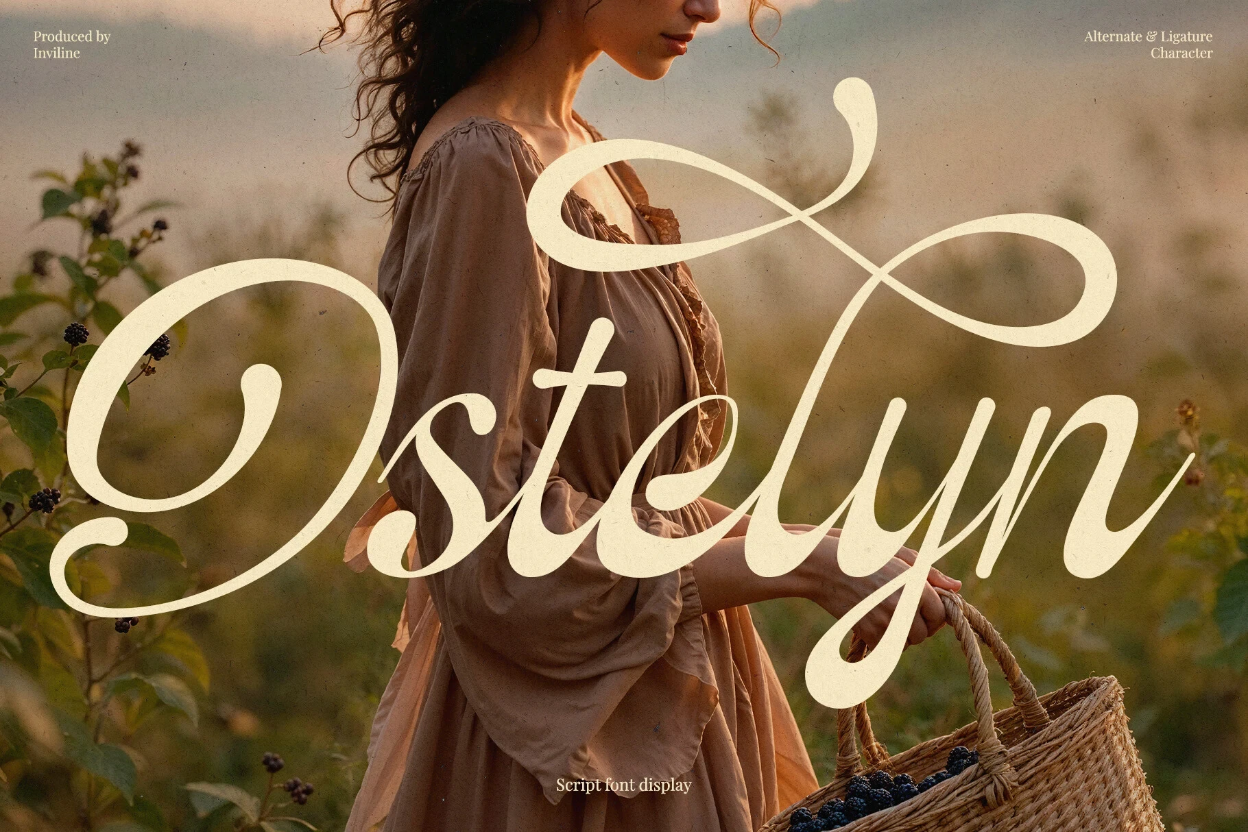
Ostelyn Regular Font combines heavy calligraphic script, high contrast, a forward slant, sweeping swashes, ligatures, and alternate characters. These options help customize prominent names, but the dense flourishes demand large display scale, making it a focused choice within Feminine Branding Fonts.
Flourished Serif Displays
This group uses serif or wide geometric display construction, with ligatures, flared terminals, open counters, and unusual letter details. It feels more structured than the connected scripts but remains headline-focused.
Beinora Font
Best For: branding, display text, clean designs, elegant designs
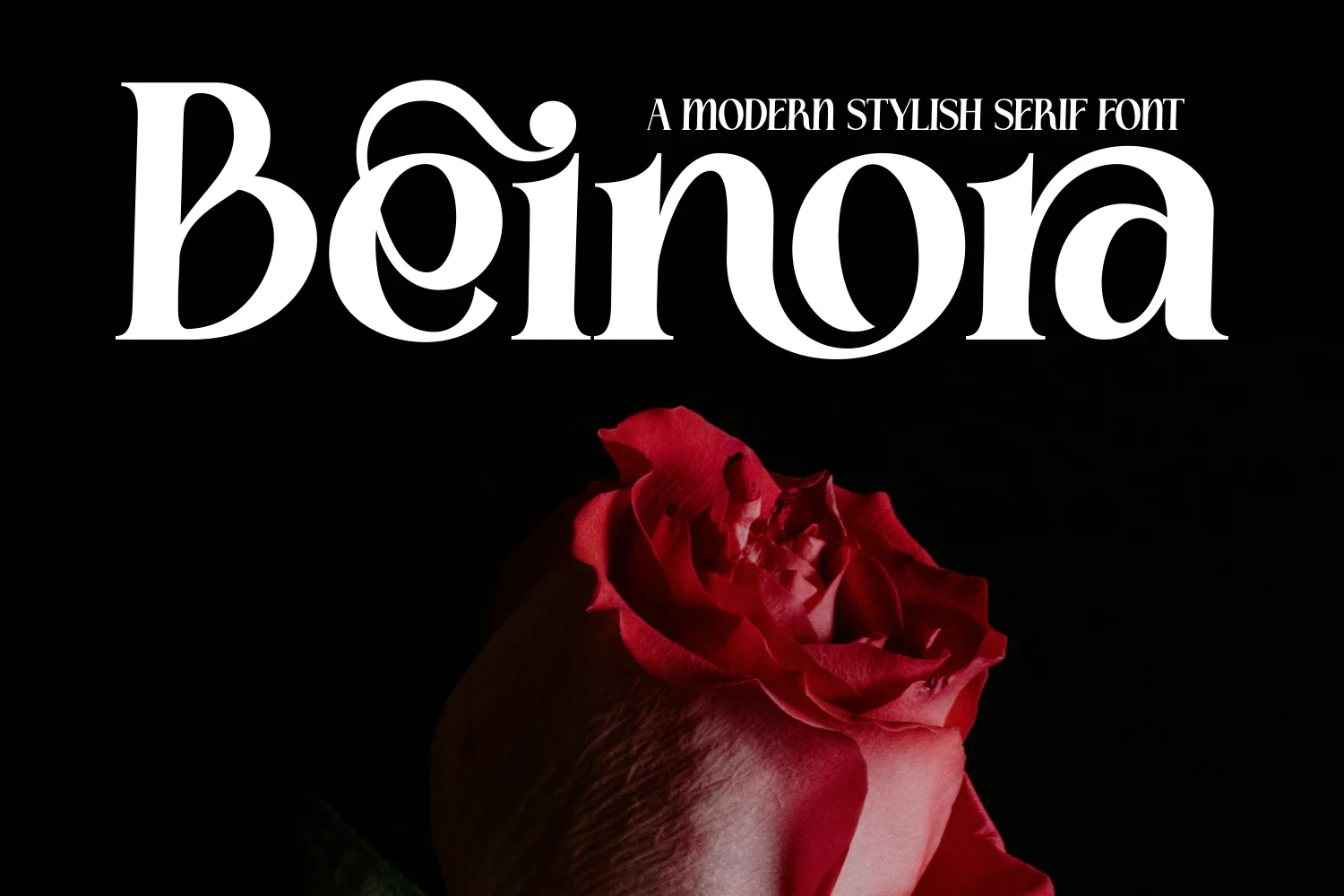
Beinora Font pairs a display serif structure with open, airy counters and sweeping lowercase flourishes. Those interiors help short titles remain recognizable, while stylized terminals keep it focused on logos, headlines, and other brief display uses rather than continuous reading.
Falore Font
Best For: branding, creative projects, beauty branding, fashion branding
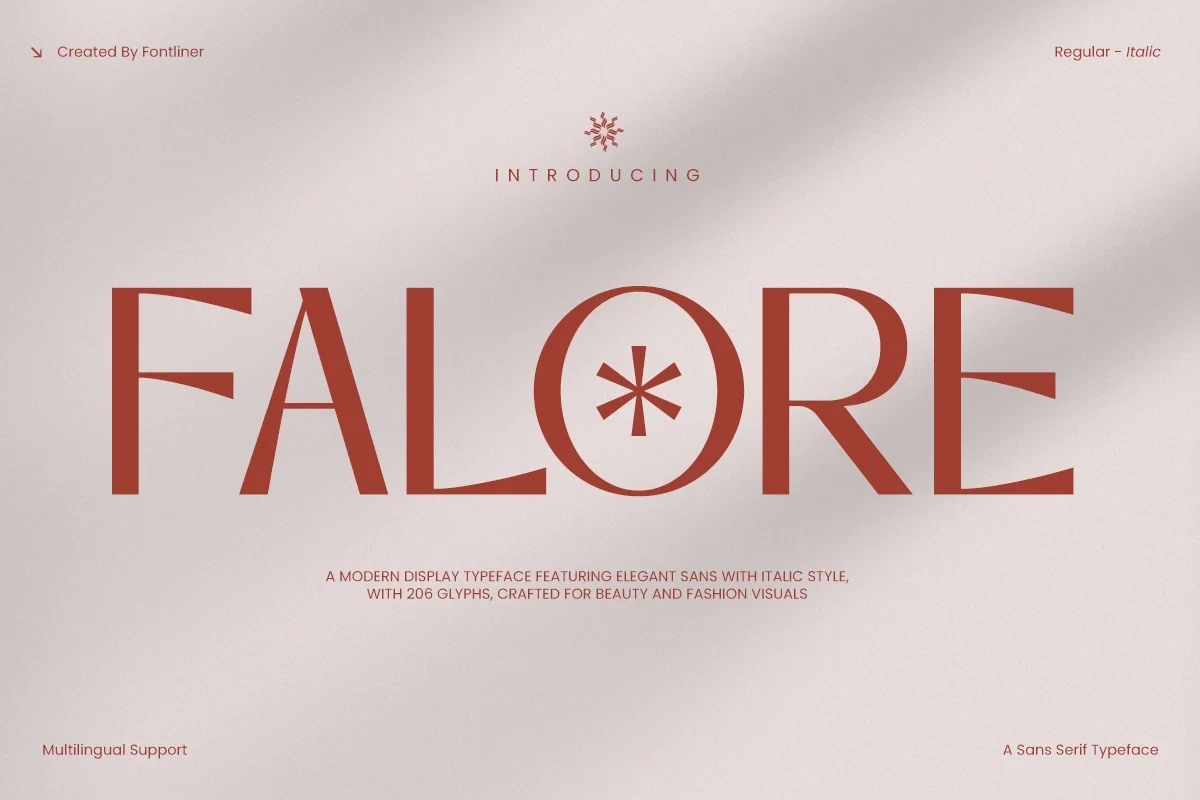
For Feminine Branding Fonts with a fashion or beauty focus, Falore Font brings wide geometric forms, flared terminals, and a circular O containing a central asterisk. Its thin horizontals and delicate terminal details need large sizing, but alternate characters can add further distinction to a headline or wordmark.
Caikera Font
Best For: branding, beauty branding, display text, modern designs
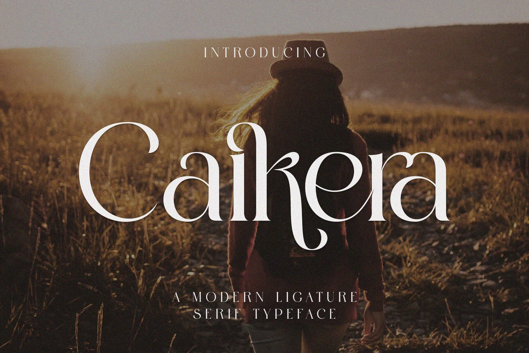
Caikera Font uses a high-contrast serif framework with prominent ligatures that visibly connect neighboring characters. This treatment gives wordmarks and display text a carefully shaped rhythm, though the ligatures favor visual impact over fast reading and are best kept away from small supporting copy.
Lady Crush Font
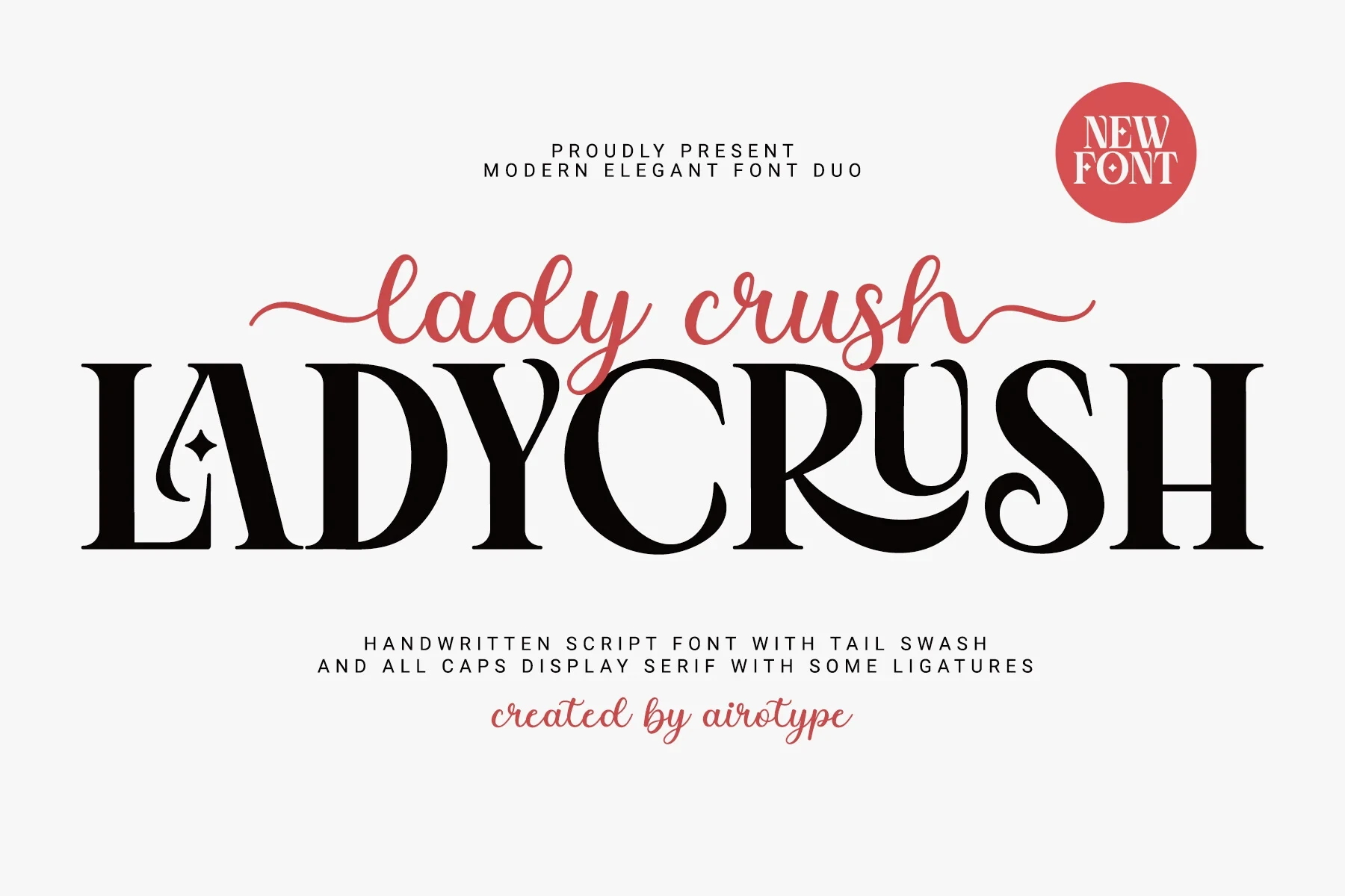
Best For: branding, packaging, wedding designs, website headers
Lady Crush Font is built as a coordinated pairing: a right-slanted connected script alongside an all-caps serif with a star-like capital terminal. It supports Feminine Branding Fonts systems for packaging and headers, but both styles are better for display hierarchy than body copy.
Contrast-Led Display Styles
These display faces rely on contrast rather than continuous connections: heavy structures, modulated strokes, swashes, or outline treatments create impact. They work best as focal branding elements, not paragraphs.
Andores Font

Best For: branding, high-end designs, display text, modern designs
Andores Font builds a heavy modern sans-serif foundation with high-contrast strokes and swashes that travel from the baseline toward cap height. The flourishes give logos and large titles strong movement, but their complexity makes extended brand copy impractical.
Gistra Font

Best For: logos, branding, editorial designs, quotes
Gistra Font offers a solid cut and an outline cut, both shaped by modulated strokes, high contrast, and flared terminals. The two treatments can create distinct logo effects, but the stylization limits it to headlines, branding, and other large-scale applications.
How to Choose the Right Font
Choose connected monoline scripts when a founder name or personal signature should feel approachable, and brush or calligraphic styles when texture and movement are central. For stronger structure, compare serif counters, ligatures, flared terminals, and contrast-led cuts. In Feminine Branding Fonts, test every finalist at its real logo or packaging size before committing.