14 Best Beauty Branding Fonts in 2026
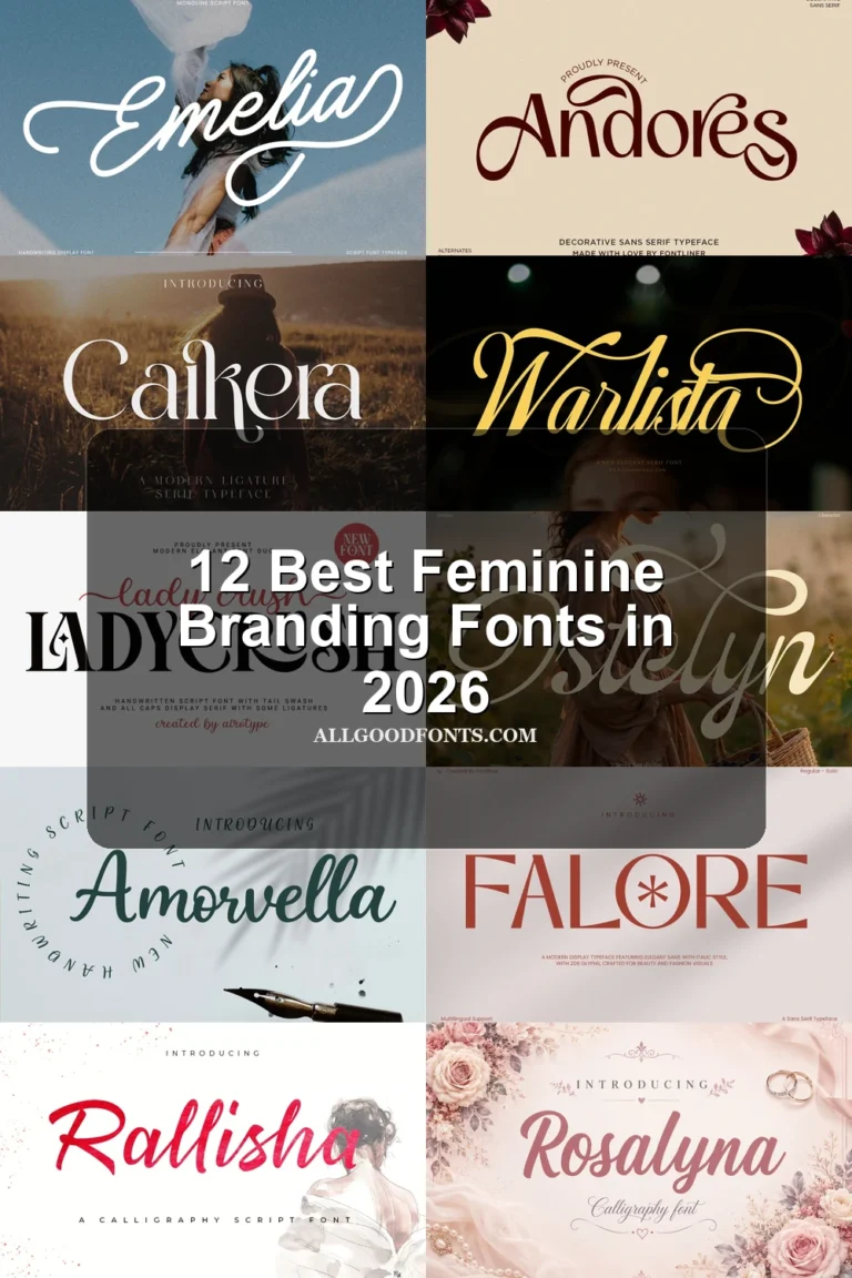
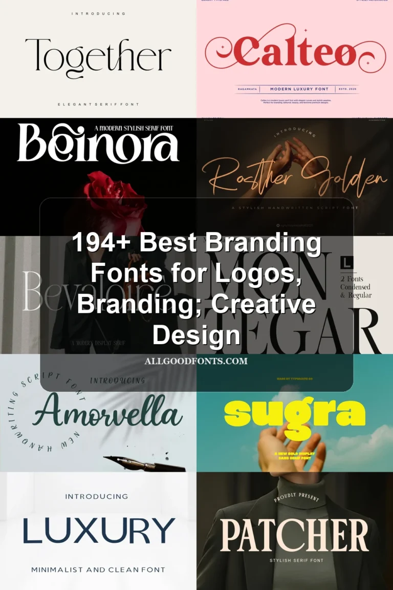
This collection spans high-contrast display serifs, connected scripts, and bold geometric forms, with differences shaped by stroke contrast, joins, terminals, and scale. These Beauty Branding Fonts suit logos, packaging, product labels, headlines, and supporting identity details, but each demands a different approach to readability.
Looking for more branding fonts? Browse our complete Branding Fonts collection to compare modern, elegant, boutique, luxury, and beauty branding styles.
Beauty Branding Fonts
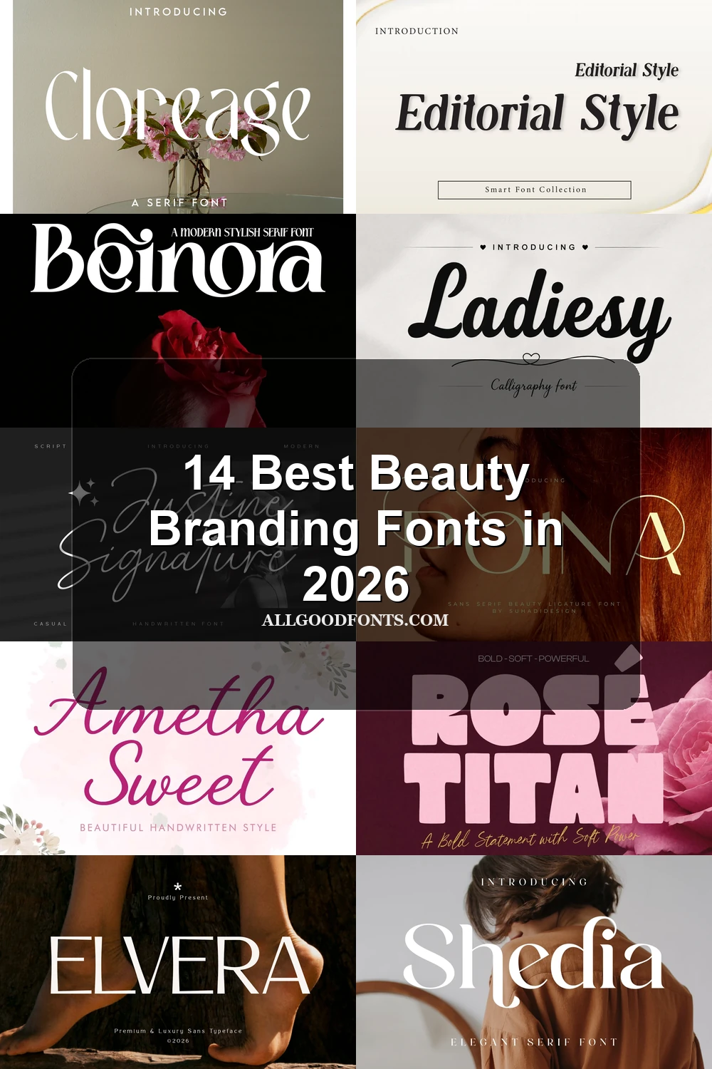
This group centers on expressive display serifs, from slender rhythmic strokes to sharp, high-contrast forms with swashes and ligatures. They create polished brand names but generally need generous sizing.
Aroms Font
Best For: business cards, beauty branding, logos
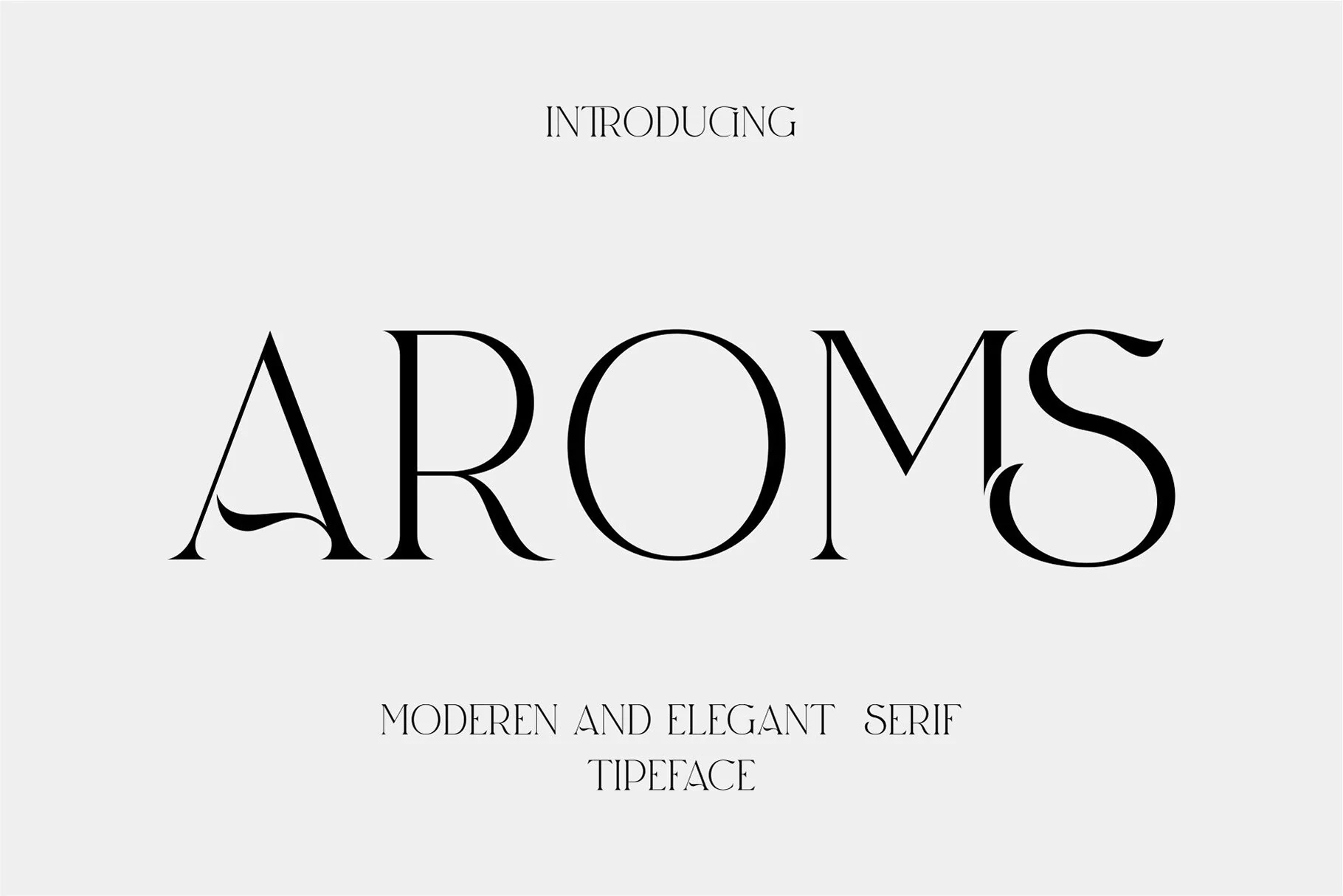
Aroms Font uses heavy, high-contrast serifs, pointed terminals, extended crossbars, and uppercase swashes to create a sharply expressive wordmark. Its ligatures add logo-level polish, while delicate thin strokes make it better for large Beauty Branding Fonts headlines, business cards, and logos than compact copy.
Shedia Font
Best For: beauty branding, branding, packaging
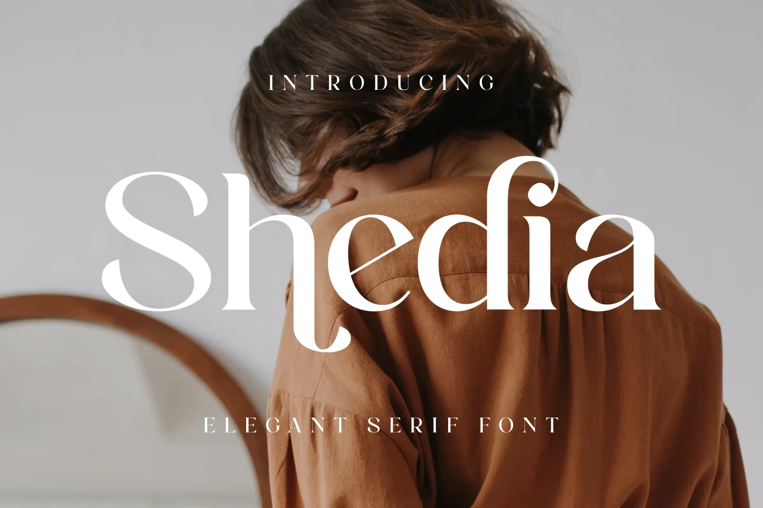
For short names, packaging labels, and headings, Shedia Font offers a lighter display presence through slender strokes and a clear, measured rhythm. Its distinctive letterforms are easier to compare when given space, making it a useful choice for beauty branding, packaging, and other brief display phrases rather than dense text.
Once After Font
Best For: beauty branding, branding, fashion branding, display text
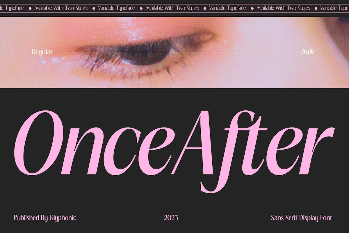
Once After Font combines heavy high-contrast serifs, pointed terminals, calligraphic curves, and open rounded counters. Its Regular and Italic styles allow variation across a brand system, but fine strokes need generous sizing. For Beauty Branding Fonts, it is especially suited to display text, fashion branding, and prominent names.
Editorial Style Font
Best For: beauty branding, branding, high-end designs, display text
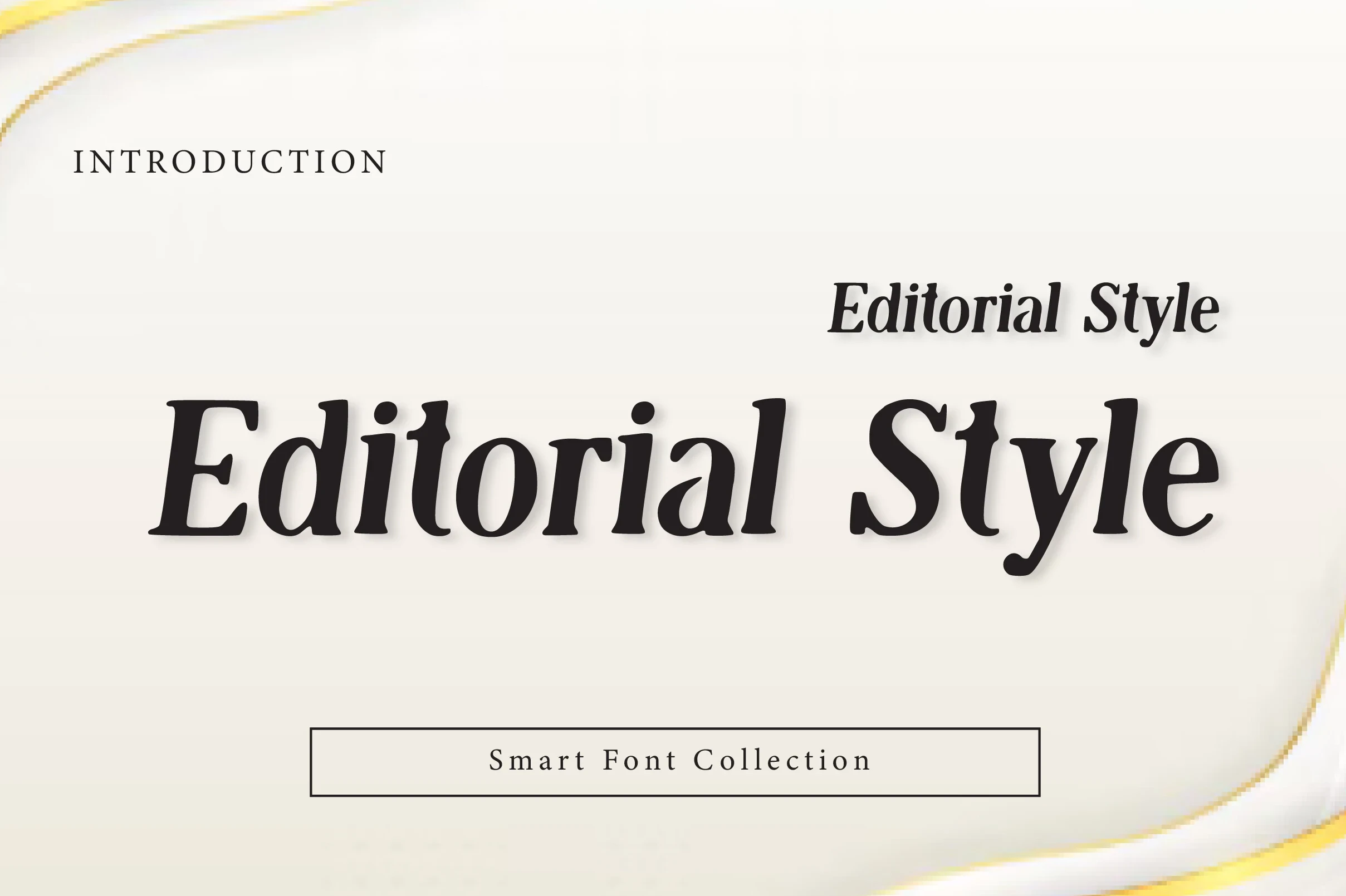
Editorial Style Font uses an upright vertical axis, sharp serifs, controlled character width, and strong thick-thin contrast. The formal structure can anchor an established beauty identity, although its fine contrast becomes less dependable at small sizes. Keep it focused on headings, display text, and high-end designs.
Cloreage Font
Best For: beauty branding, logos, branding, packaging
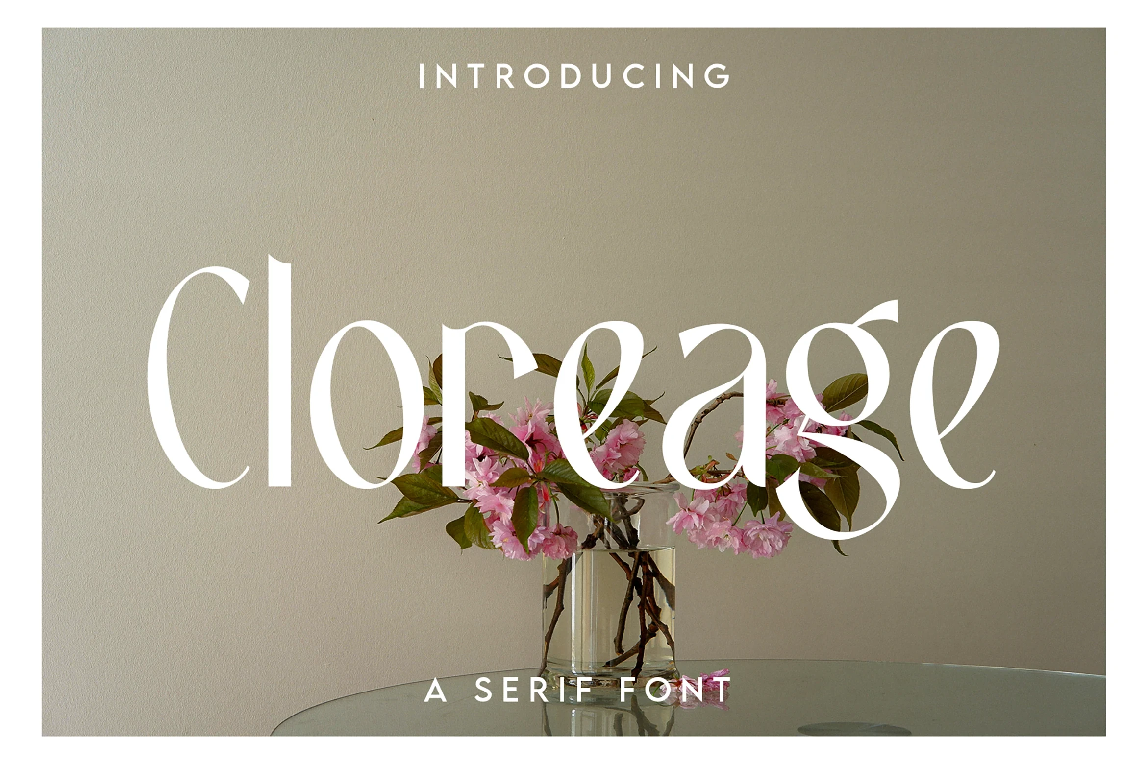
Cloreage Font draws attention through tapered, flowing serifs, elongated curves, and exaggerated descenders. These features create a graceful silhouette across packaging and logos, but delicate details need large-scale treatment to remain clear. Pairing it with a geometric sans can provide more practical supporting text.
Beinora Font
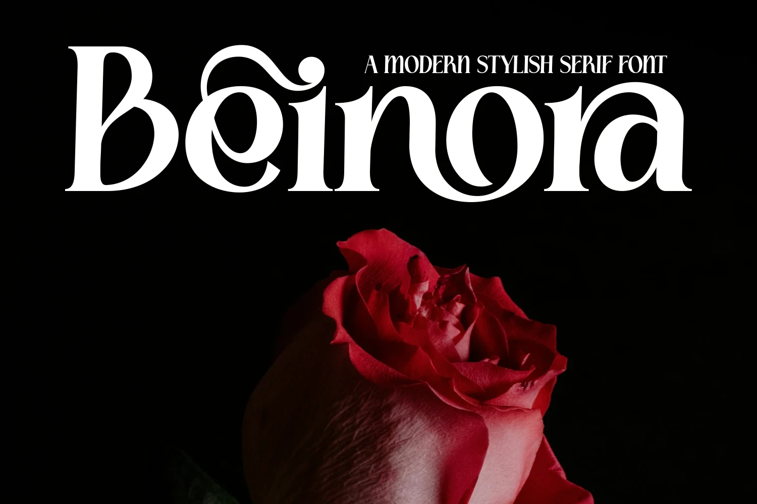
Best For: beauty branding, branding, display text
Beinora Font forms a distinctive word shape through overlapping connections, circular bowls, high contrast, and a swash on the opening B. The interlocking structure is effective for a memorable beauty logo, but unsuitable for compact text blocks. Use it for branding or large display text.
Casmera Font
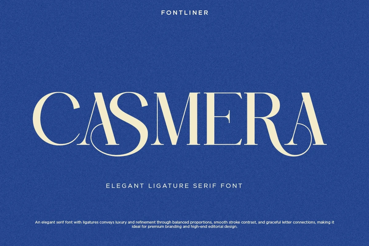
Best For: beauty branding, branding, display text, elegant designs
Casmera Font gains its identity from specialized C-A and R-A ligatures, vertical stress, and curved swash-like terminals. Those long connections make brand names distinctive at logo scale, but can obstruct smaller wording. It is strongest for beauty branding, display text, and carefully spaced identity marks.
Connected Script Signatures
Connected scripts unite letters through cursive movement, rounded terminals, loops, and extended tails. Compared with the serif group, they feel more signature-like, though their joins become harder to read when reduced.
Ametha Sweet Font
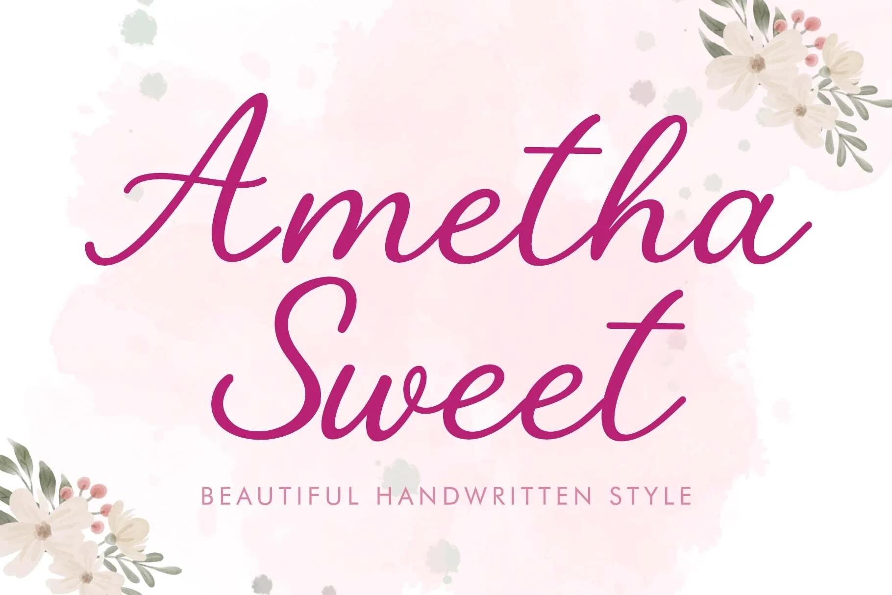
Best For: beauty branding, branding, invitations
Ametha Sweet Font relies on right-leaning connected lettering, rounded terminals, and continuous cursive movement. The stylized script works most clearly as a large title, paired with the supplied geometric sans subtitle for smaller supporting information. It suits beauty branding, invitations, and focused identity applications.
Violetta Font
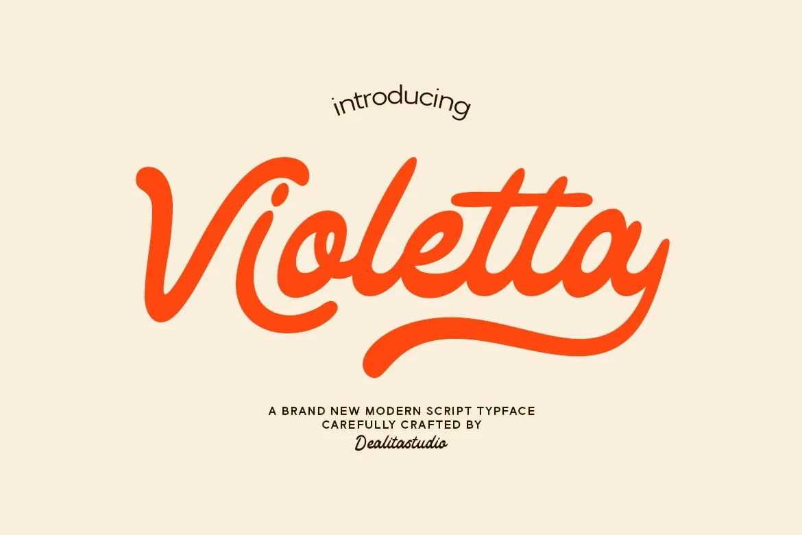
Best For: beauty branding, branding, elegant designs
Violetta Font creates a bold connected word shape with monoline strokes, rounded ends, a moderate rightward slant, and a pronounced final-letter tail. The construction stays readable in large logos, but its interconnected letters lose clarity when reduced. Use it for beauty branding, branding, or prominent identity lettering.
Justine Signature Font
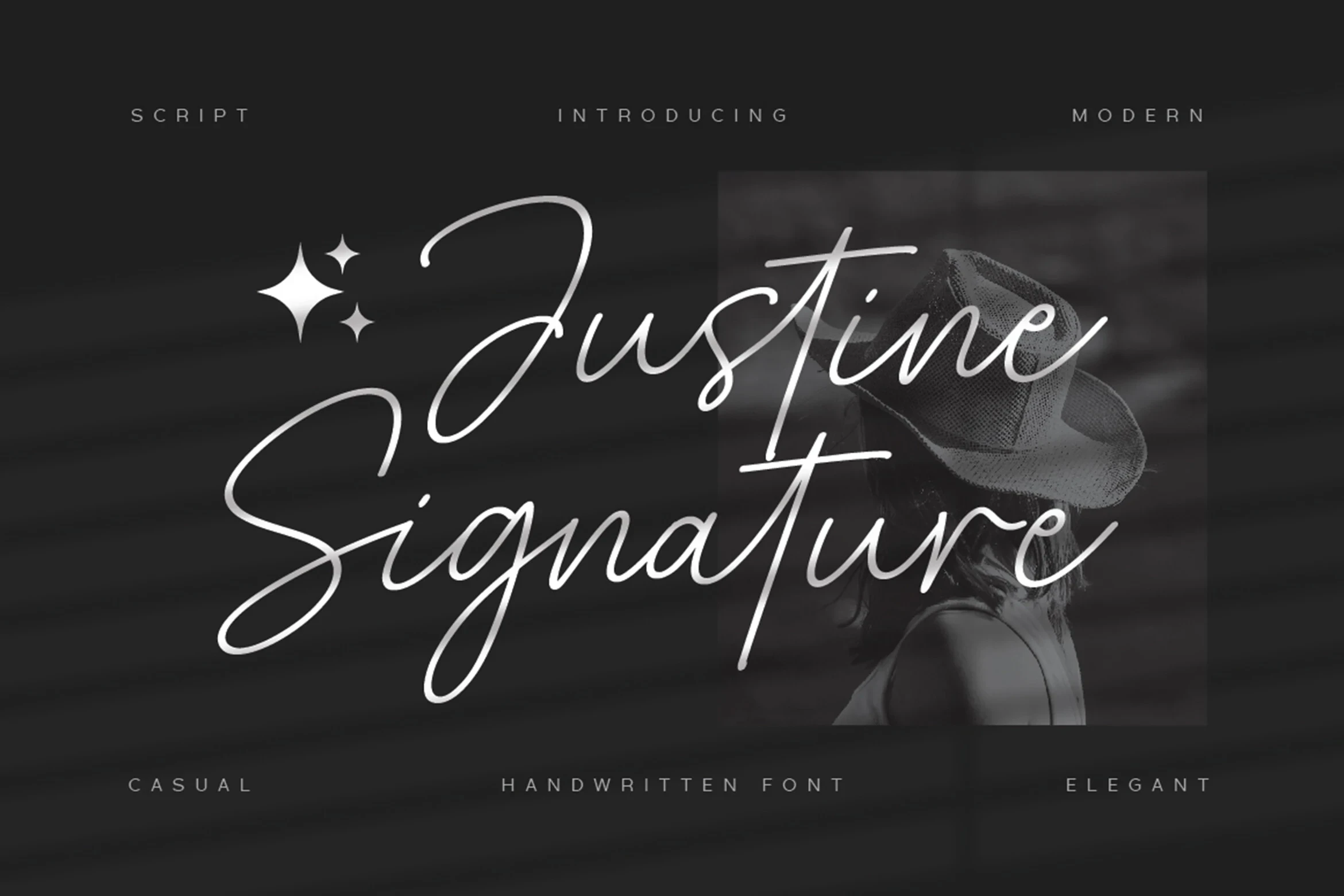
Best For: beauty branding, logos, branding
Justine Signature Font uses light connected lettering, variable line weight, extended loops, and flowing connectors to create a delicate signature effect. Its thin joins suit logos and accents, but become difficult to read when reduced. Use it selectively for Beauty Branding Fonts packaging details, branding, and logo flourishes.
Ladiesy Font
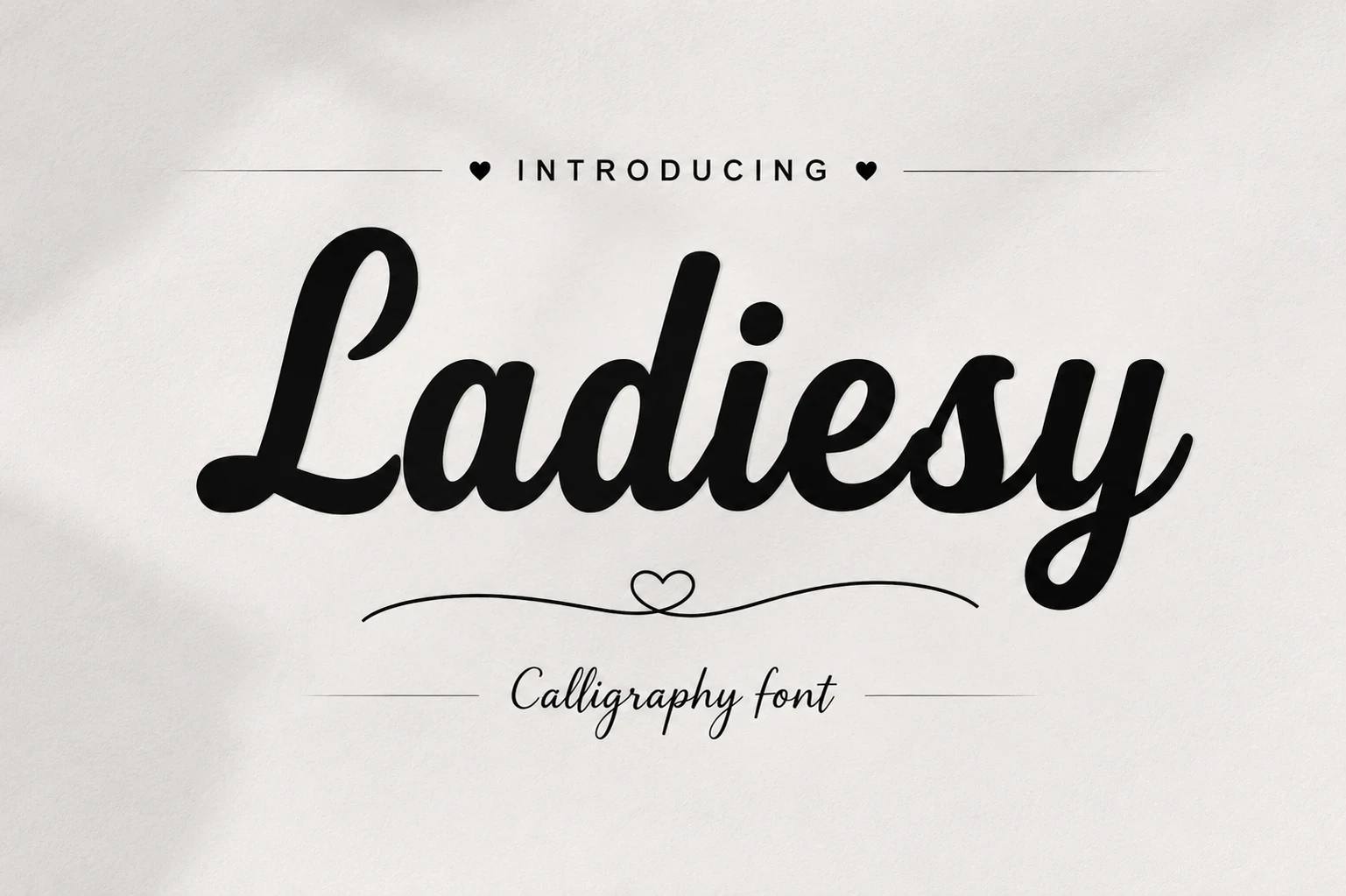
Best For: beauty branding, branding, product labels, display text
Ladiesy Font balances heavy connected calligraphy with thick-thin contrast, a slight rightward slant, and rounded flowing terminals. It remains readable as a large headline or product label, yet its connected construction is not intended for long text. Choose it when branding needs a strong script-led focal point.
Bold And Geometric Brand Marks
These display faces use wide proportions, geometric construction, rounded corners, or open apertures to build assertive wordmarks. They offer stronger structural presence than scripts while remaining primarily display-focused.
Rose Titan Font

Best For: beauty branding, branding, personal branding
Rose Titan Font builds a strong primary wordmark from ultra-bold, wide, squarish forms with minimal contrast and softened corners. Its large display letters remain highly legible in headlines, while the accompanying signature script is better treated as a secondary accent for beauty branding, personal branding, or posters.
Poina Font
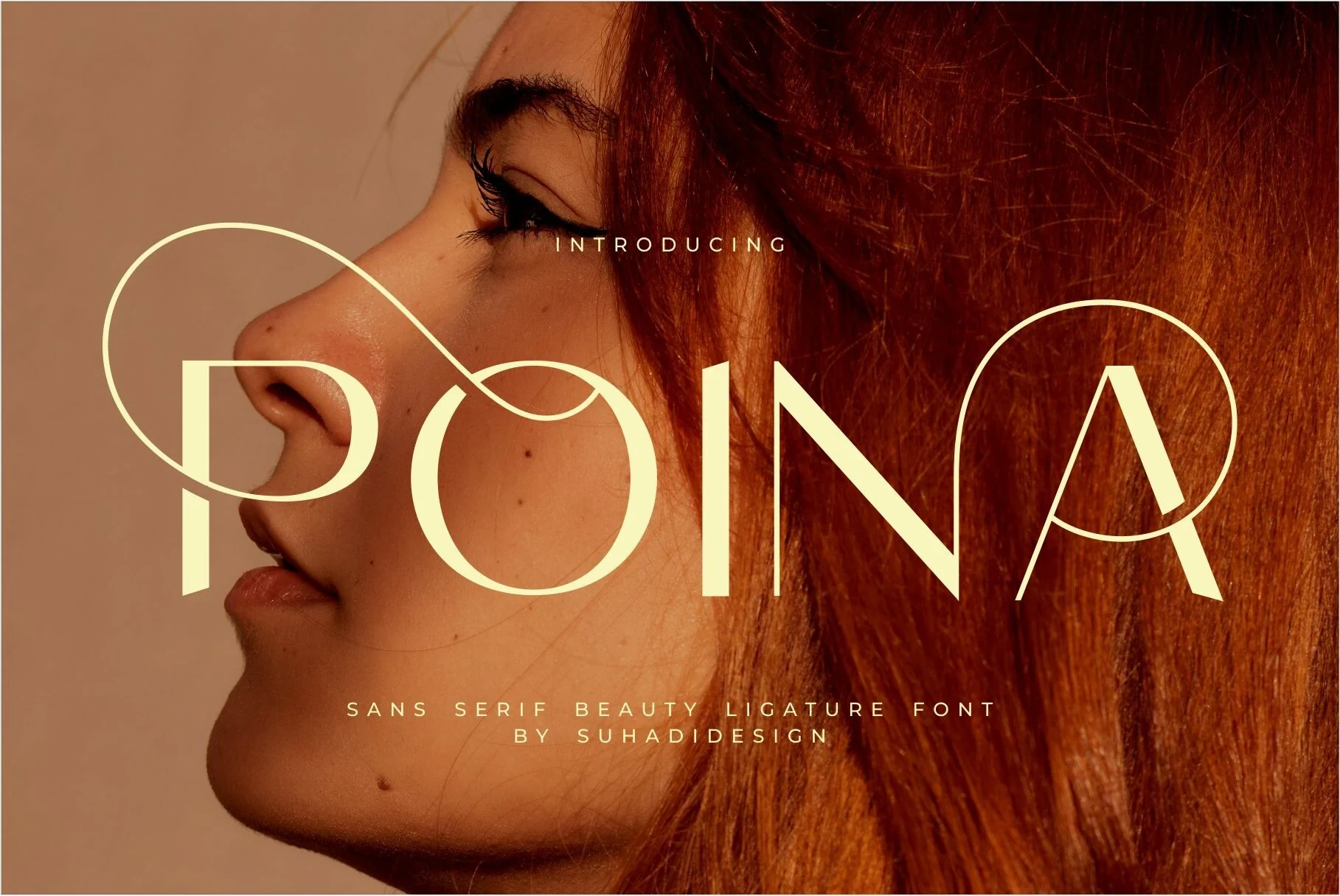
Best For: business cards, beauty branding, logos, branding
Poina Font combines geometric display construction with open apertures and swashes integrated into the character strokes. The open forms aid recognition, while decorative extensions need room to breathe. It works particularly well for logos, large headers, business cards, and beauty branding applications.
Elvera Font
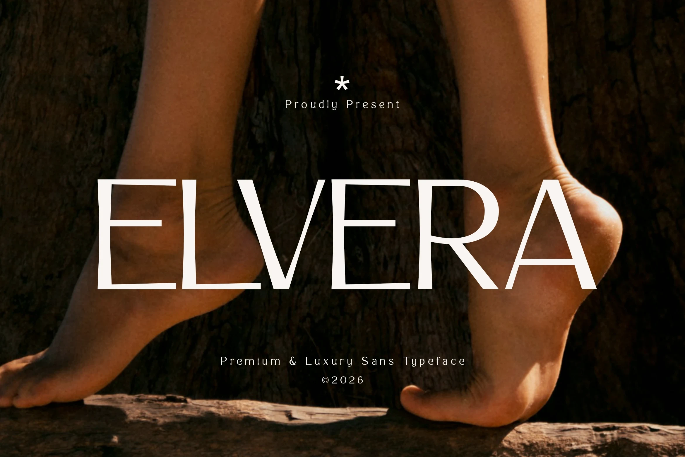
Best For: beauty branding, fashion branding, branding, packaging
For large packaging and fashion-brand names, Elvera Font offers wide geometric proportions and sans-serif terminals that create a spacious architectural outline. Its very thin horizontal strokes may disappear in smaller applications, so preserve scale and avoid relying on it for compact wording or functional details.
How to Choose the Right Font
Choose among these Beauty Branding Fonts by matching construction to the job: high-contrast serifs and ligatures need large logo scale, scripts depend on clear joins and generous spacing, while geometric faces provide firmer wordmark structure. Test every choice at its smallest real application, then pair decorative display lettering with a simpler supporting face for reliable readability.