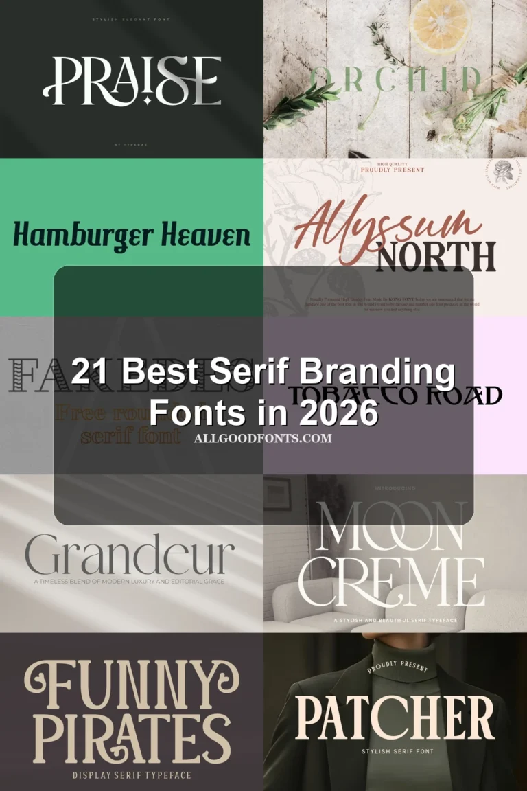
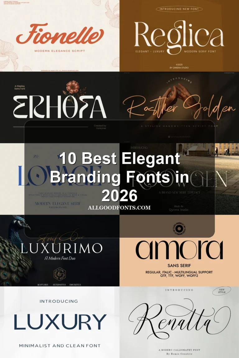
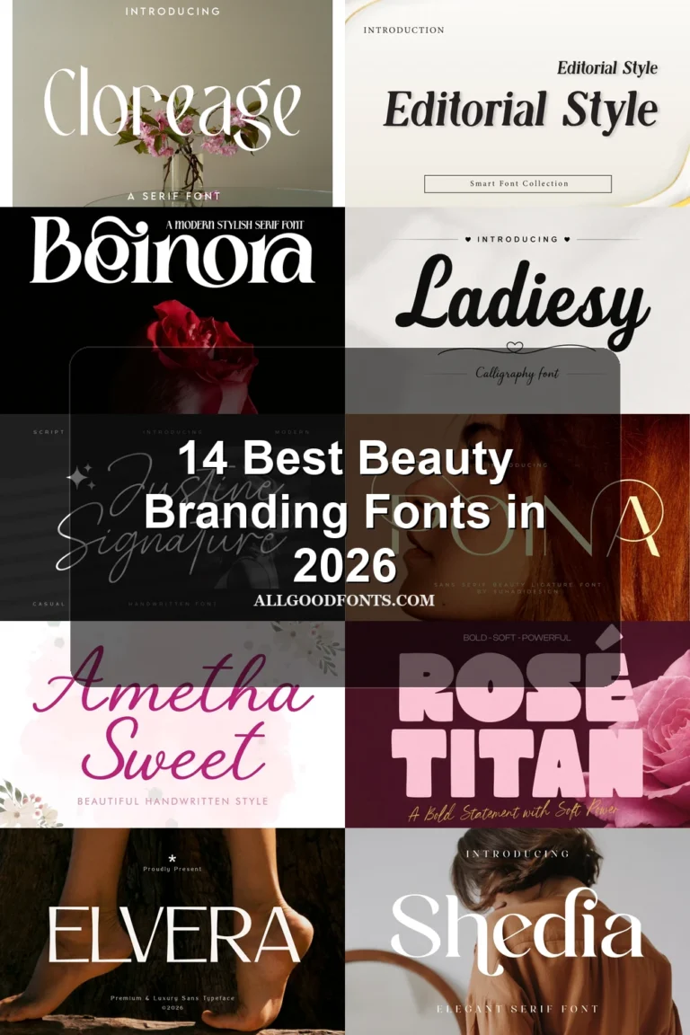
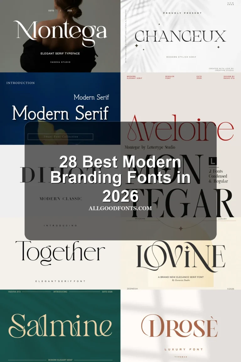
19 Best Luxury Branding Fonts in 2026
Luxury Branding Fonts span connected scripts, high-contrast serifs, narrow editorial faces, and broader display constructions. Together, they cover logo lettering, packaging names, fashion headers, invitations, and other identity work where visible letterform details must balance recognition with readability.
Looking for more branding fonts? Browse our complete Branding Fonts collection to compare modern, elegant, boutique, luxury, and beauty branding styles.

Luxury Branding Fonts: Scripts and Paired Displays
Luxury Branding Fonts in this group rely on connected movement or deliberate pairings, contrasting expressive script gestures with more dependable serif or sans-serif support for brand information.
Glamoury Font

Best For: branding, packaging, headlines, product labels
Glamoury Font pairs a heavy connected script with pronounced thick-thin contrast and a rightward slant. Its rounded cursive forms remain legible for Luxury Branding Fonts headlines, labels, and packaging, while the thinner companion script needs larger sizing.
Avonia Font
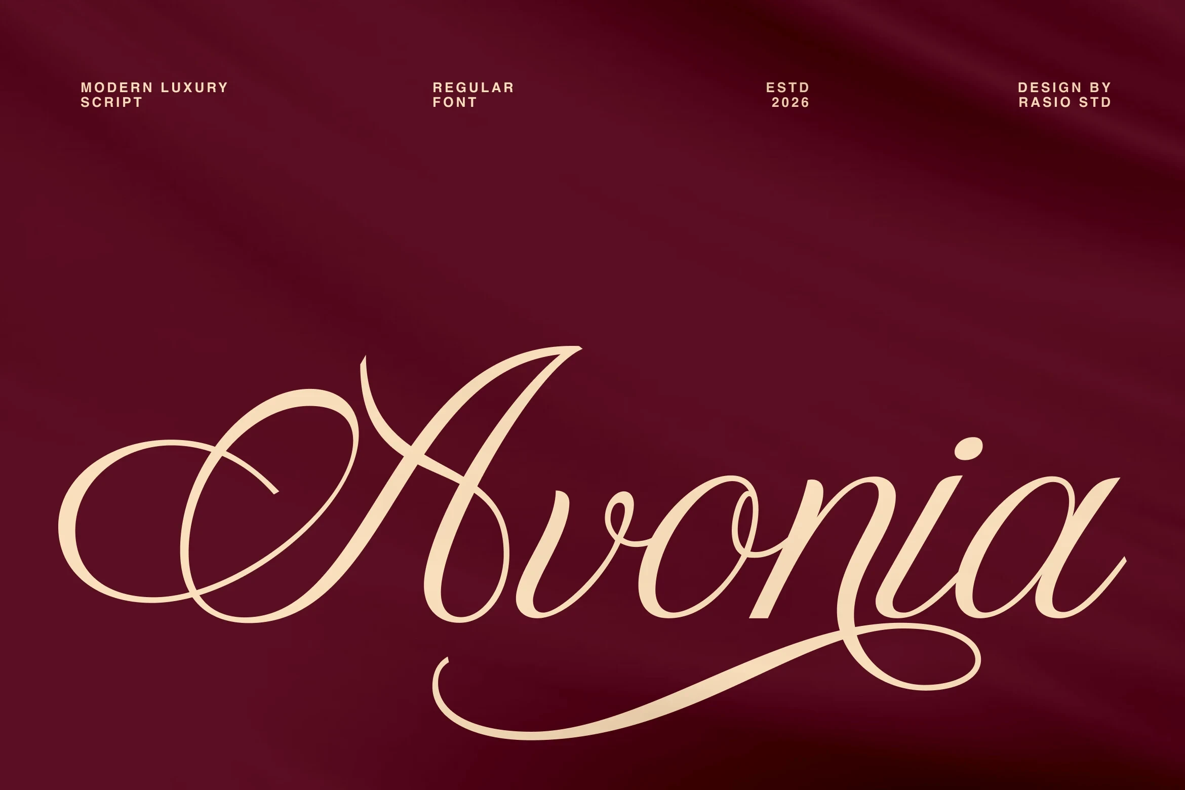
Best For: branding, high-end designs, display text, modern designs
Avonia Font is defined by connected lettering, extensive swashes, flourishes, and alternate characters. The complex construction gives large logotypes and headers a strong decorative presence, but it should stay out of body copy; the supplied alternates offer extra identity options.
Violyn Wedding Thivoria Font

Best For: branding, modern designs, clean designs, elegant designs
For event identities or prominent marks, Violyn Wedding Thivoria Font combines connected lowercase forms with dramatic ornamental swashes in a formal sloped script. Its high thick-thin contrast creates emphasis, but flourished joins and fine changes in weight reduce clarity when the lettering is scaled down.
The Paloma Font
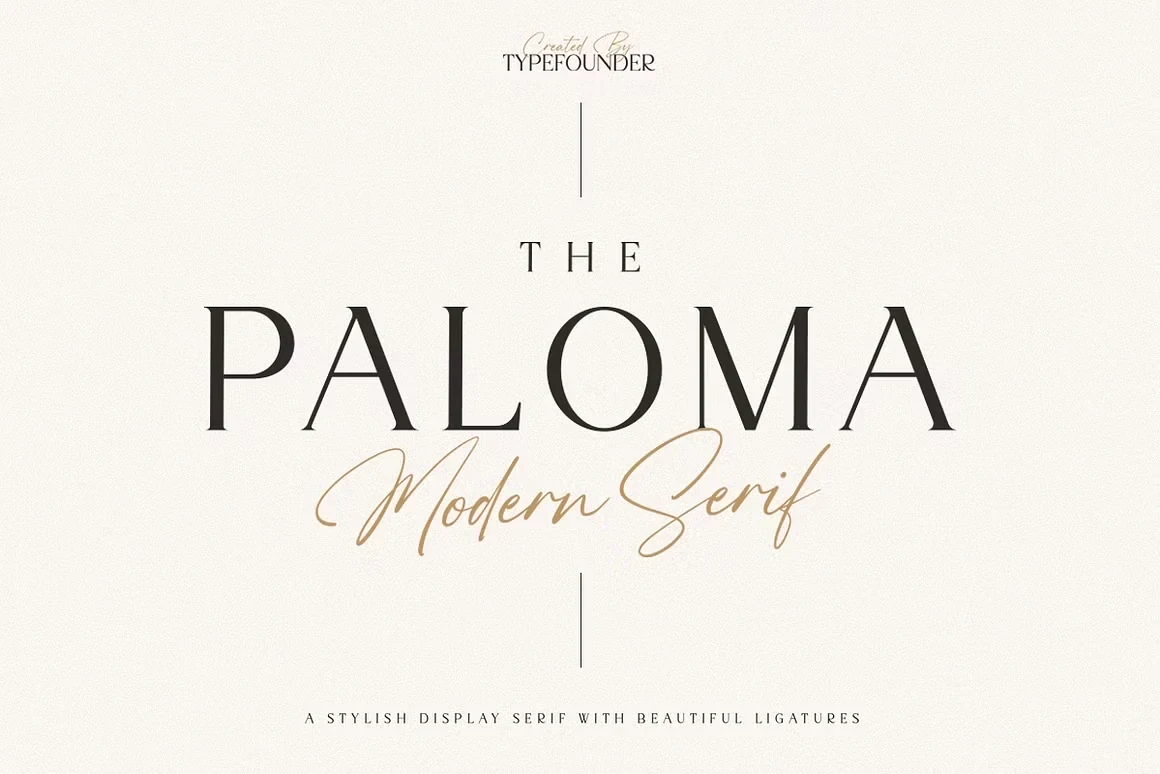
Best For: branding, high-end designs, logos, display text
The Paloma Font creates contrast through an upright, high-contrast serif and a monoline connected script. The serif handles larger informational wording more reliably, while the flowing script is best kept for a logo, heading, or small accent within Luxury Branding Fonts systems.
Luxurimo Font
Best For: social media graphics, logos, branding, packaging
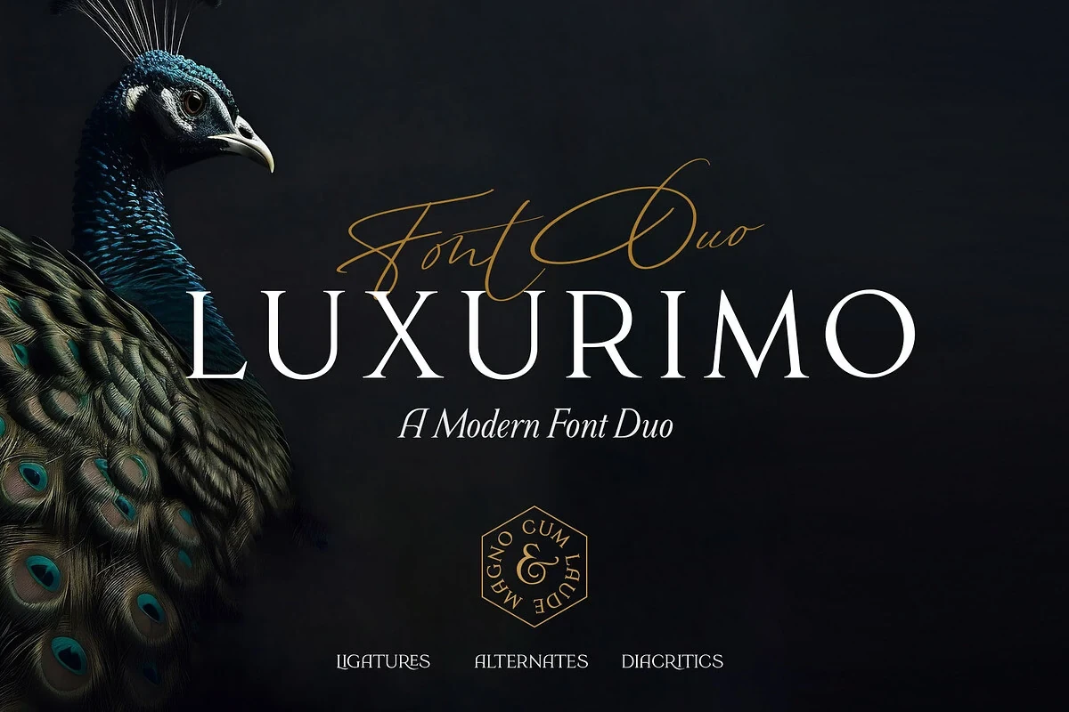
Luxurimo Font presents a vertical-axis serif beside a flowing, looped script. The serif is the more dependable component for packaging details and brand information; the script supplies headline energy and decorative emphasis rather than small supporting text.
Ornate Serif Branding Displays
These ornate serif displays use contrast, swashes, ligatures, and customized terminals to create identity marks. They are more decorative than the paired scripts and need generous display scale.
Emerale Font
Best For: branding, high-end designs, display text, clean designs
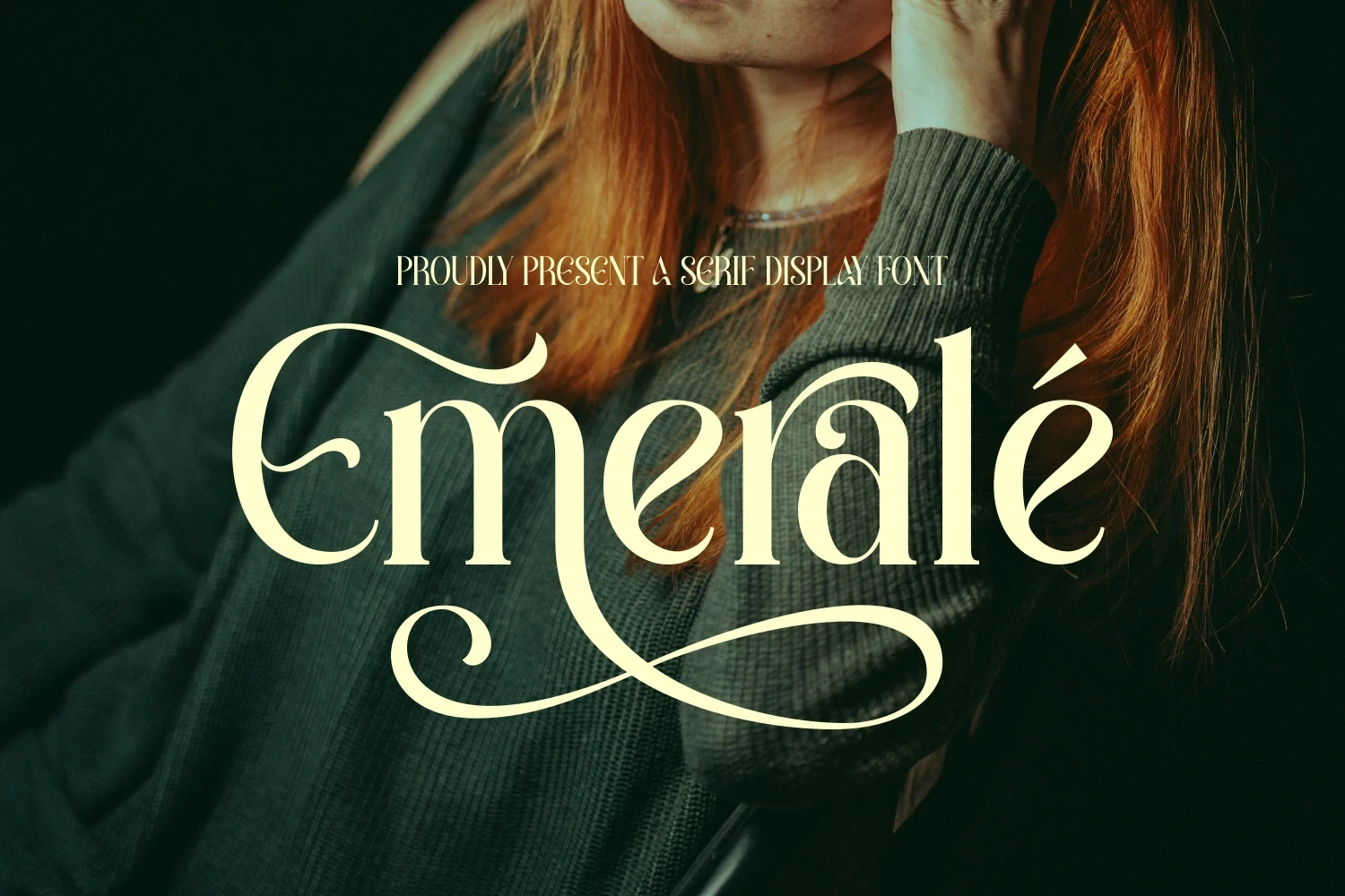
Emerale Font builds its high-contrast serif around elongated swashes on the initial and final characters. Those sweeping strokes make it effective for large logos and Luxury Branding Fonts headings, though intricate terminals can lose detail and reading comfort at smaller sizes.
Aveloire Font
Best For: branding, headlines, fashion branding, website headers
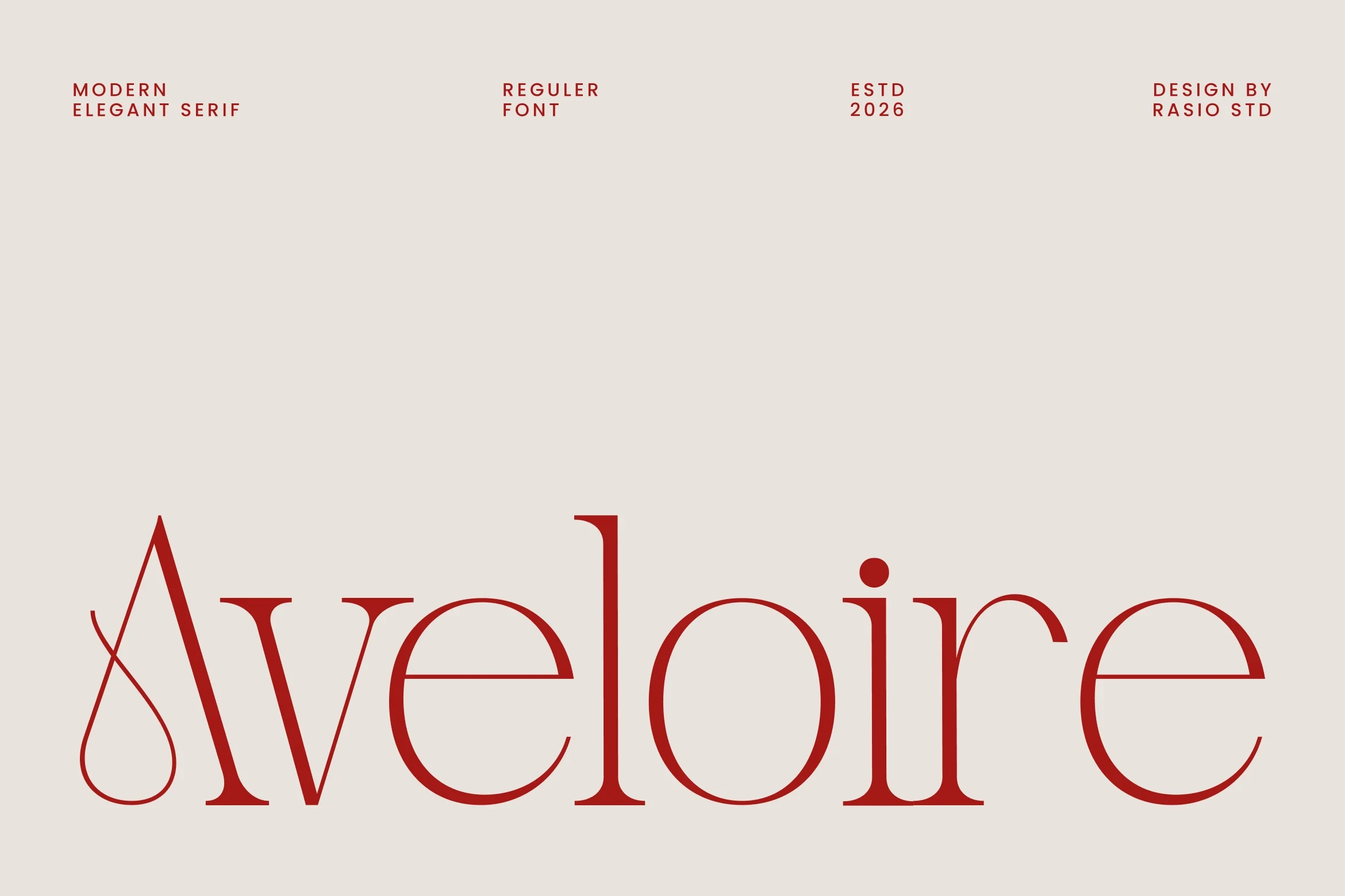
Aveloire Font follows a traditional high-contrast serif structure but separates itself with an elongated swash tail on the capital A. Open spacing helps the large wordmark breathe, while thin strokes mean the design performs better in large branding applications than at small sizes.
Arome Font
Best For: branding, beauty branding, display text, modern designs
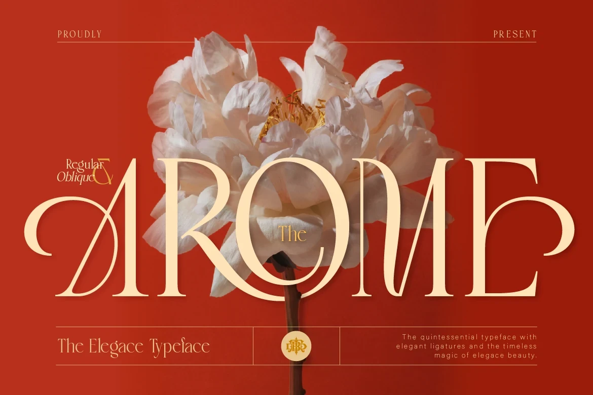
Arome Font merges modern serif proportions with dramatic swashes built into the A and E. Its decorative curves suit beauty identities and display names, where the letter details can remain visible; the same complexity makes it a poor choice for paragraphs.
Calteo Font
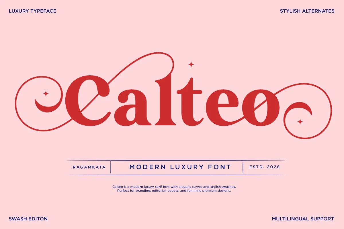
Best For: branding, creative projects, high-end designs, display text
Calteo Font pushes a high-contrast serif toward an ornamental identity mark with extravagant swashes and curvilinear letterforms. Its prominent display character suits brand titles, but the intricate construction sacrifices clarity when reduced.
Geista Mond Font
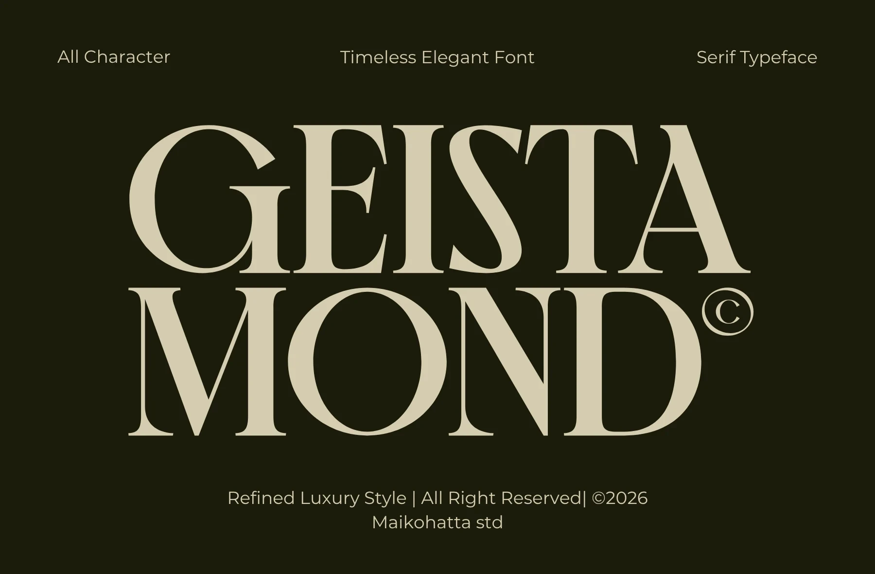
Best For: branding, headlines, fashion branding, high-end designs
Geista Mond Font is unusually clear within this ornate group because its large x-height and bracketed serifs support readable all-caps headings. It can carry prominent fashion or identity wording effectively, although its high contrast still favors display use over body text.
Merona Font
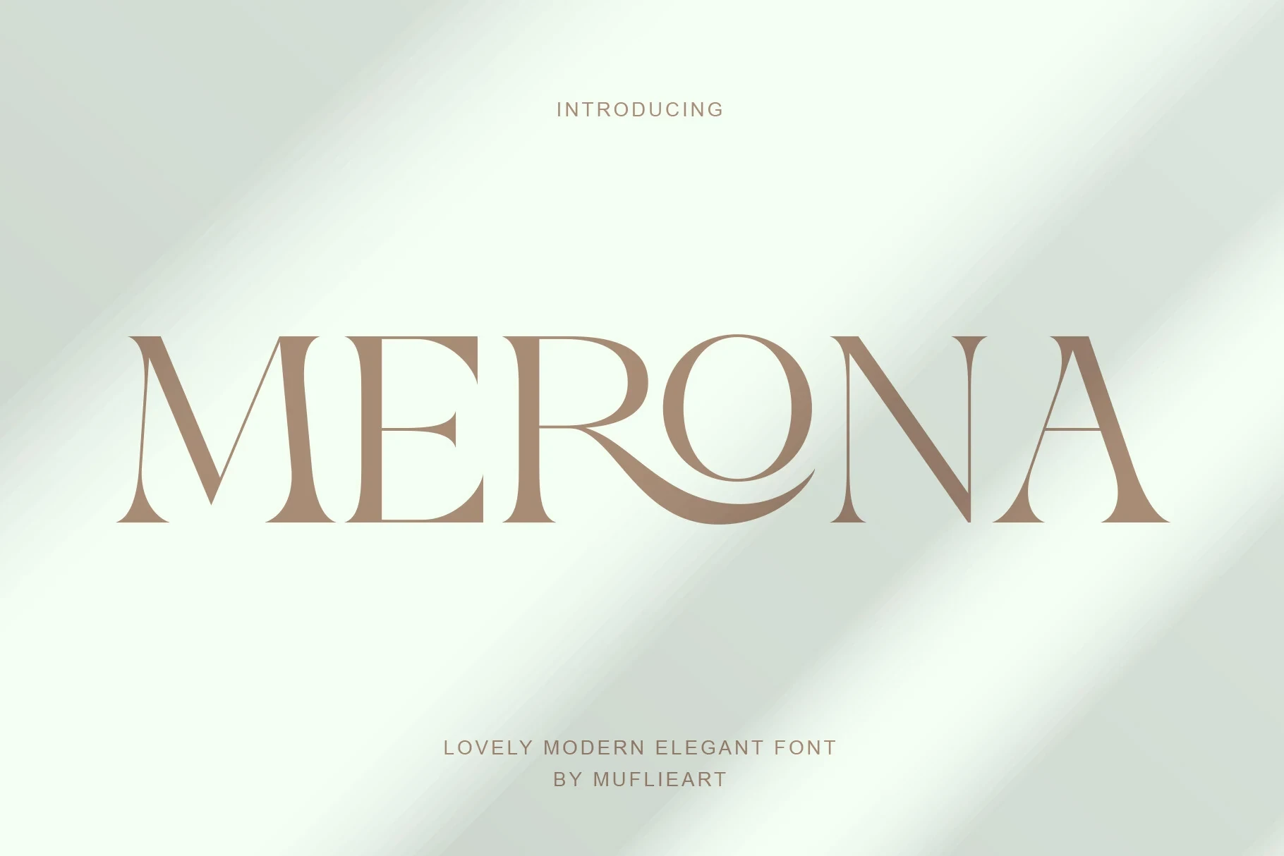
Best For: branding, display text, modern designs, clean designs
Merona Font centers its identity on a custom R-O ligature, with the R extending beneath the O inside an upright serif design. Fine strokes reward large logo work, while the ligature provides useful customization for Luxury Branding Fonts marks.
Faresty Font
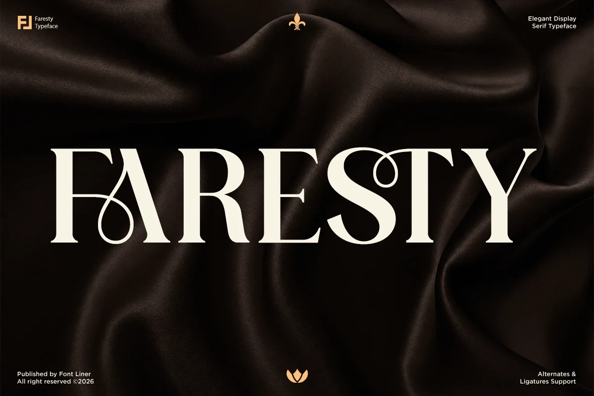
Best For: branding, fashion branding, high-end designs, display text
Faresty Font personalizes a bracketed high-contrast serif with a prominent F swash and curved S terminal. Ligatures and alternate characters expand logo-making options, but the ornament needs large sizing for reliable reading, making it especially suitable for Luxury Branding Fonts identity work.
Modern, Condensed, and Slender Serif Marks
This group emphasizes proportion: condensed, slender, contemporary, or wide serif structures shape the brand silhouette. Compared with the ornate category, ornament is restrained and construction does more of the work.
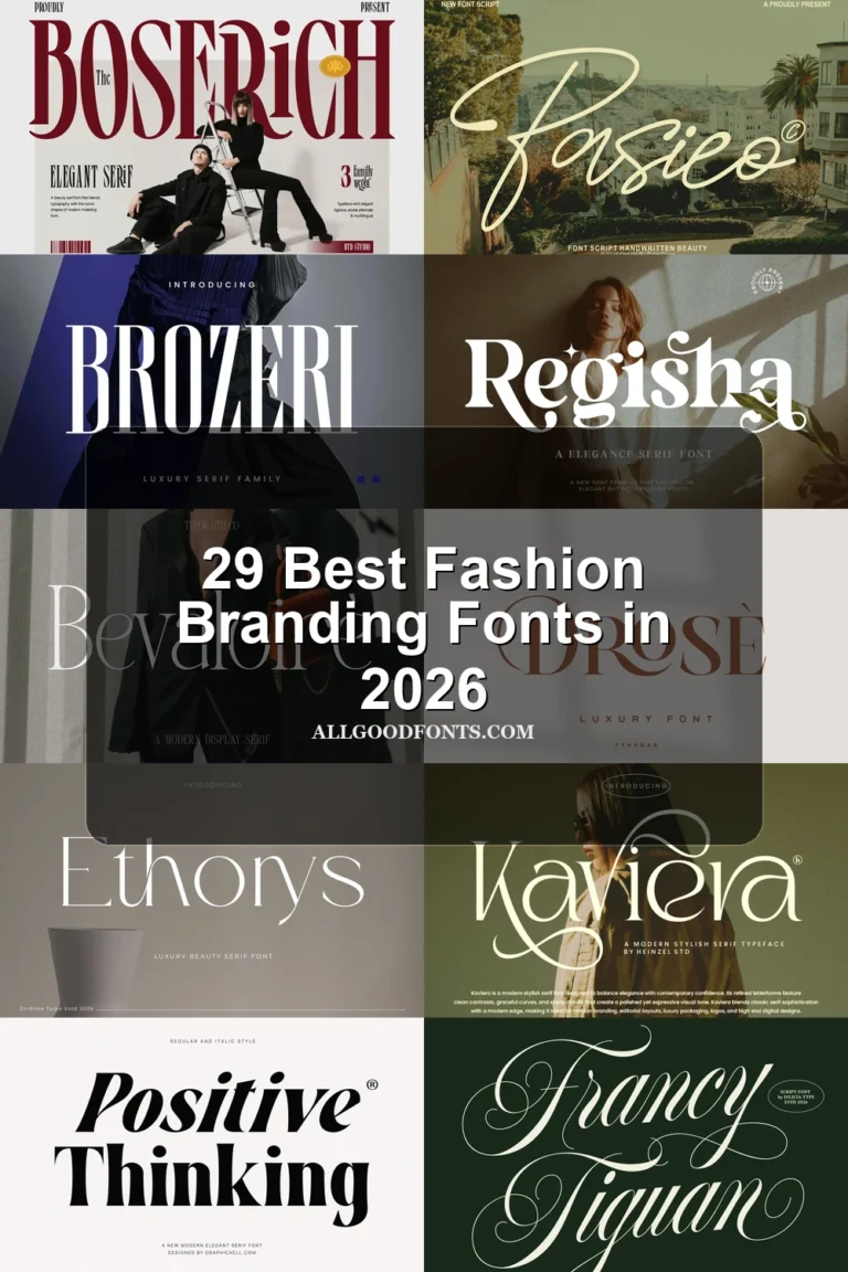
Boserich Font
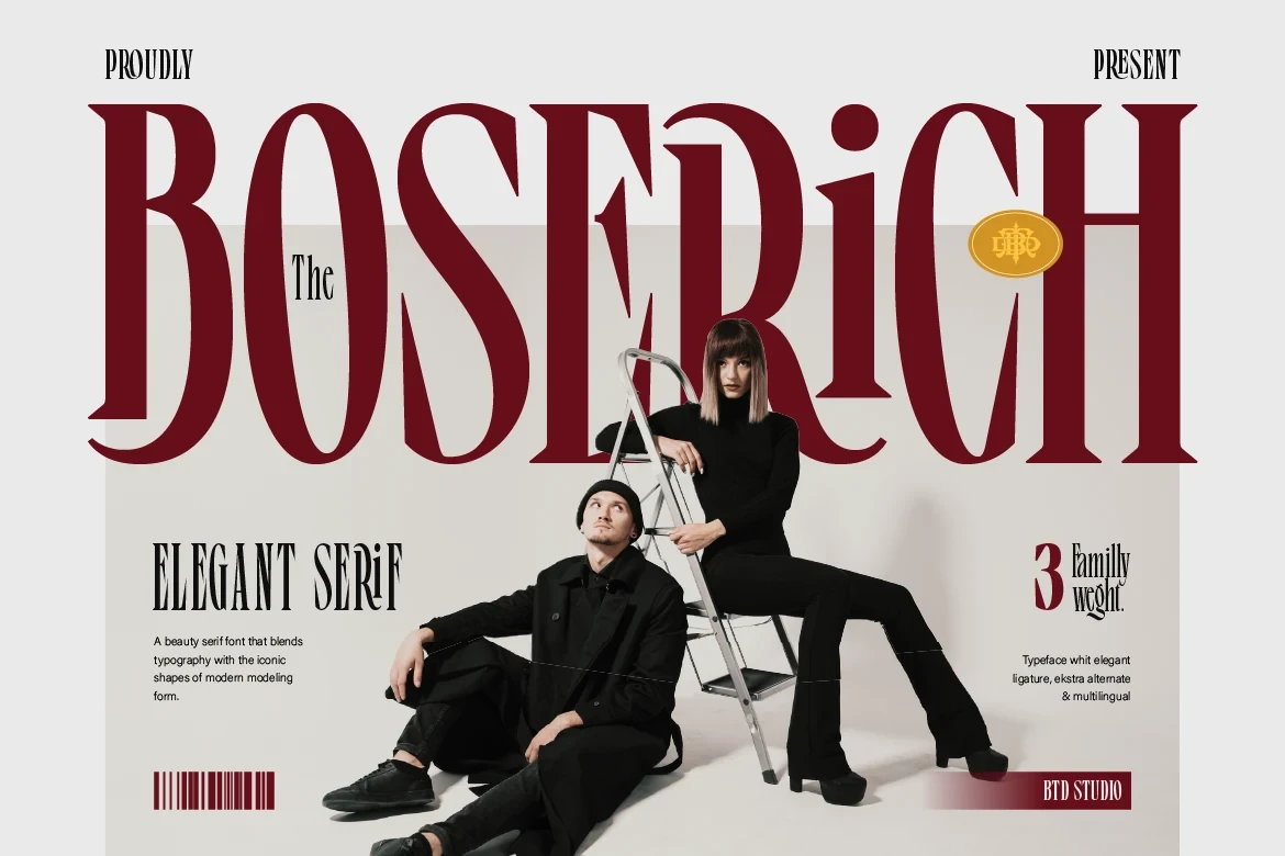
Best For: branding, creative projects, fashion branding, high-end designs
Boserich Font uses condensed proportions, vertical stress, and sharp pointed serifs to create a compact fashion-editorial profile. Its narrow, high-contrast structure concentrates impact in headlines and identity marks, making it less suitable for sustained reading or paragraph-length text.
Wackers Font
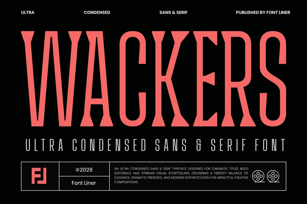
Best For: branding, packaging, fashion branding, display text
Wackers Font takes a restrained route through a contemporary display construction and clearly defined stroke rhythm. This makes it practical for comparing short brand names, packaging titles, and fashion labels in Luxury Branding Fonts layouts without relying on overt ornament.
Nemonty Font
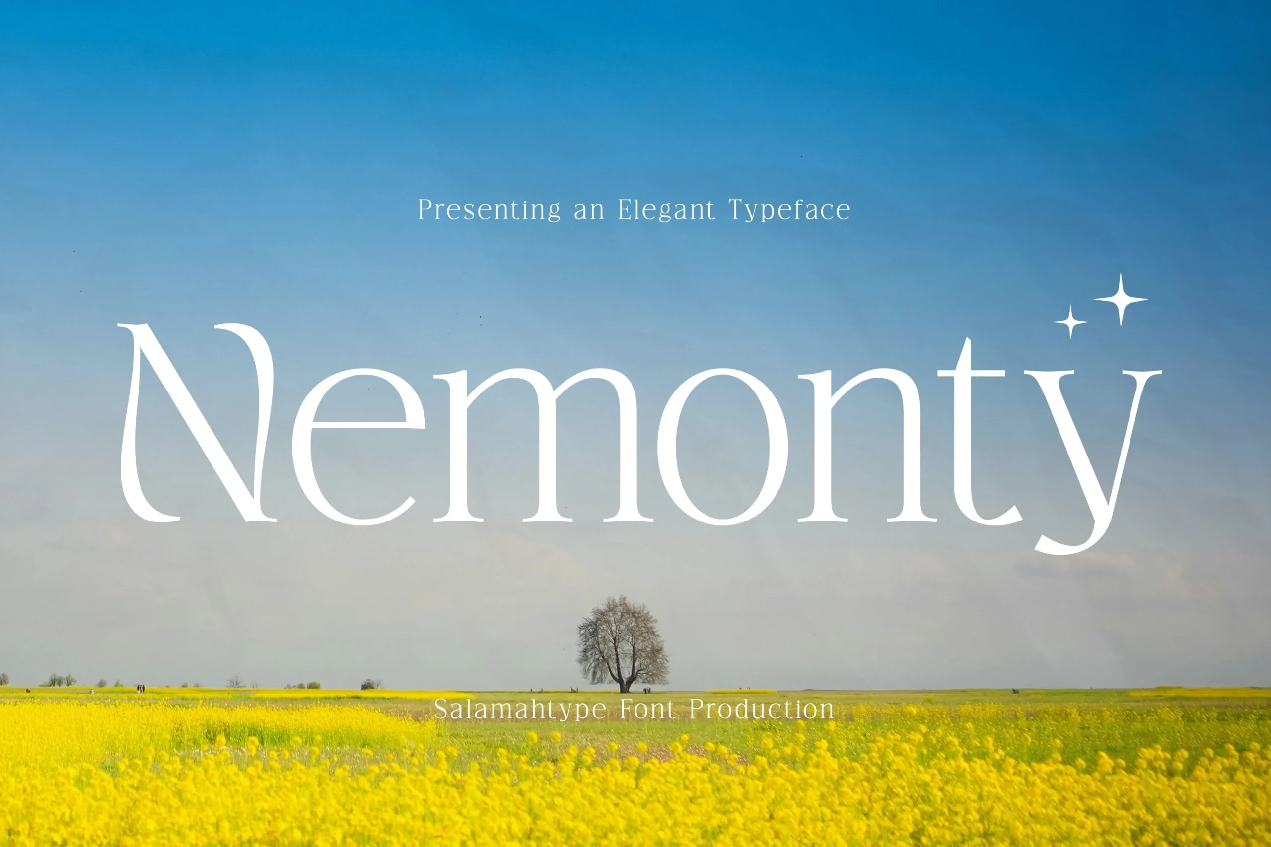
Best For: logos, branding, creative projects, display text
For large headings, Nemonty Font offers strong recognition through flared, cupped serifs and elongated curves in the N and y. Its upright vertical structure stays readable at display size, but the delicate serif details are less dependable in small supporting text.
Together Font
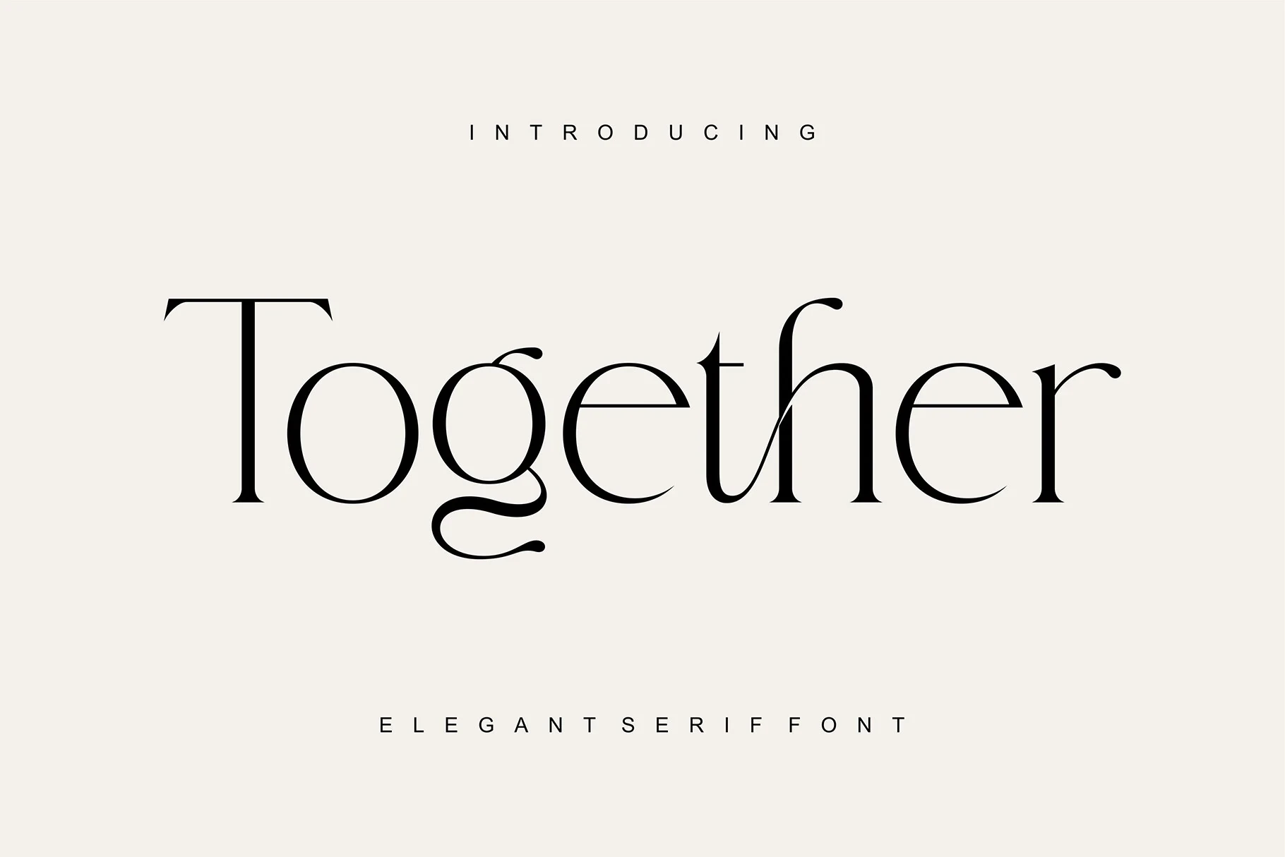
Best For: branding, packaging, invitations, beauty branding
Together Font combines sharp, delicate serifs with a distinctive lowercase g tail and selective flowing connections. Large brand names and invitations preserve these details clearly, whereas very small applications risk losing the fine strokes that define its character.
Montegar Font
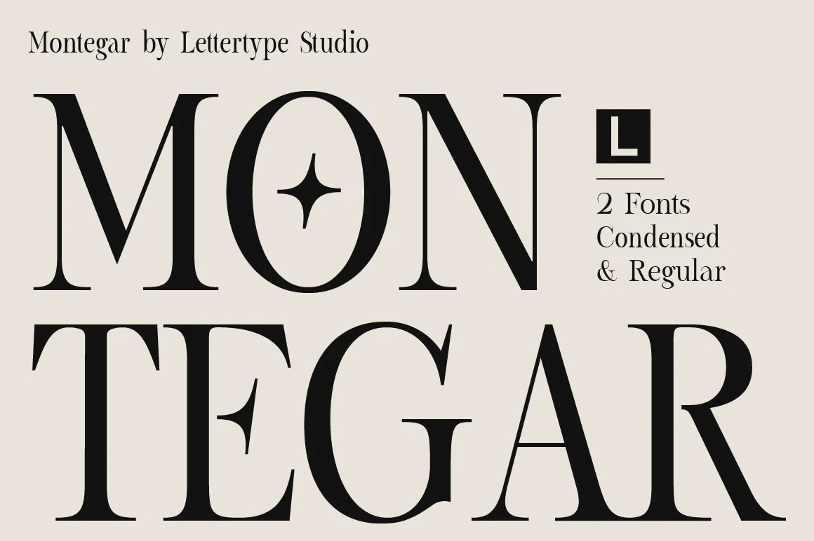
Best For: branding, headlines, fashion branding, display text
Montegar Font provides a lighter alternative in Luxury Branding Fonts through slender strokes, contemporary display shapes, and a clear stroke rhythm. Use it for short names and headings where its fine construction remains visible; longer or smaller text can lose definition.
Luxena Font
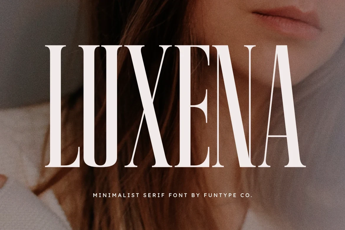
Best For: logos, branding, posters, headlines
Luxena Font creates a narrow silhouette through extreme condensation, thick vertical stems, thin horizontal serifs, and a fully upright stance. It fits logos, posters, and editorial headers, but its sharp contrast becomes difficult to read at small sizes. OTF and TTF formats are supplied.
Patcher Font
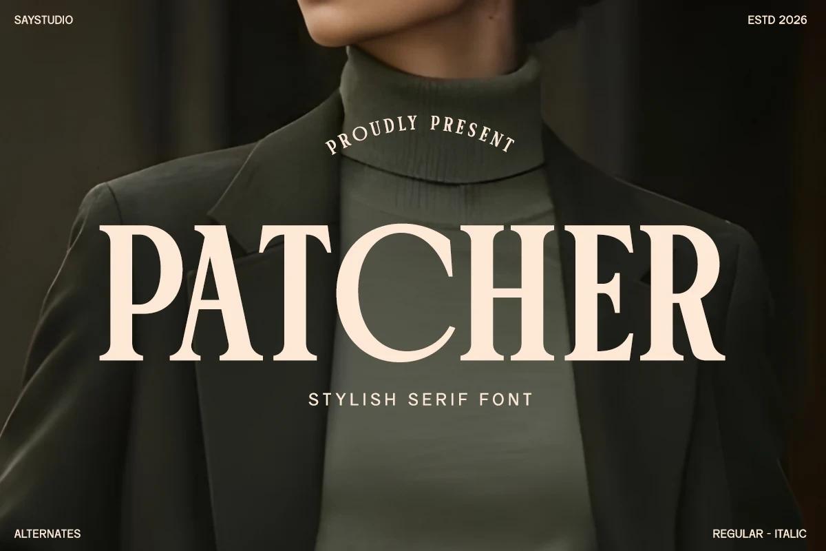
Best For: fashion branding, logos, branding, packaging
Patcher Font uses wide geometric proportions and bracketed, slab-like serifs to establish a broad display silhouette. Its generous width supports fashion labels, logos, and packaging at large sizes, though it consumes space and is less economical for small text.
How to Choose the Right Font
Choose connected scripts when the mark needs movement, but pair them with a serif or sans-serif for information. For ornament, compare swashes and ligatures against the intended size. Condensed faces save horizontal space, wide faces add presence, and slender styles require more generous scaling. The best Luxury Branding Fonts choice is the one whose construction stays recognizable where it will actually appear.