25 Best Handwritten Cute Fonts in 2027
This collection spans rounded monoline lettering, irregular handwritten forms, softly connected scripts, swashed calligraphy, and sturdy display sans serifs. Handwritten Cute Fonts can anchor website headers, logos, invitations, labels, posters, wall art, and short creative text, with readability changing sharply by size and construction.
Looking for more cute fonts? Browse our complete Cute Fonts collection to compare modern, bold, and cute cute styles.
Handwritten Cute Fonts
Handwritten Cute Fonts in this group use mostly disconnected, upright, or irregular lettering, often with rounded terminals. They feel more immediate and readable than connected scripts, while remaining display-focused.
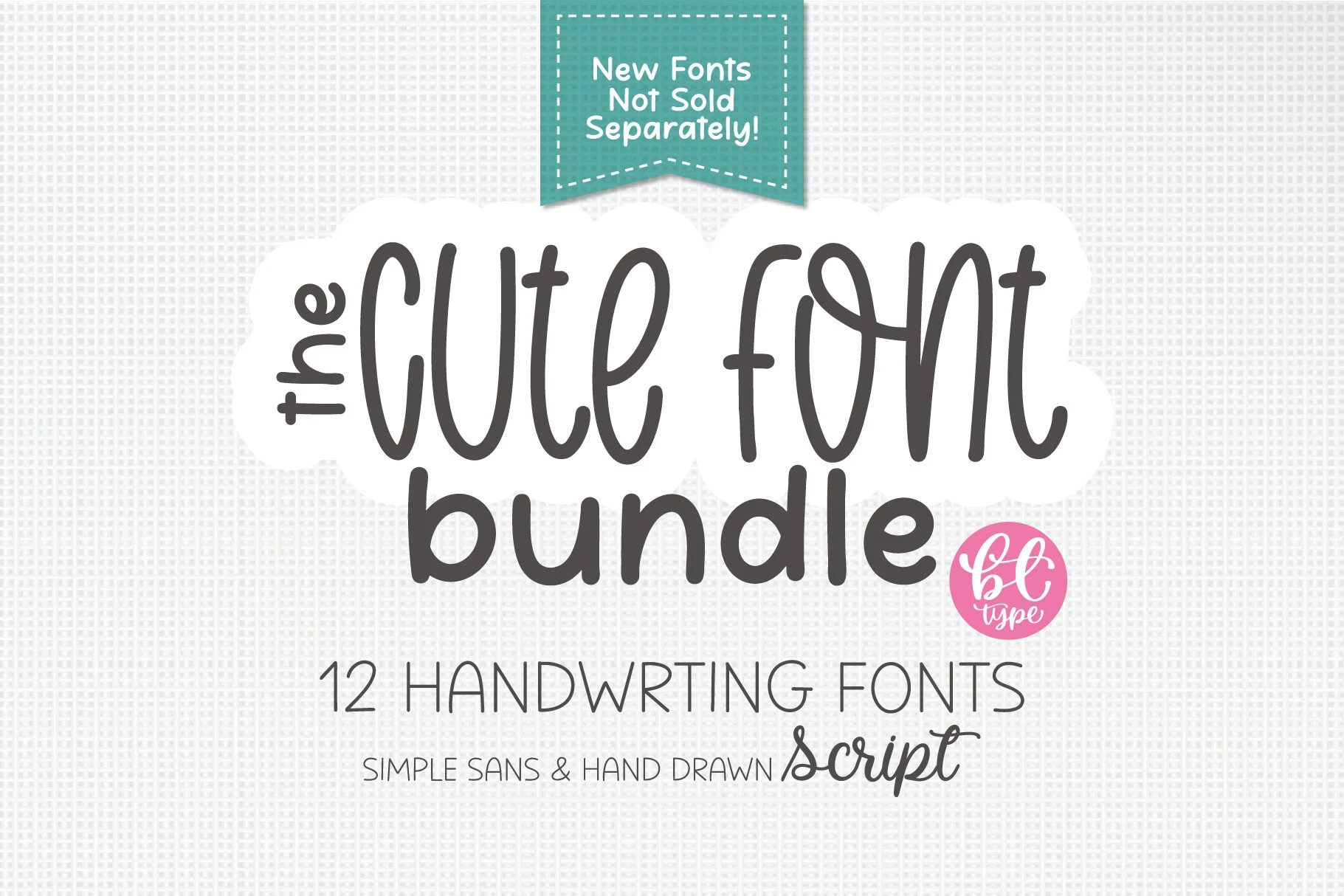
The Cute Handwriting Bundle Font
Best For: website headers, display text, clean designs, cute designs
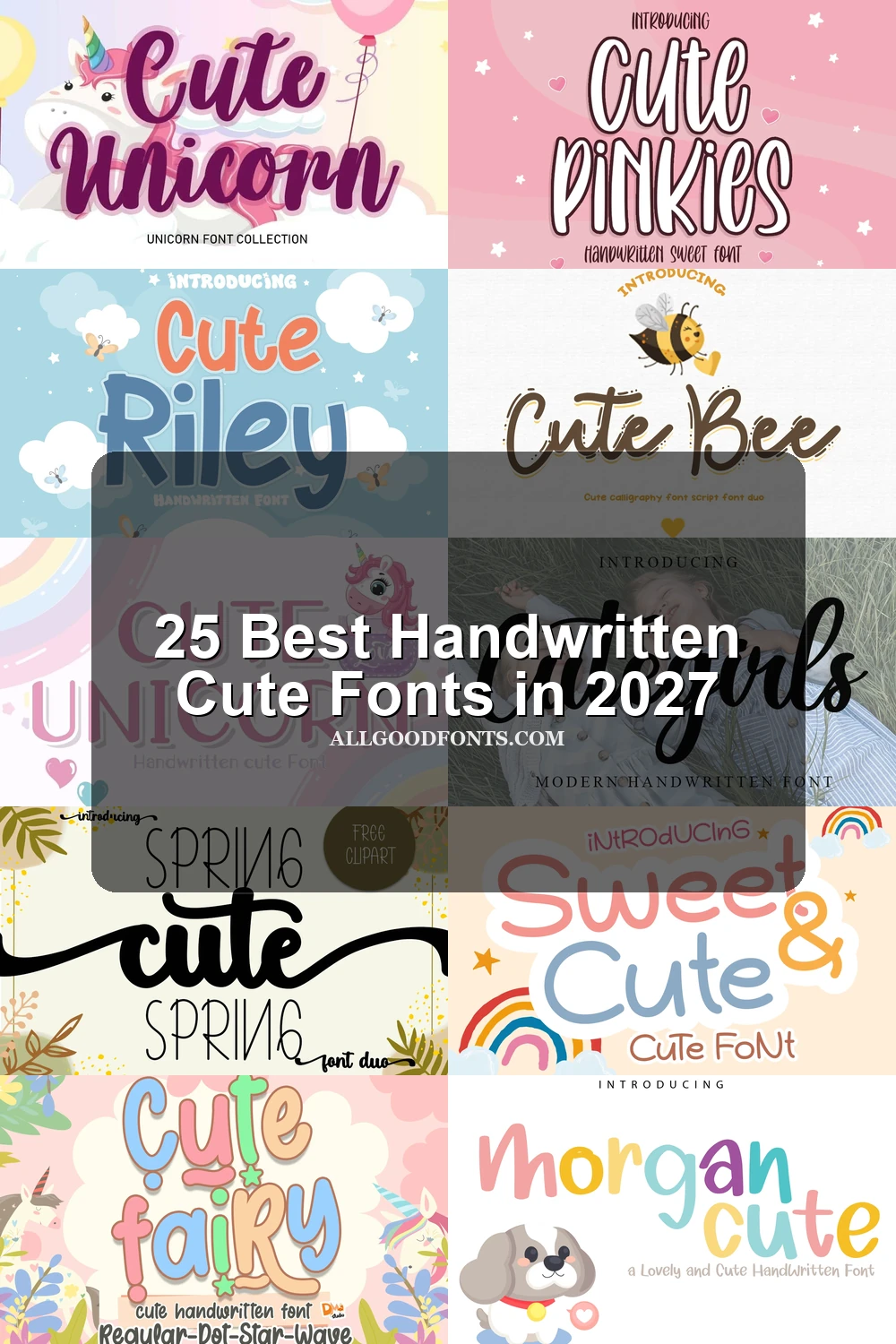
The Cute Handwriting Bundle Font pairs a large rounded handwritten title with a clean sans-serif companion. Its irregular monoline forms suit website headers and short display copy, while the smaller partner remains clearer for moderate-size subheads.
Baby Cute Font
Best For: display text, clean designs, playful designs, cute designs
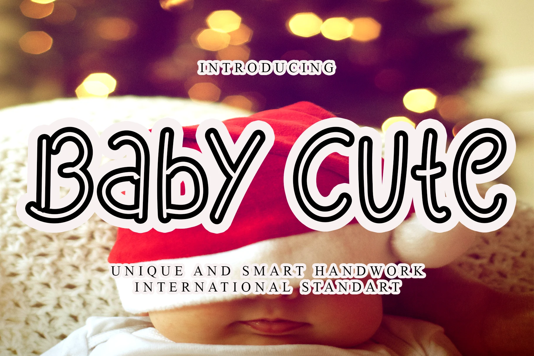
Baby Cute Font is a bold informal display face with rounded terminals and irregular proportions. Its layered outline helps the lettering hold against busy backgrounds, making it stronger for large headers and display text than for small supporting copy.
Sweet and Cute Font
Best For: website headers, posters, display text, soft designs
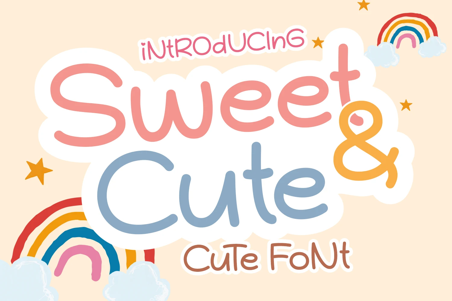
Sweet and Cute Font uses heavy monoline strokes, soft terminals, and occasional overlapping letterforms to create a strong poster texture. The thick construction reads clearly in headers, but reduction to very small text can compromise letter separation.
Cute Bunny Font

Best For: display text, wall art, playful designs, cute designs
Cute Bunny Font compresses handwritten proportions into a narrow, medium-weight monoline texture. Its irregular baseline prevents the condensed width from feeling rigid, making it useful for labels and short wall-art phrases at medium-to-large sizes.
Morgan Cute Font
Best For: display text, wall art, soft designs, playful designs
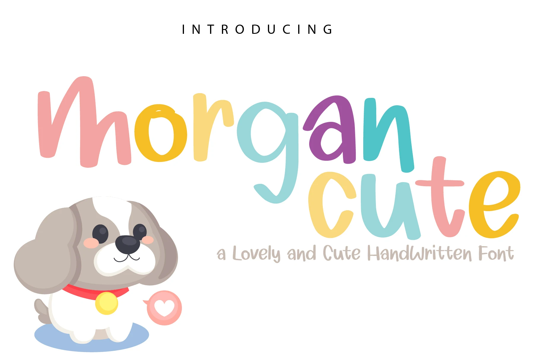
Morgan Cute Font sets an upright, non-connecting rounded title against a thinner handwritten subtitle. The simple main shapes offer dependable display legibility, while the secondary style is best reserved for larger supporting text rather than continuous reading.
Cute Pinkies Font
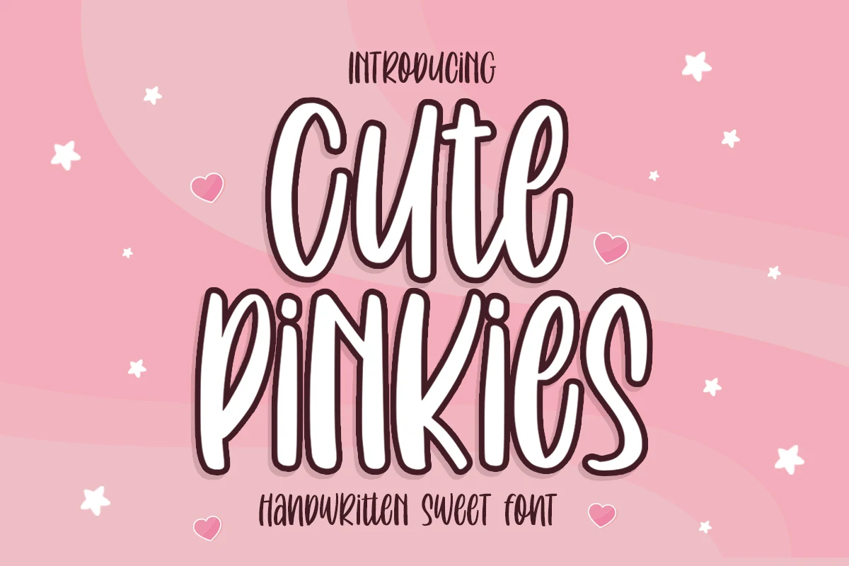
Best For: display text, wall art, soft designs, playful designs
Cute Pinkies Font separates its characters and uses strong thick-to-thin variation for an organic drawn texture. Dense heavy strokes remain clearest at larger sizes, making it more appropriate for wall art and display lettering than compact labels.
Cute Fairy Font

Best For: quotes, display text, clean designs, playful designs
Cute Fairy Font builds dots and stars into its bubbly display forms, so the decoration is part of the lettering rather than an added flourish. That makes headlines immediately thematic, though the unconventional shapes reduce body-text readability.
Cute Riley Font
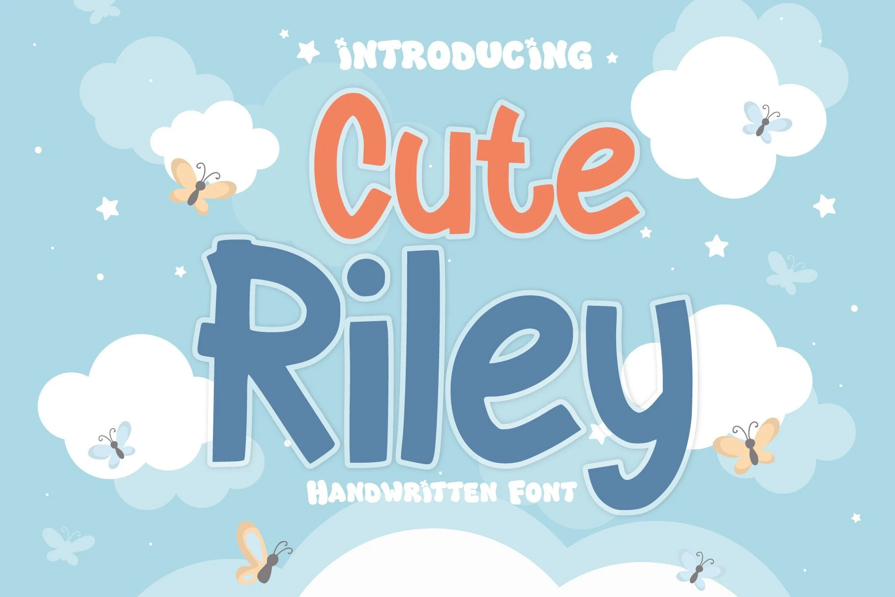
Best For: logos, branding, invitations, children’s designs
Cute Riley Font gets its strongest handwritten signature from an uneven bounce baseline and varied letter heights. The movement remains legible at title scale, fitting children’s designs, branding, and invitations better than continuous copy.
Cute Moment Font
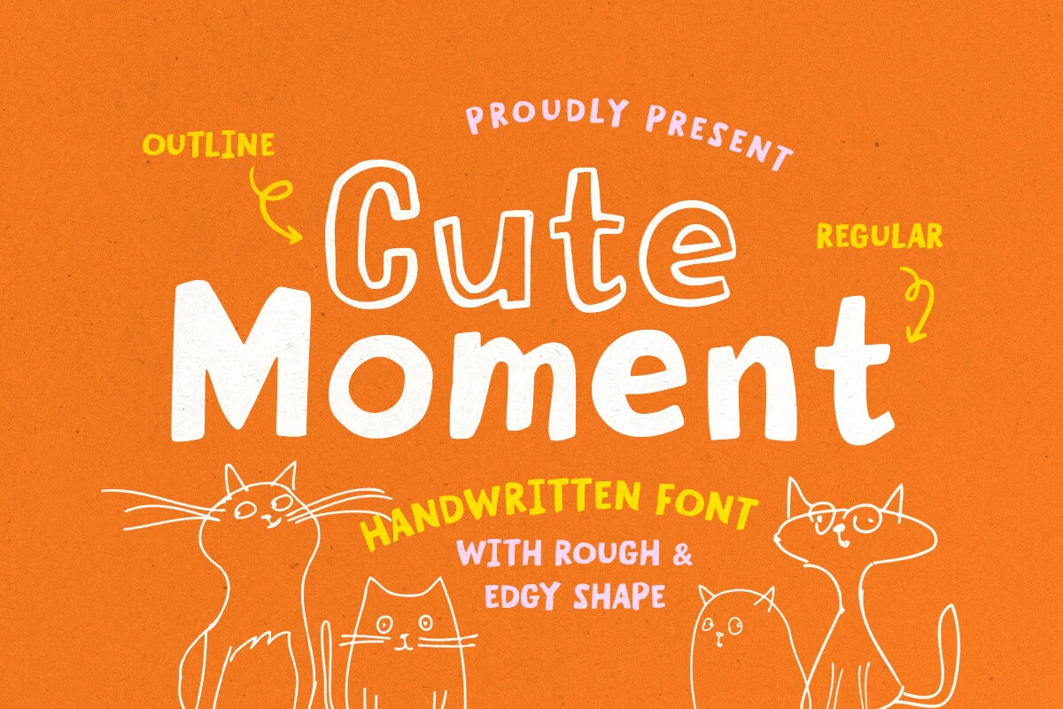
Best For: quotes, posters, display text, playful designs
Cute Moment Font takes a display sans-serif approach, keeping rounded character without handwritten connections. Its clear stroke rhythm suits quotes and posters when a script would introduce too much visual intricacy.
Ningst Cute Font
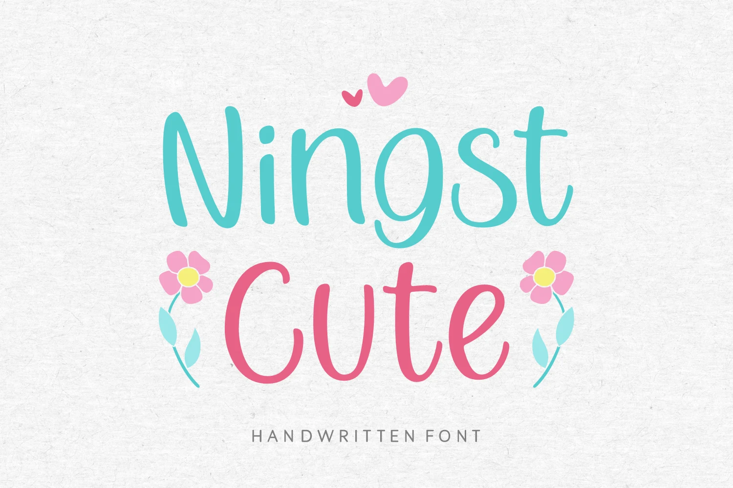
Best For: fashion branding, branding, editorial designs, display text
Ningst Cute Font stands apart with wide, upright, disconnected lettering and rounded terminals. Its broad proportions offer strong large-size legibility for fashion branding and editorial titles, although the generous width consumes more horizontal space than narrower scripts.
Connected Cute Scripts
These connected cute scripts rely on joined movement, slant, contrast, or swashes to create expressive display lines. They offer more calligraphic motion than the upright handwritten and rounded display groups.
Cute Girls Font
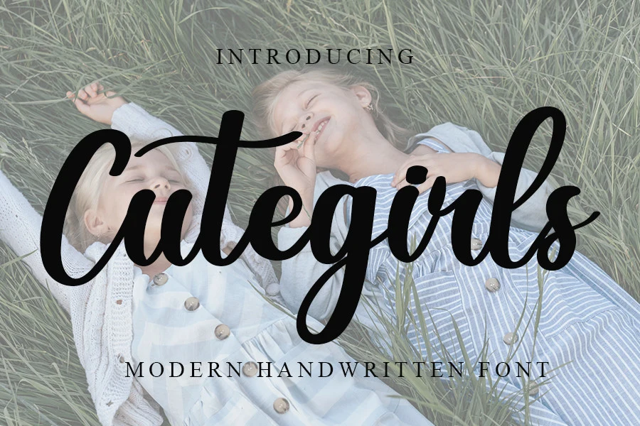
Best For: display text, classic designs, playful designs, cute designs
Cute Girls Font uses softly joined, rounded letterforms with a period-inspired display character. The connected movement gives names and headings a distinctive rhythm, but its expressive shapes are better judged in short phrases than extended reading.
Snow Cute Duo Font
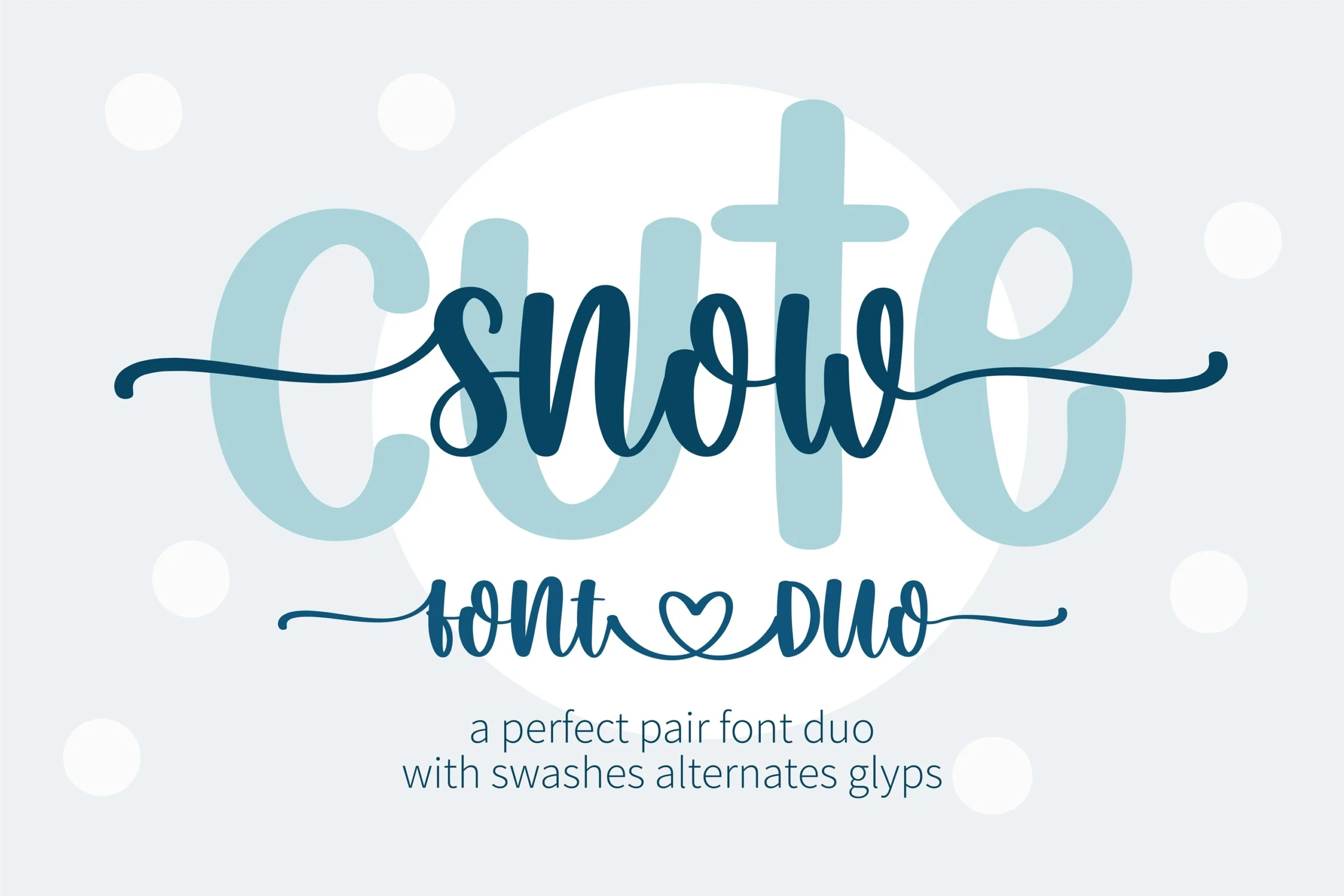
Best For: display text, playful designs, cute designs, expressive designs
For short, highly visible wording, Snow Cute Duo Font brings flowing connected movement and distinctive display shapes. Its PUA-encoded characters make its glyphs and swashes easier to access, expanding options for names, headings, and expressive designs without making it suitable for dense text.
Cute Font
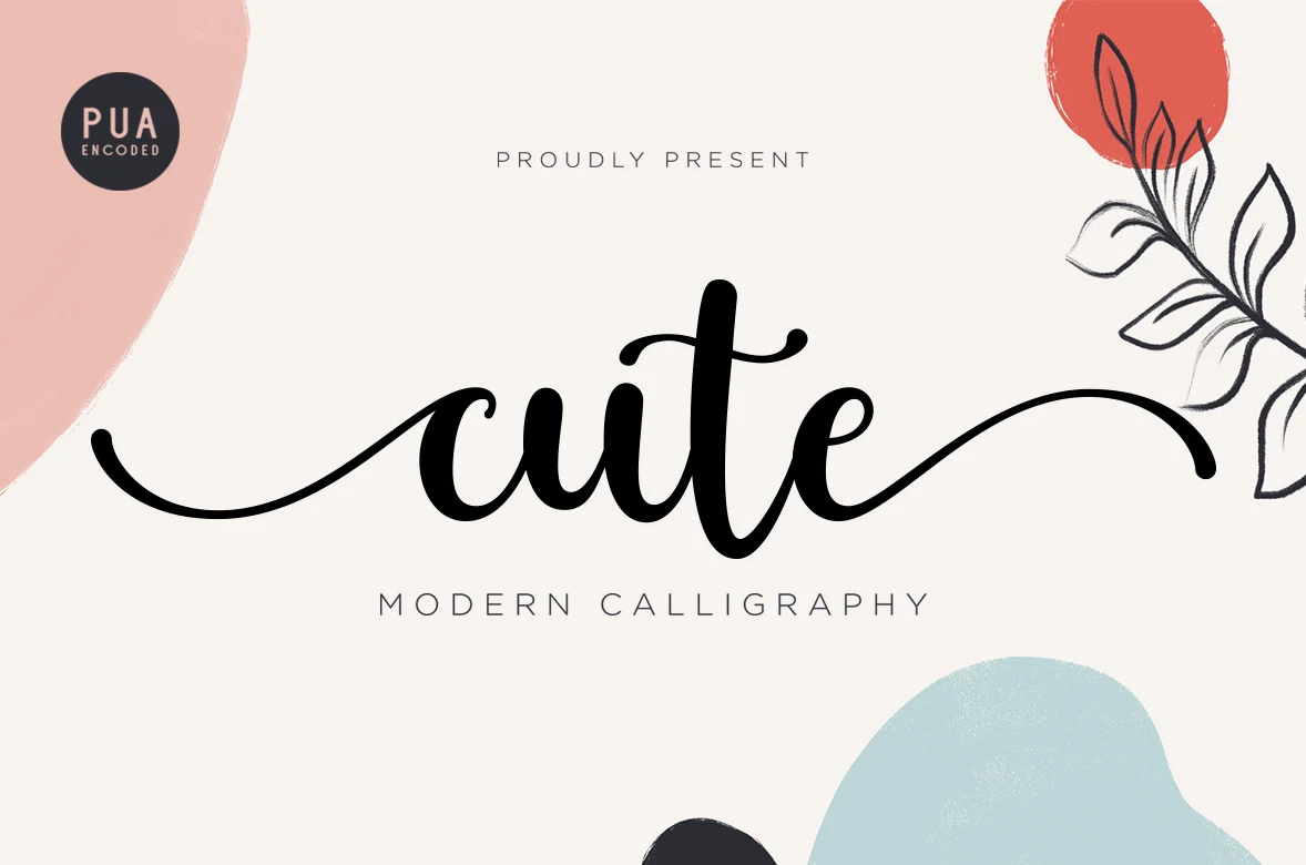
Best For: business cards, logos, invitations, quotes
Cute Font builds its display impact through high thick-to-thin contrast, fully connected lettering, and extended entry and exit swashes. Alternate characters add variation for logos and invitations, but the detailed terminals need generous heading sizes to stay clear.
Cute Bee Font
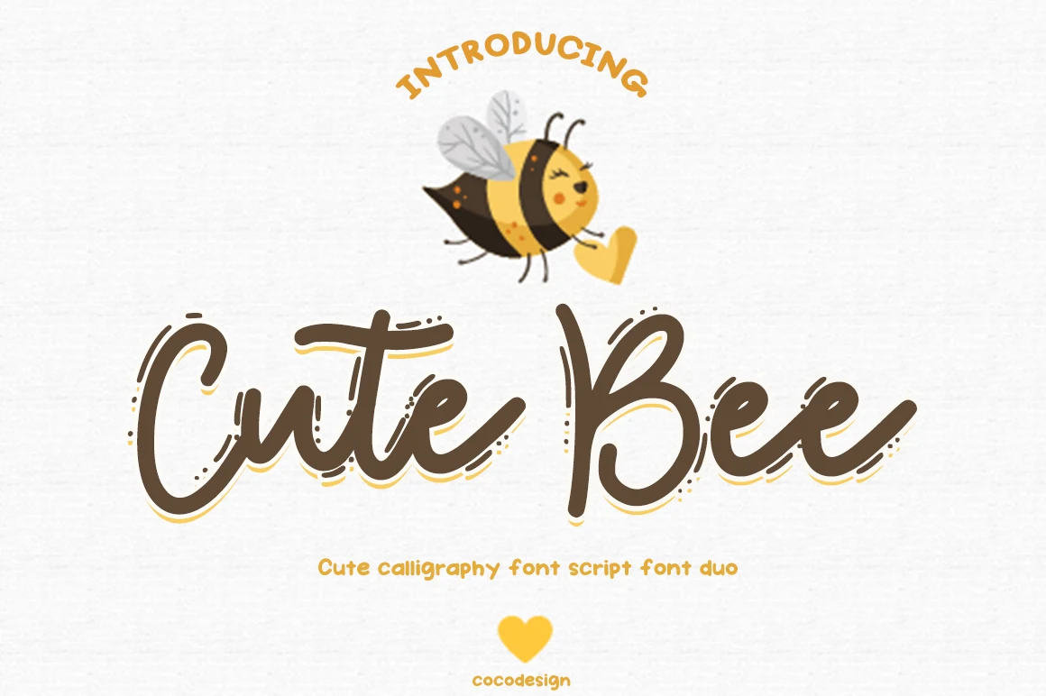
Best For: logos, packaging, product labels, display text
Cute Bee Font combines softly joined cursive forms with a rounded silhouette and expressive movement. The connected construction gives product labels and logos a stronger identity than it would provide for dense text or compact informational copy.
Cute Unicorn Font
Best For: display text, wall art, clean designs, playful designs
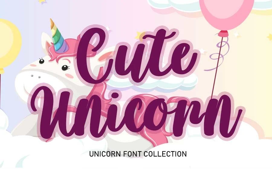
Cute Unicorn Font uses connected monoline lettering with rounded terminals and a slight rightward slant. Those joins keep names and short display lines lively, though definition can weaken in small applications where the connected strokes crowd together.
Cute Spring Font
Best For: display text, elegant designs, playful designs, cute designs
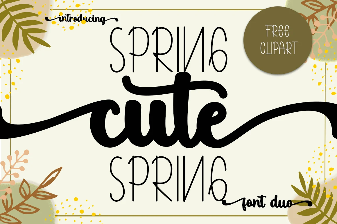
Cute Spring Font contrasts thin monoline lettering with a bold connected brush-script center. The brush line supplies headline impact through swashes, while the thinner styles provide clearer medium-size supporting text.
Cute Mermaid Font
Best For: invitations, display text, headlines, elegant designs
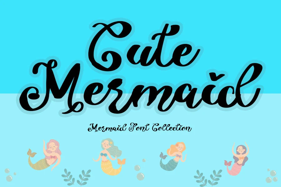
Cute Mermaid Font combines condensed connected script, high contrast, fluid curves, and swashed capitals. It has strong invitation and headline potential, but decorative capitals and contrast make very small applications harder to read.
Cute Dog and Cat Font
Best For: clean designs, playful designs, cute designs, casual designs
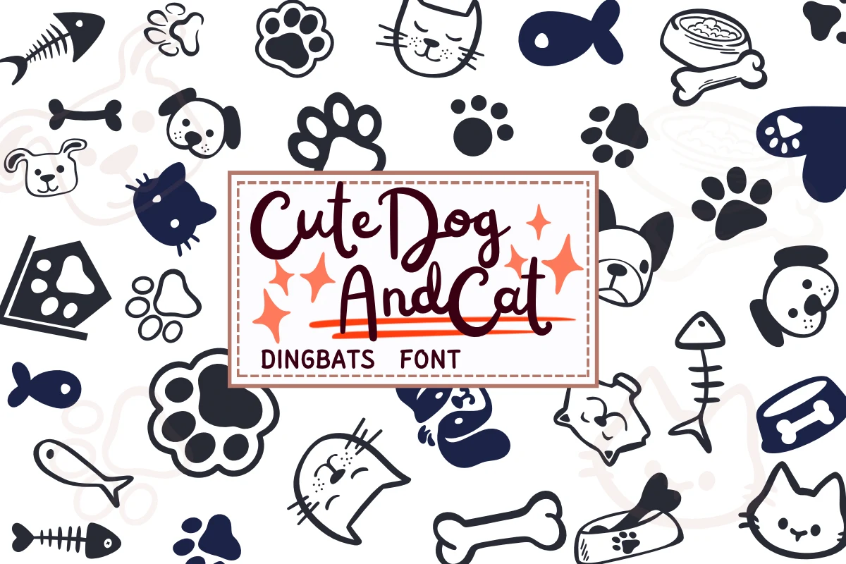
For casual logos and display phrases, Cute Dog and Cat Font uses variable stroke width, fluid joins, and a slight vertical lean. Its organic motion is most convincing at larger sizes, while smaller text becomes harder to parse.
Cute Kitten Font
Best For: book covers, logos, branding, packaging
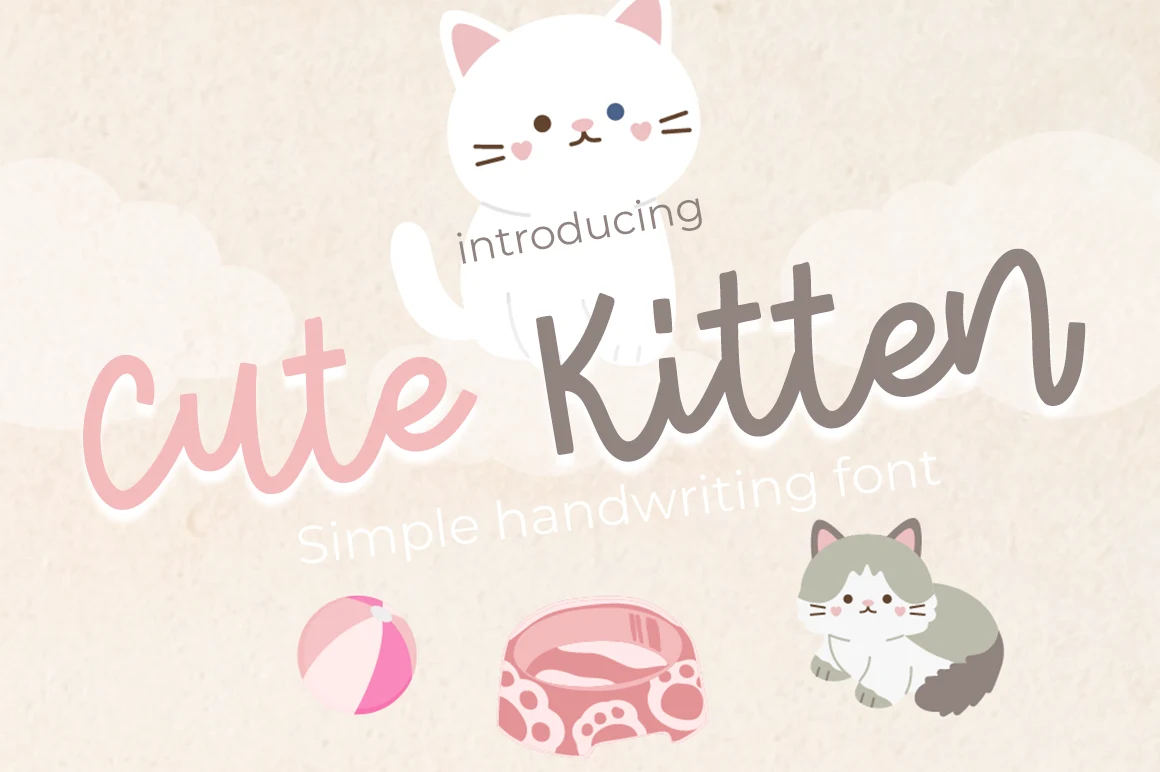
Cute Kitten Font uses softly joined cursive movement to establish a logo- and packaging-oriented identity. Its connected display structure favors names and brand marks, where the joins can breathe, rather than paragraphs or compact informational text.
Rounded Cute Display Fonts
Rounded display fonts simplify the lettering into clear, non-connecting shapes, ranging from slender forms to heavy geometric blocks. They generally provide steadier rhythm than scripts and stronger title-scale presence.
Cute Unicorn Font
Best For: display text, playful designs, cute designs, expressive designs
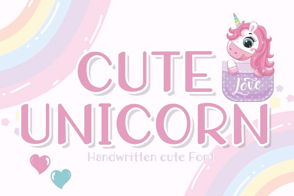
Cute Unicorn Font uses slender strokes and a clear rhythm to keep its display presence light. The refined shapes work best in short headings, names, and other prominent wording where thin construction can remain visible without heavy visual mass.
Oh Cute Baby Font
Best For: display text, playful designs, cute designs, expressive designs
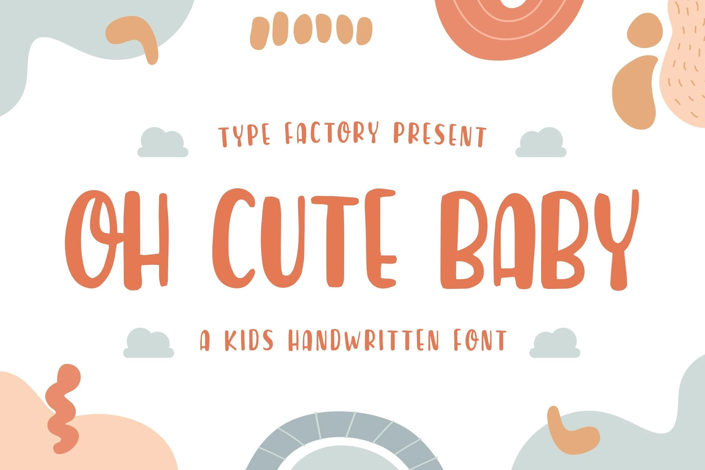
Oh Cute Baby Font is rounded display lettering shaped by a recognizable stroke rhythm rather than connected script movement. Its forms are easiest to assess in headings and short phrases, with limited evidence supporting long-form or small-scale use.
Cute Animals Font
Best For: display text, playful designs, cute designs, expressive designs
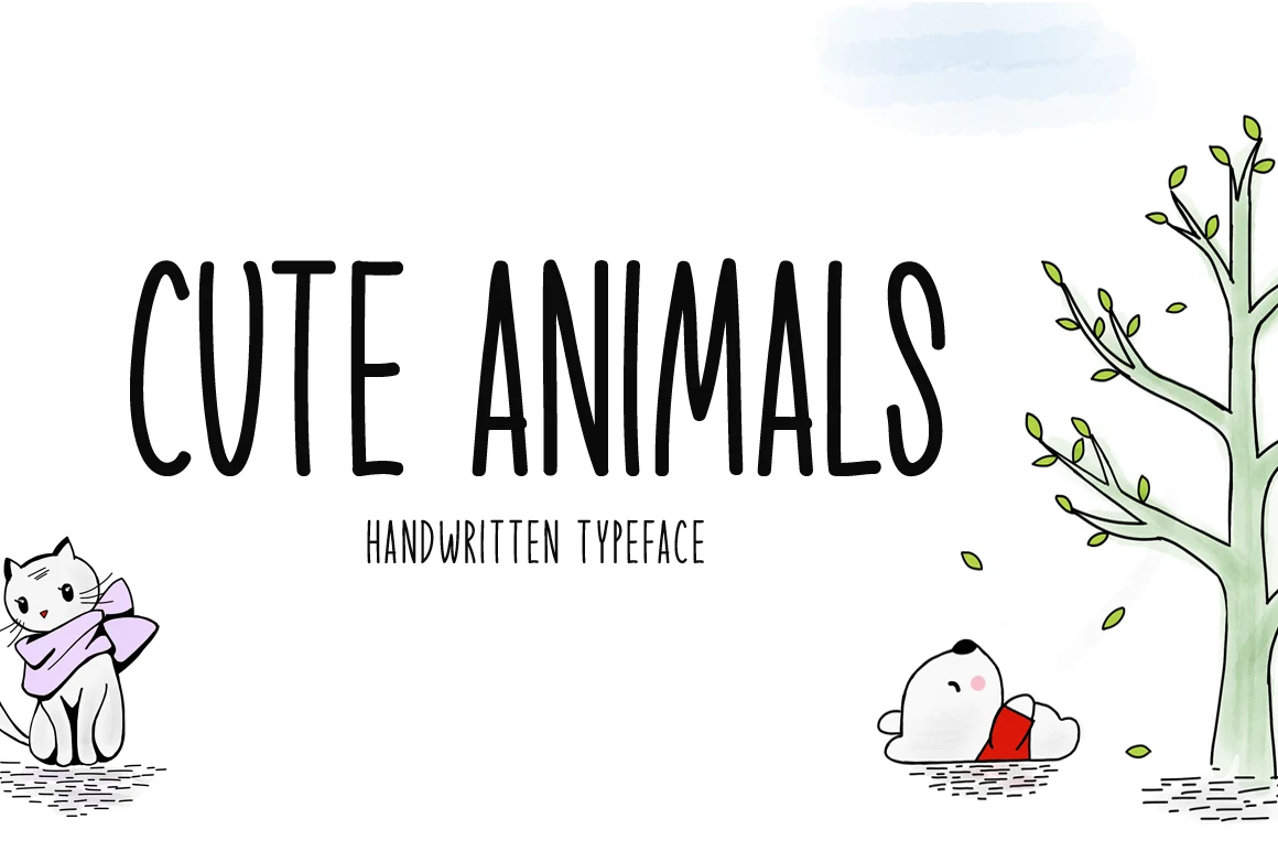
Cute Animals Font relies on a straightforward rounded display construction and clear stroke rhythm. It is most dependable for headings, names, and short decorative wording where the letter shapes can stay large and visually distinct.
Cute Cactus Font
Best For: display text, playful designs, cute designs, expressive designs
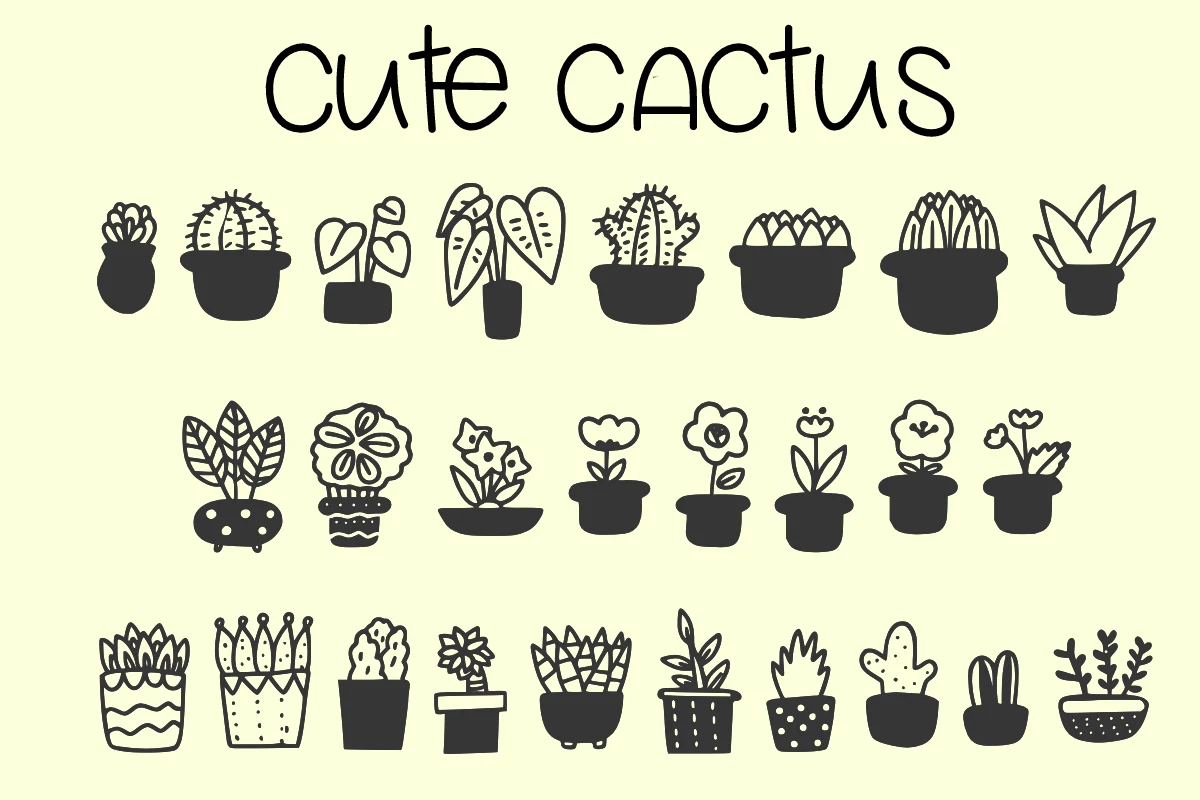
Cute Cactus Font offers rounded display forms as a simple alternative to connected handwritten lettering. The evidence supports headings and short phrases, but not continuous reading, so keep its shapes prominent and its wording brief.
Hurry Cute Font
Best For: display text, soft designs, playful designs, cute designs
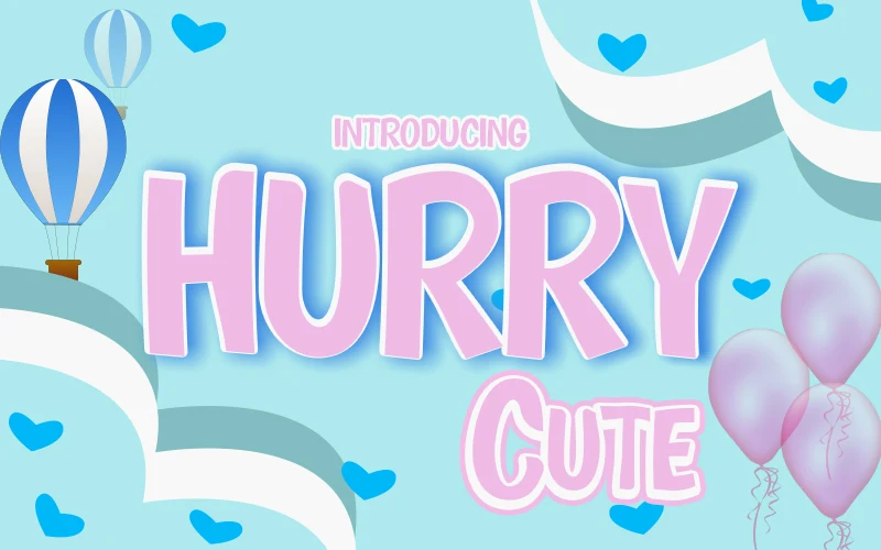
Hurry Cute Font gives rounded display sans-serif lettering a heavy, wide-squarish block presence. Its upright forms remain clear in large titles, though the thick construction becomes less comfortable when reduced to very small display sizes.
Cute Family Doodles Font
Best For: creative projects, modern designs, clean designs, playful designs
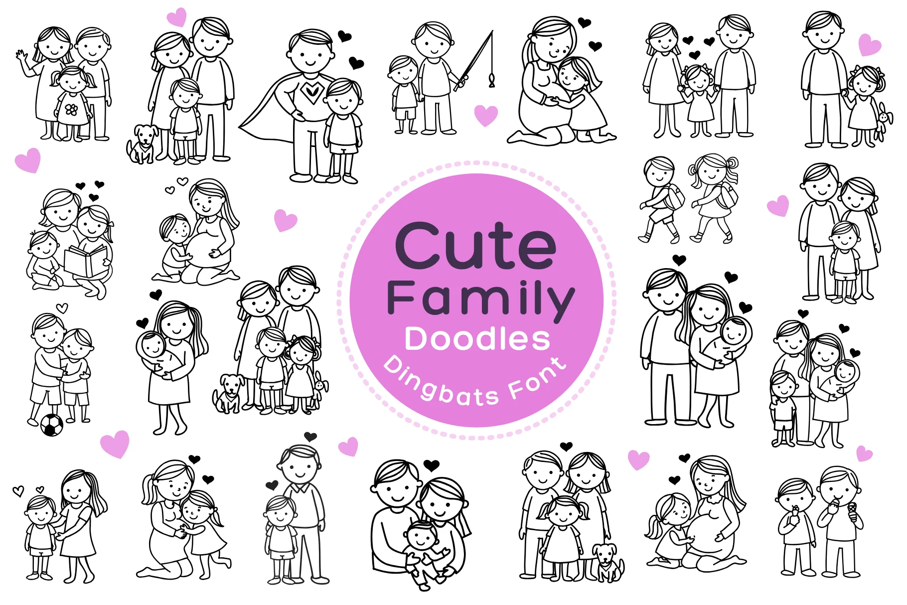
Cute Family Doodles Font uses geometric shapes, uniform strokes, rounded terminals, and closed apertures. Those uncomplicated forms provide the clearest readability here for medium-to-large creative project text, while its weight variation supports a simple title hierarchy.
How to Choose the Right Font
Choose Handwritten Cute Fonts by starting with construction: connected scripts and swashes suit logos, invitations, and brief headlines, while disconnected or geometric forms hold together better in quotes, labels, and medium-size text. Check weight, joins, contrast, flourishes, and width at the final size before committing to a design role.