30 Best Serif Aesthetic Fonts in 2026
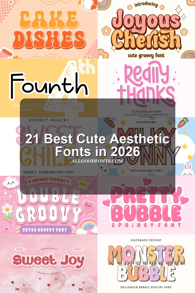
This collection moves from condensed, high-contrast serifs and structured slab forms to wide editorial faces, flowing swashes, ligatures, and highly distinctive terminals. These Serif Aesthetic Fonts are best used for headlines, branding, packaging, invitations, posters, and other display-led work where construction and scale can remain visible.
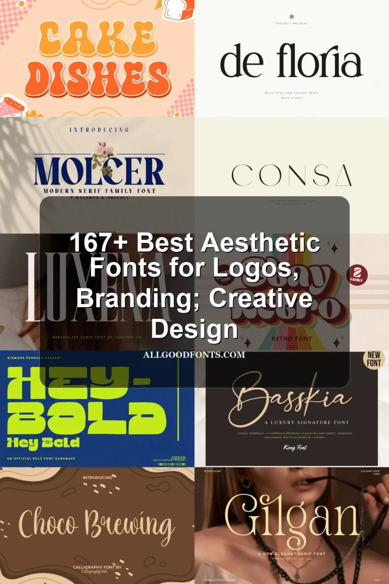
Looking for more aesthetic fonts? Browse our complete Aesthetic Fonts collection to compare modern, elegant, bold, vintage, and retro aesthetic styles.
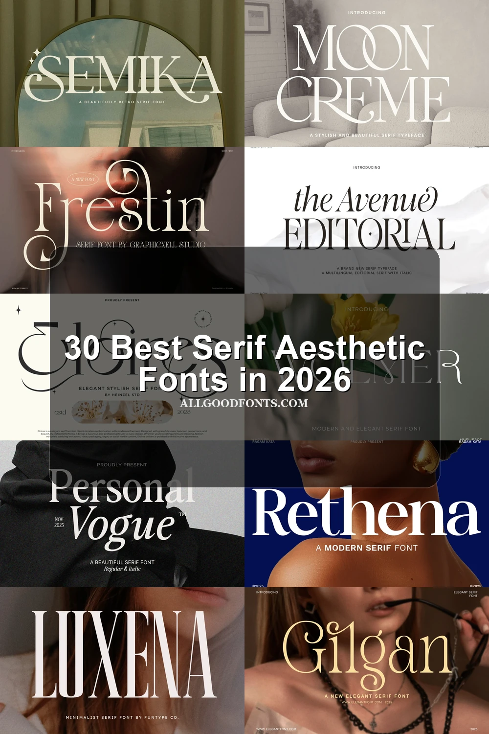
Serif Aesthetic Fonts: Refined High Contrast
These Serif Aesthetic Fonts share upright, high-contrast structures, but their restrained terminals and open forms make them less ornamental than the swash-led groups.
Established Font
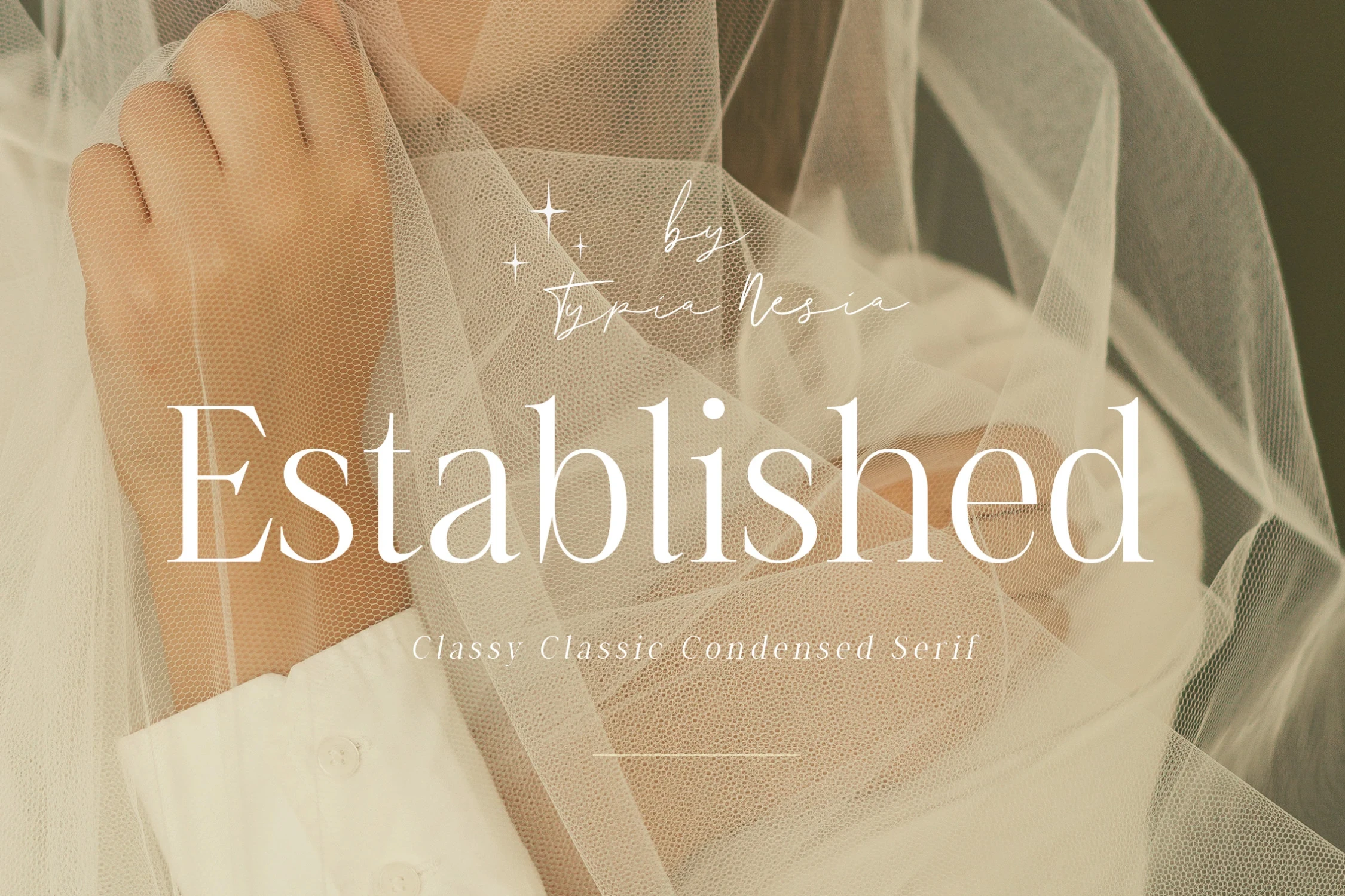
Best For: display text, modern designs, elegant designs
Established Font uses condensed, upright proportions, sharp bracketed serifs, and pronounced thick-to-thin contrast. Its delicate hairlines are most effective in prominent headlines and editorial titles, where generous sizing protects clarity; extended reading is less suitable.
Romelle Font
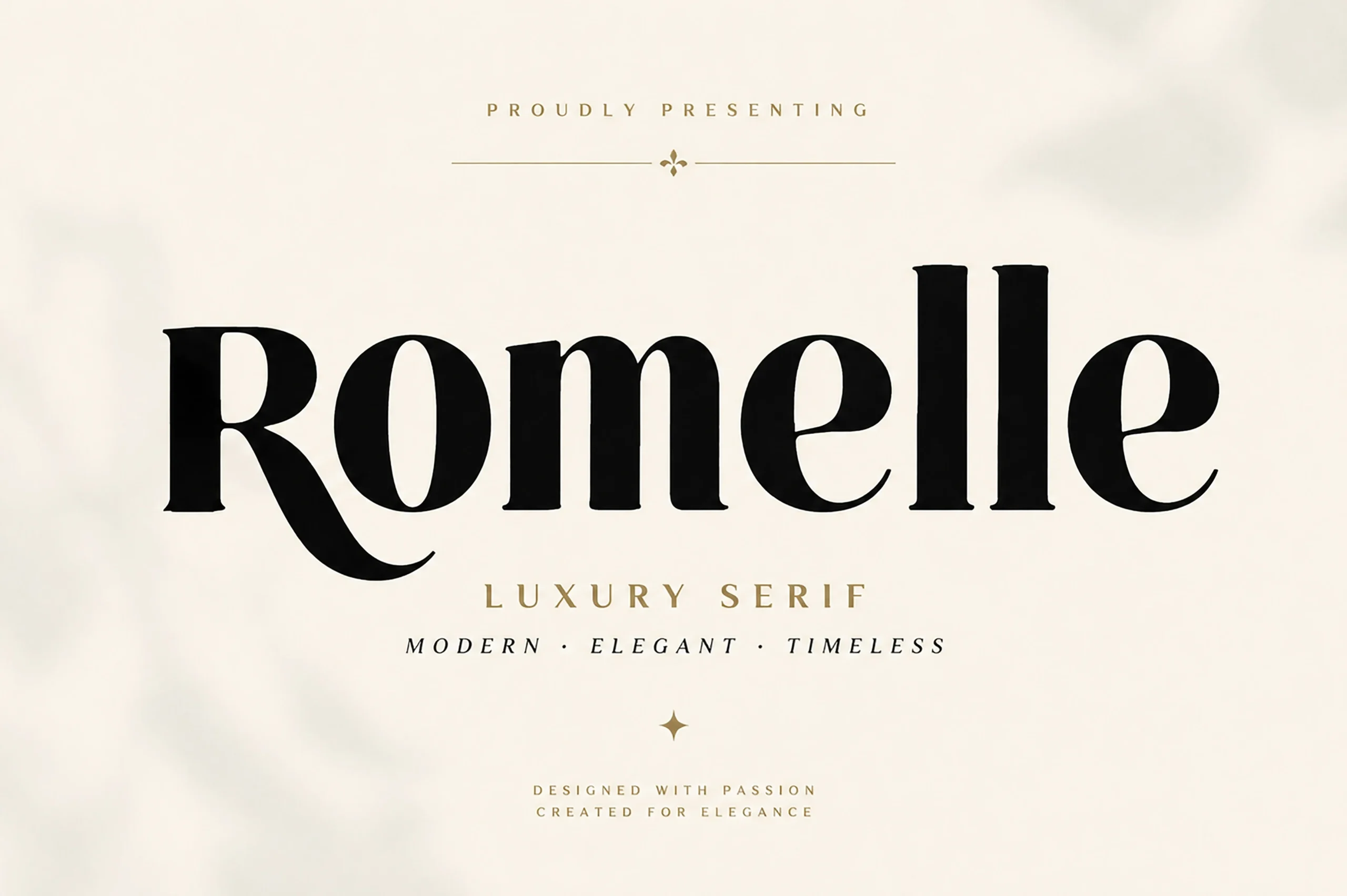
Best For: branding, packaging, headlines, beauty branding
Romelle Font builds a geometric, high-contrast serif around a sweeping capital R. That curved terminal gives branding and packaging a recognizable signature, while its delicate strokes call for generous display sizing rather than small supporting copy.
Elegant Font
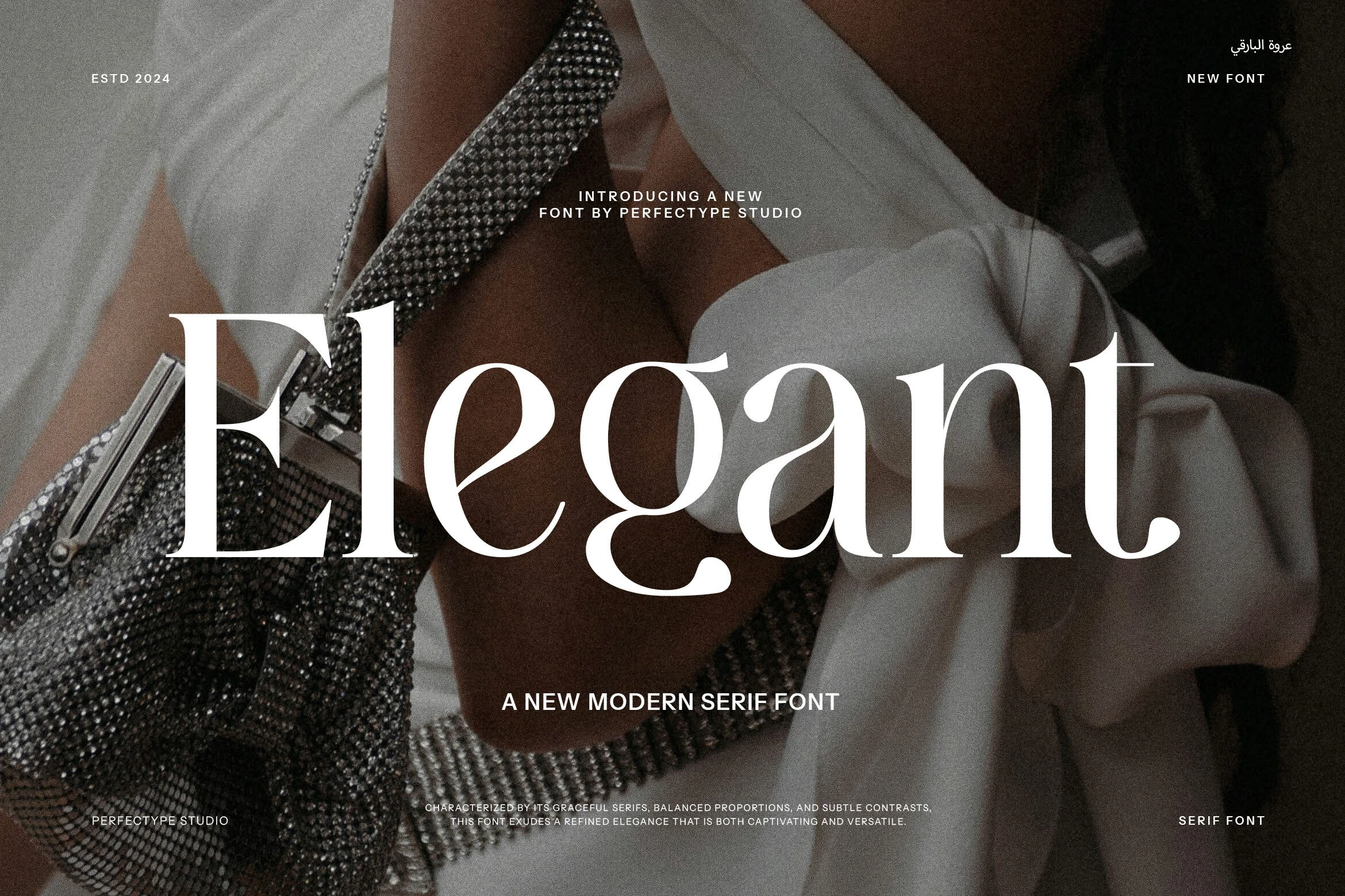
Best For: product labels, display text, modern designs, clean designs
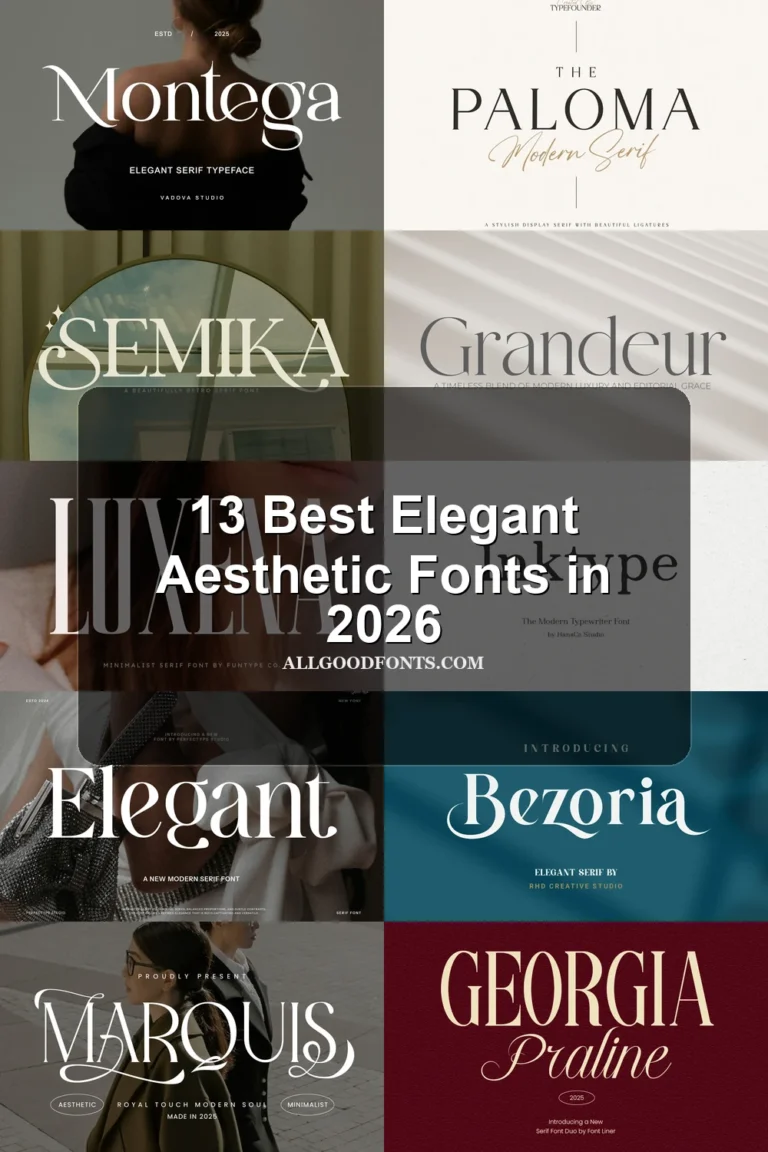
Elegant Font softens a heavy, high-contrast structure with rounded counters and open apertures. It reads clearly in large titles and product labels, but its extreme stroke contrast becomes less dependable when reduced to body-text sizes.
Romane Font
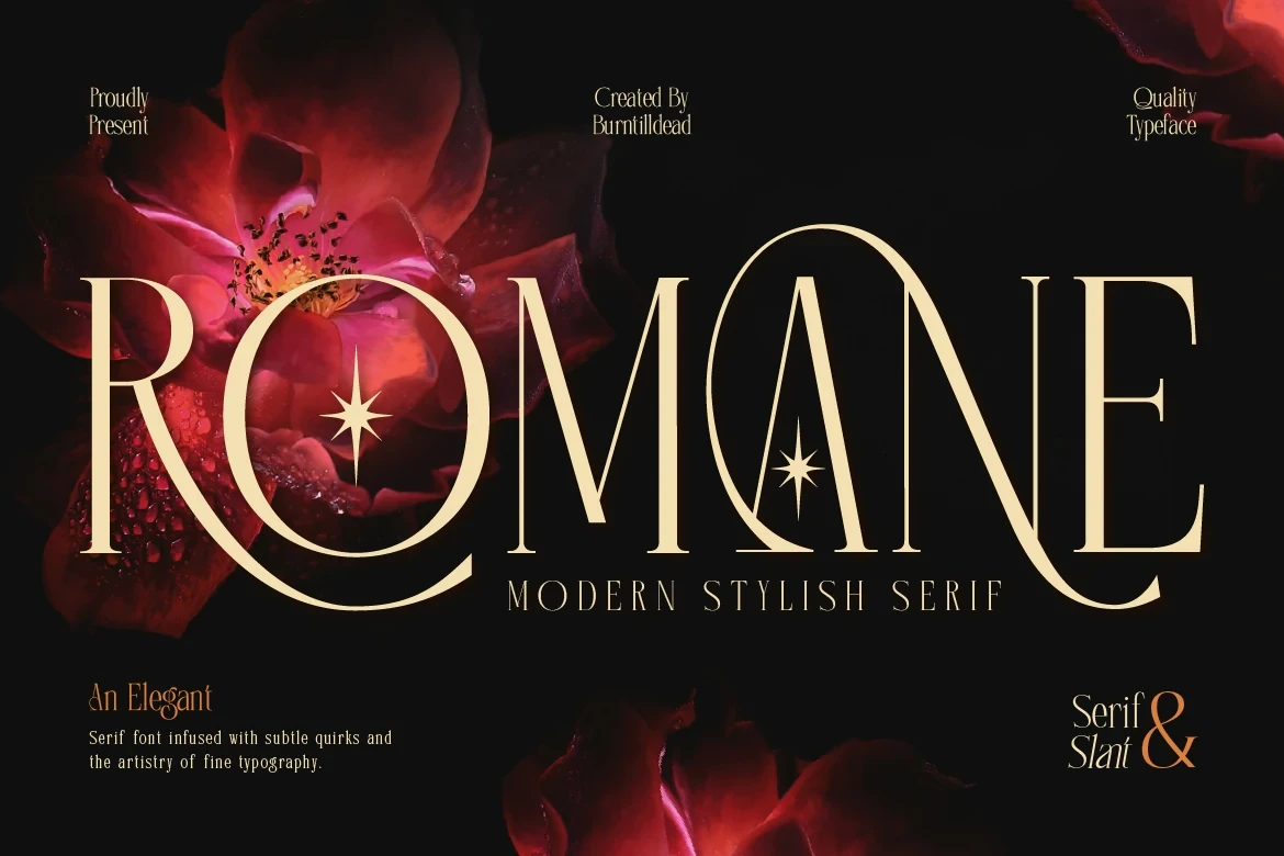
Best For: display text, modern designs, minimal designs
Romane Font stretches its proportions and introduces stylized circular enclosures, producing an unusual internal rhythm. Those details reward short display phrases and logos, while dense paragraphs become harder to scan as the decorative forms accumulate.
Wolmer Font
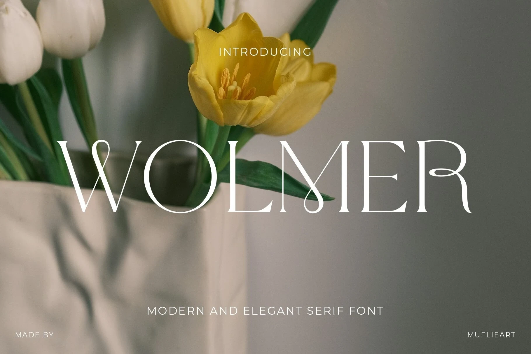
Best For: display text, wall art, modern designs, clean designs
Wolmer Font extends a traditional serif with elongated L and R terminals, pronounced vertical emphasis, and high contrast. Its upright structure works for wall art and headlines, but delicate hairlines make small applications less reliable.
Olivia Serif Font
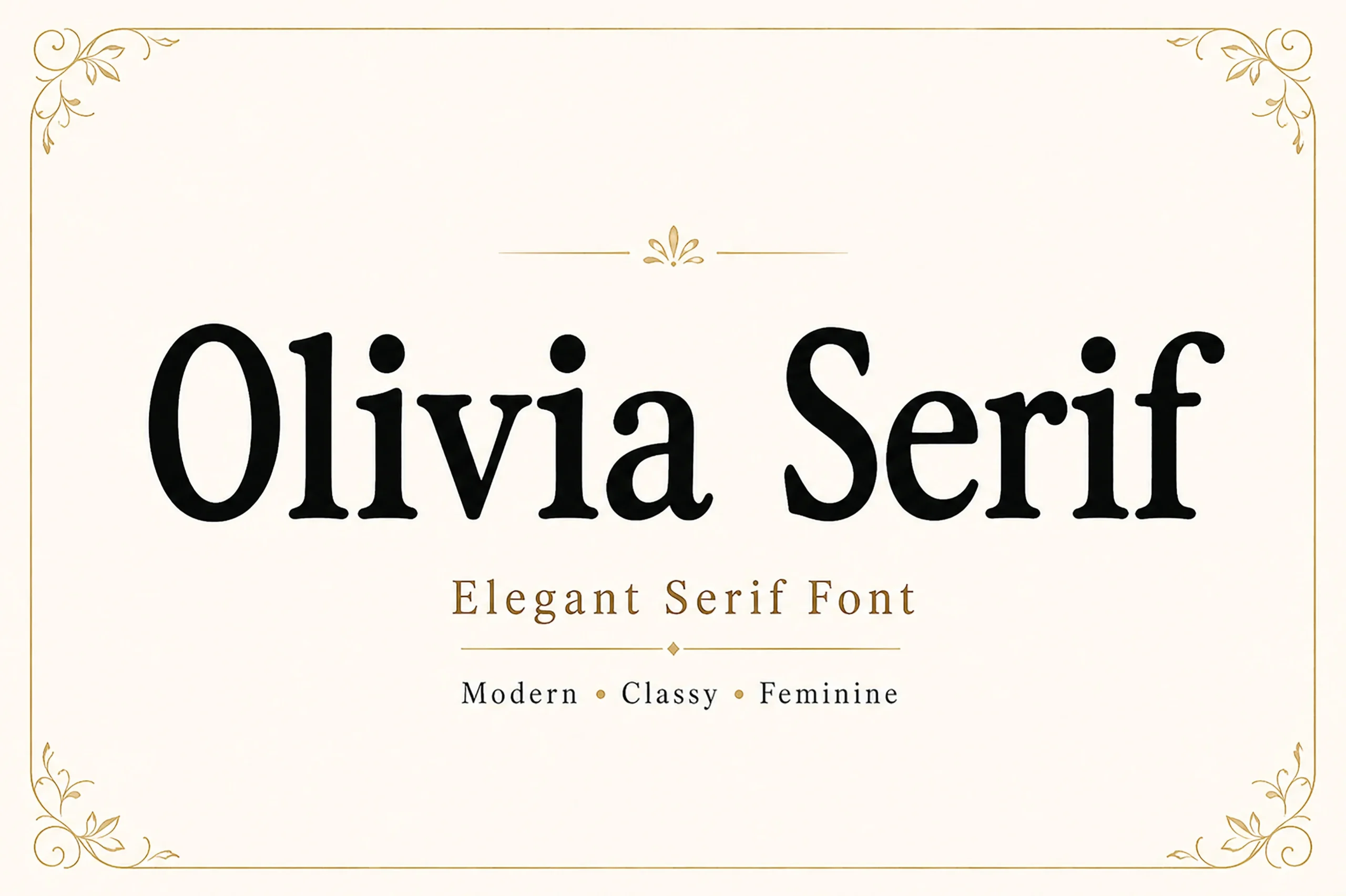
Best For: high-end designs, display text, headlines, modern designs
Olivia Serif Font uses bracketed serifs, a vertical axis, and rounded teardrop terminals to soften its formal construction. Its clear structure benefits large headlines, while sharp thin-to-thick shifts make small body text less dependable.
Grandeur – Elegant Classic Serif Font
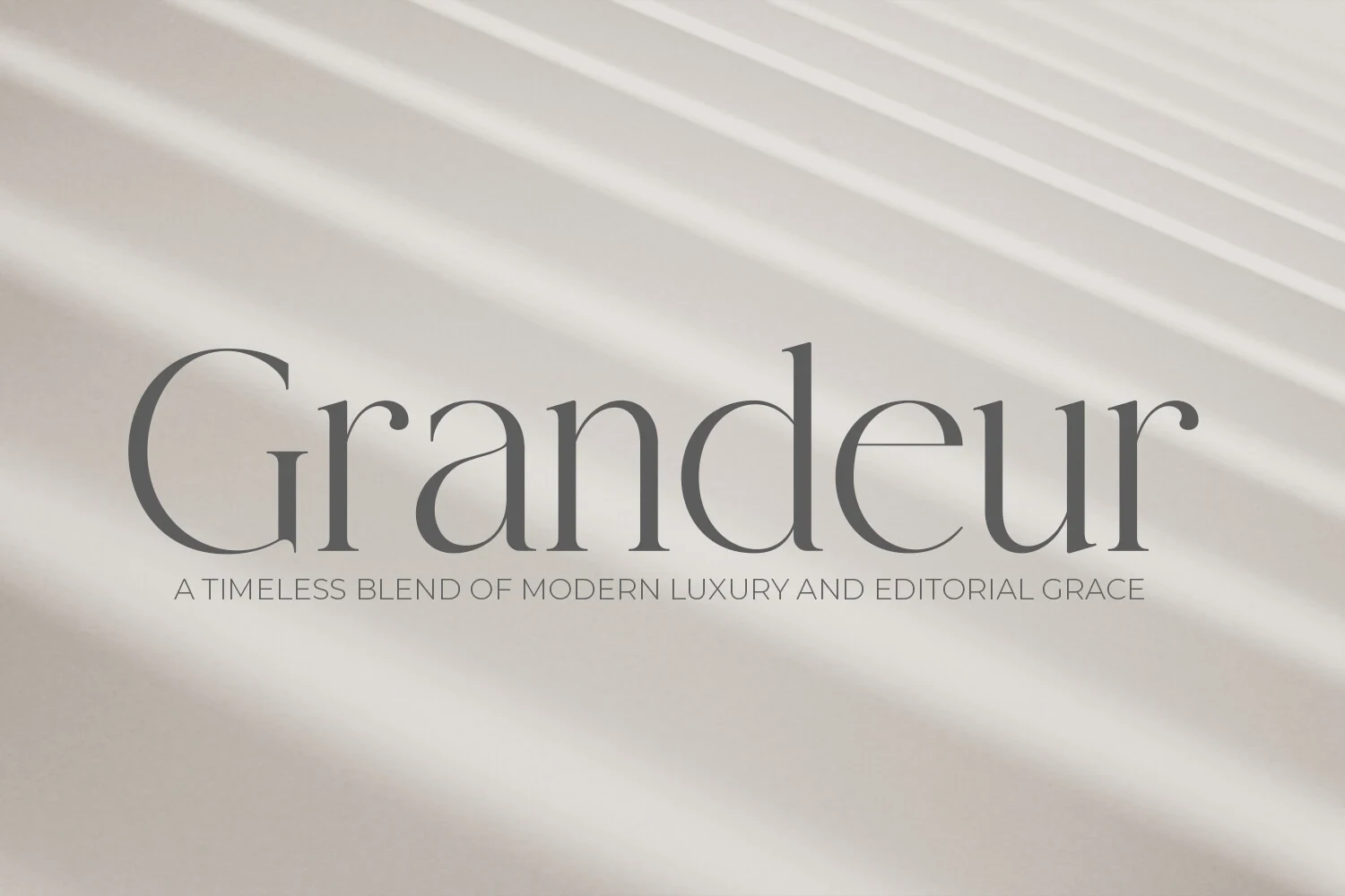
Best For: display text, clean designs, elegant designs, classic designs
Grandeur – Elegant Classic Serif Font pairs sharp triangular serifs with open apertures, preserving clarity within a formal high-contrast design. It is more dependable for large display text than small paragraphs, where its thin strokes can fade.
Rethena Font
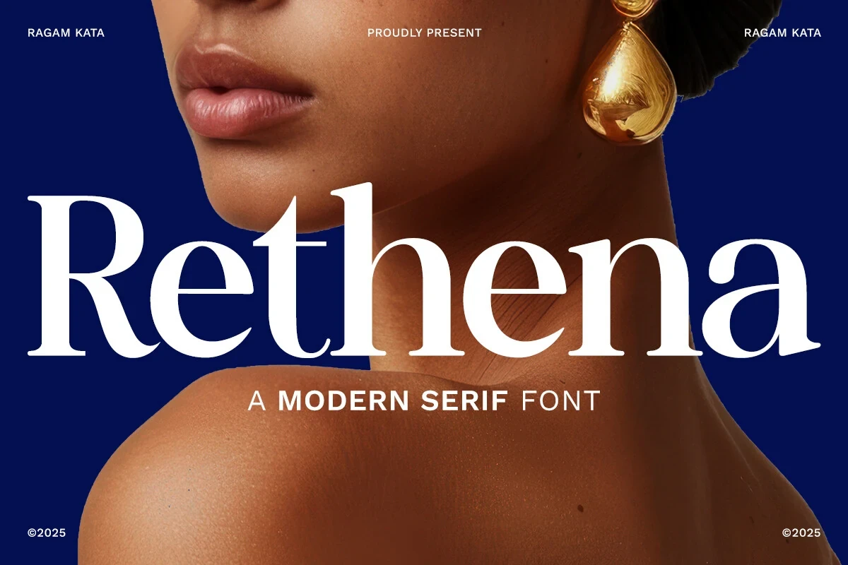
Best For: branding, fashion branding, high-end designs, display text
For fashion branding, Rethena Font offers a restrained point of difference: a ball terminal on the lowercase a set against formal bracketed serifs. Its high contrast keeps the face display-focused, so use it large rather than in body copy.
Moon Creme Font
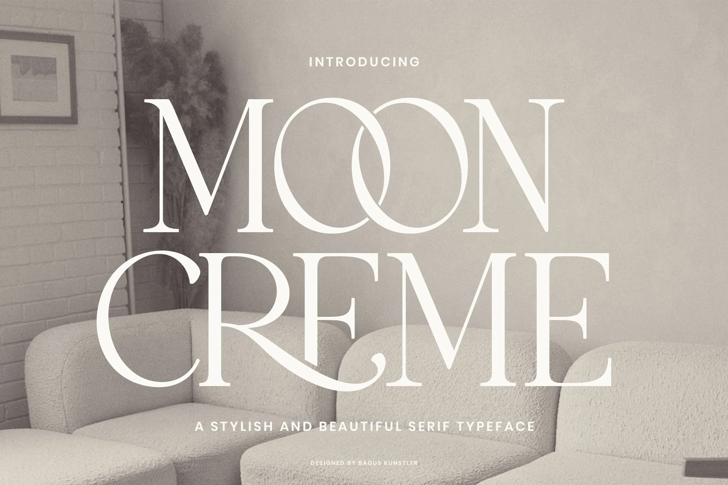
Best For: branding, fashion branding, display text, modern designs
Moon Creme Font centers its display alphabet on an interlocking OO relationship, supported by curved terminals on letters such as R and E. That integrated treatment strengthens fashion marks and headlines, while decorative details restrict body-text use.
Ethereal Font
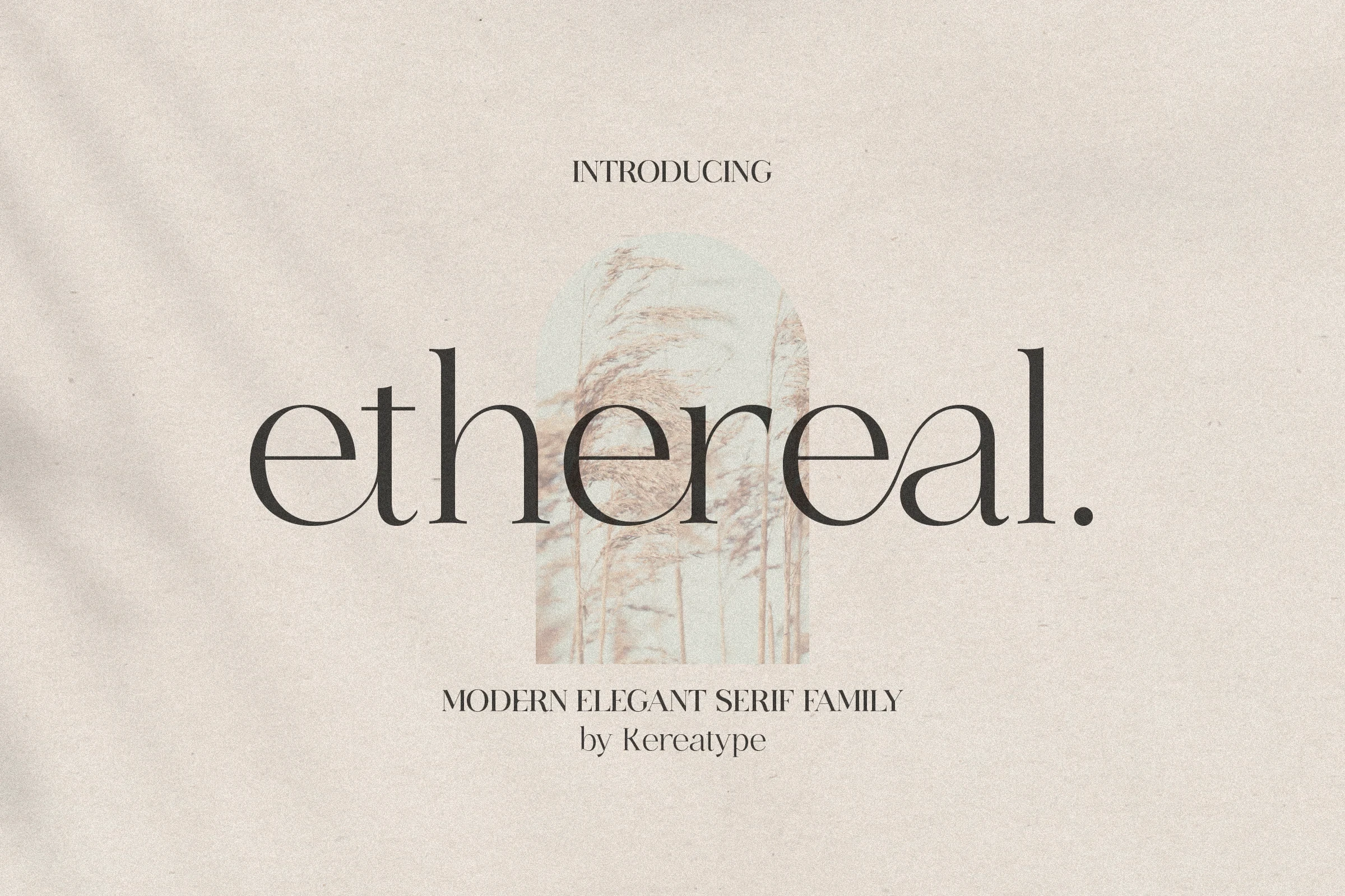
Best For: display text, modern designs, clean designs, elegant designs
Ethereal Font tempers its extended l terminal and bracketed serifs with geometric circular counters. That restrained feature supports minimalist titles and clean display layouts, though high contrast still favors large sizes over paragraphs or compact utility text.
Personal Vogue Font
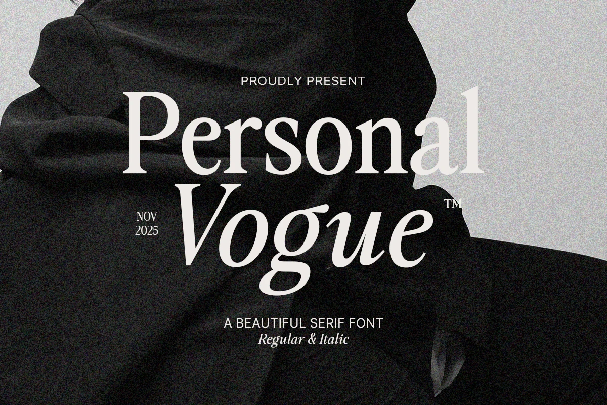
Best For: display text, elegant designs, luxury designs, editorial designs
Personal Vogue Font offers a clear upright-to-fluid contrast through Roman and italic styles within one high-contrast serif family. The italic adds movement to editorial titles, but both styles are intended for display rather than extended body copy.
Condensed and Structured Serifs
Condensed widths, tall caps, slab details, and controlled spacing define this group, which prioritizes compact headline impact over decorative movement or reading comfort.
Tobacco Road Font
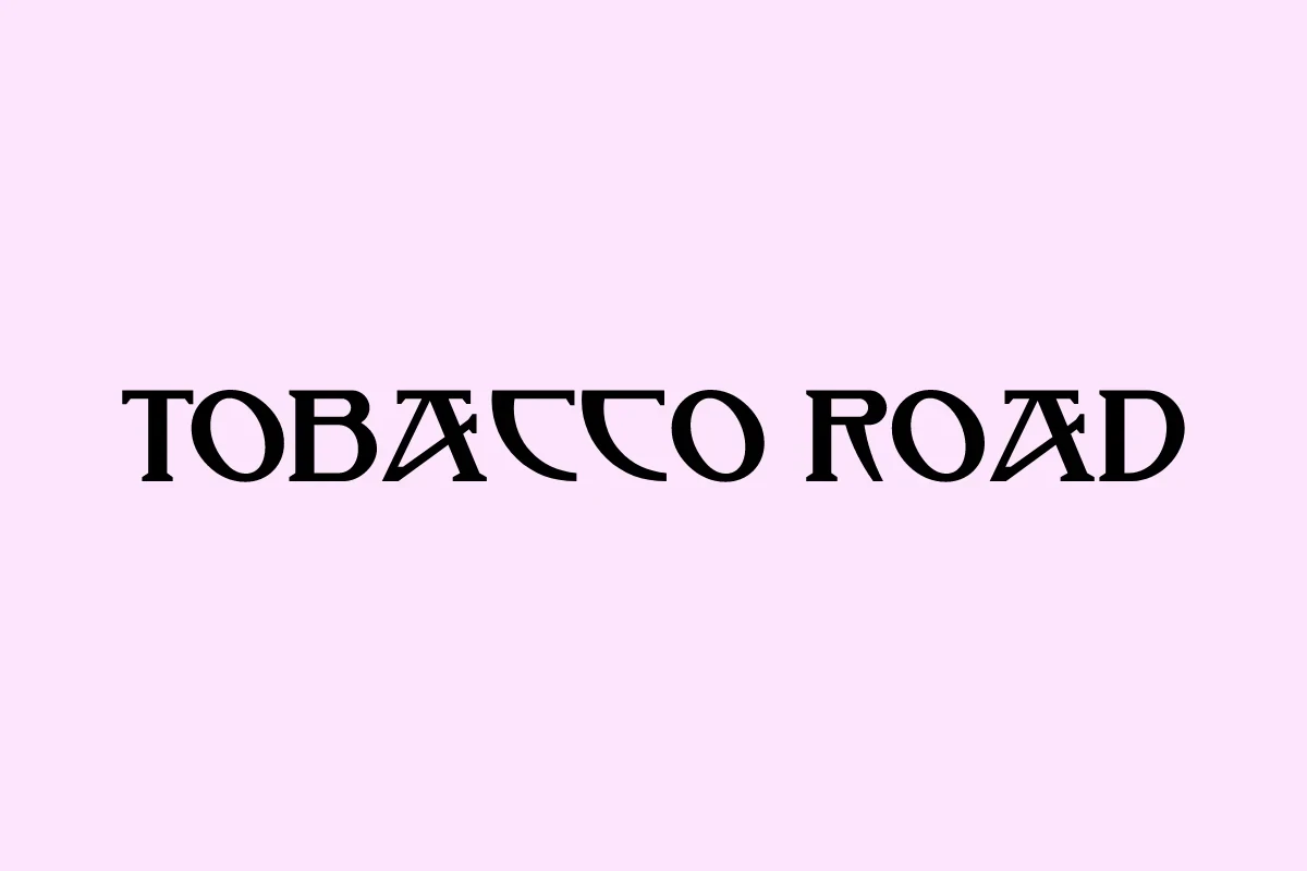
Best For: logos, branding, headlines, quotes
For logos or thematic headlines, Tobacco Road Font brings angular construction, triangular serifs, and stencil-like breaks through the A and D crossbars. Those interrupted details create a strong graphic effect, but thin strokes and gaps can hinder reading at small sizes.
Theobald Font
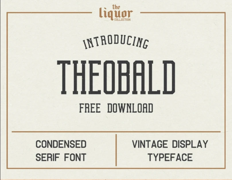
Best For: posters, product labels, social media graphics, display text
Theobald Font relies on condensed proportions, slab-style block serifs, a tall cap height, and relatively uniform strokes. Its clean vertical structure holds together on posters, labels, and signage, though the title-focused construction is not intended for body copy.
Epic Dope Font
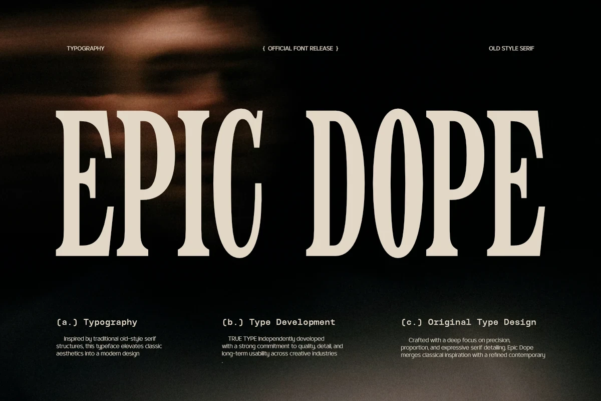
Best For: display text, modern designs, minimal designs, clean designs
Epic Dope Font combines condensed proportions with flat-bottomed bracketed serifs and high contrast. The narrow footprint fits compact headline layouts and clean title treatments, but its tightly controlled shape is better for display text than sustained reading.
Luxena Font
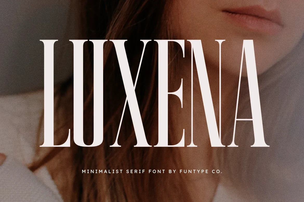
Best For: logos, branding, posters, headlines
Luxena Font creates an extremely compressed silhouette through narrow proportions, elongated verticals, sharp bracketed serifs, and high contrast. It efficiently fills tall headline spaces and posters, although fragile hairlines can disappear when the design is reduced.
Swashes, Ligatures, and Flourishes
Swashes, ligatures, unusual tittles, and alternate forms drive this category, creating identity-rich lettering that needs generous size and short wording to stay readable.
Loving Ambros Font
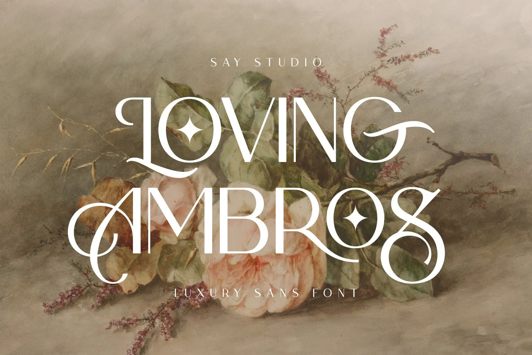
Best For: logos, branding, packaging, headlines
Loving Ambros Font combines high contrast with sweeping forms and decorative diamond-shaped star counters. These details make short logos, packaging names, and headlines distinctive, but they need large sizing so the ornamental counters and thin lines remain legible.
Arches Font
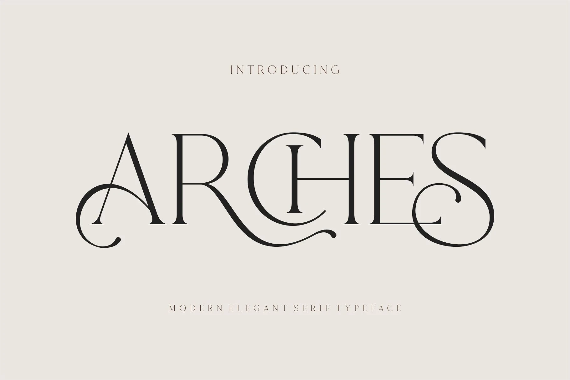
Best For: logos, branding, invitations, beauty branding
Arches Font creates a ligature-led texture through overlapping letter treatment, high contrast, and swash terminals on A, R, and S. It suits invitations and logos especially well, although the flourishes slow rapid reading in longer or denser lines.
Montega Font
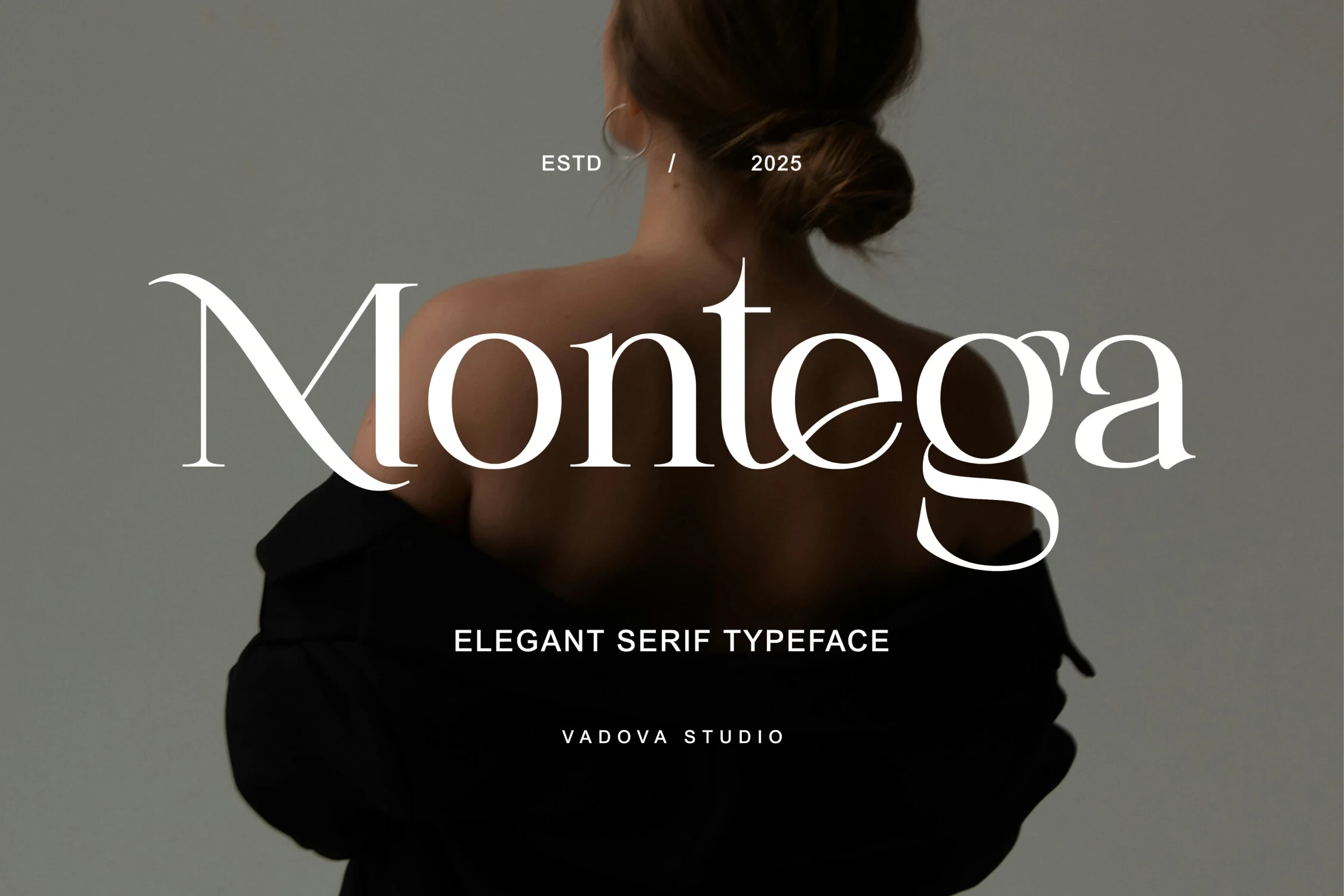
Best For: logos, branding, display text, beauty branding
Montega Font balances flowing swashes and sharp serif edges with open counters, giving its display forms more interior clarity than many decorative peers. It remains best at large sizes, where the open shapes can register without making the ornamental curves feel crowded.
Seraphim Font
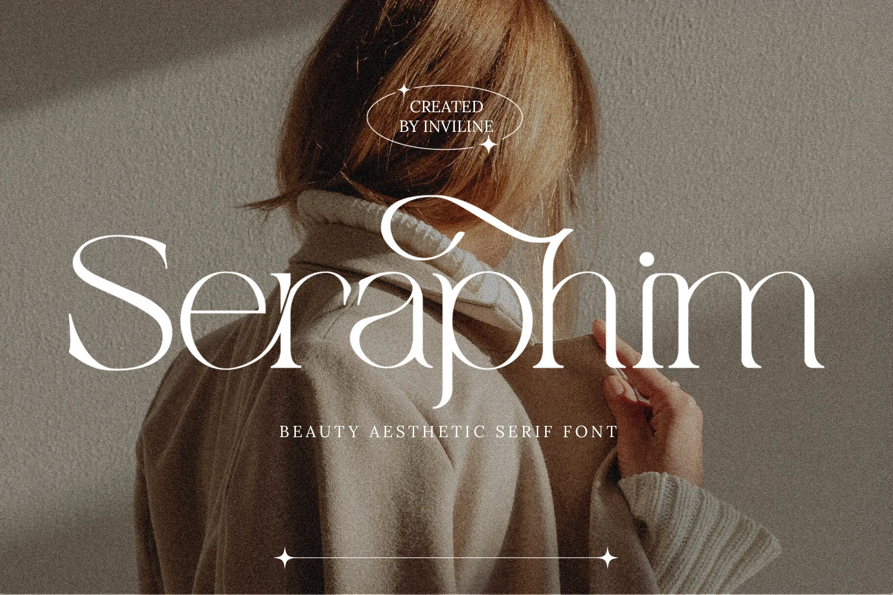
Best For: fashion branding, branding, packaging, invitations
For fashion branding or invitations, Seraphim Font makes ornament central through an exaggerated uppercase S, extensive decorative flourishes, and strong stroke contrast. Keep it to short, prominent wording: its decorative terminals are not built for body text.
Semika Font
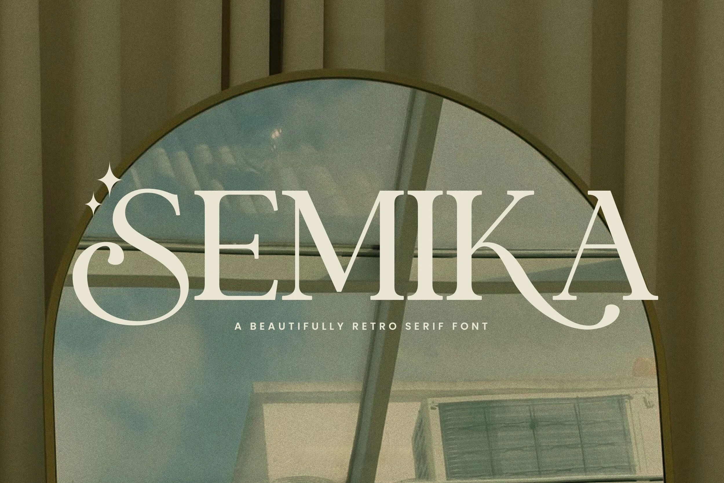
Best For: logos, packaging, website headers, display text
Semika Font keeps its underlying letterforms relatively clear while adding large sweeping swashes to the initial S and terminal A. The contrast works well in logos, headers, and packaging, but its display intent remains too pronounced for utility text.
The Avenue Editorial Font
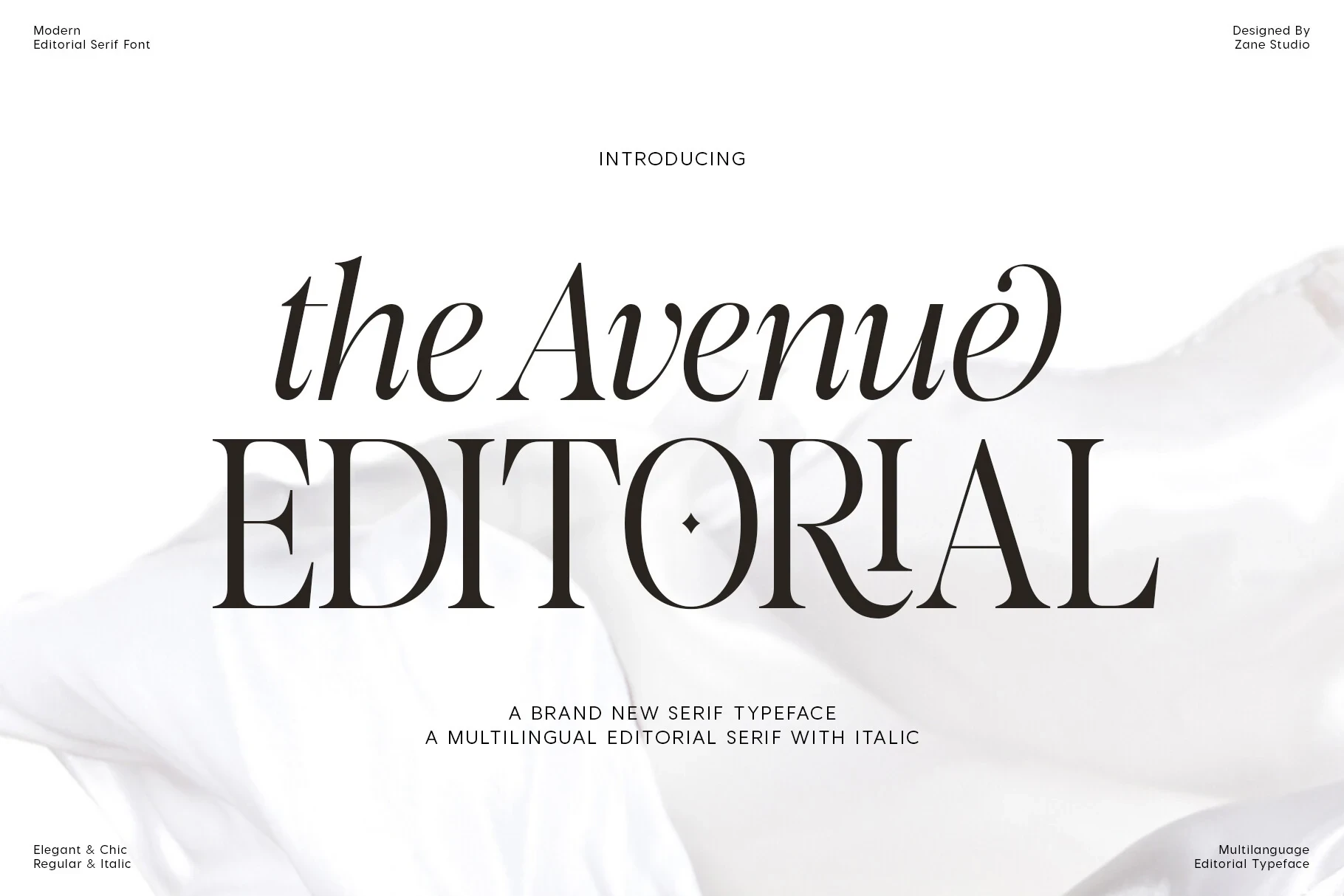
Best For: display text, modern designs, elegant designs, luxury designs
The Avenue Editorial Font adds calligraphic swash-like lowercase terminals and a diamond-shaped i tittle to its bracketed serif structure. These details distinguish short editorial titles and branding, but they make long-form reading visually inefficient.
Gilgan Font
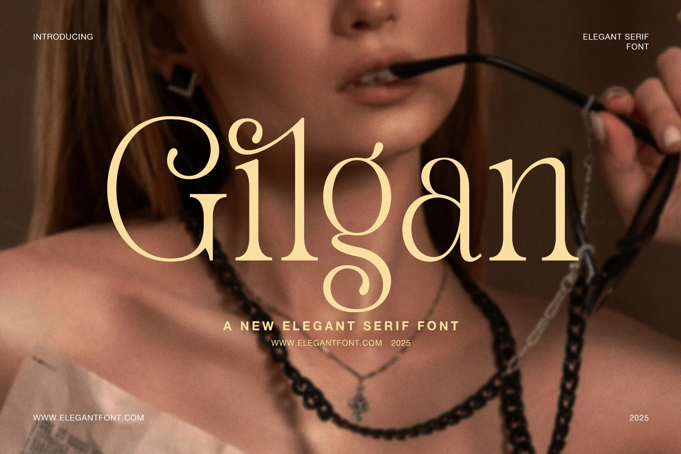
Best For: branding, fashion branding, high-end designs, display text
Gilgan Font gives the uppercase G and lowercase g their own swash-based identity instead of applying one uniform flourish. The result is memorable in branding and headings, though both letterforms should be tested carefully when the design is reduced.
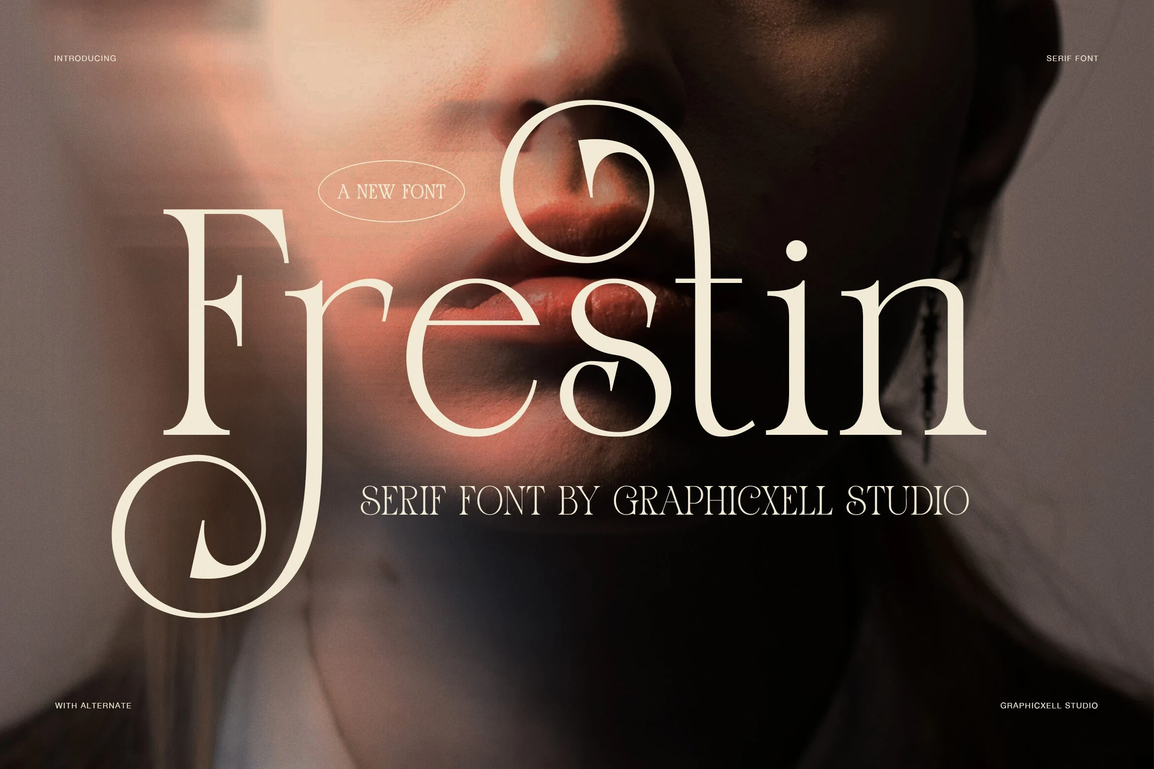
Frestin Font
Best For: branding, fashion branding, display text, modern designs
Frestin Font combines pointed wedge terminals with pronounced swashes on F, r, and t. The repeated directional accents create high-impact branding and display text, but can interrupt small, dense lines where rapid recognition matters more than personality.
Chiko Font
Best For: display text, headlines, modern designs, elegant designs
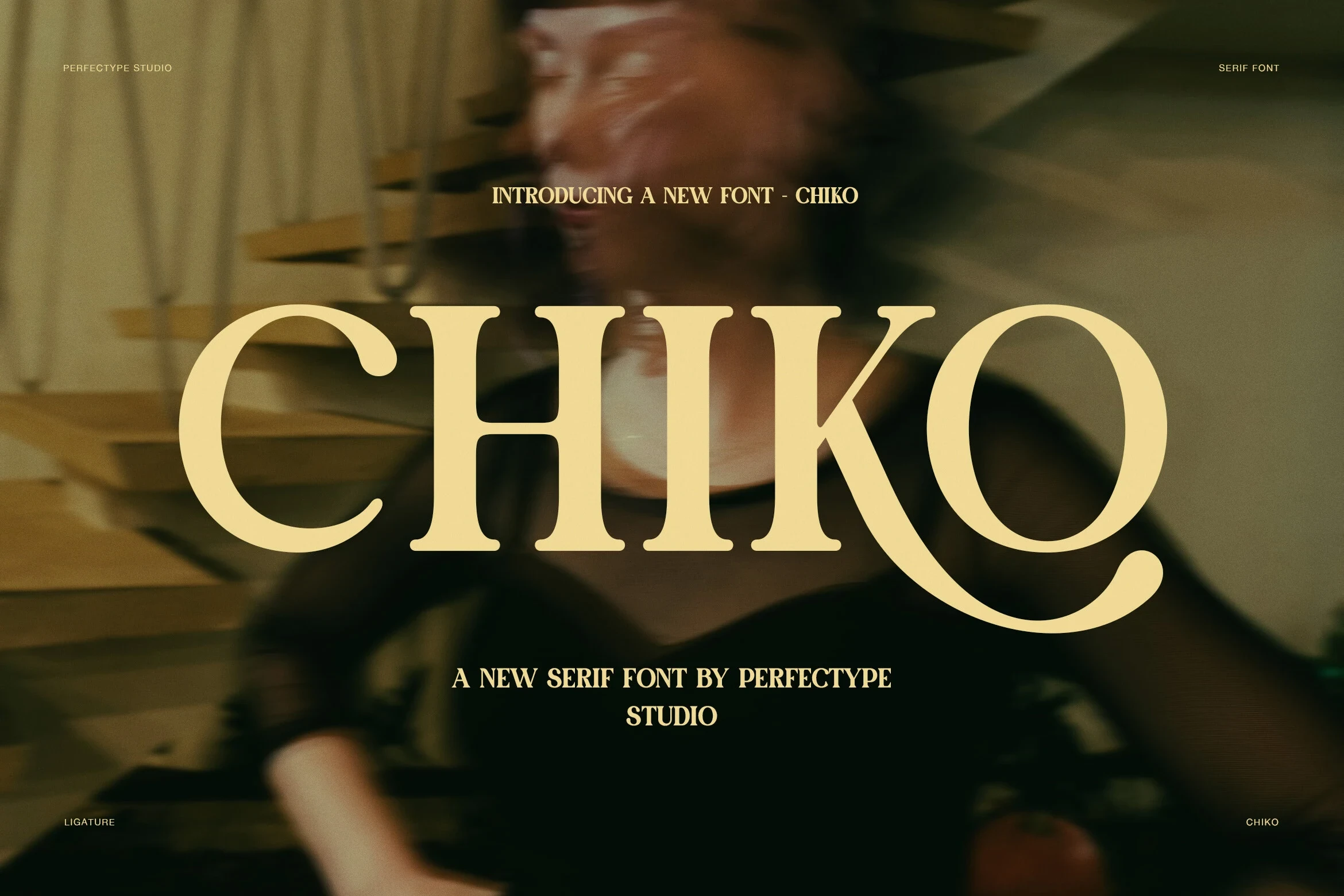
Chiko Font uses wide upright proportions and pronounced bracketed serifs, culminating in an exaggerated swash on the Q. Its broad build reads comfortably in large headlines, but the Q may need extra tracking or spacing at smaller sizes.
Acreme Bloom Font
Best For: branding, display text, high-end designs, modern designs
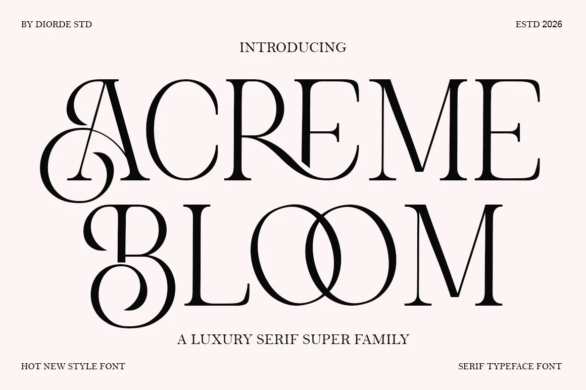
Acreme Bloom Font places elaborate swash capitals A and B over open counters and high-contrast stems. The open interiors preserve some display clarity, but the capital flourishes make it unsuitable for utility text or extended information.
Lovine Font
Best For: display text, modern designs, elegant designs, luxury designs
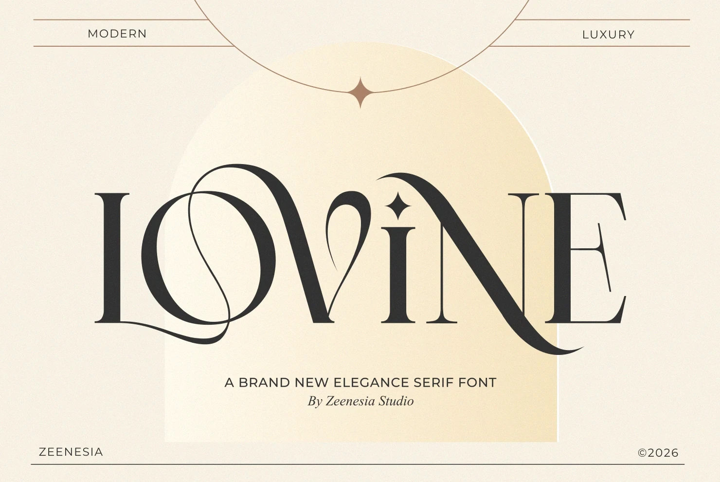
Lovine Font combines sweeping L and V swashes with a star-shaped i dot, giving short identity-led titles an immediately recognizable profile. These distinctive details are effective at display scale but make longer text laborious to read.
Eloires Font
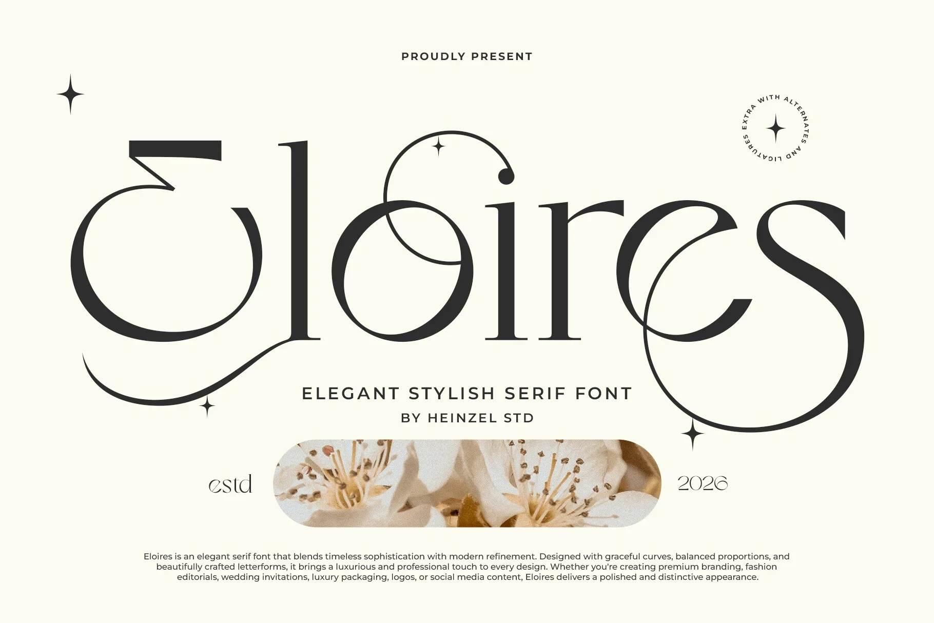
Best For: branding, display text, clean designs, elegant designs
Eloires Font extends its decorative serif through tailored letter variations and sweeping terminals on E and s. These options help shape logos and titles, while the elaborate edges limit clarity in small applications.
Wide and Expressive Editorial Serifs
Wide proportions and editorial silhouettes give these faces more horizontal presence, supporting covers, packaging, and large titles while still depending on display scale.
Stellar Oracle Font
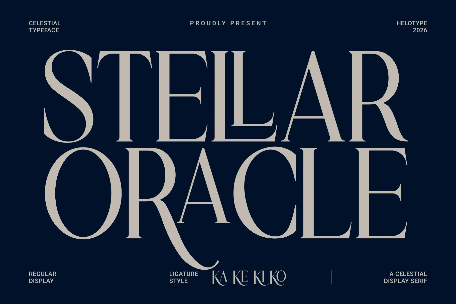
Best For: branding, packaging, beauty branding, book covers
Stellar Oracle Font gives a high-contrast serif unusual horizontal presence through wide proportions, extended curves, and decorative terminal details. That extra width supports book covers and packaging, although delicate strokes still need display scale for dependable clarity.
Georgia Praline Font
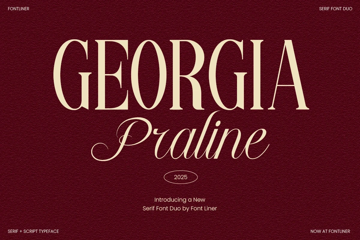
Best For: logos, branding, packaging, invitations
Georgia Praline Font pairs an upright, high-contrast serif with a genuinely flowing calligraphic script, creating built-in contrast for invitations and packaging. Use the serif at generous sizes, since fine strokes and script details can lose clarity when reduced.
Things Font
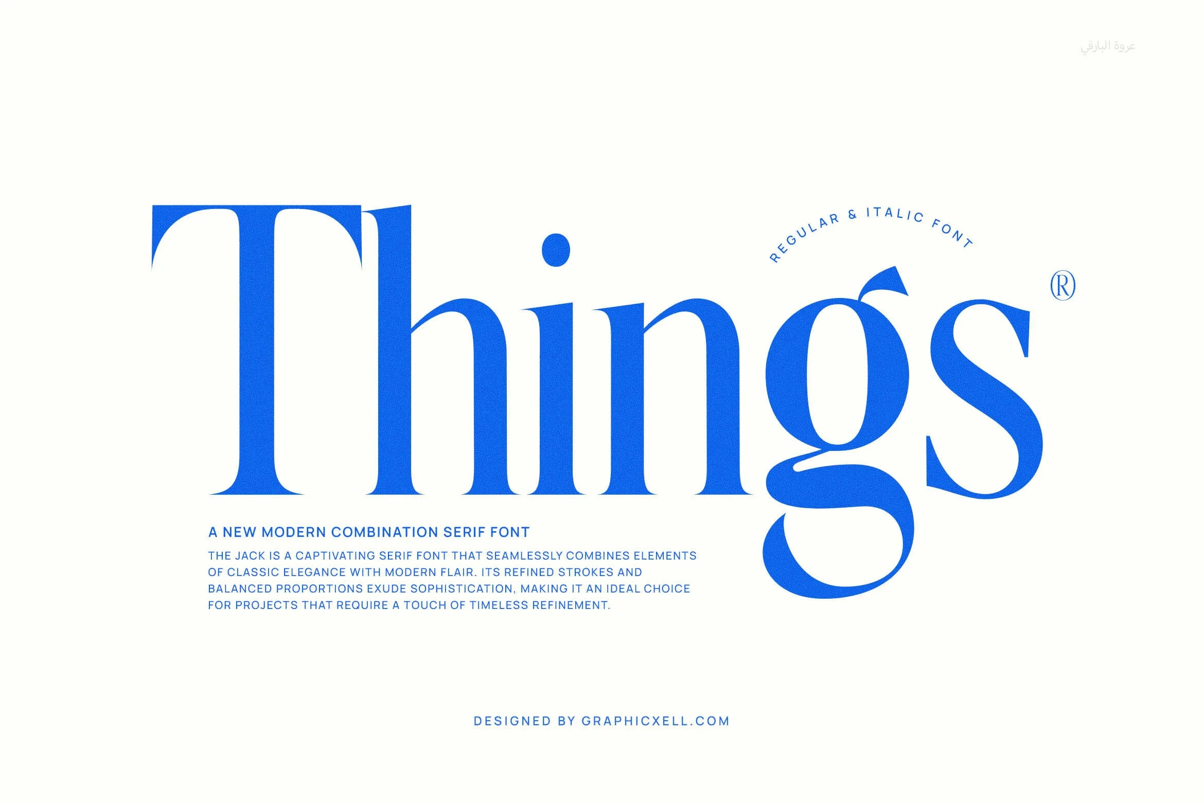
Best For: branding, high-end designs, display text, modern designs
Things Font has wide letterforms, a tall x-height, and pointed triangular serifs that create a substantial editorial silhouette. Roman and italic variants provide useful posture contrast for titles, while fine hairlines remain dependent on generous sizing.
How to Choose the Right Font
Choose condensed faces when space is narrow, wide styles when a title needs horizontal presence, and restrained serifs when readability should lead. For identity-led work, compare the actual joins, swashes, ligatures, and unusual terminals at final size. Across these Serif Aesthetic Fonts, generous scale remains the safest choice whenever contrast or flourishes become prominent.