14 Best Cursive Aesthetic Fonts in 2026
This collection moves from slanted, continuously joined lettering with long swashes to steadier upright forms with clearer rounded terminals. These Cursive Aesthetic Fonts suit logos, invitations, packaging, display headings, personal branding, and other short treatments where movement and visual personality matter more than paragraph-length readability.
Looking for more aesthetic fonts? Browse our complete Aesthetic Fonts collection to compare modern, elegant, bold, vintage, and retro aesthetic styles.
Cursive Aesthetic Fonts with Flourished Display Forms
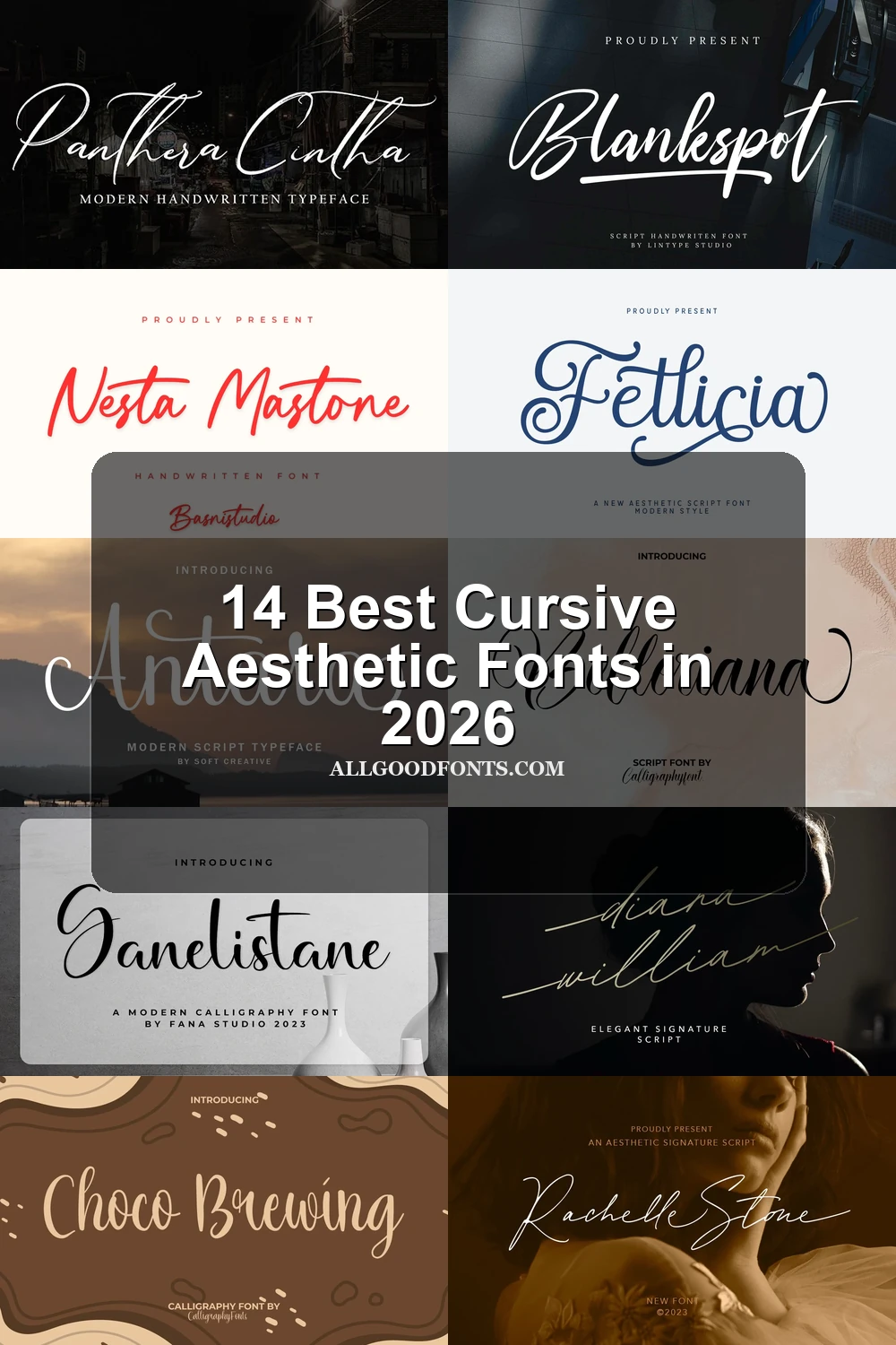
These Cursive Aesthetic Fonts use high contrast, looping flourishes, and expressive terminals to build recognizable display shapes. Compared with the other groups, they are the most decorative and most dependent on generous sizing.
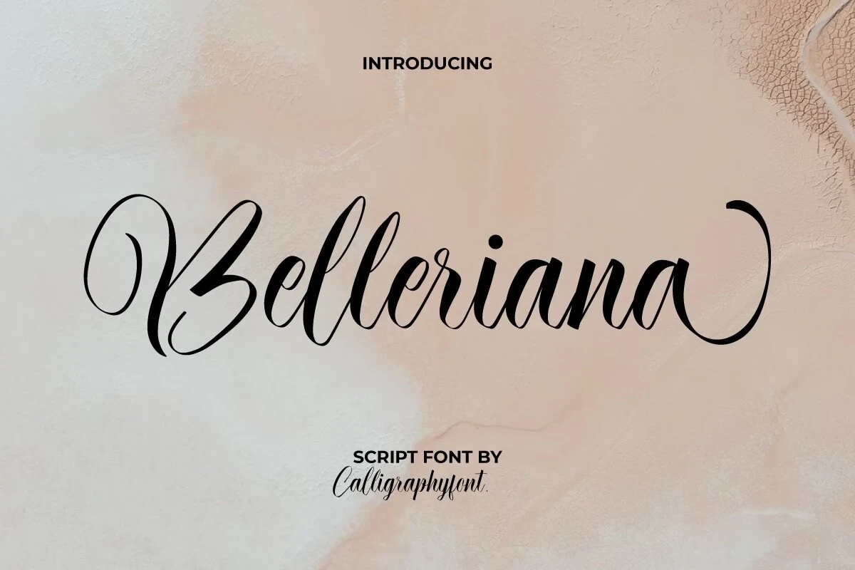
Belleriana Font
Best For: logos, invitations, product labels, website headers
Belleriana Font combines strong thick-thin contrast with looping swashes and a visibly varied cursive baseline. The shifting rhythm gives titles and labels a refined display presence, although its details can lose clarity below large sizes.
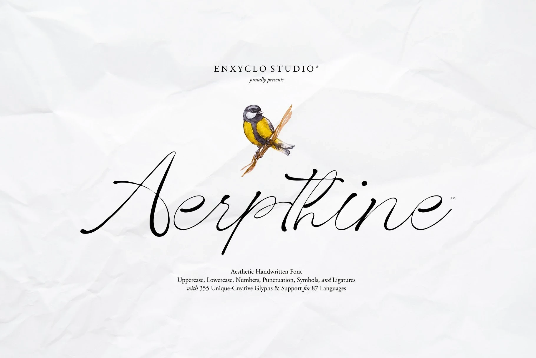
Aerpthine Font
Best For: elegant designs, decorative designs, clean designs
Aerpthine Font creates a sweeping formal effect through heavy calligraphic contrast, connected strokes, and rhythmic baseline curves. Its ligatures and PUA-encoded characters expand display options, while complex flourishes reserve it for titles and logotypes rather than body copy.
Luminary Font
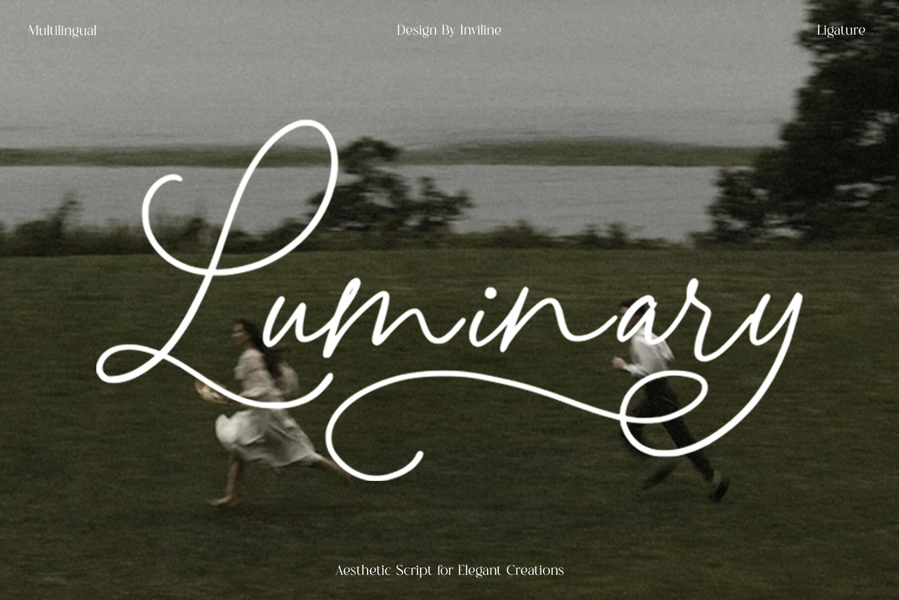
Best For: logos, branding, packaging, headlines
For branding and packaging, Luminary Font builds a distinctive frame with exaggerated swashes on the initial L and final y. High contrast, ligatures, alternates, and multilingual support broaden its toolkit, while thin details need large display scale.
The Dearling Font
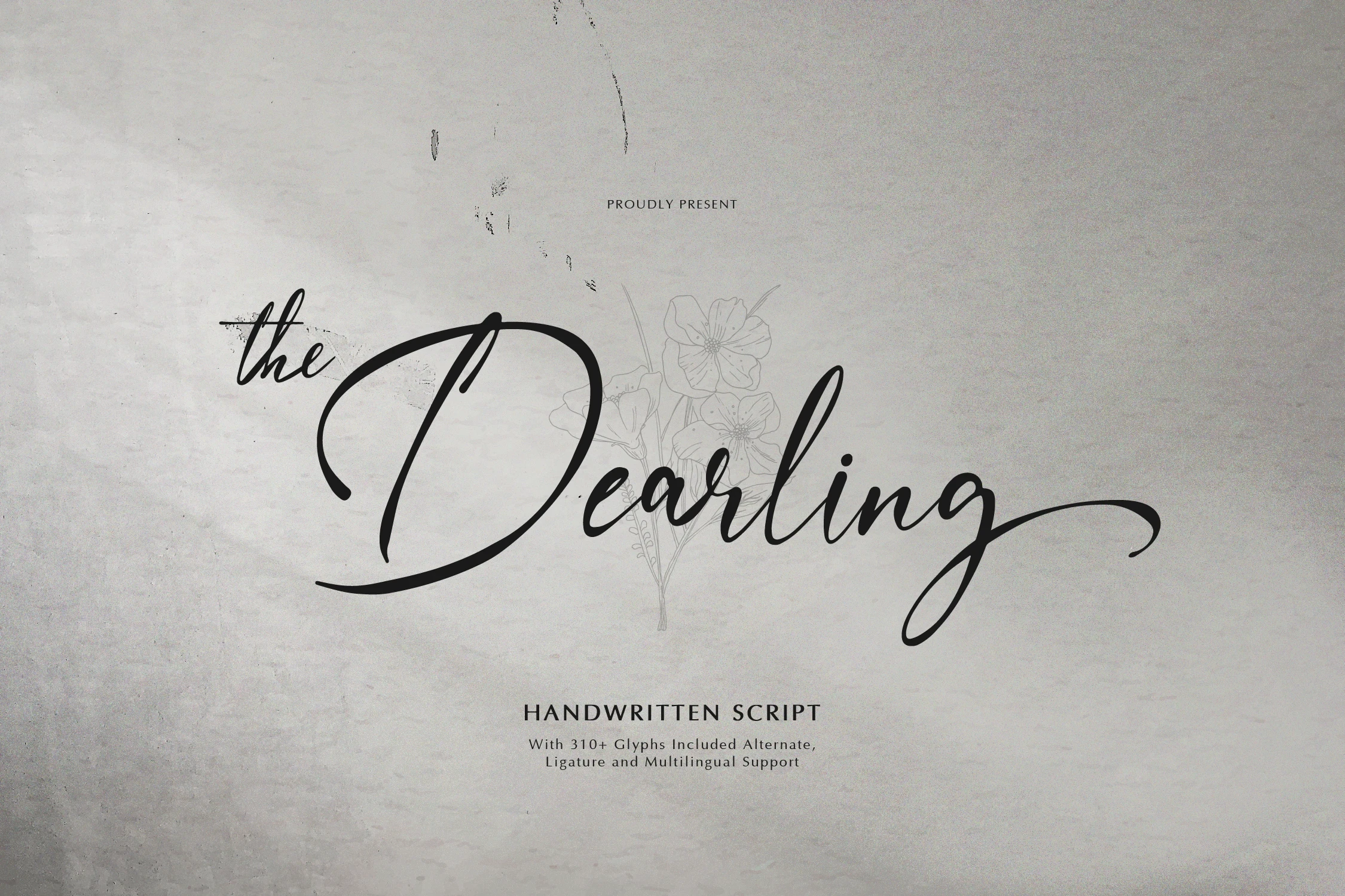
Best For: personal branding, branding, packaging, invitations
The Dearling Font pairs organic calligraphic construction with high contrast and sweeping flourishes at both ends. Ligatures, alternates, and multilingual support suit identity and packaging work, while its small-size definition falls away quickly.
Antara Font
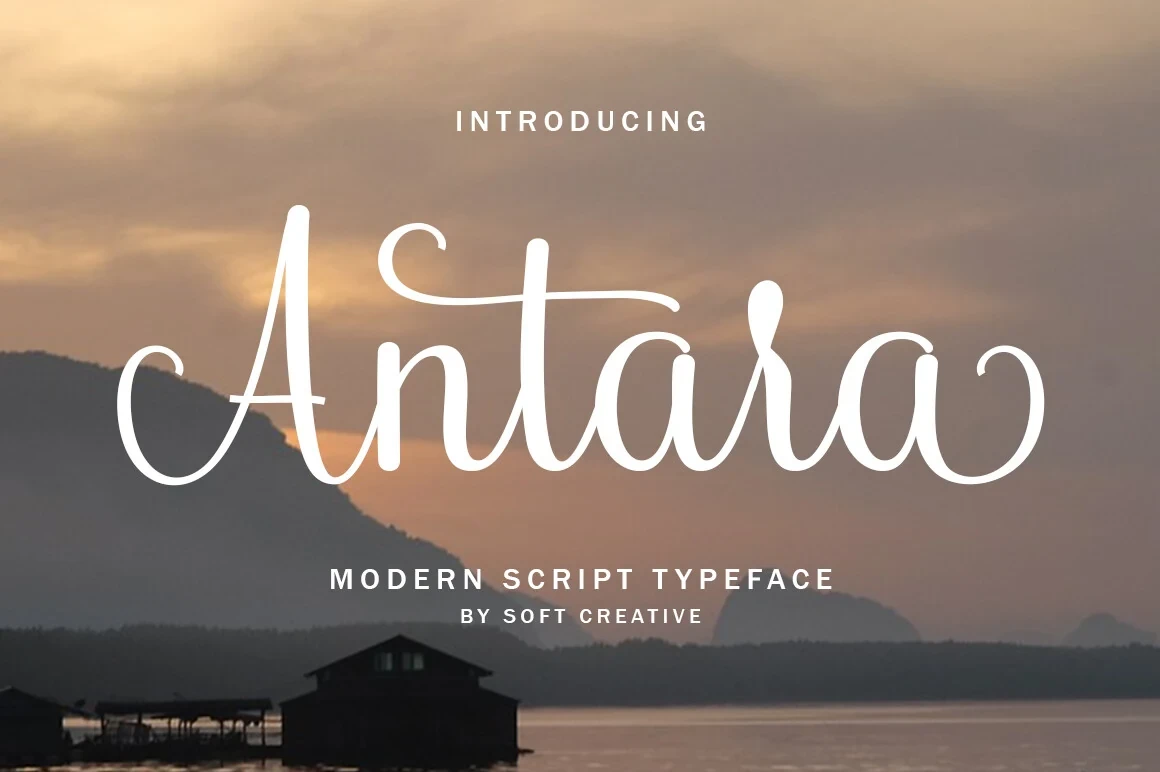
Best For: modern designs, clean designs, elegant designs, decorative designs
Antara Font gives near-vertical connected lettering a steadier decorative silhouette through ornamental terminal strokes. A subtle calligraphic slant keeps it from feeling rigid, but elaborate endings make it better suited to large wordmarks than compact text.
Fetlicia Font
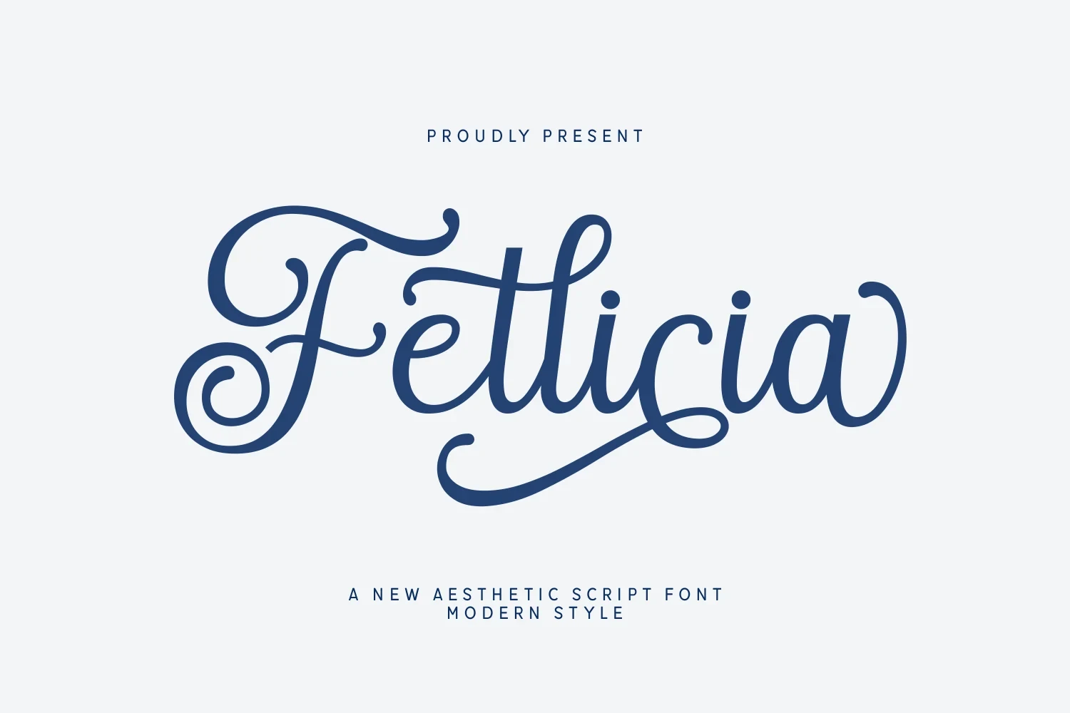
Best For: logos, branding, packaging, invitations
Fetlicia Font adds vertical movement through looping ascenders and descenders set against heavy, high-contrast connected forms. Its flourishes make logos, packaging, and invitations distinctive, although the ornament becomes difficult to manage at small sizes.
Slanted Flowing Cursive Styles
Strong rightward slant, connected monoline strokes, and extended entry or exit swashes give this group continuous forward movement. They feel more signature-like than the upright styles but remain size-dependent.
Rachelle Stone Font
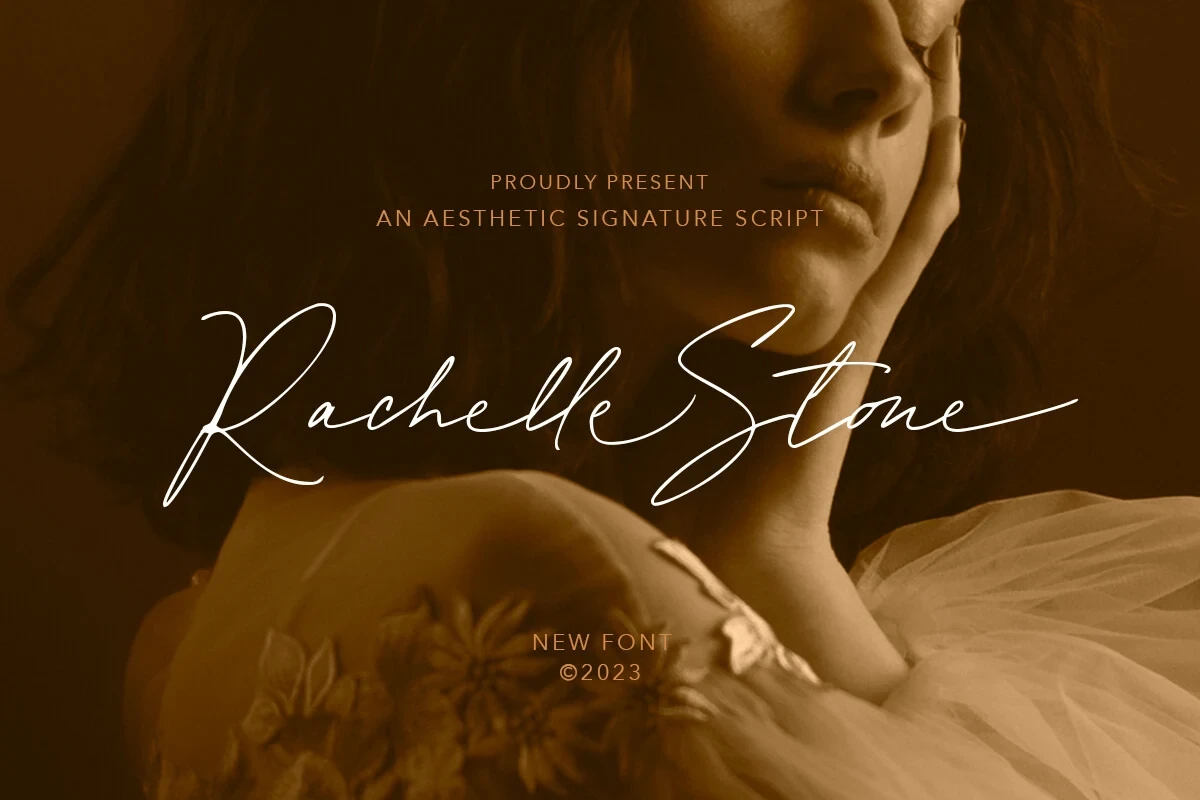
Best For: branding, logos
Rachelle Stone Font uses monoline connected lettering with a pronounced rightward gesture and extended entrance-and-exit swashes. Ligatures and alternates add branding flexibility, but its intricate joins need headline-sized treatment to stay distinct.
Rathilya Font
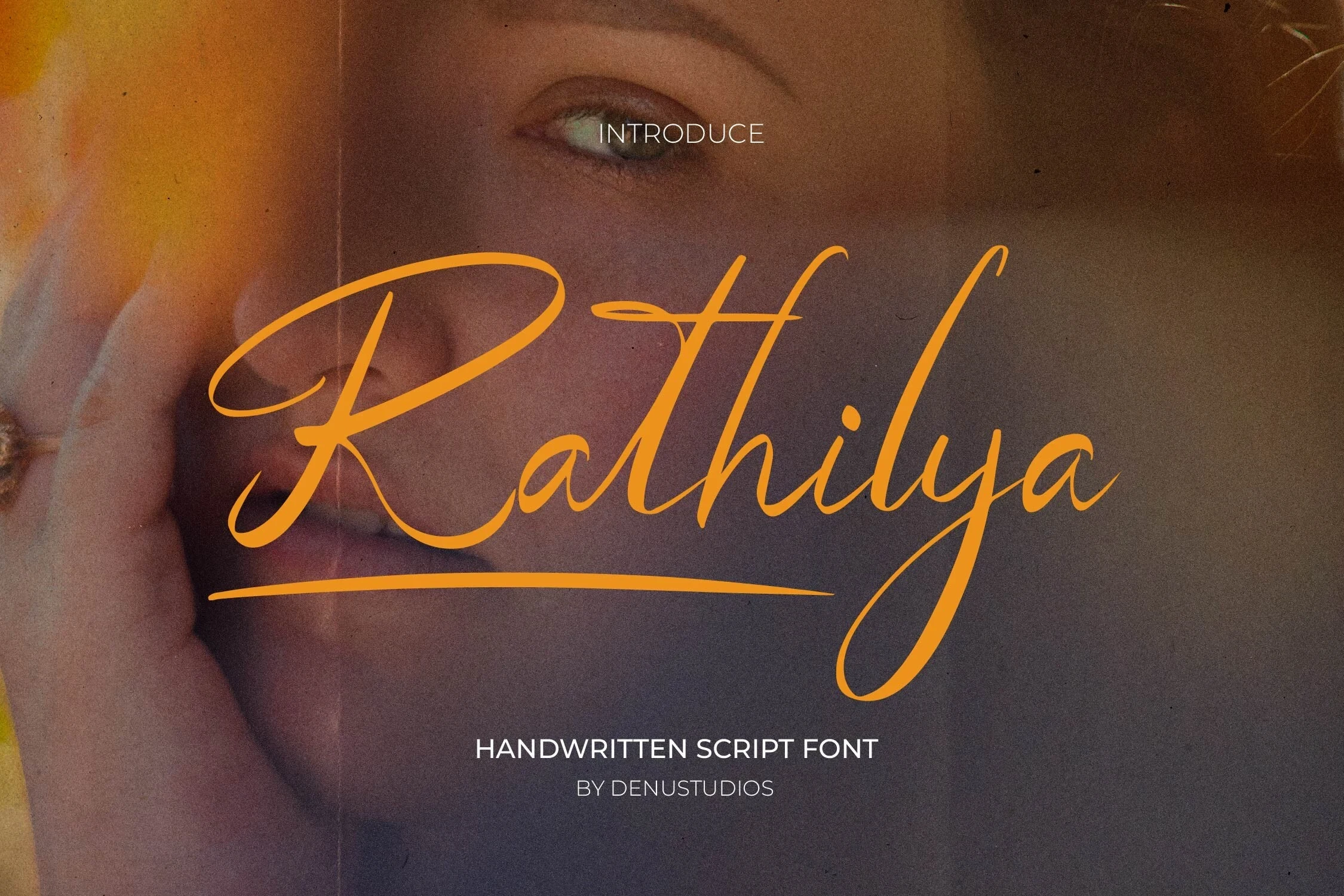
Best For: personal branding, decorative designs, elegant designs
For personal branding, Rathilya Font brings a strong rightward slant to monoline connected forms, creating a forward-moving gesture. Long initial and final swashes give decorative headlines presence, but the connected structure is not suited to compact text or very small applications.
Blankspot Font
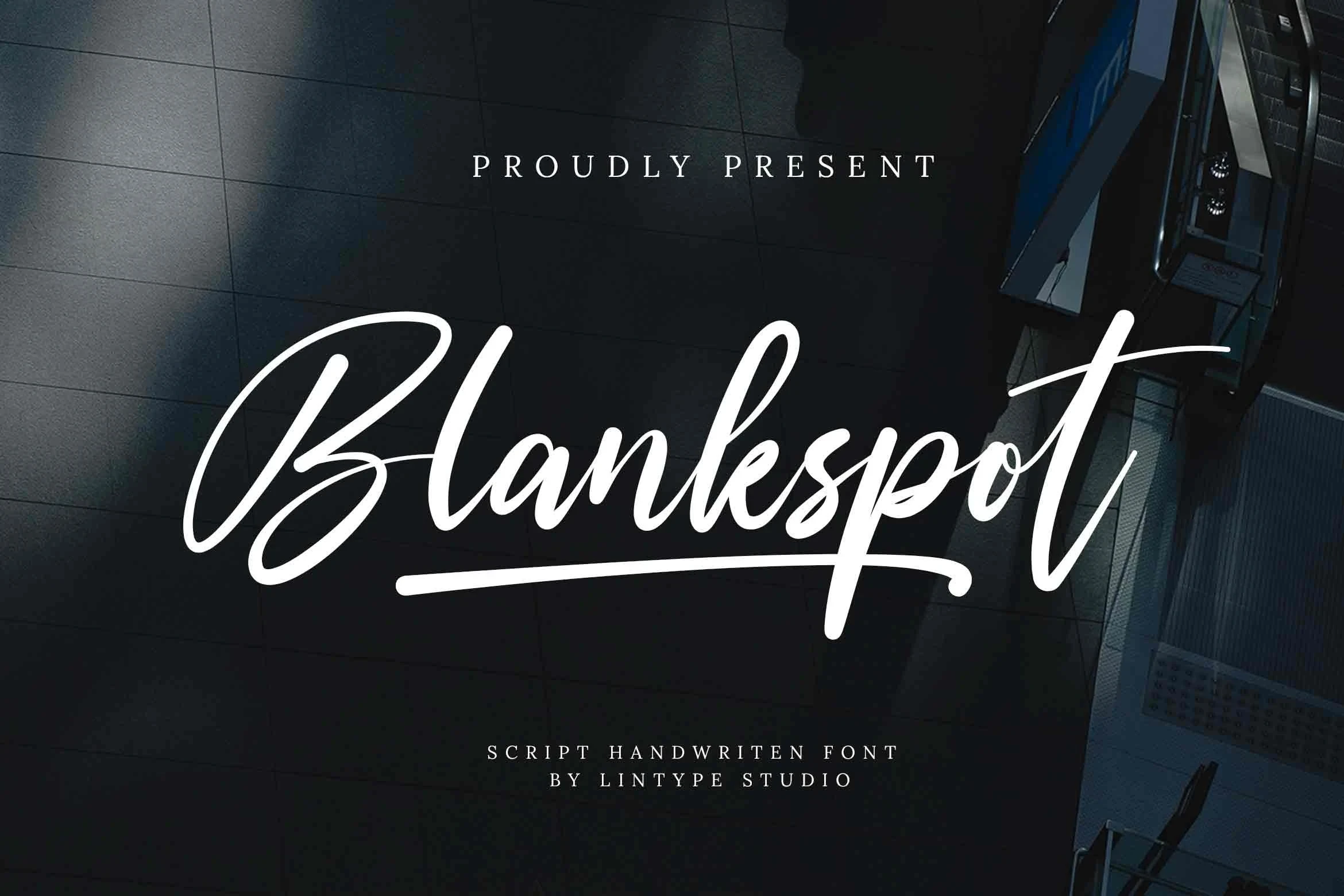
Best For: business cards, branding, display text, invitations
Blankspot Font gives connected handwriting a wider, more expansive shape through its broad structure, slight stroke variation, and rightward slant. The extended final swash suits cards and invitations, though the script remains clearest at display sizes.
Diana William Font
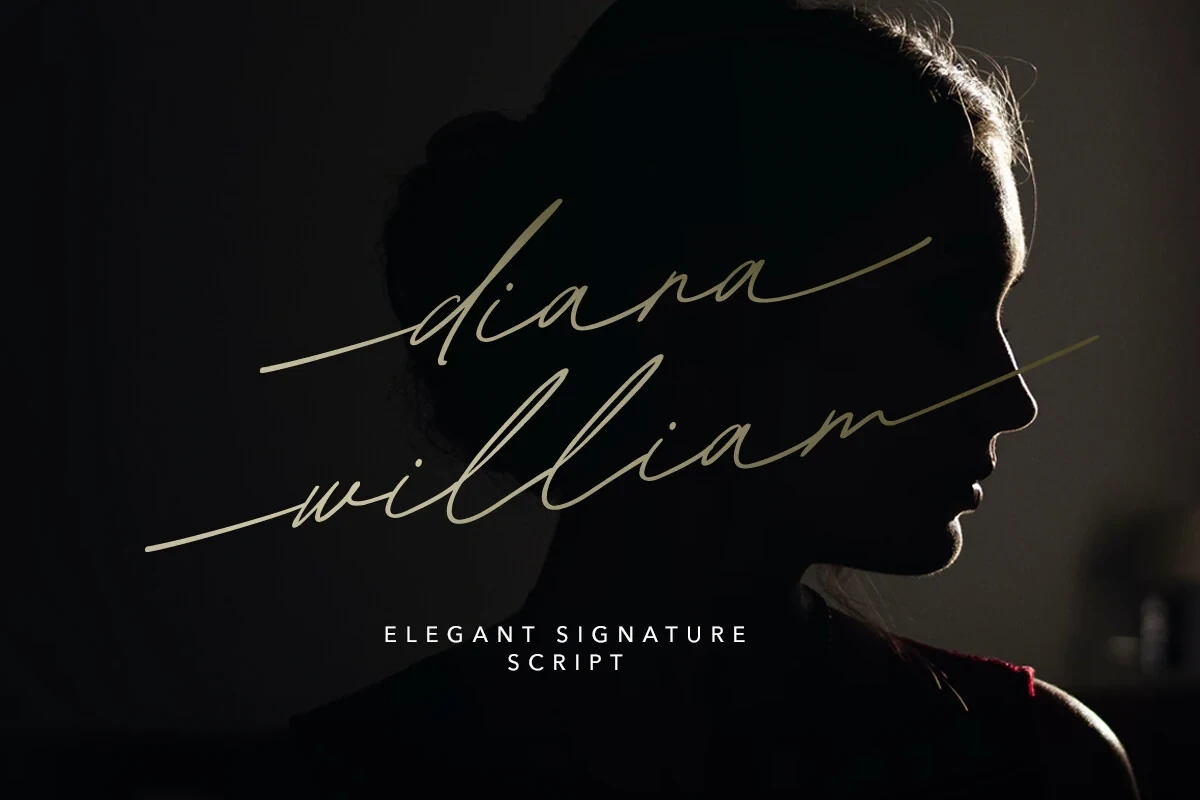
Best For: logos, branding, quotes, personal branding
Overlapping loops, long extensions, and a pronounced rightward slant define Diana William Font. Alternate characters help personalize logos and names, but the dense intersections make it unsuitable for small text or crowded wording.
Panthera Cintha Font
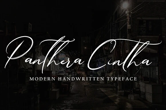
Best For: display text, modern designs, elegant designs
Panthera Cintha Font produces an expressive slanted silhouette with heavy connected strokes, high contrast, and elongated tails. Its strong swashes work especially well in branding headers, but connectivity and detail reduce readability in smaller treatments.
Upright and Approachable Cursive Styles
Near-vertical construction, rounded terminals, and restrained slant make these connected scripts the most approachable group. Their steadier silhouettes generally read more clearly than heavily flourished or sharply leaning alternatives.
Ganelistane Font
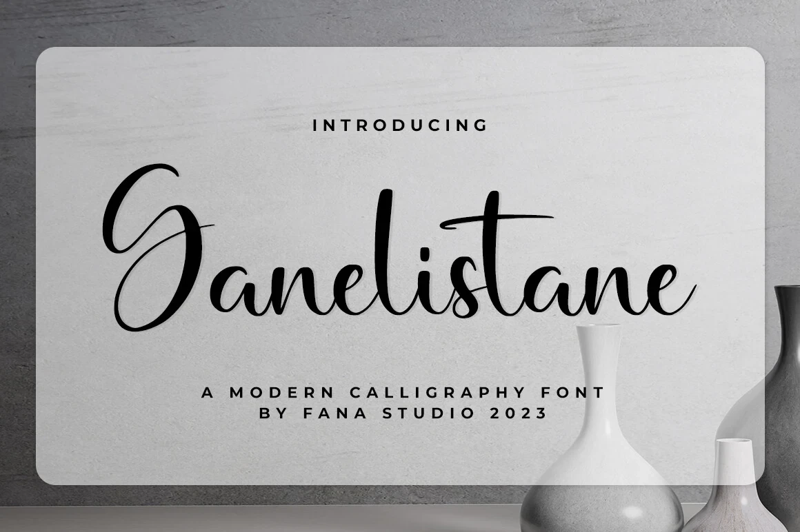
Best For: modern designs, minimal designs, clean designs, elegant designs
Ganelistane Font stands nearly upright, separating its connected calligraphy from more visibly leaning Cursive Aesthetic Fonts. Its wide format gives titles composed horizontal reach, though delicate hairlines require larger reproduction sizes for reliable reading.
Nesta Mastone Font
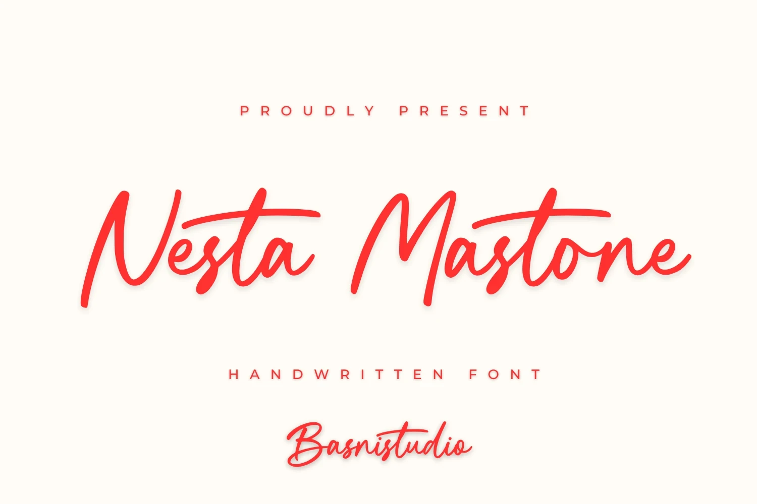
Best For: high-end designs, modern designs, clean designs
Nesta Mastone Font uses medium monoline construction, rounded terminals, and only a slight slant to create an approachable connected rhythm. It reads well at medium display sizes, but dense wording and small print can still become congested.
Choco Brewing Font
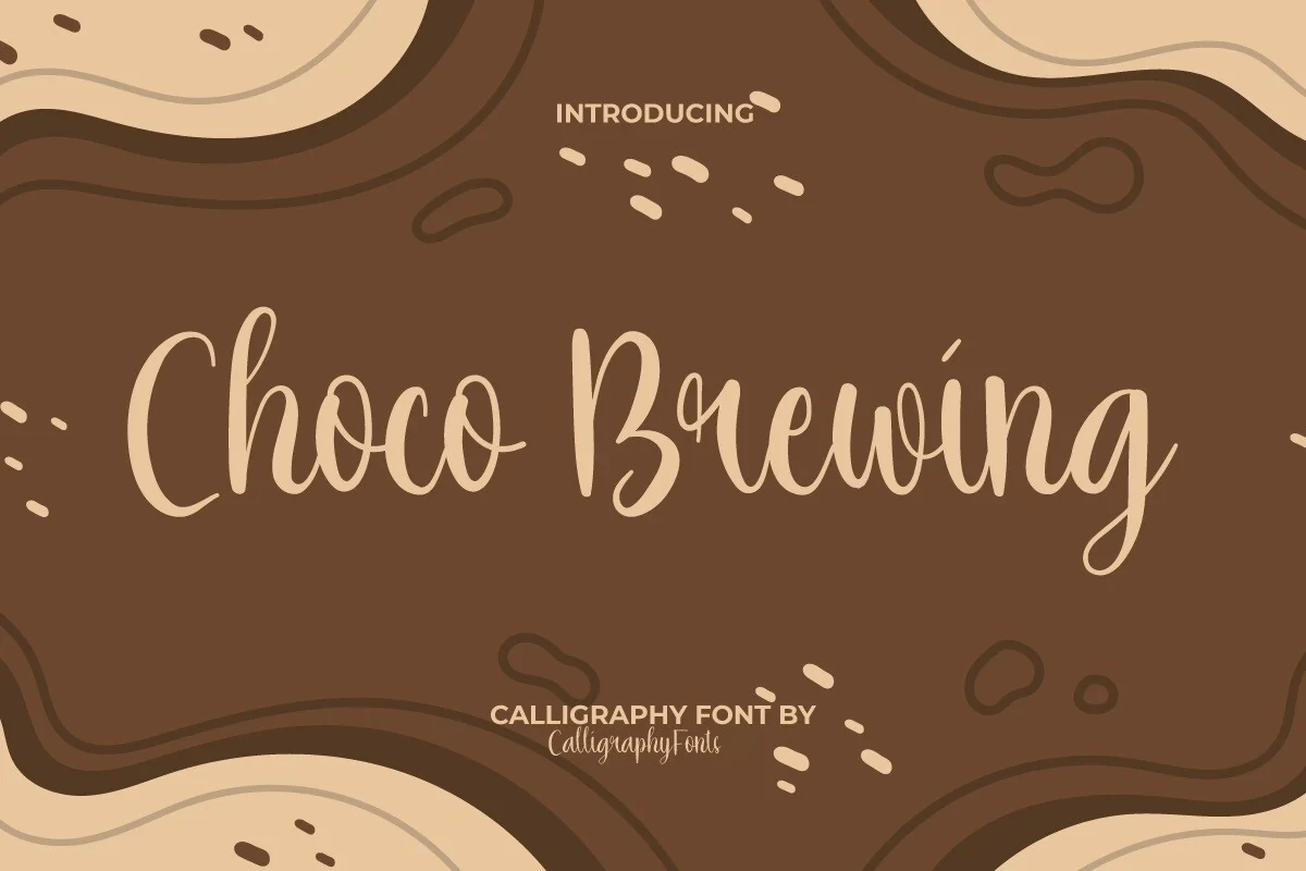
Best For: branding, display text, personal branding, beauty branding
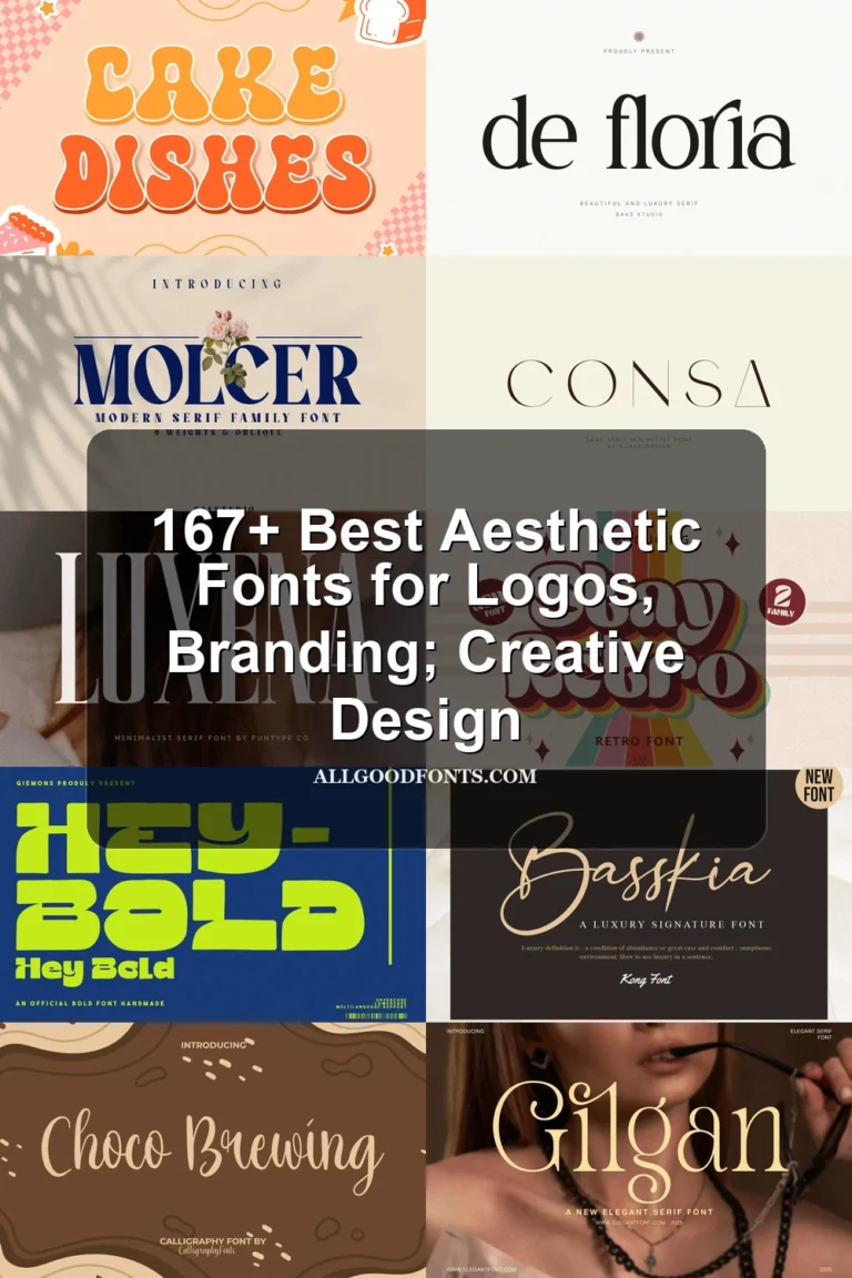
Choco Brewing Font offers the clearest flowing read in the set through upright connected lettering, consistent monoline weight, and rounded terminals. It suits display headings and approachable brand marks, while its connected rhythm still rules out long text.
How to Choose the Right Font
Choose by movement first: heavily slanted styles with long swashes make stronger logos and expressive headers, while upright monoline options provide a clearer read at medium display sizes. Check joins, hairlines, contrast, and flourishes at the intended scale, then reserve the most decorative Cursive Aesthetic Fonts for short wording rather than dense copy.