14 Best Bold Aesthetic Fonts in 2026
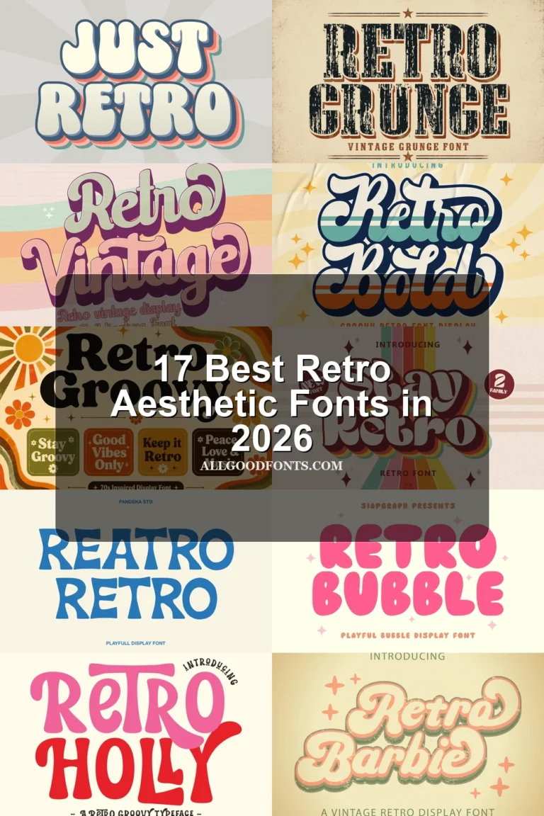
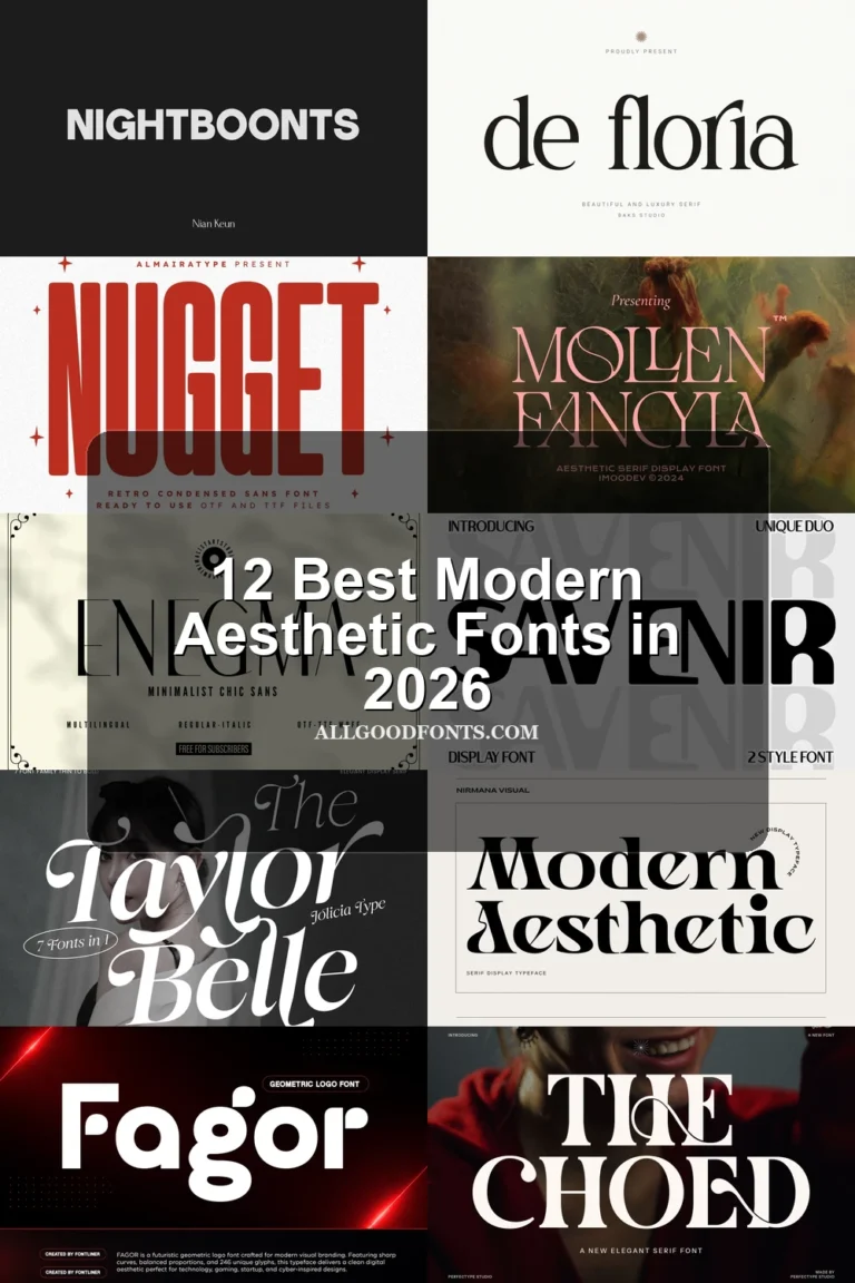
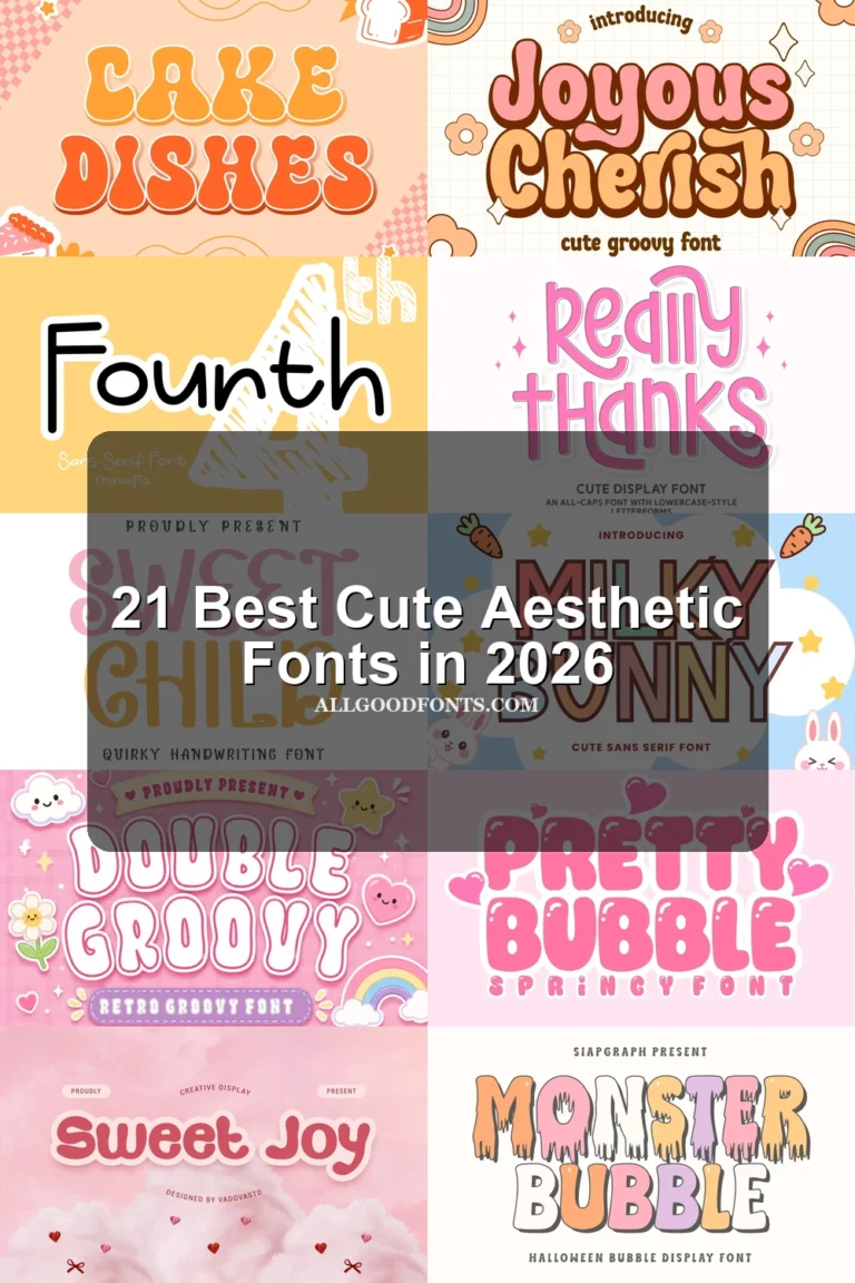
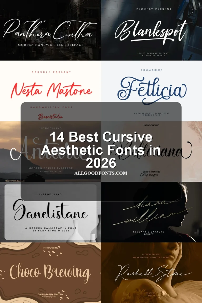
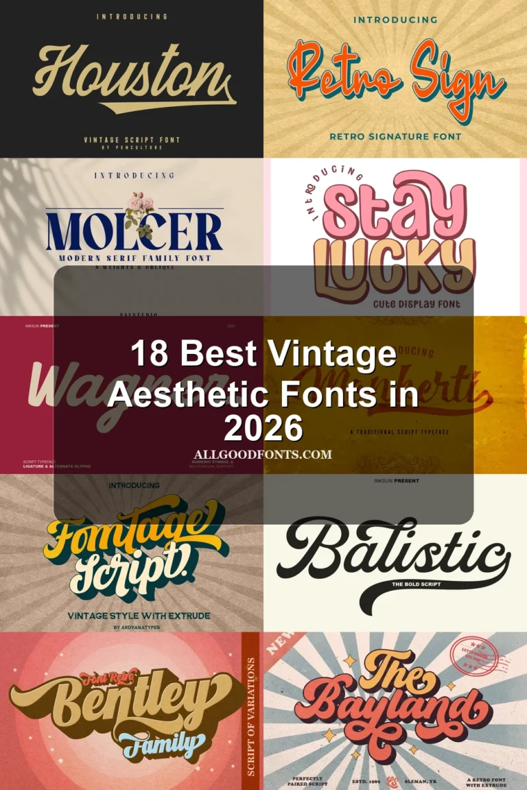
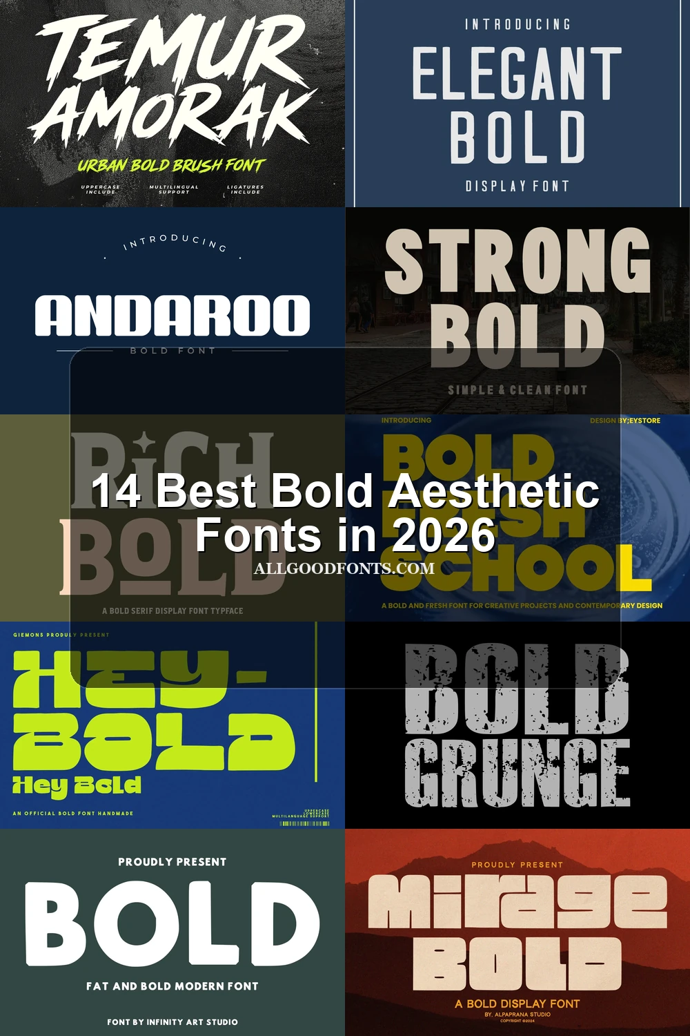
Bold Aesthetic Fonts range from rounded geometric blocks and condensed industrial forms to distressed slabs, brush lettering, and high-contrast serifs. Together, they serve headlines, logos, posters, packaging, apparel, social graphics, and other layouts where visible construction matters as much as readability.
Looking for more aesthetic fonts? Browse our complete Aesthetic Fonts collection to compare modern, elegant, bold, vintage, and retro aesthetic styles.
Bold Aesthetic Fonts: Geometric Block Styles
These Bold Aesthetic Fonts use heavy geometric structures, rounded or squared terminals, and compact counters. They feel more controlled and uniform than the textured or serif-led groups.
Hey Bold Font
Best For: headlines, social media graphics, display text
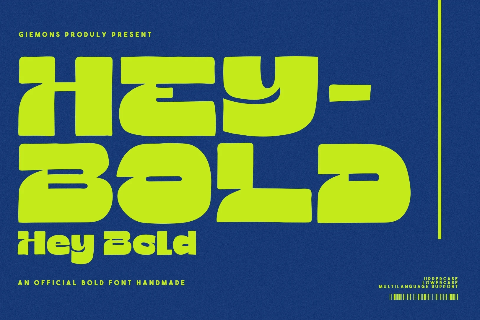
Hey Bold Font uses extreme weight, rounded corners, and large internal cutouts to create a playful mass that reads immediately in headlines. Its Bold Aesthetic Fonts character is clearest at large scale, while the complex cuts make small supporting text less dependable.
Modern Bold Font
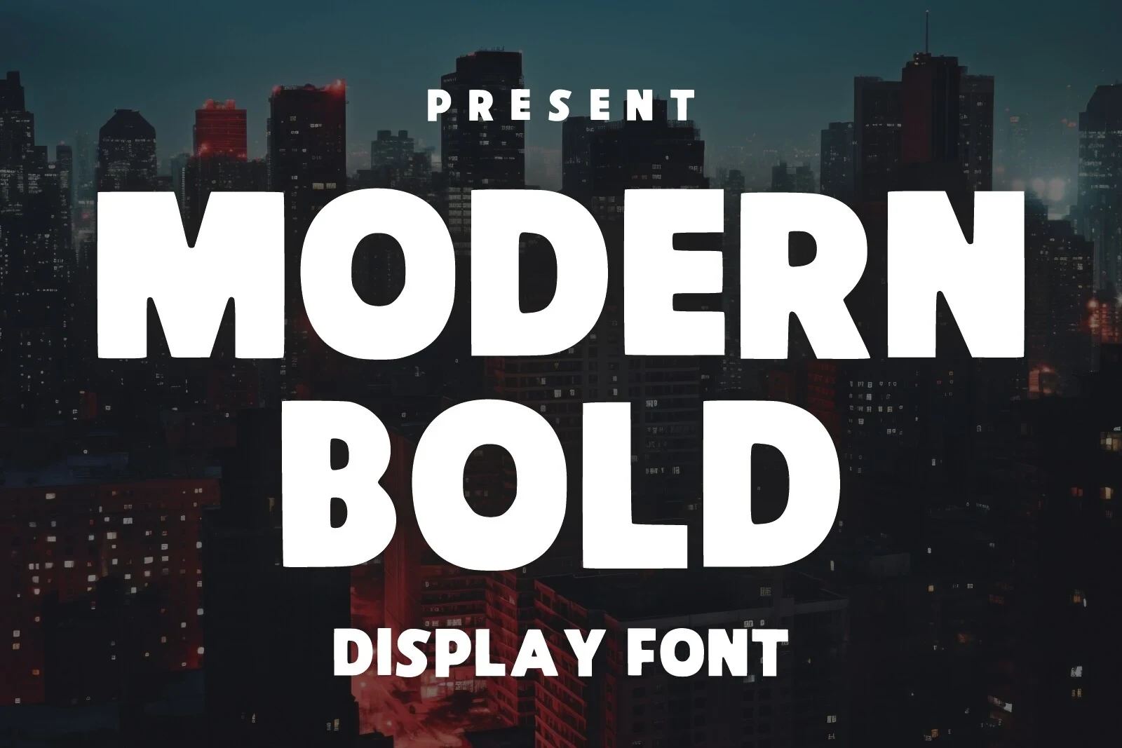
Best For: social media graphics, logos, posters
Modern Bold Font uses wide, soft-cornered block forms rather than sharply squared geometry. Its monolinear weight and open counters keep logos, posters, and social graphics readable, with the broadest visual presence appearing at large display sizes.
Be Bold Font
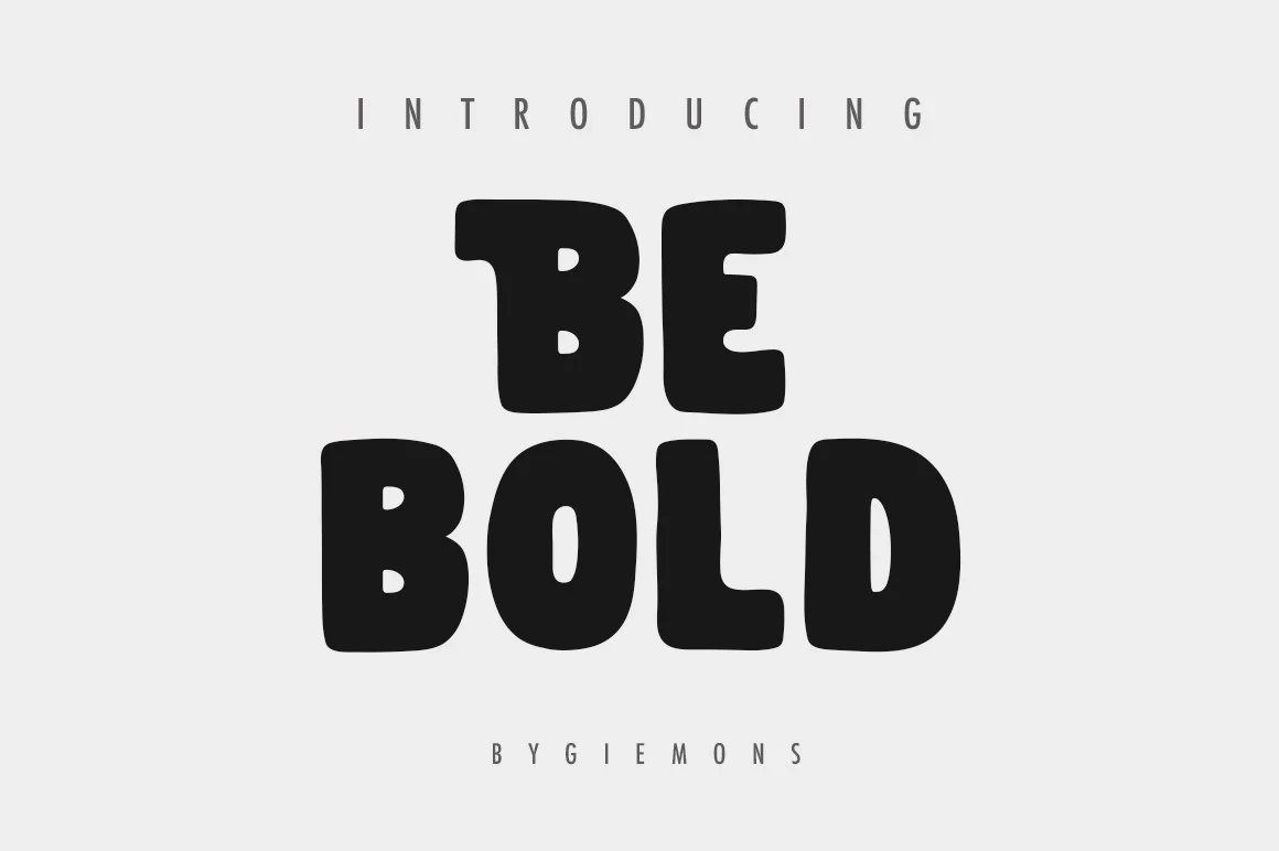
Best For: logos, posters, short phrases, website headers
Be Bold Font softens an ultra-heavy frame with bubble-like terminals, low contrast, and compressed spacing. The rounded rhythm suits short phrases and website headers, while the tight arrangement makes small body copy harder to separate.
Bold Font
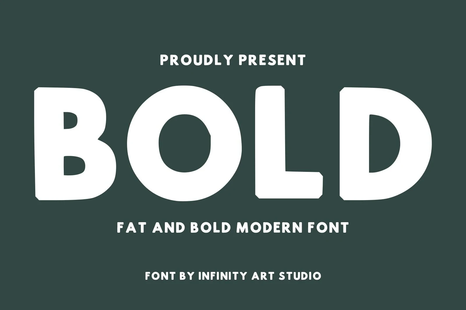
Best For: social media graphics, logos, branding, packaging
Bold Font relies on very heavy, wide geometry, rounded outer corners, and limited internal apertures. Its block construction gives logos, branding, packaging, and social graphics a decisive silhouette, but tight counters become congested as the type gets smaller.
Minimal Bold Font
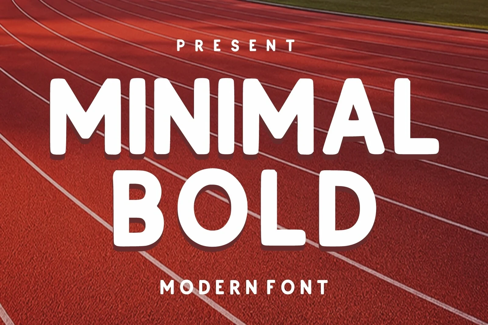
Best For: creative projects, display text, modern designs
Minimal Bold Font uses an upright, monolinear build with rounded terminals, giving its heavy geometry an informal and accessible character. The straightforward shapes remain readable in display work, though the spacing may feel cramped at very small sizes.
Strong Bold Font
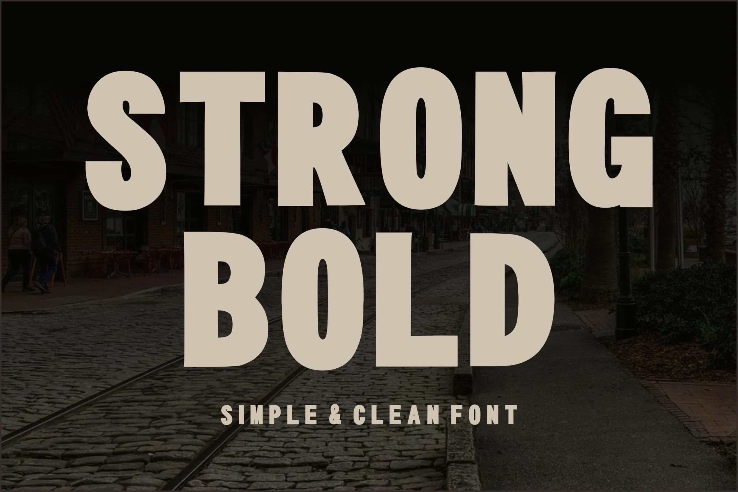
Best For: display text, modern designs, minimal designs
Strong Bold Font uses uniform heavy geometry, square terminals, and closed apertures to form a stable block. These Bold Aesthetic Fonts qualities keep large display text clear and direct, but the enclosed interiors can congest at small sizes.
Textured, Stenciled, and Brush Displays
This group makes texture and interruption part of the letterform, from stencil gaps and distressed interiors to dry-brush edges. Its expressive surfaces need more display space than the geometric styles.
Ridge 5 Bold Font
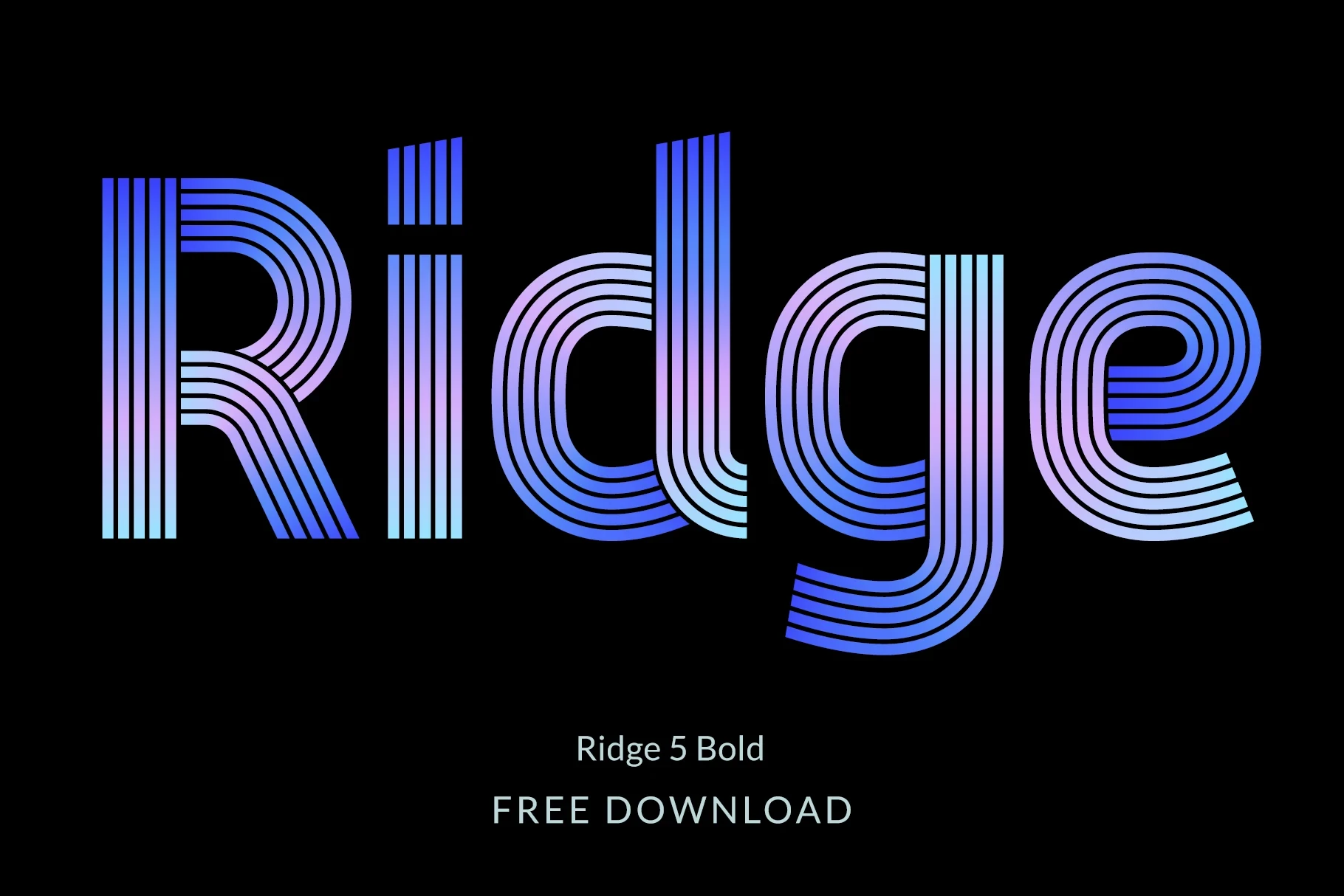
Best For: social media graphics, display text
Ridge 5 Bold Font builds its upright display presence from uniform, monolinear lines arranged in a multi-line geometric structure. Alternate characters provide extra options for display text and social media graphics, although its finer details can merge when reduced.
Mirage Bold Font
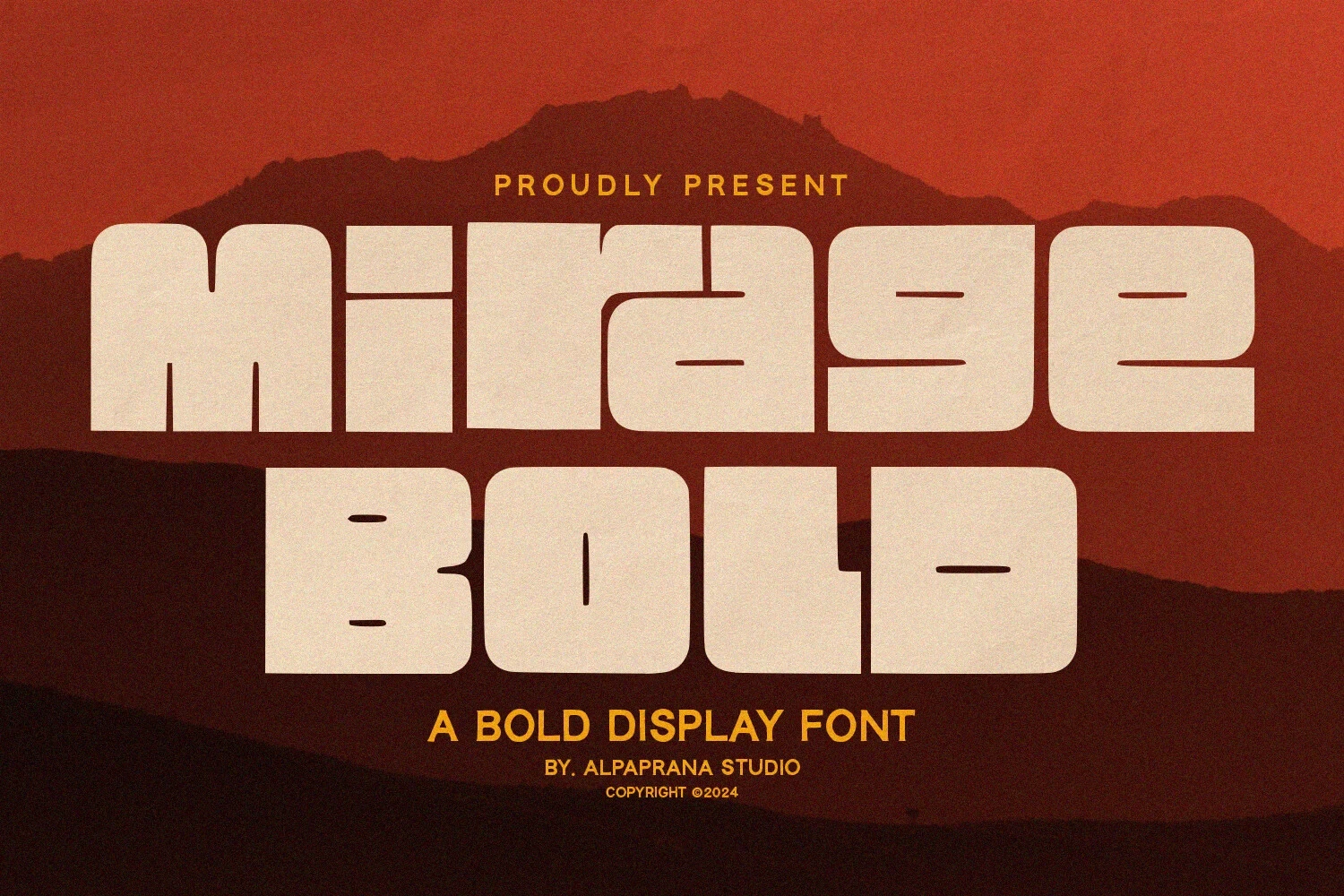
Best For: book covers, T-shirts, branding, packaging
Mirage Bold Font suits book covers, T-shirts, branding, and packaging through extended proportions, thick strokes, rounded rectangular corners, and horizontal stencil-like gaps. Those interruptions reinforce its broad, mechanically constructed look, but they can interrupt character recognition when the lettering is reduced.
Bold Grunge Font
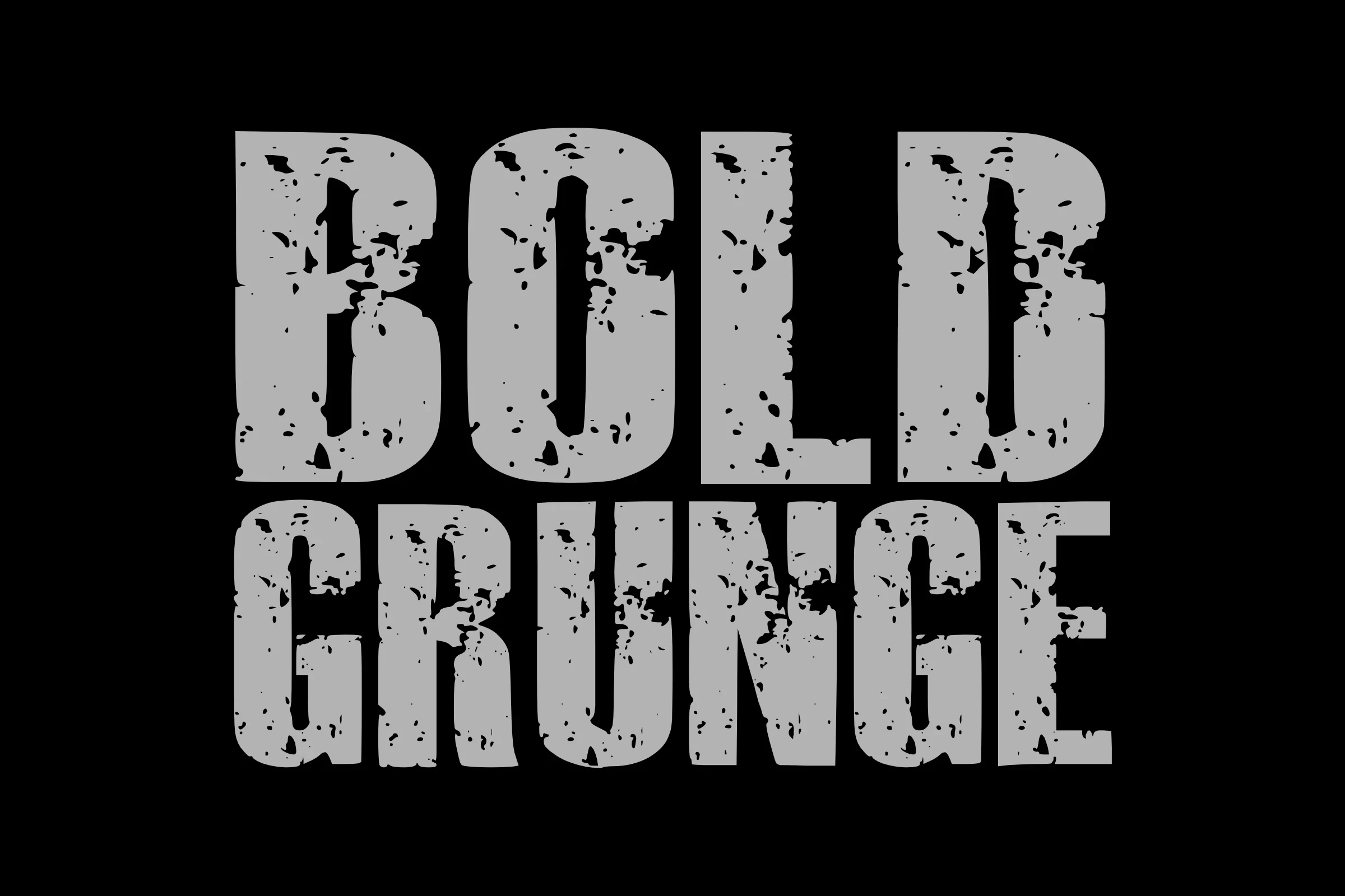
Best For: T-shirts, display text, bold designs
Bold Grunge Font combines a condensed slab-serif skeleton with weathered texture inside the letters. The distress communicates its rough, industrial mood most effectively in large display text; at smaller sizes, both the texture and the underlying shapes lose definition.
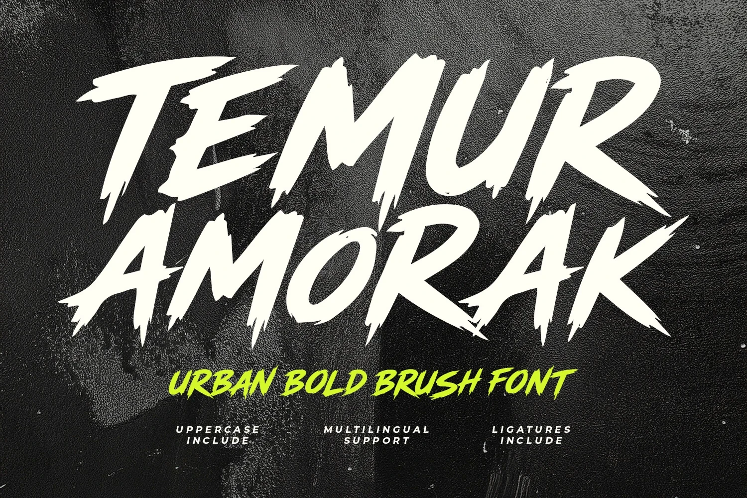
Temur Amorak Urban Bold Brush Font
Best For: branding, display text, bold designs
Temur Amorak Urban Bold Brush Font gets its energy from dry-brush edges, sharp disconnected terminals, irregular baselines, and a pronounced forward slant. Ligatures and multilingual support help branding applications, but jagged strokes limit reading comfort at small sizes.
Serif and Condensed Display Forms
Serifs, slab-like terminals, contrast, and condensed proportions define this group. Compared with the sans-serif blocks, these faces add structure and formality while remaining best suited to short display text.
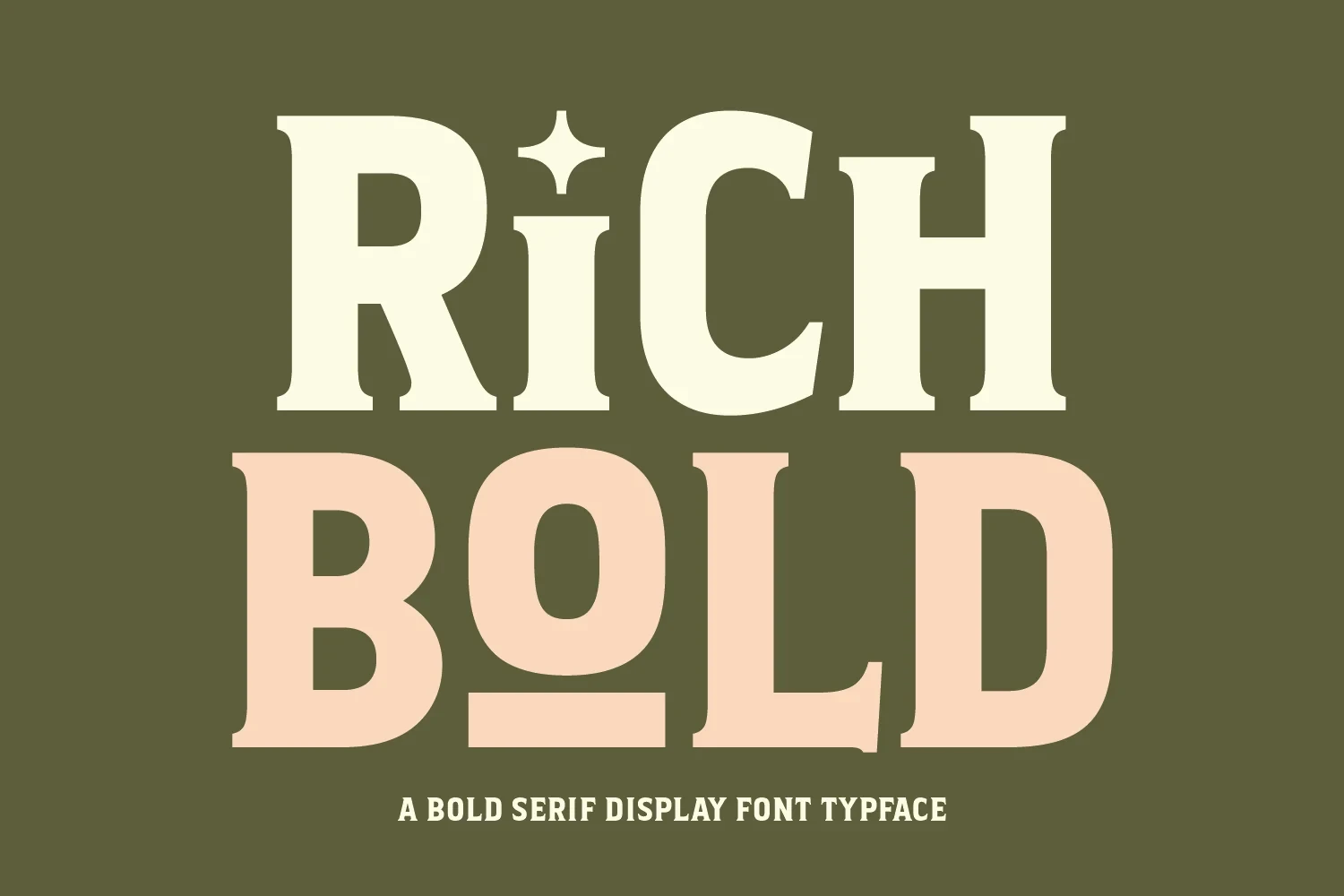
Rich Bold Font
Best For: fashion branding, branding, packaging, posters
Rich Bold Font brings bracketed serifs, high contrast, wide proportions, and flat horizontal terminals to fashion branding, packaging, and posters. Its Bold Aesthetic Fonts appeal comes from a formal monumental structure, but the broad heavy letters are unsuitable for dense text blocks.
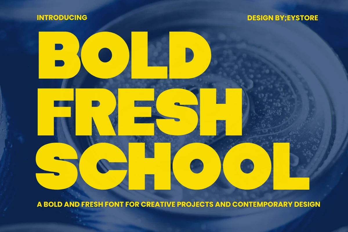
Bold Fresh School Font
Best For: T-shirts, logos, branding
Bold Fresh School Font compresses heavy geometric forms into a tight structure with little negative space. This makes short logo, apparel, and poster wording occupy less width, though its counters can close up quickly when the lettering is scaled down.
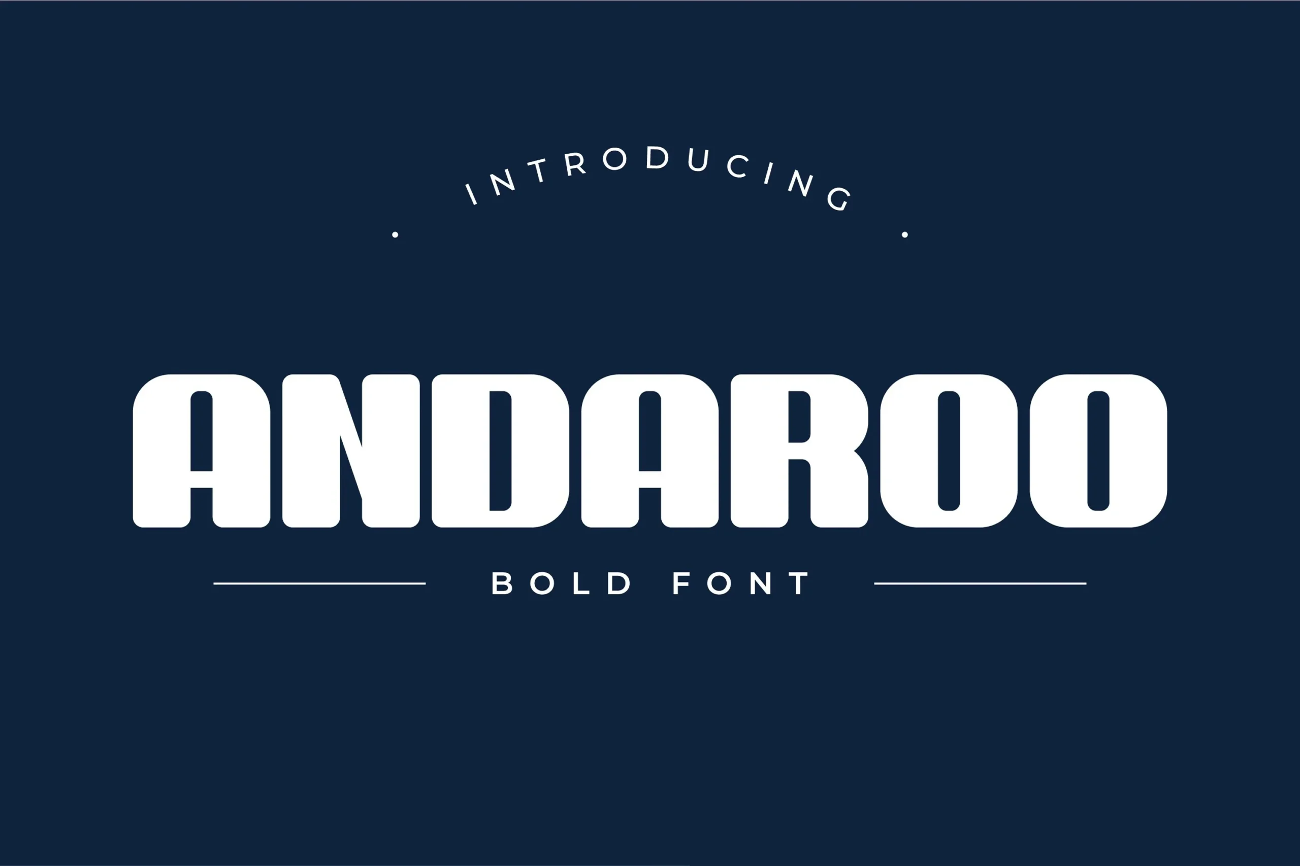
Andaroo Bold Font
Best For: social media graphics, display text, modern designs
Andaroo Bold Font combines slab-like horizontal terminals with softened corners and unusually expansive proportions. High-contrast thickness keeps large headlines readable and assertive for posters or branding, while its width makes it a poor choice for compact text settings.
Elegant Bold Font
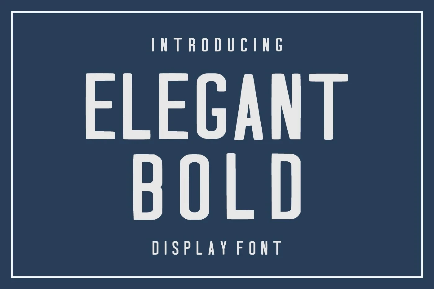
Best For: branding, headlines, display text
Elegant Bold Font is a condensed, upright sans serif with squared terminal corners and no stroke contrast. Its straightforward construction preserves headline clarity when a wide face would consume too much space, making it a practical choice for branding and display text.
How to Choose the Right Font
Choose among these Bold Aesthetic Fonts by matching construction to scale: open counters and rounded joins generally read more comfortably, while closed apertures, stencil gaps, distress, and brush edges need larger type. Use condensed faces when width is limited, serif contrast for formal display roles, and textured styles when surface character is central.