13 Best Elegant Aesthetic Fonts in 2026
This collection moves from sharp, high-contrast serifs and sweeping swashes to tactile textures, condensed proportions, and coordinated script pairings. These Elegant Aesthetic Fonts are best considered by visible construction, reading scale, and design role, whether you need a wordmark, packaging title, invitation, poster, or editorial heading.
Looking for more aesthetic fonts? Browse our complete Aesthetic Fonts collection to compare modern, elegant, bold, vintage, and retro aesthetic styles.
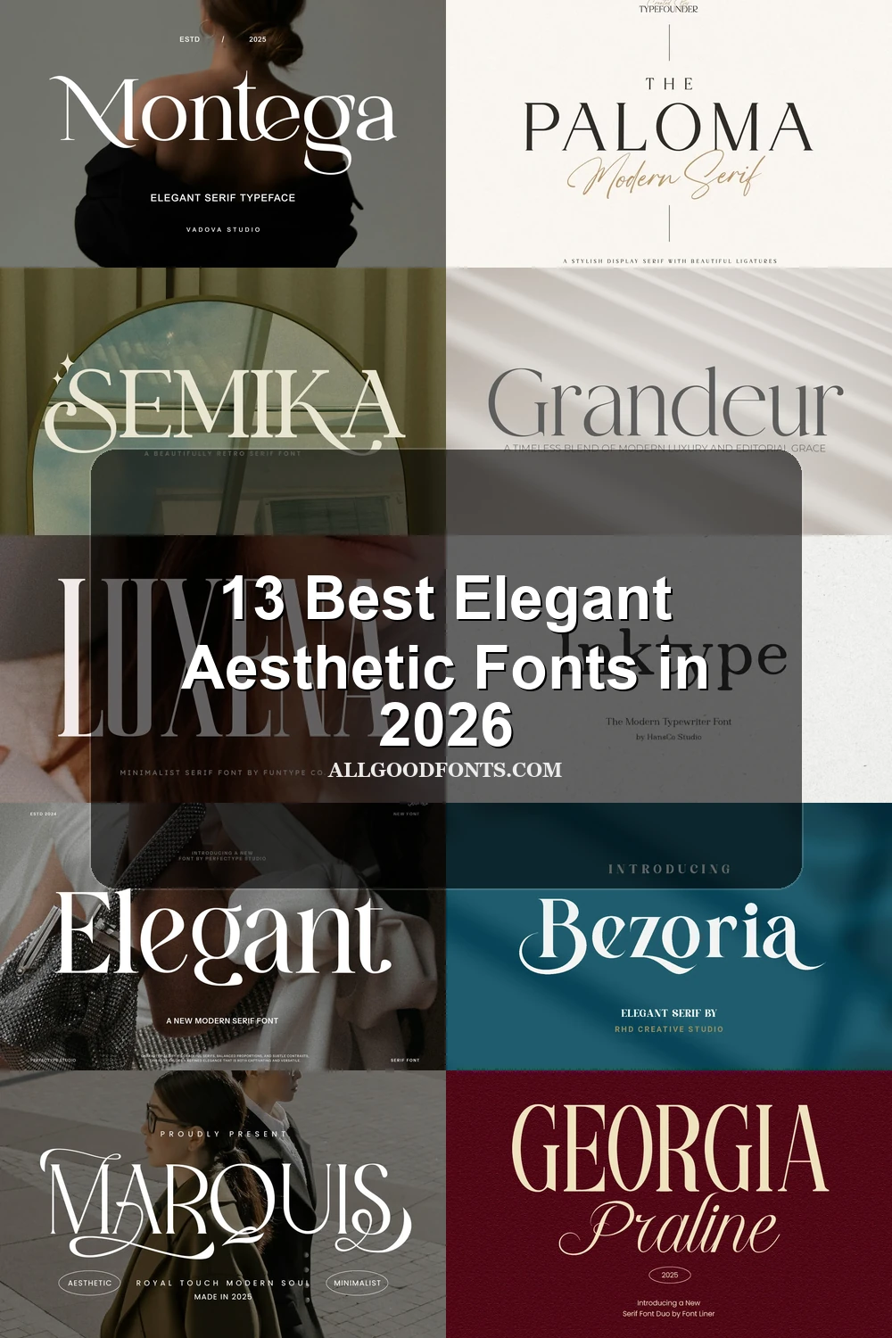
Elegant Aesthetic Fonts: High-Contrast Core
Elegant Aesthetic Fonts in this core group rely on upright, high-contrast serif structures, differing mainly through width, terminal shape, loops, and controlled flourishes.
Amsio Elegant Serif Font
Best For: logos, branding, packaging
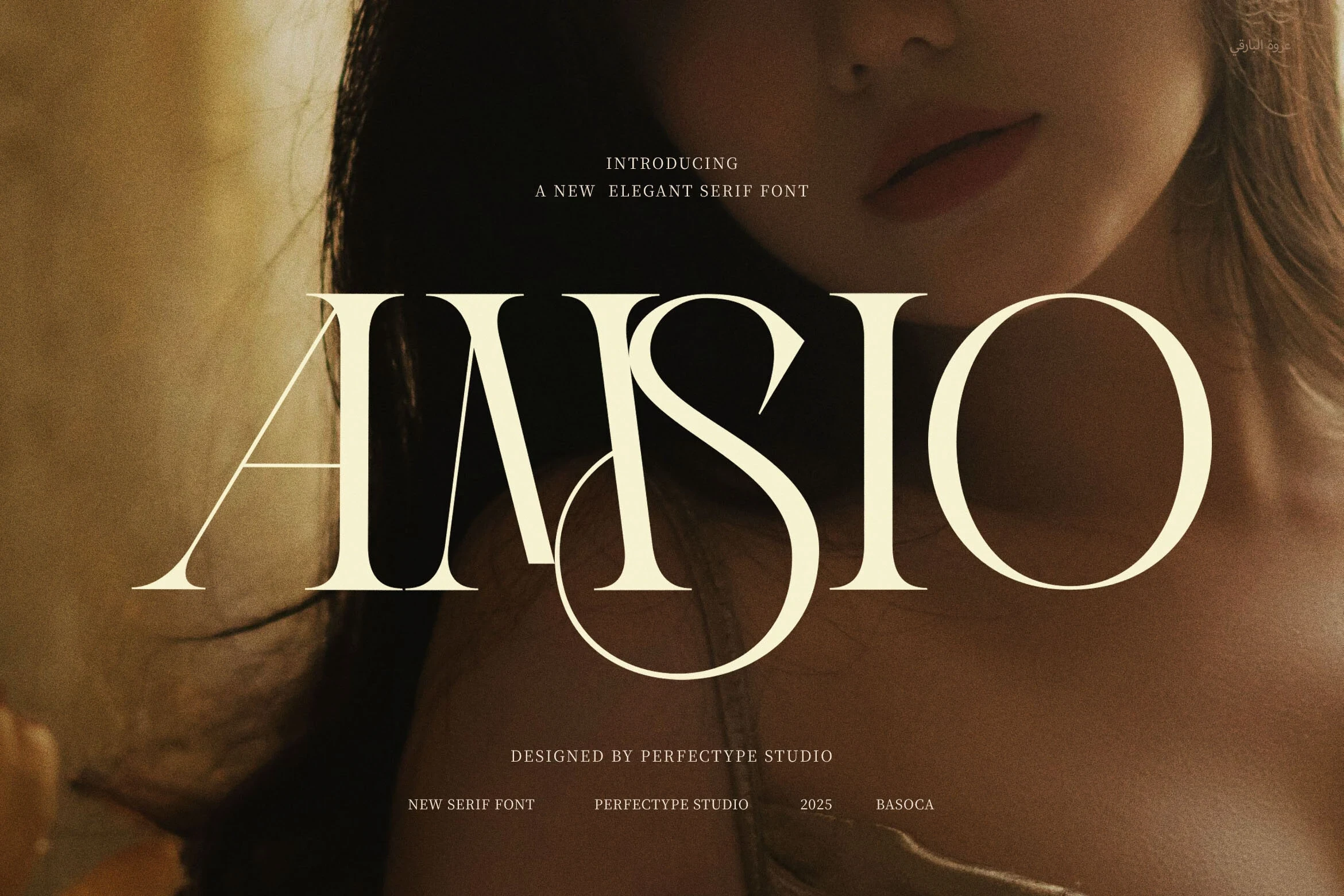
Amsio Elegant Serif Font builds its identity around a large circular S loop and extended A crossbars. Its heavy, high-contrast structure creates a strong wordmark silhouette for logos, packaging, and other headline-scale branding, though thin hairlines can weaken clarity in small copy.
Grandeur – Elegant Classic Serif Font
Best For: display text, clean designs, elegant designs
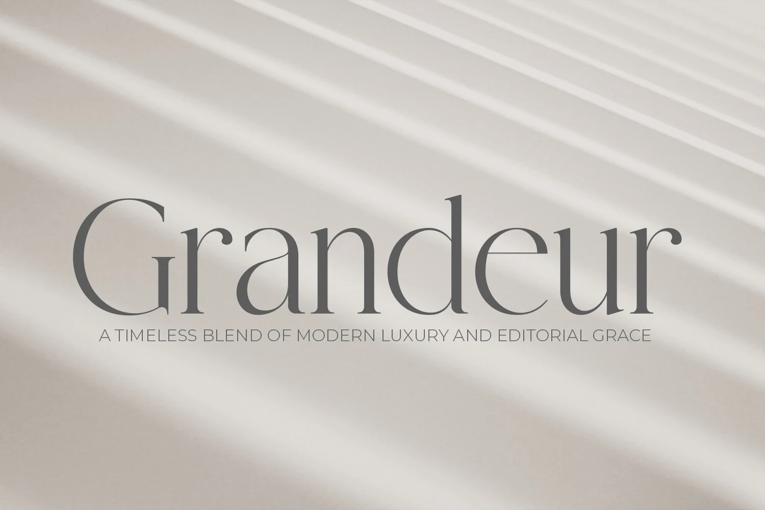
Grandeur – Elegant Classic Serif Font combines wide, upright proportions with sharp serifs, fluid curves, and pronounced thick-to-thin contrast. The spacious setting works well for editorial titles and clean layouts, but its fine strokes make it better for display text than sustained reading.
Elegant Font
Best For: branding, high-end designs, display text, wall art
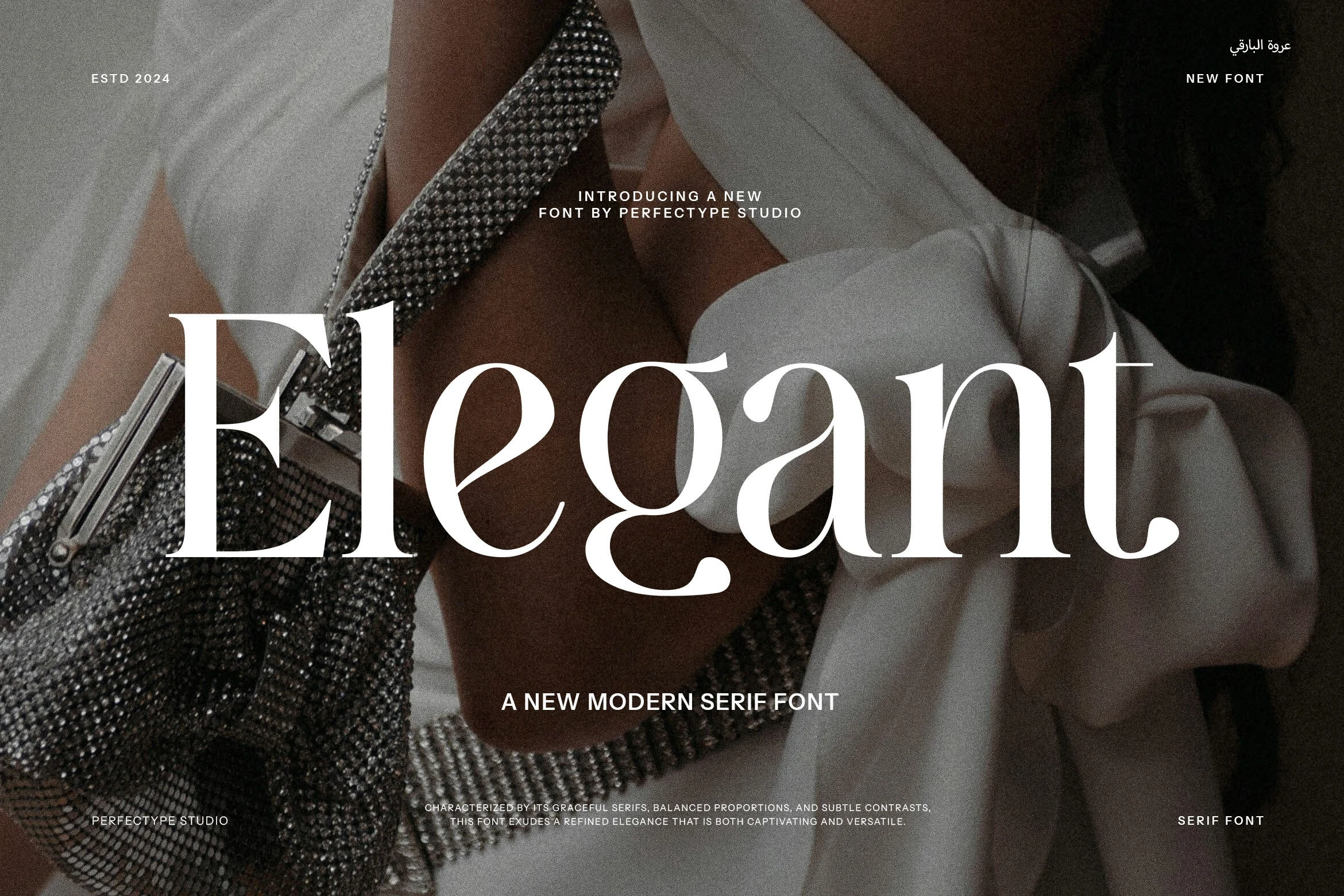
Elegant Font uses curved, ball-shaped terminals instead of the sharper ends found elsewhere in the group. Its upright ornamental serif reads clearly in large headings and wall art; PUA-encoded characters also make access to glyphs and swashes part of the setup.
Montega Font
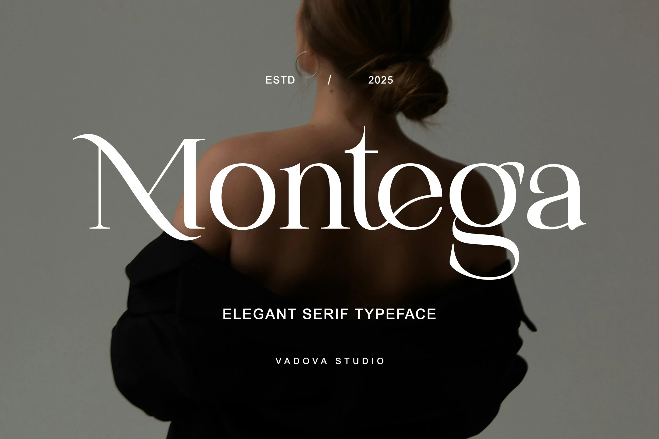
Best For: logos, branding, beauty branding, fashion branding
Montega Font is particularly suited to beauty and fashion branding, where extended swashes on the initial M and final a create a deliberate editorial signature. Its wide, high-contrast proportions command attention in logos, but delicate hairlines call for large applications.
Elegant Font
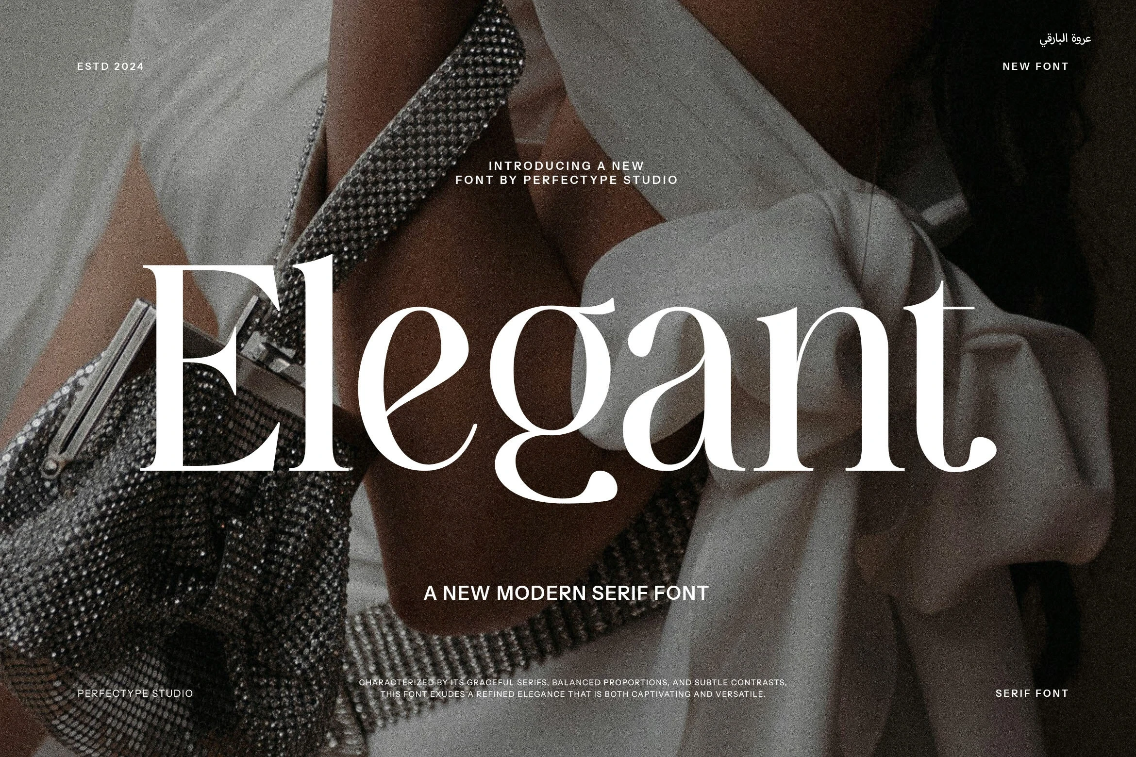
Best For: branding, headlines, high-end designs, display text
Elegant Font creates a formal display texture through bracketed and pointed serifs, a vertical axis, and curved flourishes on lowercase letters. It supports branded headlines and formal layouts effectively, though its thin hairlines may disappear in small print or informational copy.
Swashed Decorative Serifs
These decorative serifs make swashes part of the letter construction, creating more expressive silhouettes than the restrained core group while keeping a serif display framework.
Bezoria – Elegant Serif Font
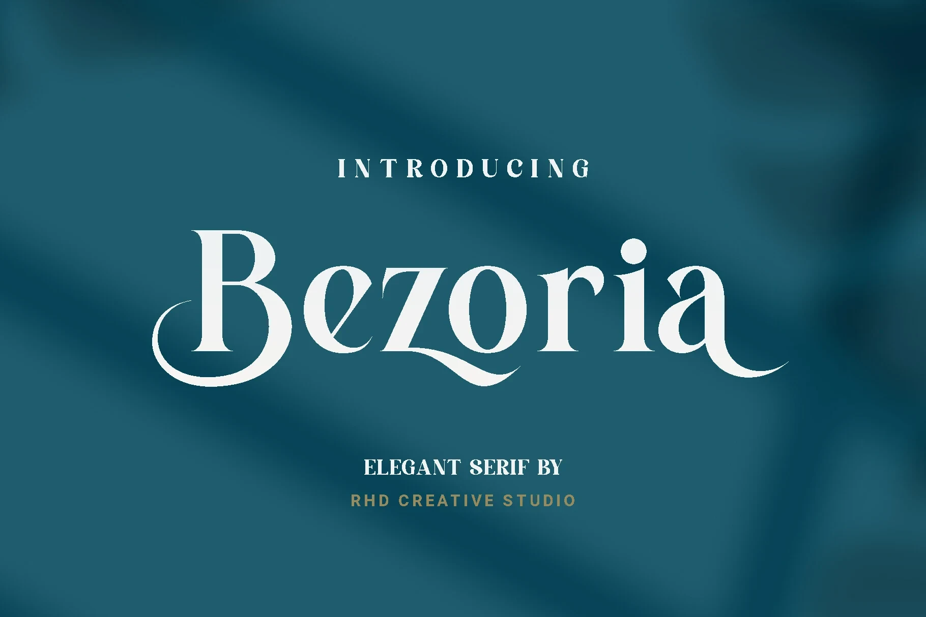
Best For: branding, high-end designs, logos, display text
Bezoria – Elegant Serif Font makes its decoration structural, with a sweeping baseline flourish on B and swash-like curves built into z and a. That gives short logos and titles a bespoke silhouette, while the high contrast and flourishes rule it out for extended reading.
Semika Font
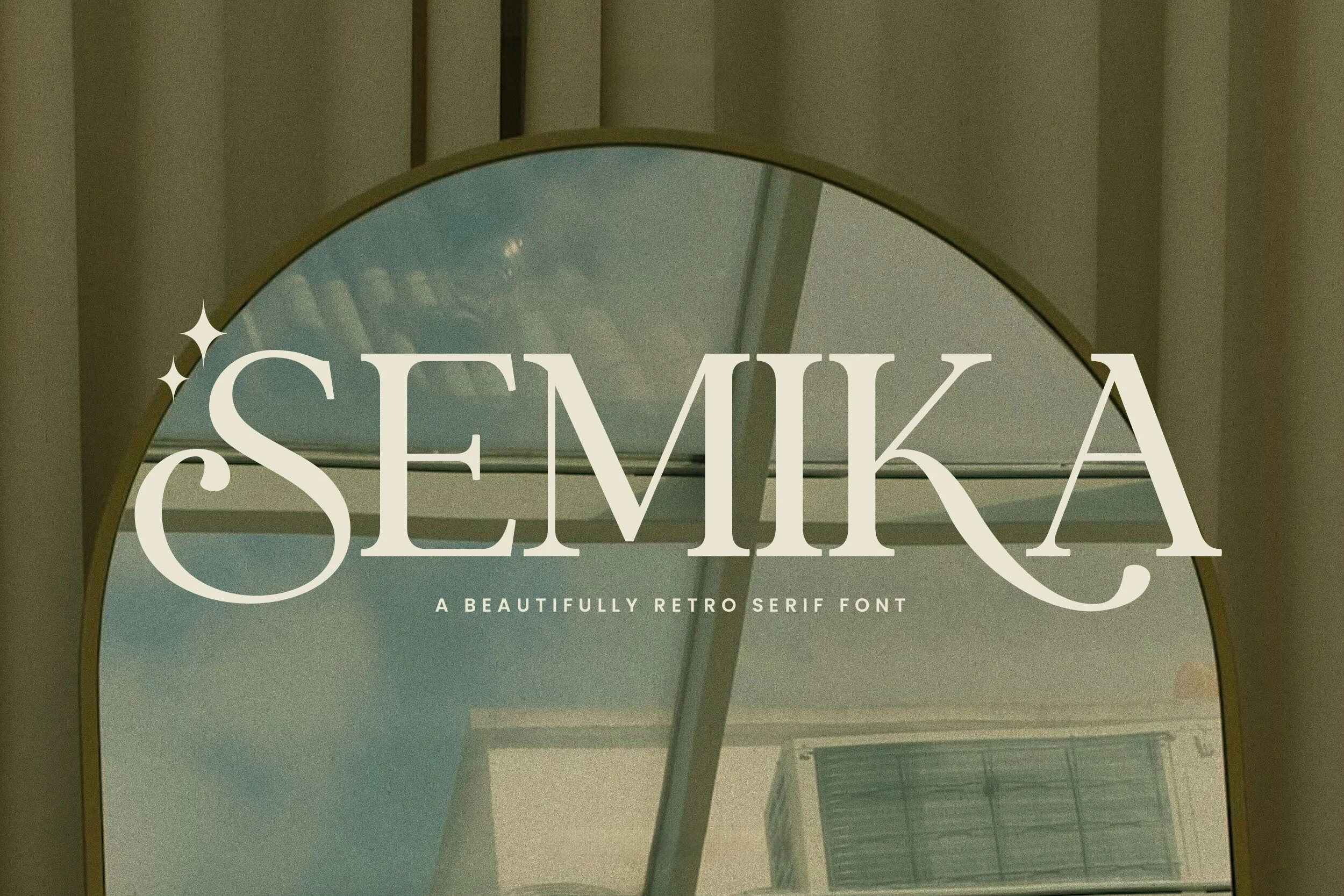
Best For: logos, packaging, high-end designs, display text
Semika Font combines bracketed serifs and vertical stress with pronounced S and A swashes. Its calligraphic details bring period character to packaging and logo work, but delicate thin strokes mean it performs most reliably in large display applications rather than small text.
Marquis – Elegant Modern Serif Font
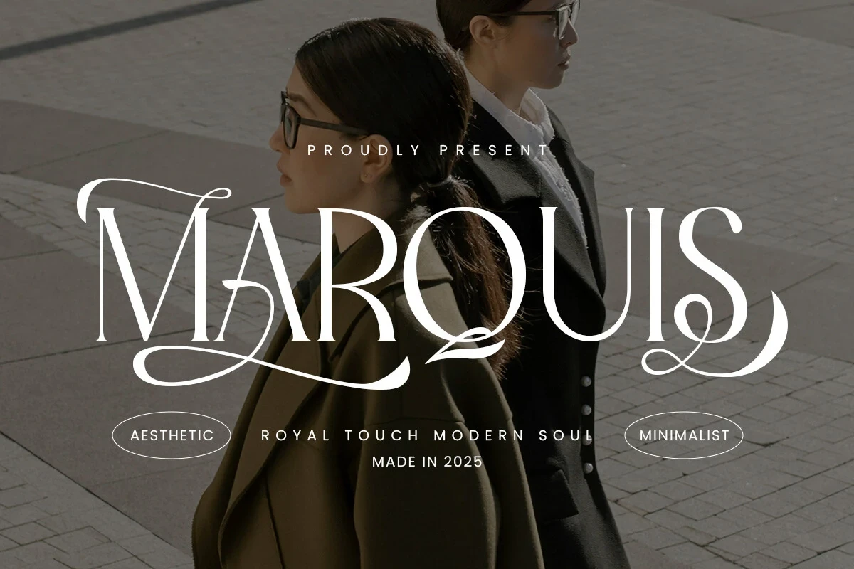
Best For: display text, modern designs, minimal designs
Marquis – Elegant Modern Serif Font offers a varied decorative vocabulary: sharp and ball-like terminals, calligraphic tension, and flowing baseline swashes. Its ligatures can help shape a polished brand lockup, though the intricate connections reduce clarity when scaled down and favor short headlines.
Wolles Elegant Modern Serif Font
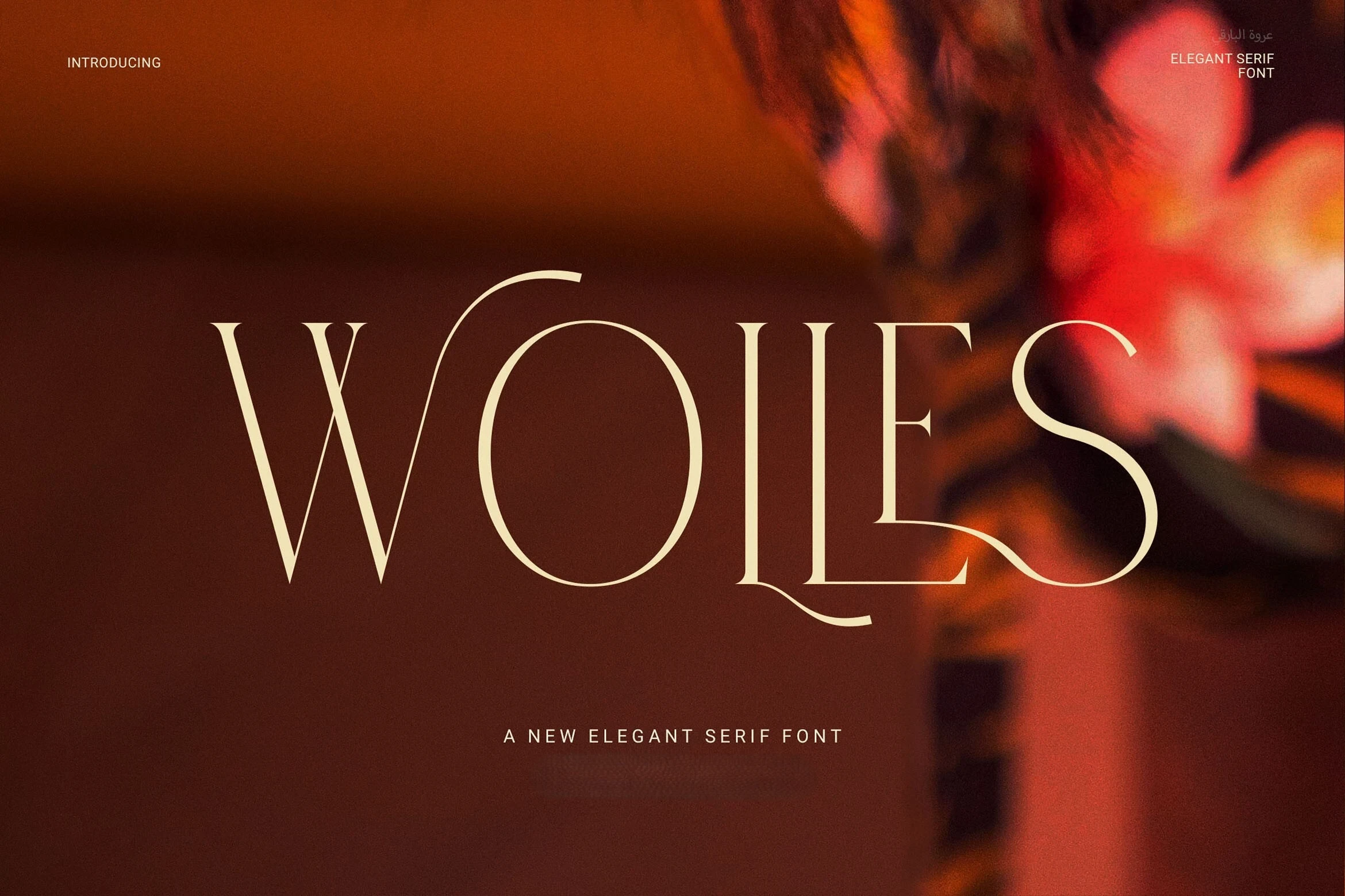
Best For: display text, modern designs, clean designs
Wolles Elegant Modern Serif Font stands apart through elongated swashes and unusual letter connections rather than conventional serif construction. That high-contrast display texture can define a short branding line or title, but its intricate joins need generous size to remain clear.
Serif-and-Script Pairings
These pairings set open, structured serif characters against flowing scripts, giving headlines both visual authority and movement without treating either style as body text.
The Paloma Font
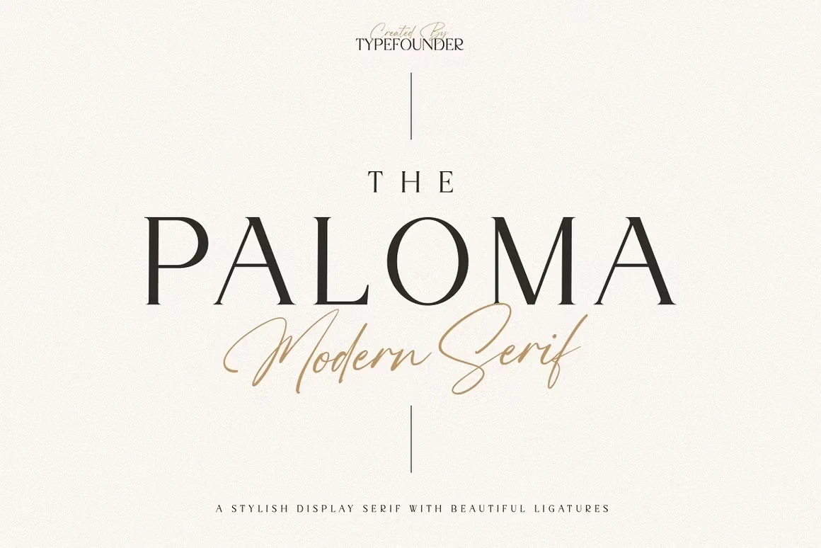
Best For: branding, high-end designs, logos, display text
The Paloma Font suits branding that needs both structure and movement: its open, wide serif supplies a clear headline foundation, while a separate flowing script introduces handwritten energy. The serif remains readable at display size, but the script's thin strokes need generous scale in logos and titles.
Georgia Praline Font
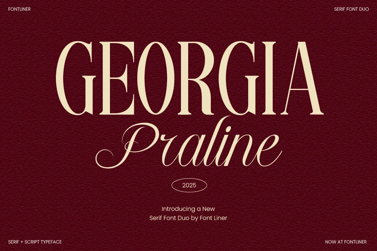
Best For: logos, branding, packaging, invitations
Georgia Praline Font pairs sharp, bracketed serif terminals with a matching calligraphic script and sweeping swashes. Because both components share wide proportions, the duo coordinates naturally across invitations, packaging, and editorial headings, while its delicate contrast remains unsuitable for long-form text.
Textured and Condensed Options
Texture and narrow proportions define this group: Inktype adds irregular tactile edges, while Luxena uses condensed width and extreme contrast to save space.
Inktype Font
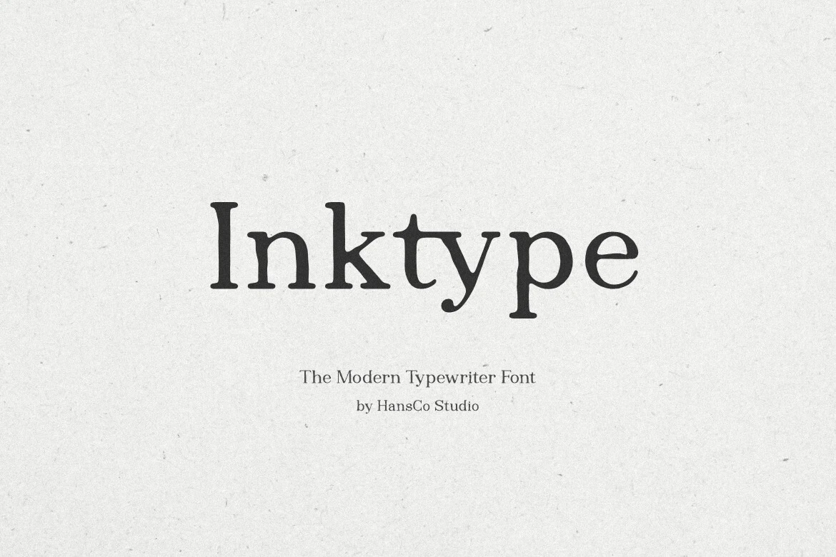
Best For: business cards, branding, posters, invitations
Inktype Font gets its tactile character from wedge-shaped slab serifs, organic edges, and an irregular baseline. The upright, typewriter-like construction adds approachable texture to posters, invitations, and business cards, although uneven strokes become harder to read when reduced significantly.
Luxena Font
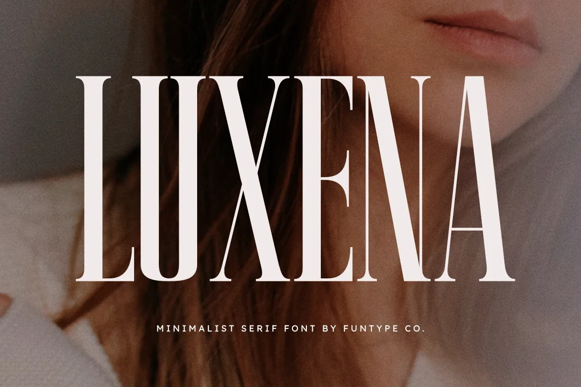
Best For: logos, branding, posters, headlines
Luxena Font uses condensed proportions, extreme vertical contrast, bracketed serifs, and a tall x-height to form a narrow headline block. It saves space in posters, logos, and restricted-width branding, while its small supporting sans-serif line needs careful spacing to stay readable.
How to Choose the Right Font
Choose the sharper core serifs when a wordmark or headline needs controlled structure, and move to swashed designs when built-in flourishes should carry the identity. Use pairings for contrast, Inktype for texture, and Luxena where width is restricted. Test every option at its final size, especially hairlines, joins, and supporting text in Elegant Aesthetic Fonts.