15 Best Handwritten Script Fonts in 2026
This collection moves from open, disconnected lettering and bold marker forms to linked calligraphic strokes, signature flourishes, and textured brush work. Handwritten Script Fonts can give headlines, logos, packaging, apparel, invitations, and social graphics a personal visual voice, provided their readability matches the size and role.
Looking for more script fonts? Browse our complete Script Fonts collection to compare modern, elegant, bold, signature, and retro script styles.
Handwritten Script Fonts
Handwritten Script Fonts in this group favor open construction, rounded or marker-like forms, and approachable display energy. Their broken joins generally read more clearly than ornate flowing scripts.
Sunny Font
Best For: T-shirts, logos, packaging
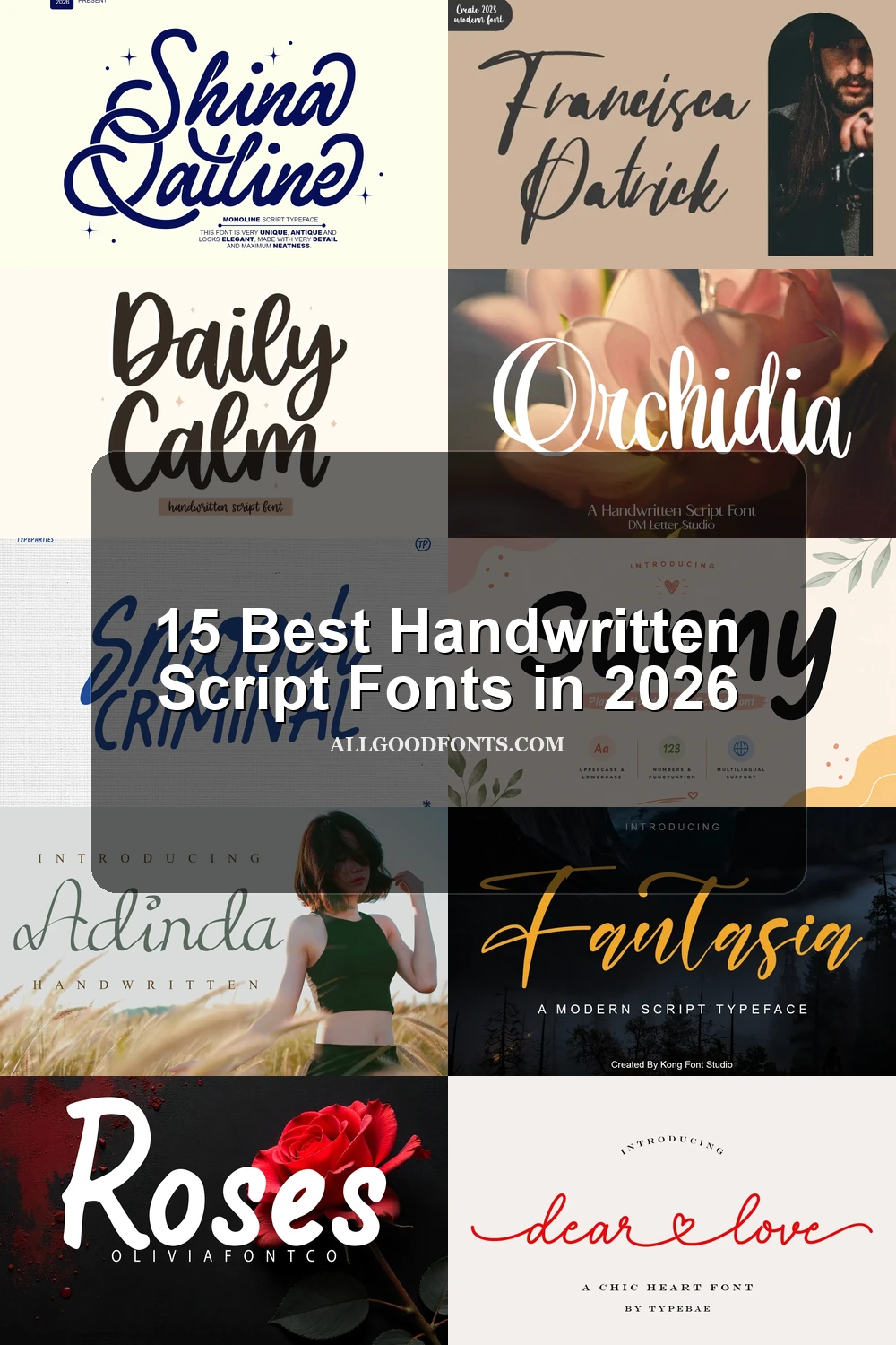
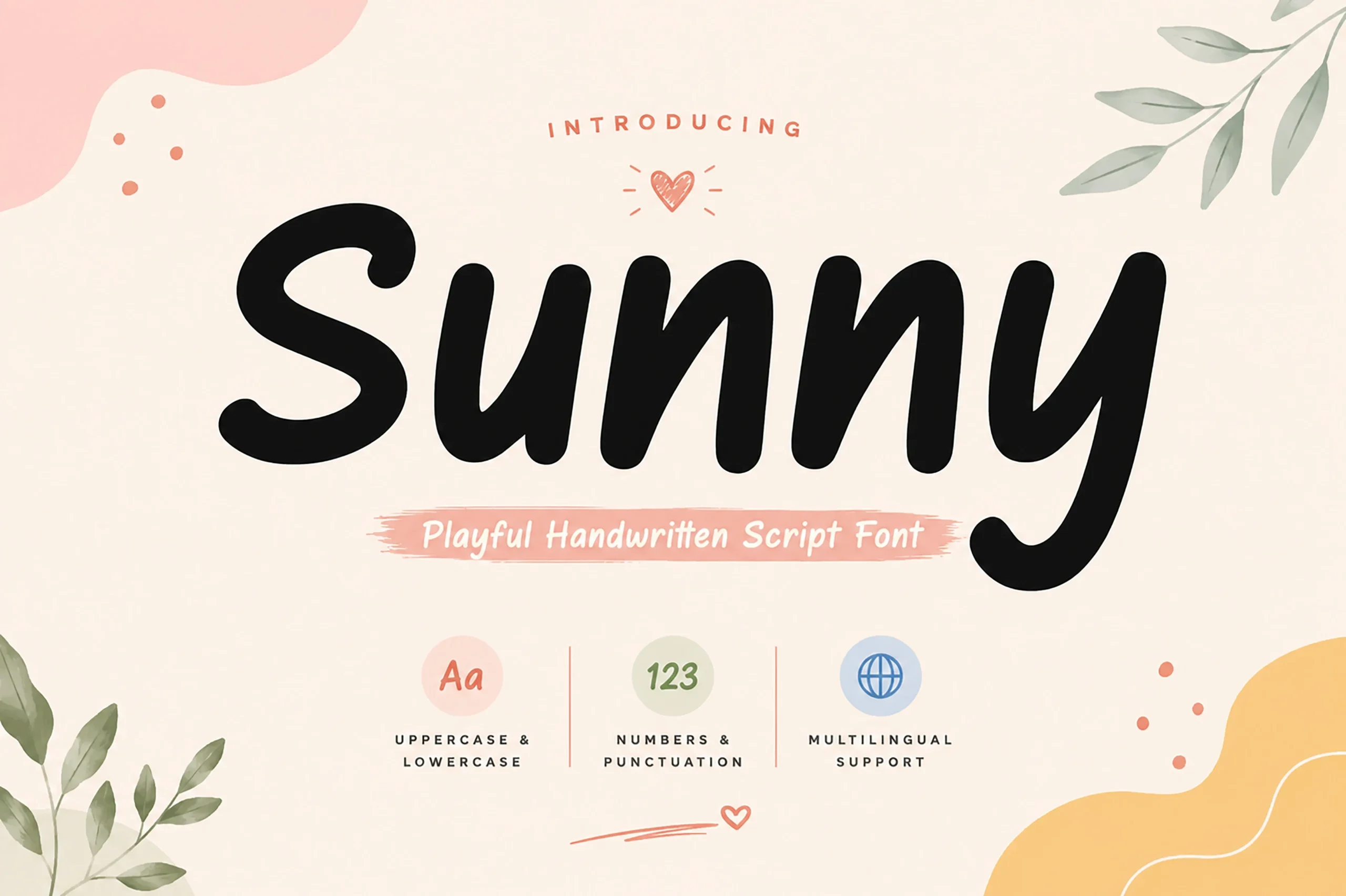
Sunny Font uses disconnected monoline letters with soft, rounded terminals, creating an open and friendly read. Its playful construction stays clear in large headlines, making it especially effective for T-shirts, packaging, logos, and social graphics rather than formal identity work.
Roses Font

Best For: display text, playful designs, bold designs
Roses Font is a bold, upright monoline with rounded terminals and immediate playful presence. Its weight suits display text and expressive designs, but at small sizes the rounded mass can crowd counters and reduce internal clarity.
Daily Calm Font
Best For: product labels, display text, minimal designs
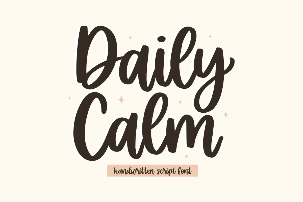
Daily Calm Font uses bold disconnected characters with a monoline appearance and shifting slant along the vertical axis. The broken construction keeps large labels and display words readable while preserving a relaxed tone, though it lacks the continuous sweep of flowing lettering.
Swept Away Duo Font

Best For: logos, branding, invitations, social media graphics
Swept Away Duo Font builds contrast into its own set: a naturally slanted script sits beside disconnected marker-style capitals. That two-voice pairing can form an instant logo lockup or social graphic, although the script remains a display element rather than body typography.
Connected Calligraphic Scripts
These connected calligraphic styles rely on continuous movement, contrast, and controlled flourishes. They feel more formal and fluid than the casual disconnected group, but need short wording and generous scale.
Mozzana Font

Best For: product labels, creative projects
For labels and logos that need substantial display presence, Mozzana Font brings heavy connected strokes, pronounced thick-thin contrast, and a lightly forward-moving slant. Its dense joins and curved terminals create a fluid, refined impression, but they are better reserved for short wording than paragraphs or small captions.
Fantasia Font

Best For: logos, branding, T-shirts, product labels
Fantasia Font gets its expressive character from connected letters, variable stroke thickness, and terminals that retain a controlled, almost monoline finish. The balance works well in branding and apparel graphics, though its flowing links need display scale to remain distinct and easy to read.
Adinda Font
Best For: product labels, creative projects, elegant designs
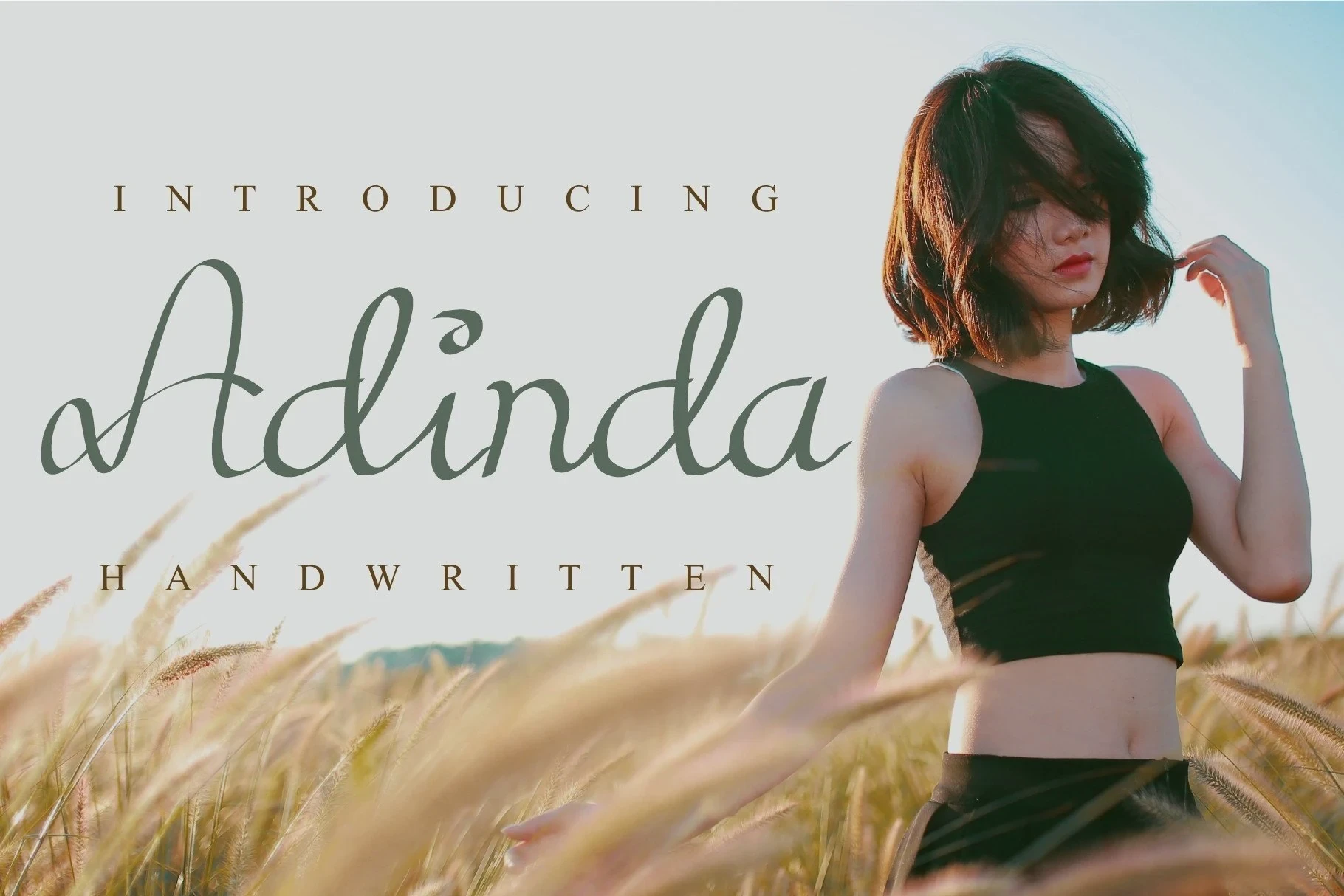
Adinda Font is built around high-contrast connected strokes, with ornamental swashes integrated into the lowercase d and a. Those specific flourishes lend labels and invitations a personal, refined signature, while also making the font most convincing in short display wording rather than extended copy.
Dear Love Font

Best For: branding, romantic designs, high-end designs
Dear Love Font turns continuous monoline movement into a romantic device, linking words with swashes and an integrated heart. The heart immediately identifies the mood for romantic branding, but the decorative connections limit the font's usefulness to short titles and display treatments.
Amerta Font
Best For: display text, headlines, minimal designs
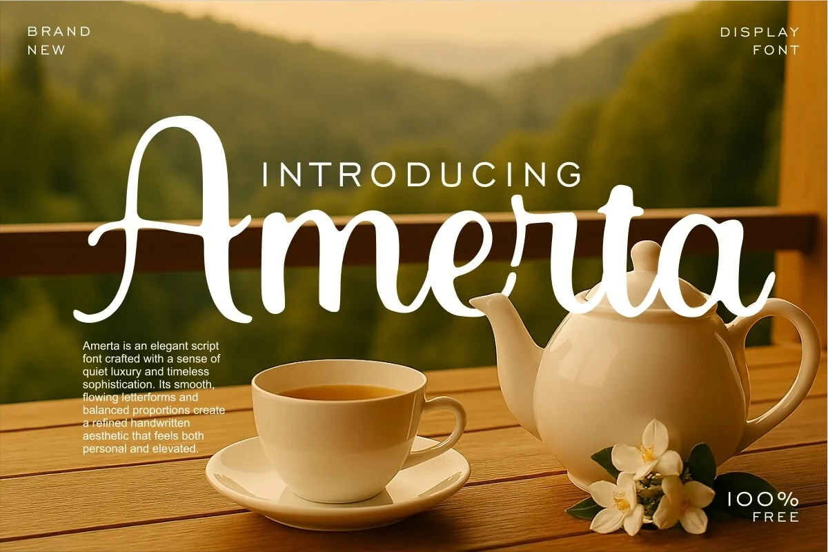
For refined headlines and restrained branding, Amerta Font offers an unusually upright flowing script with minimal slant and high stroke contrast. Its flourished opening A establishes the tone immediately, so it works best when that distinctive capital can remain visible at a generous display size.
Ornamental And Signature Scripts
Ornamental and signature scripts make personality the main design feature, using swashes, uneven rhythm, dramatic loops, or focal capitals. They create memorable marks but can quickly overwhelm compact text.
Orchidia Font
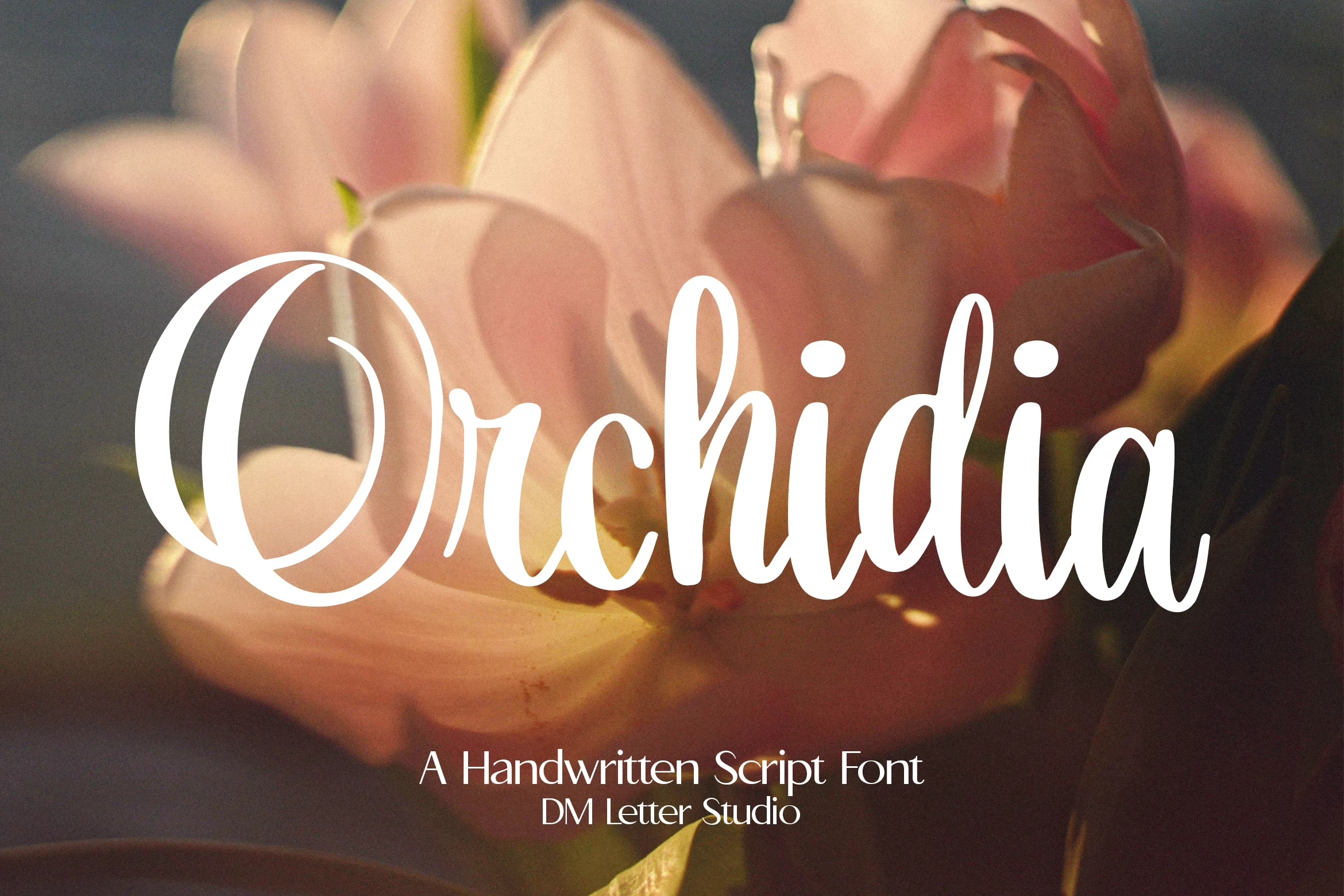
Best For: product labels, logos, branding, packaging
Orchidia Font pairs upright, disconnected letters with strong stroke contrast and an ornamental initial O. That swash gives a logo or product label an immediate focal point, although the capital's complexity can reduce readability when the wording is reproduced small.
Silent Autograph Font
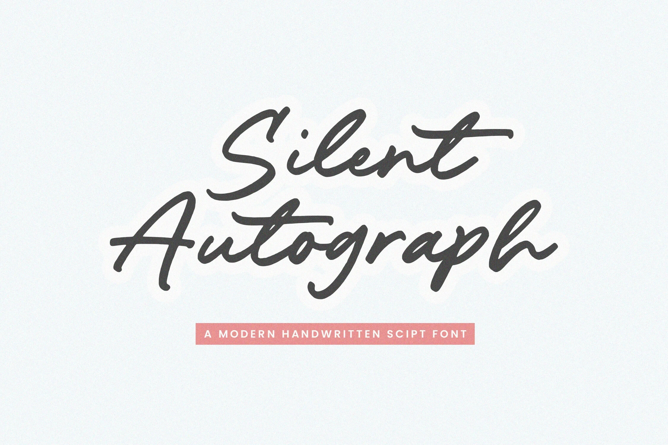
Best For: logos, branding, invitations, creative projects
Silent Autograph Font uses a connected monoline, a clear rightward slant, and noticeably varied character heights. The uneven vertical rhythm strengthens its signature impression for branding and invitations, though dense lines become slower to scan because the letters do not share a rigid rhythm.
Shina Qatline Font

Best For: display text, modern designs, elegant designs
Shina Qatline Font pushes connected lettering toward theatrical display with exaggerated loops, extended swashes, and a pronounced rightward slant. Its vintage-whimsical movement can dominate a poster or logo, while the interlocking forms call for large sizing and short words.
Brush And Organic Scripts
Brush and organic scripts foreground texture, pressure, irregular edges, or shifting baselines. Compared with cleaner scripts, they contribute stronger handmade surface character and are best treated as large display elements.
Francisca Patrick Font

Best For: wall art, bold designs, personal branding
Francisca Patrick Font combines heavy connected strokes and high contrast with rounded, irregular terminals and an uneven baseline. That organic instability gives personal branding and wall art a handmade edge, but its shifting rhythm is a poor fit for tidy informational layouts.
Whiteside Font

Best For: logos, branding, quotes, personal branding
Whiteside Font brings dry-brush texture, irregular stroke weight, and variable slant to a connected handwritten form. Its rough edges add an organic personal-branding voice and suit quotes, while textured joins and intricate connections lose definition when reduced to small text.
Santiago Font

Best For: logos, packaging, product labels, social media graphics
For packaging, product labels, and social graphics, Santiago Font translates brush pressure into high-contrast connected lettering with fluid slant and textured, irregular edges. Its visible surface energy is compelling at large sizes, but complex strokes and edge texture need room to stay legible.
How to Choose the Right Font
Choose Handwritten Script Fonts by construction first: disconnected letters usually offer clearer casual display text, while connected forms bring more flow but demand larger sizing. Then compare weight, contrast, joins, slant, and flourishes. Reserve textured or ornamental options for short focal words, and test every choice at its actual reproduction size before committing.