
20 Best Brush Script Fonts in 2026
This collection spans connected scripts with sweeping joins, disconnected brush marks, dry textures, drips, swashes, and irregular baselines. These Brush Script Fonts are primarily display tools for logos, posters, packaging, covers, apparel, signage, and social graphics, with readability depending strongly on size and texture.
Looking for more script fonts? Browse our complete Script Fonts collection to compare modern, elegant, bold, signature, and retro script styles.

Brush Script Fonts: Flowing Letterforms
This group emphasizes connected movement, directional slants, thick-thin contrast, and expressive terminals. Compared with the rougher set, these Brush Script Fonts generally offer more continuous flow and logo-friendly rhythm.
The Handled Font
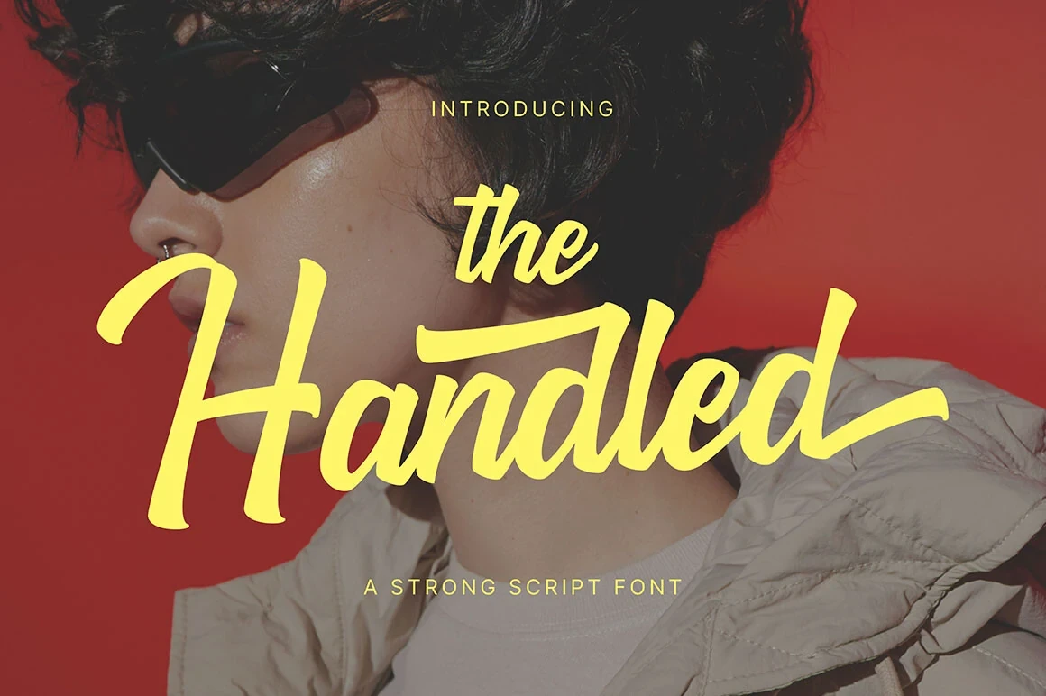
Best For: branding, display text, modern designs, clean designs
The Handled Font combines heavy connected strokes with a rightward slant and elongated entrance and exit swashes. Its sharp thick-thin contrast gives logotypes and large headlines a confident, moving quality, while the flourishes make extended copy unnecessarily difficult to scan.
Brownless Font

Best For: logos, packaging, posters, quotes
Brownless Font works especially well when enlarged for logos, packaging, posters, and quote graphics. Its connected letters, pronounced forward slant, dry-brush surface, and irregular stroke weight create an artistic, personal tone, but the rough detail needs display scale to remain clear.
Midnight Font
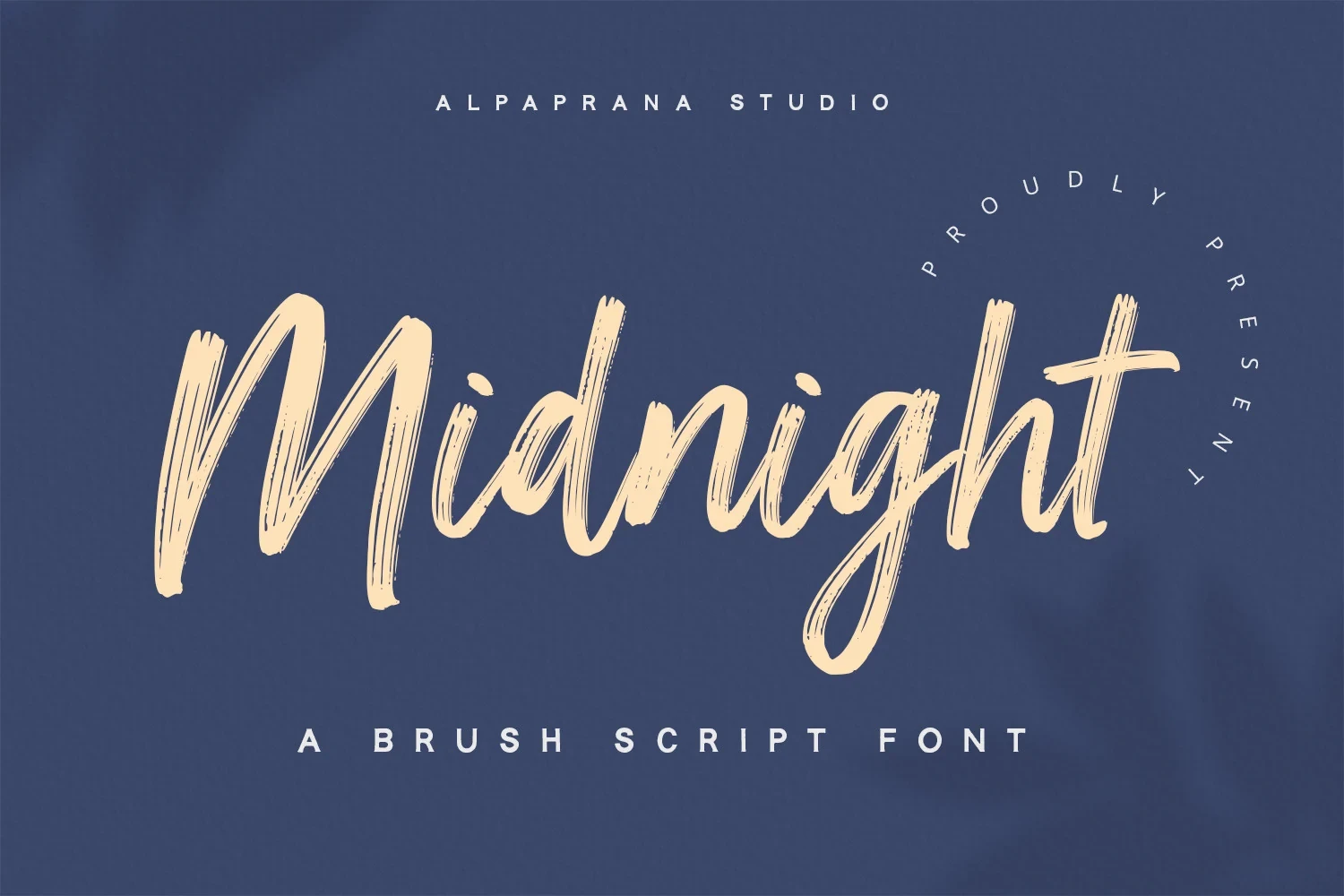
Best For: book covers, T-shirts, branding, packaging
Midnight Font uses connected brush movement, a varying baseline, and a visibly hand-drawn surface. Its changing texture gives covers, apparel, branding, and packaging a lively stamped character, but the detail becomes less dependable when reduced.
Summer Brush Font
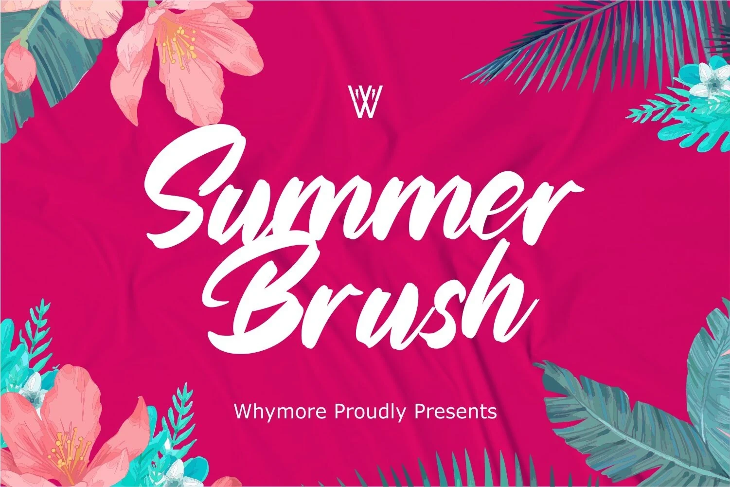
Best For: clean designs, bold designs, expressive designs, decorative designs
Summer Brush Font brings a lively connected rhythm through expressive strokes and a variable baseline. It suits decorative titles and bold compositions that can give the texture room to show, rather than tightly set wording or small captions.
Blaze Spirit Font

Best For: social media graphics, logos, book covers, display text
Blaze Spirit Font combines a slanted connected brush hand with dry texture, high contrast, ligatures, and multilingual support. Those features expand its branding and cover potential, although dense wording can lose clarity when reduced. It is a strong Brush Script Fonts option for prominent titles.
Freeday Font

Best For: logos, branding, packaging, posters
Freeday Font pushes a heavy connected stroke forward with brushed terminal edges and an upward lean. Compared with more distressed choices, its display legibility is relatively strong, making it practical for branding, packaging, and poster headlines without losing expressive movement.
The Barattie Font

The Barattie Font uses a connected italic structure, pronounced thick-thin contrast, and a clear directional sweep. Its large titles remain readable and energetic, while fine brush detail becomes less reliable on small labels or tightly packed secondary text.
Rattin Font

Best For: minimal designs, clean designs, bold designs, expressive designs
Rattin Font pairs connected brush strokes with bold thick-thin contrast, textured edges, and extended horizontal swashes. Its alternate swashes can shape a distinctive logo signature, although the flourished detail is less suitable for tiny applications.
Sorastina Font
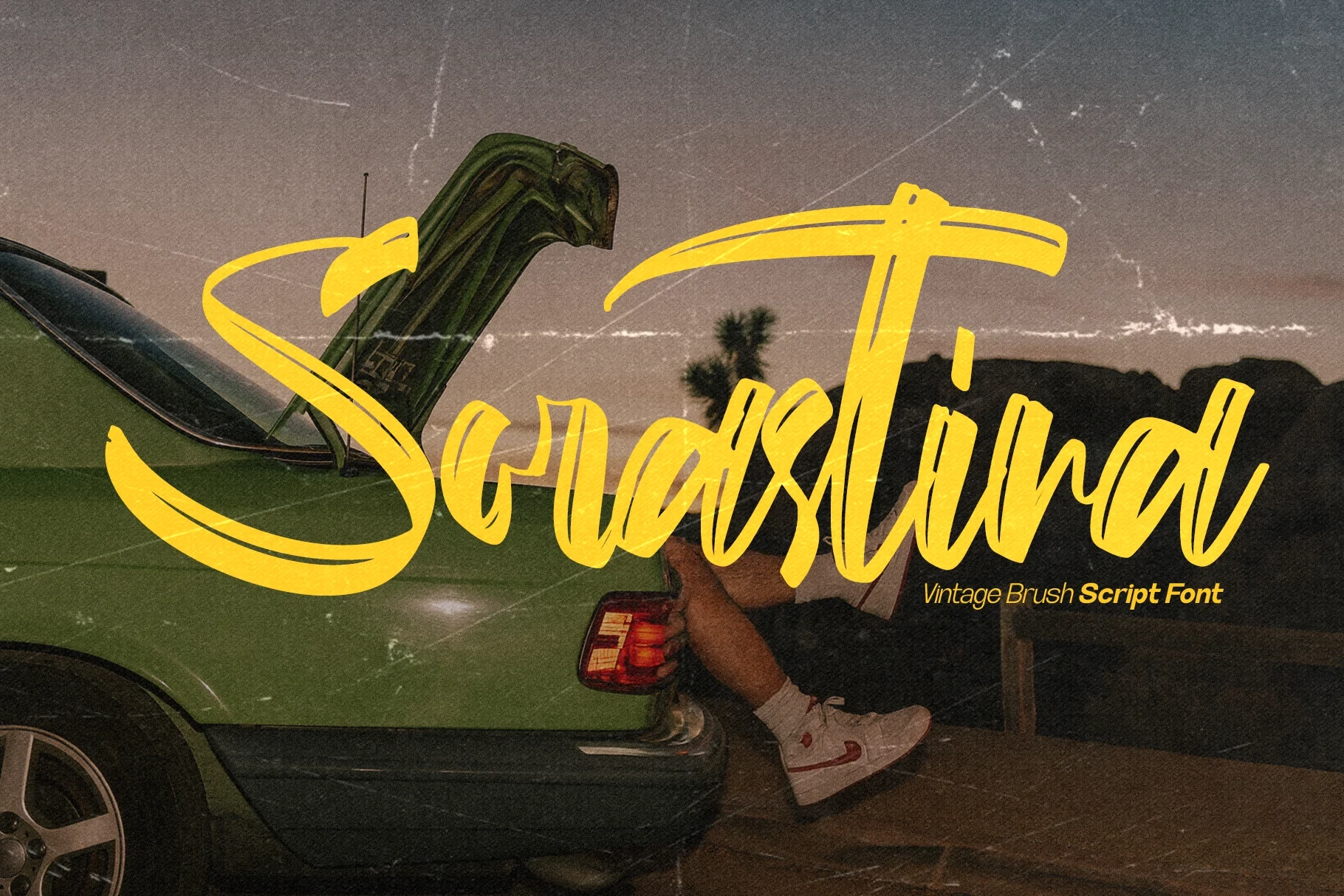
Best For: display text, clean designs, bold designs, expressive designs
Sorastina Font is built around expressive connected strokes that end in visible swash terminals. This Brush Script Fonts style works best in short display phrases where vintage-leaning movement and visual character outweigh rapid scanning or long-form readability.
Gloucester Script Font
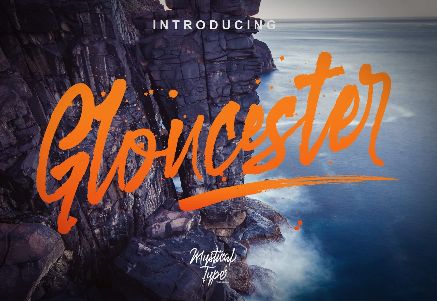
Best For: logos, elegant designs, bold designs, handmade designs
Gloucester Script Font sets a bold connected brush face against a thin monoline script pairing. That contrast supports logo work with two levels of personality, though the irregular baseline and textured main face keep it oriented toward display use.
Alyester Font

Best For: invitations, quotes, display text, clean designs
Alyester Font combines overlapping connected lowercase letters with heavy dry-brush contrast and a forceful forward slant. The overlap creates a strong signature for invitations and quotes, but complex joins can compromise quick reading in longer lines.
Bliss Sureal Font
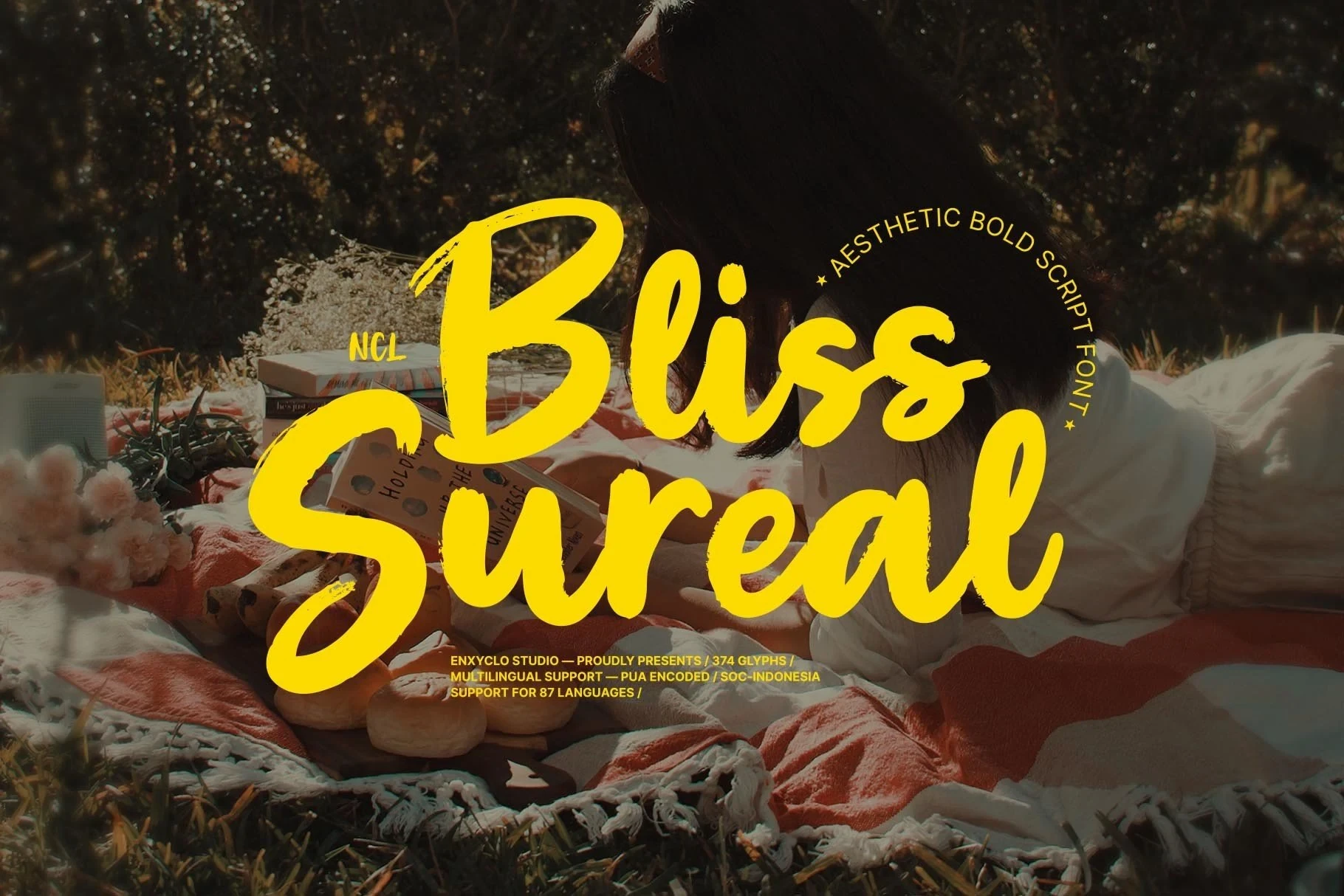
Best For: modern designs, clean designs, classic designs, bold designs
Bliss Sureal Font relies on thick, relatively uniform brush strokes and an organic connected flow. Among these Brush Script Fonts, its sturdy forms preserve headline readability better than many textured peers, although it remains unsuitable for body-length passages.
Rough Brush Lettering
These designs rely on rough edges, streaks, drips, separated characters, and distressed surfaces. Their forceful visual texture creates immediate impact, but usually demands more generous sizing than the flowing group.
Ghost Bolpi Font
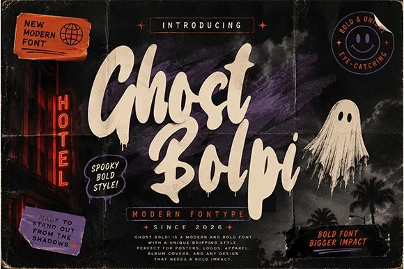
Best For: branding, posters, signage, social media graphics
Ghost Bolpi Font uses connected, high-contrast strokes, dripping terminals, and an uneven baseline to create a spooky, paint-smeared identity. This Brush Script Fonts choice is strongest in oversized poster headlines, signage, and social graphics, where impact matters more than compact readability.
South Emton Font

Best For: display text, minimal designs, clean designs, bold designs
South Emton Font gets its energy from disconnected brush lettering, visible streaks, strong contrast, and an uneven baseline. The separated construction feels punchy in display text and bold layouts, though its texture can obscure smaller words and supporting information.
Morria Font
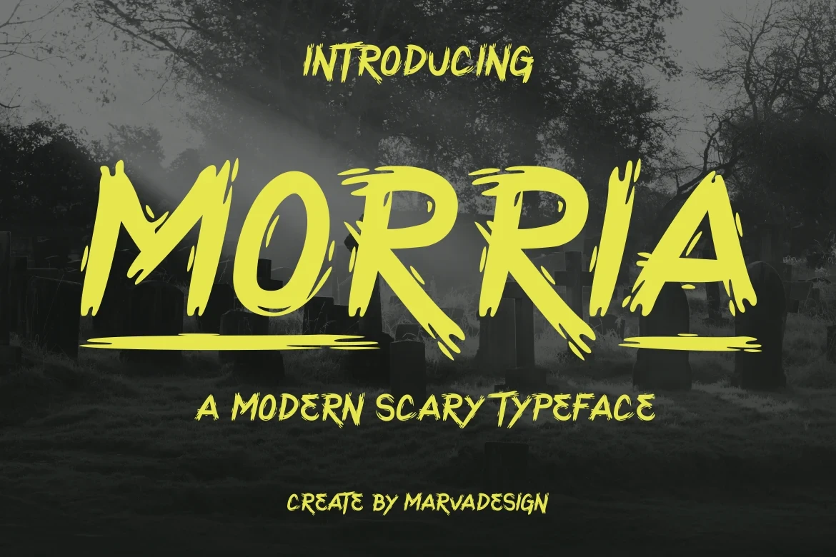
Best For: social media graphics, display text, bold designs, high-end designs
Morria Font is an all-caps display face with wide, sturdy proportions, jagged edges, uneven stroke thickness, and simulated drips. Its distressed, menacing presence suits large Brush Script Fonts treatments, social graphics, and signage, while fine-size clarity is limited.
Vibe Shift Font

Best For: signage, social media graphics, wall art, modern designs
Vibe Shift Font combines thick, irregular connected forms with a strong rightward lean and spontaneous stroke variation. Overlapping characters create a layered, energetic effect for large headlines, logos, and posters, but they reduce reading certainty at smaller sizes.
Advance Glowing Font
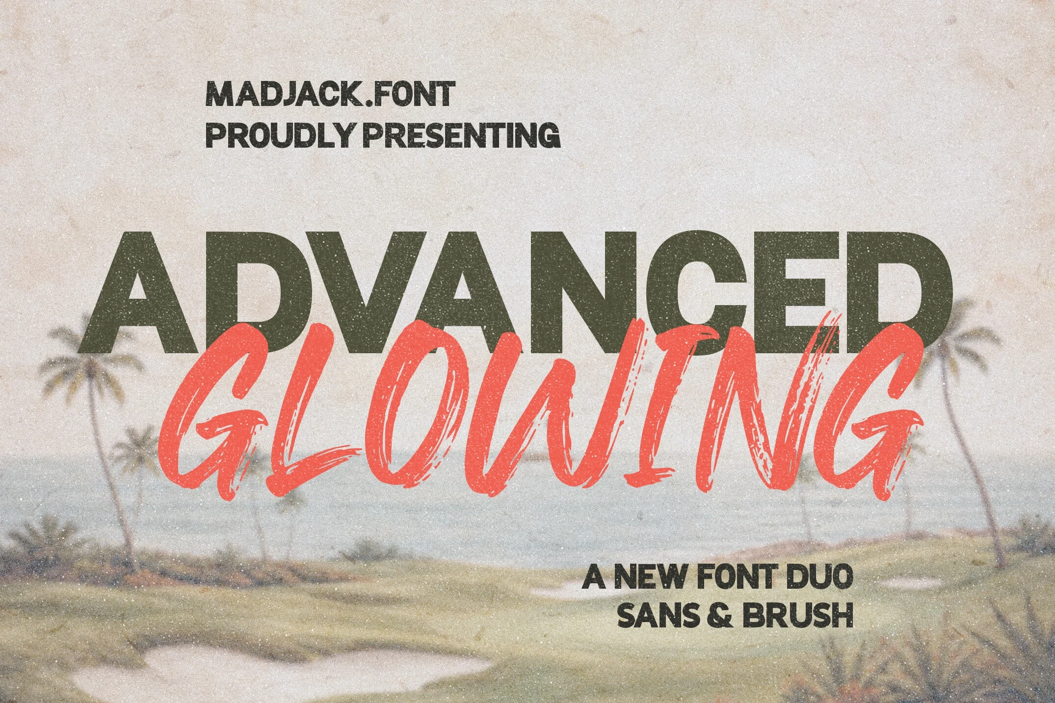
Best For: logos, branding, posters, quotes
Advance Glowing Font pairs a disconnected uppercase brush script with alternate characters and ligatures, alongside a geometric sans. The combination supports logo systems and large headlines, while the textured script remains better suited to display scale than fine detail.
Regratte Font
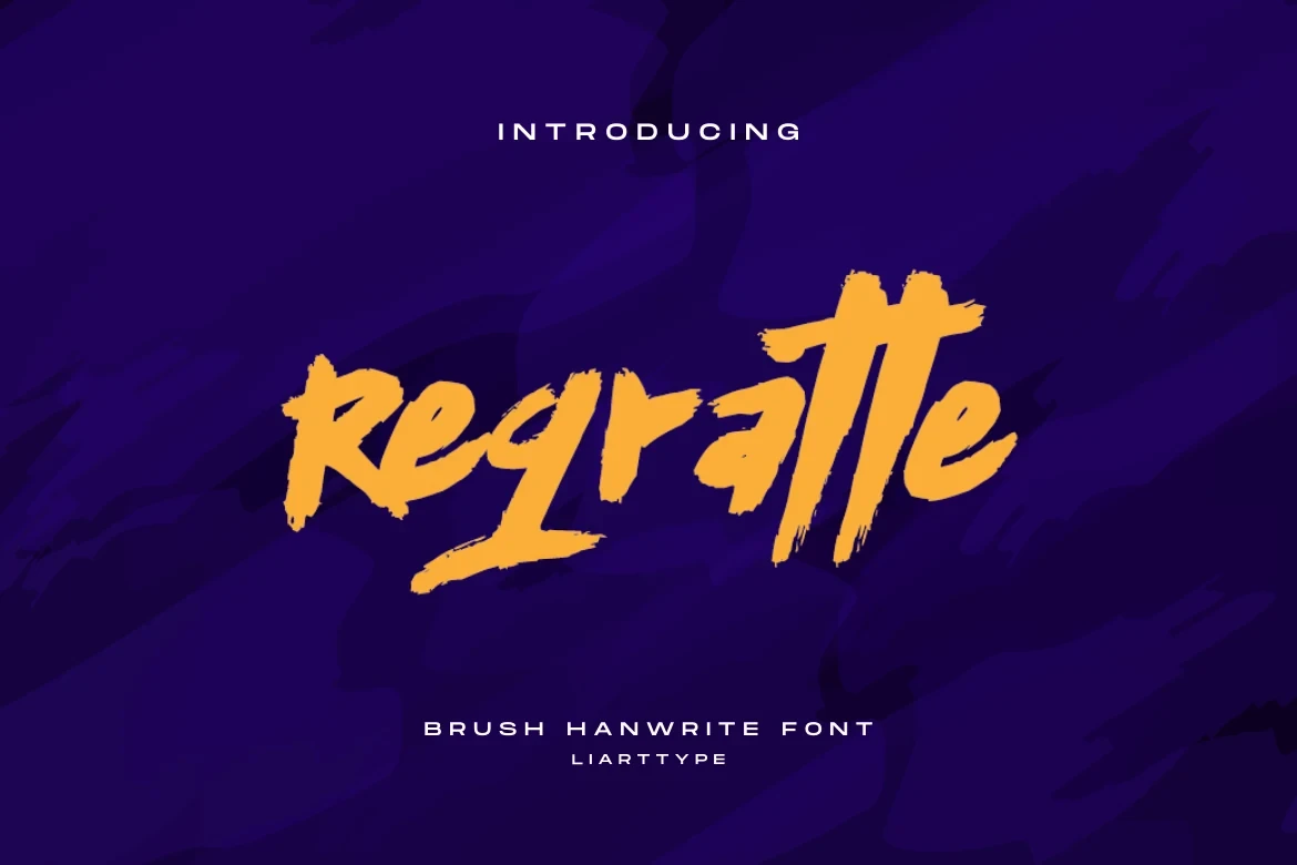
Best For: invitations, quotes, product labels, social media graphics
Regratte Font turns connected or mixed lettering into a coarse, jagged dry-brush surface with a slanted structure. The distressed edges add grit to product labels, invitations, and social graphics, but the texture needs display sizing to avoid losing definition.
Wavy Brick Font
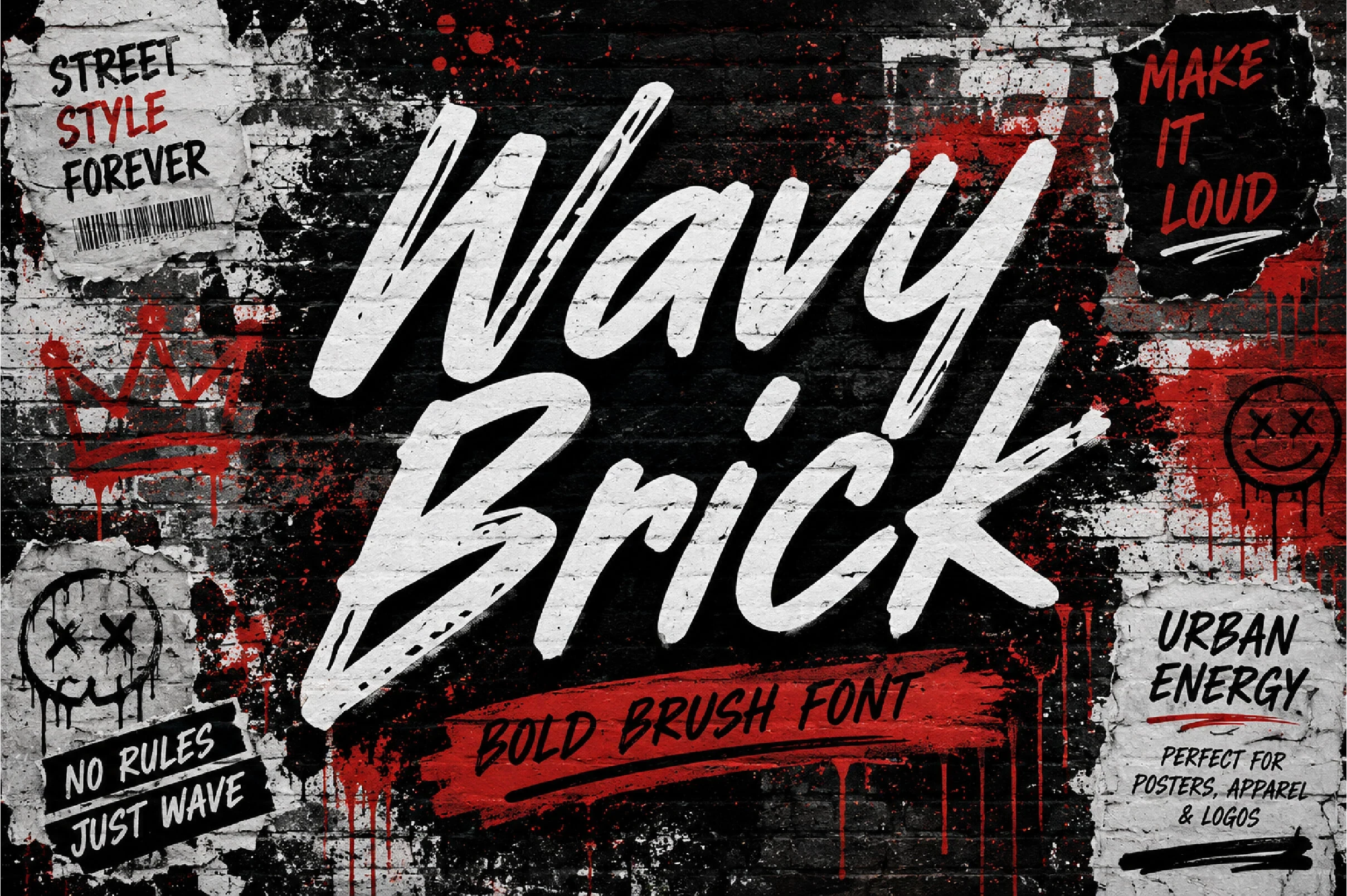
Best For: display text, modern designs, clean designs, bold designs
Wavy Brick Font uses mostly disconnected characters, rough edges, high contrast, and a slight rightward slant. The separated construction gives titles a punchy brush-mark presence, but it is not well suited to continuous reading or body-length wording.
Roughsweep Font
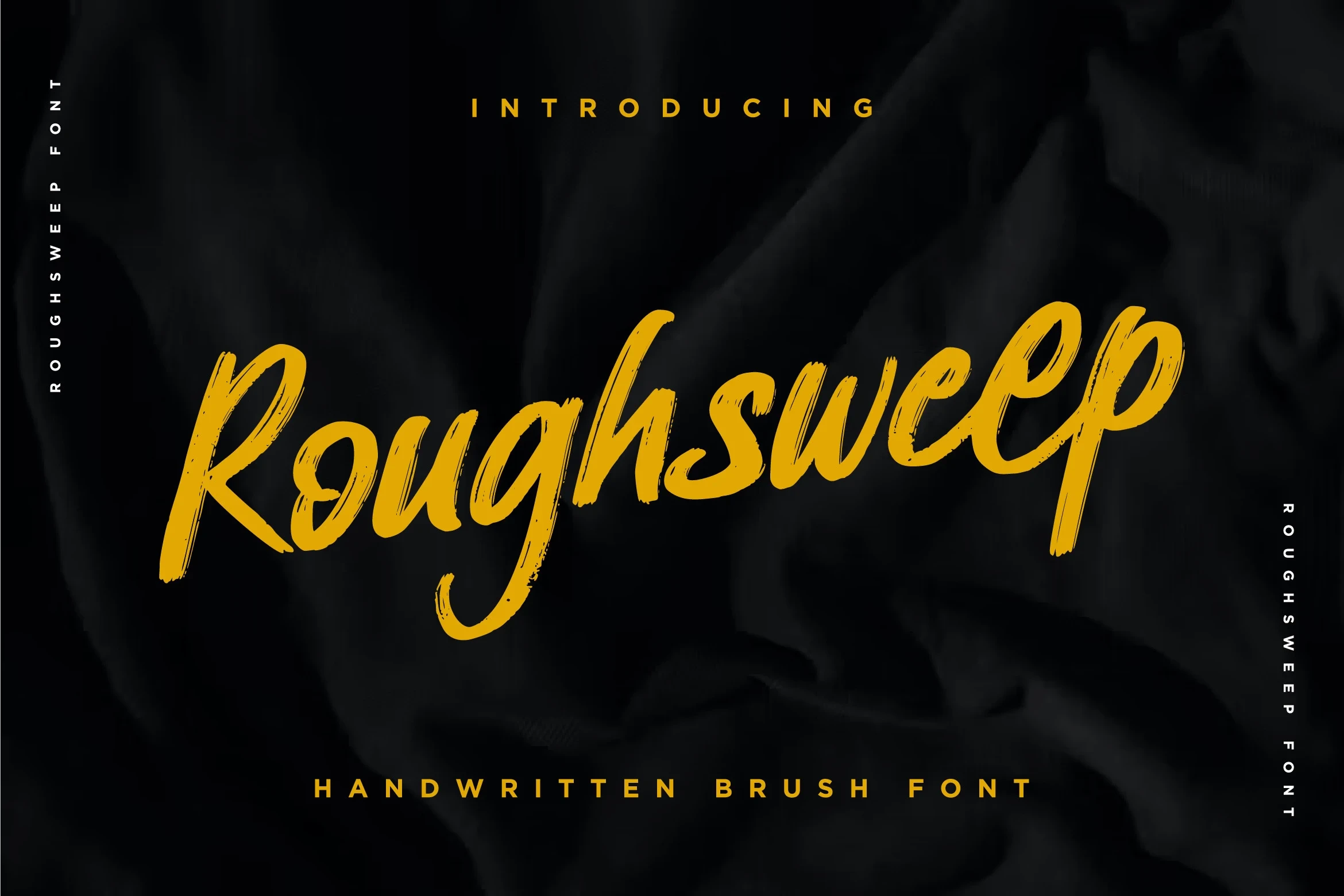
Best For: book covers, business cards, T-shirts, branding
Roughsweep Font distinguishes itself with disconnected lettering, variable stroke thickness, a lightly forward tilt, and distressed texture. It gives apparel, covers, branding, and other large treatments energetic character, while small wording can lose the individual brush marks.
How to Choose the Right Font
Choose connected scripts when joins, slant, contrast, or swashes should create a recognizable logo or expressive title. Choose disconnected and distressed styles for rougher, more forceful display impact. For any Brush Script Fonts selection, test the actual wording at its final size: texture, overlaps, drips, and fine terminals can quickly reduce readability.


