29 Best Casual Handwritten Fonts in 2026
This collection spans upright disconnected lettering, connected cursive movement, rounded bubble forms, and more distinctive brush-led display shapes. These Casual Handwritten Fonts are suited to logos, invitations, packaging, social graphics, labels, and short headings where construction and readability matter more than extended text performance.
Looking for more handwritten fonts? Browse our complete Handwritten Fonts collection to compare modern, bold, wedding, logo-friendly, and Cricut-ready handwritten styles.
Casual Handwritten Fonts
These Casual Handwritten Fonts use mostly disconnected characters, monoline strokes, upright postures, and irregular baselines, making them easier to parse than joined scripts while retaining personal display rhythm.
Roster York Font

Best For: display text, wall art, modern designs
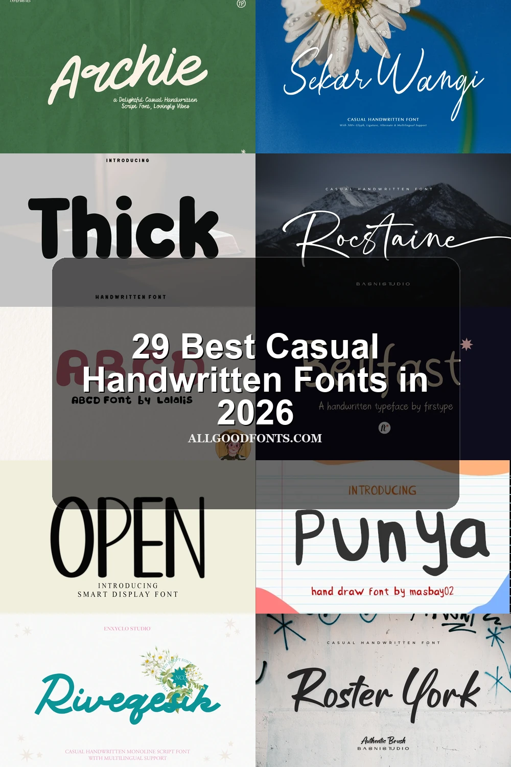
Roster York Font suits Casual Handwritten Fonts users who want disconnected, upright brush lettering instead of joined script. Its balanced characters remain readable in large headings, wall art, and branding, though the textured forms are not intended for long copy.
Party Script Font
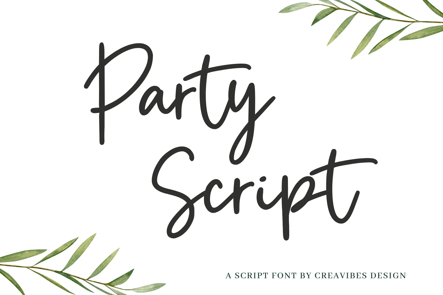
Best For: invitations, modern designs, minimal designs
Party Script Font is one of the more readable Casual Handwritten Fonts because its mostly disconnected letters and simple monoline structure avoid continuous joins. The irregular baseline adds rhythm for invitations and minimal designs at medium or large sizes.
Butter Love Font

Best For: display text, clean designs
Butter Love Font gives Casual Handwritten Fonts a disconnected, monoline option with an inconsistent baseline and personal cadence. Its large headline scale suits T-shirts and stickers better than small supporting text.
Self Love Font
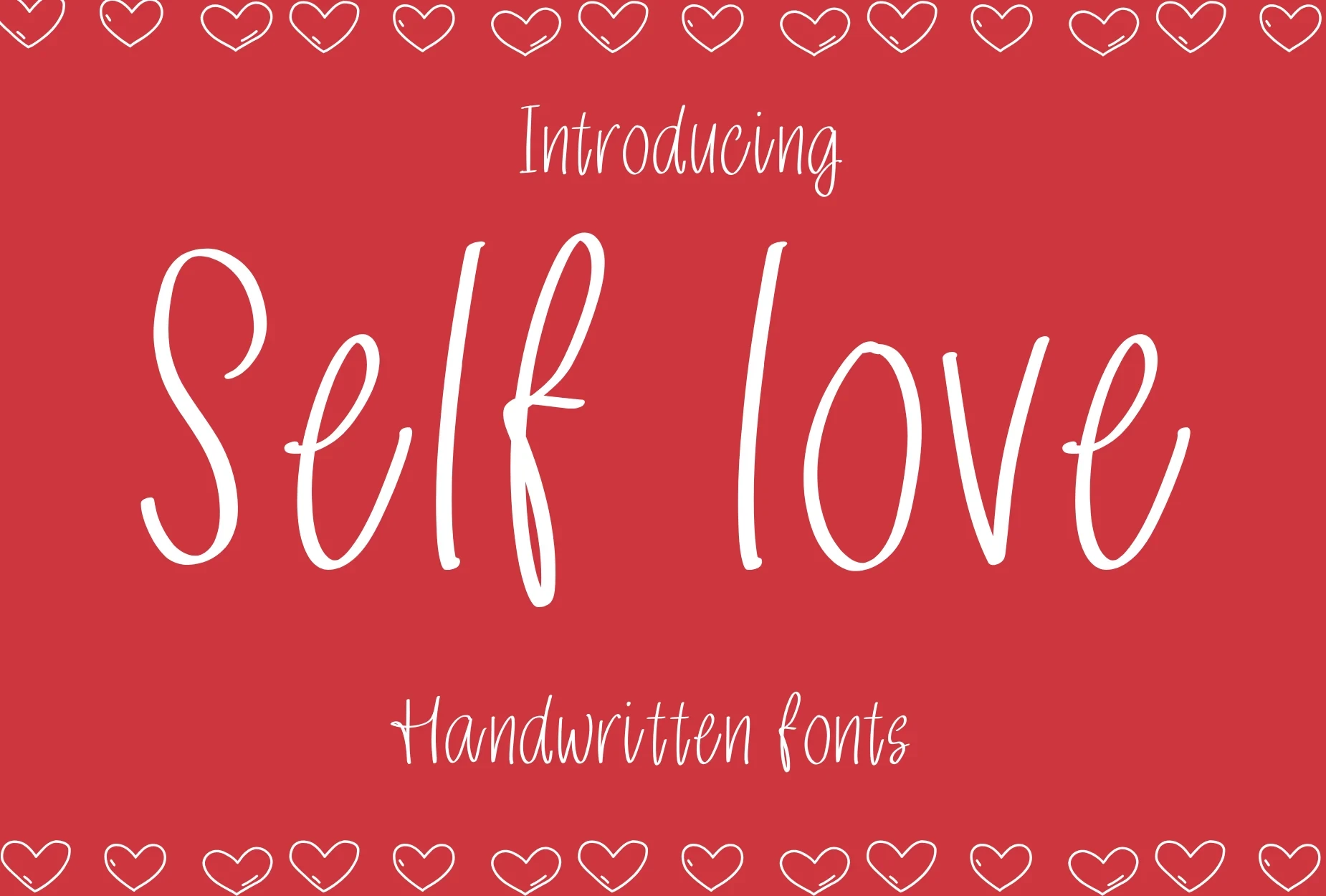
Best For: T-shirts, stickers, product labels
Self Love Font is among the most easily parsed Casual Handwritten Fonts, using upright disconnected letters, an irregular baseline, and clean monoline construction. It fits T-shirts, stickers, and product labels at medium-to-large sizes.
Huntsparkle Font
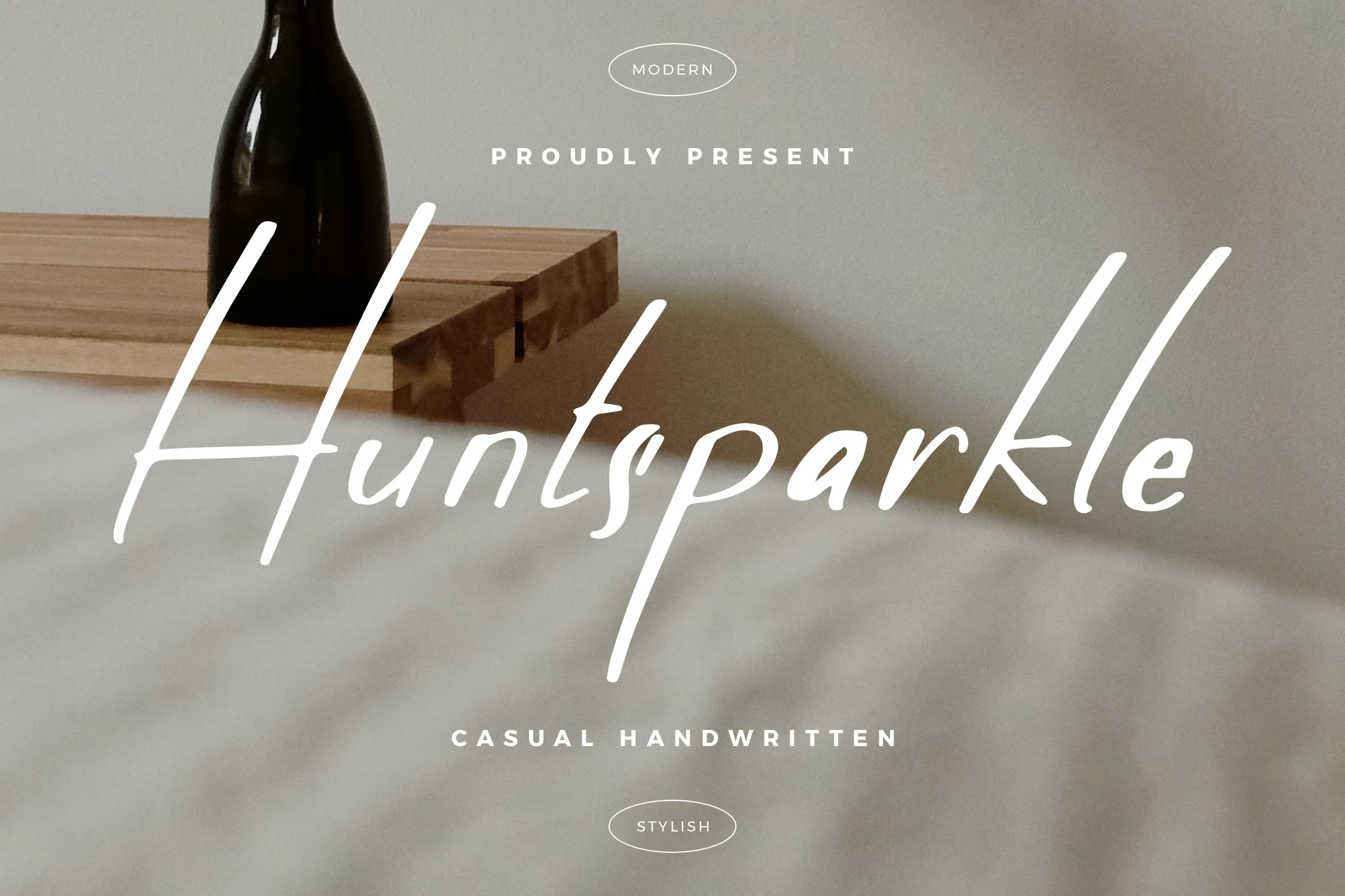
Best For: book covers, T-shirts, logos
Huntsparkle Font uses disconnected characters, a slight rightward slant, and variable stroke width to create informal movement without joined letters. It works for short logos and book-cover titles, but small or dense settings may reduce clarity.
Bellfast Font
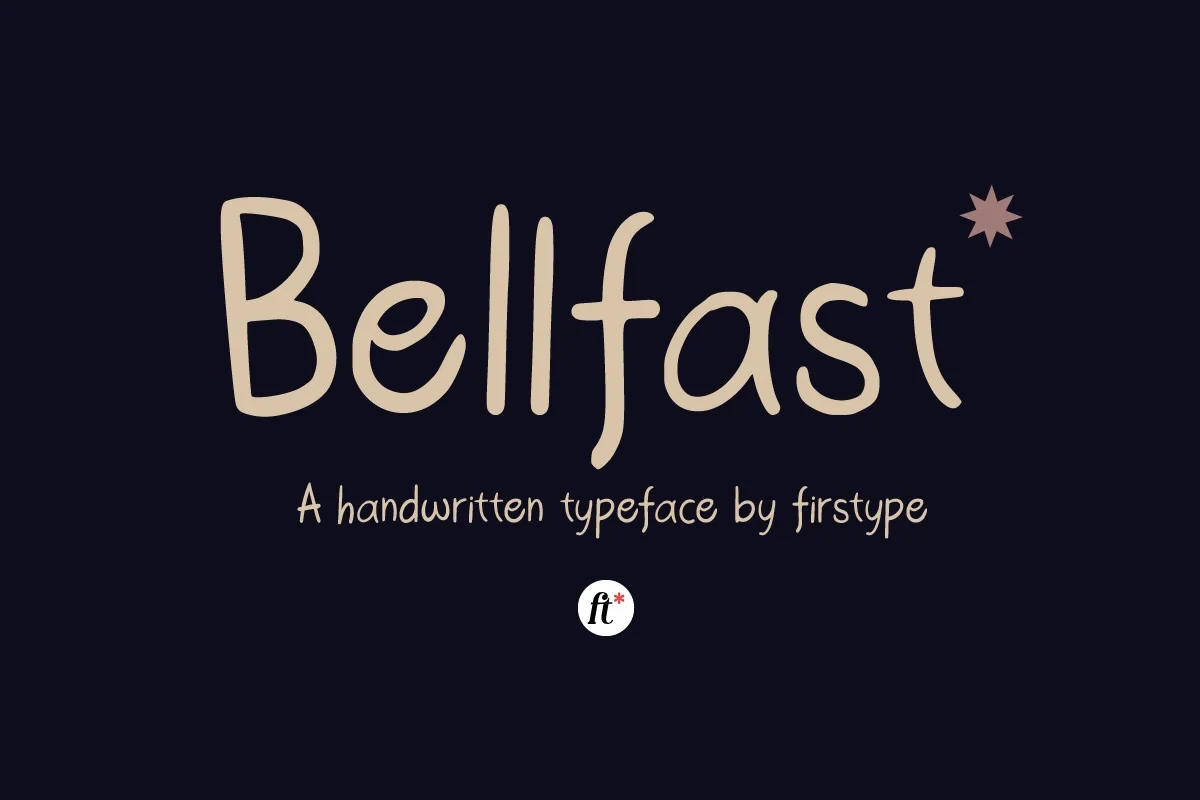
Best For: social media graphics, packaging, product labels
Bellfast Font shows why readable Casual Handwritten Fonts do not need ornate joins: clean disconnected shapes, rounded terminals, and an upright stance keep the lettering clear. It can move from headlines into short subheadings, packaging, and product labels.
Connected Flowing Scripts
Connected joins, forward movement, rounded terminals, and occasional flourishes define this group. Compared with disconnected lettering, these scripts feel more continuous but generally need larger sizes and shorter wording.
Archie Font
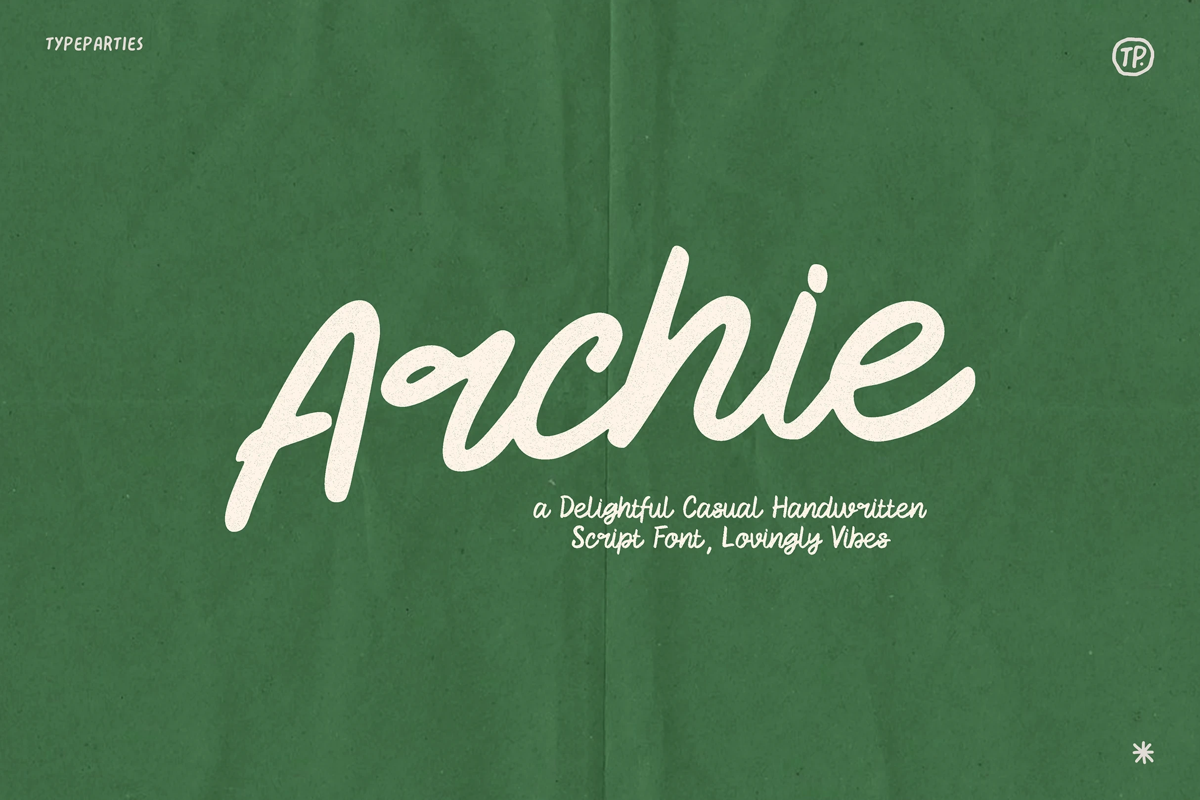
Best For: logos, invitations, social media graphics
Archie Font uses connected monoline lettering with a right-leaning posture, creating a friendly handwritten flow. It suits large logos and invitations, but its joined forms may lose legibility when reduced to very small sizes.
Punya Font
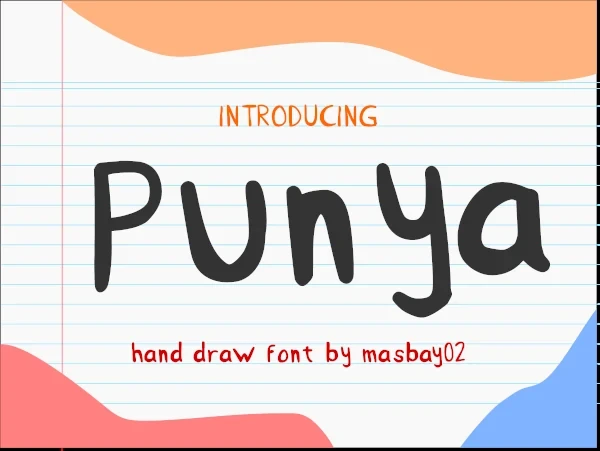
Best For: display text, wall art, expressive designs
Punya Font is built around flowing connected movement and a continuous cursive character. Its display orientation favors names, wall art, and short expressive phrases, while dense text would give the joined forms too little room to breathe.
Shyest Font
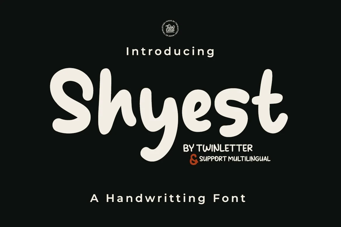
Best For: display text, wall art, playful designs
Shyest Font softens connected cursive with rounded forms and gentle joins. That playful construction works well for short display messages and designs with a light tone, but it is less suitable for compact informational copy.
Rocstaine Handwritten Font

Best For: modern designs, clean designs, expressive designs
Rocstaine Handwritten Font pairs light connected strokes with a clean contemporary finish. Its slender profile is most useful for modern headings and branding where open spacing helps preserve the letterforms.
Breadfast Font
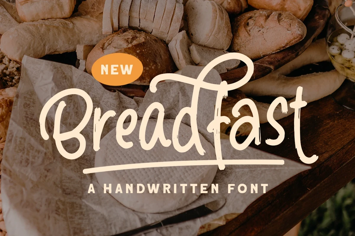
Best For: product labels, display text, headlines
Breadfast Font combines connected script characters with irregular stroke texture and rounded flowing terminals. It suits large labels and headlines, while its accompanying sans-serif role is better reserved for brief informational text.
Wildpaint Font
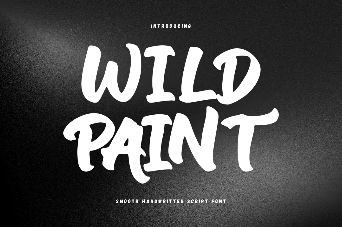
Best For: social media graphics, packaging, quotes
Wildpaint Font combines light connected movement with rounded forms and a refined stroke profile. Short phrases in packaging, quotes, and social graphics give its joins enough scale to remain clear.
Outside Font

Best For: display text, wall art, minimal designs
Outside Font is especially decorative, using high stroke contrast, a right-leaning axis, and looping ascenders and descenders. Its fluid detail needs large display sizing and is unsuitable for long-form text.
Riveqesik Font
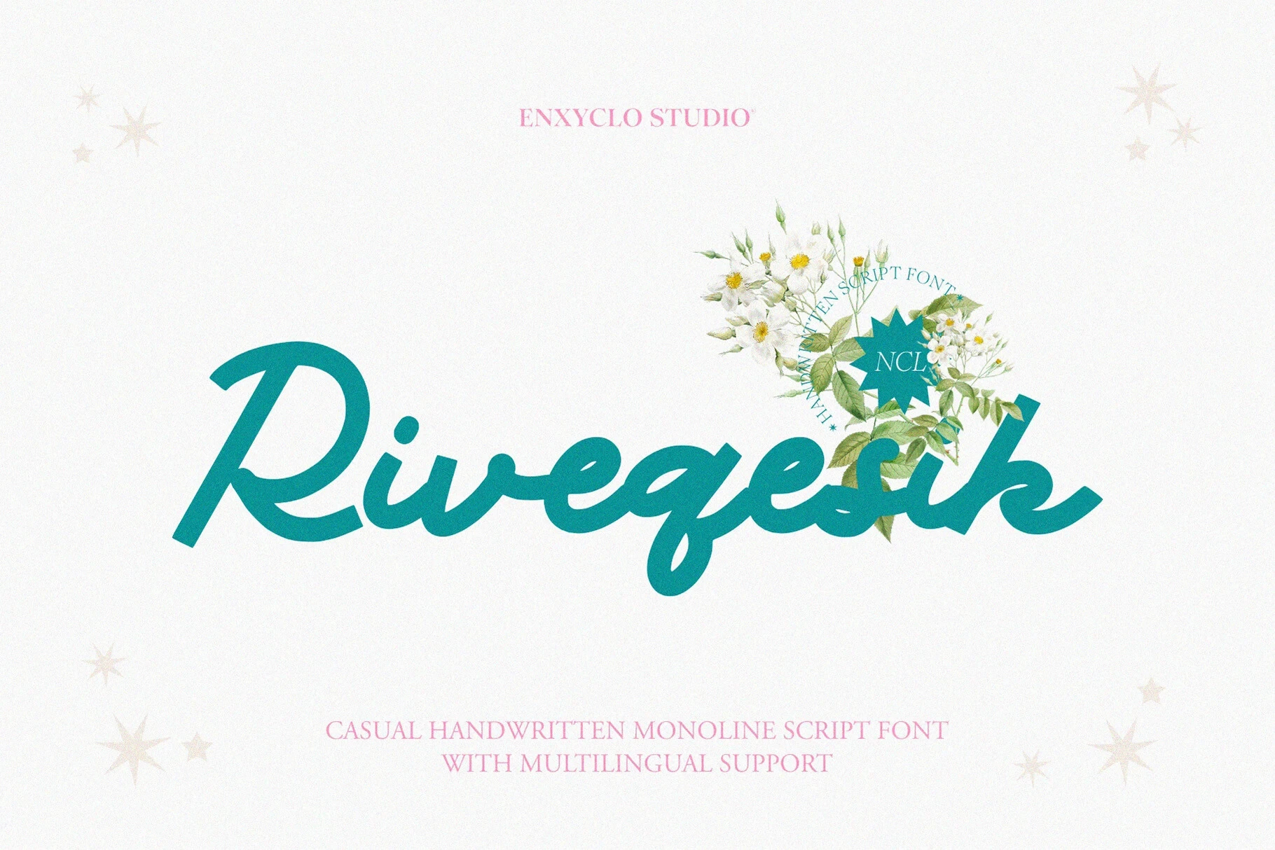
Best For: logos, branding, website headers
Riveqesik Font combines medium-weight connected cursive with uniform strokes, rounded terminals, and a slight forward slant. That consistency supports readable logos and website headers, although it remains a display face rather than body text.
Kartina Font
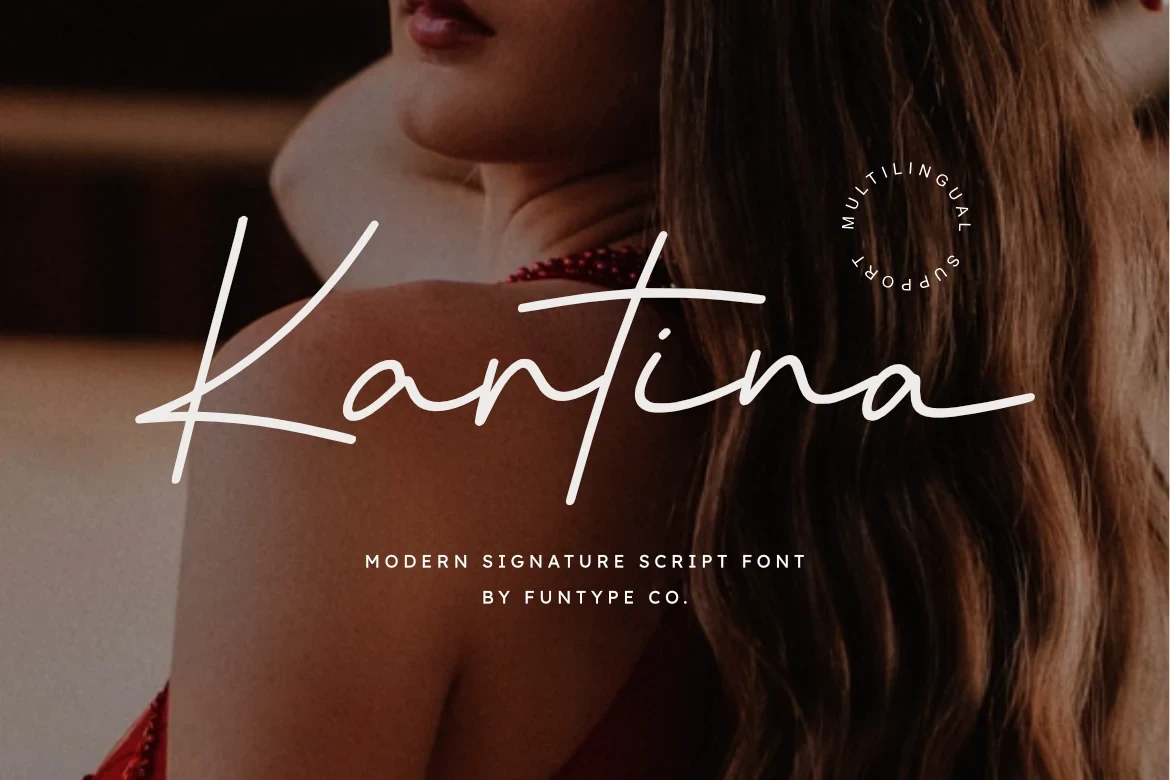
Best For: fashion branding, logos, branding
Kartina Font offers light connected strokes and a clean contemporary build for restrained cursive work. Its multilingual support and TTF and OTF formats make it especially practical for fashion branding and logo projects.
Lonthe Font
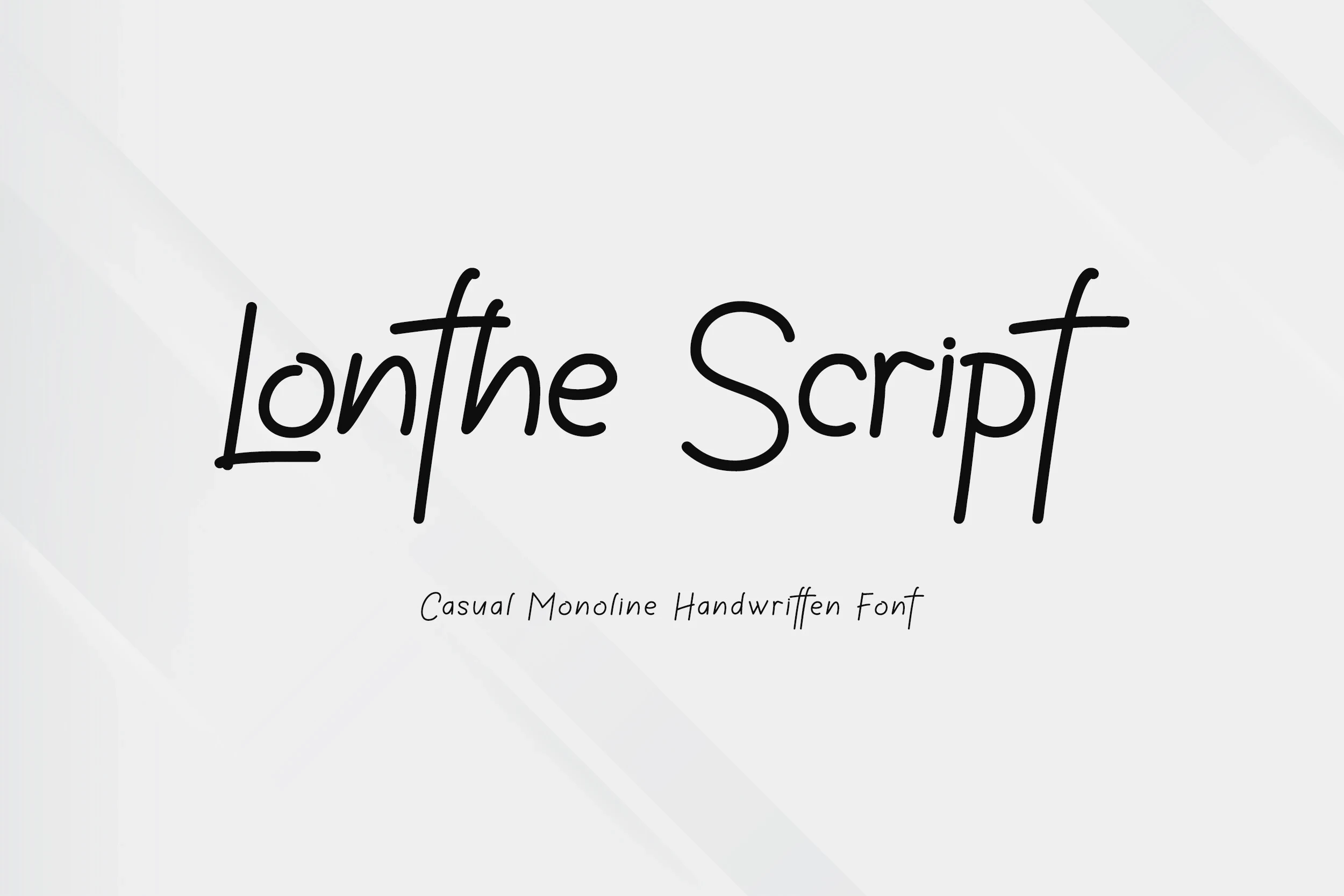
Best For: branding, modern designs, clean designs
Lonthe Font uses light connected movement and clean contemporary construction for a restrained cursive display option. Its slender forms favor modern branding and short phrases, while dense lettering would compromise openness.
Humble Font

Best For: display text, modern designs
Humble Font provides connected flowing letterforms with a clear cursive identity and contemporary display character. Reserve it for short modern headings and expressive branding rather than extended reading.
Rounded Playful Displays
Rounded proportions and playful display construction connect these faces, from light airy forms to heavy bubble letters. They offer a clearer graphic silhouette than flowing scripts or textured brush lettering.
Smoothie Delights Font

Best For: display text, modern designs, playful designs
Smoothie Delights Font brings rounded playful forms together with a brush-like rhythm and clean contemporary construction. Among Casual Handwritten Fonts, it is a useful choice for short modern phrases where its rounded shapes can stay prominent.
Open Font
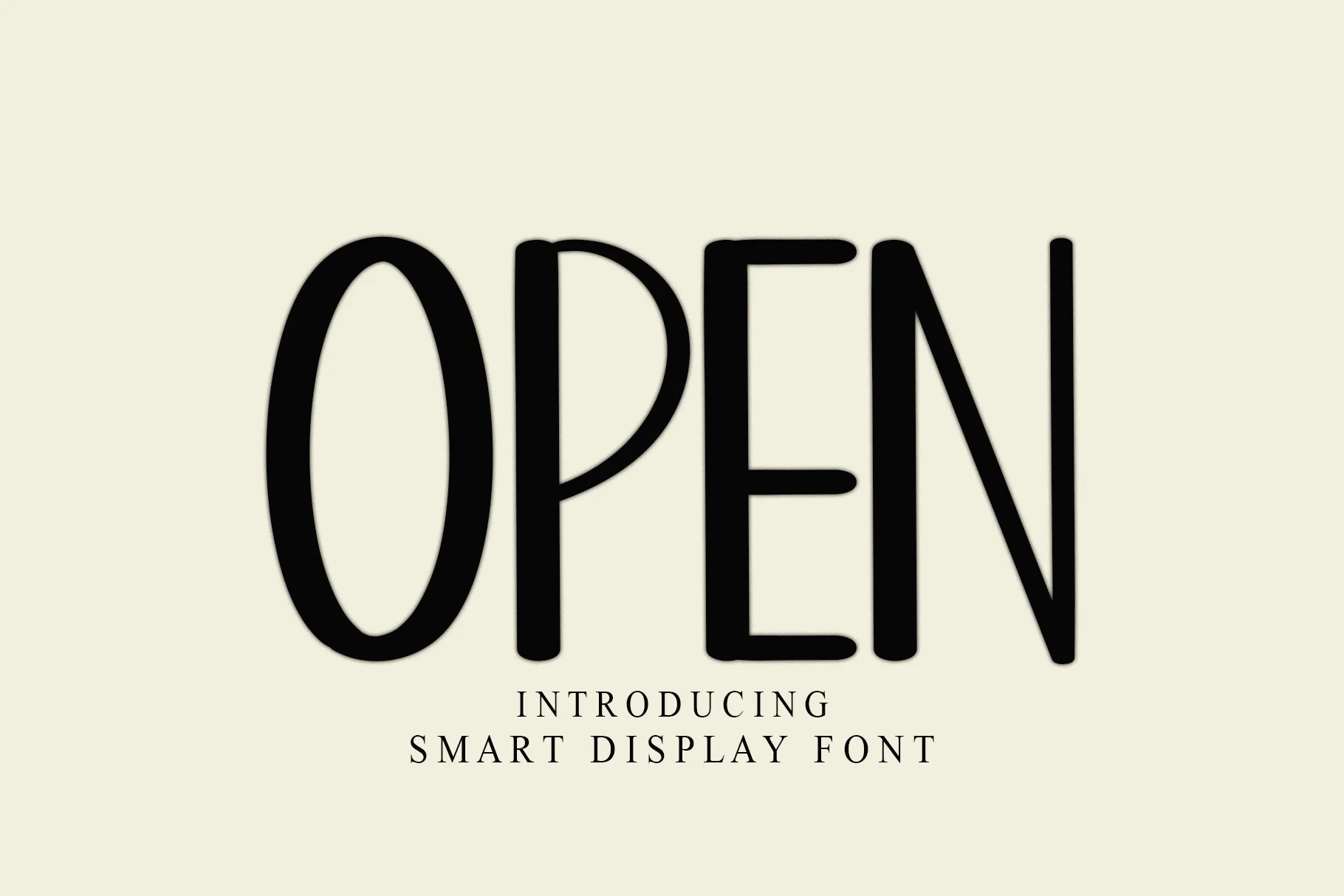
Best For: social media graphics, invitations, display text
Open Font combines light strokes with rounded playful shapes for an airy display impression. Short wording keeps those forms readable, making it particularly appropriate for invitations and social graphics.
Seamless Font
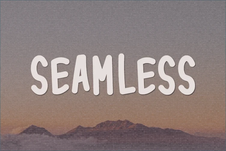
Best For: display text, playful designs, business cards
Seamless Font is defined by rounded playful character and distinctive display shapes. It can add an approachable tone to business cards and short display text, but there is no evidence here for paragraph-length use.
Abcd Font
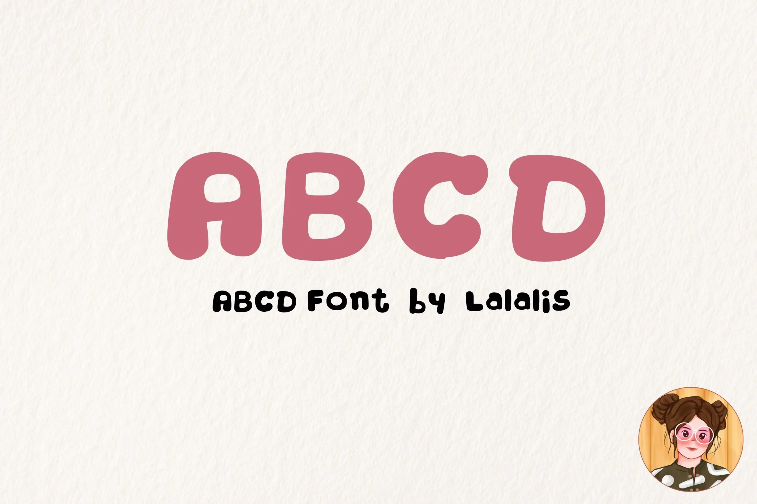
Best For: display text, soft designs, playful designs
Abcd Font uses heavy bubble construction, pill-shaped terminals, and wide squarish proportions. The large forms stay legible in short headlines and logos, though reducing them too far can make the shapes lose clarity.
Expressive Display Letterforms
This group gathers expressive display faces distinguished by stroke rhythm, brush texture, weight, or period cues rather than one shared connection style. They work best when individual letter shapes carry the design.
Sekar Wangi Font

Best For: book covers, logos
Sekar Wangi Font leads with distinctive display letterforms and a clearly defined stroke rhythm. Compare it in short headings, names, book covers, or logos, where its shapes can remain visible rather than carrying extended text.
Thing King Font
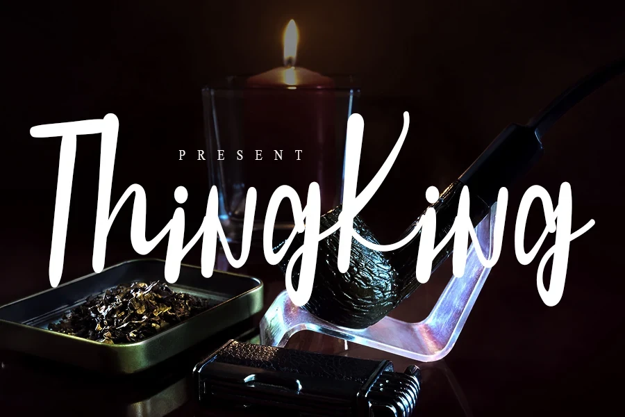
Best For: display text, branding
Thing King Font uses light, slender strokes to give its display lettering a lighter visual presence. The construction is most effective in short branding lines and expressive display text, where thin details have room to remain legible.
Night Winter Font
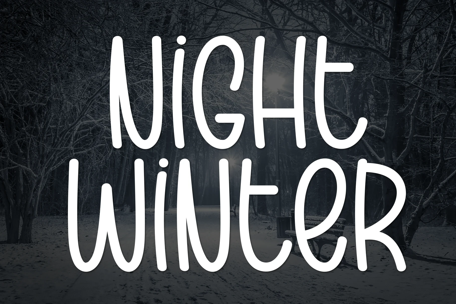
Best For: branding, invitations, quotes
Night Winter Font keeps its expressive display shapes controlled through a clean contemporary construction. Recognizable letterforms make it practical for short quotes, invitations, branding, and social graphics rather than dense reading.
Thick Font

Best For: creative projects, display text, personal branding
Thick Font gives expressive letterforms substantial display weight and immediate visual presence. Use it for short headlines, personal branding, and other high-impact phrases, checking the spacing carefully when the wording becomes longer.
Purgatory Font
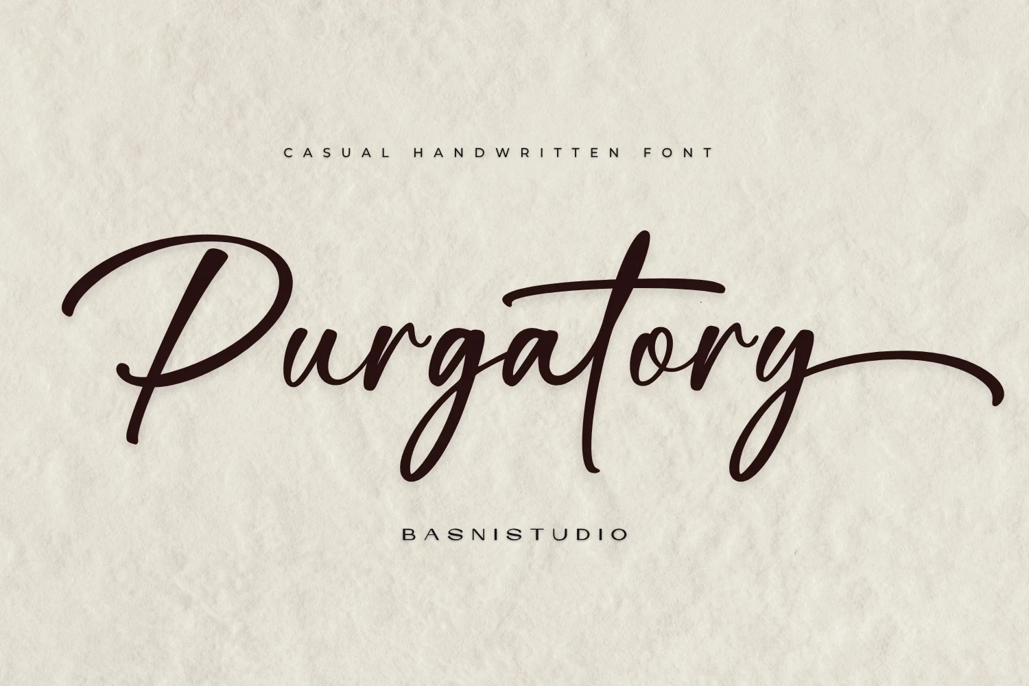
Best For: display text, classic designs, casual designs
Purgatory Font carries a period-inspired display character that gives short phrases a clear historical cue. It works best when that era-leaning personality is part of the design, rather than when neutral lettering is required.
Gostend Font
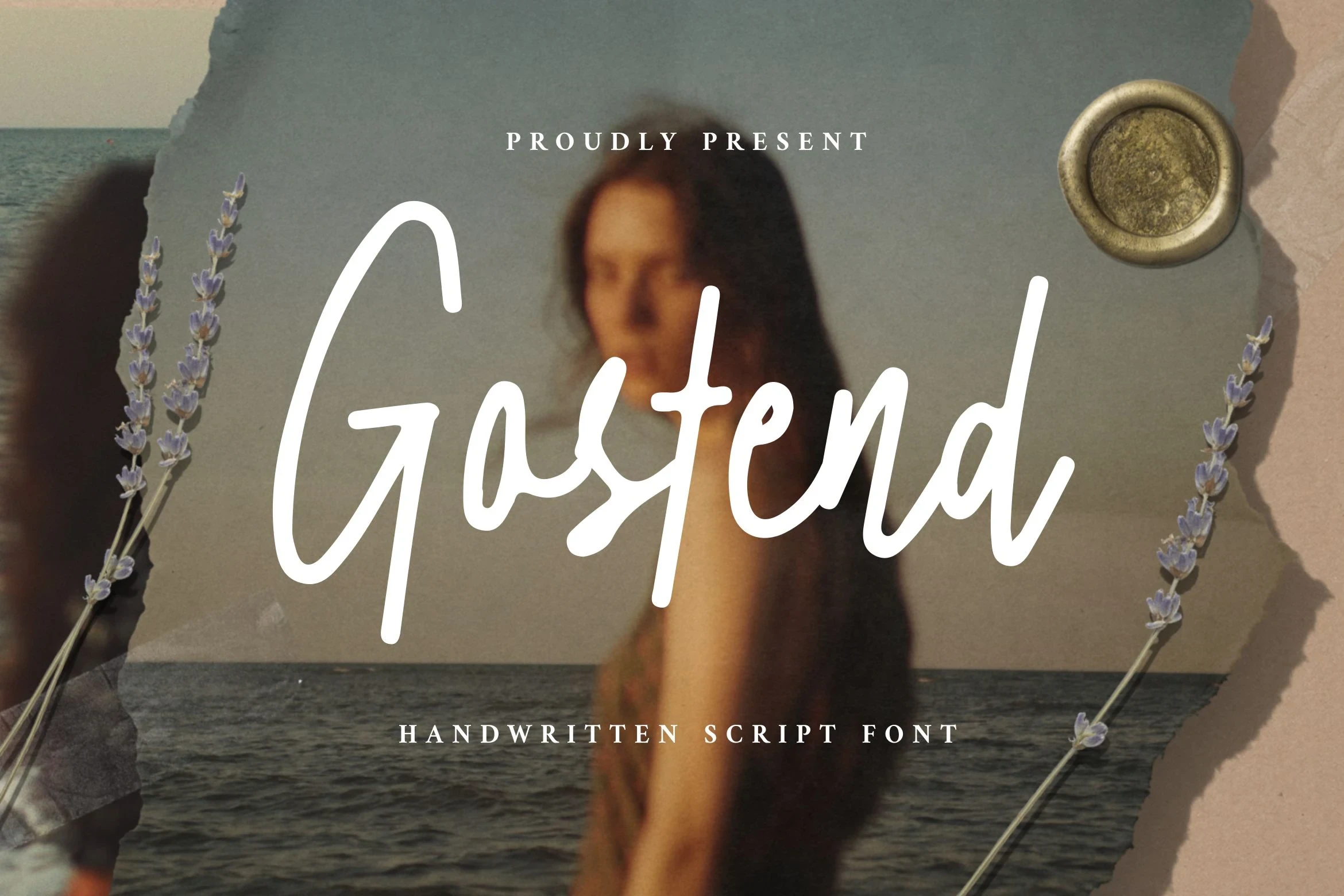
Best For: logos, posters, display text
Gostend Font relies on a clear stroke rhythm and distinctive individual letterforms rather than documented connected-script structure. Its strongest applications are logos, posters, and brief expressive wording that can be read character by character.
Valen Font
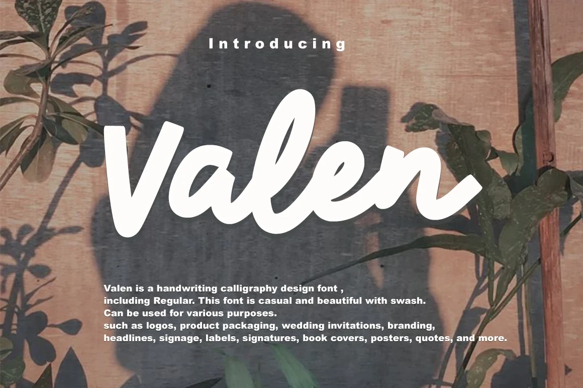
Best For: invitations, business cards, display text
Valen Font uses distinctive display shapes that suit compact invitation and business-card lettering. Keep the wording short so its expressive forms remain easy to compare and do not become visually crowded.
Alison Phillips Casual Handwritten Font

Best For: display text, personal branding, casual designs
Alison Phillips Casual Handwritten Font has a visibly drawn, brush-like stroke rhythm. At readable sizes, that surface texture supports personal branding and short casual display phrases without requiring connected lettering.
How to Choose the Right Font
Choose disconnected, upright styles when readability and medium-size flexibility matter most; Bellfast, Party Script, and Self Love are stronger starting points than ornate joins. For a continuous signature, compare slant, stroke weight, and flourishes in Archie, Riveqesik, or Outside. Rounded displays suit playful short phrases, while light scripts need generous size and spacing.