25 Best Cute Handwritten Fonts in 2026
Cute Handwritten Fonts range from bold rounded displays and structured serifs to slender lettering, connected scripts, and irregular monoline styles. Together, they cover practical roles including titles, logos, packaging, invitations, social graphics, stickers, covers, and other short-form display work.
Looking for more handwritten fonts? Browse our complete Handwritten Fonts collection to compare modern, bold, wedding, logo-friendly, and Cricut-ready handwritten styles.

Cute Handwritten Fonts: Rounded Display Styles
These Cute Handwritten Fonts emphasize rounded, disconnected display shapes with clear stroke rhythms. They feel more direct and readable than the slender, scripted, or irregular styles in the other groups.
Hurry Cute Font
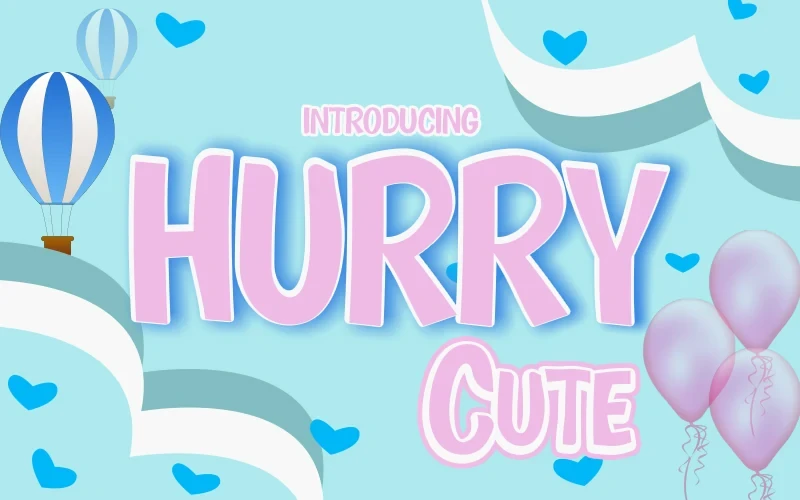
Best For: display text, soft designs
Hurry Cute Font uses bold, rounded forms with a uniform stroke and upright, disconnected construction. Its clean weight keeps Cute Handwritten Fonts highly legible in large headings, though the substantial presence is better for short display copy than paragraphs.
Cute Monster Font
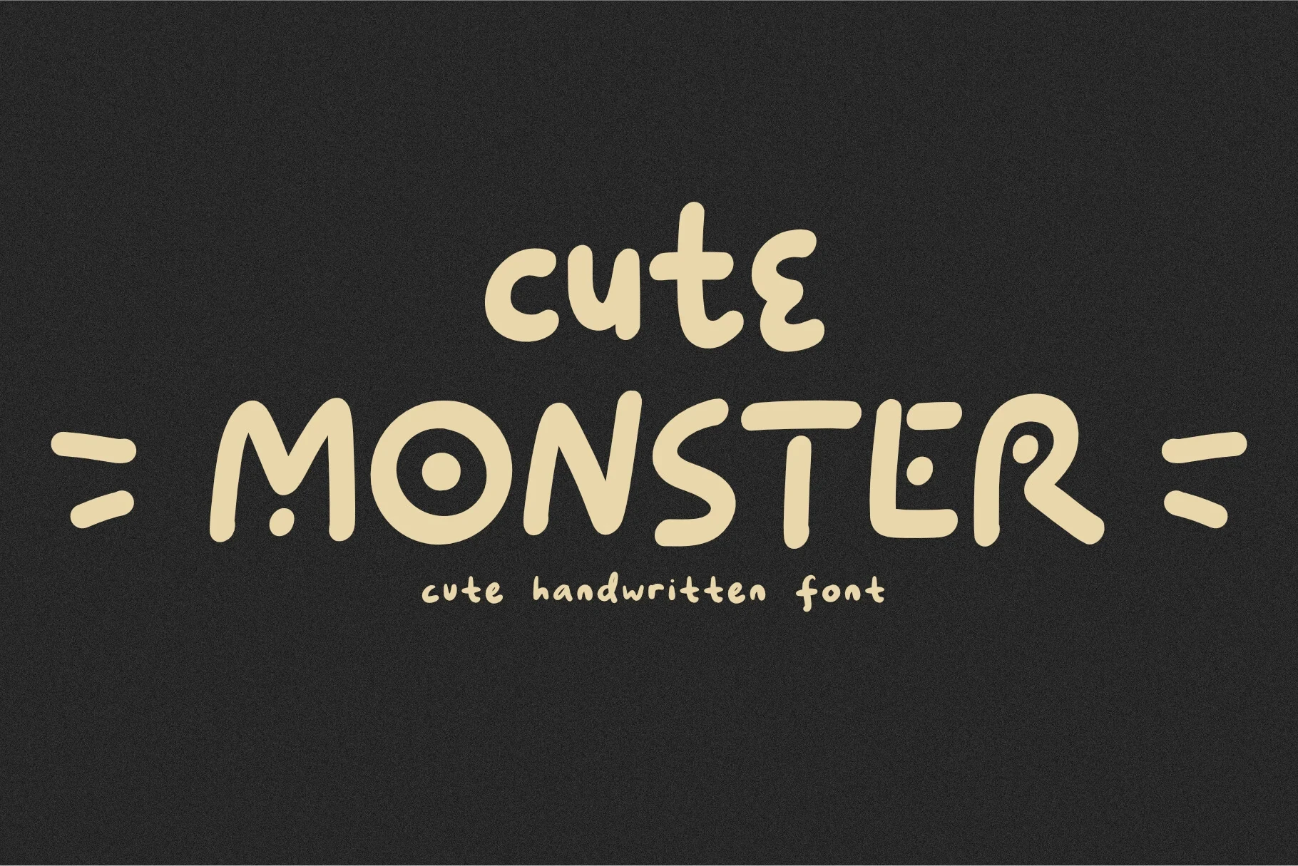
Best For: branding, invitations, creative projects
Cute Monster Font brings a substantial display serif structure to rounded, expressive lettering. The clear stroke rhythm gives names and headings a defined edge, making it more structured than many rounded displays, while longer reading is outside its strongest role.
Cute Bunny Font
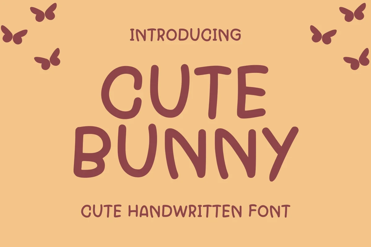
Best For: display text, cute designs, expressive designs
Cute Bunny Font is built for titles, names, and other compact wording where distinctive rounded shapes can be read at a glance. Its expressive display construction gives short phrases visual identity, but it is better judged as a heading face than as text for extended reading.
Cute Devil Font
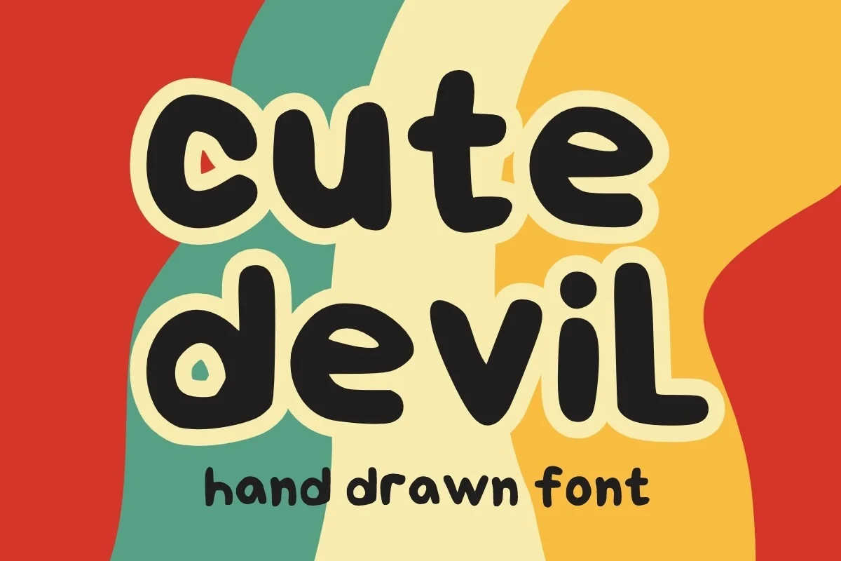
Best For: book covers, magazine covers, display text
Cute Devil Font relies on distinctive rounded display shapes to make short phrases stand out. Its strongest application is a prominent title or cover line where the letterforms can remain the focal point and do not have to compete with dense supporting information.
Barbie Cute Font
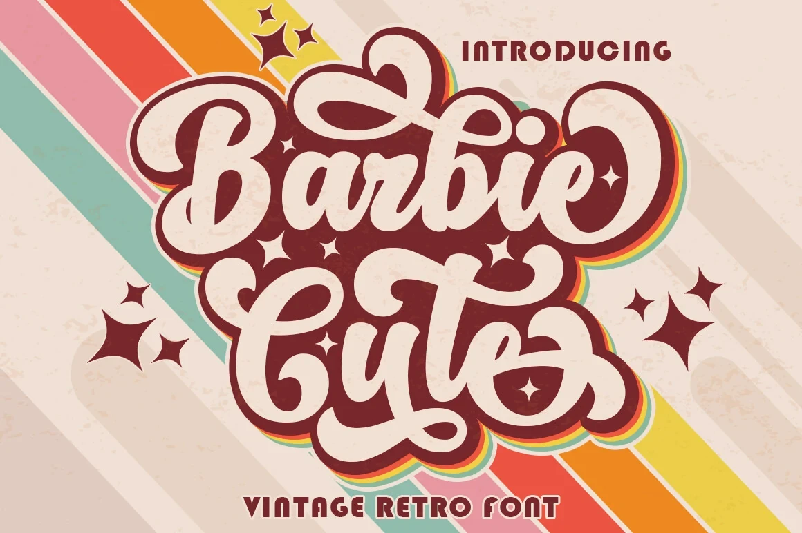
Barbie Cute Font uses rounded display construction for soft, invitation-oriented compositions. Its friendly visual tone works best in short prominent wording, where the shapes remain easy to see, rather than in information-heavy layouts requiring sustained reading.
Cute Kitty Font
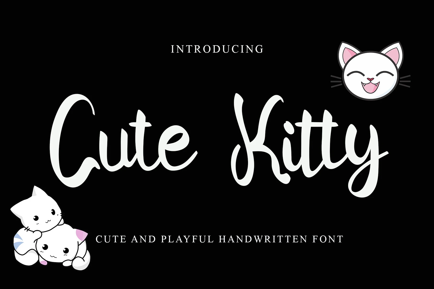
Best For: business cards, logos, display text
Cute Kitty Font pairs rounded display shapes with a polished, expressive presence that can move between logos and business cards. Concise wording allows its letterforms to compare clearly, while larger display settings give the construction room to register.
Super Cute Font
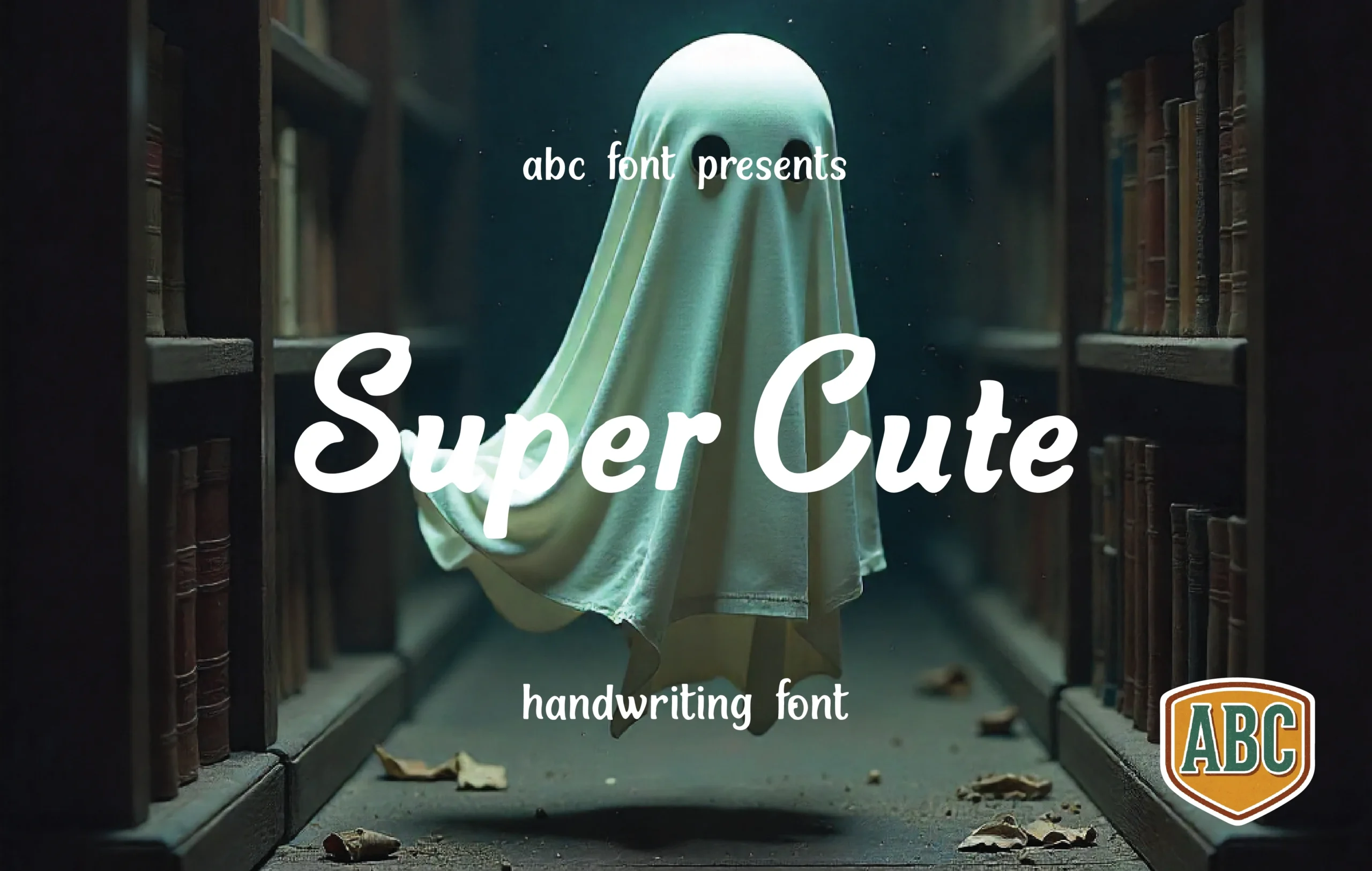
Best For: logos, branding, packaging
Super Cute Font uses rounded expressive forms that can carry a logo, package name, or quoted phrase. Its practical strength comes from clear display letterforms rather than extended-reading ability, so keep supporting copy in a separate, simpler face.
Caroline Everett Font
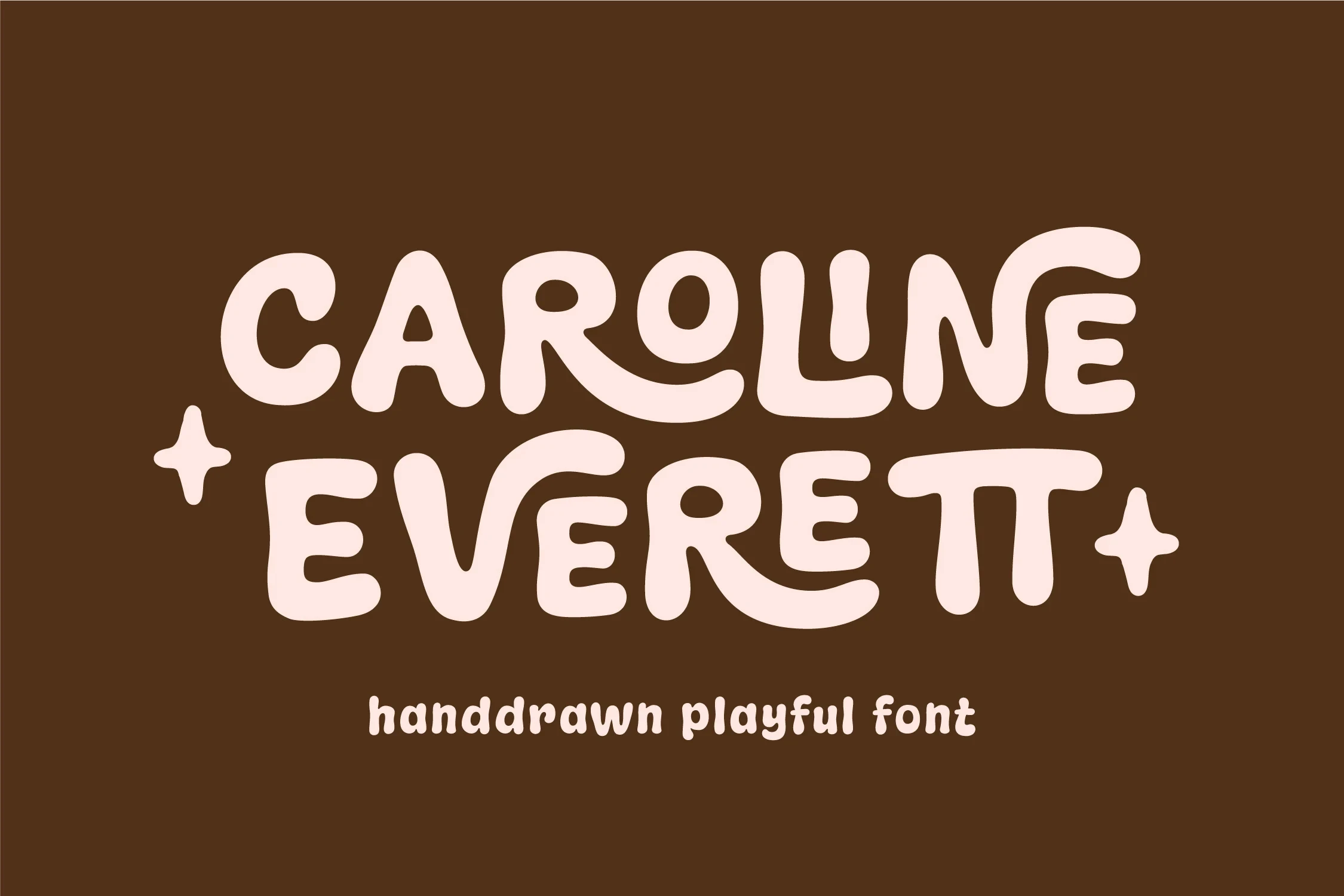
Best For: book covers, packaging, posters
Caroline Everett Font is a rounded display face suited to editorial-scale titles and packaging statements. Book covers, posters, and magazine covers give its distinctive shapes enough room to register, particularly when the wording is brief and visually prominent.
Cute Bear Font
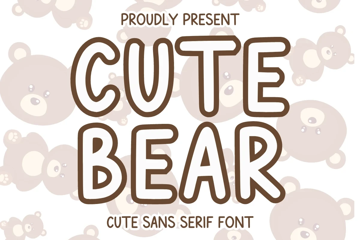
Best For: display text, playful designs, expressive designs
Cute Bear Font is built around rounded display shapes for direct, expressive short wording. It works most clearly as a title, label, or decorative phrase where the letterforms remain prominent instead of carrying detailed supporting information.
Chalksy Font
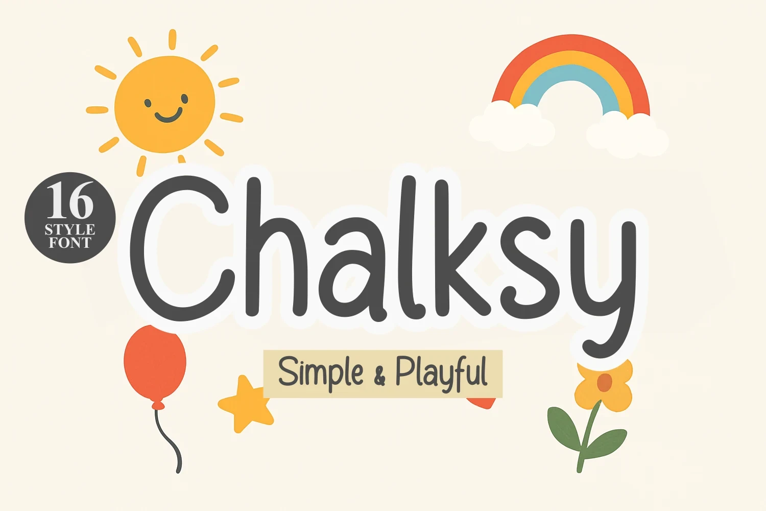
Best For: branding, posters, invitations
Chalksy Font is a rounded display face for brief statements across posters, invitations, and quotes. Its clear short-form presence makes it useful for branding and prominent layouts, especially when the phrase can remain the main visual element.
Cute Font
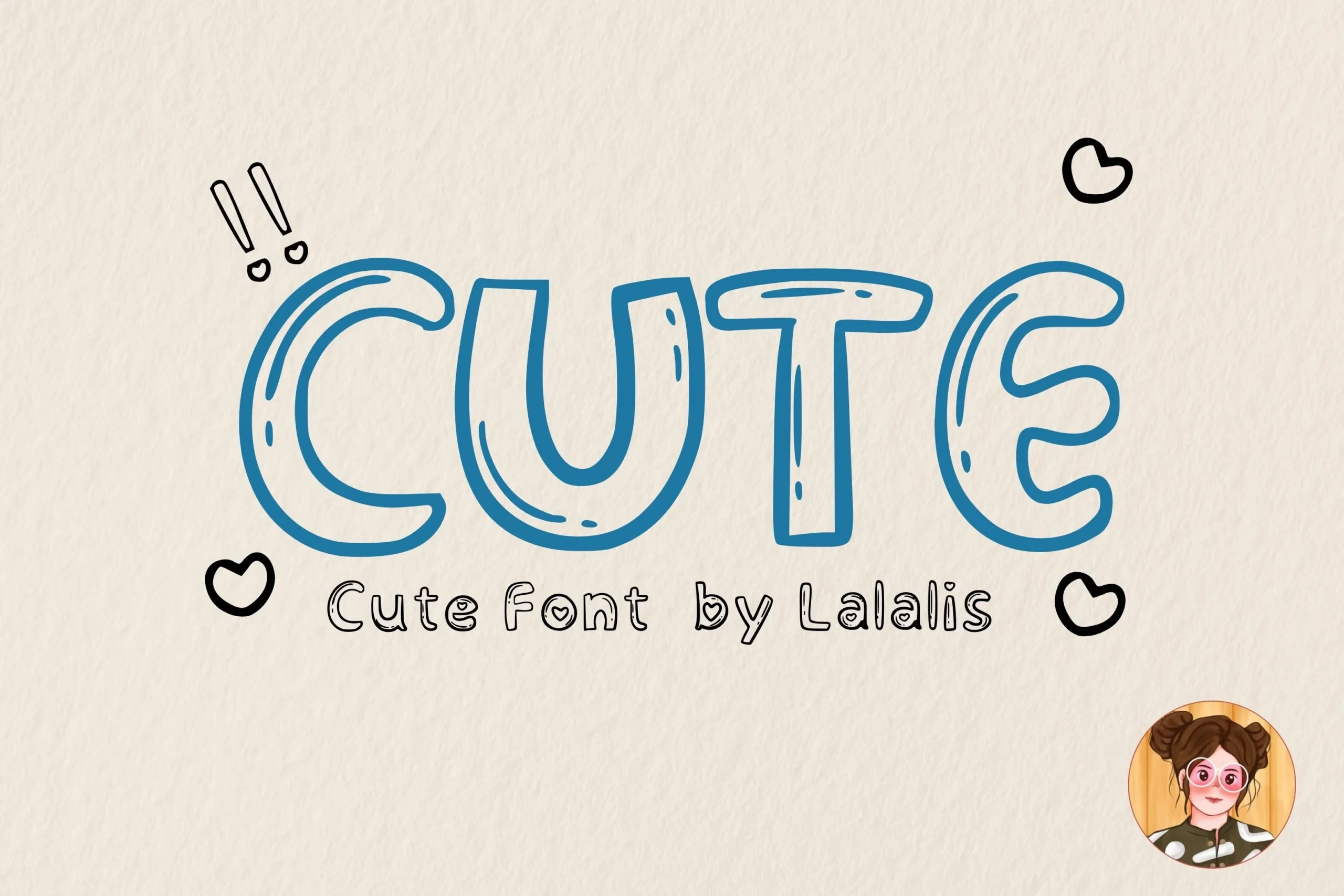
Best For: display text, playful designs, expressive designs
Cute Font uses straightforward rounded display lettering with an immediately recognizable tone. It works best when carrying a short title or decorative phrase, while detailed supporting copy should use a more neutral companion face for easier reading.
Slender and Structured Lettering
This group uses lighter strokes, cleaner construction, and, in one case, rounded slab serifs. Compared with heavier displays, these faces need more size and spacing to stay visible.
Lucky Farmer Font

Best For: branding, display text, soft designs
Lucky Farmer Font gives Cute Handwritten Fonts a lighter visual footprint through refined, slender strokes and rounded display shapes. It supports soft branding and headings without adding visual weight, but its delicate construction should be assessed at display sizes and kept to concise wording.
Laser Cute Font
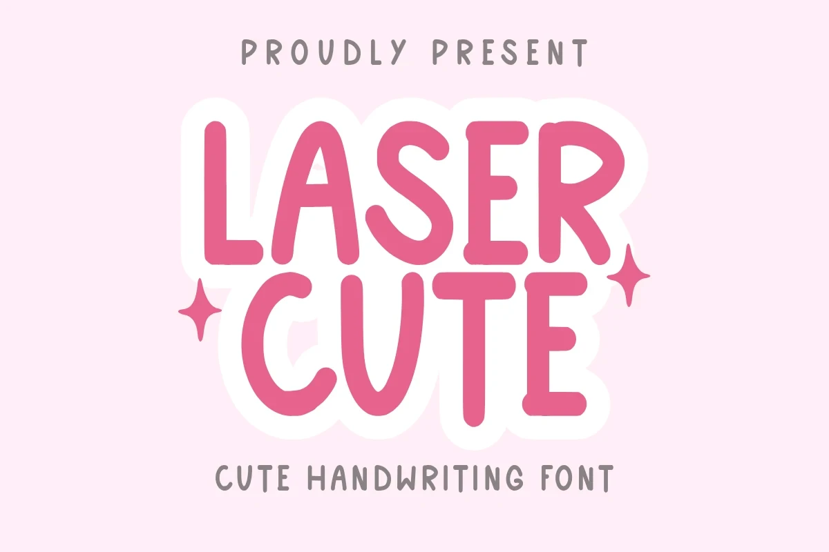
Best For: social media graphics, branding, invitations
Laser Cute Font brings slender rounded strokes and clean contemporary construction to Cute Handwritten Fonts. Its restrained weight suits social graphics and invitations, although selective display use, generous sizing, and short phrases will preserve the clearest reading.
Animal Cute Font

Best For: headlines, stickers, quotes
Animal Cute Font uses light rounded lettering with a consistent display rhythm. It keeps stickers and quotations visually gentle, while headings provide the clearest reading context; the lighter stroke is less suited to small or information-dense layouts.
Cute Anne Font
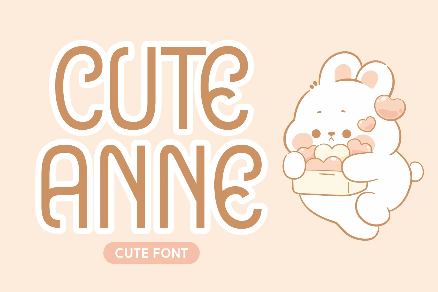
Best For: headlines, display text, playful designs
Cute Anne Font offers slender rounded display lettering with a clean, refined stroke presence. It supports lighthearted headlines without becoming heavy, making size, contrast with surrounding type, and phrase length important practical choices.
Cute Berry Font
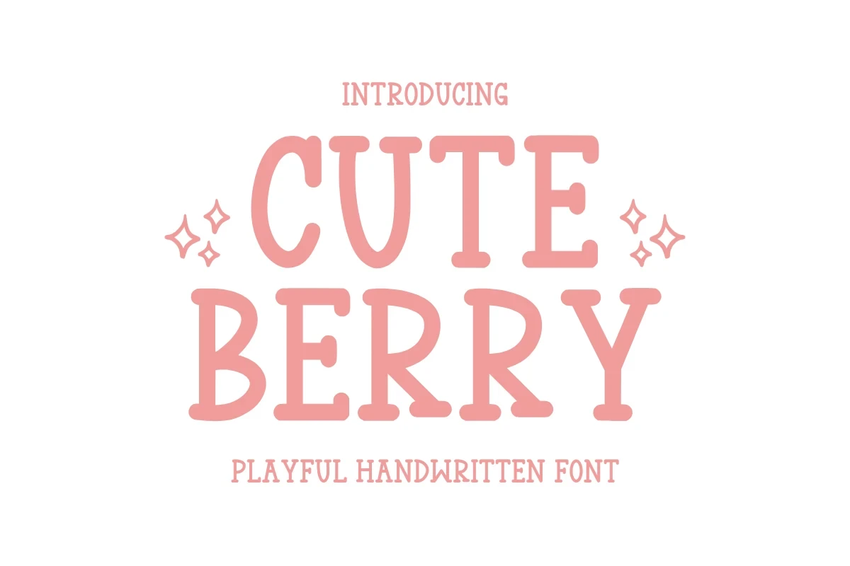
Best For: stickers, website headers, display text
Cute Berry Font gives Cute Handwritten Fonts a sturdier identity through rounded slab serifs, medium weight, disjointed letters, chunky corners, and generous spacing. Those features support readable headers, stickers, and website titles more reliably than fine scripted forms.
Connected Cursive Lettering
Connected letterforms create continuous movement across this group, from bold scripts with swashes to lighter signature-like styles. Short wording remains more reliable than dense text or small applications.
Winter Script Font
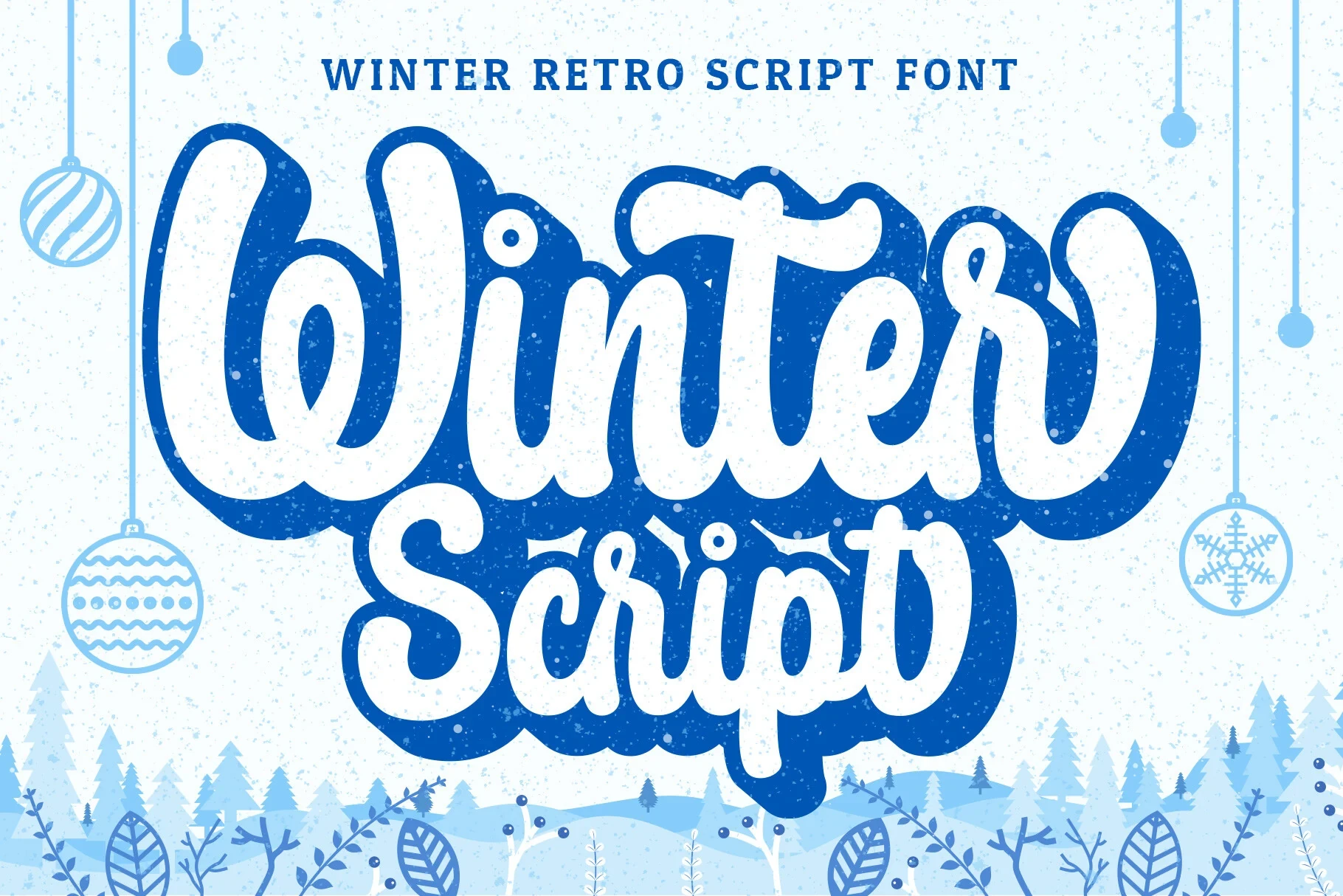
Best For: T-shirts, stickers, social media graphics
Winter Script Font gives Cute Handwritten Fonts bold connected movement through substantial cursive strokes. The weight supports shirts, stickers, and covers, but the joins make short phrases the safest format and can reduce clarity when wording becomes dense.
Barbie Cute Font
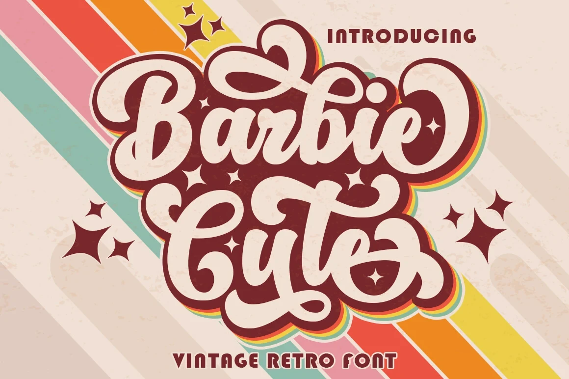
Barbie Cute Font uses bold connected script, pronounced curves, and decorative swashes for a retro 1970s flavor. It suits logos and packaging at large sizes, but its stylization may lose clarity when reduced or arranged in dense blocks.
Milkshake Font
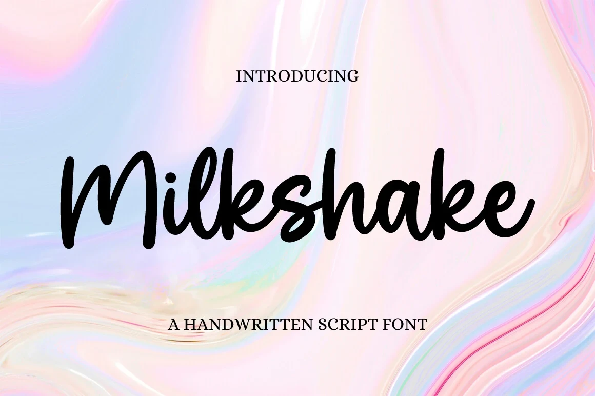
Best For: invitations, social media graphics, wall art
Milkshake Font gives Cute Handwritten Fonts light connected script with continuous movement and refined slender strokes. It adds a softer signature to invitations and wall art, with short names and phrases offering the clearest reading and strongest visual control.
Cute Bee Font
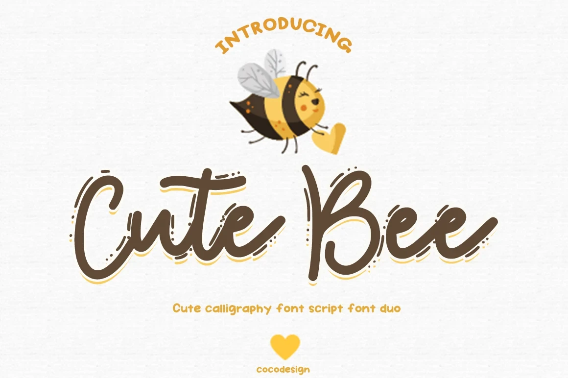
Best For: logos, packaging, product labels
Cute Bee Font uses connected rounded script to give branded labels and product names a continuous shape. The joins create visual unity, but its display construction is best reserved for concise wording rather than detailed descriptions or small text.
Organic Handwritten Display Styles
Organic styles introduce monoline weight, irregular baselines, condensed proportions, or informal shape variation. Their handmade visual cues distinguish them from the more controlled rounded and connected lettering.
Good Nature Font
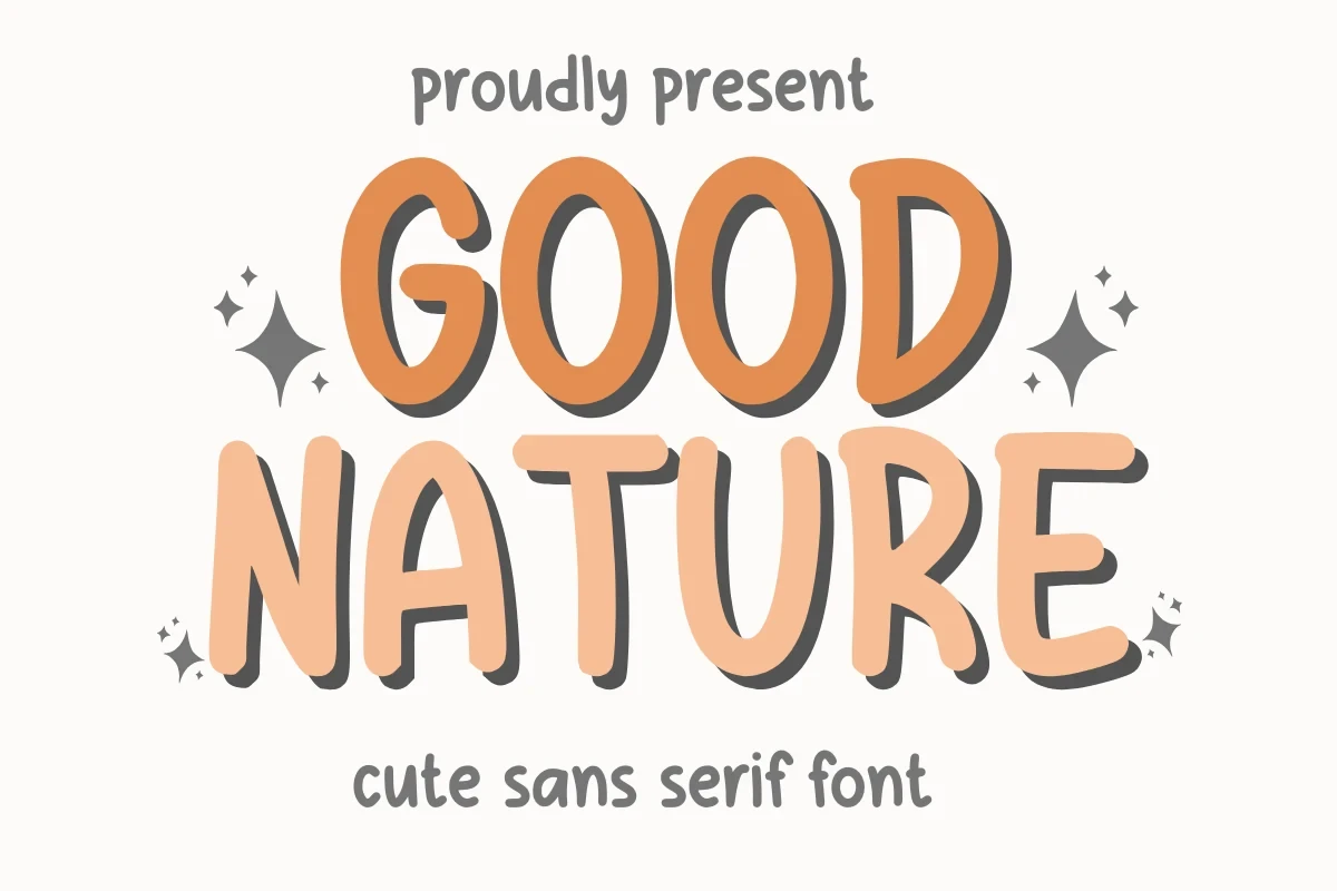
Best For: display text, soft designs, playful designs
Good Nature Font brings Cute Handwritten Fonts bold monoline lettering, upright proportions, and an irregular baseline. Its strong large-size clarity supports friendly display text, while the uneven baseline adds handmade movement without disrupting short headline readability.
I Am Cute Font

Best For: invitations, social media graphics, headlines
I Am Cute Font combines bold upright monoline lettering, soft terminals, and disconnected characters. The construction keeps Cute Handwritten Fonts clear in short headlines and invitations, while its supplied TTF and OTF formats add practical flexibility; it is not intended for long text blocks.
Roster Font
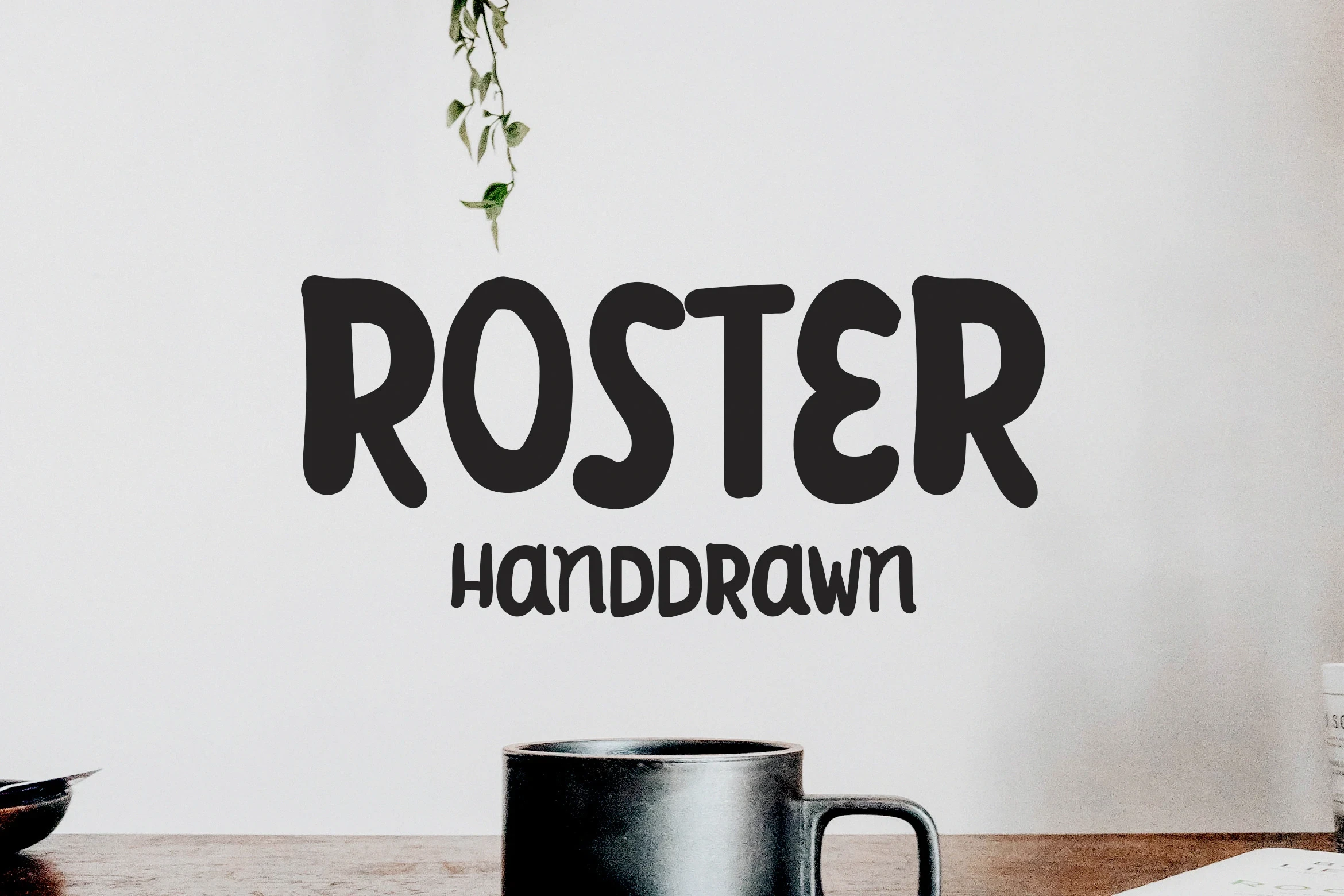
Best For: display text, wall art, clean designs
Roster Font uses heavy condensed lettering with thick rounded strokes and informal shape variation. Its compact width suits wall art and prominent lines, while the secondary handwritten style should remain around medium sizing to avoid losing clarity.
Hello Cute Font
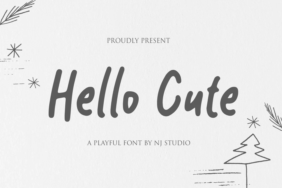
Best For: clean designs, business cards
Hello Cute Font gives Cute Handwritten Fonts monoline lettering with disconnected characters and an irregular baseline. Consistent weight and spacing preserve headline and mid-size readability, while the uneven baseline adds informal movement to business cards and clean display layouts.
Reyskie Font
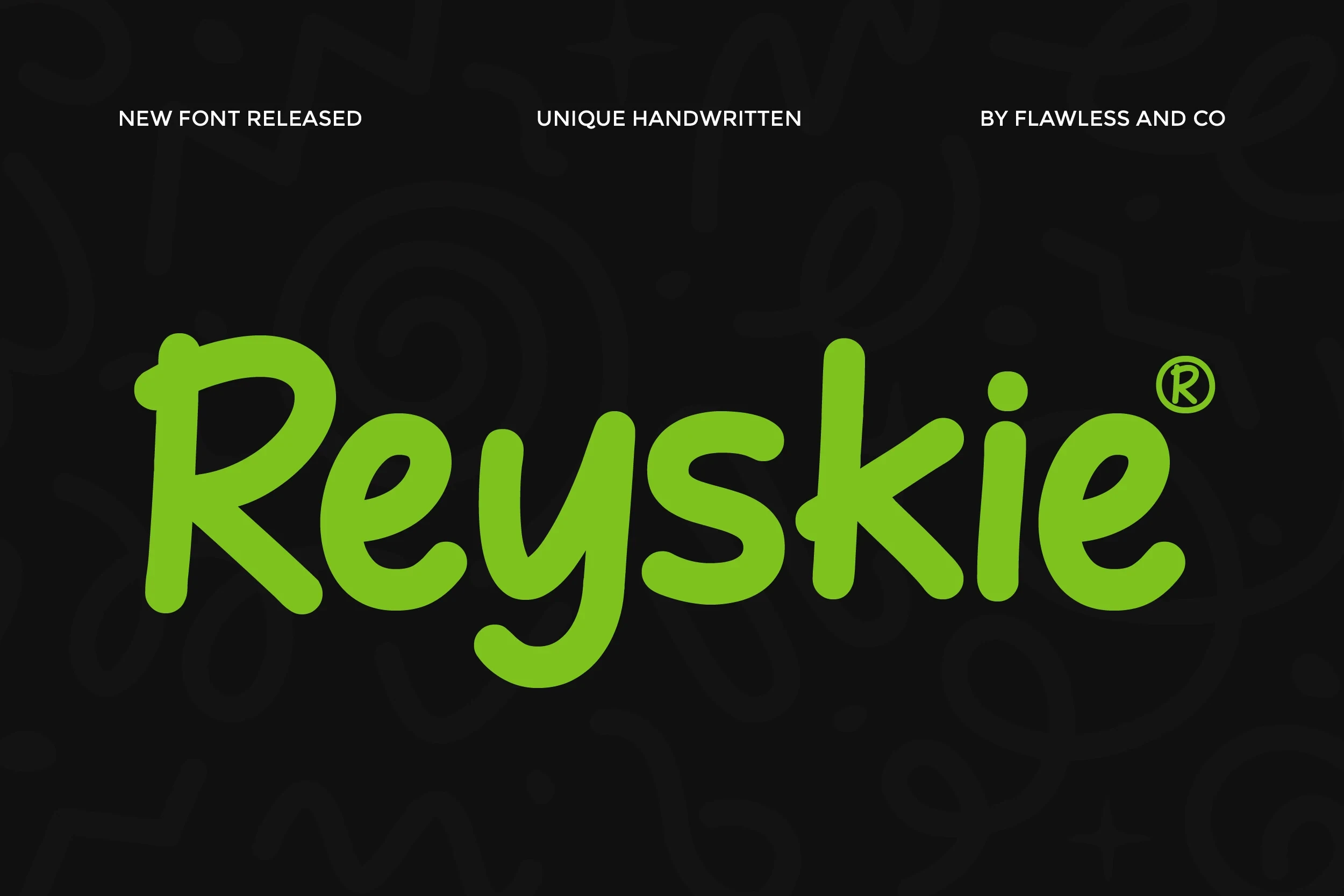
Best For: branding, social media graphics, display text
Reyskie Font provides bold upright monoline forms with rounded terminals and disconnected letters. Its clear construction makes branding and social graphics approachable and readable in large headlines, particularly when the wording is short and the display scale is generous.
How to Choose the Right Font
Choose among Cute Handwritten Fonts by first comparing weight and connection: bold disconnected styles usually read most clearly, while joined scripts need shorter wording and more space. Slender faces suit lighter branding, slab serifs add structure, and irregular baselines supply handmade movement. Always test the actual phrase at its intended size before finalizing.