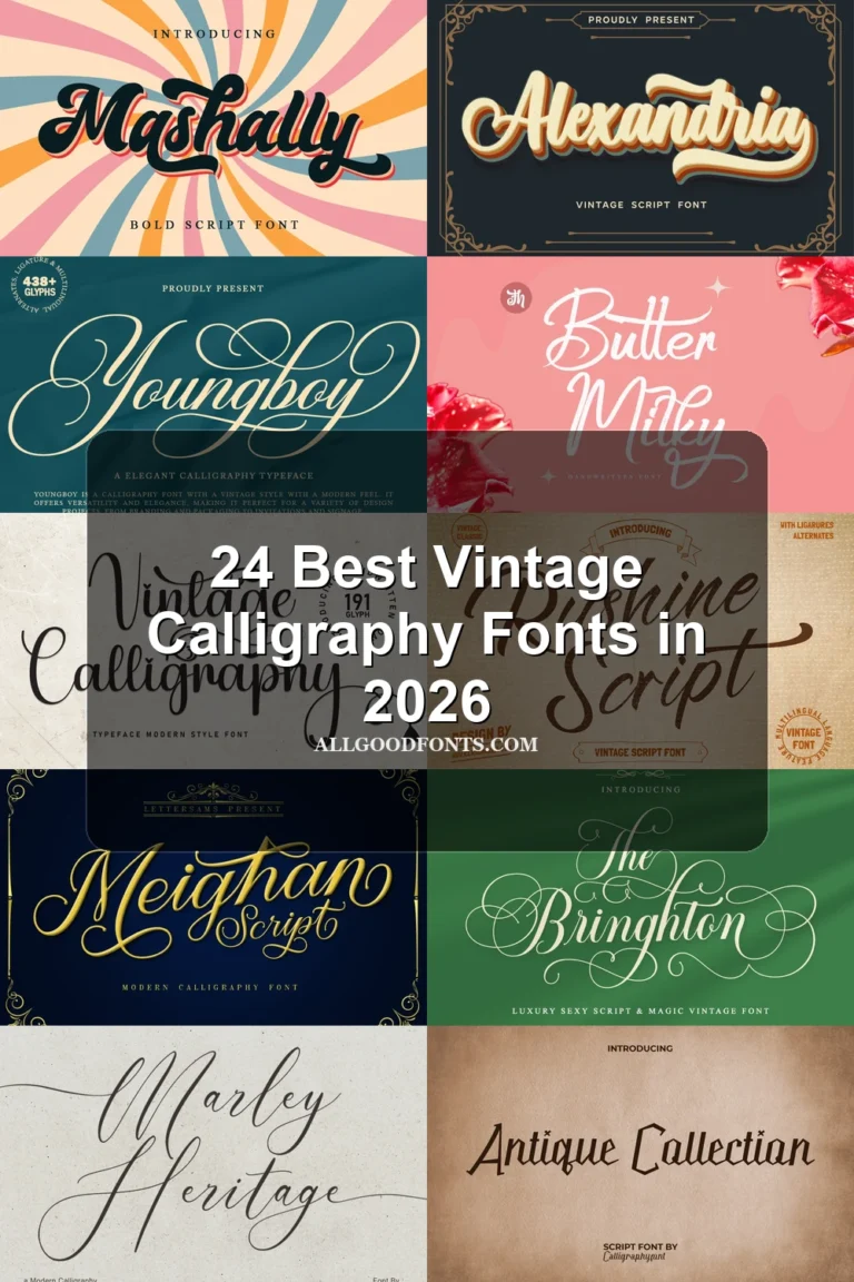
19 Best Bold Calligraphy Fonts in 2026
This collection of Bold Calligraphy Fonts spans connected cursive, ornate high-contrast lettering, layered shadows, interrupted joins, and brush-style overlaps. These construction choices shape where each face works best, from logos and invitations to posters, labels, signage, and short display titles.
Looking for more calligraphy fonts? Browse our complete Calligraphy Fonts collection to compare modern, elegant, bold, wedding, and logo-friendly calligraphy styles.

Bold Calligraphy Fonts for Connected Display
Bold Calligraphy Fonts for Connected Display share joined, substantial lettering, but range from upright and rounded to slanted, refined, period-inspired, and contemporary forms.
Regalyn Font
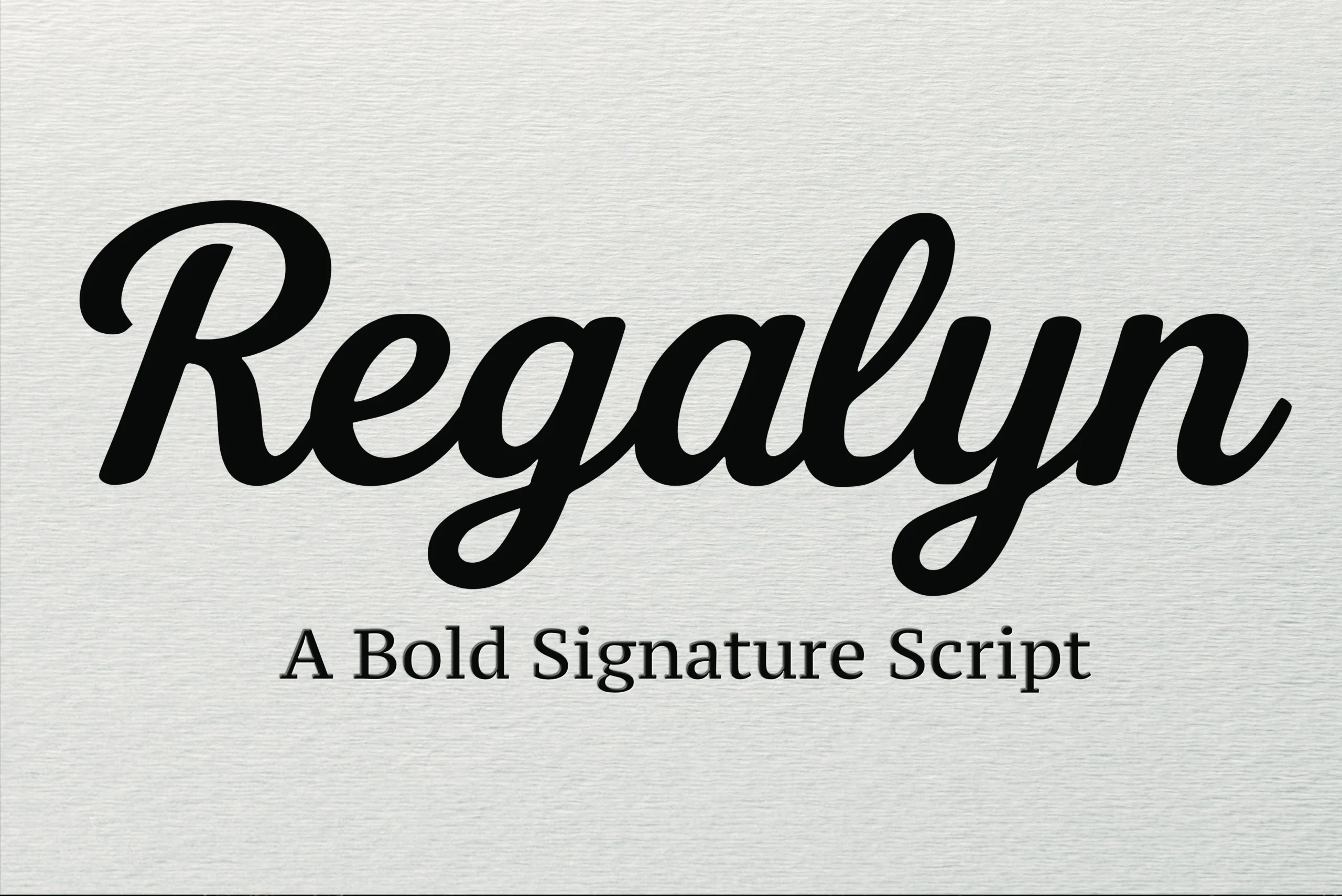
Best For: short phrases, modern designs, elegant designs
Regalyn Font pairs a bold connected script, high contrast, rounded terminals, and a slight slant with a supporting serif. As Bold Calligraphy Fonts go, it suits short, large titles; use the serif for smaller labels rather than matching display emphasis.
Skayla Font

Best For: fashion branding, logos, branding, packaging
Skayla Font uses clean, softly joined cursive movement and substantial weight for a readable display rhythm. This Bold Calligraphy Fonts choice is strongest in names, headings, fashion branding, and short logos, where unusual letter shapes can be checked individually.
Egalia Kokane Font
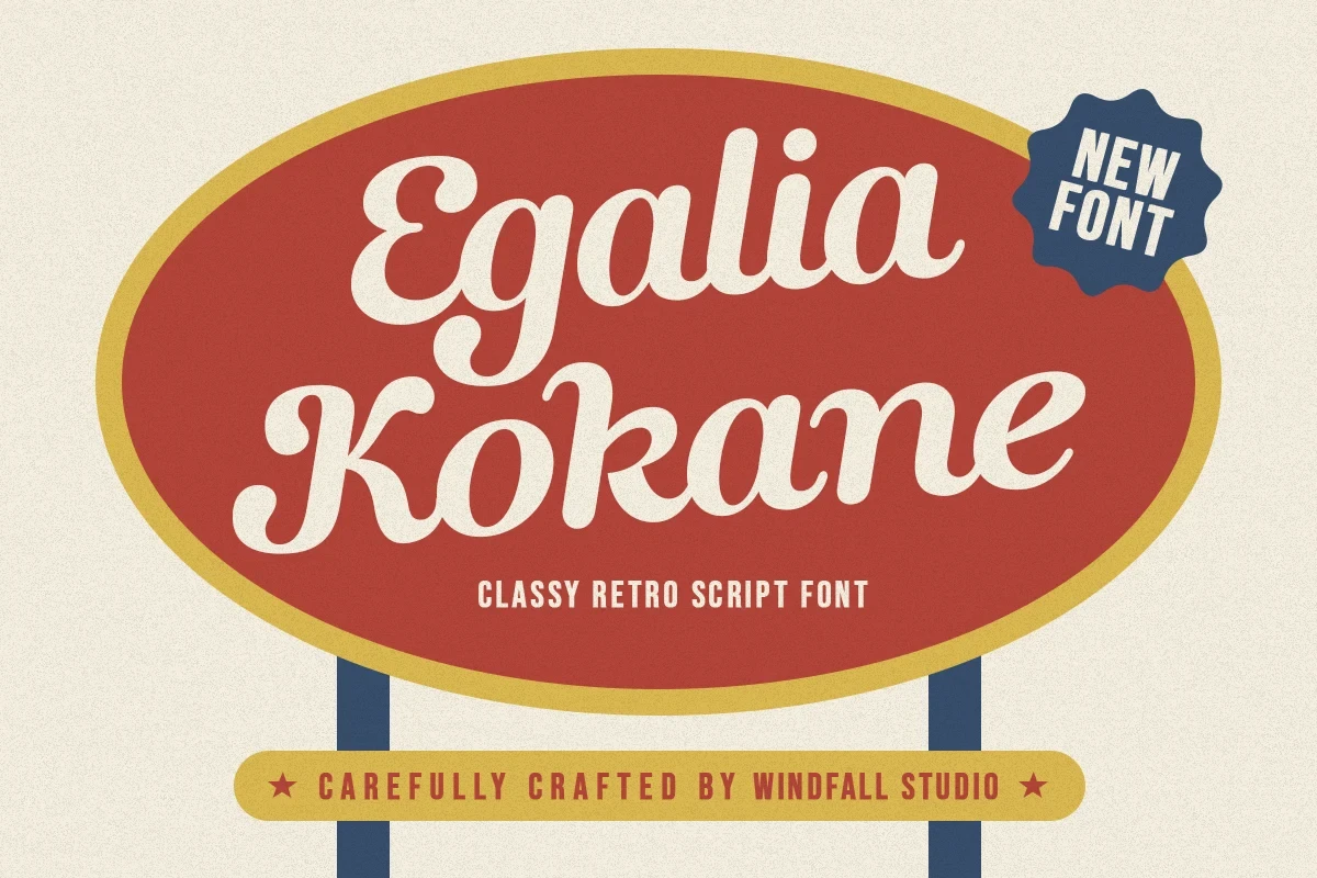
Best For: signage, clean designs, soft designs, bold designs
Egalia Kokane Font leans strongly right, with heavy connected forms, softly rounded terminals, and lightly modulated strokes. The thick rhythm keeps signage and large titles readable, although its flowing joins lose definition when reduced to small sizes.
Maranta Font
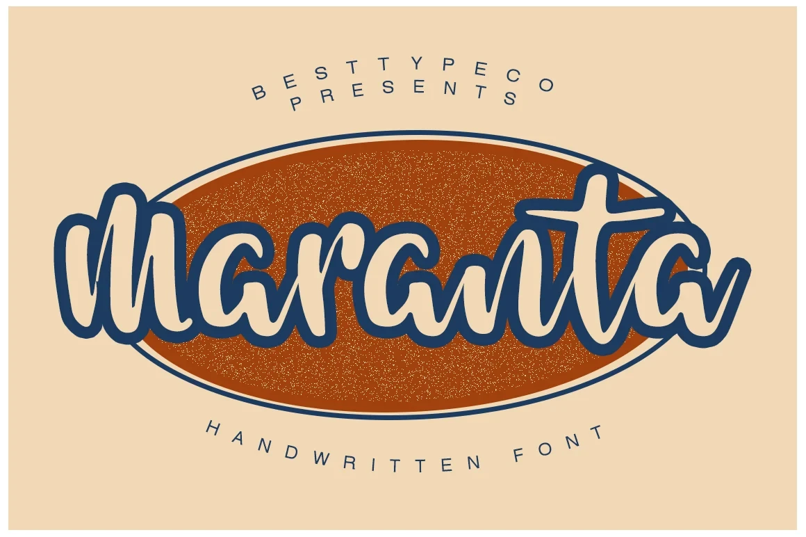
Best For: wall art, clean designs, bold designs, retro designs
Maranta Font keeps its bold connected cursive upright rather than heavily slanted. That consistent stroke weight makes it approachable and clear for medium-to-large wall art, labels, and other designs needing a friendly retro voice.
Crabsy Pattya Font

Best For: book covers, T-shirts, logos, branding
Crabsy Pattya Font combines flowing joined letters with distinctive display forms, creating a more expressive silhouette than a plain cursive. Its substantial weight supports short branding phrases, but names and titles deserve careful checking before production.
Glaster Font
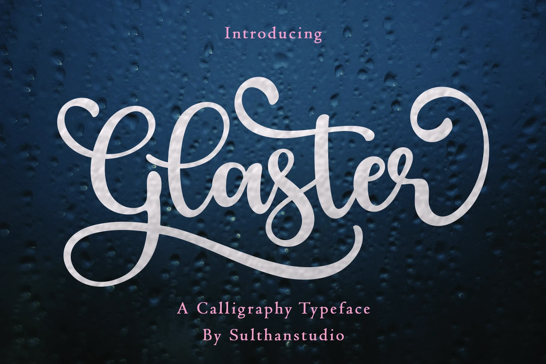
Best For: display text, elegant designs, bold designs, expressive designs
Glaster Font distinguishes its bold connected lettering with refined, slender strokes rather than blunt heaviness. It brings an elegant line to headings and expressive display text, but those thinner details need generous sizing to stay clear.
Shine Font
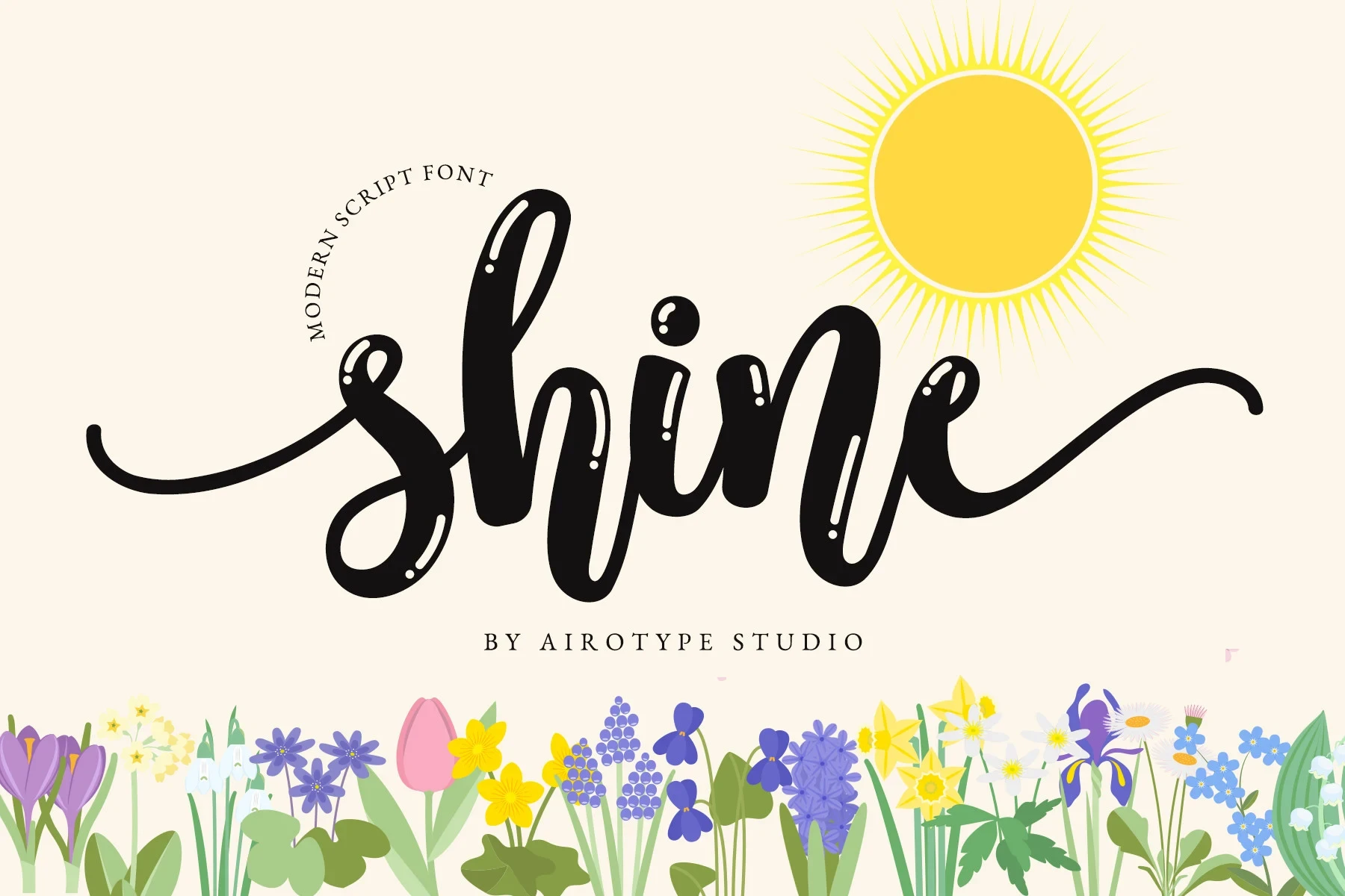
Best For: invitations, stickers, T-shirts, display text
Shine Font balances a bold cursive framework with refined strokes and flowing movement. Its letterforms remain prominent in short invitations, stickers, and shirt phrases, where the expressive joins have room to function as the main visual feature.
Aylimah Font

Best For: business cards, logos, invitations, quotes
Aylimah Font forms a clean calligraphic block from heavy connected letters, rounded terminals, and a slight rightward slant. Its weight supports logos, quotes, invitations, and business cards at display sizes, while significant reduction can blur the joins.
Najwa Font
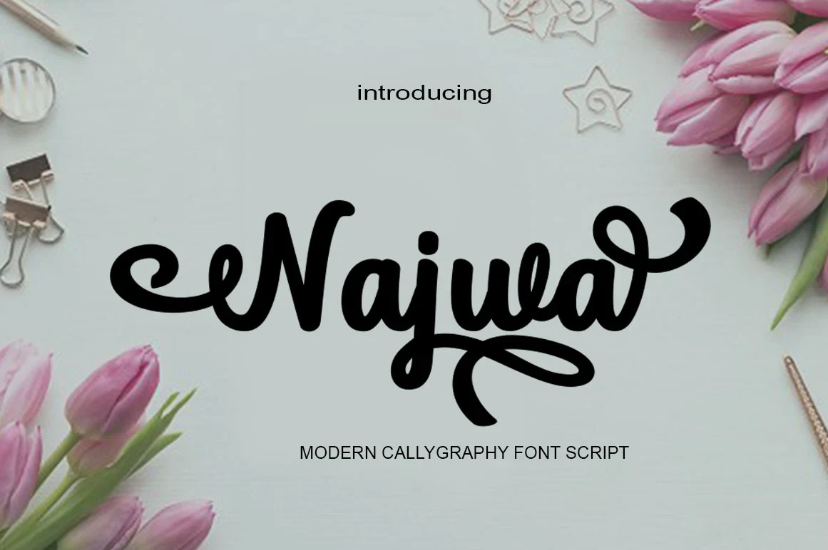
Best For: display text, classic designs, bold designs, expressive designs
Najwa Font brings a period-inspired display character to bold, flowing connected script. It gives short headings and names expressive classic emphasis, although its decorative personality is less appropriate when branding needs a restrained, neutral impression.
Flourished High-Contrast Scripts
These flourished scripts emphasize thick-thin contrast, loops, swashes, and decorative terminals, making them more ornate and display-dependent than the cleaner connected group.
Flondayscript Regular Font
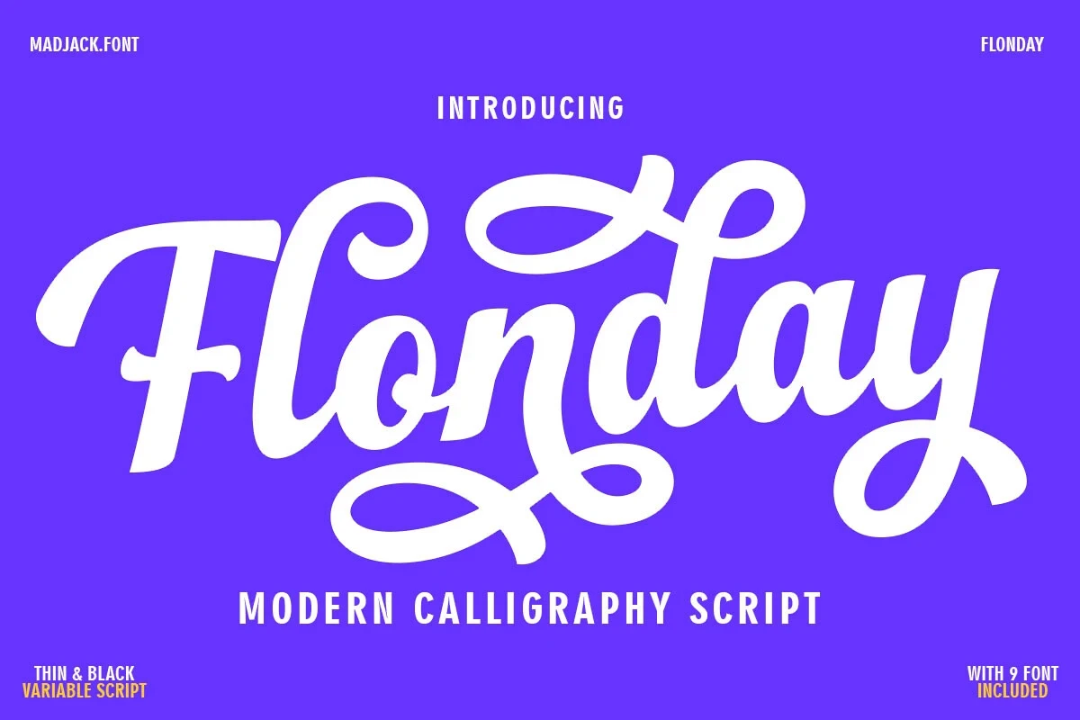
Best For: social media graphics, product labels, logos, branding
Flondayscript Regular Font is built for large logos and labels, with connected cursive, strong thick-thin contrast, decorative loops, swashes, and included ligatures. Among Bold Calligraphy Fonts, its ornate construction has the greatest readability penalty when text becomes small or dense.
Wishmeluck Font

Best For: product labels, display text, modern designs
Wishmeluck Font compresses heavy joined strokes, a rightward slant, and sweeping swashes into a compact word shape. This Bold Calligraphy Fonts option fits product-label layouts efficiently, though its intricate flourishes rule it out for body copy.
Bindery Theclips Font
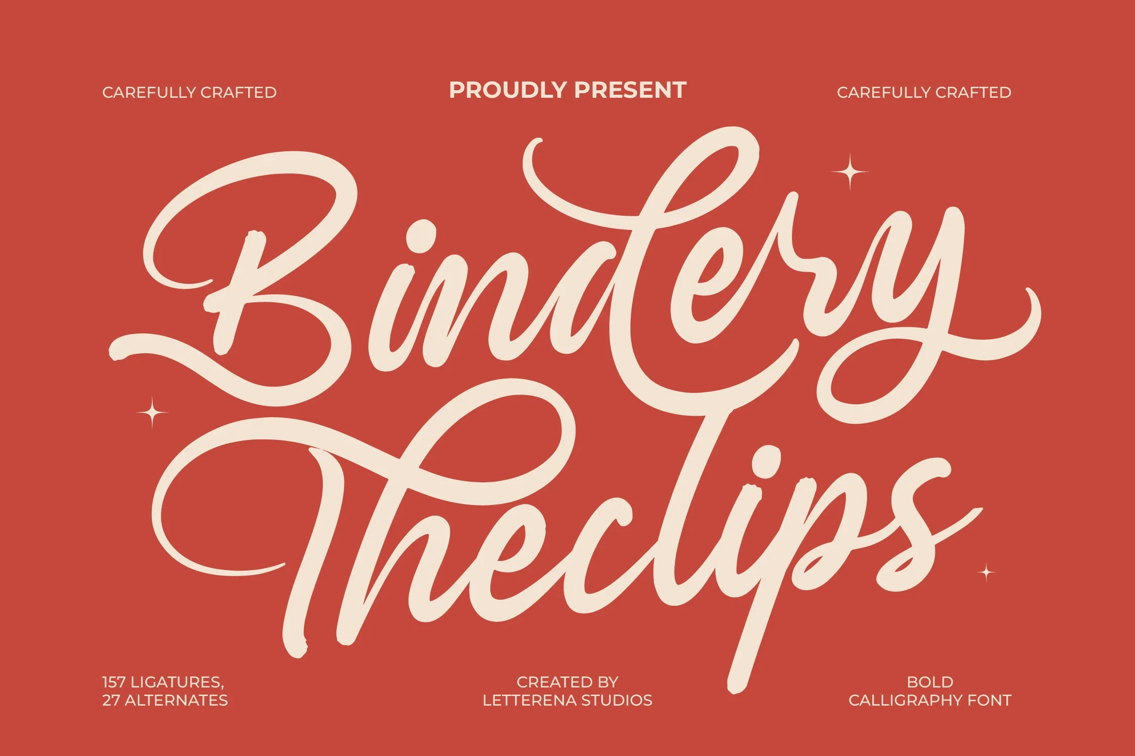
Best For: book covers, T-shirts, logos, branding
Bindery Theclips Font uses complex connected forms, a right-leaning slant, and pronounced initial and terminal swashes for a ceremonial signature effect. This Bold Calligraphy Fonts style suits book covers and logos, but its dense connections need large display treatment.
Firebreak Font
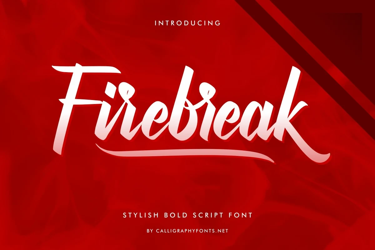
Best For: headlines, social media graphics, display text, clean designs
Firebreak Font adds an extended underline swash beneath high-contrast connected lettering, giving headlines and social graphics a strong horizontal anchor. Its large-size display use is clear, while PUA-encoded characters call for a font-aware design workflow.
Lettifa Cute Font
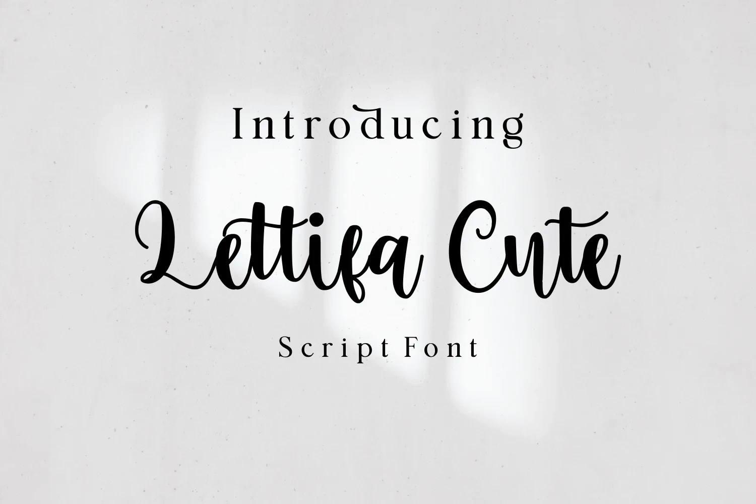
Best For: fashion branding, branding, invitations
Lettifa Cute Font relies on looping ascenders and descenders, heavy connected strokes, and a slight forward slant for a playful decorative profile. It works well in large fashion branding and invitations, though thin swash details can vanish when reduced.
Grantsburg Font

Best For: headlines, elegant designs, bold designs, decorative designs
Grantsburg Font makes its ornament deliberate through a terminal lowercase g swash, high-contrast connected letters, and a layered drop shadow. The shadow strengthens headlines, but the flowing joins still demand generous sizing for reliable character clarity.
Ackworth Font

Best For: branding, fashion branding, product labels, modern designs
Ackworth Font combines variable stroke width, high contrast, a horizontal underline swash, alternates, and PUA-encoded characters. These Bold Calligraphy Fonts features expand branding options, but the connected detail favors large titles and logos over paragraphs.
Interrupted, Layered, and Brush Scripts
Interrupted joins, drop shadows, and brush overlaps define this group, adding playful or athletic impact while making character boundaries less dependable at small sizes.
Outbreak Font
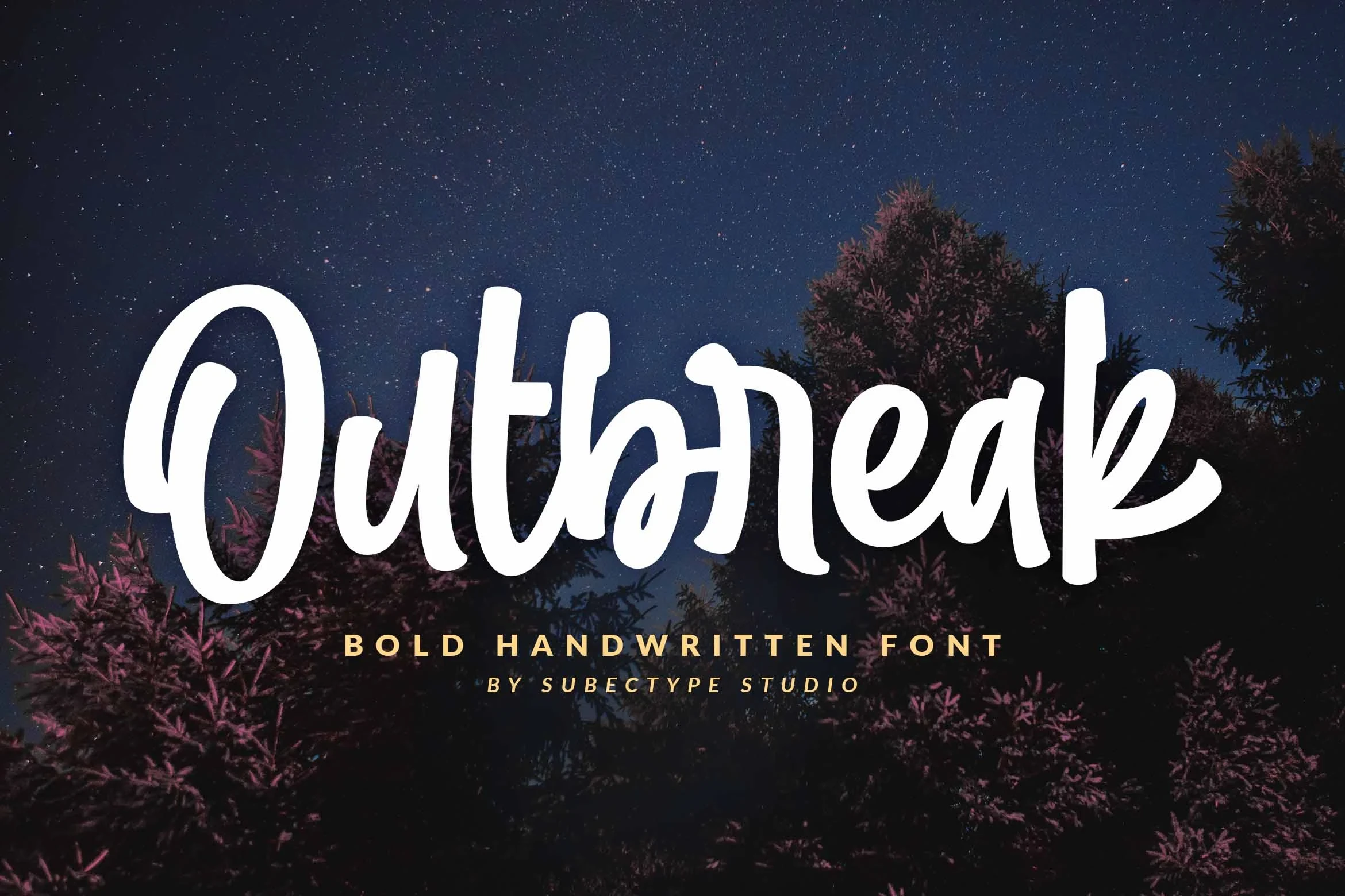
Best For: wall art, clean designs, playful designs
Outbreak Font works for wall art and playful titles through thick monolinear strokes, rounded terminals, and discontinuous connections rather than fully continuous cursive. Its heavy weight keeps short phrases clear at large sizes, while the mixed construction adds a deliberately casual, energetic character.
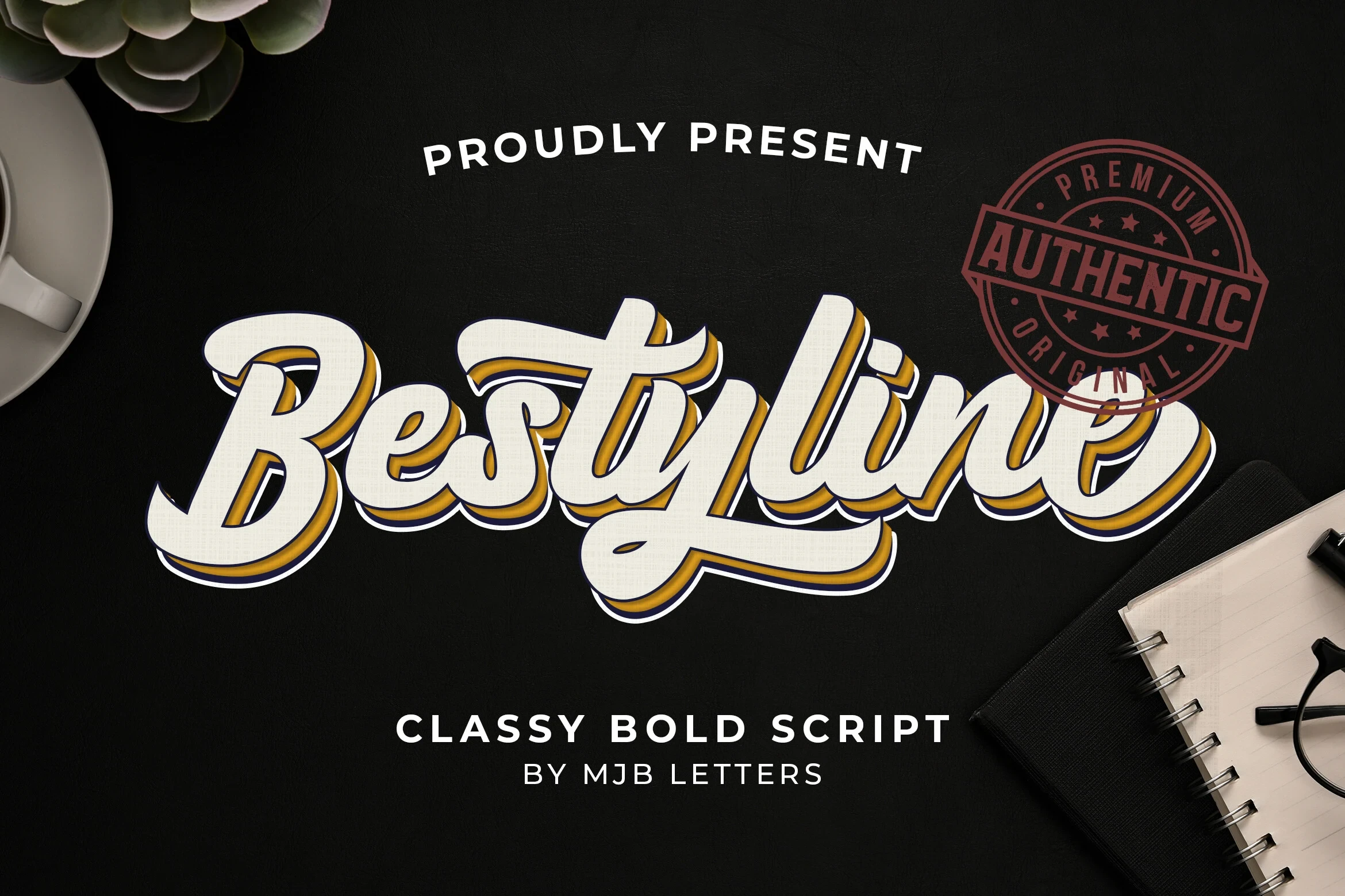
Bestyline Font
Best For: logos, posters, headlines, signage
Bestyline Font is made for posters, logos, and signage, combining heavy connected lettering, a pronounced rightward slant, and layered drop-shadow treatment. This Bold Calligraphy Fonts design gains retro athletic force from the effect, but is less adaptable than a plain script setting.
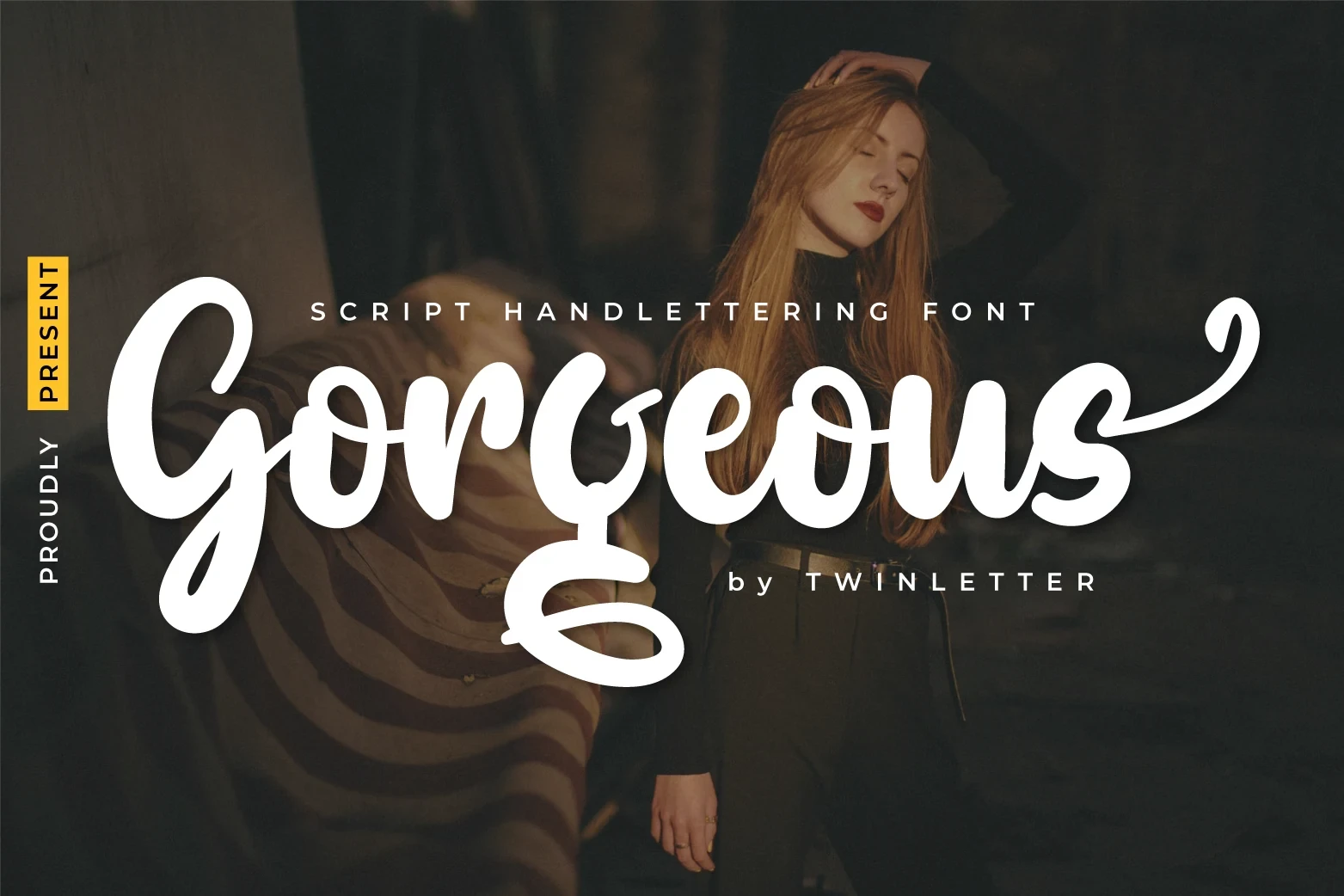
Gorgeous Font
Best For: posters, invitations, social media graphics, clean designs
Gorgeous Font uses brush-style strokes, overlapping connections, and swash terminals on the uppercase G and lowercase s for an organic painted quality. The overlaps add force to posters and social graphics, but can obscure character boundaries in small text.
How to Choose the Right Font
Choose Bold Calligraphy Fonts by construction first: connected, upright forms generally read more cleanly than ornate swashes, overlapping brush strokes, or layered effects. Check every name at its final size, reserve high-contrast flourishes for short titles, and use alternates, underlines, or shadows only when they strengthen the design role rather than compete with the wording.