14 Best Handwritten Fonts for Logos in 2026
This collection spans fine connected scripts, substantial brush lettering, rounded retro forms, geometric display faces, and refined period-inspired styles. These Handwritten Fonts for Logos help shape personal wordmarks, packaging identities, signage, and short brand names, with readability depending heavily on stroke weight, joins, flourishes, and final size.
Looking for more handwritten fonts? Browse our complete Handwritten Fonts collection to compare modern, bold, wedding, logo-friendly, and Cricut-ready handwritten styles.
Handwritten Fonts for Logos
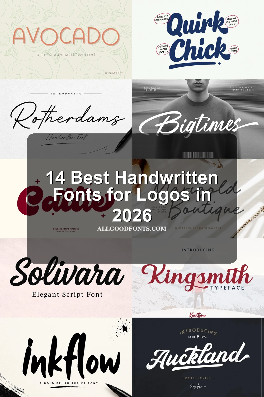
These Handwritten Fonts for Logos rely on connected movement, cursive joins, and varied stroke weights, ranging from slender personal scripts to heavy display lettering with nostalgic character.
Rotherdams Font

Best For: logos, branding, packaging
Rotherdams Font uses light monoline strokes and right-leaning connected cursive to create a personal wordmark. Its ornate joins and fine lines need generous display sizing, so it suits a prominent logo, package name, or invitation more than small supporting text.
Alverina Font
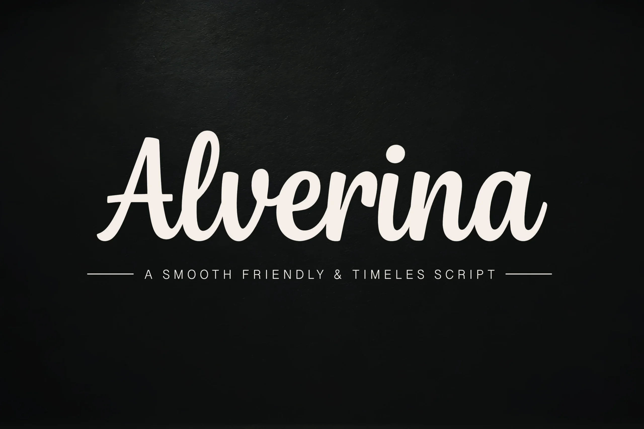
Best For: product labels, beauty branding, logos
Alverina Font gives connected script a substantial weight, allowing its flowing movement to hold attention more clearly than a fine handwritten style. It fits short names, product labels, and beauty branding, especially when the logo needs visible letter shapes without losing cursive motion.
Inkflow Font
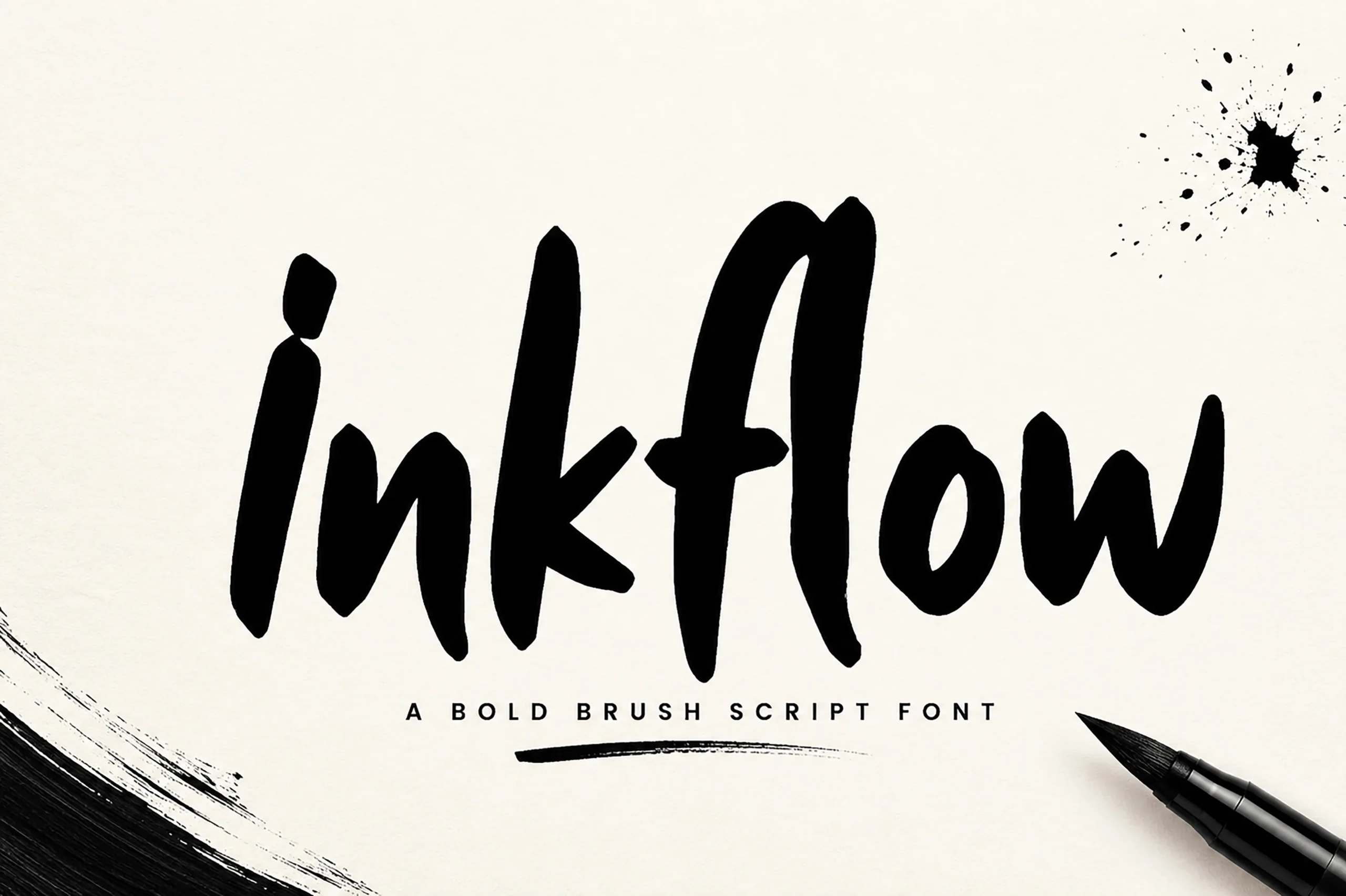
Best For: logos, display text, modern designs
For Handwritten Fonts for Logos with brush-like energy, Inkflow Font brings bold connected lettering and a pronounced stroke rhythm. The movement feels openly expressive in short names and display phrases, but the dense joins make it better for a compact mark than extended supporting copy or detailed information.
Cattie Font
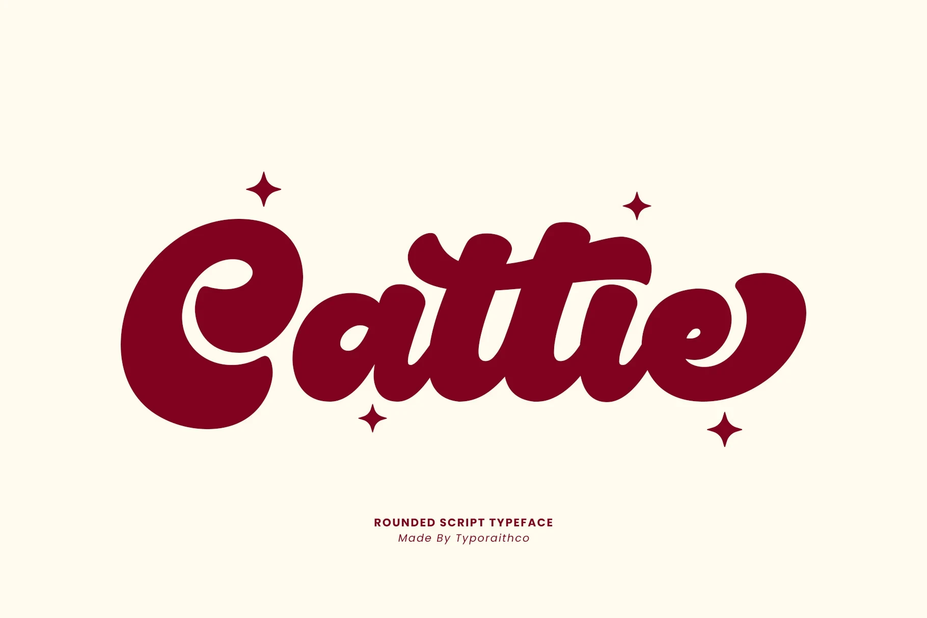
Best For: logos, branding, packaging
Cattie Font builds its presence from rounded heavy strokes, low contrast, and flowing connected forms. The rounded terminals create a playful period flavor, while the strong display legibility helps short brand names, packaging, and posters; its stylized connections are not intended for long-form reading.
Solivara Font
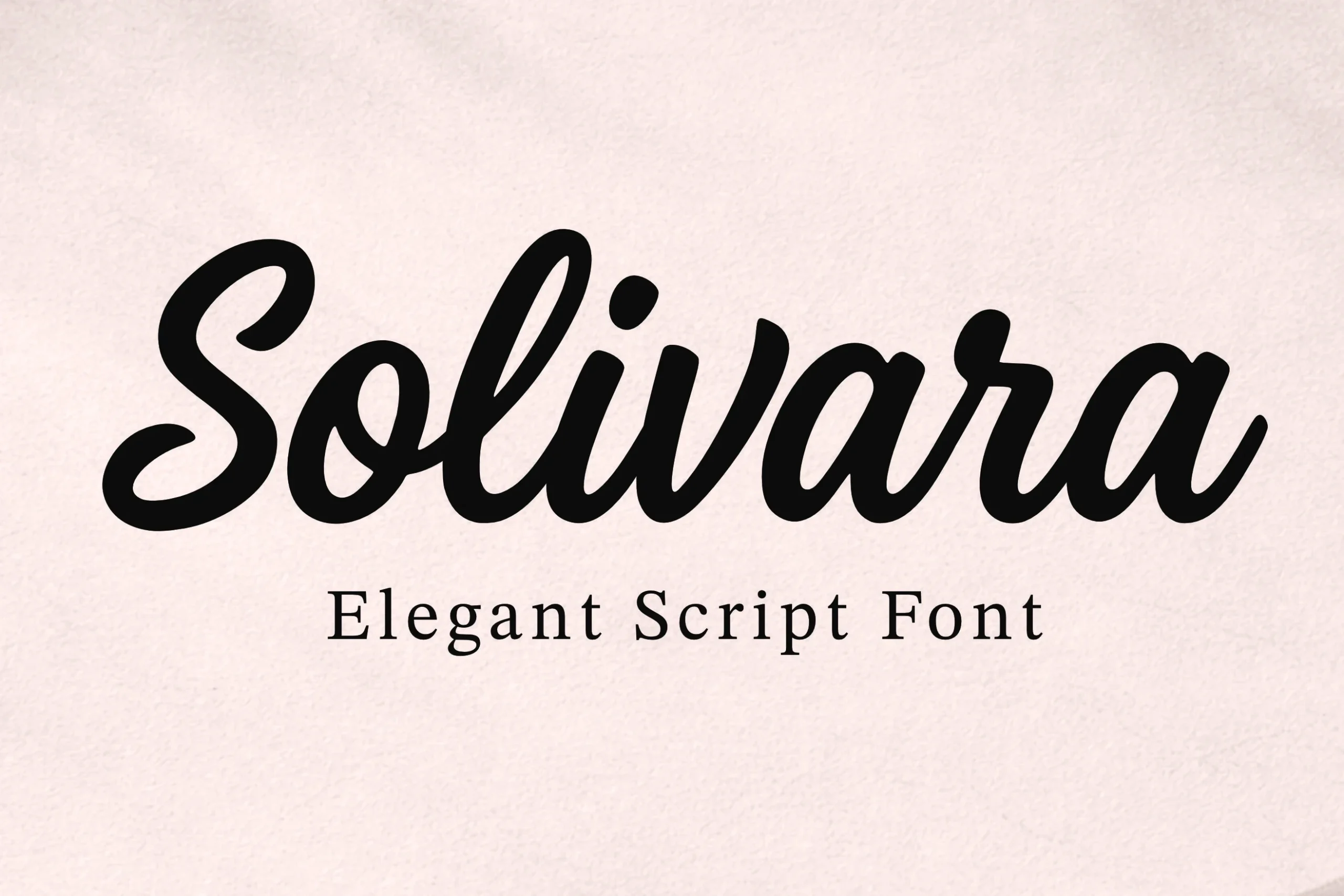
Best For: logos, branding, packaging
Solivara Font combines slender connected lettering with flowing movement and a period-inspired display character. The light construction works well for prominent names on packaging, invitations, and branding, but its fine forms should be checked at the intended logo size before being reduced.
Auckland Script Font
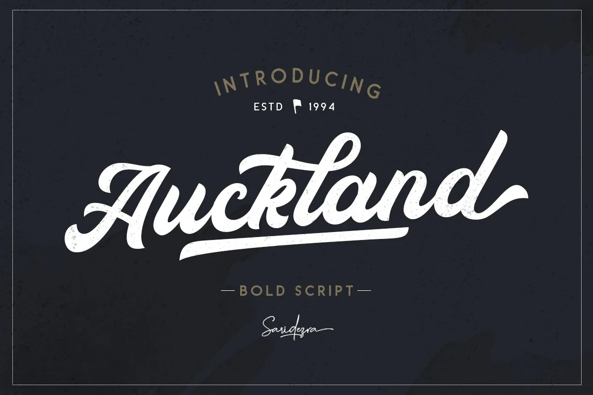
Best For: logos, branding, minimal designs
Auckland Script Font gives Handwritten Fonts for Logos a high-contrast, right-slanting signature with connected letters and an integrated underline. That built-in stroke can serve as a logo accent, while the large-scale design works best for names, labels, and branding rather than small text.
Bigtimes Font

Best For: logos, premium designs, bold designs
Bigtimes Font uses right-leaning connected cursive, extended terminals, and decorative flourishes to build a prominent wordmark. Its high contrast and fluid joins reward large placement, but thin flourishes can disappear at small sizes, so reserve it for clear, spacious logo applications.
Kingsmith Font

Best For: T-shirts, logos, display text
Kingsmith Font gives Handwritten Fonts for Logos connected movement and period-inspired character, creating a nostalgic voice for short names and display marks. Its PUA-encoded characters and swashes may require font-aware software or a compatible workflow when preparing the final logo artwork.
Contemporary Display Lettering
This group replaces connected script with distinct display letterforms, geometric structure, or clear stroke rhythm, giving short wordmarks a cleaner construction and stronger contemporary separation.
Avocado Font

Best For: logos, invitations, clean designs
Avocado Font offers Handwritten Fonts for Logos a non-connected alternative: geometric construction, uniform strokes, rounded terminals, and open counters. Its clean shape remains easy to read at large scale, making it useful for approachable wordmarks, invitations, and display identities without relying on script joins.
Quirk Chick Font
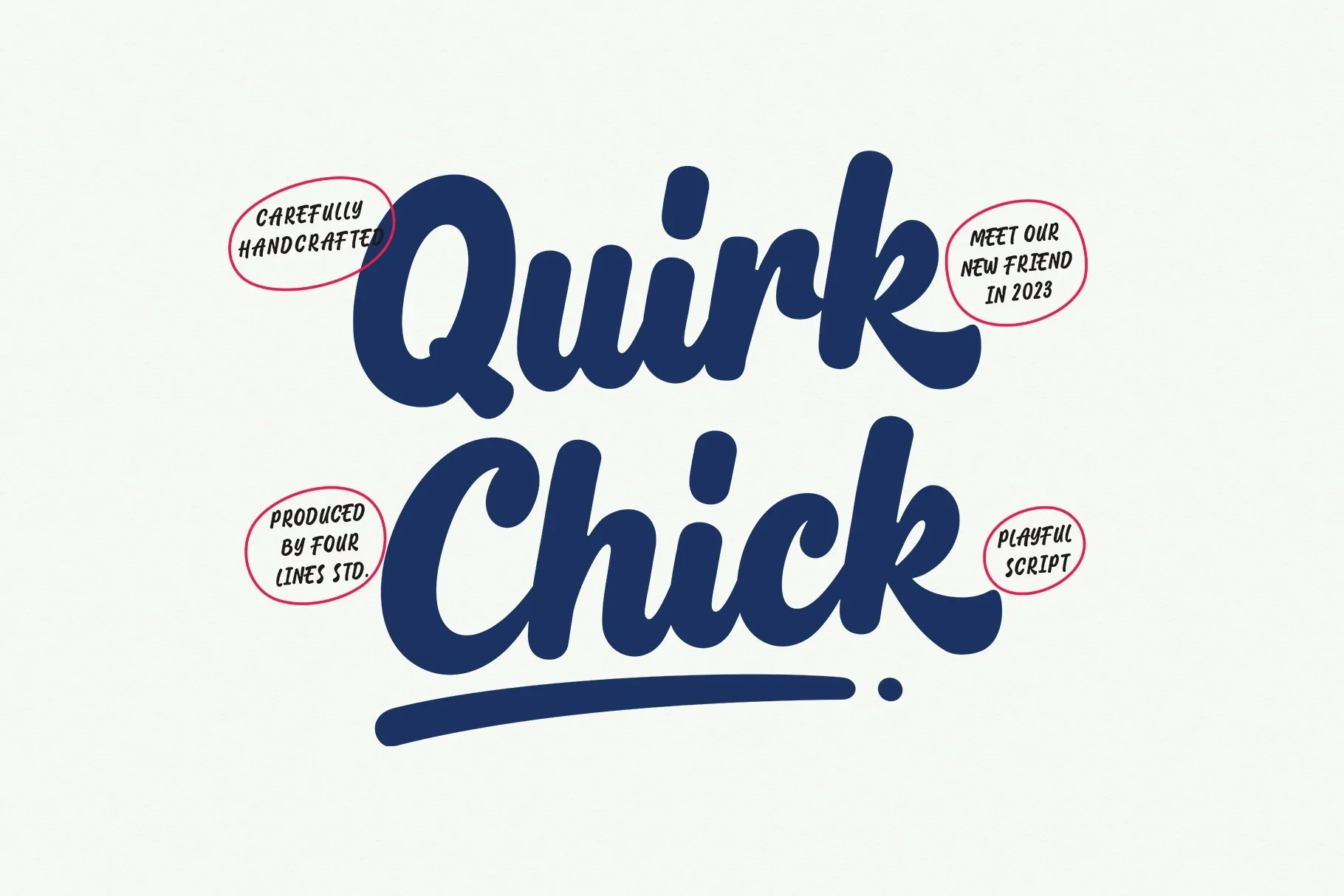
Best For: eye-catching designs, logos, branding
Quirk Chick Font centers on distinctive display letterforms and a clear stroke rhythm, giving a compact logo name an immediately noticeable shape. Since the evidence emphasizes display behavior rather than broad text use, keep it to short branding, packaging, or other large, closely reviewed applications.
Everyday Font
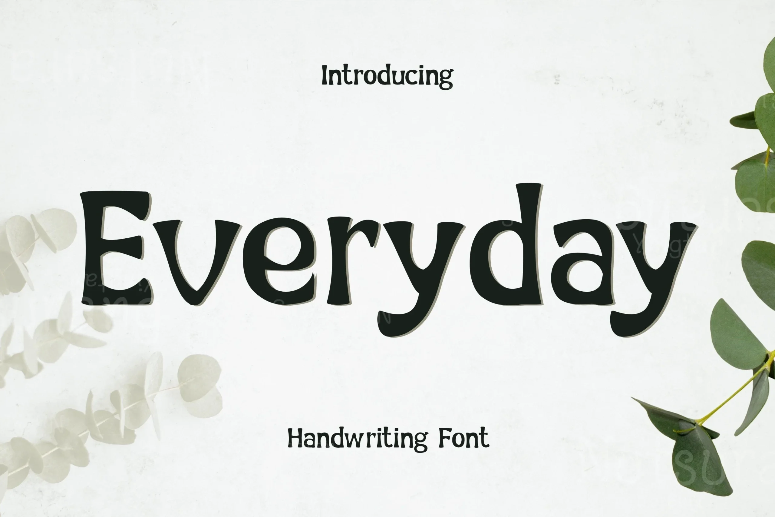
Best For: logos, creative projects, modern designs
Everyday Font suits Handwritten Fonts for Logos when you want contemporary character without connected joins. Its clean construction, distinctive display forms, and orderly stroke rhythm support short wordmarks and creative brands, while its display focus makes it less appropriate for secondary copy or information-heavy identity systems.
Woonder Font
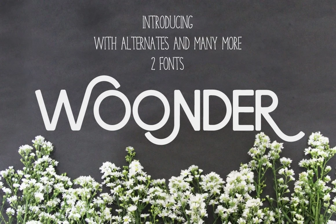
Best For: logos, display text, headlines
Woonder Font is best used when a logo name or emblem needs a distinctly display-led treatment. Its recognizable letterforms and clear stroke rhythm can carry a headline-sized identity, but the evidence supports short branding rather than detailed secondary information or extended text.
Refined and Nostalgic Display Lettering
Refined strokes and period-influenced forms define this smaller group, balancing polished lightness against substantial weight for prominent names, headlines, signage, and identity work.
Marigold Boutique Font
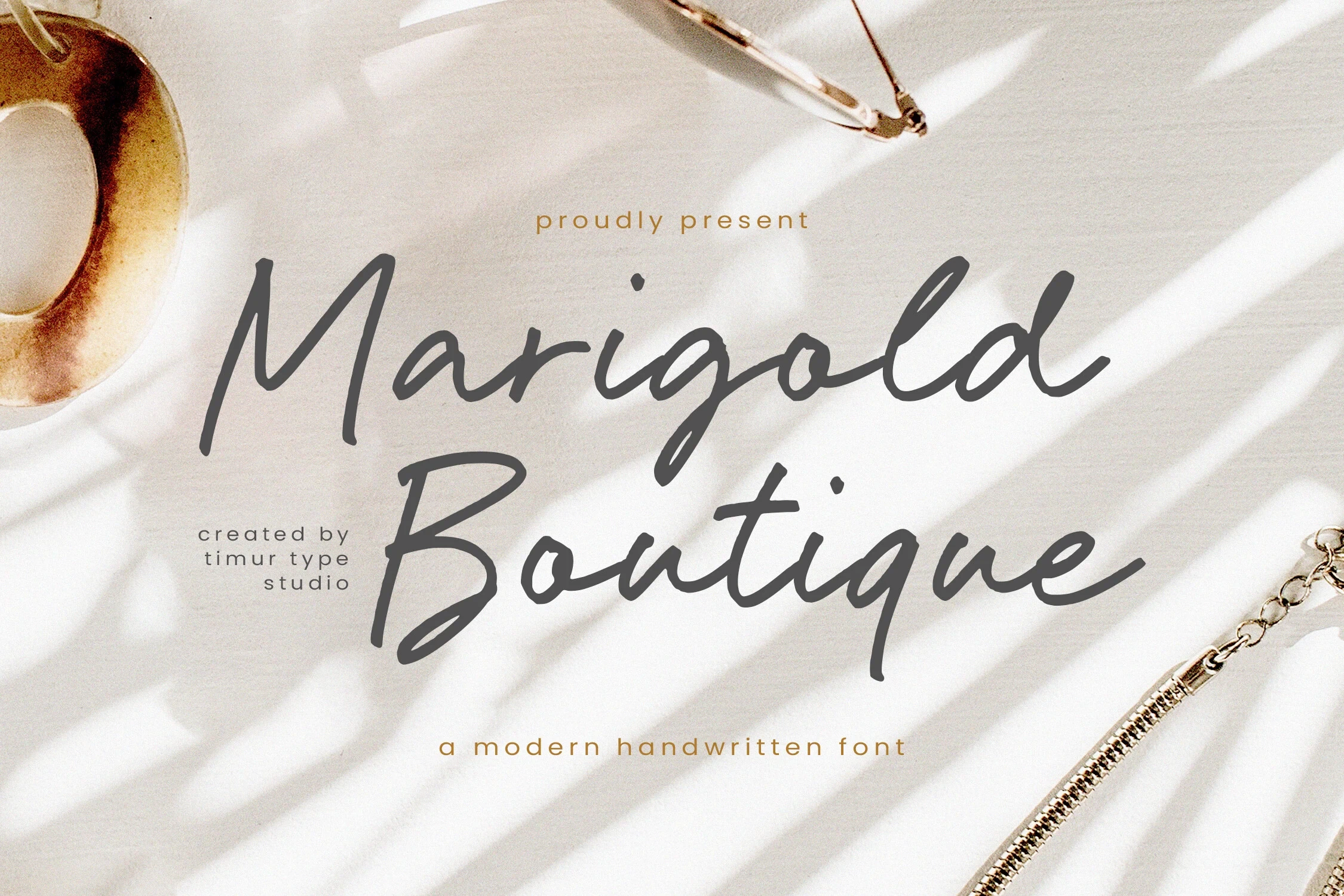
Best For: logos, branding, invitations
Marigold Boutique Font brings refined slender strokes and clean contemporary construction to Handwritten Fonts for Logos. Its light display weight suits prominent branding and invitations, where the name can remain large; test reductions carefully because the narrow strokes are less dependable in small applications.
Mantel Font
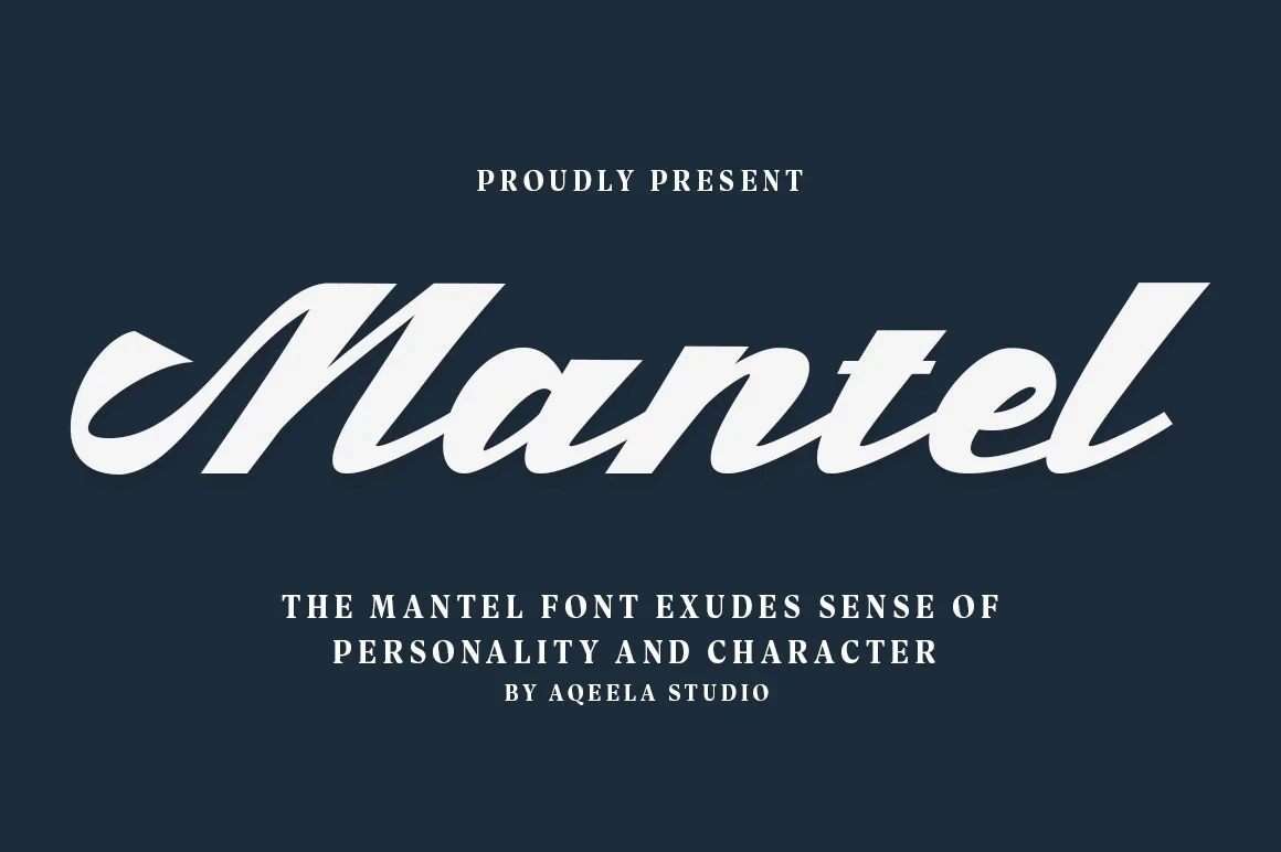
Best For: logos, headlines, signage
Mantel Font pairs substantial display weight with period-inspired character, producing a sturdy silhouette that holds attention from a distance. It is a practical choice for logo headlines, signage, and other short names where strong letter shapes matter more than extended reading comfort.
How to Choose the Right Font
Choose by construction first: connected scripts feel personal but need careful sizing, while non-connected display faces usually offer clearer large-scale shapes. Light weights and thin flourishes require prominent placement; heavier, low-contrast forms hold attention farther away. For Handwritten Fonts for Logos, test the complete name at final size and confirm any PUA glyph workflow before delivery.